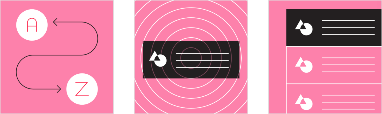
Lists are continuous, vertical indexes of text or images.
Usage
Lists are a continuous group of text or images. They are composed of items containing primary and supplemental actions, which are represented by icons and text.
设计原则
Logical
Lists should be sorted in logical ways that make content easy to scan, such as alphabetical, numerical, chronological, or by user preference.
Actionable
Lists present content in a way that makes it easy to identify a specific item in a collection and act on it.
Consistent
Lists should present icons, text, and actions in a consistent format.
分类
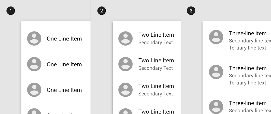
1. Single-line list
Single-line list items contain a maximum of one line of text.
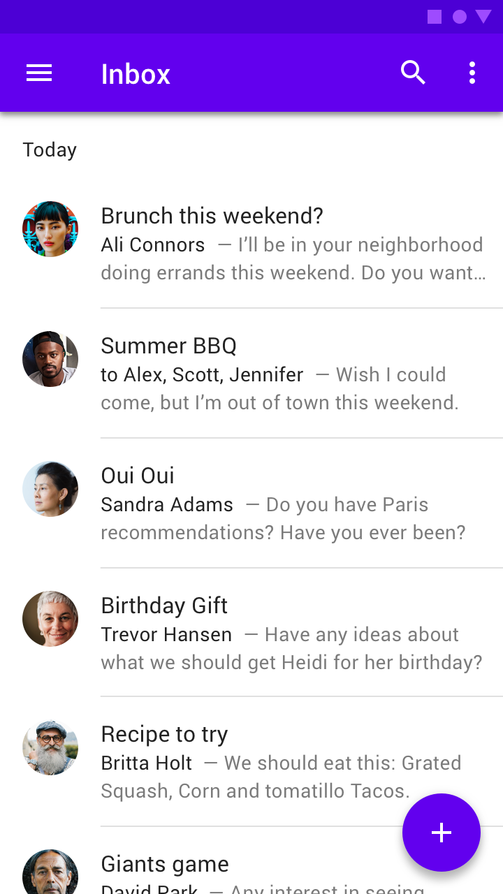
2. Two-line list
Two-line list items contain a maximum of two lines of text.
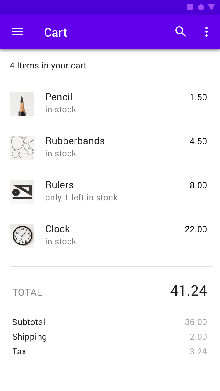
3. Three-line list
Three-line list items contains a maximum of three lines of text.
解析
Lists are optimized for reading comprehension. A list consists of a single continuous column of subdivisions called rows that contain items of content.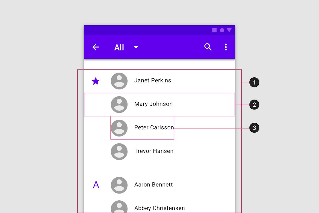
1. List
2. Row
3. List item content
Content types
Content types can take different forms, depending on the needs of a list.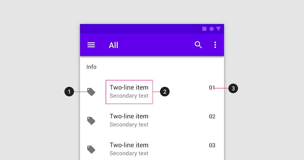
List items are comprised of three different content types:
- Supporting visuals
2. Primary text
3. Metadata
A list control can display information and actions for list items.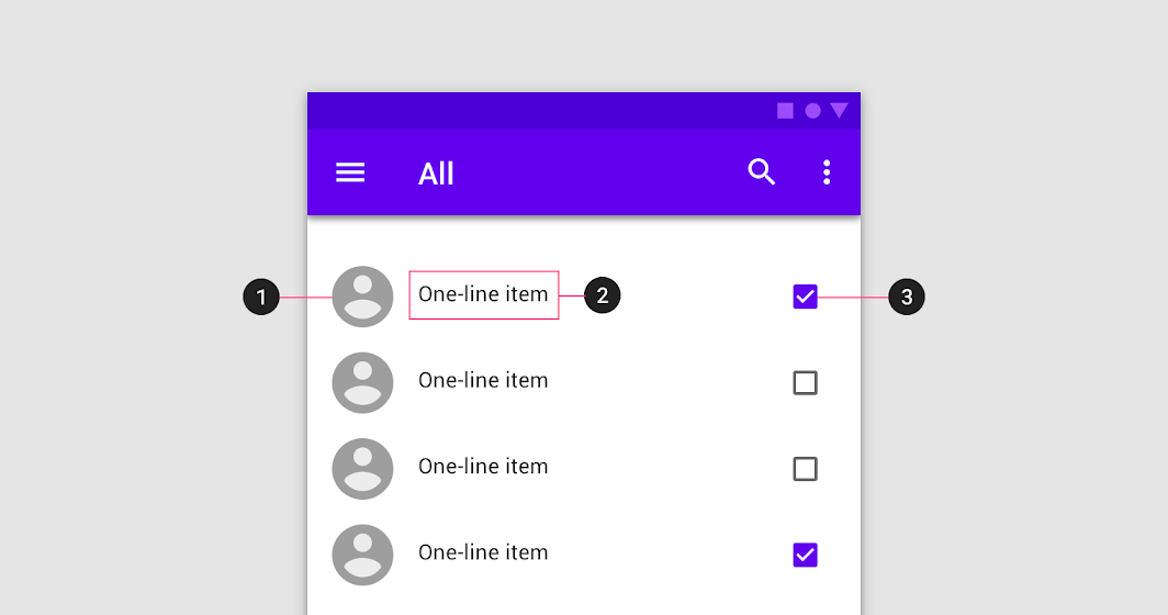
Lists with controls contain three content types:
- Supporting visuals
2. Primary text
3. List control
A list should be easily scannable, and any element of a list can be used to anchor and align list item content. Scannability is improved when elements (such as supporting visual and primary text) are placed in consistent locations across list items.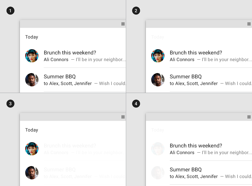
1. Sample list
2. Content placement in a row
3. Supporting visuals are aligned for easy scanning
4. Primary text is aligned for easy scanning
Visuals, dividers, and spacing
List structure can be organized using visuals, dividers, and spacing.

Do
Improve scannability by anchoring supporting visuals, such as thumbnails, along the row’s edge.

Caution
Placing supporting visuals in the center of the row can make it difficult to see the relationship between primary content and supporting content.


Do
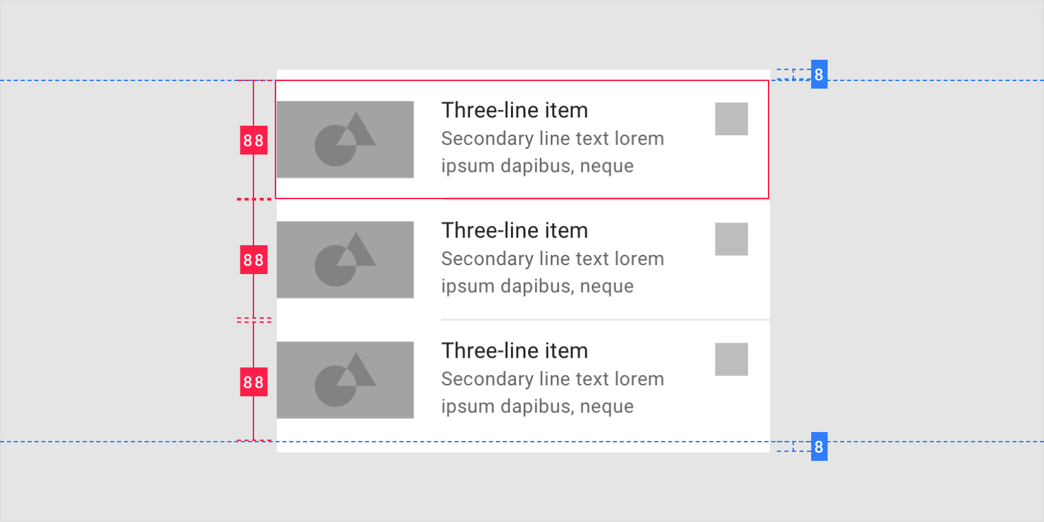
Place a divider between rows with lots of content, such as those with three-line lists.

Caution
Distinguish rows by maintaining sufficient space between list items.
The primary action takes up the majority of space.
- Primary Action area
2. Secondary Action area
Clear hierarchy is created by aligning the most distinguishing content on the left, with the least distinguishing on the right.
- More distinguishing content
2. Less distinguishing content
Subheaders
Subheaders delineate sections of a list. They appear on list rows.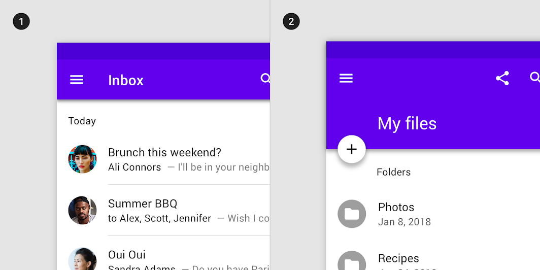
1. Subheader
A subheader should be left-aligned with an avatar or icon in a list.
2. Subheader inset
If a floating action button is aligned with list avatars or icons, the subheader should be aligned with the text content.
交互行为
Transitions
Tapping a list item expands it across the entire screen using a container transform transition pattern.
 To expand a list item, display a parent-child transition.
Gestures
Swiping a list item (either left or right) can perform an action.
To archive a list item, swipe it.
Items can be dragged to reorder a list.
To reorder a list item, drag it.
Expand
A three-line list transition (on mobile) is displayed as a two-line list (on desktop).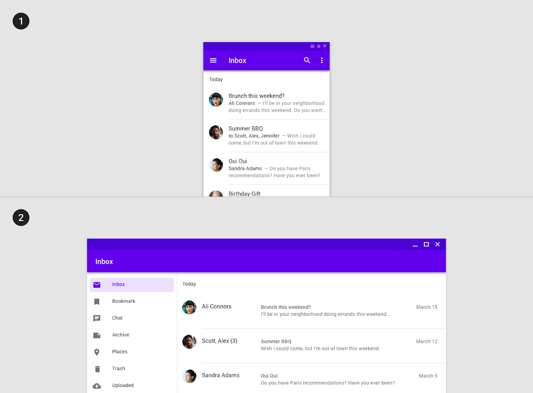
Scaled down to 50%
1. A three-line list on mobile
2. A two-line list on desktop
Transform
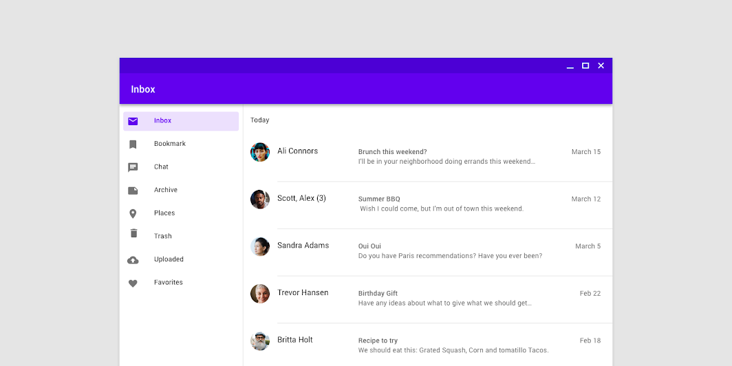
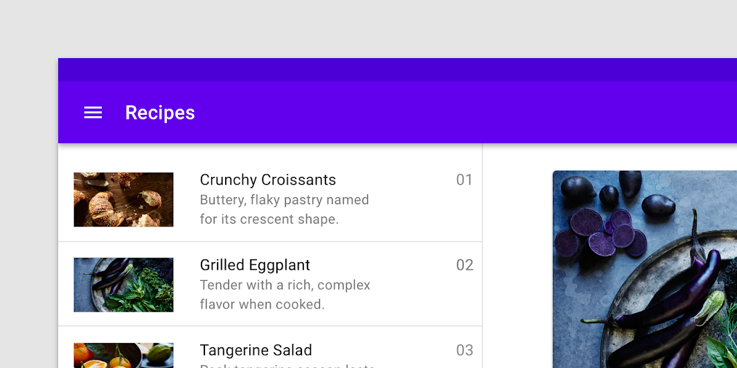
On a larger screen, a list may transform into an image list.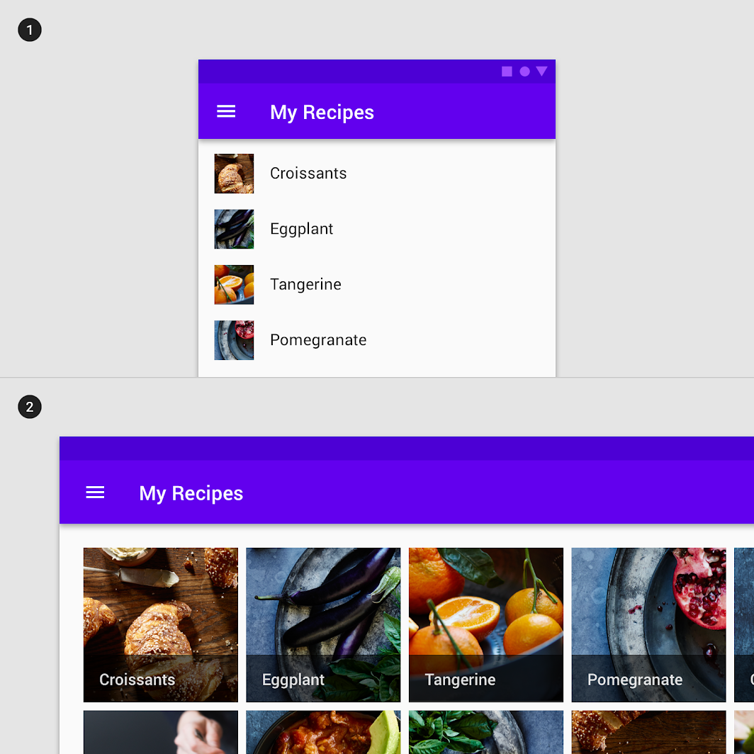
1. A one-line list on mobile
2. An image list on desktop
Reveal additional content
Lists can also show more or less content as they scale up and down in size. For example, a list item can reveal more content when the component expands.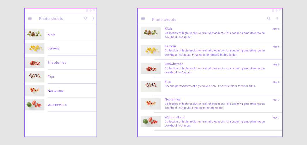
List items on larger screens (right) can display more information as the screen size transitions from small to medium breakpoints.
Scaling and adaptation
Line length
Avoid excessively long lines of text when expanding containers and text-heavy components within fluid layouts. This often means changing margins and typography properties as the container scales.
The ideal line length for text is typically between 40-60 characters, but large screen devices can accommodate up to 120 characters per line. Consider increasing the line height to improve readability if a line of text becomes close to 120 characters in length.
Adapt the width of the list container based on a line’s length, or by switching to a multi-column layout.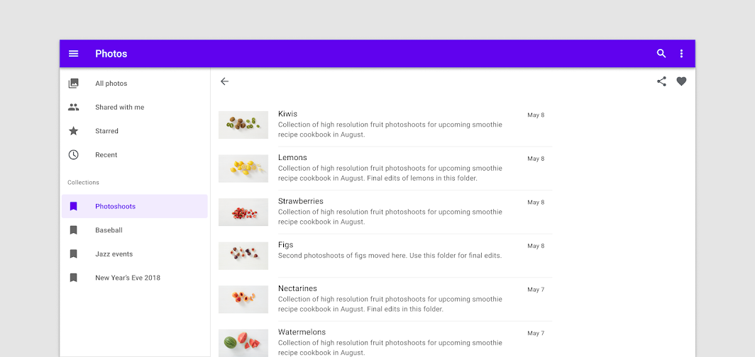

Do
Adjust margins to create a more comfortable line length for reading.

Don’t
Don’t scale components without adjusting other affected areas of the screen, such as text length. This can result in line lengths that make reading difficult.

Do
A multi-column layout can help break up content when needed.
Component adaptation
Visual presentation is the most common method of adaptation, affecting the scale and placement of content and objects on a screen, as well as their relationships to each other.
For example, a text list on mobile can adjust its margins, vertical spacing, or density to better fit large screens like tablets.
Component swapping
Given the flexibility needed for lists and cards to support multiple types of content, use caution if swapping between the two on large screens. As screen sizes increase, there are new opportunities for text and image compositions; in large screens you can use more space for images and text.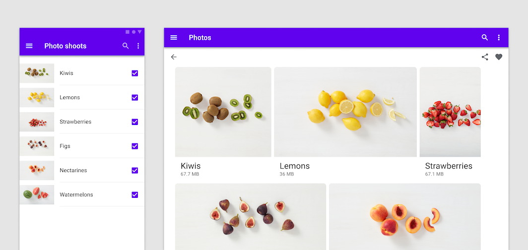
Composition
Lists and views
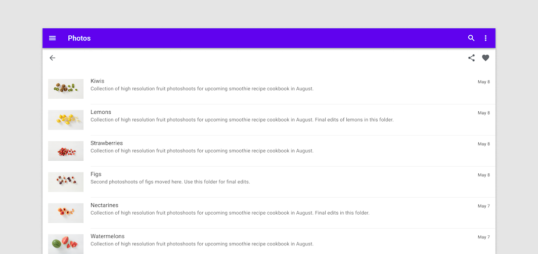
On smaller screens, lists extend edge-to-edge. Users navigate between full-screen views, as seen in a photo app’s transition from a thumbnail list to full image view.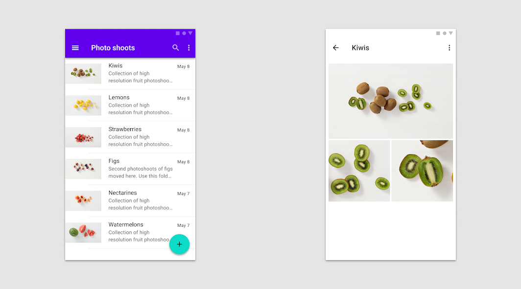
On small screens, users navigate between full-screen views.
Large screens can display primary and secondary content in the same view, such as a list adjacent to a detail view.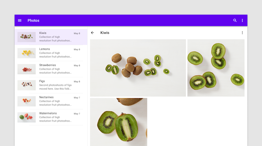
On larger screens, a list/detail view can be more appropriate.
分类
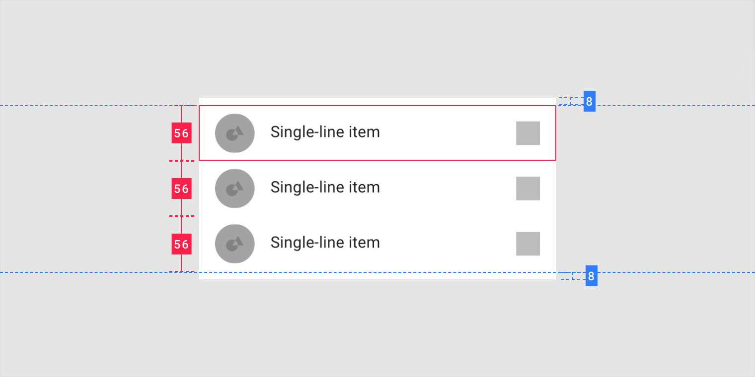
Single-line list
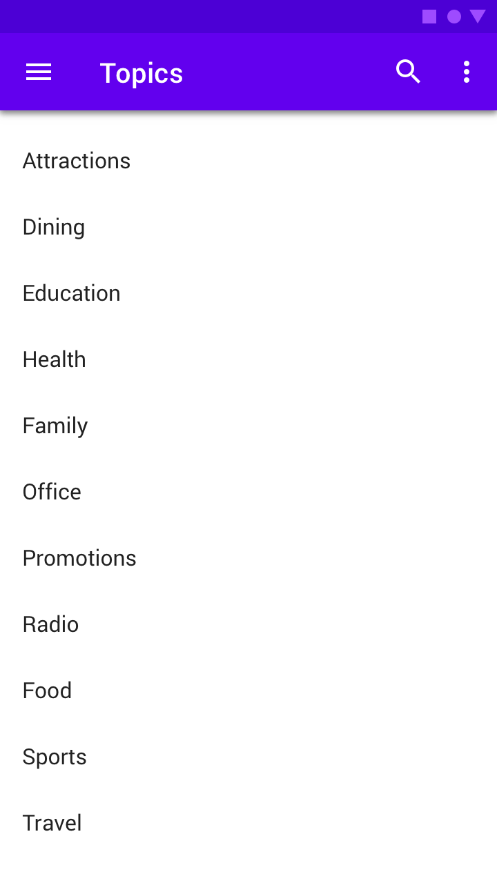
A text list.
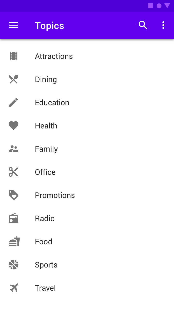
A single-line list with icons and text.
Scaled down to 50% on desktop, a single-line list with icons and text.
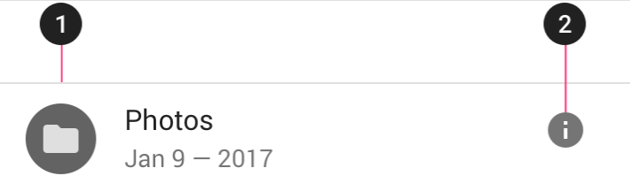
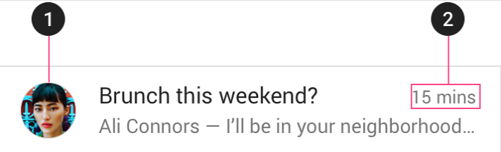
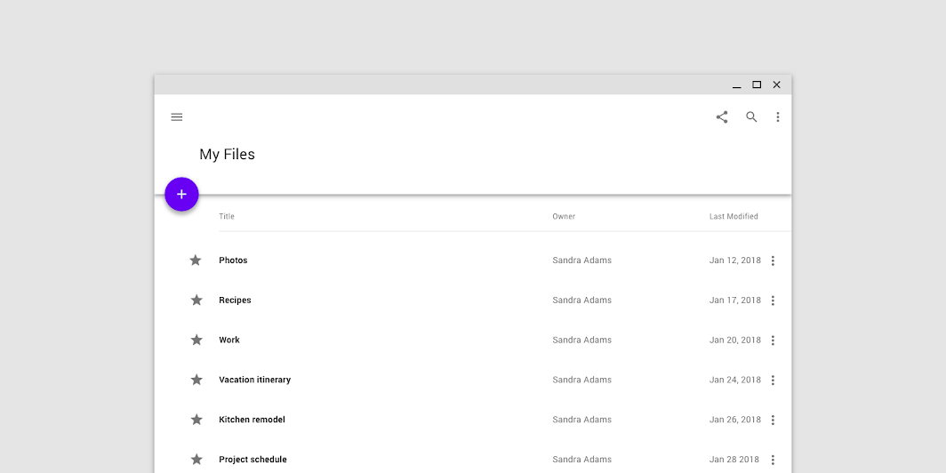
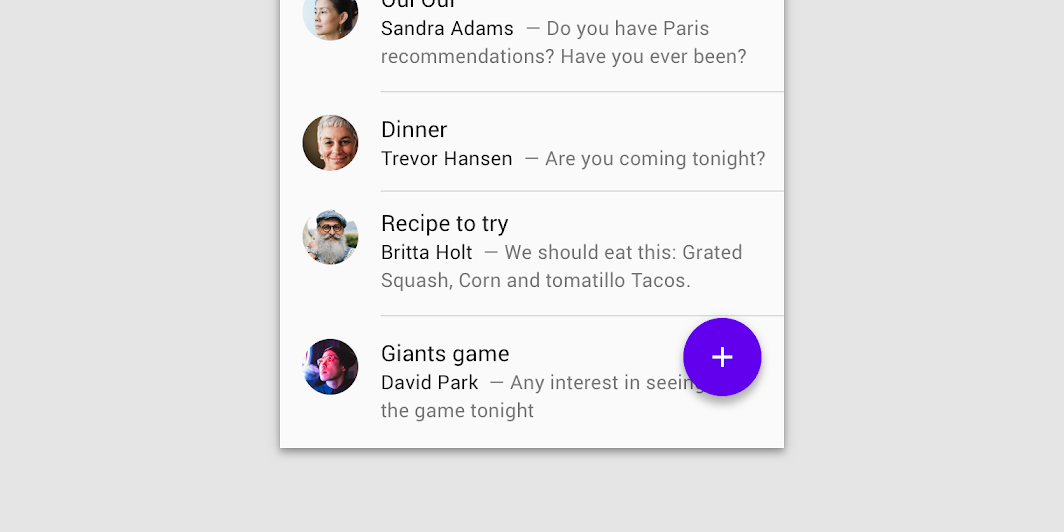
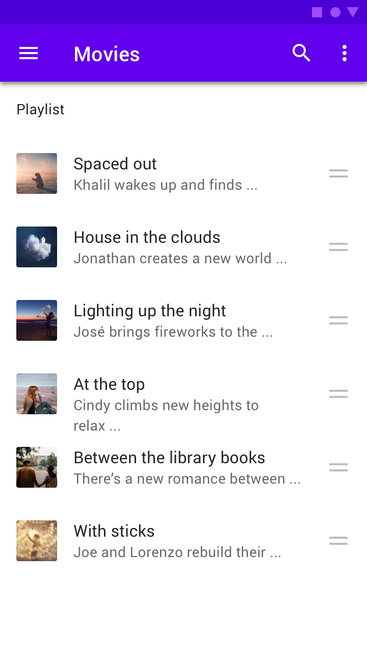
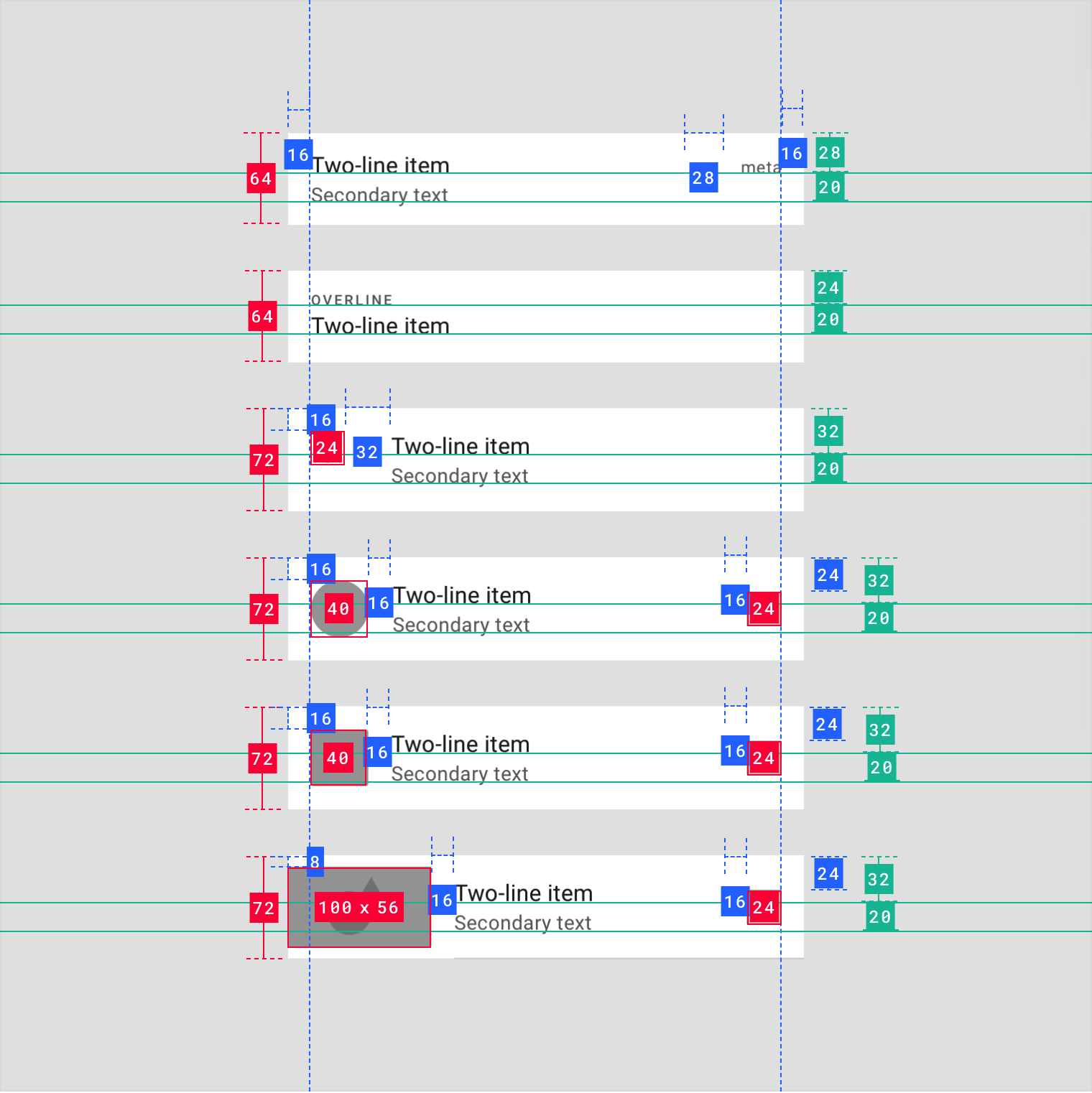
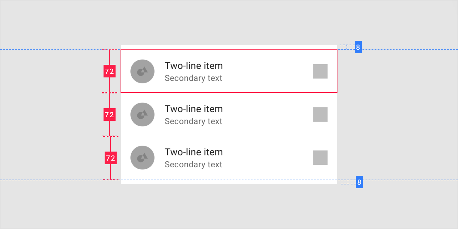
Two-line list
In a two-line list, each row contains two lines of text maximum.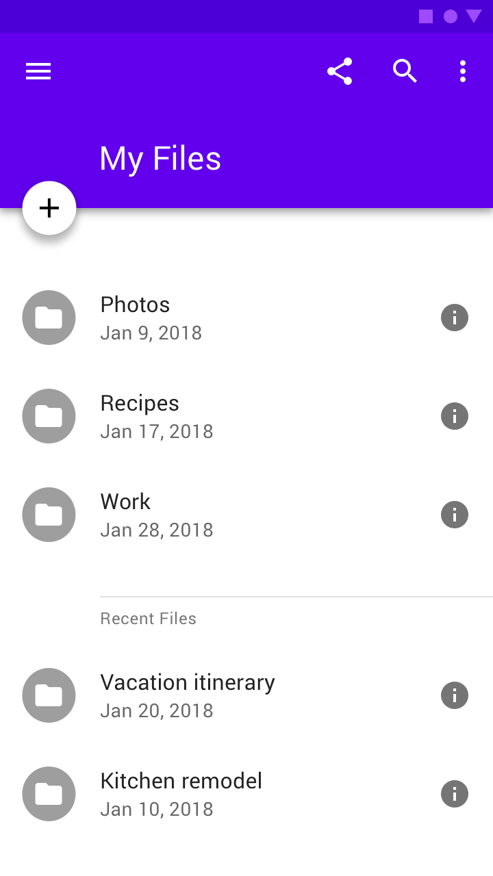
A two-line list, with an icon and meta icon.
A two-line list, with a thumbnail and meta text.
The amount of text can vary between different rows within the same list.
Scaled down to 50% on desktop, a two-line list accompanied by an avatar and meta text.
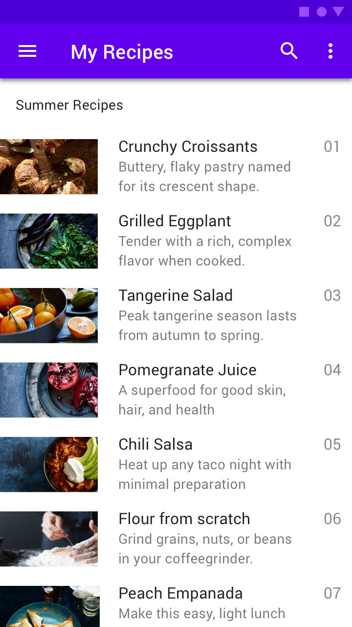
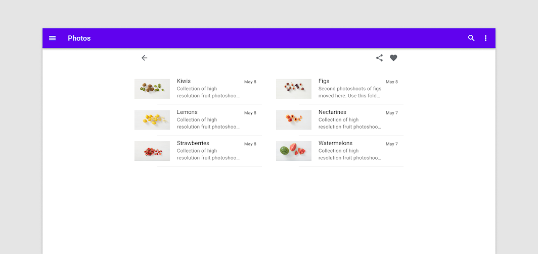
Three-line list
A three-line text with an avatar.
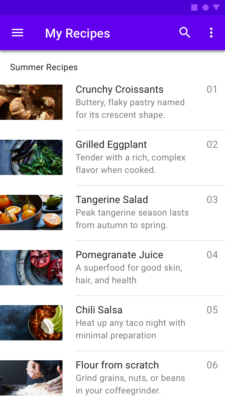
A three-line text list, with a thumbnail and meta text.
The amount of text can vary between rows within the same list.
On desktop, a three-line list accompanied by a large thumbnail and meta text.
List controls
List controls display information and actions for list items.
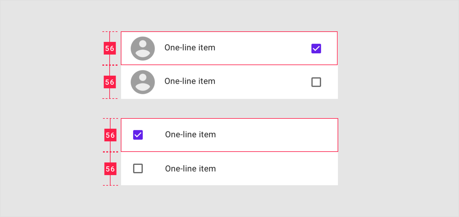
Checkbox
A checkbox can either be a primary or secondary action.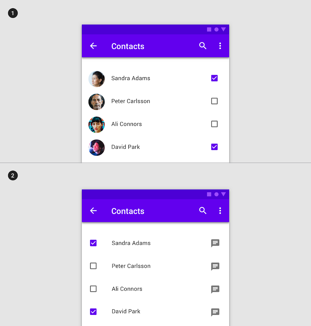
1. Secondary action
This checkbox is the list item’s secondary action.
- Primary action
This checkbox is both the list item’s primary action and state indicator.
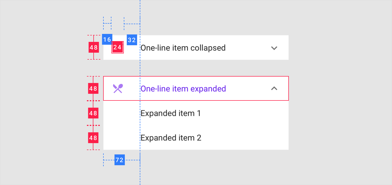
Expand and collapse
Show and hide details of existing list items by expanding and collapsing list content vertically.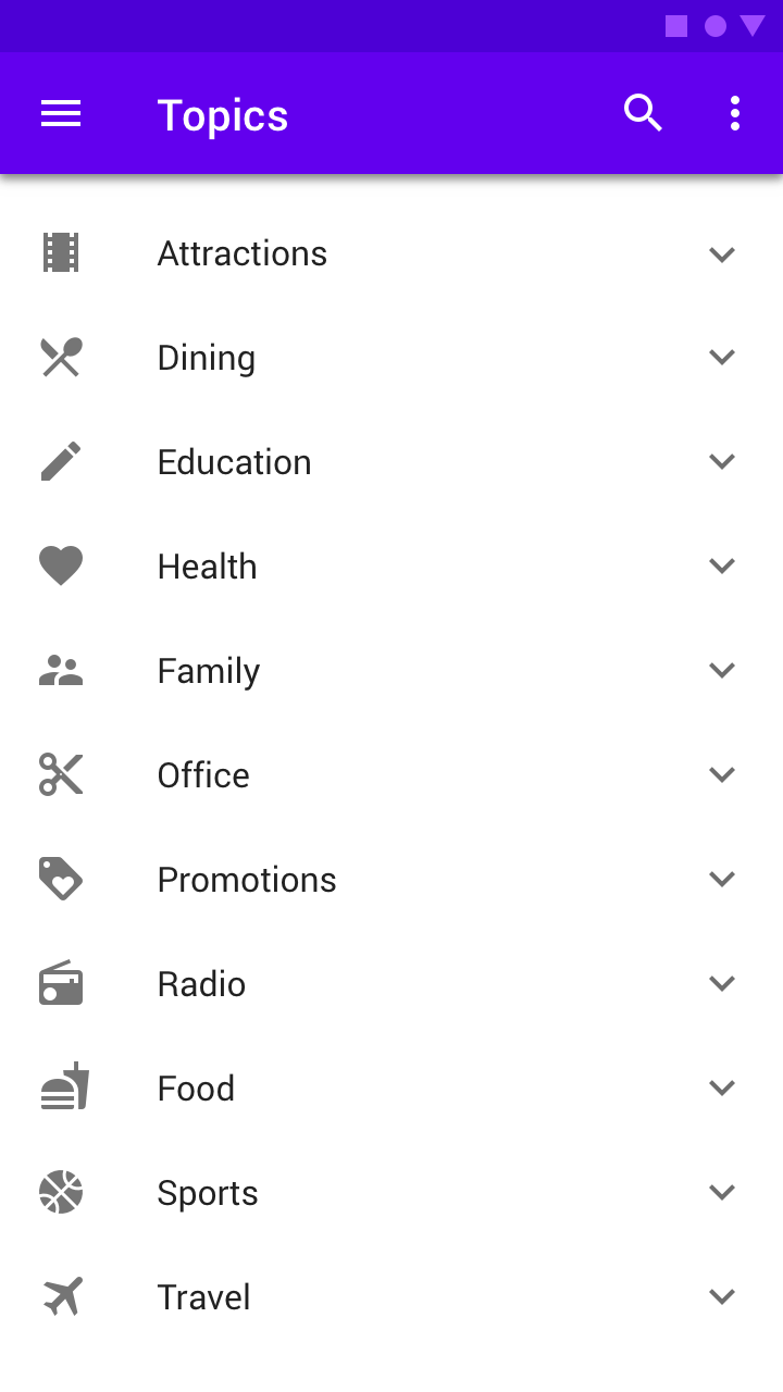
Tapping the list control expands the list.
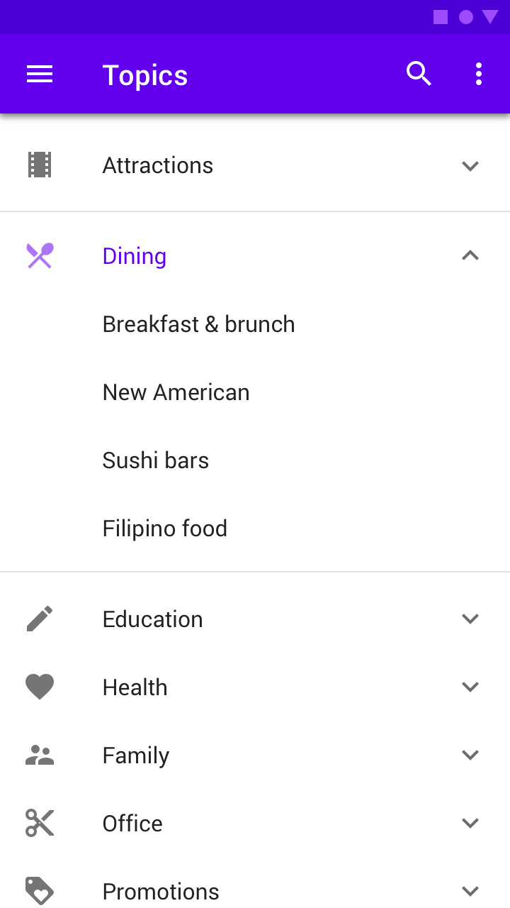
An expanded list.
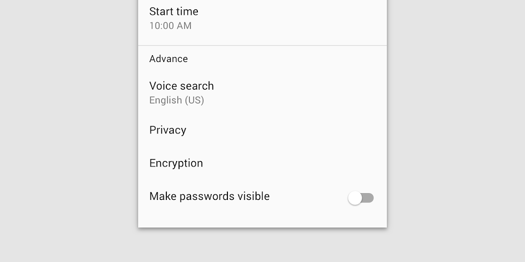
Switch
Tapping the list control expands the list.
Reorder
Usually appearing in edit mode, dragging lists items moves them to other locations within the list. This reorder icon is the list item’s secondary action.
主题
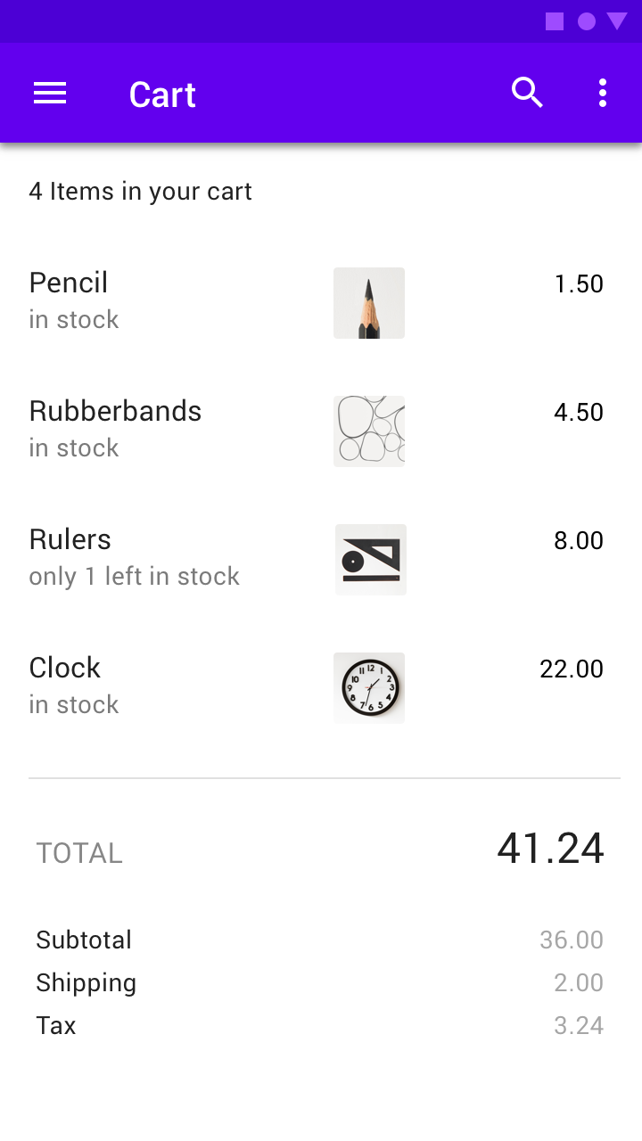
Basil Material theme
This recipe app’s lists have been customized using Material Theming. Areas of customization include color and typography.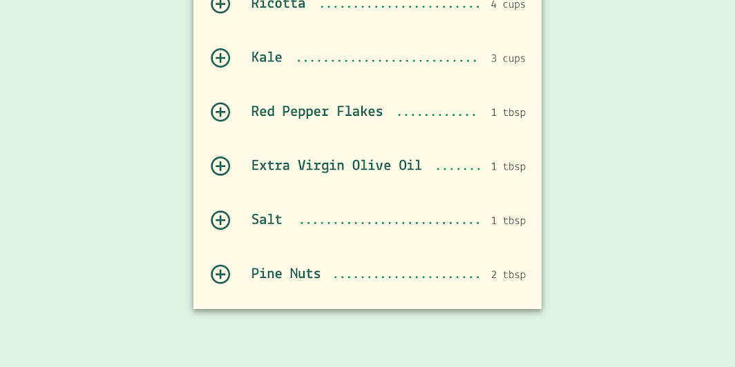
Basil’s customized list.
Color
Basil’s lists use custom color on four elements: the background, icon, item text, and quantity text.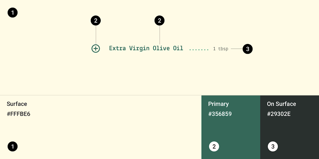
| Element | Category | Attribute | Value |
|---|---|---|---|
| Surface | Surface | Color Opacity |
#FFFBE6 100% |
| Item text, Icons | Primary | Color Opacity |
#356859 100% |
| Quantity text | On Surface | Color Opacity |
#29302E 100% |
Typography
Basil’s lists use custom typography for item and quantity text.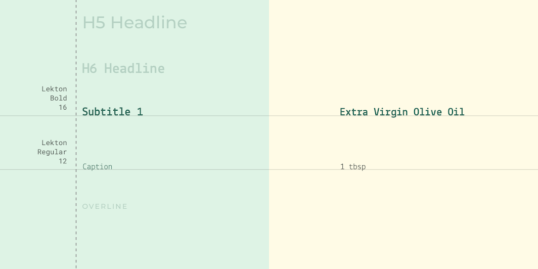
| Element | Category | Attribute | Value |
|---|---|---|---|
| Item text | Subtitle 1 | Typeface Font Size Case |
Lekton Bold 16 Title case |
| Quantity text | Caption | Typeface Font Size Case |
Lekton Regular 12 Sentence case |
Crane Material theme
This travel app’s lists have been customized using Material Theming. Areas of customization include color and typography.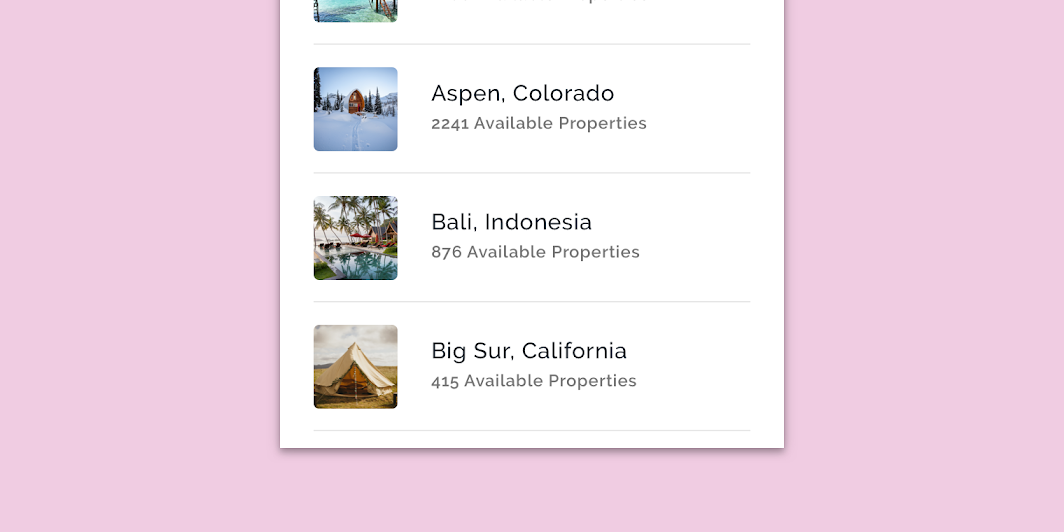
Crane’s customized list.
Typography
Crane’s lists use custom typography for title and caption text.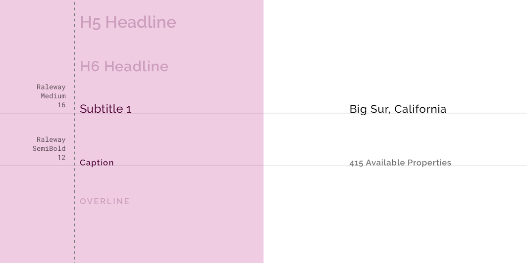
| Element | Category | Attribute | Value |
|---|---|---|---|
| Title text | Subtitle 1 | Typeface Font Size Case |
Raleway Medium 16 Title case |
| Caption text | Caption | Typeface Font Size Case |
Raleway SemiBold 12 Title case |
Specs
One line
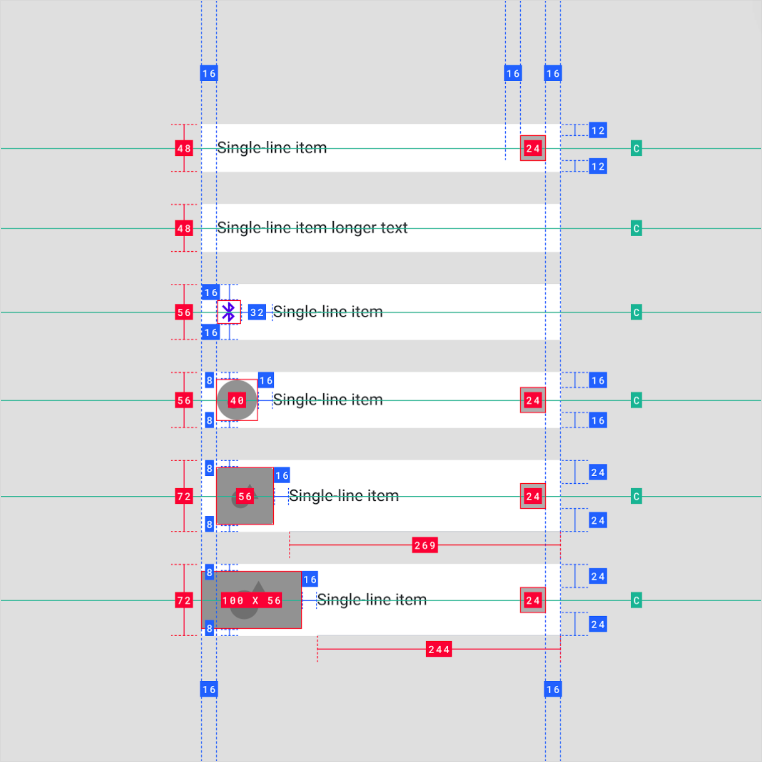
Two line
Three line
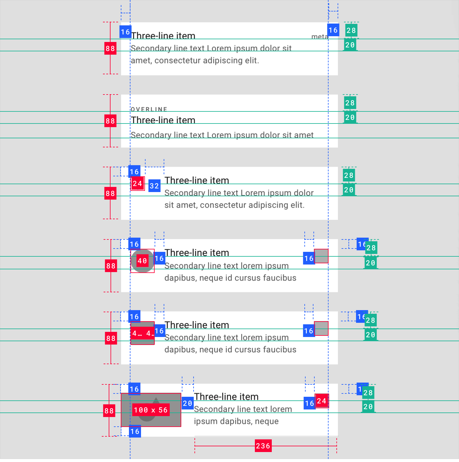
The trailing padding (padding to the right of the image) in the example above and below is intended to be 16dp.
Collapsed & expanded

若有收获,就点个赞吧
0 人点赞
