将组件或元素的状态通过可视化设计展示给用户会更加生动形象。
States are visual representations used to communicate the status of a component or interactive element.
用法
将组件或可交互元素的状态通过可视化设计展示给用户。
在同一个系统中,状态的视觉效果应该保持统一,并且不会彻底改变组件,但必须具有一定的辨识度,以区别于其他状态和周围的组件或元素。
States communicate the status of UI elements to the user. Each state should be visually similar and not drastically alter a component, but must have clear affordances that distinguish it from other states and the surrounding layout.
States must have clear affordances that distinguish them from one other.
原则
- 差异性
组件的状态可视化必须要有一定的辨识度,来将它们与周围的用户界面区分开来。
States must have clear affordances distinguishing them from one other and the surrounding UI, emphasized according to their priority levels.
- 叠加性
当一次出现多个状态时,例如选择和悬停,应显示两个状态对应的指示效果。
When multiple states occur at once, such as selection and hover, both state indicators should be displayed.
- 统一性
在同一个应用下,各个组件的状态可视化风格应该保持一致,以提高可用性。
States should be applied consistently across components in order to increase usability.
状态分类
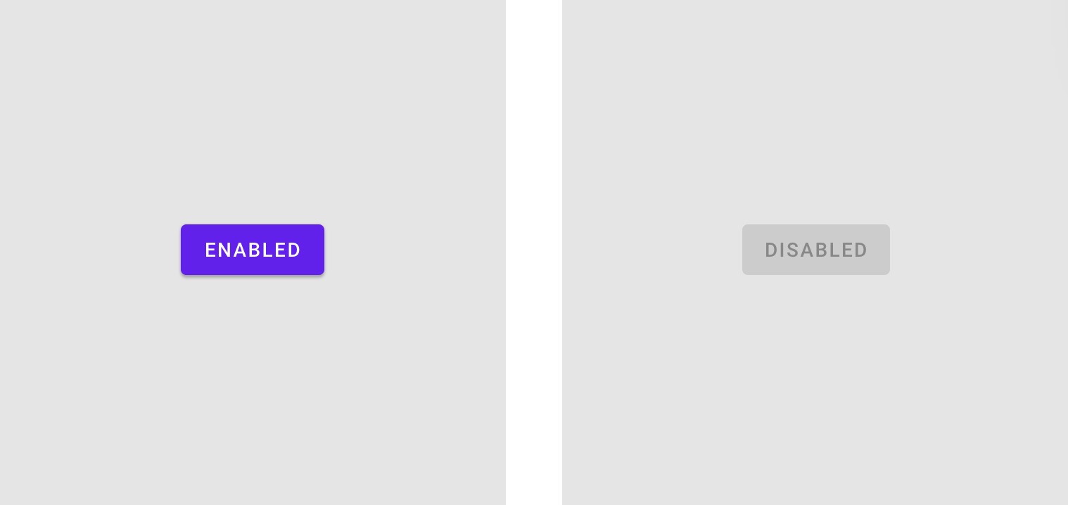
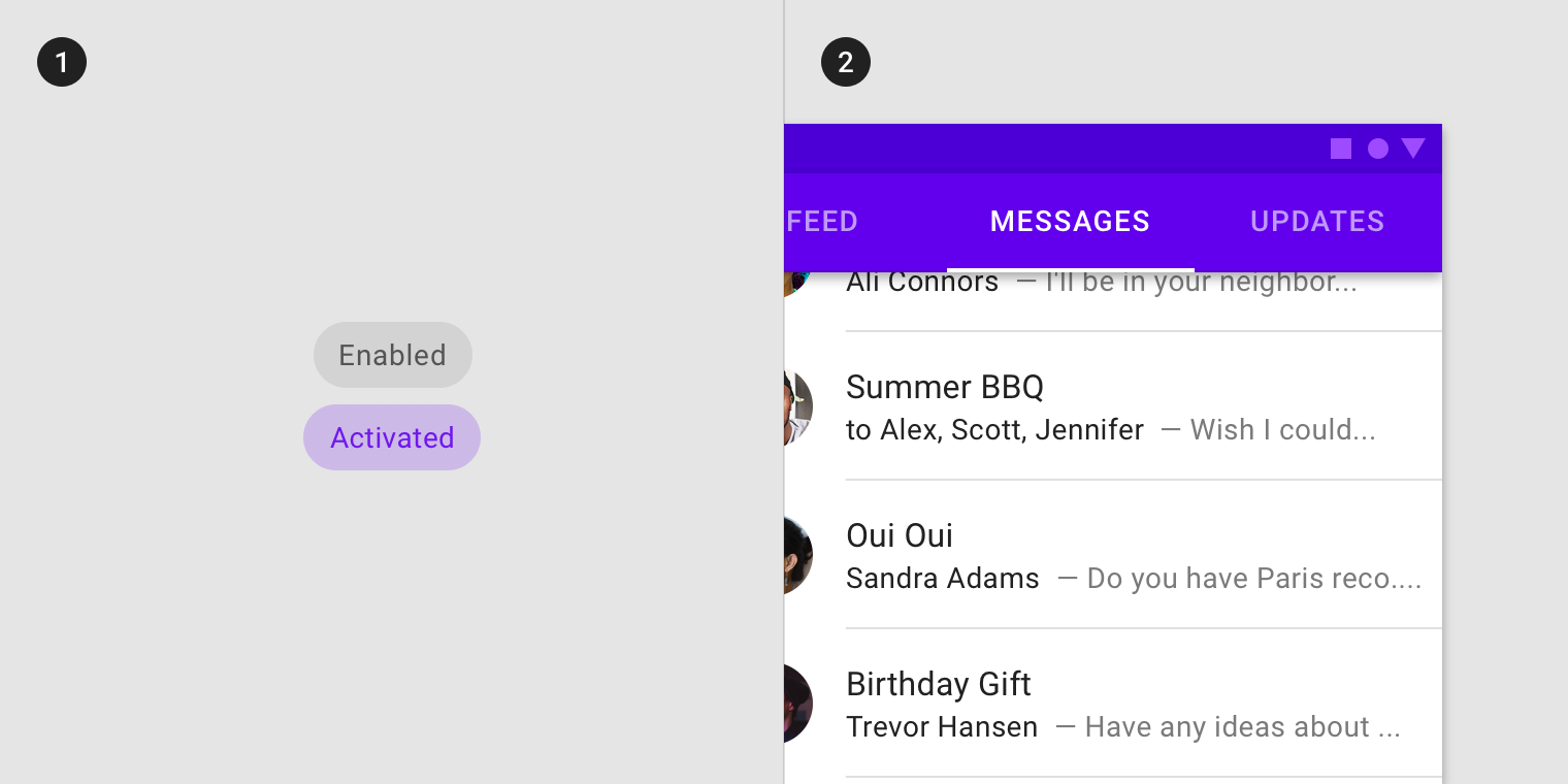
Enabled
An enabled state communicates an interactive component or element.
Disabled
A disabled state communicates a noninteractive component or element.
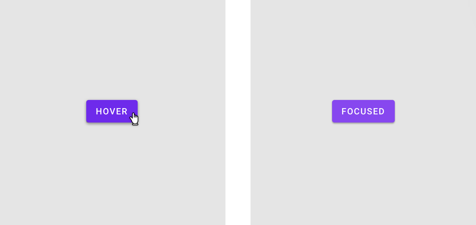
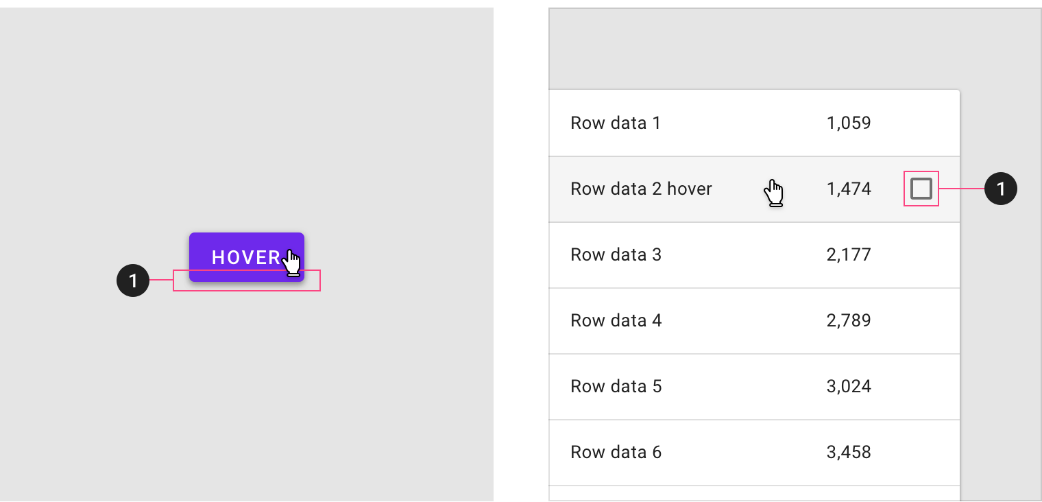
Hover
A hover state communicates when a user has placed a cursor above an interactive element.
Focused
A focused state communicates when a user has highlighted an element, using an input method such as a keyboard or voice.
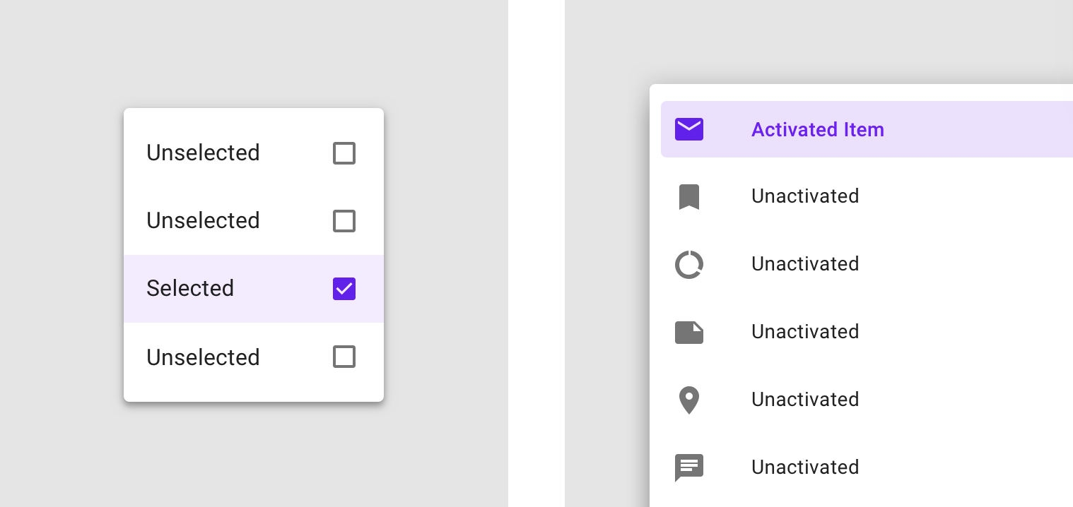
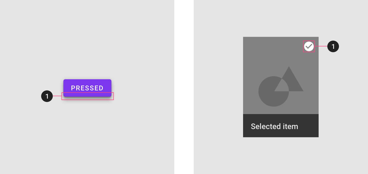
Selected
A selected state communicates a user choice.
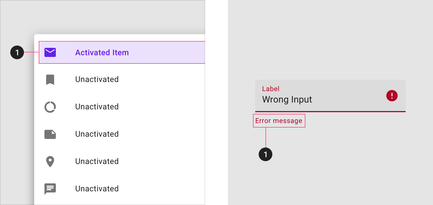
Activated
An activated state communicates a highlighted destination, whether initiated by the user or by default.
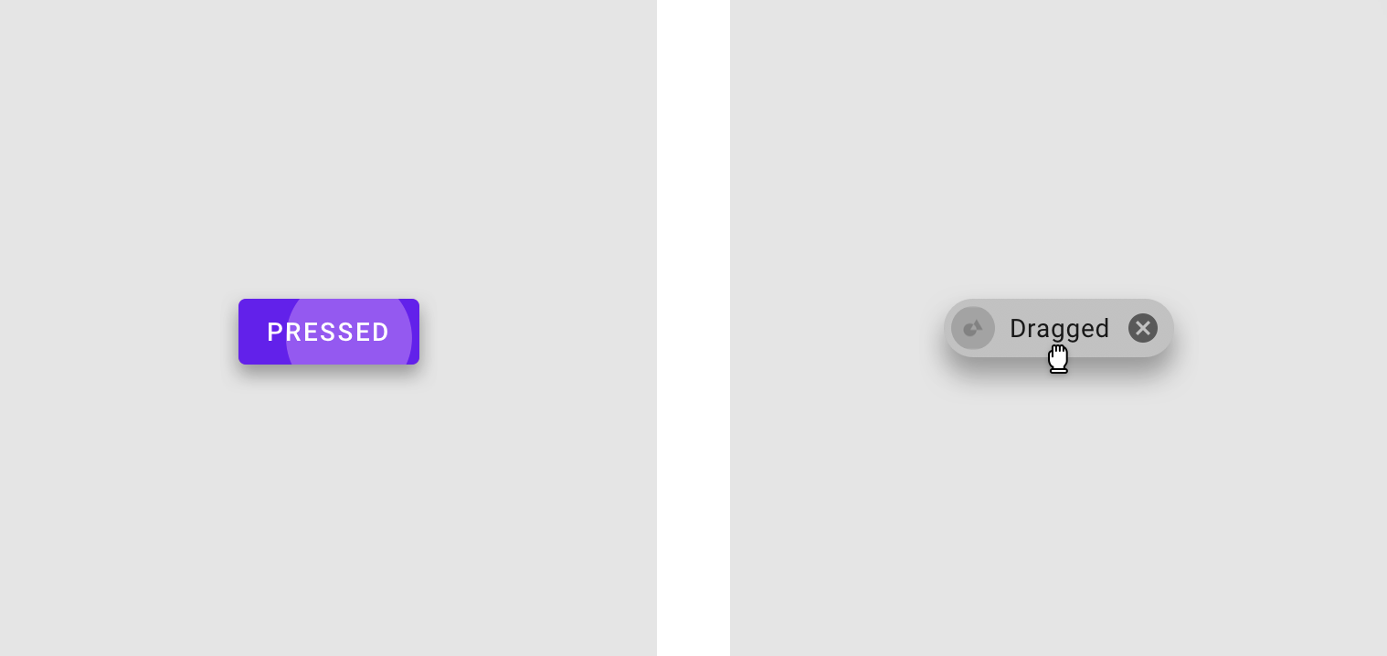
Pressed
A pressed state communicates a user tap.
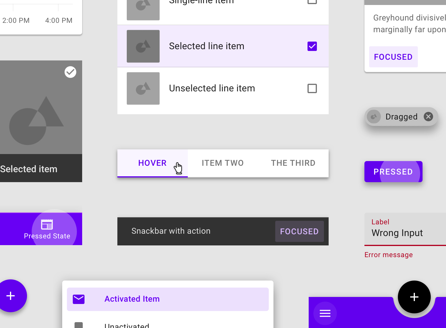
Dragged
A dragged state communicates when a user presses and moves an element.
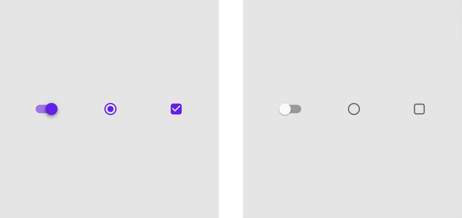
On
An on state communicates a toggle between two options.
Off
An off state communicates a toggle between two options.
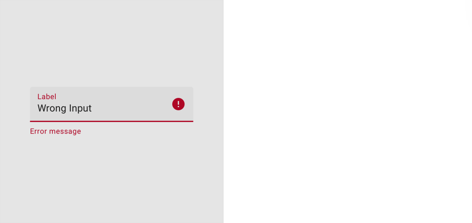
Error
An error state communicates a user or system mistake.
解构
遮罩
遮罩是组件或元素上的半透明覆盖,用于指示当前组件或元素所处的状态。material design 将使用系统化方法来为不同状态提供不同的参数配置。
An overlay is a semi-transparent covering on an element that indicates its state. Overlays provide a systematic approach to visualizing states by using opacity. An overlay can be applied to an entire element or in a circular shape.
遮罩可以用于某个组件或者带圆角的矩形元素。遮罩的颜色与其应用的元素上的文本或图标的颜色相匹配。如果文本或者图标在状态切换过程中颜色发生变化,那么遮罩的颜色以状态切换完成后的颜色为准。
The overlay color matches the color of the text or icon on the element that it’s applied to. If the text or icon changes color during a state change, the overlay should match the end state’s color.
Only one state layer is applied at a time. For example, if an element is first focused and then hovered, the hover state layer will be shown only until the hover is complete, then returning to the focus state layer if the element is still focused.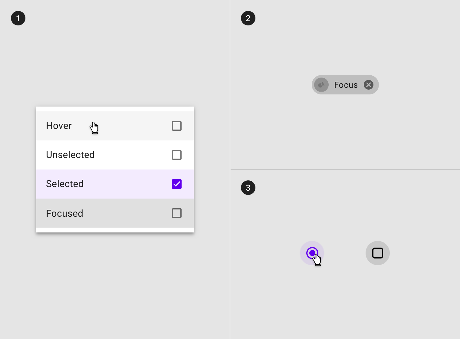
(1) Overlay on line items (2) overlay on chip, (3) overlay on selection controls.
图例(左):1)阴影与遮罩效果相结合,可以表示某些组件的状态。 图例(右):1)图标与遮罩效果相结合,可以表示某些组件的状态。
图例(左):1)颜色变化可能表示状态发生了改变。 图例(右):1)部分文字提示表示了状态发生了改变。
不透明度
为了确保状态能够正确地被表达并且保证颜色对比度的可视性,针对不同的状态我们在系统中设置了不同的可视化参数。
To ensure proper visibility and color contrast accessibility, the opacity value of overlays should be adjusted for every different combination of text on a surface.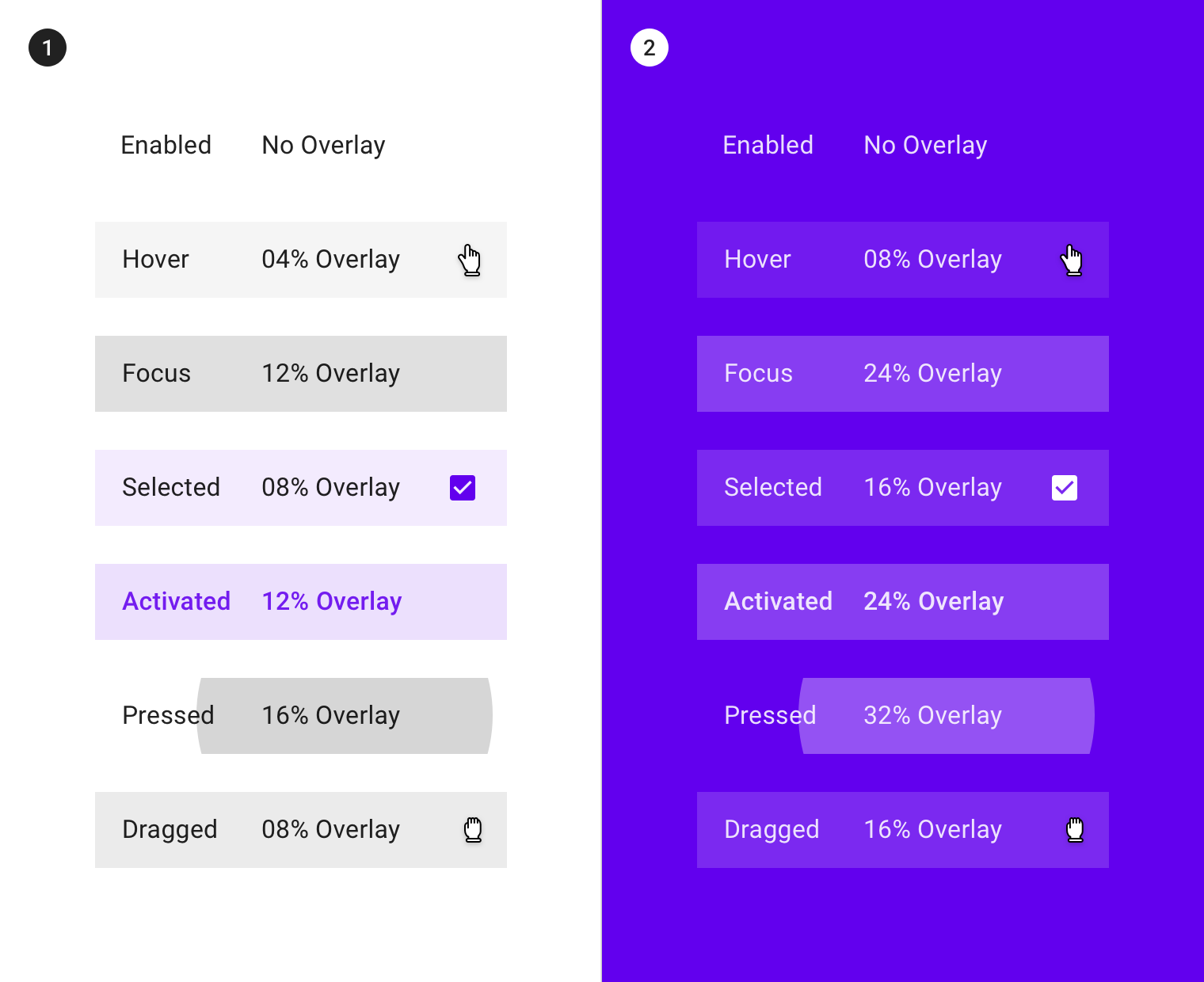
(1) Overlay opacity values on #FFFFFF on a white surface. (2) Overlay opacity values on #6200EE on a surface colored with a primary color.
禁用
用法
当用户无法与组件或元素进行交互时,组件或元素则处于禁用状态,并且需要弱化这些组件或元素的存在感。
禁用状态的不透明度为启用状态的 38%。
设计者还可以通过颜色与阴影的变化来通知用户当前的组件火元素处于禁用状态。
A disabled state communicates when a component or element isn’t interactive, and should be deemphasized in a UI. Disabled states are displayed at 38% opacity of the enabled state.
Disabled states can also indicate they are not interactive through color changes and reduced elevation.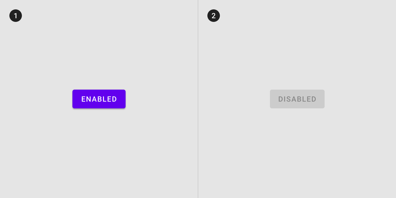
(1) Enabled and (2) disabled buttons differentiate through color and elevation changes.
继承
组件可以继承禁用状态的样式,例如切换按钮、选择控件、文本字段、图标、网格和列表项、卡片、纸片以及按钮。
Components can inherit a disabled state, such as toggle buttons, selection controls, text fields, icons, grid and list items, cards, chips, and buttons.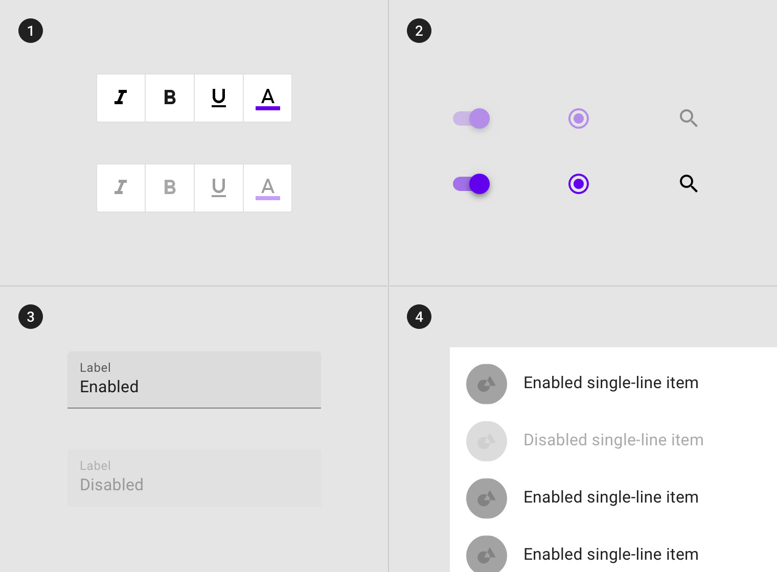
(1) Toggle buttons, (2) selection controls, (3) text fields and a (4) list item inheriting a disabled state.
部分组件不能继承禁用状态的样式:FAB、底部或侧面导航栏、对话框、菜单、提示和警告、导航组件(顶部导航栏,tabs,底部导航和步进器等)。
如果当前页面的 FAB 不可用,则 FAB 需要被隐藏。
Disabled states cannot be inherited by: floating action buttons (FABs), bottom and side sheets, dialogs, menus, tooltips, and alerts, or navigational components (such as app bars, tabs, bottom navigation and steppers). If the action represented in the FAB is unavailable, the FAB should not appear in the composition.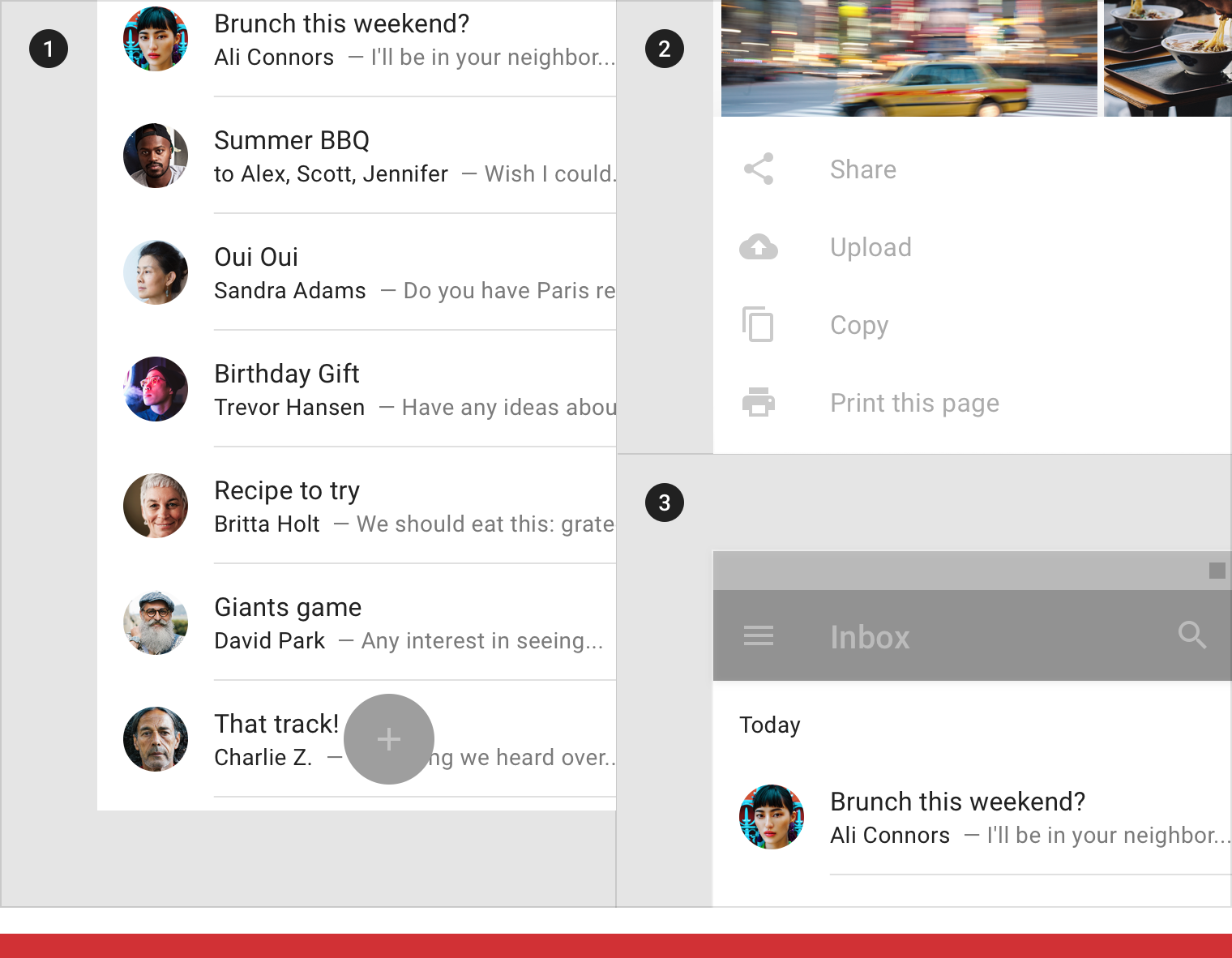
Don’t
(1) FABs (2) bottom sheets and (3) app bars cannot inherit a disabled state.
行为规范
单击或悬停时,被禁用的组件不会改变状态。
Disabled components don’t change state when tapped or hovered over.
 Disabled components can be hovered over, but won’t display state changes to the component or cursor.
Disabled components don’t change state when tapped.
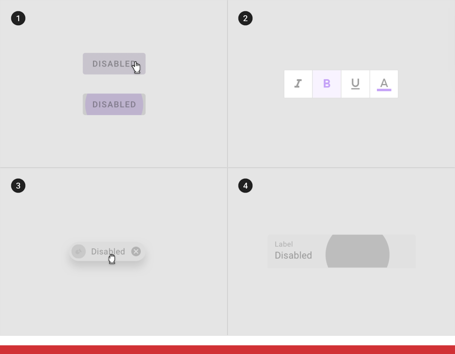
Don’t
Disabled components cannot be (1) hovered, (2) focused, (3) dragged or (4) pressed.
There may be zero, one, or multiple disabled components in a composition.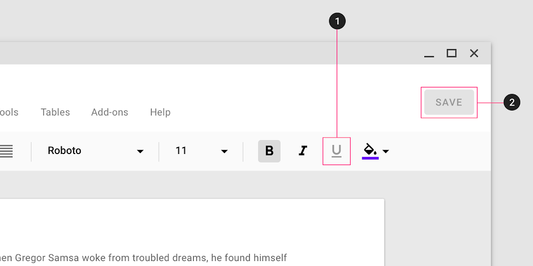
(1) Disabled toggle button, (2) Disabled button in one layout
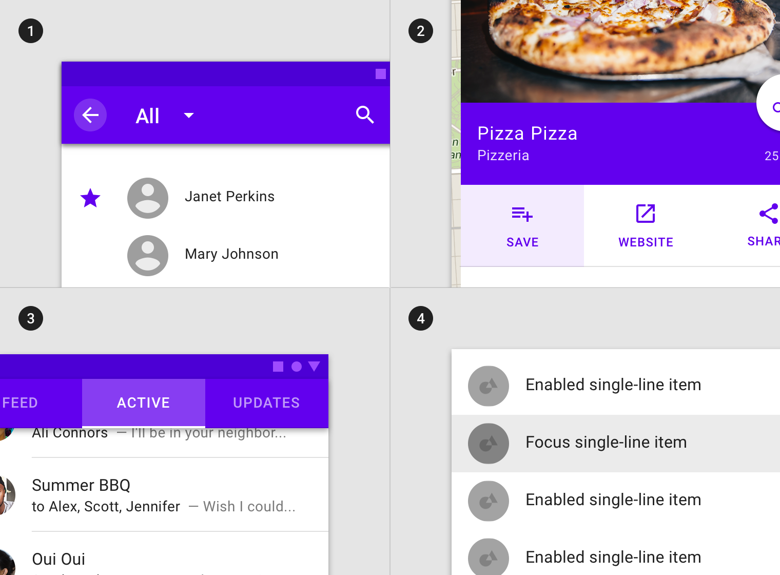
悬停
用法
当光标在组件或元素上方悬停时,未被禁用的组件或元素进入悬停状态。
可交互的组件或元素均可拥有悬停状态,但是悬停状态的样式无需突出强调,以避免用户注意力被分散。
悬停状态往往采用遮罩进行可视化。它可以应用于整个组件,组件内的元素,或组件的一部分。
Hover states are initiated by the user pausing over an interactive element using a cursor. They can be applied to all interactive components, and should be deemphasized to avoid distracting from content.
An overlay signifies a hover state. It can be applied to the entire component, elements within a component, or as a circular shape over part of the component.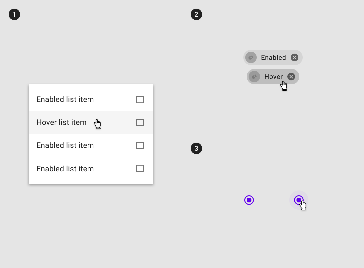
Overlay applied to (1) certain elements in a component, (2) the component as a whole, or (3) in circular form.
图例:1)列表卡片中的列表项;2)纸片组件;3)单选框。
Some components, such as buttons or cards, can inherit (1) elevation to signify a hover state. (1) Additional controls can appear on hover.
继承
悬停状态可以由以下组件继承:按钮、FAB、切换按钮、选择控件、文本字段、图标、网格和列表项、卡片、纸片以及图标。
Hover states can be inherited by the following components: buttons, FABs, toggle buttons, selection controls, grid list items, list items, cards, chips, text fields, and icons.
Whole components such as (1) icons, (2) text fields, (3) cards and (4) buttons can inherit a hover state.
交互式元素可以继承悬停状态。
Interactive elements can inherit a hover state.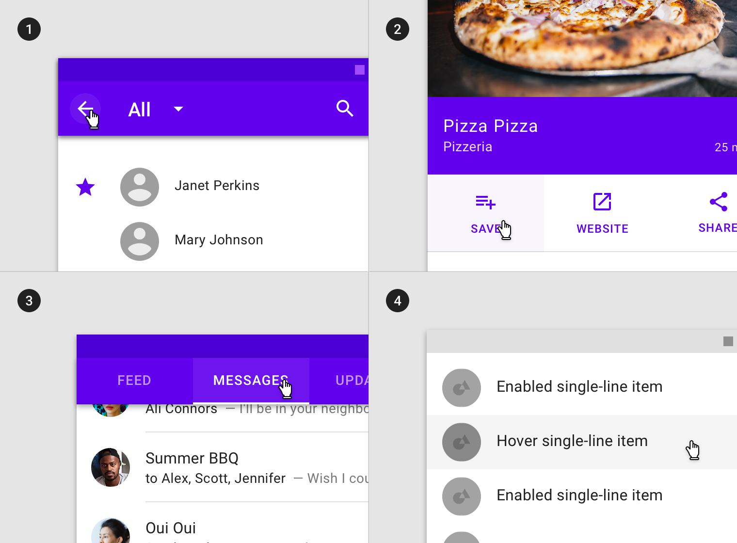
Hover states can be inherited by interactive elements or segments within components such as (1) app bars icons, (2) actions in sheets, (3) tabs items and (4) list items.
部分组件不能继承禁用状态的样式:应用导航栏、tabs 选项卡、底部导航、对话框、表格、警告通知、菜单以及步进器。
Hover states cannot be inherited by: app bars, tabs, bottom navigation, sheets, dialogs, alerts, menus and steppers.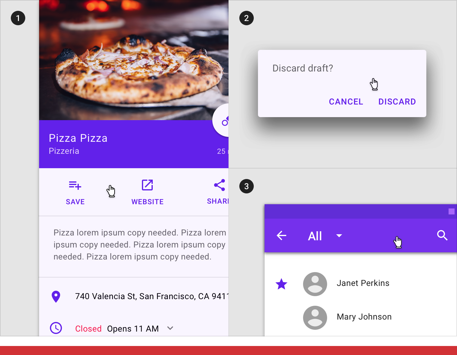
Don’t
(1) Sheets, (2) app bars or (3) dialogs cannot inherit a hover state.
行为规范
当光标在组件或元素上方悬停时,未被禁用的组件或元素进入悬停状态。
Hover states are initiated by the user pausing over an interactive element using a cursor.
Hover states appear and disappear using a low-emphasis animated fade.
Hover state in combination with (1) focused, (2) activated, (3) selected and (4) pressed states.

There can only be one hover state at a time in a layout.
Hover state can only be on one element at a time based on cursor position.
不透明度
为了确保状态能够正确地被表达并且保证颜色对比度的可视性,针对不同的状态我们在系统中设置了不同的可视化参数。
The opacity value of the overlay should be adjusted for each different combination of text on surface in order to ensure proper visibility and color contrast accessibility. Hover overlays should be at lower opacities to avoid distracting from content.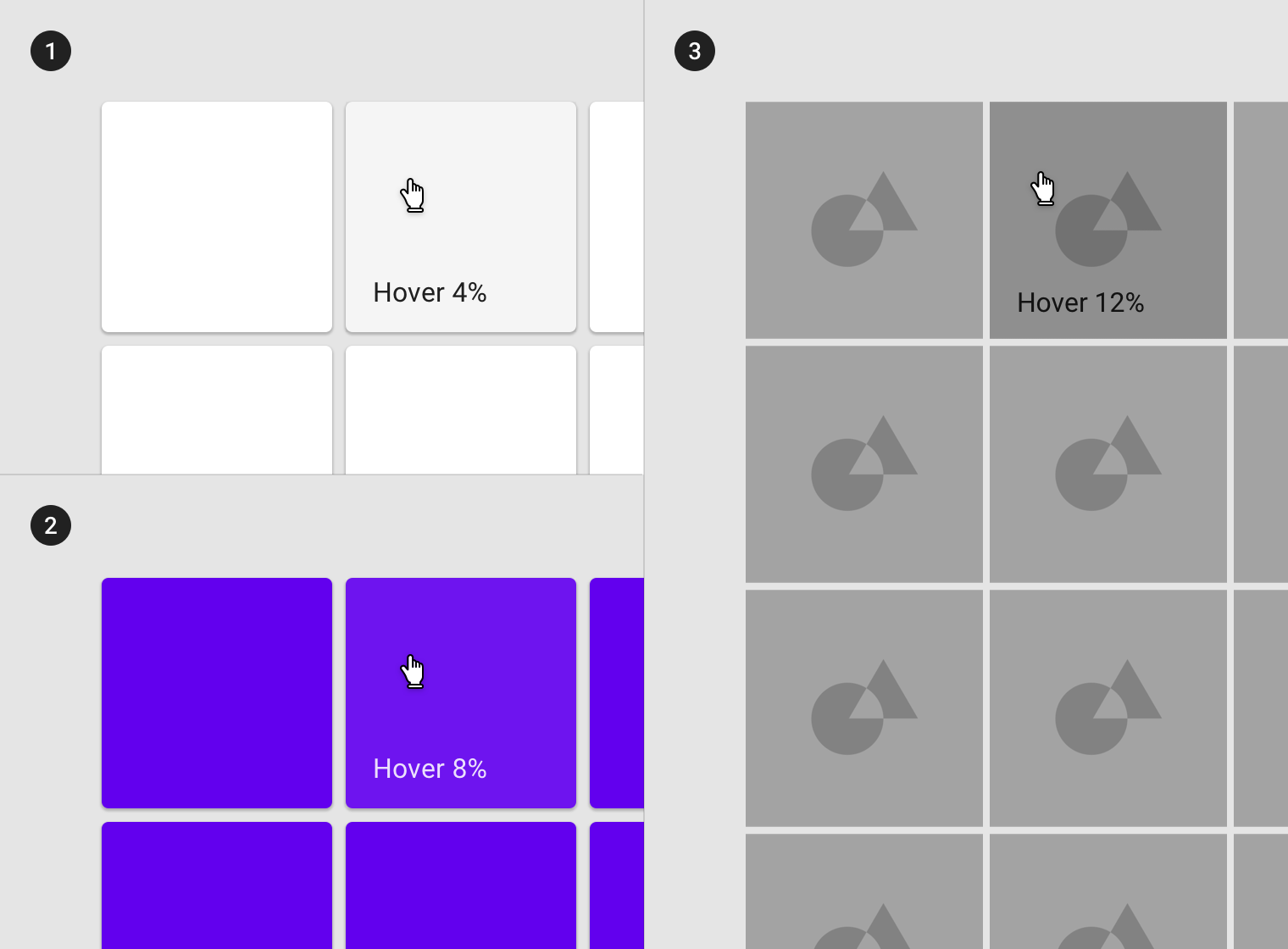
(1) Surface: 100% #FFFFFF
Ink: 100% #000000
Overlay: 4% #000000
(2) Surface: 100% #6200EE
Ink: 100% #FFFFFF
Overlay: 8% #FFFFFF
(3) Surface: Image
Overlay: 12% #000000
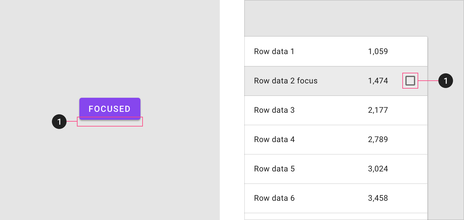
聚焦
用法
当用户使用键盘或者语音进行输入时,对应组件或元素进入聚焦状态。聚焦状态适用于所有交互时组件或元素。
聚焦状态的样式应该突出显示,需要起到引导用户的注意力的作用。
聚焦状态可以应用于整个组件,组件内的元素,或组件的一部分。
A focused state communicates when a user has highlighted an element using a keyboard or voice. Focus states apply to all interactive components.
They should receive high emphasis, as they are not indicated by other visual cues.
An overlay signifies a focus state. It can be applied to an entire component, elements within a component, or as a circular shape covering part of a component.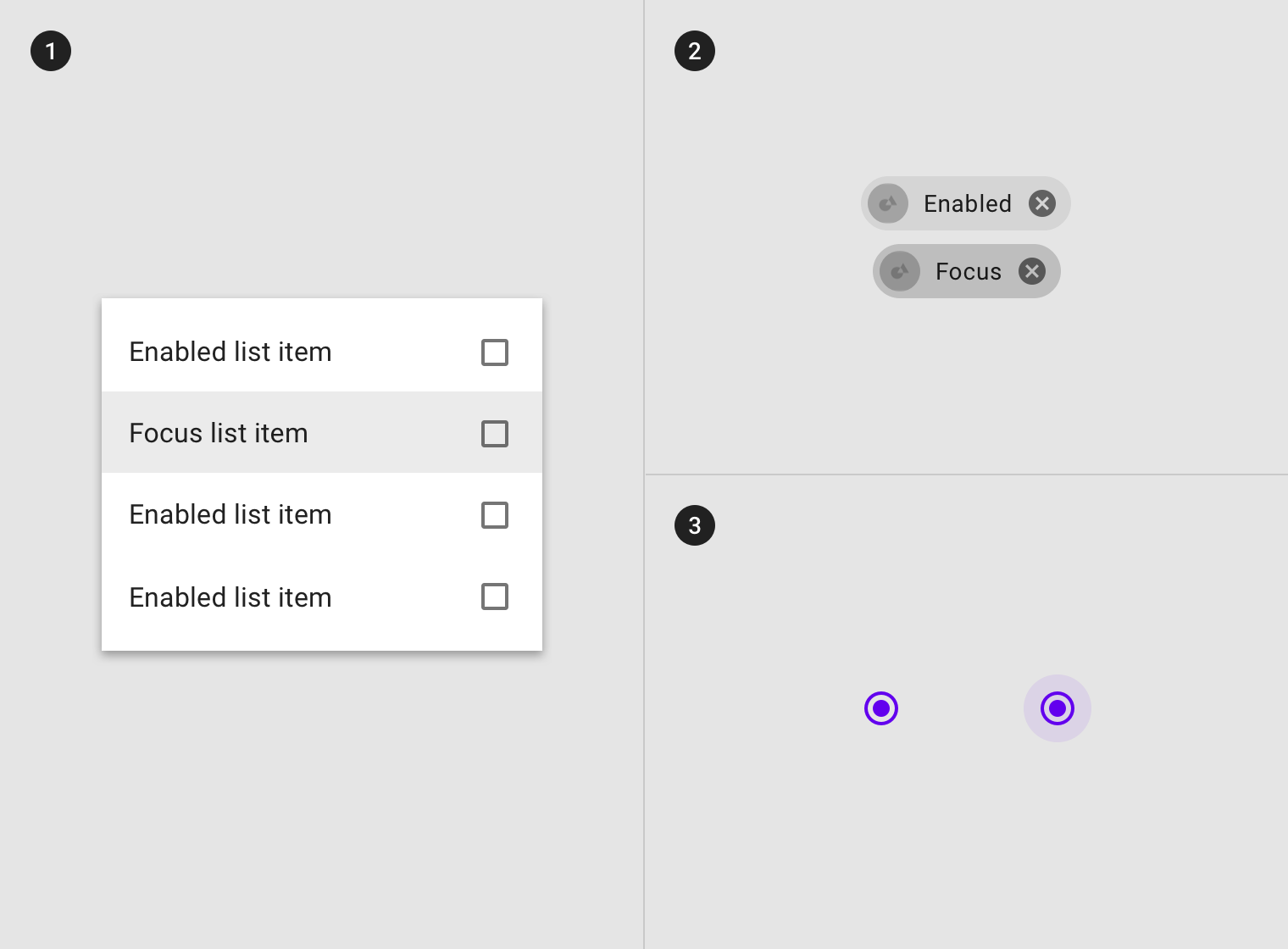
Overlays can be applied (1) to certain elements in a component, (2) to the component as a whole, or (3) in circular form.
Some components, such as button, chips or cards, can inherit (1) elevation to signify a focus state. (1) Controls can appear on focus.
继承
悬停状态可以由以下组件继承:按钮、FAB、切换按钮、选择控件、文本字段、图标、网格和列表项、卡片、纸片以及图标。
Components that can inherit focus states include: buttons, FABs, toggle buttons, selection controls, grid list items, list items, cards, chips, text fields, and icons.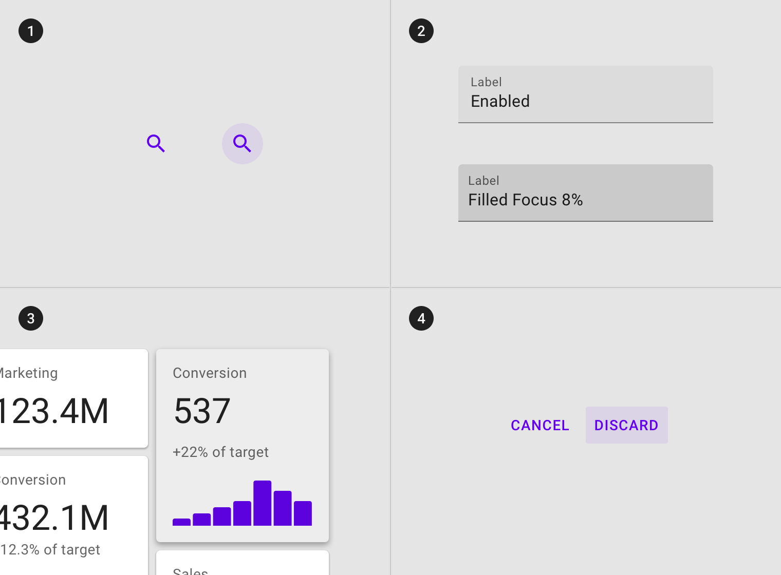
Components such as (1) icons, (2) text fields, (3) cards and (4) buttons can inherit focus states.
Interactive elements within components can inherit a hover state, such as (1) app bars icons, (2) actions in sheets, (3) tabs items and (4) list items.
Don’t
Components that can’t inherit a focus state include: (1) whole sheets, (2) whole app bars or (3) whole dialogs.
行为规范
用户使用键盘或语音输入时,对应的组件或元素进入聚焦状态,直到用户完成输入操作时结束。
Focus states are initiated by user keyboard or voice input on an interactive element, until the user completes the audio or keyboard action.
Focus states appear and disappear using a fade animation.
Focus states appear in a read order specific to the composition.
焦点状态可以与悬停,激活或选中状态结合使用。
Focus states can be represented in combination with hover, activated, or selected states.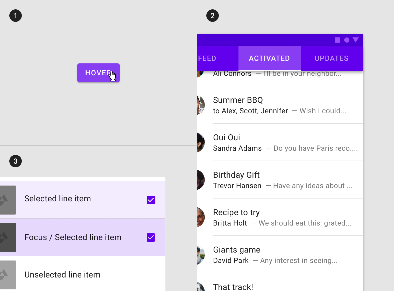
Focus state in combination with (1) hover, (2) activated and (3) selected states.
当前场景下一次只能存在一个焦点状态。
Only one focus state may exist at a time on a screen.
A focus state can only be on one element at a time.
不透明度
为了确保状态能够正确地被表达并且保证颜色对比度的可视性,针对不同的状态我们在系统中设置了不同的可视化参数。
聚焦状态需要高不透明度的遮罩。
To ensure proper visibility and color contrast accessibility, the overlay’s opacity value should be adjusted for every different combination of text on surface. Focus overlays should be at higher opacities as they are not indicated otherwise by visual cues.
(1) Surface: 100% #FFFFFF
Ink: 100% #000000
Overlay: 12% #000000

(2) Surface: 100% #6200EE
Ink: 100% #FFFFFF
Overlay: 24% #FFFFFF
(3) Surface: Image
Overlay: 36% #000000
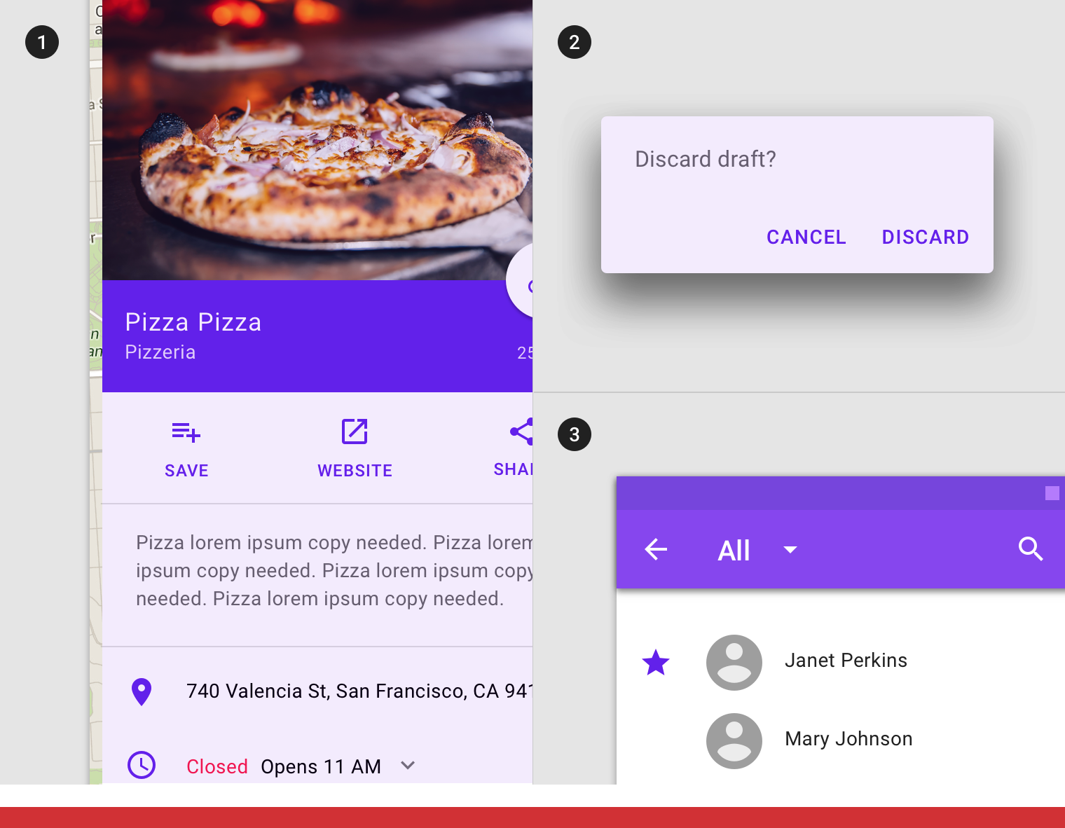
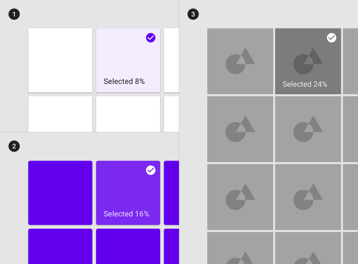
选中
用法
用户使用点击、光标、键盘或语音等输入方式时,对应的组件或元素进入选中状态。
被选中的对象的重视级别提升到中等,这样的设计既能够让对象易于识别,又不会干扰用户的工作流。
选中状态可以应用于组件内的元素或整个组件。
A selected state indicates user selection of options using one of the following input methods:
tap, cursor, keyboard, or voice.
Selected states should receive medium emphasis so they are easily identifiable, but not distracting.
An overlay signifies a selection state. It can be applied to elements within a component or to the entire component.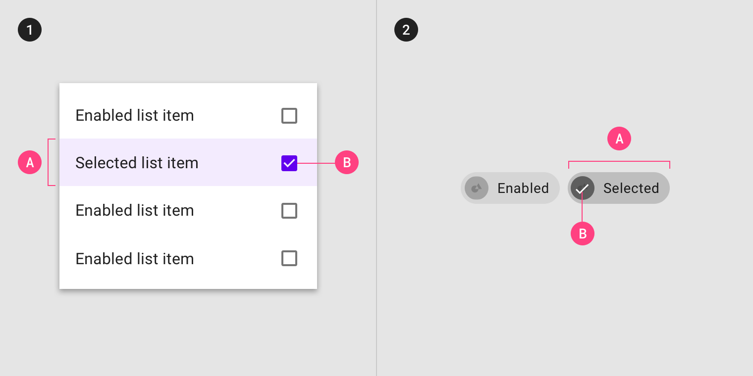
The overlay can be applied to (1) certain elements in a component, (2) the component as a whole. Selection can be signified by an (A) overlay and (B) iconography.
选择状态继承
可以继承选中状态的组件包括:网格列表(图片列表)项、列表项、纸片、卡片、数据表格、菜单项以及选择器。
Components that can inherit selected states include: image list items, list items, chips, cards, data tables, menu items, and pickers.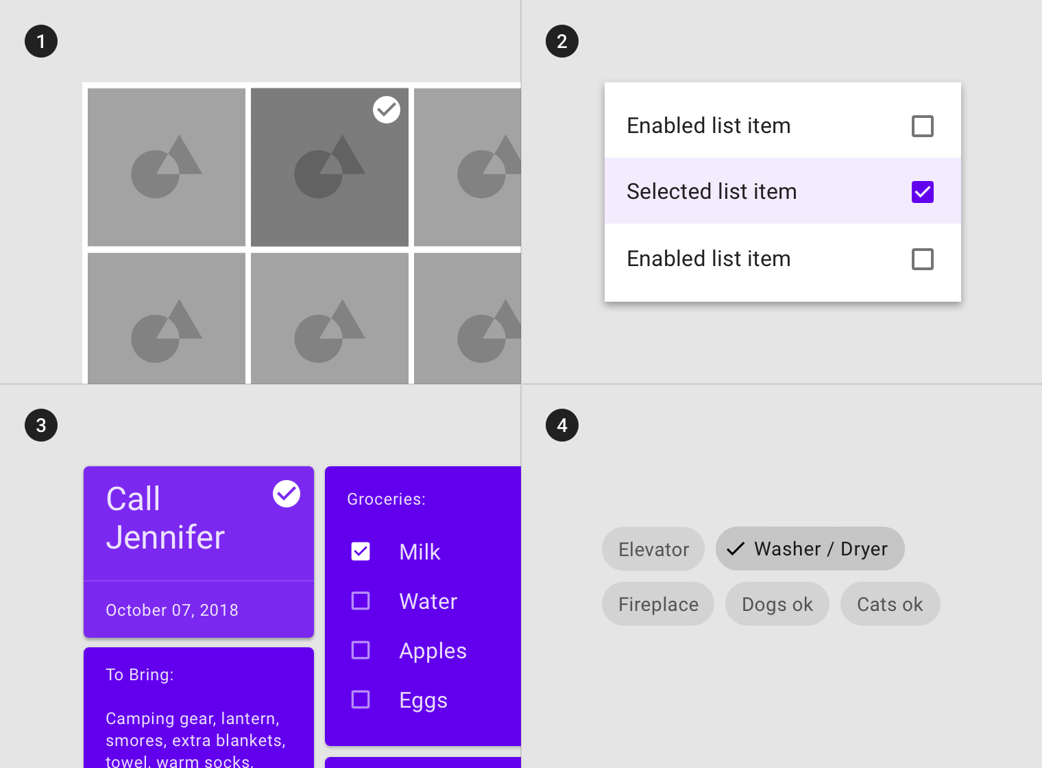
(1) Grid list items, (2) list items, (3) cards, and (4) chips can inherit a selected state.
无法继承选中状态的组件包括:应用栏、背景、底部导航、工作表、按钮、对话框、分隔符、扩展面板、警告、快捷方式、选项卡、文本字段以及文字提示。
Components that cannot inherit selected states include: app bars, backdrop, bottom navigation, sheets, buttons, dialogs, dividers, expansion panels, alerts, snackbars, tabs, text fields, or tooltips.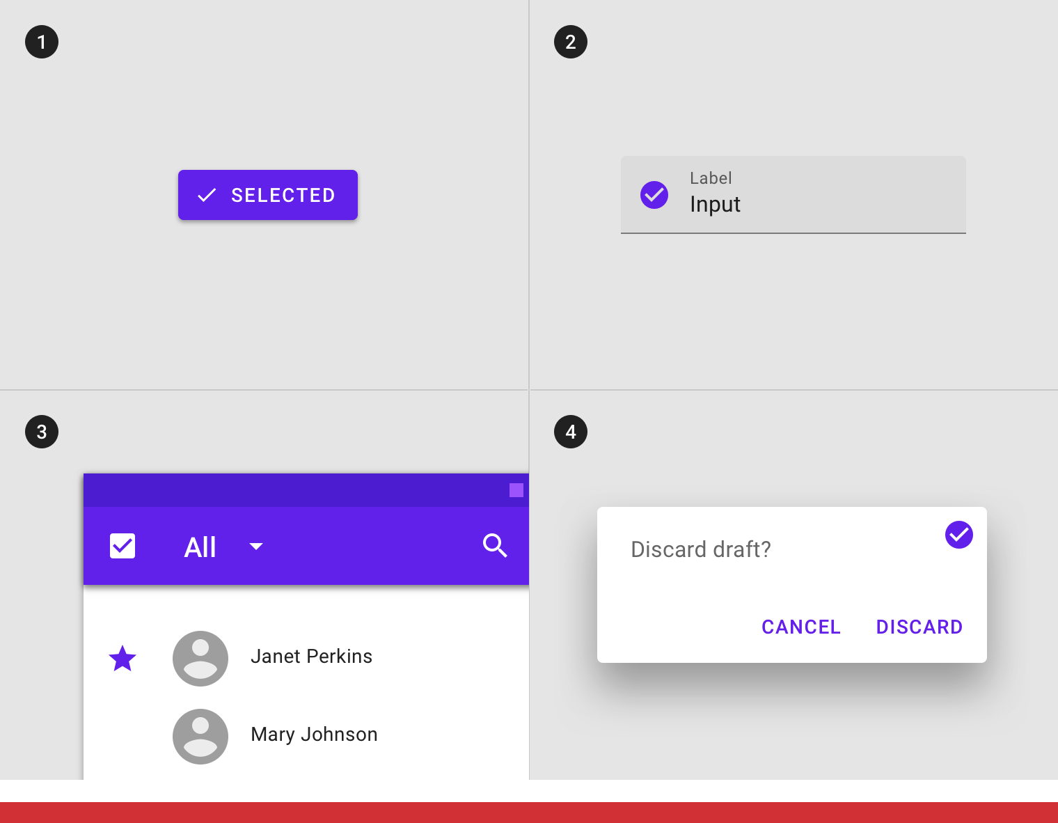
Don’t
(1) Buttons, (2) text fields, (3) app bars, and (4) dialogs can’t inherit a selected state.
行为规范
当用户选择一个或多个选项时,将激活选中状态。
Selected states are initiated when users select one or more options.
Selected states appear and disappear using a fade animation.
Selected states appear in user-initiated order.
选中状态可以与悬停、聚焦、按压或拖拽状态结合使用。
Selected states can be represented in combination with hover, focus, pressed or dragged states.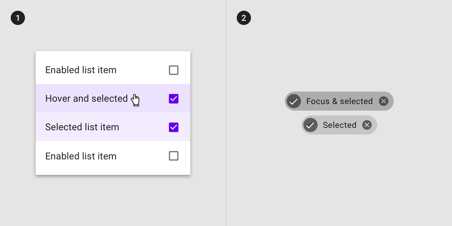
Selected state in combination with (1) hover and (2) focus states.
同一个场景中,一次可以存在多个选择的状态。
Multiple selected states may exist at a time in a layout.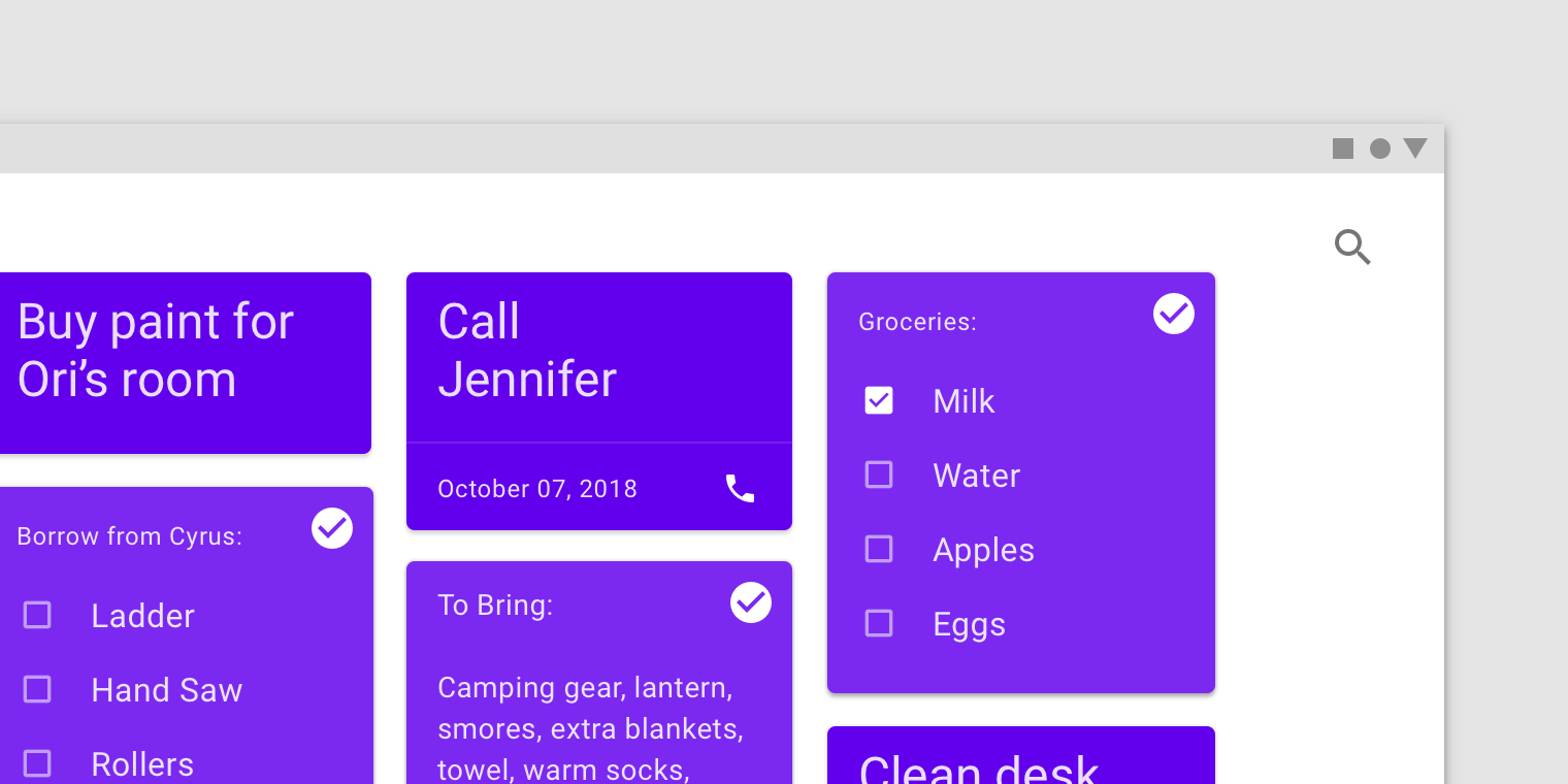
Multiple selected states
不透明度
为了确保状态能够正确地被表达并且保证颜色对比度的可视性,针对不同的状态我们在系统中设置了不同的可视化参数。
To ensure proper visibility and color contrast accessibility, the overlay’s opacity should be adjusted for every different combination of text on surface. Selection overlays should be at medium emphasis so they are easily identifiable, but not distracting.
(1) Surface: 100% #FFFFFF
Ink: 100% #6200EE
Overlay: 8% #6200EE
(2) Surface: 100% #6200EE
Ink: 100% #FFFFFF
Overlay: 16% #FFFFFF
(3) Surface: Image
Overlay: 24% #000000
激活
用法
激活状态一般用于表示用户当前查看的内容所属的父级节点。用户通过点击、光标、键盘或语音输入等方式来开启激活状态。
部分场景下,激活状态是默认开启的。
激活状态的组件或元素应该引起用户高级别的重视。激活状态通过遮罩、颜色变化等可视化方法来展示。
Activated states indicate which item from a set of options is currently being viewed. They are initiated either by default or user choice, using input methods such as a tap, cursor, keyboard, or voice input. This state should be highly emphasized.
Activated states are signified by an overlay, color change, or other visual treatments applied to elements or segments within a component.
(1) Overlays as activated state signifier. (2) Line element as activated state signifier.
继承
激活状态与选中状态不同,激活状态更倾向于指示用户在工作流中的位置。
可以继承激活状态的组件包括:导航列表项、选项卡项、底部导航项、步进项、选择纸片以及切换按钮。
An activated state differs from a selected state because it communicates a highlighted destination.
Components that can inherit activation states include: navigation list items, tab items, bottom navigation items, stepper items, choice chips, or toggle buttons.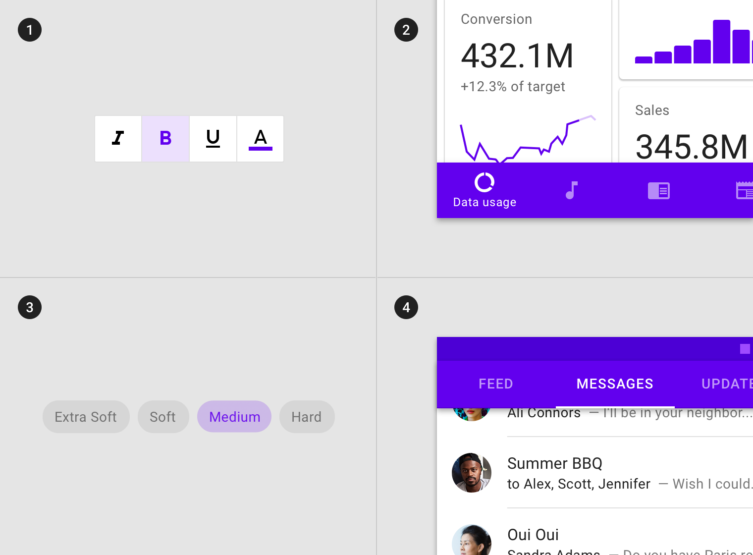
(1) Toggle buttons, (2) bottom navigation items, (3) choice chips and (4) tab items can inherit an activated state.
无法继承激活状态的组件包括:按钮、浮动操作按钮、选择控件、滑块、应用栏、底部和侧面导航、对话框以及警告。
Components that cannot inherit activation states include: buttons, floating action buttons, selection controls, sliders, app bars, bottom and side sheets, dialogs, or alerts.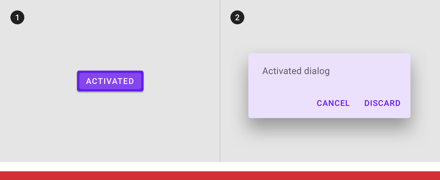
Don’t
(1) Buttons and (2) dialogs cannot inherit an activated state.
行为规范
用户通过点击、光标、键盘或语音输入等方式来开启激活状态。部分场景下,激活状态是默认开启的。
Activated states are initiated either by default or user choice.
Activated states appear and disappear using a fade animation.
Activated states appear in user-initiated order.
激活状态可以与悬停和聚焦状态组合表示。
Activated states can be represented in combination with hover and focus states.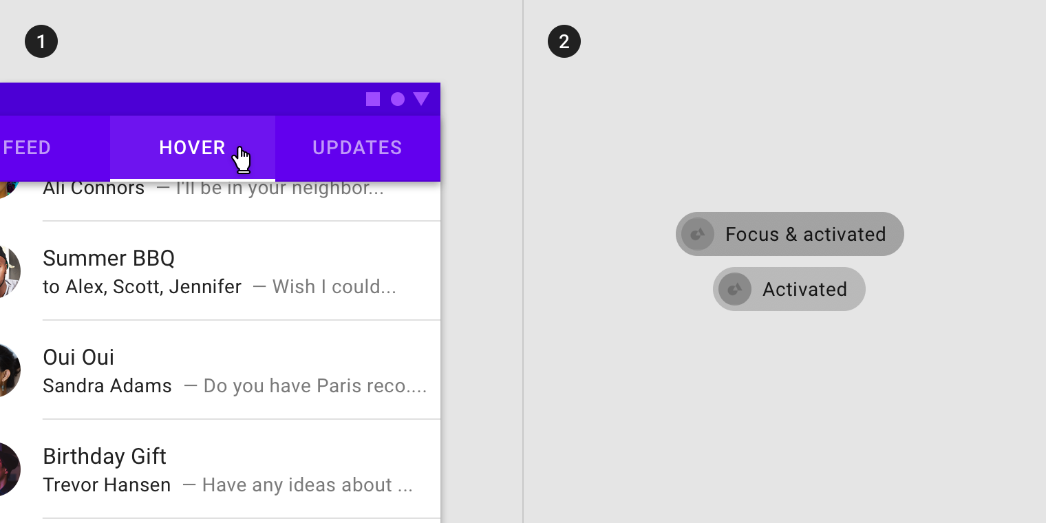
Activated states can be represented in combination with (1) hover and (2) focus.
同一组别的选项中,一次只能存在一个激活状态。
Within a single set of options, only one activated state may be present at a time.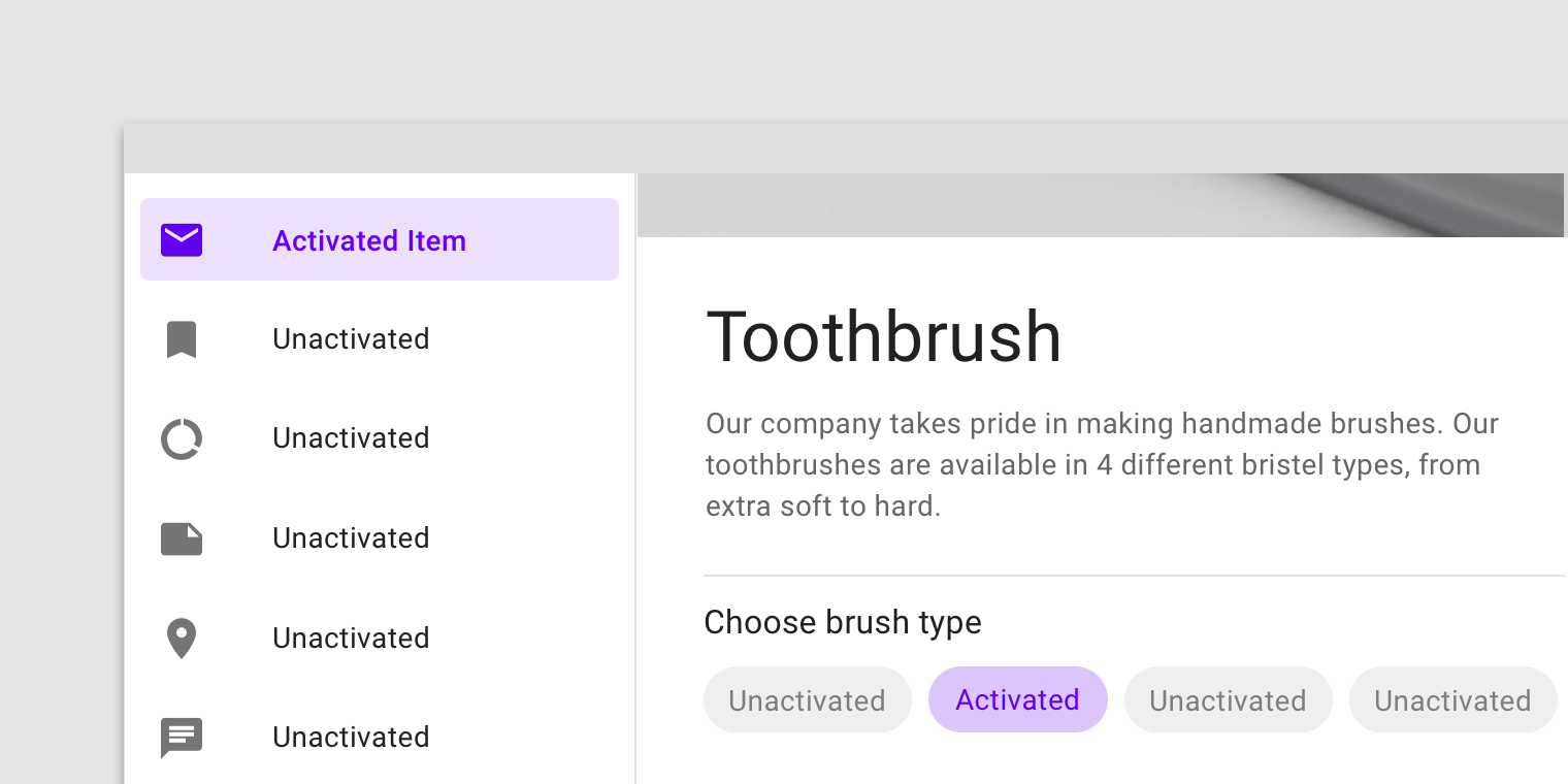
This navigational list has an activated item in the same layout as a choice chip with an activated item.
不透明度
为了确保状态能够正确地被表达并且保证颜色对比度的可视性,针对不同的状态我们在系统中设置了不同的可视化参数。
To ensure proper visibility and color contrast accessibility, the overlay’s opacity should be adjusted for every different combination of text on surface. Activation overlays should be at higher opacities since they are not always user-initiated.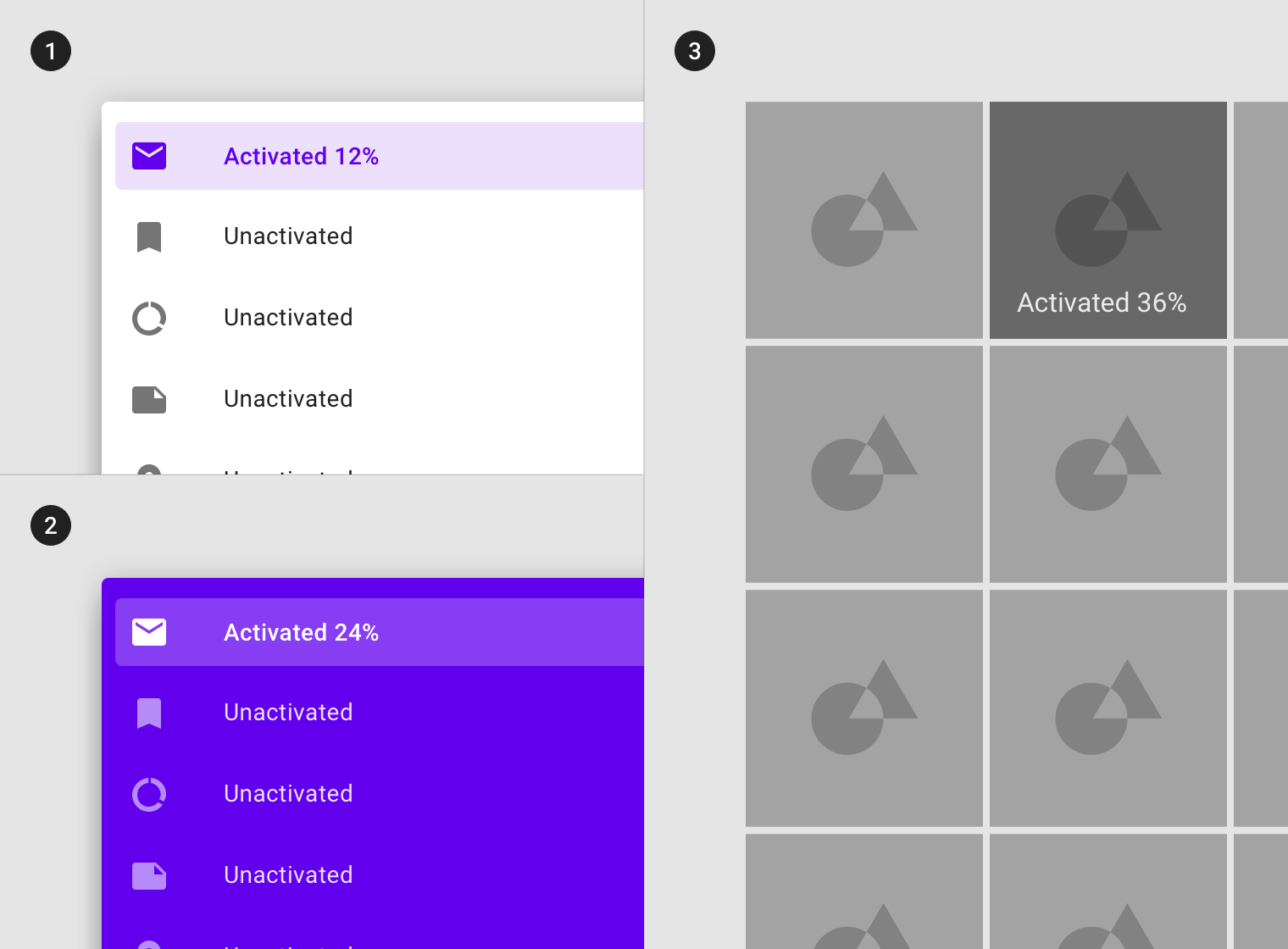
(1) Surface: 100% #FFFFFF
Ink: 100% #6200EE
Overlay: 12% #6200EE
(2) Surface: 100% #6200EE
Ink: 100% #FFFFFF
Overlay: 24% #FFFFFF
(3) Surface: Image
Overlay: 36% #000000
按压
用法
用户在通过键盘或语音输入时,相应的组件或元素会进入按压状态来向用户传递反馈感。此状态适用于所有交互式组件。
激活状态的组件或元素应该引起用户高级别的重视。遮罩的波纹效果表示该组件或元素进入了按压状态。
它可以应用于整个组件或组件内的元素,或者应用于组件的一部分。
A pressed state communicates a user-initiated tap or click by a cursor, keyboard, or voice input method. This state applies to all interactive components.
Pressed states trigger a change in composition and should be high-emphasis.
A ripple overlay signifies a pressed state. It can be applied to an entire component or elements within a component, or as a circular shape over part of the component.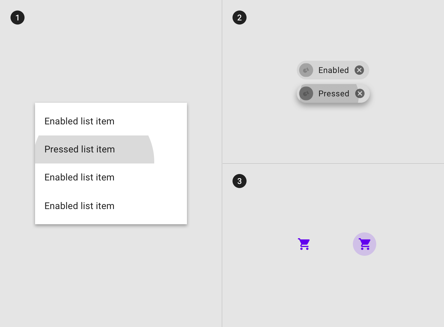
A ripple overlay applied to (1) elements in a component, (2) the component as a whole, or (3) in circular form.
某些组件(如按钮或卡片)可以继承阴影样式以表示按压状态。
Some components, such as buttons or cards, can inherit elevation to signify a pressed state.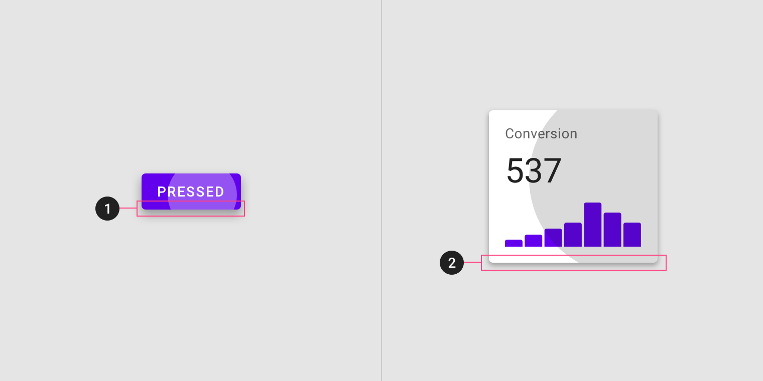
Elevation applied to a pressed (1) button and (2) card.
继承
按压状态可以通过以下组件继承:按钮、FAB、切换按钮、选择控件、网格列表项、列表项、卡片、芯片、文本字段和图标按钮。
Pressed states can be inherited by the following components: buttons, FABs, toggle buttons, selection controls, grid list items, list items, cards, chips, text fields, and icons.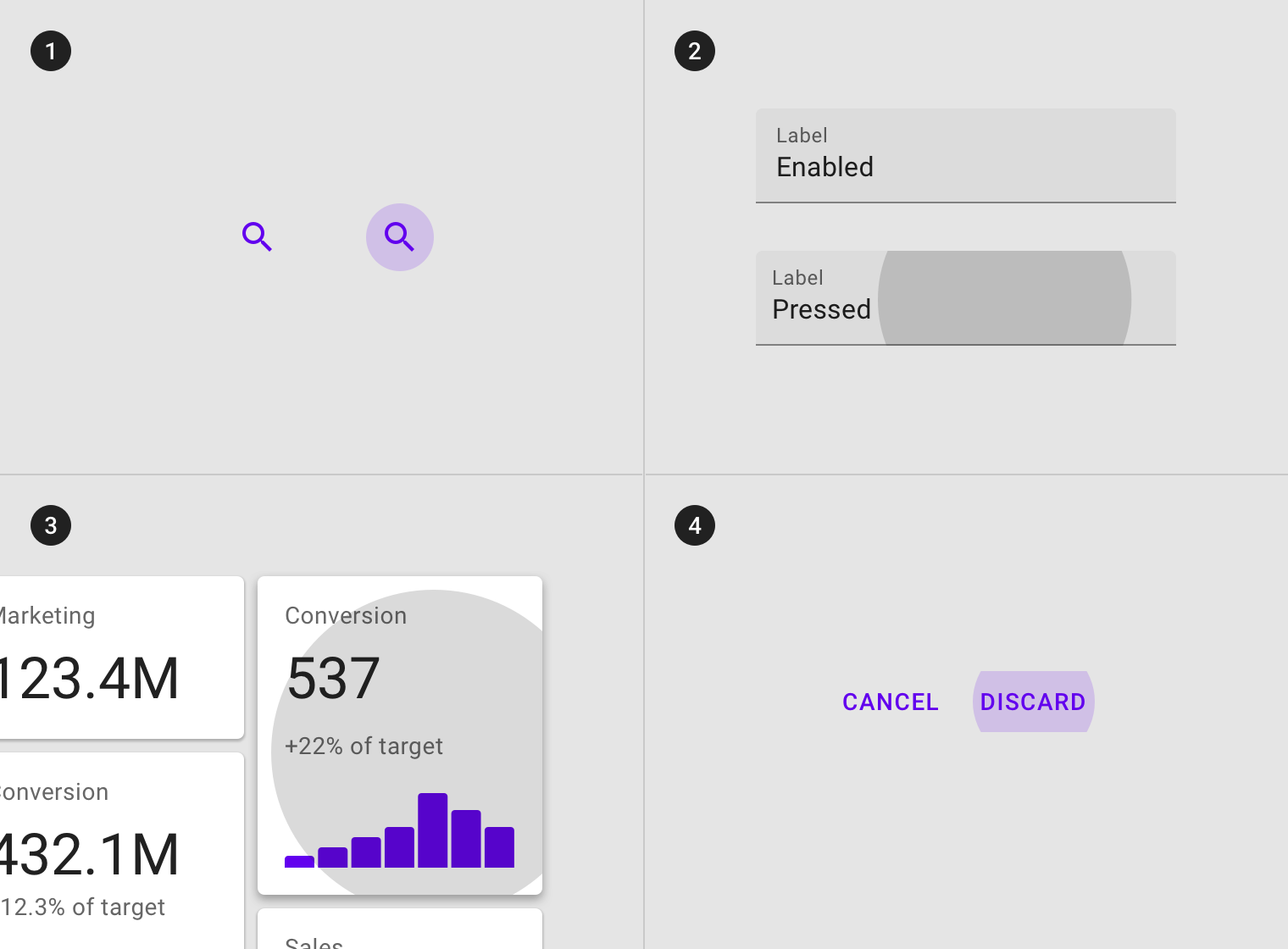
Entire components such as (1) icons, (2) text fields, (3) cards, and (4) buttons can inherit a pressed state.
交互式元素均可继承压缩状态。
Interactive elements can inherit a pressed state.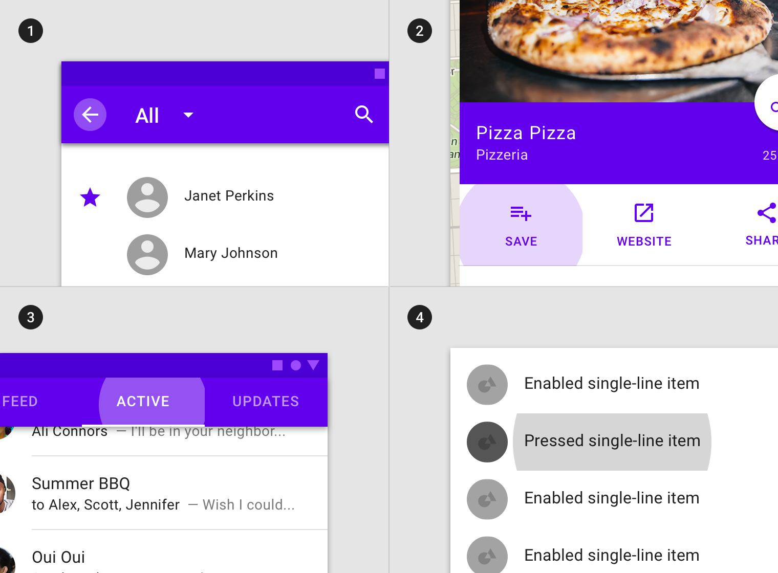
Interactive elements or segments within components such as (1) app bars icons, (2) actions in sheets, (3) tabs items, and (4) list items can inherit a pressed state.
以下组件不能继承按压状态:应用栏、选项卡、底部导航、工作表、对话框、警告、菜单以及步进器。
Pressed states cannot be inherited by: app bars, tabs, bottom navigation, sheets, dialogs, alerts, menus, and steppers.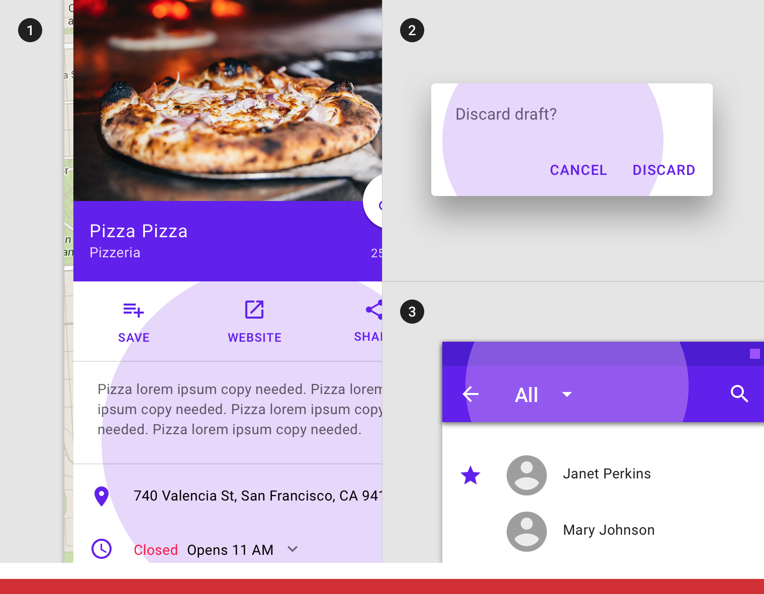
Don’t
Components such as (1) sheets, (2) app bars, or (3) dialogs cannot inherit a pressed state.
行为规范
按压状态由用户键盘或交互元素上的语音输入操作开启。
Pressed states are initiated by user keyboard or voice input on an interactive element.
Pressed states appear and disappear using a ripple animation.
按压状态可以与悬停、聚焦、激活或选中状态组合。
Pressed states can be combined with hovered, focused, activated, or selected states.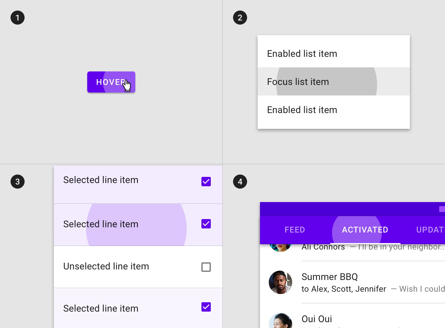
Pressed state in combination with (1) hover, (2) focus, (3) selected, and (4) activated states.
当前场景中一次只能有一个按压状态。
There may only be a single pressed state at a time in a layout.
不透明度
为了确保状态能够正确地被表达并且保证颜色对比度的可视性,针对不同的状态我们在系统中设置了不同的可视化参数。
To ensure proper visibility, an overlay’s opacity should be adjusted for every different combination of text on surface. Pressed overlays should be at higher opacities since they trigger a change in layout.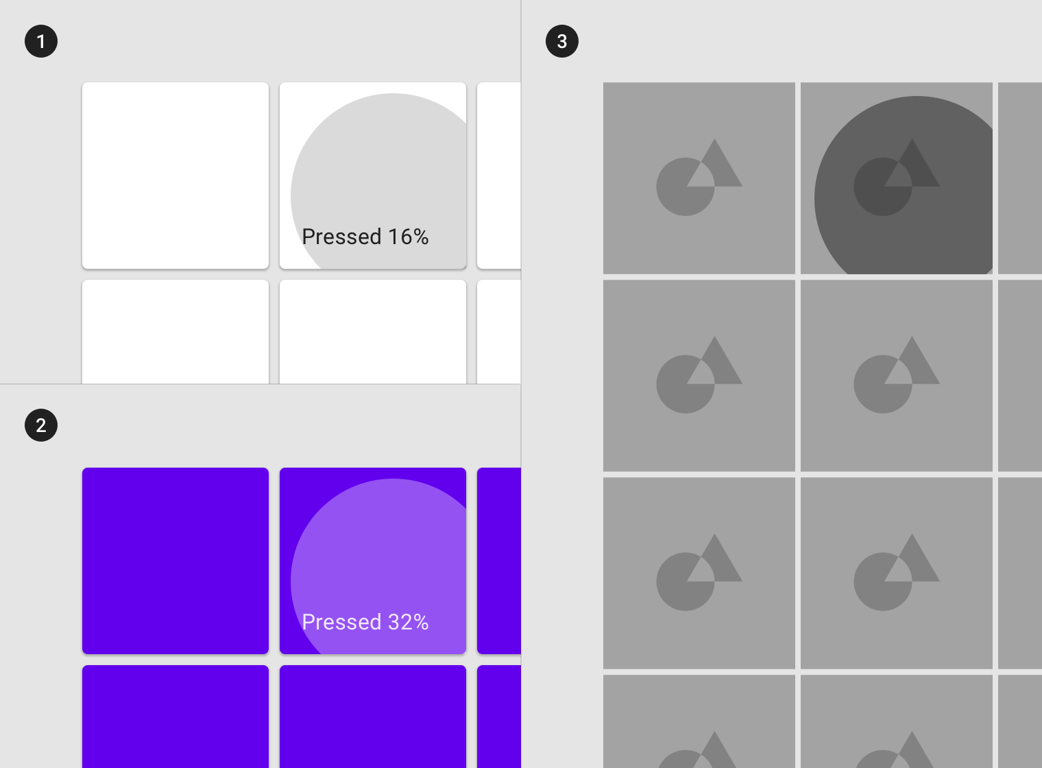
(1) Surface: 100% #FFFFFF
Ink: 100% #000000
Overlay: 16% #000000
(2) Surface: 100% #6200EE
Ink: 100% #FFFFFF
Overlay: 32% #FFFFFF
(3) Surface: Image
Overlay: 48% #000000
拖拽
用法
当用户按压并移动组件或元素时,会开启拖动状态。
为了避免分散用户的注意力,拖动状态的重视级别较低。它可以应用于整个组件或组件中的元素。
A dragged state occurs when a user presses and moves an element or component. Dragged states should be low emphasis, to avoid distracting users from their task.
An overlay signifies a dragged state. It can be applied to the entire component or to elements within a component.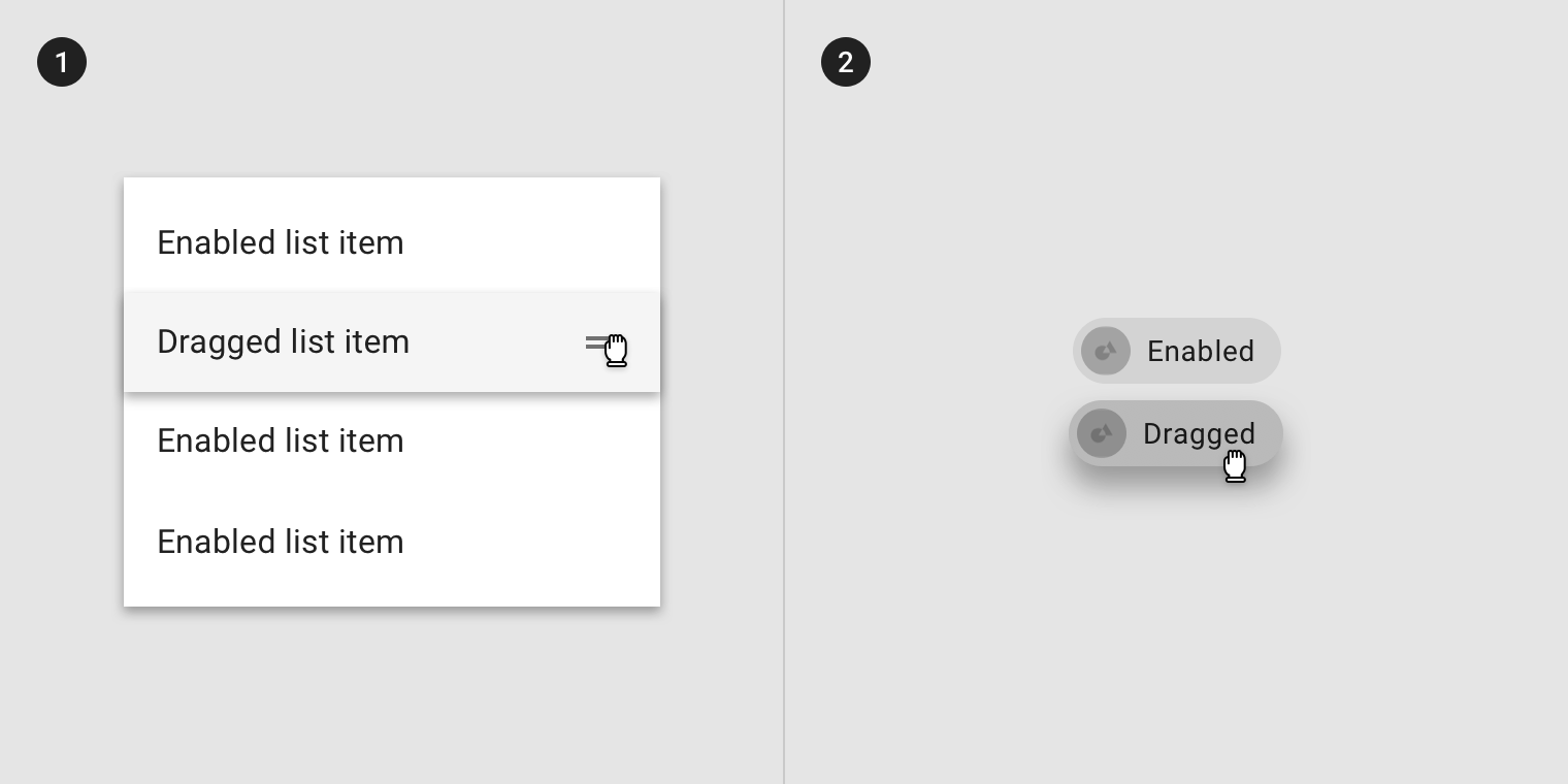
An overlay applied to (1) elements in a component or (2) the component as a whole.
某些组件(如列表项,纸片或卡)可以继承阴影样式以表示拖动状态。
Some components, such as list items, chips, or cards, can inherit elevation to signify a dragged state.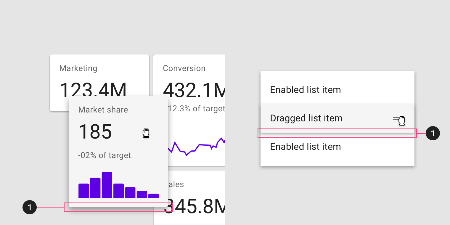
Elevation applied to (1) card and (2) list item
继承
拖拽状态可以由以下组件继承:网格列表项、列表项、卡片以及纸片。
Dragged states can be inherited by the following components: grid list items, list items, cards, and chips.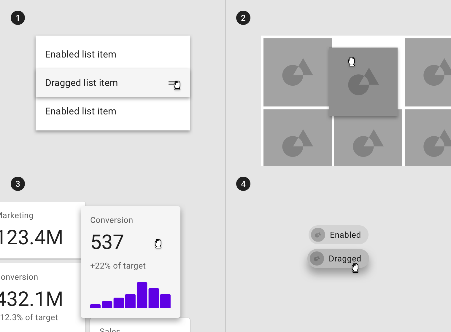
(1) List items, (2) grid list items, (3) cards, and (4) chips can inherit a dragged state.
以下组件不能继承按压状态:应用栏、按钮、底部导航、对话框、警告、菜单或步进器。
Dragged states cannot be inherited by: app bars, buttons, bottom navigation, dialogs, alerts, menus, or steppers.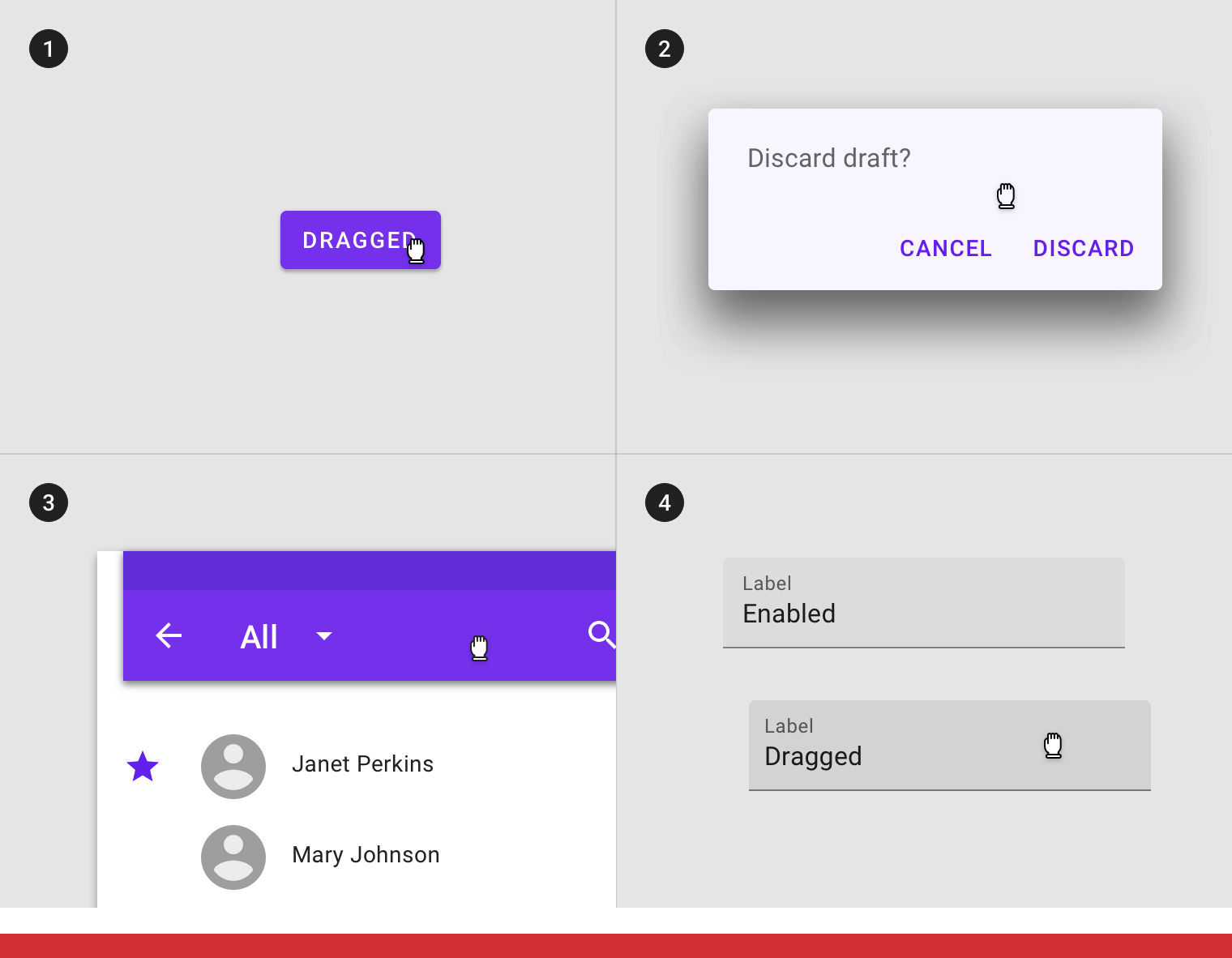
Don’t
Components such as (1) buttons, (2) app bars, (3) dialogs, or (4) text fields cannot inherit a dragged state.
行为规范
Dragged states are initiated when users touch and hold elements, using an input method such as a tap or click.
Dragged states occur after a pressed state and appear and disappear using a fade animation.
The user’s touch should directly control the movement of the dragged element.
There may only be a single dragged state at a time within a layout.
A single dragged state
不透明度
为了确保状态能够正确地被表达并且保证颜色对比度的可视性,针对不同的状态我们在系统中设置了不同的可视化参数。
To ensure proper visibility, an overlay’s opacity should be adjusted for every different combination of text on surface. Dragged overlays should be at lower opacities to avoid distracting from content.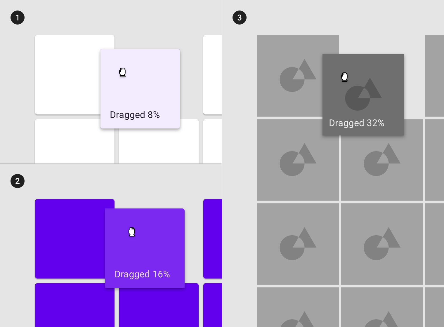
(1) Surface: 100% #FFFFFF
Ink: 100% #000000
Overlay: 8% #000000
(2) Surface: 100% #6200EE
Ink: 100% #FFFFFF
Overlay: 16% #FFFFFF
(3) Surface: Image
Overlay: 32% #000000

若有收获,就点个赞吧
0 人点赞
