Navigation rails provide ergonomic movement between primary destinations in apps.

Guidance in beta reflects the latest Material Design insights. It may significantly change to support new research and code.
Learn more or send us your feedback.
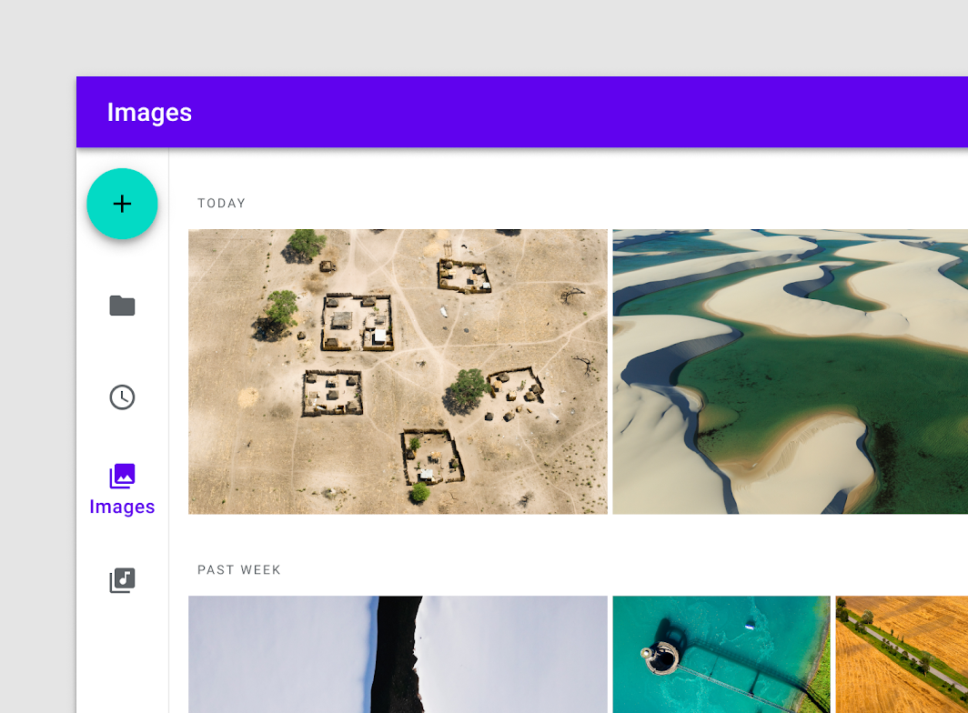
A navigation rail with four destinations and a Floating Action Button.
Usage
The rail is a side navigation component that displays three to seven app destinations and, optionally, a Floating Action Button. Each destination is represented by an icon and a text label.
The rail can function on its own at larger screen sizes, such as desktop and tablet. When users transition between screen sizes and devices, the rail can also complement other navigation components, such as bottom navigation.
Principles
Ergonomic
The navigation rail is a compact arrangement that puts high-priority destinations within reach on large screens.
Consistent
The rail should appear consistently on the same side of each screen in an app.
Adaptive
The rail complements adaptive and responsive navigation patterns.
When to use
Navigation rails should be used for:
- Top-level destinations that need to be accessible anywhere in an app
- Three to seven main destinations in a product
- Tablet or desktop layouts
Navigation rails shouldn’t be used for:
- Small screen sizes
- Single tasks, such as viewing a single email
- Secondary navigation destinations
解析
- Container
- Floating Action Button (optional)
- A destination
- Text label
- Divider (optional)
Container
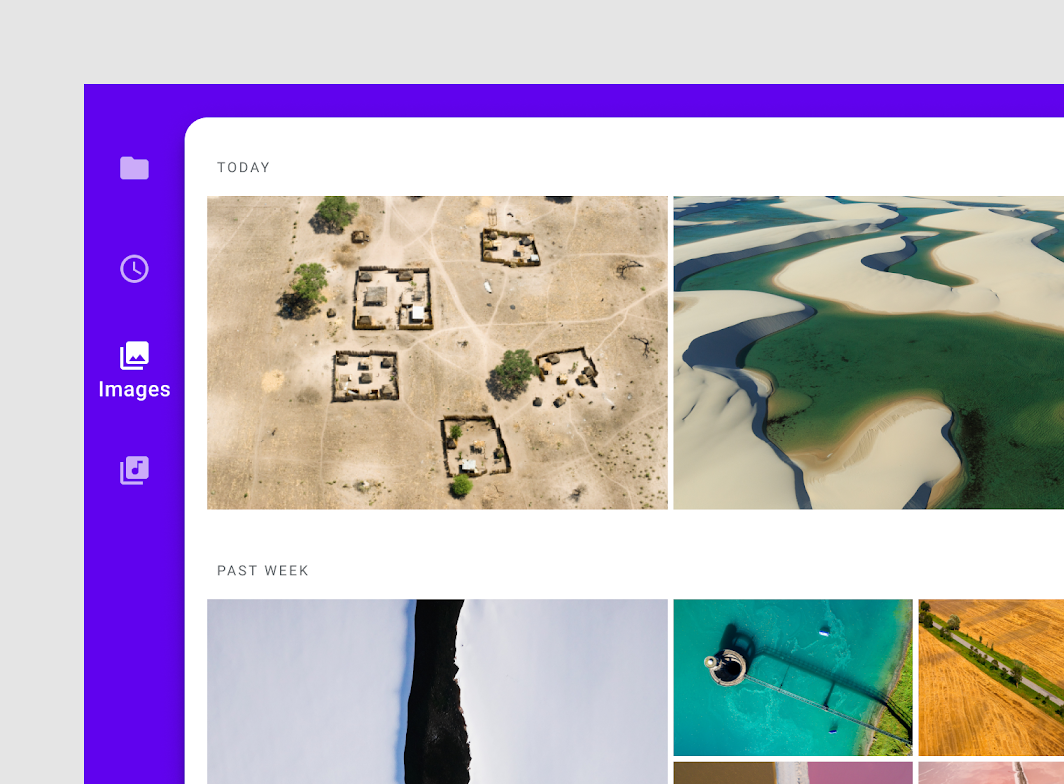
The navigation rail is placed on the left side of the screen for left-to-right languages, and on the right side of the screen for right-to-left languages.
Density
The navigation rail container is 72 dp wide by default. To adjust for dense layouts, the container width can be reduced to 56 dp and text labels are omitted.
The navigation rail container is 72 dp wide by default.
In denser layouts, the rail can be reduced to 56 dp and text labels are omitted.
Orientation
The navigation rail should always run vertically along the side of a layout. For horizontal navigation components or smaller screens, consider using bottom navigation. For closely related sibling views under one parent, tabs and in combination with the navigation rail can form a cohesive navigation structure.

Don’t
Don’t position the navigation rail container horizontally.
Rail destinations
Users are taken to the top-level destination associated with an icon when selected.
Icons
Navigation rail destinations are always represented by icons that can symbolize the content or the nature of a destination.
Destinations are always represented by icons in the navigation rail.
Text labels
Text labels provide short, meaningful descriptions of navigation destinations and provide an alternative way for users to understand an icon’s meaning. Labels can either be persistent or can appear on active destinations only.

Do
Write succinct labels that describe a destination.
Labels should be short enough to not be truncated. Additionally, the type scale should not be reduced to fit longer text labels.

Don’t
Do not truncate or display an ellipsis in place of label text.


Don’t
Do not reduce the type size to fit more characters into a destination label.
Avoid wrapping long labels when possible. If necessary, create a line break between words, or hyphenate longer words.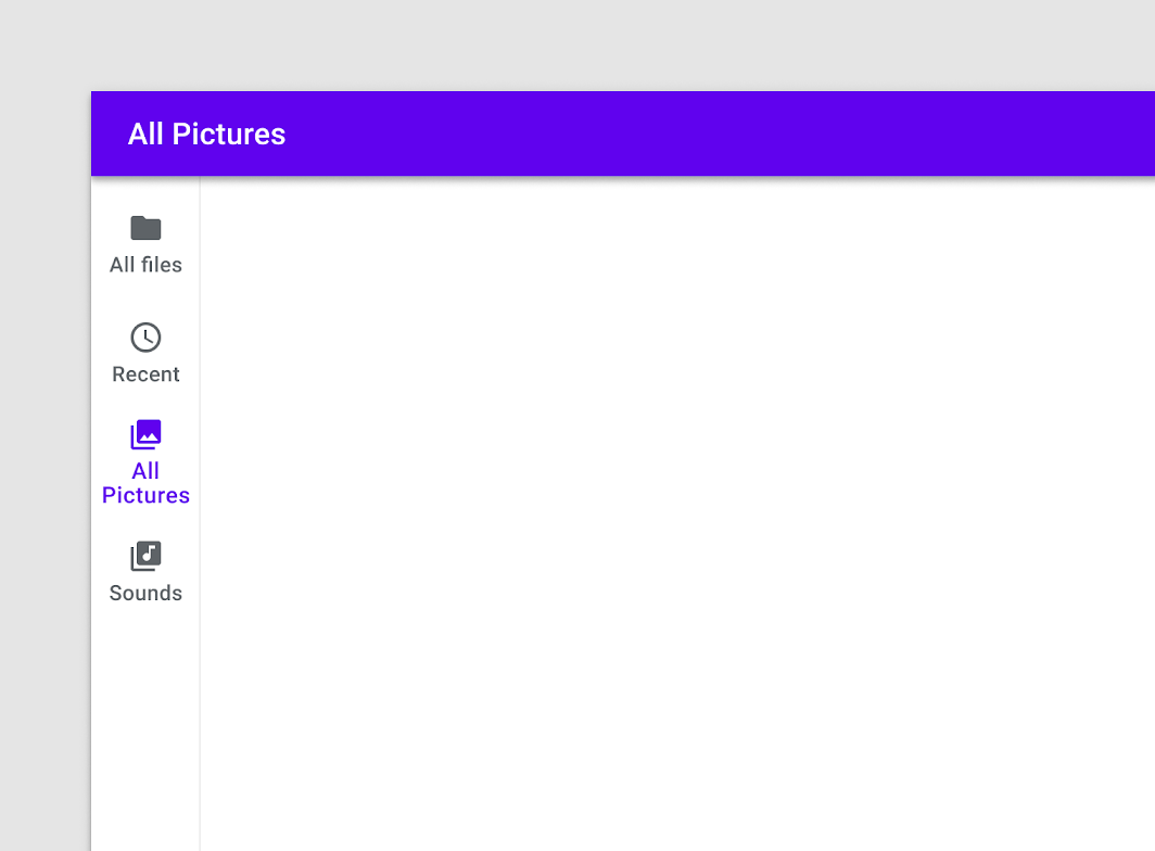

Caution
Break up longer phrases into two text lines if necessary.
Icon and label colors
Active icons, inactive icons, and text labels should have sufficient contrast with the container. An active destination icon and label should use your app’s primary or high-emphasis “On” color. Inactive icons and labels use the medium emphasis “On” color.

Do
Use the primary or high-emphasis “On” color for the active destination.


Don’t
Do not use more than two colors for destinations or low-contrast colors in the navigation rail. This will make distinguishing active items more difficult.
Group alignment
Navigation rail destinations can be aligned as a group to the top, bottom, or center of a layout. On tablets, bottom alignment can make destinations easier for a user to reach with their thumbs.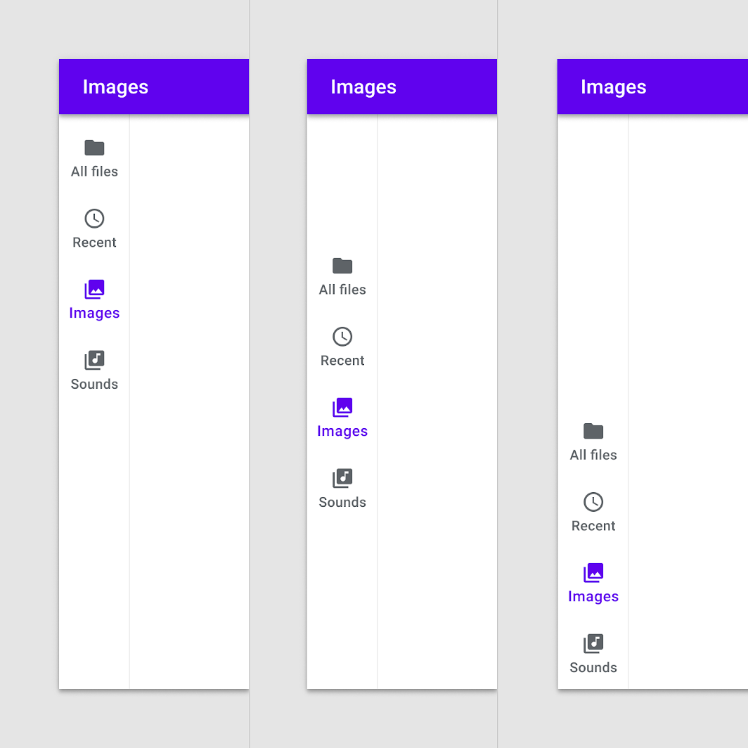
Left to right: Top, center, and bottom-aligned rail destination placement.
Floating Action Button
Optional: The rail provides a convenient container for anchoring the Floating Action Button (FAB) to the top of a screen, placing the app’s key action above navigation destinations.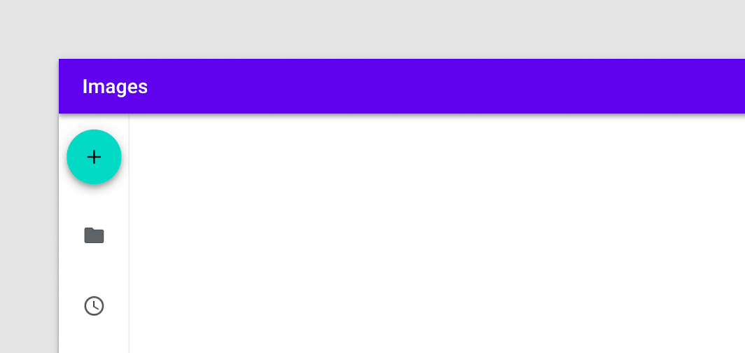

Do
A top-aligned FAB in the navigation rail.

Don’t
Do not place the FAB below rail destinations.
The top of the rail can also be used for a logo.

Caution
Use caution when placing logos in the rail where they might be confused with an action or destination.
Divider
Optional: A divider can help separate the rail from app content. The divider should be positioned on the edge of the rail container that’s adjacent to the app’s content area.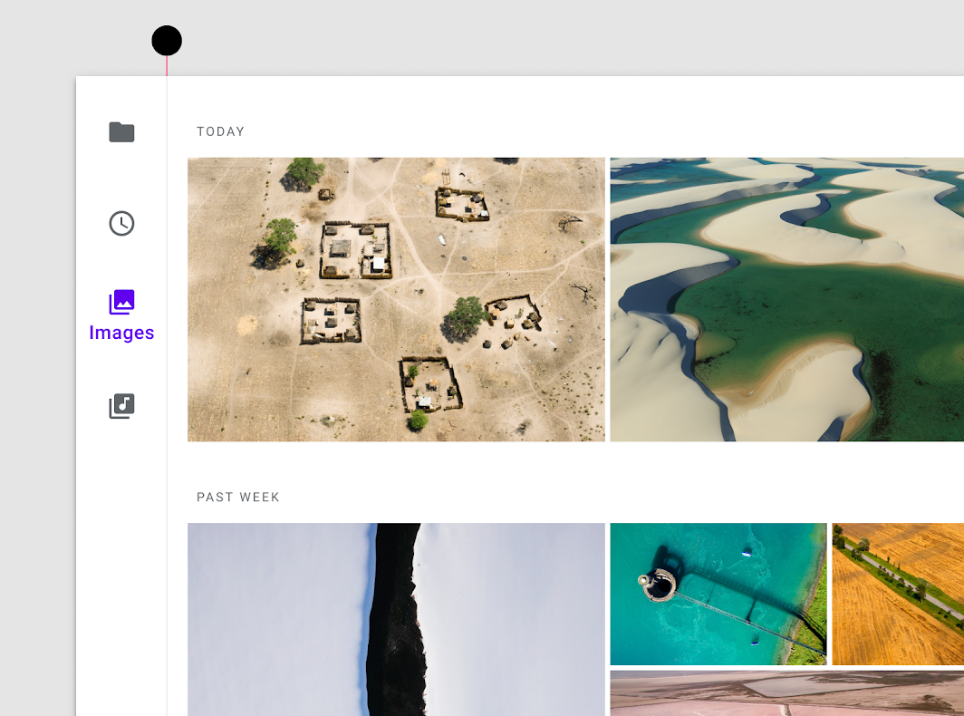
A divider can make the navigation rail container distinct from other on-screen content.
Behavior
Scrolling
Destinations in the navigation rail should remain visible when scrolling vertically.


Do
Rail destinations remain fixed while on-screen content scrolls vertically.
If a layout scrolls horizontally, the rail can scroll off-screen or remain fixed. To distinguish that content is scrolling underneath the rail, use a divider or add elevation to the rail.
A divider creates visual distinction between the rail and horizontally scrolling content.
Elevating the rail to 1 dp creates visual distinction between the rail and horizontally scrolling content.

Caution
Use caution when horizontal scrolling will move the rail offscreen and limit access to rail destinations.
Text labels
Persistent
Persistent text labels are visible at all times, regardless of a destination’s state.
Persistent text labels are always visible.
Selected text labels
Selected text labels appear only when a destination is activated.
Unlabeled icons
If all icons in the navigation rail can be expected to have clear meaning to users, labels can be omitted as a group.

Caution
Ensure that icons are clear to users if labels are omitted.
Badges
Rail icons can include badges on the upper right corner of the icon. Badges convey dynamic information about the associated destination, such as counts or status.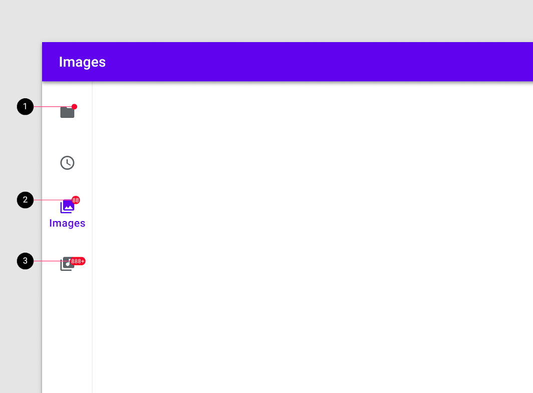
- Badge on a rail destination
- Badge with a number
- Badge with a maximum character count
Interaction with other navigation components
Bottom navigation
When moving from a small screen to a larger display, bottom navigation can transform into rail navigation, providing the same quick access in a configuration that’s ergonomic and prominent on larger displays. However, the navigation rail and bottom navigation should not be used simultaneously.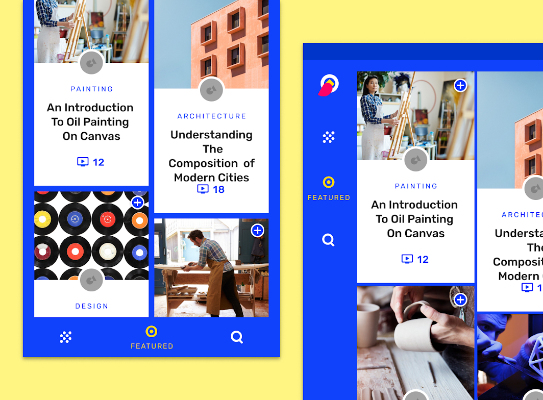
Left: Owl uses bottom navigation on smaller devices.
Right: On larger displays the bottom navigation becomes a rail.

Don’t
Do not use a navigation rail and bottom navigation on the same screen.
Navigation drawer
The rail provides access to three to seven top-level destinations. A modal navigation drawer can work as a complementary component by supporting your navigation structure with secondary destinations or additional actions. A navigation drawer is unnecessary if there are no secondary destinations or actions in an app.

Do
Pair the rail with a modal navigation drawer when there are secondary destinations or actions that don’t belong in the rail.


Don’t
Do not use a navigation rail and bottom navigation on the same screen.

Don’t
Do not pair the rail with a permanent or persistent navigation drawer.
Some apps, such as Material’s Reply, customize and extend the rail to function as both a rail and a navigation drawer.
Reply uses a custom version of the navigation rail which expands into a dismissable navigation drawer and contains additional actions.
Tabs
Tabs can be added when a top-level destination contains multiple related pieces of content. Create a clear distinction between the tab and rail destinations when both are in use.

Caution
Avoid repeating in the navigation drawer destinations that are already in the rail.
Backdrop
When a backdrop is in use, position the navigation rail on the back layer. When additional contextual information (such as titles) or actions (such as filtering) are present on the backdrop, ensure that they remain distinct from the rail.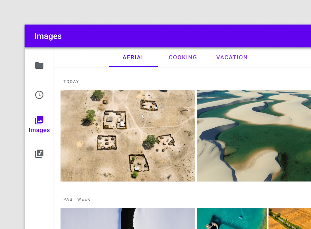

Caution
Rail and tab destinations should be distinguishable when both are in use.
The navigation rail can rest on the back layer when a backdrop is in use.
Responsive patterns
When moving between screen sizes, the rail can enhance responsive design patterns. For example, an app that uses bottom navigation and a navigation drawer on mobile screens might adapt to a navigation rail and modal navigation drawer on tablet screens. On desktop screens, the app might use a permanent navigation drawer with additional destinations and actions.
The navigation rail is part of a cohesive navigation system that adapts across screen sizes.
Placement
Elevation
The navigation rail sits below the app bar (if an app bar is used) and rests on the background layer. The rail usually adopts an app’s background color.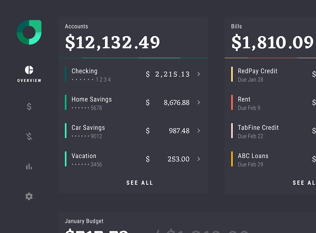
Rally’s navigation rail rests against the background and shares the same color.
When an app bar or other elevated overlapping components are not in use, the navigation rail can be elevated for more differentiation from surrounding content.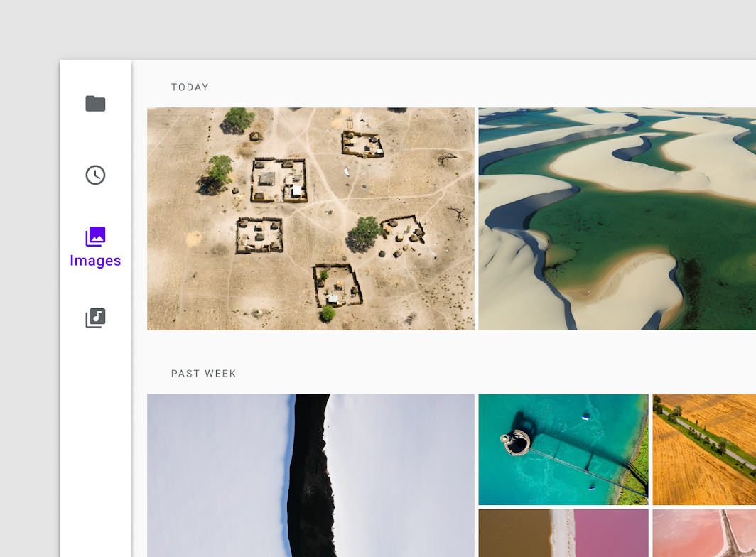
The rail can be elevated when overlapping elevated components are not in use.
States
Destinations in the navigation rail can be active, inactive, focused, or pressed.
States are communicated through opacity and text to show when a destination is active or inactive. States are used to show pressed, focused, hover, and unselected states.
Inactive destination states have a reduced opacity while active states are fully opaque and use the app’s primary color by default.
When the navigation rail container uses an app’s primary color or belongs to a dark theme, the rail uses the app’s “On” Background color to convey states.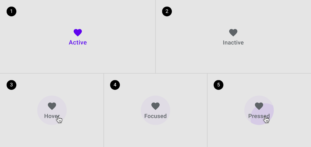
- Active
- Inactive
- Hover
- Focused
- Pressed
主题
Rally Material Theme
The navigation rail in this personal finance app was customized using Material Theming.
Areas of customization include typography and color. Other adjustments include widening the rail width, vertically centering the destination group, and placing a logo at the top of the rail. On mobile screens, Rally’s navigation rail is replaced by simplified tab navigation.
Rally is a personal finance app that uses the navigation rail on large displays
Color
Rally’s navigation rail uses custom colors for three elements: the container, activated items, and inactive items.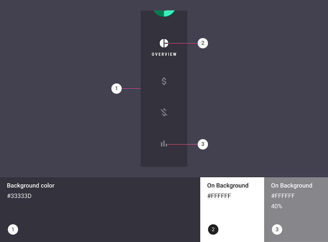
| Element | Category | Attribute | Value |
|---|---|---|---|
| 1. Container | Background | Color Opacity |
#33333D 100% |
| 2. Active icon, active text | On Background | Color Opacity |
#FFFFFF 100% |
| 3. Inactive icons | On Background | Color Opacity |
#FFFFFF 40% |
Typography
Rally’s navigation rail uses custom typography for destination text labels.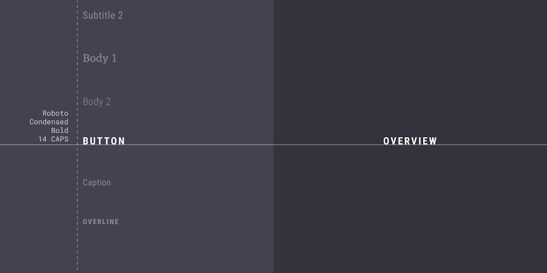
| Element | Category | Attribute | Value |
|---|---|---|---|
| Text label | Button | Typeface Font Size Case |
Roboto Condensed Bold 14 All caps |
Specs
Tablet and desktop
Default
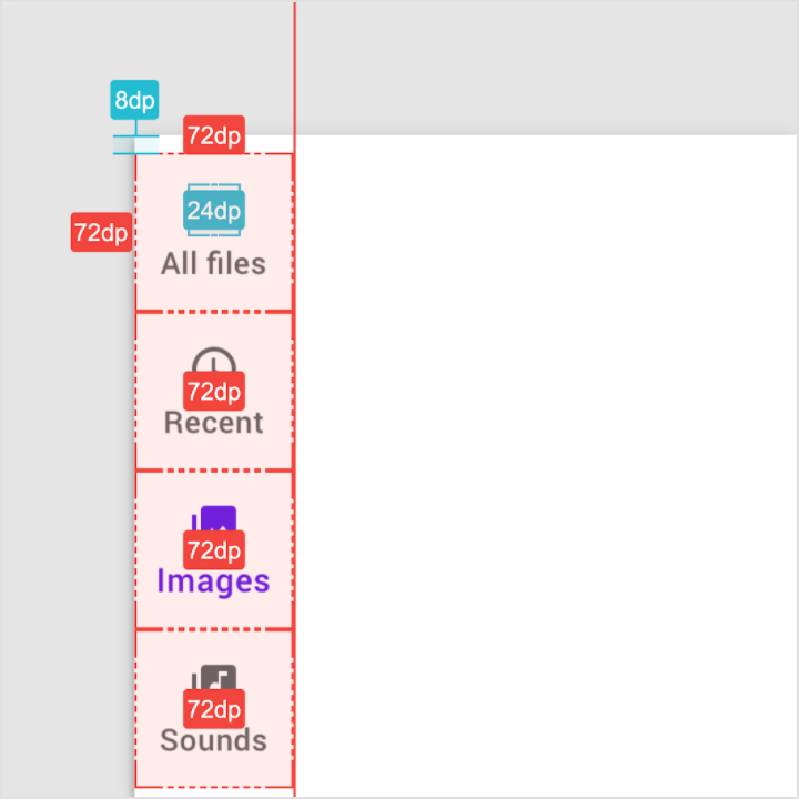
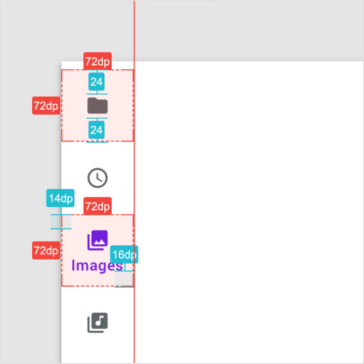
Destination height and width: 72 dp
Destination icon height and width: 24 dp
Destination group: 8 dp from the top edge of container
Rail with a FAB
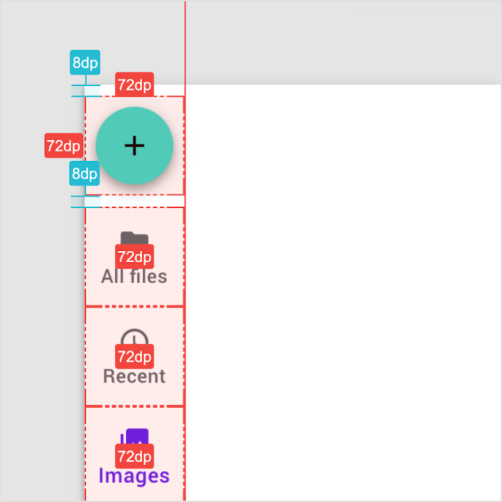
FAB container: 72 dp; 8 dp padding above and below
Destination height and width: 72 dp
Rail with selected text labels
Inactive destination icons: centered within 72 dp container
Active destination icon: 14 dp from top edge of destination container
Text label baseline: 16 dp from bottom edge of destination container
Compact rail without text labels
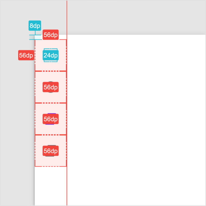
Destination height and width: 56 dp
Destination group: 8 dp from top edge of container
Destination icon height and width: 24 dp

若有收获,就点个赞吧
0 人点赞
