Android O 的应用图标用于在主屏幕或者应用列表上提供应用程序的启动快捷方式。
Android O icons represent your app on a device’s Home and All Apps screens.
用法
Material Design 对应用图标(图像、动效以及操作)如何设计进行了一定的规范。
The following guidelines describe how icons can receive unique visual treatments, animations, and behaviors.
规范
启动图标专门提供给 Google Play 商店进行展示,并且有如下几条规范需要设计者遵守:
- 格式要求:PNG 或 矢量格式
- 背景与前景都没有遮罩或阴影
- 图标的样式面积占所有图层的比例不超过 50%
代工(OEM)平台的要求:
- 代工平台上的应用图标需要采用统一的样式
- 外阴影(可选)
Launcher icons are provided to the Google Play store, with the following requirements:
- Icon drawables in a PNG or vector format
- Background and foreground layers without mask or background shadows
- All layers must exceed the base icon shape by 50%
The OEM requirements include:
- One shape for masking any icons that are displayed on an OEM’s platform
- An outer shadow (optional)
辅助线
辅助线可以帮助设计者在设计图标时,保证视觉上具有统一性。
Keyline shapes are used across all app icons to maintain consistent visual proportions.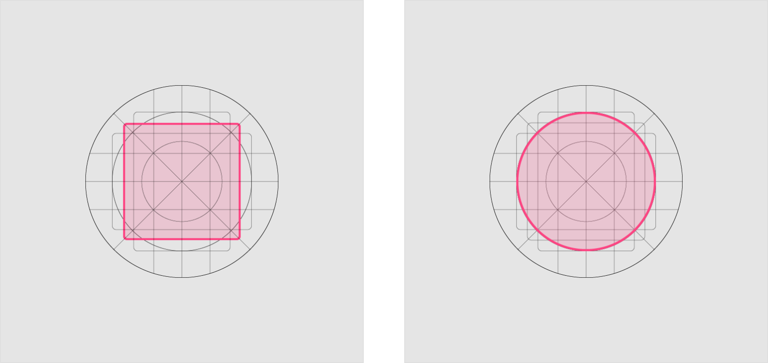
Square
Height: 44dp
Width: 44dp
Corner radius: 4dp
Circle
Diameter: 52dp
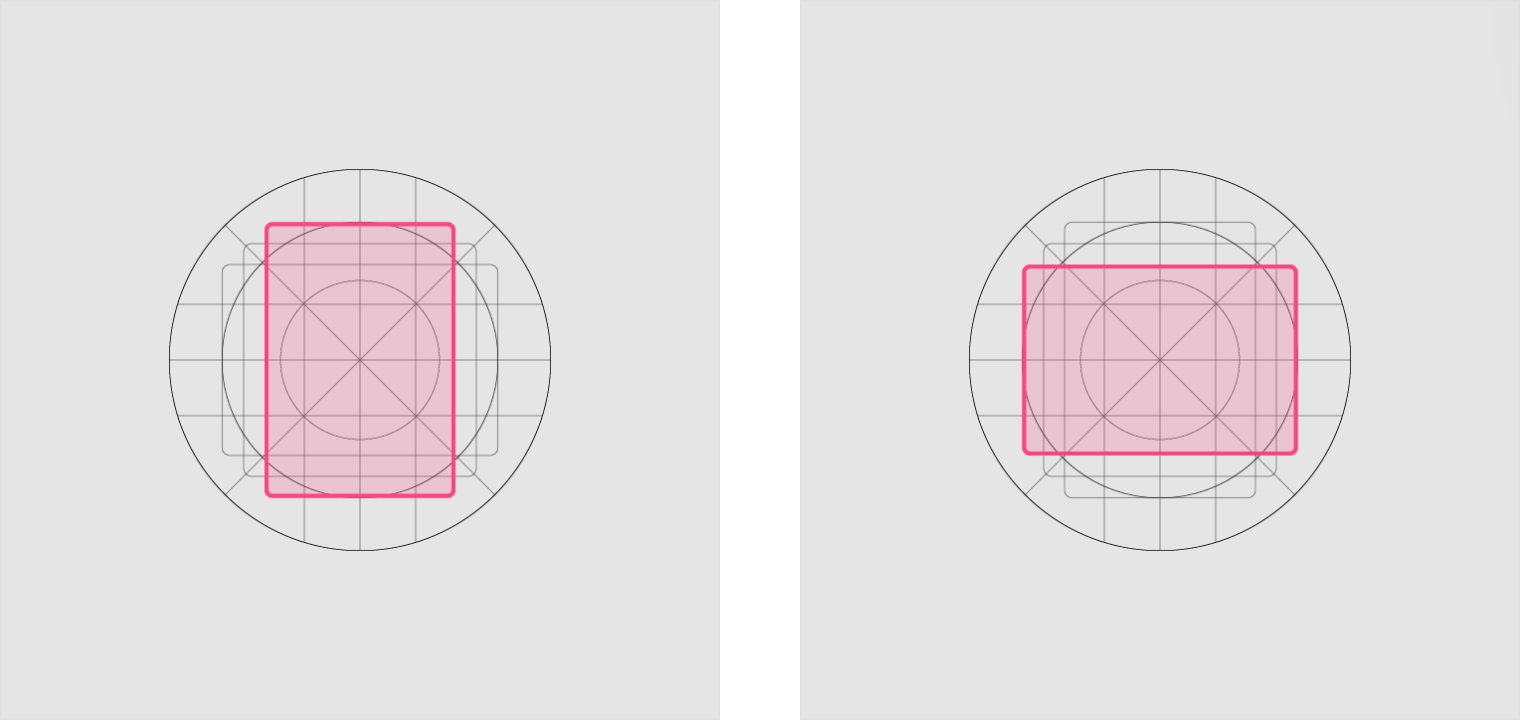
Vertical rectangle
Height: 52dp
Width: 36dp
Corner radius: 4dp
Horizontal rectangle
Height: 36dp
Width: 52dp
Corner radius: 4dp
设计规范
图层
应用图标由两层组成:前景和背景。
每一个图层都可以拥有独立地动效设计。
Icons consist of two layers: a foreground and a background. Each layer can animate and receive treatments independently from the other layer.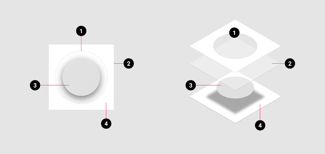
1. OEM Mask
2. Finishing layer
3. Foreground (App icon); 108 x 108 dp; 72dp masked section; Transparency optional
4. Background (Icon shadow); 108 x 108 dp; 72dp masked section; Must be Opaque
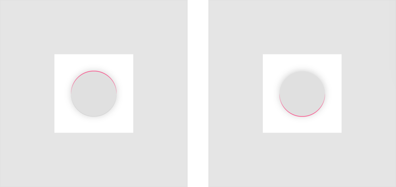
阴影
在同一套设计中,平台上的每一个图标在光效与阴影设置上都应该保持一致。
When designing new icons, lighting and shadow effects should be consistent with other icons on the platform. Contact shadows are placed on elements to make them stand out from the background.
Illustrator mode: Normal
Opacity: 20%
X Offset: 0dp
Y Offset: 4dp
Blur: 4dp
Color: Refer to tint, shade and shadow values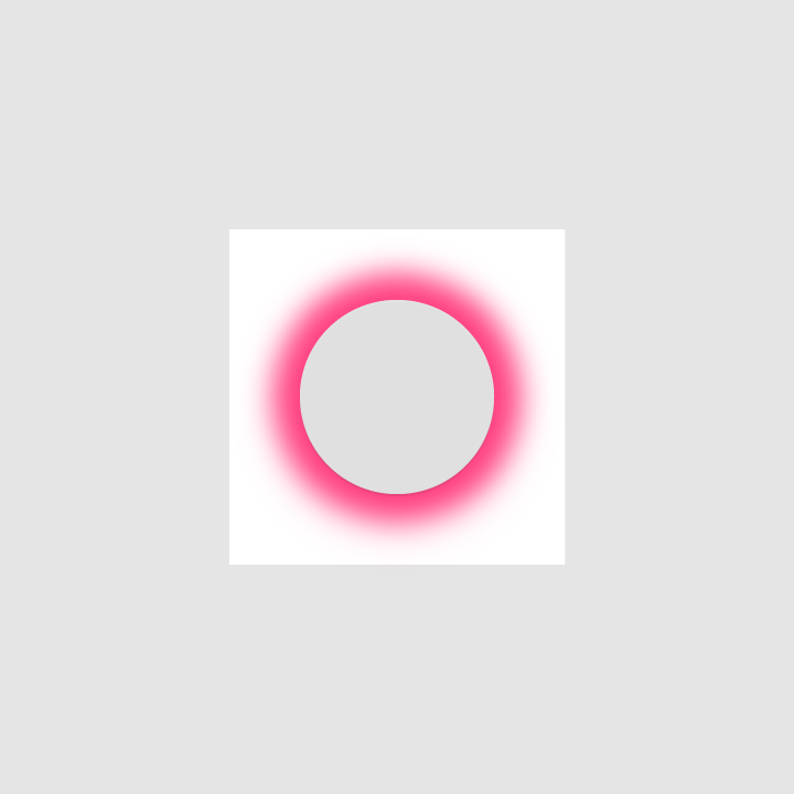
A contact shadow is a soft shadow surrounding an element.
边缘色 & 阴影
为了让图标更加立体,设计者可以对图标中的主体的顶部与底部进行边缘处理。
- 上边缘设置边缘色时,左、右以及下边缘不做处理。
- 下边缘设置边缘色时,左、右以及上边缘不做处理。
To provide a sense of depth, treatments are applied to the top and bottom edges of elements.
- Tinted edges highlight the top edge of elements (the left, right, and bottom edges are not tinted)
- Shaded edges display dark bottom edges on elements (the left, right, and top edges are not shaded)
Tinted edge
Height: 1dp
Opacity: 20%
Color: White (#FFFFFF)
Shaded edge
Height: 1dp
Opacity: 20%
Color: See tint, shade, and shadow values
抛光层
抛光层位于前景层上方。
A finishing layer is placed above the foreground layer.
规范
- Angle: 45º
- Midpoint: 32%
- Color: Refer to tint, shade and shadow values
| Illustrator gradient tool |
Opacity | Location |
|---|---|---|
| Slider 1 | 10% | 0% |
| Slider 2 | 0% | 100% |
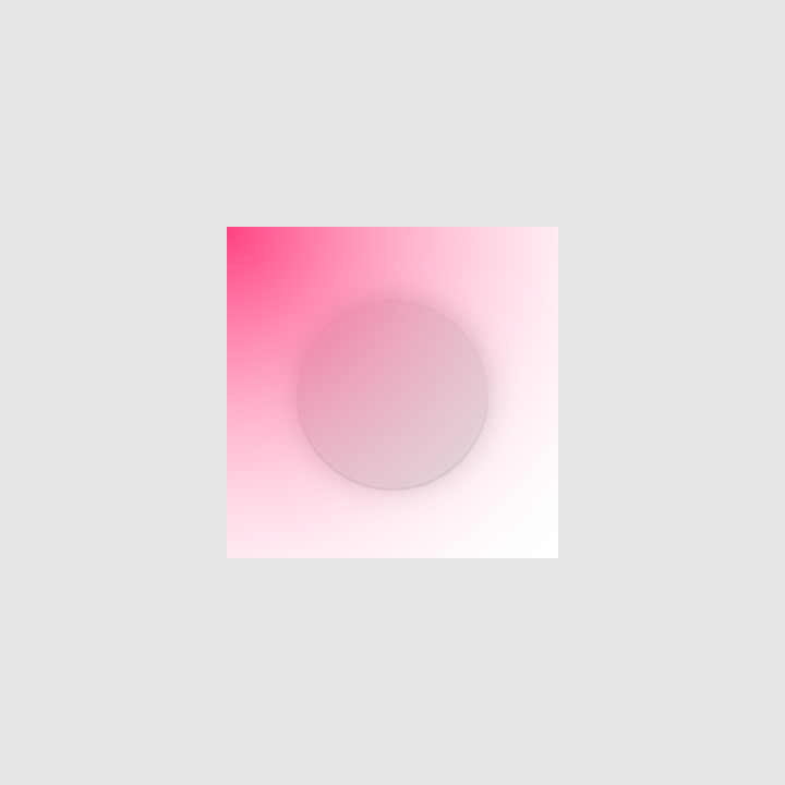
Finishing layer above foreground layer
OEM 自定义
在不影响图标布局的前提下,代工(OEM)平台可以设置 72 × 72 dp 的蒙版区域对预设形状进行裁剪。
Without affecting icon layout, OEMs can apply their own custom masks to icons using a 72 x 72 dp masked area. The convex shapes include both a circular mask and a square mask.
 OEM mask shapes
 Final icon shapes

若有收获,就点个赞吧
0 人点赞
