1.项目概述
1.1.项目演示
- 运行 “饿了么前端网页项目” ,演示页面效果。
- 本项目参照 “饿了么官网网页版”制作,演示饿了么官网效果。饿了么网页版:http://h5.ele.me/
- 本项目中的首页,完全按照“饿了么网页版”实际效果制作,相似度达到99%。
- 本项目中的其它页面,专注于完成一个“点餐业务线”功能,所以其它页面效果会有适当的删减。
1.2.项目目标
- 本项目为课程级贯穿项目中的第二个项目(JDBC项目、前端项目、javaWeb项目)。
- 本项目成果物将在第三个项目中继续使用,也就是作为第三个项目的前端网页部分。
- 本项目完成后,学员将能够使用HTML+CSS+JS技术开发企业级静态网页。
1.3.项目中所涉及到相关知识点
- HTML5标签的使用
- CSS3样式的使用
- JS对DOM的基本操作
- DIV+CSS布局基础
- 移动端布局基础
- viewport设置
- 弹性布局
- 边框盒子模型
- vw与vh的使用
- 图片按比例自适应
- CSS3小图标的使用
- 第三方字体库的使用
2.部分相关知识点讲解
2.1.移动端开发之viewport
2.1.1.问题的提出
移动端屏幕尺寸多变,不像PC端屏幕那样统一。这样就造成在移动端显示网页时,由于尺寸问题,会出现显示不下网页,从而出现横向滚动条现象。 为了解决这个问题,出现了viewport(屏幕视口)的概念。2.1.2.解决方案
viewport有三种:
- layout viewport(布局视口):网页实际尺寸,或者说,网页实际有多大,layout viewport就有多大。
- ideal viewport(理想视口):移动设备理想viewport,也就是实际屏幕尺寸,根据机型的不同,尺寸也不尽相同。
- visualviewport(视觉视口):用户看到的视口区域
使用viewport就可以解决上述问题: 先将网页放入layout viewport中,然后在将layout viewport等比例缩小到ideal viewport中。 这样就能保证:无论什么样的网页,都能在手机屏幕上显示,而且没有横向滚动条。
2.1.3.总结
移动端网页开发时,都要加上这样一段代码:
<meta name="viewport" content="width=device-width, initial-scale=1">
width就是网页实际尺寸,也就是layout viewport。 device-width就是屏幕实际尺寸,也就是ideal viewport。 所以,width=device-width就是将layout viewport按照ideal viewport实际尺寸来显示。
2.2. 弹性布局(弹性盒子)
一个元素的display属性值设置为flex,那么这个元素中的子元素,就会遵循弹性布局的规则。
display:flex /*flex是flexible box的缩写*/
此时,这个元素就可以称为是一个弹性布局容器(弹性容器),它内部的子元素,将只按照弹性布局的规则来排列和对齐,以前的float、clear、块状与内联、vertical-align属性都不能用了。
2.2.1.重要概念:主轴与侧轴
弹性布局中的一个重要概念:主轴与侧轴: 弹性盒子中默认存在两根轴,一个是水平方向的主轴,一个是垂直方向的侧轴。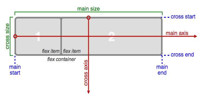
注意点:
- 主轴的开始位置叫做 main start、 结束位置叫做 main end;
- 侧轴的开始位置叫做cross start、结束位置叫做cross end;
- 侧轴永远垂直于主轴;
2.2.2.flex-direction样式
flex-direction属性就是用来设置主轴方向的。
flex-direction:row /*子元素沿主轴方向排列,也就是水平方向。 row为默认值*/
flex-direction:column /*子元素沿侧轴方向排列,也就是垂直方向。*/
一个完整的例子:
<!DOCTYPE html>
<html>
    <head>
        <meta charset="utf-8">
        <title></title>
        <style>
            body{
                display: flex;           /*将body设置为弹性布局*/
                flex-direction: column;  /*这里设置为侧轴方向排列*/
            }
            .son{
                width: 100px;
                height: 100px;
                border: solid 2px #f90;
                background-color: yellow;
            }
        </style>
    </head>
    <body>
        <div class="son">1</div>
        <div class="son">2</div>
        <div class="son">3</div>
        <div class="son">4</div>
        <div class="son">5</div>
    </body>
</html>
总结:
- 在弹性容器中,子元素想要水平方向排列,那就在弹性盒子中设置:flex-direction:row
- 在弹性容器中,子元素想要垂直方向排列,那就在弹性盒子中设置:flex-direction:column
- 在弹性容器中,以前的“块状元素独占一行”,“内联元素不独占一行”,“元素水平排列时需要浮> 动”等等规则,一律不再有效。
2.2.3.flex-wrap样式
由于弹性布局中的子元素能自动伸缩,所以,当父容器此次小于子元素整体尺寸时,子元素不会自动换行,而是自动收缩。
body{
    display: flex;
}
那么,如果想要让子元素自动换行,可以使用flex-wrap:wrap
body{
    display: flex;
    flex-wrap: wrap;   /*当弹性布局容器尺寸小于所以子元素尺寸时,子元素会自动换行*/
}
总结:
- 在弹性盒子中,默认子元素不换行,即使是容器宽度不够时,子元素也不换行,只是宽度缩小。
- 如果在父容器宽度不够时想要自动换行,那么设置:flex-wrap:wrap
2.2.4.justify-content样式
以主轴方向为例:子元素水平方向排列后,默认依次靠左排列。 如果想让子元素居中、居右等,那么就可以设置justify-content样式。值有五种:
- flex-start(默认):左对齐。
- flex-end:右对齐。
- center:居中。
- space-between:两端对齐,子元素之间间距都相等。
- space-around:每个子元素两侧的间距相等。所以子元素之间间距比子元素到边框 间距大一倍。
例如:
body{
    display: flex;
    justify-content: space-between;    /*两端对齐,子元素之间间距都相等。*/
}
总结:在弹性盒子中,子元素主轴对齐方式使用justify-content来设置
2.2.5.align-items与align-content样式
以主轴方向为例:子元素水平方向排列后,如果想让子元素垂直居中,那么就可以设置align-items样式。常用值有三种:
- flex-start(默认):上对齐。
- flex-end:下对齐。
- center:居中。
html,body{
 height: 100%;               /*html与body的高度默认为0,所以要设置高度*/
}
body{
 display: flex;
 flex-wrap: wrap;           /*如果允许换行,那么换行后,多行元素中的每一行也会垂直居中*/
 justify-content: center;
 align-items: center;       /*不论是一行,还是多行,都会垂直居中*/
}
再来看align-content样式: align-content样式对单行没有效果,对多行有效果,而且是将多行整体作为一个整体附加效果的。
总结:在弹性盒子中,子元素侧轴对齐方式可以使用align-items或align-content
- align-items对单行和多行都有效,align-content对单行无效。
- 在多行中,align-items让每一行都在各自范围内垂直居中。 align-content将多行作为一个整> 体,然后居中。
2.2.6.flex样式
如果想让每个子元素所占空间不一致,那么可以使用flex给子元素分配空间。 使用flex时要注意一下两点:
- flex样式是设置在子元素上的。
- 如果设置了flex,那就说明要给子元素按比例分配空间,因此width与height就失效了。
实例1:
<!DOCTYPE html>
<html>
    <head>
        <meta charset="utf-8">
        <title></title>
        <style>
            html,body{
                height: 100%;
            }
            body{
                display: flex;
            }
            .son{
                width: 100px;
                height: 100px;
                border: solid 2px #f90;
                background-color: yellow;
            }
        </style>
    </head>
    <body>
        <div class="son" style="flex:1;">1</div>
        <div class="son" style="flex:1;">2</div>
        <div class="son" style="flex:2;">3</div>
        <div class="son" style="flex:2;">3</div>
    </body>
</html>
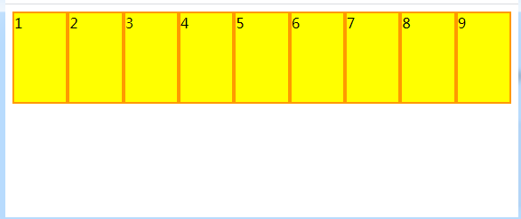
上面实例中:flex样式后跟1个值:表示子元素所占空间的比例。 三个div的宽度分别是窗口宽度的:1/4、1/2、1/4
实例2:
<!-- 第一个div的宽度是400px,是不变的。第二个和第三个div将剩下宽度按比例分配:1/3、2/3 -->
<body>
    <div class="son" style="flex:0 0 400px;">1</div>
    <div class="son" style="flex:1;">2</div>
    <div class="son" style="flex:2;">3</div>
</body>
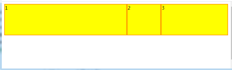
上面实例中:flex样式后跟3个值:
- 第一个值:子元素尺寸自动放大值
- 第二个值:子元素尺寸自动缩小值
- 第三个值:子元素尺寸(”auto”或”%”、”px”、”em” 或任何其他长度单位的数字。)
例如:
- 0 1 auto(默认):父元素尺寸变化时,子元素不放大,只缩小,尺寸自动充满。
- 1 1 auto: 父元素尺寸变化时,子元素自动放大缩小,尺寸自动充满。
- 0 0 300px: 父元素尺寸变化时,子元素不放大缩小,尺寸固定。
总结:可以使用flex让一行内的所有子元素自动撑满窗口宽度。而且每个子元素的宽度可以按比例> 进行分配。
2.3.视口尺寸
视口:在PC端,指浏览器的可视区域;在移动端,指Viewport 中的 Layout Viewport。 视口尺寸常用的有以下2个: vw : 1vw 等于视口宽度的1% vh : 1vh 等于视口高度的1% 实际应用中,可以使用vw,实现元素宽度和高度成比例自动缩放。
<!DOCTYPE html>
<html>
    <head>
        <meta charset="utf-8">
        <title></title>
        <style>
            div{
                width: 30vw;
                height: 20vw;
                background-color: blue;
                color: #fff;
                font-size: 5vw;
            }
        </style>
    </head>
    <body>
        <div>
            我能够随着屏幕自适应
        </div>
    </body>
</html>
2.4.边框盒子模型
CSS3之前的盒子模型,可以说是content-box型盒子,即宽和高为内容。 CSS3之后新增了一的盒子模型,可以说是border-box型盒子,即宽和高为边框。 那么,使用box-sizing属性可以设置盒子模型类型。
div{
    width: 200px;
    height: 200px;
    box-sizing: border-box;   /*值有两个: border-box:边框盒子; content-box:内容盒子(默认)*/
    padding: 30px;
    background-color: orange;
    border: solid 30px blue;
    margin: 50px;
}
总结:使用了边框盒子,就可以任意设置内边距、边框了,而且不用担心会改变盒子的总体尺寸。
2.5. 字体图标
一般来说,在网页上使用字体图标可以有三种方式:自定义CSS图标、第三方字体图标、转义字符
2.5.1.自定义CSS图标
下面是一个自定义CSS小图标:定位图标(icon.css文件)
/**
 * location 定位小图标
 * 说明:使用div标签,加上icon-location类样式即可。
 *       但需要放置在一个容器中,调整容器大小,图标能自适应容器大小。
 * 示例:
 * <div class="icon-location-box">
 *     <div class="icon-location"></div>
 * </div>
 */
.icon-location {
    position: relative;
    width: 100%;                         /*先画一个正方形*/
    height: 100%;
    border-radius: 50% 50% 50% 0;        /*然后将三个角变成圆角*/
    background: #fff;
    transform: rotate(-45deg);           /*最后,旋转45度*/
}
.icon-location:after {
    content: '';
    width: 40%;
    height: 40%;
    margin: 30% 0 0 29%;
    background-color: #0097FF;
    position: absolute;
    border-radius: 50%;
}
使用时:
<!DOCTYPE html>
<html>
    <head>
        <meta charset="utf-8">
        <title></title>
        <link href="css/icon.css" rel="stylesheet">
        <style>
            .icon-location-box{
                width: 50px;
                height: 50px;
            }
        </style>
    </head>
    <body bgcolor="#0000FF">
        <div class="icon-location-box">
            <div class="icon-location"></div>
        </div>
    </body>
</html>
2.5.2.使用第三方字体图标库
第三方字体图标库有很多很多,比如常用的: Font Awesome:https://fontawesome.dashgame.com/ (直接在官网上进行讲解)
2.5.3.使用转义字符
HTML转义字符:http://114.xixik.com/character/ (直接在此网站上进行讲解)
3.项目实战
3.1.搭建项目结构
- css文件夹: 存放css文件。
- framework文件夹: 存放第三方库文件,以及一些共通的css文件(自定义css图标、css重置)
- img: 存放图片
- js: 存放js文件
CSS重置:reset.css文件中的内容:
/***************** CSS重置 *******************/
html,body,div,span,h1,h2,h3,h4,h5,h6,ul,ol,li,p{
    margin: 0;
    padding: 0;
}
html,body{
    width: 100%;
    height: 100%;
    font-family: "微软雅黑";
}
ul,ol{
    list-style:none;
}
a{
    text-decoration: none;
}
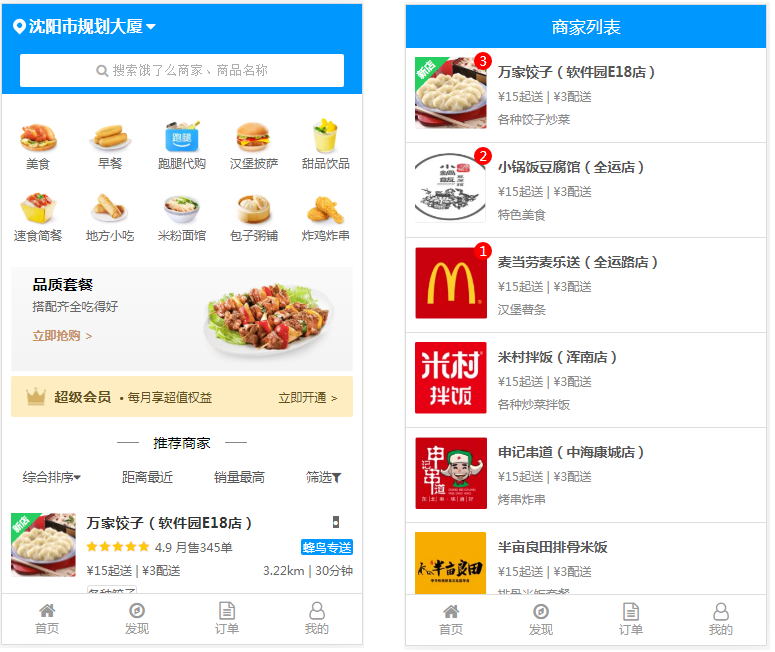
3.2.首页(index.html)
3.2.1.html部分
<!DOCTYPE html>
<html>
<head>
<meta charset="utf-8">
<meta name="viewport" content="width=device-width,initial-scale=1">
<link href="framework/font-awesome/css/font-awesome.min.css" rel="stylesheet">
<link href="framework/reset.css" rel="stylesheet">
<link href="framework/icon.css" rel="stylesheet">
<link href="css/index.css" rel="stylesheet">
<script src="js/index.js"></script>
<title>饿了么 首页</title>
</head>
<body>
<!-- 总容器 -->
<div class="wrapper">
<!-- header部分 -->
<header>
<div class="icon-location-box">
<div class="icon-location"></div>
</div>
<div class="location-text">沈阳市规划大厦<i class="fa fa-caret-down"></i></div>
</header>
<!-- search部分 -->
<!--
搜索框部分(此块与search-fixed-top块宽度高度一致,用于当
search-fixed-top块固定后,挡住下面块不要窜上去)
-->
<div class="search">
<!-- 当滚动条超过上面的定位块时,search-fixed-top块变成固定在顶部。 -->
<div class="search-fixed-top" id="fixedBox">
<!-- 搜索框部分中间的白框 -->
<div class="search-box">
<i class="fa fa-search"></i>搜索饿了么商家、商品名称
</div>
</div>
</div>
<!-- 点餐分类部分 -->
<ul class="foodtype">
<li onclick="location.href='businessList.html'">
<img src="img/dcfl01.png">
<p>美食</p>
</li>
<li onclick="location.href='businessList.html'">
<img src="img/dcfl02.png">
<p>早餐</p>
</li>
<li onclick="location.href='businessList.html'">
<img src="img/dcfl03.png">
<p>跑腿代购</p>
</li>
<li onclick="location.href='businessList.html'">
<img src="img/dcfl04.png">
<p>汉堡披萨</p>
</li>
<li onclick="location.href='businessList.html'">
<img src="img/dcfl05.png">
<p>甜品饮品</p>
</li>
<li onclick="location.href='businessList.html'">
<img src="img/dcfl06.png">
<p>速食简餐</p>
</li>
<li onclick="location.href='businessList.html'">
<img src="img/dcfl07.png">
<p>地方小吃</p>
</li>
<li onclick="location.href='businessList.html'">
<img src="img/dcfl08.png">
<p>米粉面馆</p>
</li>
<li onclick="location.href='businessList.html'">
<img src="img/dcfl09.png">
<p>包子粥铺</p>
</li>
<li onclick="location.href='businessList.html'">
<img src="img/dcfl10.png">
<p>炸鸡炸串</p>
</li>
</ul>
<!-- 横幅广告部分 -->
<div class="banner">
<h3>品质套餐</h3>
<p>搭配齐全吃得好</p>
<a>立即抢购 ></a>
</div>
<!-- 超级会员部分 -->
<div class="supermember">
<div class="left">
<img src="img/super_member.png">
<h3>超级会员</h3>
<p>• 每月享超值权益</p>
</div>
<div class="right">
立即开通 >
</div>
</div>
<!-- 推荐商家部分 -->
<div class="recommend">
<div class="recommend-line"></div>
<p>推荐商家</p>
<div class="recommend-line"></div>
</div>
<!-- 推荐方式部分 -->
<ul class="recommendtype">
<li>综合排序<i class="fa fa-caret-down"></i></li>
<li>距离最近</li>
<li>销量最高</li>
<li>筛选<i class="fa fa-filter"></i></li>
</ul>
<!-- 推荐商家列表部分 -->
<ul class="business">
<li>
<img src="img/sj01.png">
<div class="business-info">
<div class="business-info-h">
<h3>万家饺子(软件园E18店)</h3>
<div class="business-info-like">•</div>
</div>
<div class="business-info-star">
<div class="business-info-star-left">
<i class="fa fa-star"></i>
<i class="fa fa-star"></i>
<i class="fa fa-star"></i>
<i class="fa fa-star"></i>
<i class="fa fa-star"></i>
<p>4.9 月售345单</p>
</div>
<div class="business-info-star-right">
蜂鸟专送
</div>
</div>
<div class="business-info-delivery">
<p>¥15起送 | ¥3配送</p>
<p>3.22km | 30分钟</p>
</div>
<div class="business-info-explain">
<div>各种饺子</div>
</div>
<div class="business-info-promotion">
<div class="business-info-promotion-left">
<div class="business-info-promotion-left-incon">新</div>
<p>饿了么新用户首单立减9元</p>
</div>
<div class="business-info-promotion-right">
<p>2个活动</p>
<i class="fa fa-caret-down"></i>
</div>
</div>
<div class="business-info-promotion">
<div class="business-info-promotion-left">
<div class="business-info-promotion-left-incon" style="background-color: #F1884F;">特</div>
<p>特价商品5元起</p>
</div>
</div>
</div>
</li>
<li>
<img src="img/sj02.png">
<div class="business-info">
<div class="business-info-h">
<h3>小锅饭豆腐馆(全运店)</h3>
<div class="business-info-like">•</div>
</div>
<div class="business-info-star">
<div class="business-info-star-left">
<i class="fa fa-star"></i>
<i class="fa fa-star"></i>
<i class="fa fa-star"></i>
<i class="fa fa-star"></i>
<i class="fa fa-star"></i>
<p>4.9 月售345单</p>
</div>
<div class="business-info-star-right">
蜂鸟专送
</div>
</div>
<div class="business-info-delivery">
<p>¥15起送 | ¥3配送</p>
<p>3.22km | 30分钟</p>
</div>
<div class="business-info-explain">
<div>各种饺子</div>
</div>
<div class="business-info-promotion">
<div class="business-info-promotion-left">
<div class="business-info-promotion-left-incon">新</div>
<p>饿了么新用户首单立减9元</p>
</div>
<div class="business-info-promotion-right">
<p>2个活动</p>
<i class="fa fa-caret-down"></i>
</div>
</div>
<div class="business-info-promotion">
<div class="business-info-promotion-left">
<div class="business-info-promotion-left-incon">特</div>
<p>特价商品5元起</p>
</div>
</div>
</div>
</li>
<li>
<img src="img/sj03.png">
<div class="business-info">
<div class="business-info-h">
<h3>麦当劳麦乐送(全运路店)</h3>
<div class="business-info-like">•</div>
</div>
<div class="business-info-star">
<div class="business-info-star-left">
<i class="fa fa-star"></i>
<i class="fa fa-star"></i>
<i class="fa fa-star"></i>
<i class="fa fa-star"></i>
<i class="fa fa-star"></i>
<p>4.9 月售345单</p>
</div>
<div class="business-info-star-right">
蜂鸟专送
</div>
</div>
<div class="business-info-delivery">
<p>¥15起送 | ¥3配送</p>
<p>3.22km | 30分钟</p>
</div>
<div class="business-info-explain">
<div>各种饺子</div>
</div>
<div class="business-info-promotion">
<div class="business-info-promotion-left">
<div class="business-info-promotion-left-incon">新</div>
<p>饿了么新用户首单立减9元</p>
</div>
<div class="business-info-promotion-right">
<p>2个活动</p>
<i class="fa fa-caret-down"></i>
</div>
</div>
<div class="business-info-promotion">
<div class="business-info-promotion-left">
<div class="business-info-promotion-left-incon">特</div>
<p>特价商品5元起</p>
</div>
</div>
</div>
</li>
<li>
<img src="img/sj04.png">
<div class="business-info">
<div class="business-info-h">
<h3>米村拌饭(浑南店)</h3>
<div class="business-info-like">•</div>
</div>
<div class="business-info-star">
<div class="business-info-star-left">
<i class="fa fa-star"></i>
<i class="fa fa-star"></i>
<i class="fa fa-star"></i>
<i class="fa fa-star"></i>
<i class="fa fa-star"></i>
<p>4.9 月售345单</p>
</div>
<div class="business-info-star-right">
蜂鸟专送
</div>
</div>
<div class="business-info-delivery">
<p>¥15起送 | ¥3配送</p>
<p>3.22km | 30分钟</p>
</div>
<div class="business-info-explain">
<div>各种饺子</div>
</div>
<div class="business-info-promotion">
<div class="business-info-promotion-left">
<div class="business-info-promotion-left-incon">新</div>
<p>饿了么新用户首单立减9元</p>
</div>
<div class="business-info-promotion-right">
<p>2个活动</p>
<i class="fa fa-caret-down"></i>
</div>
</div>
<div class="business-info-promotion">
<div class="business-info-promotion-left">
<div class="business-info-promotion-left-incon">特</div>
<p>特价商品5元起</p>
</div>
</div>
</div>
</li>
<li>
<img src="img/sj05.png">
<div class="business-info">
<div class="business-info-h">
<h3>申记串道(中海康城店)</h3>
<div class="business-info-like">•</div>
</div>
<div class="business-info-star">
<div class="business-info-star-left">
<i class="fa fa-star"></i>
<i class="fa fa-star"></i>
<i class="fa fa-star"></i>
<i class="fa fa-star"></i>
<i class="fa fa-star"></i>
<p>4.9 月售345单</p>
</div>
<div class="business-info-star-right">
蜂鸟专送
</div>
</div>
<div class="business-info-delivery">
<p>¥15起送 | ¥3配送</p>
<p>3.22km | 30分钟</p>
</div>
<div class="business-info-explain">
<div>各种饺子</div>
</div>
<div class="business-info-promotion">
<div class="business-info-promotion-left">
<div class="business-info-promotion-left-incon">新</div>
<p>饿了么新用户首单立减9元</p>
</div>
<div class="business-info-promotion-right">
<p>2个活动</p>
<i class="fa fa-caret-down"></i>
</div>
</div>
<div class="business-info-promotion">
<div class="business-info-promotion-left">
<div class="business-info-promotion-left-incon">特</div>
<p>特价商品5元起</p>
</div>
</div>
</div>
</li>
</ul>
<!-- 底部菜单部分 -->
<ul class="footer">
<li onclick="location.href='index.html'">
<i class="fa fa-home"></i>
<p>首页</p>
</li>
<li>
<i class="fa fa-compass"></i>
<p>发现</p>
</li>
<li onclick="location.href='orderList.html'">
<i class="fa fa-file-text-o"></i>
<p>订单</p>
</li>
<li>
<i class="fa fa-user-o"></i>
<p>我的</p>
</li>
</ul>
</div>
</body>
</html>
3.2.2.css部分
/****************** 总容器 ******************/
.wrapper{
    width: 100%;
    height: 100%;
}
/****************** header ******************/
.wrapper header{
    width: 100%;
    height: 12vw;
    background-color: #0097FF;
    display: flex;
    align-items: center;
}
.wrapper header .icon-location-box{
    width: 3.5vw;
    height: 3.5vw;
    margin: 0 1vw 0 3vw;
}
.wrapper header .location-text{
    font-size: 4.5vw;
    font-weight: 700;
    color: #fff;
}
.wrapper header .location-text .fa-caret-down{
    margin-left: 1vw;
}
/****************** search ******************/
.wrapper .search{
    width: 100%;
    height: 13vw;
}
.wrapper .search .search-fixed-top{
    width: 100%;
    height: 13vw;
    background-color: #0097FF;
    display: flex;
    justify-content: center;
    align-items: center;
}
.wrapper .search .search-fixed-top .search-box{
    width: 90%;
    height: 9vw;
    background-color: #fff;
    border-radius: 2px;
    display: flex;
    justify-content: center;
    align-items: center;
    font-size: 3.5vw;
    color: #AEAEAE;
    font-family: "宋体";
    /*此样式是让文本选中状态无效*/
    user-select: none;
}
.wrapper .search .search-fixed-top .search-box .fa-search{
    margin-right: 1vw;
}
/****************** 点餐分类部分 ******************/
.wrapper .foodtype{
    width: 100%;
    height: 48vw;
    display: flex;
    flex-wrap: wrap;
    justify-content: space-around;
    /*要使用align-content。10个子元素将自动换行为两行,而且两行作为一个整体垂直居中*/
    align-content: center;
}
.wrapper .foodtype li{
    /*一共10个子元素,通过计算,子元素宽度在16.7 ~ 20 之间,才能保证换两行*/
    width: 18vw;
    height: 20vw;
    display: flex;
    /*弹性盒子主轴方向设为column,然后仍然是垂直水平方向居中*/
    flex-direction: column;
    justify-content: center;
    align-items: center;
    user-select: none;
    cursor: pointer;
}
.wrapper .foodtype li img{
    width: 12vw;
    /*视频讲解时高度设置为12vw,实际上设置为10.3vw更佳*/
    height: 10.3vw;
}
.wrapper .foodtype li p{
    font-size: 3.2vw;
    color: #666;
}
/****************** 横幅广告部分 ******************/
.wrapper .banner{
    /**
     * 设置容器宽度95%,然后水平居中,这样两边留白;
     * 这里不能用padding,因为背景图片也会覆盖padding
     */
    width: 95%;
    margin: 0 auto;
    height: 29vw;
    /*此三个样式组合,可以保证背景图片充满整个容器*/
    background-image: url(../img/index_banner.png);
    background-repeat: no-repeat;
    background-size: cover;
    box-sizing: border-box;
    padding: 2vw 6vw;
}
.wrapper .banner h3{
    font-size: 4.2vw;
    margin-bottom: 1.2vw;
}
.wrapper .banner p{
    font-size: 3.4vw;
    color: #666;
    margin-bottom: 2.4vw;
}
.wrapper .banner a{
    font-size: 3vw;
    color: #C79060;
    font-weight: 700;
}
/****************** 超级会员部分 ******************/
.wrapper .supermember{
    /*这里也设置容器宽度95%,不能用padding,因为背景色也会充满padding*/
    width: 95%;
    margin: 0 auto;
    height: 11.5vw;
    background-color: #FEEDC1;
    margin-top: 1.3vw;
    border-radius: 2px;
    color: #644F1B;
    display: flex;
    justify-content: space-between;
    align-items: center;
}
.wrapper .supermember .left{
    display: flex;
    align-items: center;
    margin-left: 4vw;
    user-select: none;
}
.wrapper .supermember .left img{
    width: 6vw;
    height: 6vw;
    margin-right: 2vw;
}
.wrapper .supermember .left h3{
    font-size: 4vw;
    margin-right: 2vw;
}
.wrapper .supermember .left p{
    font-size: 3vw;
}
.wrapper .supermember .right{
    font-size: 3vw;
    margin-right: 4vw;
    cursor: pointer;
}
/****************** 推荐商家部分 ******************/
.wrapper .recommend{
    width: 100%;
    height: 14vw;
    display: flex;
    justify-content: center;
    align-items: center;
}
.wrapper .recommend .recommend-line{
    width: 6vw;
    height: 0.2vw;
    background-color: #888;
}
.wrapper .recommend p{
    font-size: 4vw;
    margin: 0 4vw;
}
/****************** 推荐方式部分 ******************/
.wrapper .recommendtype{
    width: 100%;
    height: 5vw;
    margin-bottom: 5vw;
    display: flex;
    justify-content: space-around;
    align-items: center;
}
.wrapper .recommendtype li{
    font-size: 3.5vw;
    color: #555;
}
/****************** 推荐商家列表部分 ******************/
.wrapper .business{
    width: 100%;
    margin-bottom: 14vw;
}
.wrapper .business li{
    width: 100%;
    box-sizing: border-box;
    padding: 2.5vw;
    user-select: none;
    border-bottom: solid 1px #DDD;
    display: flex;
}
.wrapper .business li img{
    width: 18vw;
    height: 18vw;
}
.wrapper .business li .business-info{
    width: 100%;
    box-sizing: border-box;
    padding-left: 3vw;
}
.wrapper .business li .business-info .business-info-h{
    display: flex;
    justify-content: space-between;
    align-items: center;
    margin-bottom: 2vw;
}
.wrapper .business li .business-info .business-info-h h3{
    font-size: 4vw;
    color: #333;
}
.wrapper .business li .business-info .business-info-h .business-info-like{
    width: 1.6vw;
    height: 3.4vw;
    background-color: #666;
    color: #fff;
    font-size: 4vw;
    margin-right: 4vw;
    display: flex;
    justify-content: center;
    align-items: center;
}
.wrapper .business li .business-info .business-info-star{
    display: flex;
    justify-content: space-between;
    align-items: center;
    margin-bottom: 2vw;
    font-size: 3.1vw;
}
.wrapper .business li .business-info .business-info-star .business-info-star-left{
    display: flex;
    align-items: center;
}
.wrapper .business li .business-info .business-info-star .business-info-star-left .fa-star{
    color: #FEC80E;
    margin-right: 0.5vw;
}
.wrapper .business li .business-info .business-info-star .business-info-star-left p{
    color: #666;
    margin-left: 1vw;
}
.wrapper .business li .business-info .business-info-star .business-info-star-right{
    background-color: #0097FF;
    color: #fff;
    font-size: 2.4vw;
    border-radius: 2px;
    padding: 0 0.6vw;
}
.wrapper .business li .business-info .business-info-delivery{
    display: flex;
    justify-content: space-between;
    align-items: center;
    margin-bottom: 2vw;
    color: #666;
    font-size: 3.1vw;
}
.wrapper .business li .business-info .business-info-explain{
    display: flex;
    align-items: center;
    margin-bottom: 3vw;
}
.wrapper .business li .business-info .business-info-explain div{
    border: solid 1px #DDD;
    font-size: 2.8vw;
    color: #666;
    border-radius: 3px;
    padding: 0 0.1vw ;
}
.wrapper .business li .business-info .business-info-promotion{
    display: flex;
    justify-content: space-between;
    align-items: center;
    margin-bottom: 1.8vw;
}
.wrapper .business li .business-info .business-info-promotion .business-info-promotion-left{
    display: flex;
    align-items: center;
}
.wrapper .business li .business-info .business-info-promotion .business-info-promotion-left .business-info-promotion-left-incon{
    width: 4vw;
    height: 4vw;
    background-color: #70BC46;
    border-radius: 3px;
    font-size: 3vw;
    color: #fff;
    display: flex;
    justify-content: center;
    align-items: center;
}
.wrapper .business li .business-info .business-info-promotion .business-info-promotion-left p{
    color: #666;
    font-size: 3vw;
    margin-left: 2vw;
}
.wrapper .business li .business-info .business-info-promotion .business-info-promotion-right{
    display: flex;
    align-items: center;
    font-size: 2.5vw;
    color: #999;
}
.wrapper .business li .business-info .business-info-promotion .business-info-promotion-right p{
    margin-right: 2vw;
}
/****************** 底部菜单部分 ******************/
.wrapper .footer{
    width: 100%;
    height: 14vw;
    border-top: solid 1px #DDD;
    background-color: #fff;
    position: fixed;
    left: 0;
    bottom: 0;
    display: flex;
    justify-content: space-around;
    align-items: center;
}
.wrapper .footer li{
    /*li本身的尺寸完全由内容撑起*/
    display: flex;
    flex-direction: column;
    justify-content: center;
    align-items: center;
    color: #999;
    user-select: none;
    cursor: pointer;
}
.wrapper .footer li p{
    font-size: 2.8vw;
}
.wrapper .footer li i{
    font-size: 5vw;
}
3.3.商家列表页面(businessList.html)
3.3.1.html部分
<!DOCTYPE html>
<html>
<head>
<meta charset="utf-8">
<meta name="viewport" content="width=device-width,initial-scale=1">
<link href="framework/font-awesome/css/font-awesome.min.css" rel="stylesheet">
<link href="framework/reset.css" rel="stylesheet">
<link href="css/businessList.css" rel="stylesheet">
<title>饿了么 商家列表</title>
</head>
<body>
<div class="wrapper">
<!-- header部分 -->
<header>
<p>商家列表</p>
</header>
<!-- 商家列表部分 -->
<ul class="business">
<li onclick="location.href='businessInfo.html'">
<div class="business-img">
<img src="img/sj01.png">
<div class="business-img-quantity">3</div>
</div>
<div class="business-info">
<h3>万家饺子(软件园E18店)</h3>
<p>¥15起送 | ¥3配送</p>
<p>各种饺子炒菜</p>
</div>
</li>
<li onclick="location.href='businessInfo.html'">
<div class="business-img">
<img src="img/sj02.png">
<div class="business-img-quantity">2</div>
</div>
<div class="business-info">
<h3>小锅饭豆腐馆(全运店)</h3>
<p>¥15起送 | ¥3配送</p>
<p>特色美食</p>
</div>
</li>
<li onclick="location.href='businessInfo.html'">
<div class="business-img">
<img src="img/sj03.png">
<div class="business-img-quantity">1</div>
</div>
<div class="business-info">
<h3>麦当劳麦乐送(全运路店)</h3>
<p>¥15起送 | ¥3配送</p>
<p>汉堡薯条</p>
</div>
</li>
<li onclick="location.href='businessInfo.html'">
<div class="business-img">
<img src="img/sj04.png">
</div>
<div class="business-info">
<h3>米村拌饭(浑南店)</h3>
<p>¥15起送 | ¥3配送</p>
<p>各种炒菜拌饭</p>
</div>
</li>
<li onclick="location.href='businessInfo.html'">
<div class="business-img">
<img src="img/sj05.png">
</div>
<div class="business-info">
<h3>申记串道(中海康城店)</h3>
<p>¥15起送 | ¥3配送</p>
<p>烤串炸串</p>
</div>
</li>
<li onclick="location.href='businessInfo.html'">
<div class="business-img">
<img src="img/sj06.png">
</div>
<div class="business-info">
<h3>半亩良田排骨米饭</h3>
<p>¥15起送 | ¥3配送</p>
<p>排骨米饭套餐</p>
</div>
</li>
<li onclick="location.href='businessInfo.html'">
<div class="business-img">
<img src="img/sj07.png">
</div>
<div class="business-info">
<h3>茶兮鲜果饮品(国际软件园店)</h3>
<p>¥15起送 | ¥3配送</p>
<p>甜品饮品</p>
</div>
</li>
<li onclick="location.href='businessInfo.html'">
<div class="business-img">
<img src="img/sj08.png">
</div>
<div class="business-info">
<h3>唯一水果捞(软件园E18店)</h3>
<p>¥15起送 | ¥3配送</p>
<p>新鲜水果</p>
</div>
</li>
<li onclick="location.href='businessInfo.html'">
<div class="business-img">
<img src="img/sj09.png">
</div>
<div class="business-info">
<h3>满园春饼(全运路店)</h3>
<p>¥15起送 | ¥3配送</p>
<p>各种春饼</p>
</div>
</li>
</ul>
<!-- 底部菜单部分 -->
<ul class="footer">
<li onclick="location.href='index.html'">
<i class="fa fa-home"></i>
<p>首页</p>
</li>
<li>
<i class="fa fa-compass"></i>
<p>发现</p>
</li>
<li onclick="location.href='orderList.html'">
<i class="fa fa-file-text-o"></i>
<p>订单</p>
</li>
<li>
<i class="fa fa-user-o"></i>
<p>我的</p>
</li>
</ul>
</div>
</body>
</html>
3.3.2.css部分
/****************** 总容器 ******************/
.wrapper{
    width: 100%;
    height: 100%;
}
/****************** header部分 ******************/
.wrapper header{
    width: 100%;
    height: 12vw;
    background-color: #0097FF;
    color: #fff;
    font-size: 4.8vw;
    position: fixed;
    left: 0;
    top: 0;
    z-index: 1000;
    display: flex;
    justify-content: center;
    align-items: center;
}
/****************** 商家列表部分 ******************/
.wrapper .business{
    width: 100%;
    margin-top: 12vw;
    margin-bottom: 14vw;
}
.wrapper .business li{
    width: 100%;
    box-sizing: border-box;
    padding: 2.5vw;
    border-bottom: solid 1px #DDD;
    user-select: none;
    cursor: pointer;
    display: flex;
    align-items: center;
}
.wrapper .business li .business-img{
    /*这里设置为相当定位,成为business-img-quantity元素的父元素*/
    position: relative;
}
.wrapper .business li .business-img img{
    width: 20vw;
    height: 20vw;
}
.wrapper .business li .business-img .business-img-quantity{
    width: 5vw;
    height: 5vw;
    background-color: red;
    color: #fff;
    font-size: 3.6vw;
    border-radius: 2.5vw;
    display: flex;
    justify-content: center;
    align-items: center;
    /*设置成绝对定位,不占文档流空间*/
    position: absolute;
    right: -1.5vw;
    top: -1.5vw;
}
.wrapper .business li .business-info{
    margin-left: 3vw;
}
.wrapper .business li .business-info h3{
    font-size: 3.8vw;
    color: #555;
}
.wrapper .business li .business-info p{
    font-size: 3vw;
    color: #888;
    margin-top: 2vw;
}
/****************** 底部菜单部分 ******************/
.wrapper .footer{
    width: 100%;
    height: 14vw;
    border-top: solid 1px #DDD;
    background-color: #fff;
    position: fixed;
    left: 0;
    bottom: 0;
    display: flex;
    justify-content: space-around;
    align-items: center;
}
.wrapper .footer li{
    display: flex;
    flex-direction: column;
    justify-content: center;
    align-items: center;
    color: #999;
    user-select: none;
    cursor: pointer;
}
.wrapper .footer li p{
    font-size: 2.8vw;
}
.wrapper .footer li i{
    font-size: 5vw;
}
3.4.商家信息页面(businessInfo.html)
3.4.1.html部分
<!DOCTYPE html>
<html>
<head>
<meta charset="utf-8">
<meta name="viewport" content="width=device-width,initial-scale=1">
<link href="framework/font-awesome/css/font-awesome.min.css" rel="stylesheet">
<link href="framework/reset.css" rel="stylesheet">
<link href="css/businessInfo.css" rel="stylesheet">
<title>饿了么 商家信息</title>
</head>
<body>
<div class="wrapper">
<!-- header部分 -->
<header>
<p>商家信息</p>
</header>
<!-- 商家logo部分 -->
<div class="business-logo">
<img src="img/sj01.png">
</div>
<!-- 商家信息部分 -->
<div class="business-info">
<h1>万家饺子(软件园E18店)</h1>
<p>¥15起送 ¥3配送</p>
<p>各种饺子炒菜</p>
</div>
<!-- 食品列表部分 -->
<ul class="food">
<li>
<div class="food-left">
<img src="img/sp01.png">
<div class="food-left-info">
<h3>纯肉鲜肉(水饺)</h3>
<p>新鲜猪肉</p>
<p>¥15</p>
</div>
</div>
<div class="food-right">
<div>
<i class="fa fa-minus-circle"></i>
</div>
<p><span>3</span></p>
<div>
<i class="fa fa-plus-circle"></i>
</div>
</div>
</li>
<li>
<div class="food-left">
<img src="img/sp02.png">
<div class="food-left-info">
<h3>玉米鲜肉(水饺)</h3>
<p>玉米鲜肉</p>
<p>¥16</p>
</div>
</div>
<div class="food-right">
<div>
<i class="fa fa-minus-circle"></i>
</div>
<p><span>2</span></p>
<div>
<i class="fa fa-plus-circle"></i>
</div>
</div>
</li>
<li>
<div class="food-left">
<img src="img/sp03.png">
<div class="food-left-info">
<h3>虾仁三鲜(蒸饺)</h3>
<p>虾仁三鲜</p>
<p>¥22</p>
</div>
</div>
<div class="food-right">
<div>
</div>
<p></p>
<div>
<i class="fa fa-plus-circle"></i>
</div>
</div>
</li>
<li>
<div class="food-left">
<img src="img/sp04.png">
<div class="food-left-info">
<h3>素三鲜(蒸饺)</h3>
<p>素三鲜</p>
<p>¥15</p>
</div>
</div>
<div class="food-right">
<div>
</div>
<p></p>
<div>
<i class="fa fa-plus-circle"></i>
</div>
</div>
</li>
<li>
<div class="food-left">
<img src="img/sp05.png">
<div class="food-left-info">
<h3>角瓜鸡蛋(蒸饺)</h3>
<p>角瓜鸡蛋</p>
<p>¥16</p>
</div>
</div>
<div class="food-right">
<div>
</div>
<p></p>
<div>
<i class="fa fa-plus-circle"></i>
</div>
</div>
</li>
<li>
<div class="food-left">
<img src="img/sp06.png">
<div class="food-left-info">
<h3>小白菜肉(水饺)</h3>
<p>小白菜肉</p>
<p>¥18</p>
</div>
</div>
<div class="food-right">
<div>
</div>
<p></p>
<div>
<i class="fa fa-plus-circle"></i>
</div>
</div>
</li>
<li>
<div class="food-left">
<img src="img/sp07.png">
<div class="food-left-info">
<h3>芹菜牛肉(水饺)</h3>
<p>芹菜牛肉</p>
<p>¥18</p>
</div>
</div>
<div class="food-right">
<div>
</div>
<p></p>
<div>
<i class="fa fa-plus-circle"></i>
</div>
</div>
</li>
</ul>
<!-- 购物车部分 -->
<div class="cart">
<div class="cart-left">
<div class="cart-left-icon">
<i class="fa fa-shopping-cart"></i>
<div class="cart-left-icon-quantity">3</div>
</div>
<div class="cart-left-info">
<p>¥12.88</p>
<p>另需配送费3元</p>
</div>
</div>
<div class="cart-right">
<!-- 不够起送费 -->
<!--
<div class="cart-right-item">
¥15起送
</div>
-->
<!-- 达到起送费 -->
<div class="cart-right-item" onclick="location.href='order.html'">
去结算
</div>
</div>
</div>
</div>
</body>
</html>
3.4.2.css部分
/****************** 总容器 ******************/
.wrapper{
    width: 100%;
    height: 100%;
}
/****************** header部分 ******************/
.wrapper header{
    width: 100%;
    height: 12vw;
    background-color: #0097FF;
    color: #fff;
    font-size: 4.8vw;
    position: fixed;
    left: 0;
    top: 0;
    z-index: 1000;
    display: flex;
    justify-content: center;
    align-items: center;
}
/****************** 商家logo部分 ******************/
.wrapper .business-logo{
    width: 100%;
    height: 35vw;
    /*使用上外边距避开header部分*/
    margin-top: 12vw;
    display: flex;
    justify-content: center;
    align-items: center;
}
.wrapper .business-logo img{
    width: 40vw;
    height: 30vw;
    border-radius: 5px;
}
/****************** 商家信息部分 ******************/
.wrapper .business-info{
    width: 100%;
    height: 20vw;
    display: flex;
    flex-direction: column;
    justify-content: center;
    align-items: center;
}
.wrapper .business-info h1{
    font-size: 5vw;
}
.wrapper .business-info p{
    font-size: 3vw;
    color: #666;
    margin-top: 1vw;
}
/****************** 食品列表部分 ******************/
.wrapper .food{
    width: 100%;
    /*使用下外边距避开footer部分*/
    margin-bottom: 14vw;
}
.wrapper .food li{
    width: 100%;
    box-sizing: border-box;
    padding: 2.5vw;
    user-select: none;
    display: flex;
    justify-content: space-between;
    align-items: center;
}
.wrapper .food li .food-left{
    display: flex;
    align-items: center;
}
.wrapper .food li .food-left img{
    width: 20vw;
    height: 20vw;
}
.wrapper .food li .food-left .food-left-info{
    margin-left: 3vw;
}
.wrapper .food li .food-left .food-left-info h3{
    font-size: 3.8vw;
    color: #555;
}
.wrapper .food li .food-left .food-left-info p{
    font-size: 3vw;
    color: #888;
    margin-top: 2vw;
}
.wrapper .food li .food-right{
    width: 16vw;
    display: flex;
    justify-content: space-between;
    align-items: center;
}
.wrapper .food li .food-right .fa-minus-circle{
    font-size: 5.5vw;
    color: #999;
    cursor: pointer;
}
.wrapper .food li .food-right p{
    font-size: 3.6vw;
    color: #333;
}
.wrapper .food li .food-right .fa-plus-circle{
    font-size: 5.5vw;
    color: #0097EF;
    cursor: pointer;
}
/****************** 购物车部分 ******************/
.wrapper .cart{
    width: 100%;
    height: 14vw;
    position: fixed;
    left: 0;
    bottom: 0;
    display: flex;
}
.wrapper .cart .cart-left{
    flex: 2;
    background-color: #505051;
    display: flex;
}
.wrapper .cart .cart-left .cart-left-icon{
    width: 16vw;
    height: 16vw;
    box-sizing: border-box;
    border: solid 1.6vw #444;
    border-radius: 8vw;
    background-color: #3190E8;
    font-size: 7vw;
    color: #fff;
    display: flex;
    justify-content: center;
    align-items: center;
    margin-top: -4vw;
    margin-left: 3vw;
    position: relative;
}
.wrapper .cart .cart-left .cart-left-icon-quantity{
    width: 5vw;
    height: 5vw;
    border-radius: 2.5vw;
    background-color: red;
    color: #fff;
    font-size: 3.6vw;
    display: flex;
    justify-content: center;
    align-items: center;
    position: absolute;
    right: -1.5vw;
    top: -1.5vw;
}
.wrapper .cart .cart-left .cart-left-info p:first-child{
    font-size: 4.5vw;
    color: #fff;
    margin-top: 1vw;
}
.wrapper .cart .cart-left .cart-left-info p:last-child{
    font-size: 2.8vw;
    color: #AAA;
}
.wrapper .cart .cart-right{
    flex: 1;
}
/*达到起送费时的样式*/
.wrapper .cart .cart-right .cart-right-item{
    width: 100%;
    height: 100%;
    background-color: #38CA73;
    color: #fff;
    font-size: 4.5vw;
    font-weight: 700;
    user-select: none;
    cursor: pointer;
    display: flex;
    justify-content: center;
    align-items: center;
}
/*不够起送费时的样式(只有背景色和鼠标样式的区别)*/
/*
.wrapper .cart .cart-right .cart-right-item{
    width: 100%;
    height: 100%;
    background-color: #535356;
    color: #fff;
    font-size: 4.5vw;
    font-weight: 700;
    user-select: none;
    display: flex;
    justify-content: center;
    align-items: center;
}
*/
3.5.确认订单页面(order.html)
3.5.1.html部分
<!DOCTYPE html>
<html>
<head>
<meta charset="utf-8">
<meta name="viewport" content="width=device-width,initial-scale=1">
<link href="framework/font-awesome/css/font-awesome.min.css" rel="stylesheet">
<link href="framework/reset.css" rel="stylesheet">
<link href="css/order.css" rel="stylesheet">
<title>饿了么 确认订单</title>
</head>
<body>
<div class="wrapper">
<!-- header部分 -->
<header>
<p>确认订单</p>
</header>
<!-- 订单信息部分 -->
<div class="order-info">
<h5>订单配送至:</h5>
<div class="order-info-address">
<p>沈阳市浑南区智慧四街1-121号</p>
<i class="fa fa-angle-right"></i>
</div>
<p>习近平先生 13656785432</p>
</div>
<h3>万家饺子(软件园E18店)</h3>
<!-- 订单明细部分 -->
<ul class="order-detailed">
<li>
<div class="order-detailed-left">
<img src="img/sp01.png">
<p>纯肉鲜肉(水饺) x 2</p>
</div>
<p>¥15</p>
</li>
<li>
<div class="order-detailed-left">
<img src="img/sp02.png">
<p>玉米鲜肉(水饺) x 1</p>
</div>
<p>¥16</p>
</li>
</ul>
<div class="order-deliveryfee">
<p>配送费</p>
<p>¥3</p>
</div>
<!-- 合计部分 -->
<div class="total">
<div class="total-left">
¥49
</div>
<div class="total-right" onclick="location.href='payment.html'">
去支付
</div>
</div>
</div>
</body>
</html>
3.5.2.css部分
/****************** 总容器 ******************/
.wrapper{
    width: 100%;
    height: 100%;
}
/****************** header部分 ******************/
.wrapper header{
    width: 100%;
    height: 12vw;
    background-color: #0097FF;
    color: #fff;
    font-size: 4.8vw;
    position: fixed;
    left: 0;
    top: 0;
    z-index: 1000;
    display: flex;
    justify-content: center;
    align-items: center;
}
/****************** 订单信息部分 ******************/
.wrapper .order-info{
    /*注意这里,不设置高,靠内容撑开。因为地址有可能折行*/
    width: 100%;
    margin-top: 12vw;
    background-color: #0097EF;
    box-sizing: border-box;
    padding: 2vw;
    color: #fff;
}
.wrapper .order-info h5{
    font-size: 3vw;
    font-weight: 300;
}
.wrapper .order-info .order-info-address{
    width: 100%;
    display: flex;
    justify-content: space-between;
    align-items: center;
    font-weight: 700;
    user-select: none;
    cursor: pointer;
    margin: 1vw 0;
}
.wrapper .order-info .order-info-address p{
    width: 90%;
    font-size: 5vw;
}
.wrapper .order-info .order-info-address i{
    font-size: 6vw;
}
.wrapper .order-info p{
    font-size: 3vw;
}
.wrapper h3{
    box-sizing: border-box;
    padding: 3vw;
    font-size: 4vw;
    color: #666;
    border-bottom: solid 1px #DDD;
}
/****************** 订单明细部分 ******************/
.wrapper .order-detailed{
    width: 100%;
}
.wrapper .order-detailed li{
    width: 100%;
    height: 16vw;
    box-sizing: border-box;
    padding: 3vw;
    color: #666;
    display: flex;
    justify-content: space-between;
    align-items: center;
}
.wrapper .order-detailed li .order-detailed-left{
    display: flex;
    align-items: center;
}
.wrapper .order-detailed li .order-detailed-left img{
    width: 10vw;
    height: 10vw;
}
.wrapper .order-detailed li .order-detailed-left p{
    font-size: 3.5vw;
    margin-left: 3vw;
}
.wrapper .order-detailed li p{
    font-size: 3.5vw;
}
.wrapper .order-deliveryfee{
    width: 100%;
    height: 16vw;
    box-sizing: border-box;
    padding: 3vw;
    color: #666;
    display: flex;
    justify-content: space-between;
    align-items: center;
    font-size: 3.5vw;
}
/****************** 订单合计部分 ******************/
.wrapper .total{
    width: 100%;
    height: 14vw;
    position: fixed;
    left: 0;
    bottom: 0;
    display: flex;
}
.wrapper .total .total-left{
    flex: 2;
    background-color: #505051;
    color: #fff;
    font-size: 4.5vw;
    font-weight: 700;
    user-select: none;
    display: flex;
    justify-content: center;
    align-items: center;
}
.wrapper .total .total-right{
    flex: 1;
    background-color: #38CA73;
    color: #fff;
    font-size: 4.5vw;
    font-weight: 700;
    user-select: none;
    cursor: pointer;
    display: flex;
    justify-content: center;
    align-items: center;
}
3.6.在线支付页面(payment.html)
3.6.1.html部分
<!DOCTYPE html>
<html>
<head>
<meta charset="utf-8">
<meta name="viewport" content="width=device-width,initial-scale=1">
<link href="framework/font-awesome/css/font-awesome.min.css" rel="stylesheet">
<link href="framework/reset.css" rel="stylesheet">
<link href="css/payment.css" rel="stylesheet">
<script src="js/payment.js"></script>
<title>饿了么 在线支付</title>
</head>
<body>
<div class="wrapper">
<!-- header部分 -->
<header>
<p>在线支付</p>
</header>
<!-- 订单信息部分 -->
<h3>订单信息:</h3>
<div class="order-info">
<p>
万家饺子(软件园E18店)
<i class="fa fa-caret-down" id="showBtn"></i>
</p>
<p>¥49</p>
</div>
<!-- 订单明细部分 -->
<ul class="order-detailet" id="detailetBox">
<li>
<p>纯肉鲜肉(水饺) x 2</p>
<p>¥15</p>
</li>
<li>
<p>玉米鲜肉(水饺) x 1</p>
<p>¥16</p>
</li>
<li>
<p>配送费</p>
<p>¥3</p>
</li>
</ul>
<!-- 支付方式部分 -->
<ul class="payment-type">
<li>
<img src="./img/alipay.png">
<i class="fa fa-check-circle"></i>
</li>
<li>
<img src="./img/wechat.png">
</li>
</ul>
<div class="payment-button">
<button>确认支付</button>
</div>
<!-- 底部菜单部分 -->
<ul class="footer">
<li onclick="location.href='index.html'">
<i class="fa fa-home"></i>
<p>首页</p>
</li>
<li>
<i class="fa fa-compass"></i>
<p>发现</p>
</li>
<li onclick="location.href='orderList.html'">
<i class="fa fa-file-text-o"></i>
<p>订单</p>
</li>
<li>
<i class="fa fa-user-o"></i>
<p>我的</p>
</li>
</ul>
</div>
</body>
</html>
3.6.2.css部分
/****************** 总容器 ******************/
.wrapper{
    width: 100%;
    height: 100%;
}
/****************** header部分 ******************/
.wrapper header{
    width: 100%;
    height: 12vw;
    background-color: #0097FF;
    color: #fff;
    font-size: 4.8vw;
    position: fixed;
    left: 0;
    top: 0;
    z-index: 1000;
    display: flex;
    justify-content: center;
    align-items: center;
}
/****************** 订单信息部分 ******************/
.wrapper h3{
    margin-top: 12vw;
    box-sizing: border-box;
    padding: 4vw 4vw 0;
    font-size: 4vw;
    font-weight: 300;
    color: #999;
}
.wrapper .order-info{
    box-sizing: border-box;
    padding: 4vw;
    font-size: 4vw;
    color: #666;
    display: flex;
    justify-content: space-between;
    align-items: center;
}
.wrapper .order-info p:last-child{
    color: orangered;
}
/****************** 订单明细部分 ******************/
.wrapper .order-detailet{
    width: 100%;
}
.wrapper .order-detailet li{
    width: 100%;
    box-sizing: border-box;
    padding: 1vw 4vw;
    display: flex;
    justify-content: space-between;
    align-items: center;
}
.wrapper .order-detailet li p{
    font-size: 3vw;
    color: #666;
}
/****************** 支付方式部分 ******************/
.wrapper .payment-type{
    width: 100%;
}
.wrapper .payment-type li{
    width: 100%;
    box-sizing: border-box;
    padding: 4vw;
    display: flex;
    justify-content: space-between;
    align-items: center;
}
.wrapper .payment-type li img{
    width: 33vw;
    height: 8.9vw;
}
.wrapper .payment-type li .fa-check-circle{
    font-size: 5vw;
    color: #38CA73;
}
.wrapper .payment-button{
    width: 100%;
    box-sizing: border-box;
    padding: 4vw;
}
.wrapper .payment-button button{
    width: 100%;
    height: 10vw;
    border: none;
    /*去掉外轮廓线*/
    outline: none;
    border-radius: 4px;
    background-color: #38CA73;
    color: #fff;
}
/****************** 底部菜单部分 ******************/
.wrapper .footer{
    width: 100%;
    height: 14vw;
    border-top: solid 1px #DDD;
    background-color: #fff;
    position: fixed;
    left: 0;
    bottom: 0;
    display: flex;
    justify-content: space-around;
    align-items: center;
}
.wrapper .footer li{
    display: flex;
    flex-direction: column;
    justify-content: center;
    align-items: center;
    color: #999;
    user-select: none;
    cursor: pointer;
}
.wrapper .footer li p{
    font-size: 2.8vw;
}
.wrapper .footer li i{
    font-size: 5vw;
}
3.7.历史订单页面(orderList.html)
3.7.1.html部分
<!DOCTYPE html>
<html>
<head>
<meta charset="utf-8">
<meta name="viewport" content="width=device-width,initial-scale=1">
<link href="framework/font-awesome/css/font-awesome.min.css" rel="stylesheet">
<link href="framework/reset.css" rel="stylesheet">
<link href="css/orderList.css" rel="stylesheet">
<script src="js/orderList.js"></script>
<title>饿了么 我的订单</title>
</head>
<body>
<div class="wrapper">
<!-- header部分 -->
<header>
<p>我的订单</p>
</header>
<!-- 订单列表部分 -->
<h3>未支付订单信息:</h3>
<ul class="order">
<li>
<div class="order-info">
<p>
万家饺子(软件园E18店)
<i class="fa fa-caret-down"></i>
</p>
<div class="order-info-right">
<p>¥49</p>
<div class="order-info-right-icon">去支付</div>
</div>
</div>
<ul class="order-detailet">
<li>
<p>纯肉鲜肉(水饺) x 2</p>
<p>¥15</p>
</li>
<li>
<p>玉米鲜肉(水饺) x 1</p>
<p>¥16</p>
</li>
<li>
<p>配送费</p>
<p>¥3</p>
</li>
</ul>
</li>
<li>
<div class="order-info">
<p>
小锅饭豆腐馆(全运店)
<i class="fa fa-caret-down"></i>
</p>
<div class="order-info-right">
<p>¥55</p>
<div class="order-info-right-icon">去支付</div>
</div>
</div>
<ul class="order-detailet">
<li>
<p>纯肉鲜肉(水饺) x 2</p>
<p>¥15</p>
</li>
<li>
<p>玉米鲜肉(水饺) x 1</p>
<p>¥16</p>
</li>
<li>
<p>配送费</p>
<p>¥3</p>
</li>
</ul>
</li>
</ul>
<h3>已支付订单信息:</h3>
<ul class="order">
<li>
<div class="order-info">
<p>
万家饺子(软件园E18店)
<i class="fa fa-caret-down"></i>
</p>
<div class="order-info-right">
<p>¥49</p>
</div>
</div>
<ul class="order-detailet">
<li>
<p>纯肉鲜肉(水饺) x 2</p>
<p>¥15</p>
</li>
<li>
<p>玉米鲜肉(水饺) x 1</p>
<p>¥16</p>
</li>
<li>
<p>配送费</p>
<p>¥3</p>
</li>
</ul>
</li>
<li>
<div class="order-info">
<p>
小锅饭豆腐馆(全运店)
<i class="fa fa-caret-down"></i>
</p>
<div class="order-info-right">
<p>¥55</p>
</div>
</div>
<ul class="order-detailet">
<li>
<p>纯肉鲜肉(水饺) x 2</p>
<p>¥15</p>
</li>
<li>
<p>玉米鲜肉(水饺) x 1</p>
<p>¥16</p>
</li>
<li>
<p>配送费</p>
<p>¥3</p>
</li>
</ul>
</li>
</ul>
<!-- 底部菜单部分 -->
<ul class="footer">
<li onclick="location.href='index.html'">
<i class="fa fa-home"></i>
<p>首页</p>
</li>
<li>
<i class="fa fa-compass"></i>
<p>发现</p>
</li>
<li onclick="location.href='orderList.html'">
<i class="fa fa-file-text-o"></i>
<p>订单</p>
</li>
<li>
<i class="fa fa-user-o"></i>
<p>我的</p>
</li>
</ul>
</div>
</body>
</html>
3.7.2.css部分
/****************** 总容器 ******************/
.wrapper{
    width: 100%;
    height: 100%;
}
/****************** header部分 ******************/
.wrapper header{
    width: 100%;
    height: 12vw;
    background-color: #0097FF;
    color: #fff;
    font-size: 4.8vw;
    position: fixed;
    left: 0;
    top: 0;
    z-index: 1000;
    display: flex;
    justify-content: center;
    align-items: center;
}
/****************** 历史订单列表部分 ******************/
.wrapper h3{
    margin-top: 12vw;
    box-sizing: border-box;
    padding: 4vw;
    font-size: 4vw;
    font-weight: 300;
    color: #999;
}
.wrapper .order{
    width: 100%;
}
.wrapper .order li{
    width: 100%;
}
.wrapper .order li .order-info{
    box-sizing: border-box;
    padding: 2vw 4vw;
    font-size: 4vw;
    color: #666;
    display: flex;
    justify-content: space-between;
    align-items: center;
}
.wrapper .order li .order-info .order-info-right{
    display: flex;
}
.wrapper .order li .order-info .order-info-right .order-info-right-icon{
    background-color: #f90;
    color: #fff;
    border-radius: 3px;
    margin-left: 2vw;
    user-select: none;
    cursor: pointer;
}
.wrapper .order li .order-detailet{
    width: 100%;
}
.wrapper .order li .order-detailet li{
    width: 100%;
    box-sizing: border-box;
    padding: 1vw 4vw;
    color: #666;
    font-size: 3vw;
    display: flex;
    justify-content: space-between;
    align-items: center;
}
/****************** 底部菜单部分 ******************/
.wrapper .footer{
    width: 100%;
    height: 14vw;
    border-top: solid 1px #DDD;
    background-color: #fff;
    position: fixed;
    left: 0;
    bottom: 0;
    display: flex;
    justify-content: space-around;
    align-items: center;
}
.wrapper .footer li{
    display: flex;
    flex-direction: column;
    justify-content: center;
    align-items: center;
    color: #999;
    user-select: none;
    cursor: pointer;
}
.wrapper .footer li p{
    font-size: 2.8vw;
}
.wrapper .footer li i{
    font-size: 5vw;
}
3.8.登陆页面(login.html)
3.8.1.html部分
<!DOCTYPE html>
<html>
    <head>
        <meta charset="utf-8">
        <meta name="viewport" content="width=device-width,initial-scale=1">
        <link href="framework/font-awesome/css/font-awesome.min.css" rel="stylesheet">
        <link href="framework/reset.css" rel="stylesheet">
        <link href="css/login.css" rel="stylesheet">
        <title>饿了么 用户登陆</title>
    </head>
    <body>
        <div class="wrapper">
            <!-- header部分 -->
            <header>
                <p>用户登陆</p>
            </header>
            <!-- 表单部分 -->
            <ul class="form-box">
                <li>
                    <div class="title">
                        手机号码:
                    </div>
                    <div class="content">
                        <input type="text" placeholder="手机号码">
                    </div>
                </li>
                <li>
                    <div class="title">
                        密码:
                    </div>
                    <div class="content">
                        <input type="password" placeholder="密码">
                    </div>
                </li>
            </ul>
            <div class="button-login">
                <button>登陆</button>
            </div>
            <div class="button-register">
                <button onclick="location.href='register.html'">去注册</button>
            </div>
            <!-- 底部菜单部分 -->
            <ul class="footer">
                <li onclick="location.href='index.html'">
                    <i class="fa fa-home"></i>
                    <p>首页</p>
                </li>
                <li>
                    <i class="fa fa-compass"></i>
                    <p>发现</p>
                </li>
                <li onclick="location.href='orderList.html'">
                    <i class="fa fa-file-text-o"></i>
                    <p>订单</p>
                </li>
                <li>
                    <i class="fa fa-user-o"></i>
                    <p>我的</p>
                </li>
            </ul>
        </div>
    </body>
</html>
3.8.2.css部分
/****************** 总容器 ******************/
.wrapper{
    width: 100%;
    height: 100%;
}
/****************** header部分 ******************/
.wrapper header{
    width: 100%;
    height: 12vw;
    background-color: #0097FF;
    color: #fff;
    font-size: 4.8vw;
    position: fixed;
    left: 0;
    top: 0;
    z-index: 1000;
    display: flex;
    justify-content: center;
    align-items: center;
}
/****************** 表单部分 ******************/
.wrapper .form-box{
    width: 100%;
    margin-top: 12vw;
}
.wrapper .form-box li{
    box-sizing: border-box;
    padding: 4vw 3vw 0 3vw;
    display: flex;
    align-items: center;
}
.wrapper .form-box li .title{
    flex: 0 0 18vw;
    font-size: 3vw;
    font-weight: 700;
    color: #666;
}
.wrapper .form-box li .content{
    flex: 1;
}
.wrapper .form-box li .content input{
    border: none;
    outline: none;
    width: 100%;
    height: 4vw;
    font-size: 3vw;
}
.wrapper .button-login{
    width: 100%;
    box-sizing: border-box;
    padding: 4vw 3vw 0 3vw;
}
.wrapper .button-login button{
    width: 100%;
    height: 10vw;
    font-size: 3.8vw;
    font-weight: 700;
    color: #fff;
    background-color: #38CA73;
    border-radius: 4px;
    border: none;
    outline: none;
}
.wrapper .button-register{
    width: 100%;
    box-sizing: border-box;
    padding: 4vw 3vw 0 3vw;
}
.wrapper .button-register button{
    width: 100%;
    height: 10vw;
    font-size: 3.8vw;
    font-weight: 700;
    /*与上面登陆按钮不同的只有颜色、背景色、边框不同*/
    color: #666;
    background-color: #EEE;
    border: solid 1px #DDD;
    border-radius: 4px;
    border: none;
    outline: none;
}
/****************** 底部菜单部分 ******************/
.wrapper .footer{
    width: 100%;
    height: 14vw;
    border-top: solid 1px #DDD;
    background-color: #fff;
    position: fixed;
    left: 0;
    bottom: 0;
    display: flex;
    justify-content: space-around;
    align-items: center;
}
.wrapper .footer li{
    display: flex;
    flex-direction: column;
    justify-content: center;
    align-items: center;
    color: #999;
    user-select: none;
    cursor: pointer;
}
.wrapper .footer li p{
    font-size: 2.8vw;
}
.wrapper .footer li i{
    font-size: 5vw;
}
3.9.注册页面(register.html)
3.9.1.html部分
<!DOCTYPE html>
<html>
    <head>
        <meta charset="utf-8">
        <meta name="viewport" content="width=device-width,initial-scale=1">
        <link href="framework/font-awesome/css/font-awesome.min.css" rel="stylesheet">
        <link href="framework/reset.css" rel="stylesheet">
        <link href="css/register.css" rel="stylesheet">
        <title>饿了么 用户注册</title>
    </head>
    <body>
        <div class="wrapper">
            <!-- header部分 -->
            <header>
                <p>用户注册</p>
            </header>
            <!-- 表单部分 -->
            <ul class="form-box">
                <li>
                    <div class="title">
                        手机号码:
                    </div>
                    <div class="content">
                        <input type="text" placeholder="手机号码">
                    </div>
                </li>
                <li>
                    <div class="title">
                        密码:
                    </div>
                    <div class="content">
                        <input type="password" placeholder="密码">
                    </div>
                </li>
                <li>
                    <div class="title">
                        确认密码:
                    </div>
                    <div class="content">
                        <input type="password" placeholder="确认密码">
                    </div>
                </li>
                <li>
                    <div class="title">
                        性别:
                    </div>
                    <div class="content" style="font-size: 3vw;">
                        <input type="radio" name="sex" checked style="width:6vw;height: 3.2vw;">男
                        <input type="radio" name="sex" style="width:6vw;height: 3.2vw;">女
                    </div>
                </li>
            </ul>
            <div class="button-login">
                <button onclick="location.href='login.html'">注册</button>
            </div>
            <!-- 底部菜单部分 -->
            <ul class="footer">
                <li onclick="location.href='index.html'">
                    <i class="fa fa-home"></i>
                    <p>首页</p>
                </li>
                <li>
                    <i class="fa fa-compass"></i>
                    <p>发现</p>
                </li>
                <li onclick="location.href='orderList.html'">
                    <i class="fa fa-file-text-o"></i>
                    <p>订单</p>
                </li>
                <li>
                    <i class="fa fa-user-o"></i>
                    <p>我的</p>
                </li>
            </ul>
        </div>
    </body>
</html>
3.9.2.css部分
/****************** 总容器 ******************/
.wrapper{
    width: 100%;
    height: 100%;
}
/****************** header部分 ******************/
.wrapper header{
    width: 100%;
    height: 12vw;
    background-color: #0097FF;
    color: #fff;
    font-size: 4.8vw;
    position: fixed;
    left: 0;
    top: 0;
    z-index: 1000;
    display: flex;
    justify-content: center;
    align-items: center;
}
/****************** 表单部分 ******************/
.wrapper .form-box{
    width: 100%;
    margin-top: 12vw;
}
.wrapper .form-box li{
    box-sizing: border-box;
    padding: 4vw 3vw 0 3vw;
    display: flex;
    align-items: center;
}
.wrapper .form-box li .title{
    flex: 0 0 18vw;
    font-size: 3vw;
    font-weight: 700;
    color: #666;
}
.wrapper .form-box li .content{
    flex: 1;
}
.wrapper .form-box li .content input{
    border: none;
    outline: none;
    width: 100%;
    height: 4vw;
    font-size: 3vw;
}
.wrapper .button-login{
    width: 100%;
    box-sizing: border-box;
    padding: 4vw 3vw 0 3vw;
}
.wrapper .button-login button{
    width: 100%;
    height: 10vw;
    font-size: 3.8vw;
    font-weight: 700;
    color: #fff;
    background-color: #38CA73;
    border-radius: 4px;
    border: none;
    outline: none;
}
.wrapper .button-register{
    width: 100%;
    box-sizing: border-box;
    padding: 4vw 3vw 0 3vw;
}
.wrapper .button-register button{
    width: 100%;
    height: 10vw;
    font-size: 3.8vw;
    font-weight: 700;
    color: #666;
    background-color: #EEE;
    border-radius: 4px;
    border: none;
    outline: none;
    border: solid 1px #DDD;
}
/****************** 底部菜单部分 ******************/
.wrapper .footer{
    width: 100%;
    height: 14vw;
    border-top: solid 1px #DDD;
    background-color: #fff;
    position: fixed;
    left: 0;
    bottom: 0;
    display: flex;
    justify-content: space-around;
    align-items: center;
}
.wrapper .footer li{
    display: flex;
    flex-direction: column;
    justify-content: center;
    align-items: center;
    color: #999;
    user-select: none;
    cursor: pointer;
}
.wrapper .footer li p{
    font-size: 2.8vw;
}
.wrapper .footer li i{
    font-size: 5vw;
}
[
](https://null_688_6639.gitee.io/javase/13%E5%89%8D%E7%AB%AF%E9%A1%B9%E7%9B%AE/)

若有收获,就点个赞吧
0 人点赞
