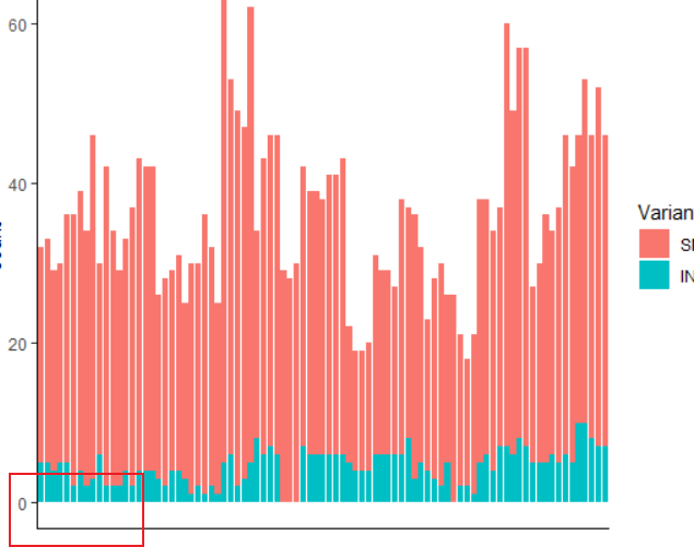
在画图的时候,ggplot 会非常贴心的给我们留出一块空白,可是,这样直接来看还是挺丑的:
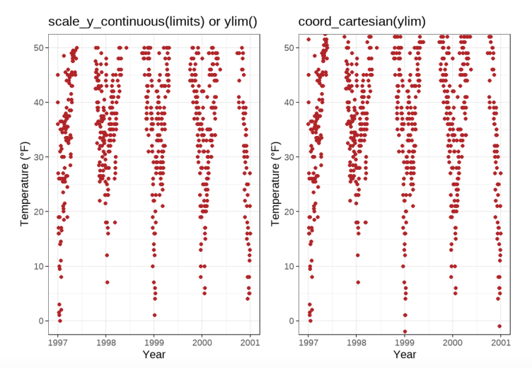
在ggplot 中,有两种对坐标轴限制的定义。
第一种情况就是限制数据的范围:
scale_y_continuous(limits = c(0, 50))# 限制数据范围,超出范围数据不显示coord_cartesian(ylim = c(0, 50))# 直接限制图的坐标
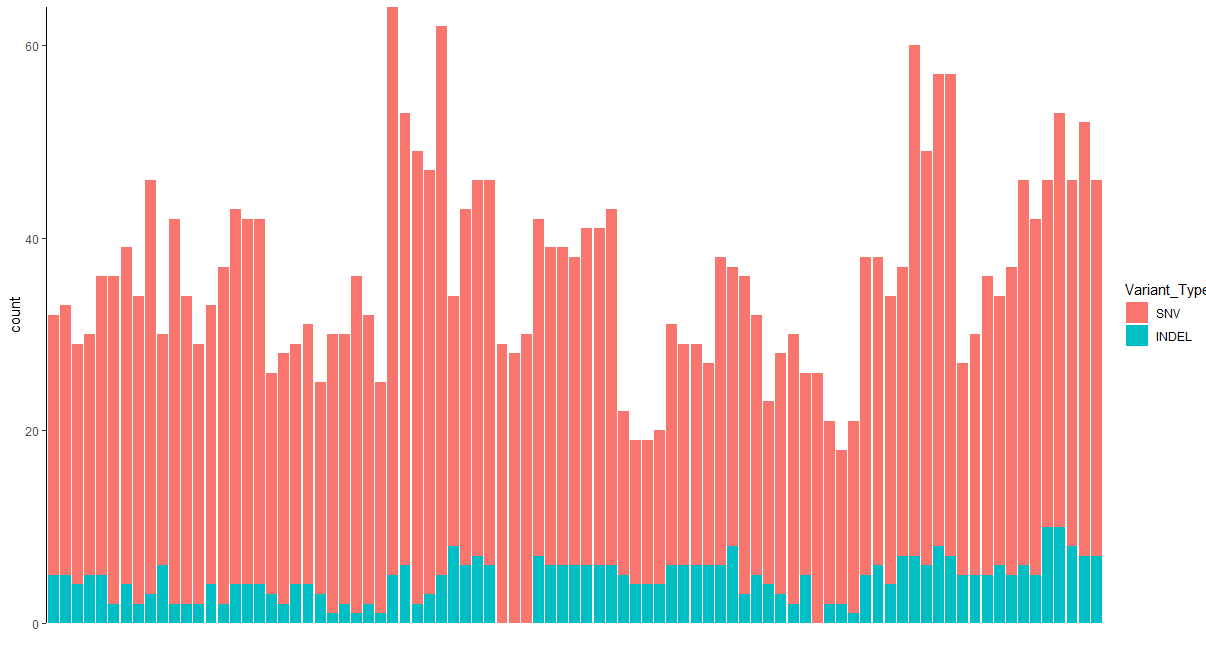
而第二种情况,则是scale_y_continuous(expand=c(0,0):
ggplot(snv_df) + theme_classic() +geom_bar(aes(Tumor_Sample_Barcode, fill = Variant_Type)) +theme(panel.grid = element_blank(),axis.text.x = element_blank(),axis.ticks.x = element_blank(),axis.line.x = element_blank()) +labs(x = "") + scale_y_continuous(expand=c(0,0))
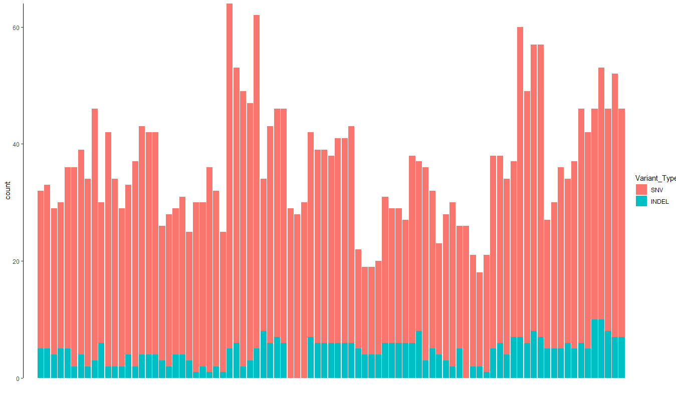
这里我已经去掉了x 轴的坐标系,现在如果能增大y 坐标轴与数据的距离就更好看了:
(p1 <- ggplot(snv_df) + theme_classic() +geom_bar(aes(Tumor_Sample_Barcode, fill = Variant_Type)) +theme(panel.grid = element_blank(),axis.text.x = element_blank(),axis.ticks.x = element_blank(),axis.line.x = element_blank()) +labs(x = "") + scale_y_continuous(expand=c(0,0)) +scale_x_discrete(expand = expansion(mult = c(0.03,0))))
说起来很神奇,我也并不清楚这个scale_x_discrete(expand = expansion(mult = c(0.03,0)) 的谜之操作到底做了什么,总是,修改成功了。

若有收获,就点个赞吧
0 人点赞
