开始前
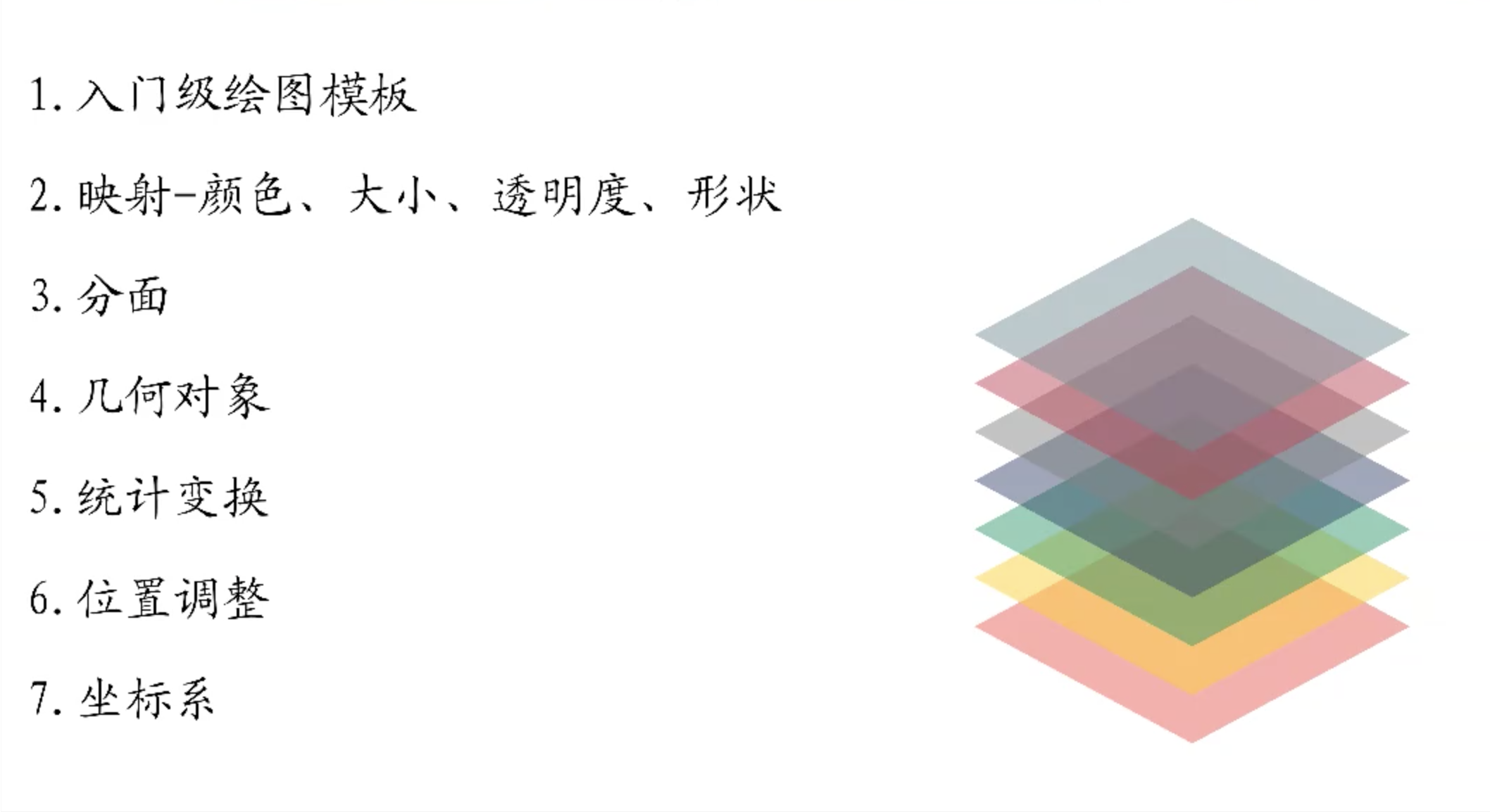
主要为ggplot2 中的后四个部分的内容。
geometries 几何对象
不同的几何对象
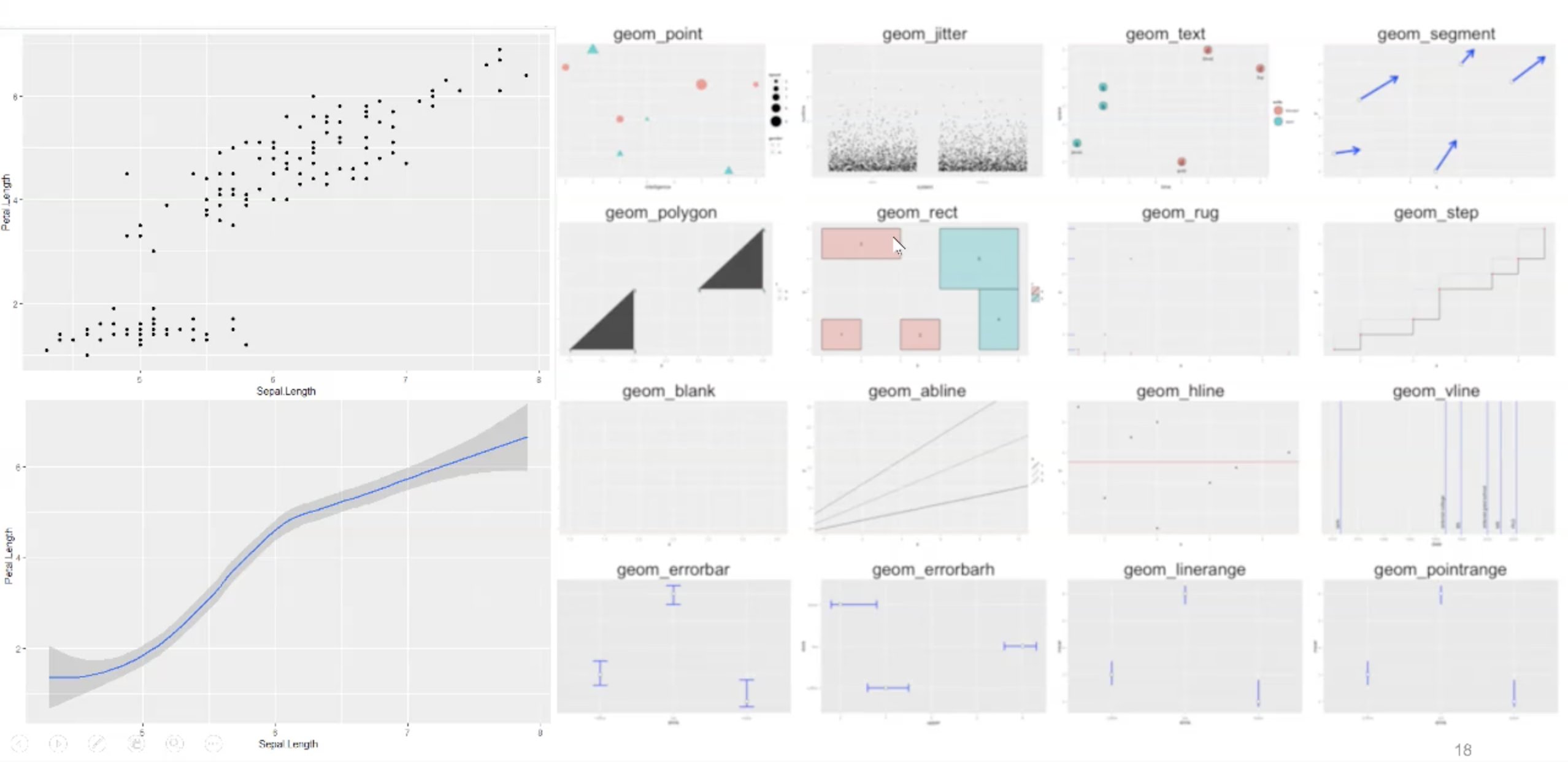
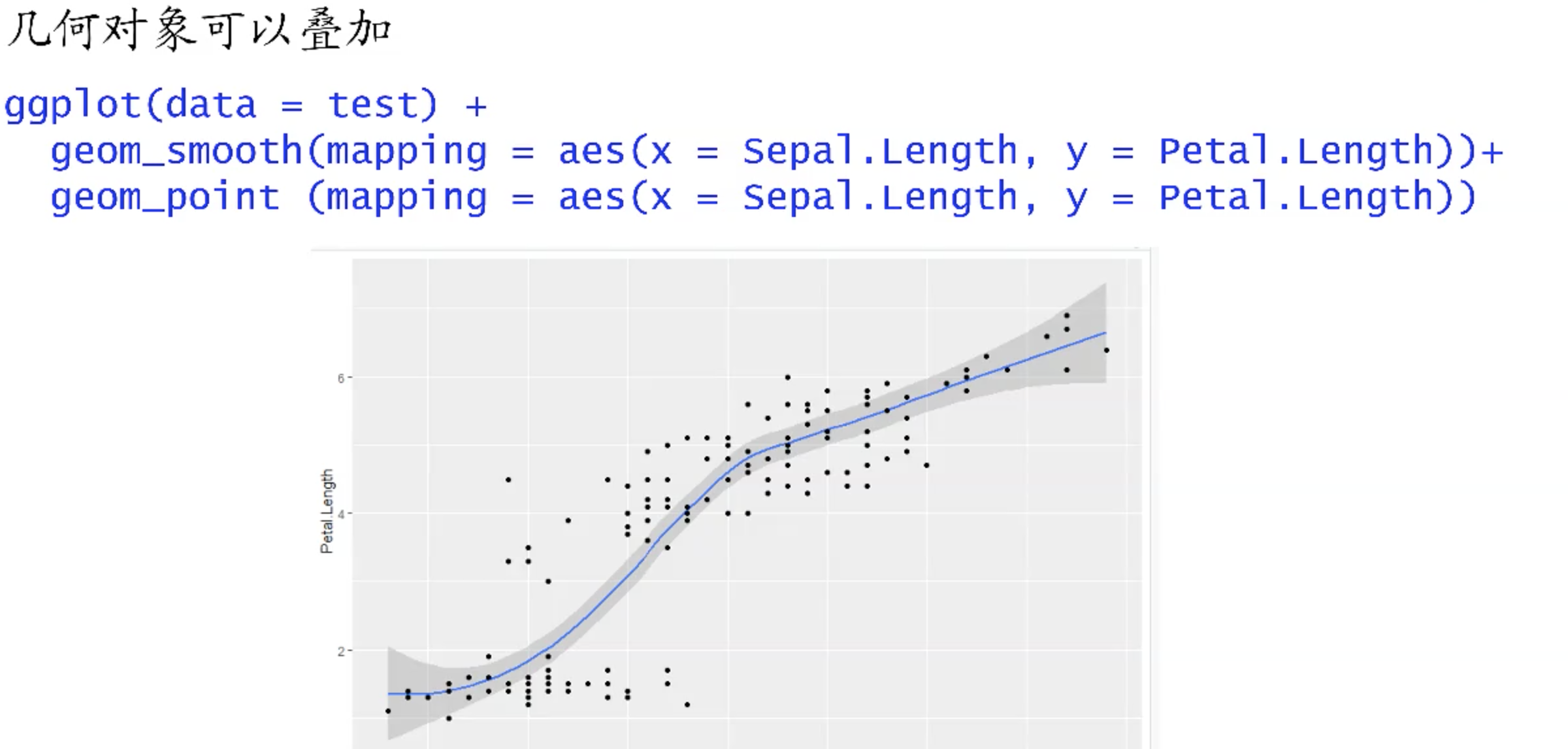
几何对象的叠加
几何对象的本质,也就是画面上的不同图层。当我们通过 ggplot(data=example) 后,便相当于设定了默认的ggplot2 设定的背景图层,接着依靠 +geom_point() , +geom_bar() 等等,便可以实现图层的添加。
也正因其代表不同的图层,因此也可以利用新的图层对旧的图层进行叠加(或覆盖)。
先后顺序
但也正和图层的叠加一样,R中ggplot 的叠加也有先后顺序,后来的图层会覆盖在原来的图层上。
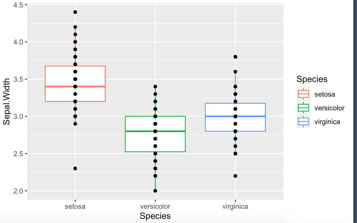
library(ggplot2)test = irisggplot(data=test,aes(x=Species,y=Sepal.Width))+geom_point()+geom_boxplot(aes(color=Species))
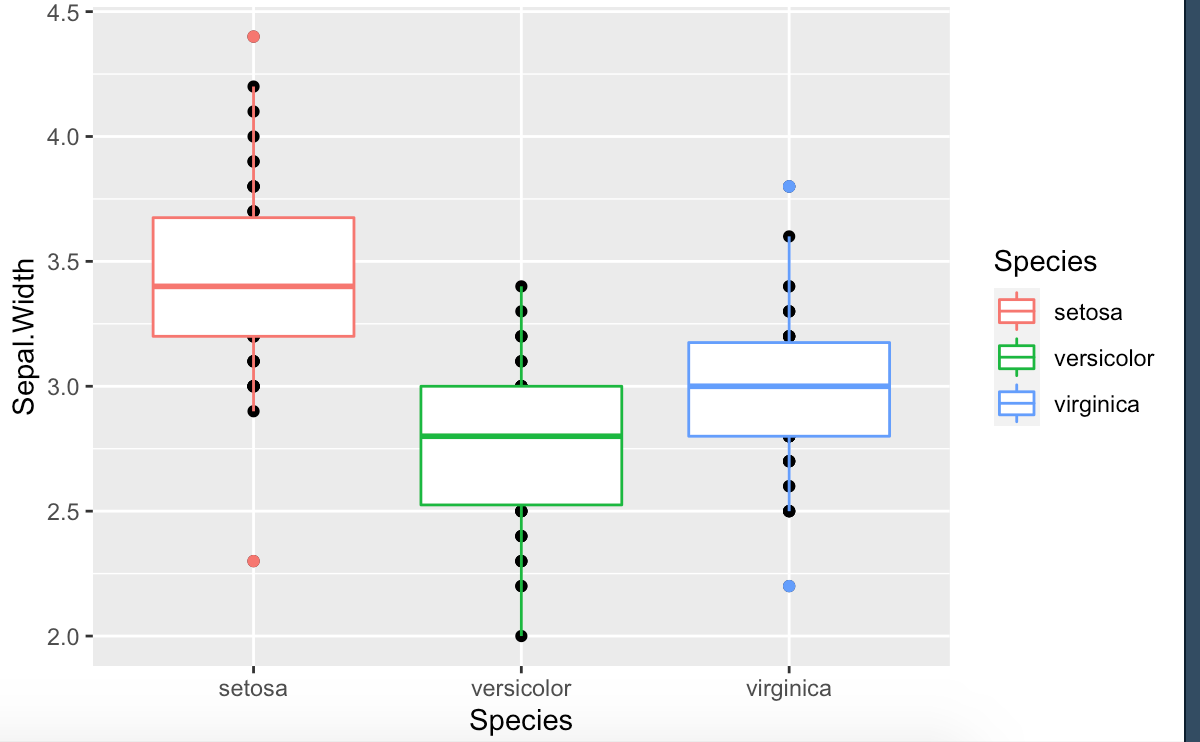
library(ggplot2)

test = iris

ggplot(data=test,aes(x=Species,y=Sepal.Width))+
  geom_boxplot(aes(color=Species))+
  geom_point()
全局与局部映射
我们可以设定整个图像中图层的参数,依靠设置 ggplot ,也可以对不同的图层进行局部设定 geom_xxx() ,这样也就实现了局部和全局的映射设置。
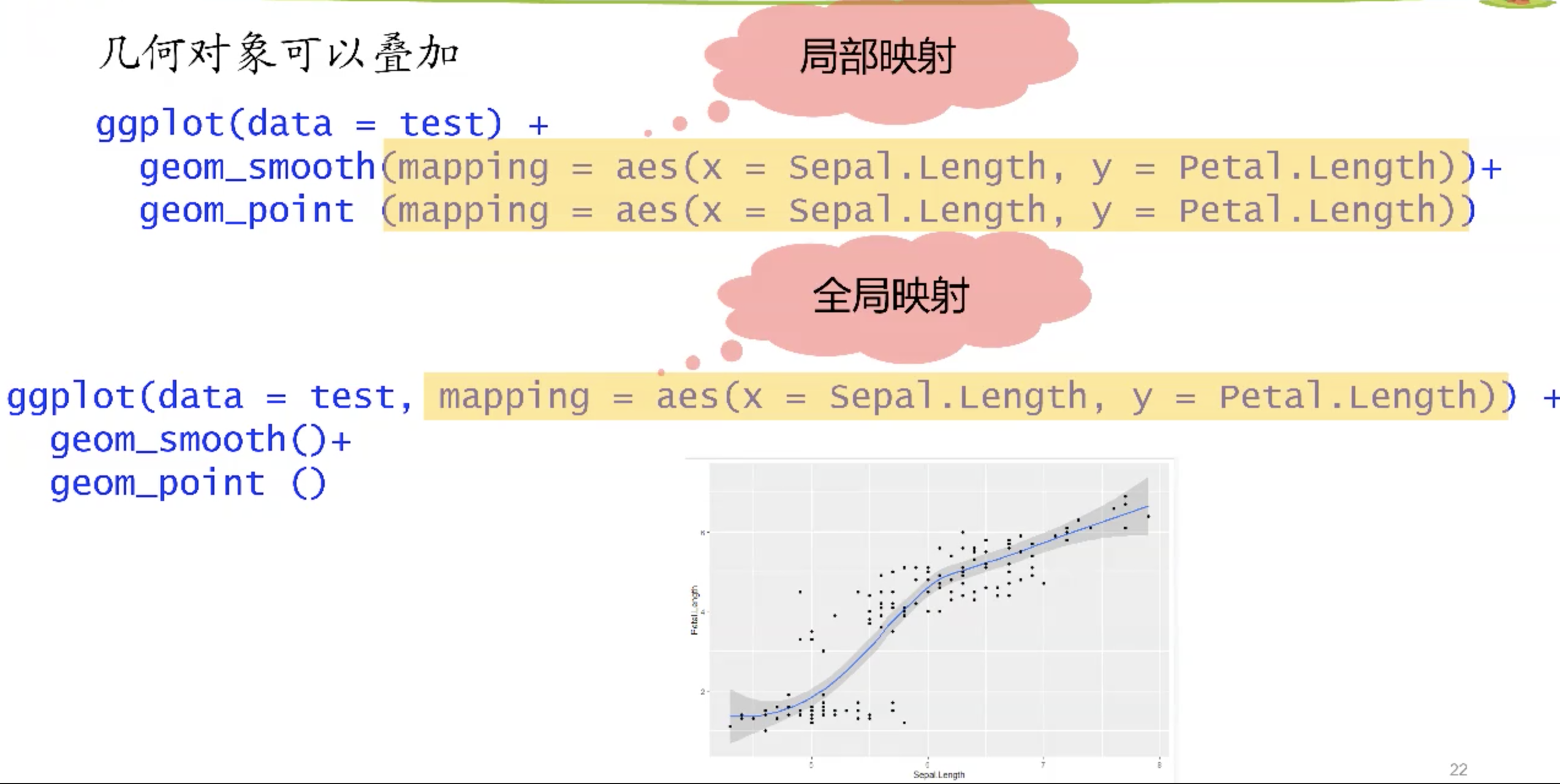
映射冲突
如果全局映射与局部映射发生冲突,则以局部映射为准。
library(ggplot2)

test = iris

ggplot(data=test,aes(x=Species,y=Sepal.Width,color=Species))+
  geom_boxplot()+
  geom_point(color='black')
statistics 统计变换
对应几何图形
几何图形函数一般都会对应一个统计变换函数的图形。
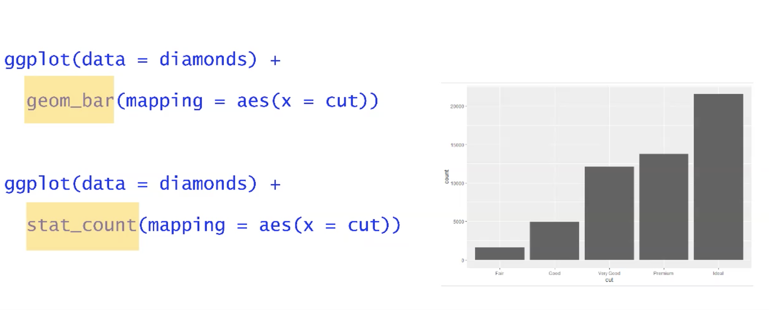
因此某种程度来说,统计变换对应的函数和几何对象对应的函数差别不大。
geom_bar 相当于默认的帮助我们以cut 列作为统计对象,对diamonds 表格进行频数计算。
对此我们可以使用 table 并转换为 dataframe 自行实现。
freq = as.data.frame(table(diamonds$cut))
freq
       Var1  Freq
1      Fair  1610
2      Good  4906
3 Very Good 12082
4   Premium 13791
5     Ideal 21551

ggplot(data = freq) +
  geom_bar(mapping = aes(x = Var1, y = Freq), stat = "identity")
相关参数
stat
当需要对直方图自定义x,y 时,需要设定参数 stat ,其默认参数为 count (也正因此geom_bar 对应stat_count),它会计算出选择的对象在出现的频数作为y。因此若我们希望自定义y,需要将其改为 identity 。否则会报错。
> ggplot(data = fre) +
+   geom_bar(mapping = aes(x = Var1, y = Freq))
Error: stat_count() can only have an x or y aesthetic.
Run `rlang::last_error()` to see where the error occurred.
..prop..
若希望显示出的不是频数,而是频率,则可以通过为y 赋值,将直方图计算出的统计结果重新映射给比例 ..prop.. 。
ggplot(data = diamonds) +
  geom_bar(mapping = aes(x = cut, y = ..prop.., group = 1))
position 位置调整
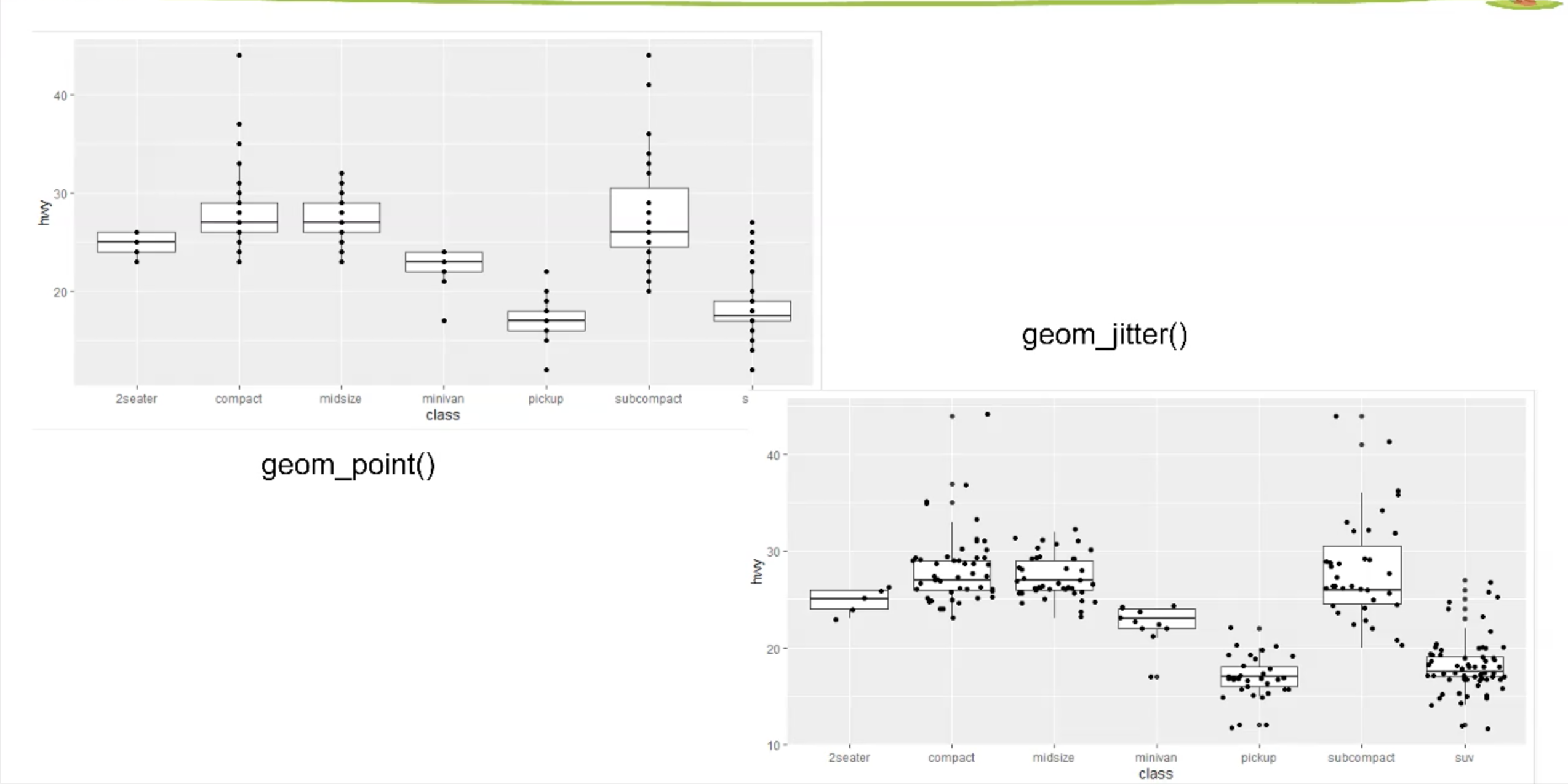
一般的位置调整问题存在于散点图或直方图中,指的是变量经过ggplot 转换而成的图形所进行的位置调整。
散点图
jitter
通过为本来重叠在同一位置的点添加随机的“抖动”,使重叠的点产生错位,也因此能够完全地显示在图像里。
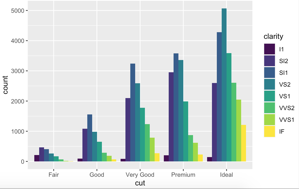
柱状图
dodge
可以让组中的直方图并列显示。(适合组间或组内参数的比较)
ggplot(data = diamonds) +
  geom_bar(mapping = aes(x = cut, fill = clarity), position = "dodge")
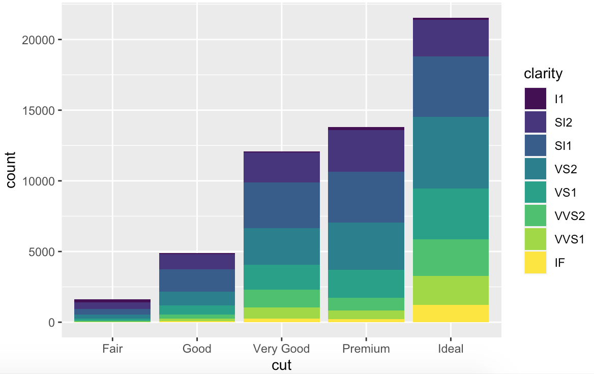
stack
默认的直方图其位置参数即为 stack 。图形堆叠在一起。(适合整体的比较)
ggplot(data = diamonds) +
  geom_bar(mapping = aes(x = cut,fill=clarity))
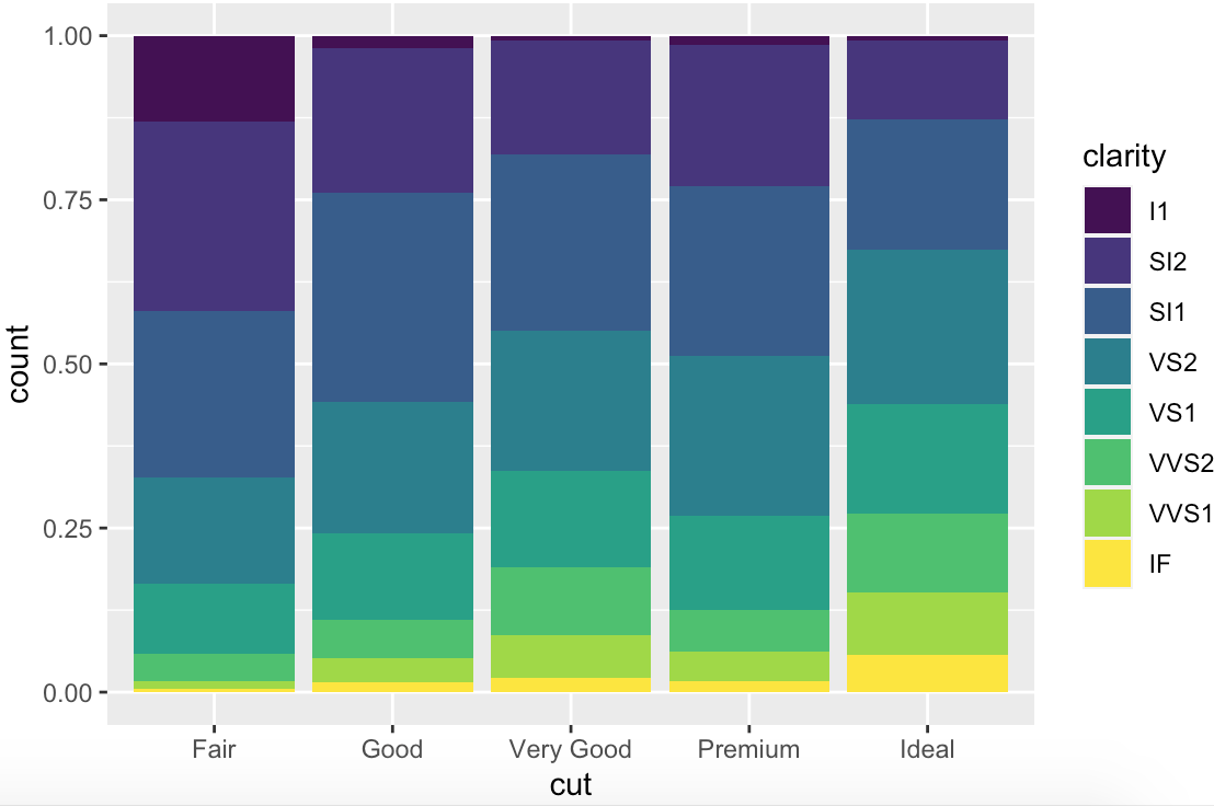
fill
与 stack 类似,只不过显示的是各部分占其整体的比重。(无法比较各组之间大小差异)
ggplot(data = diamonds, aes(cut, fill = clarity)) +
  geom_bar(position = 'fill')
coordinate 坐标系
翻转坐标系
ggplot(data = mpg, mapping = aes(x = class, y = hwy)) +
  geom_boxplot() +
  coord_flip()
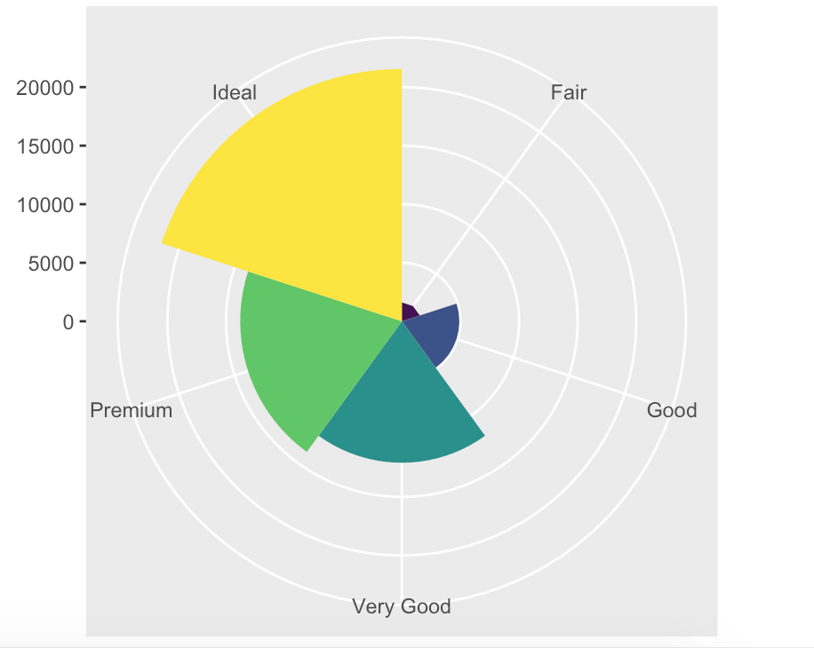
极坐标系
bar <- ggplot(data = diamonds) +
  geom_bar(
    mapping = aes(x = cut, fill = cut),
    show.legend = FALSE,
    width = 1
  ) +
  theme(aspect.ratio = 1) +
  labs(x = NULL, y = NULL)
bar + coord_flip()
bar + coord_polar()
theme 主题
通过theme 可以改变绘图图形本来的一些样式,属于非常细节的部分。通常来说,theme 可以定义一些非数据的绘图元素,包括:
Axis label aesthetics
Plot background
Facet label backround
Legend appearance
我们可以使用ggplot 内建的theme。
theme_gray() 默认主题,灰色。
theme_bw() 非常适合显示透明度的映射内容。
theme_void() 去除非数据外的全部内容。
theme_classic() # 经典ggplot 主题,白板背景。
ggplot(data = mpg, mapping = aes(x = class, y = hwy)) +
  geom_boxplot() +
  theme_void()
我们还可以直接定义theme 中的参数,如通过rel函数将字体大小提升到1.5倍:
ggplot(new_metadata) +
  geom_point(aes(x = age_in_days, y= samplemeans, color = genotype,
              shape=celltype), size=3.0) +
  theme_bw() +
  theme(axis.title = element_text(size=rel(1.5)))
labs
labs 可以对ggplot2 绘图中的标签进行修改。
library(ggplot2)
p <- ggplot(mtcars, aes(mpg, wt, colour = cyl)) + geom_point()
p + labs(colour = "Cylinders") # 图例标签修改
p + labs(x = "New x label") # x轴标签
p + labs(title = "New plot title", subtitle = "A subtitle", tag="A") # 标题与子标题,以及右上方子图标记
p + labs(caption = "(based on data from ...)") # 右下方的说明标签
p + labs(title = NULL) # 移除先前的标签,直接赋值为NULL 即可。
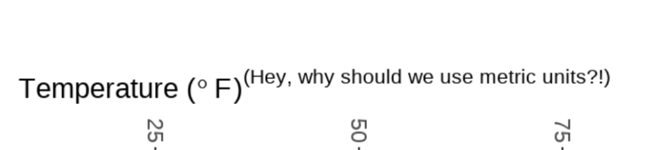
在使用labs 属性定义图像时,还可以使用expression 语句,生成绘图中的希腊字母、特殊符号或公式,但该包的语法比较奇怪,比如:
expression(paste("Temperature (", degree ~ F, ")"^"(Hey, why should we use metric units?!)")))
expression(paste(bold("log"["2"])*italic(sigma)," + ",bold("log"["2"])*bolditalic(alpha)))

自定义主题
如果我们想保留某类主题作为模版,这样就不用在绘制新图时反复调用它了:
personal_theme <- function(){
  theme_bw() +
    theme(axis.title=element_text(size=rel(1.5)),
          plot.title=element_text(size=rel(1.5), hjust=0.5))
}
另外,如果希望主题在全局生效,可以直接使用函数:
theme_set(theme_bw())
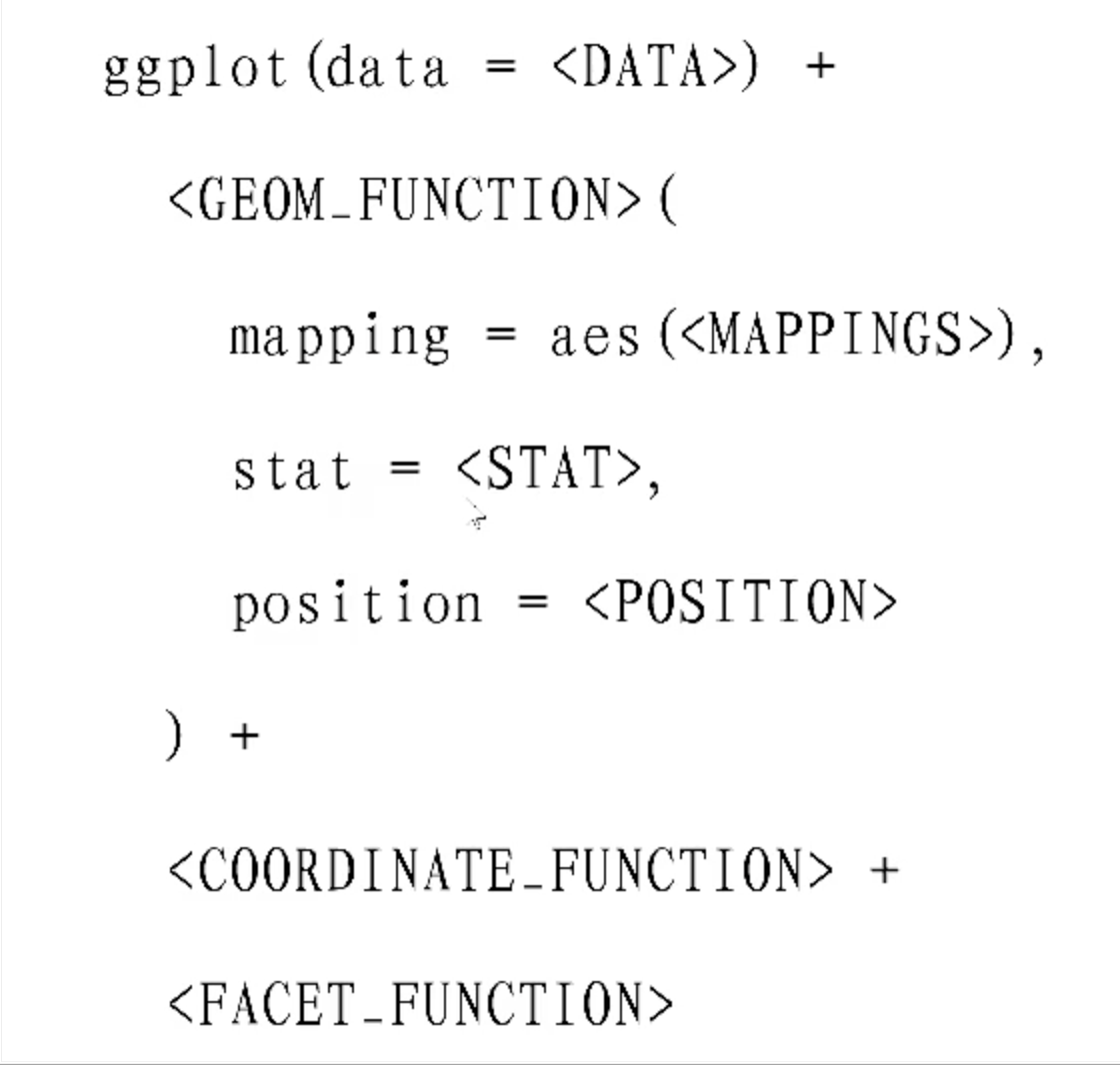
完整绘图模版
易错点
- 局部映射与全局映射冲突时,以局部映射为准。
- 图层存在先后顺序,后来的图层越靠近顶层。
- ggplot2 无法借助循环直接批量将绘图映射在同一层面上,可以借助列表先存储这些绘图,再使用拼图函数将它们拼接在同一画面上。
练习题
6-2
#练习6-2
# 1.尝试写出下图的代码
# 数据是iris
# X轴是Species
# y轴是Sepal.Width
# 图是箱线图
library(ggplot2)
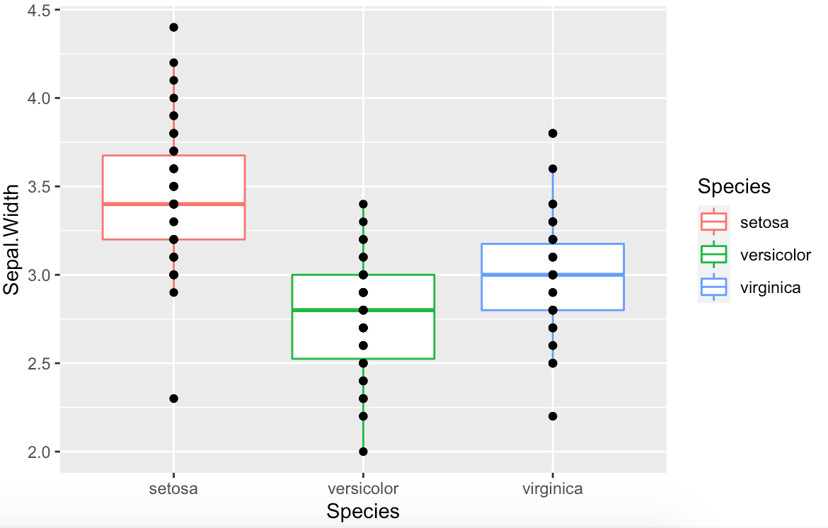
test = iris
ggplot(data=test,aes(x=Species,y=Sepal.Width))+
geom_boxplot(aes(color=Species))+
geom_point()
# 2. 尝试在此图上叠加点图,
# 能发现什么问题?
点图覆盖在箱线图上。后设定的图层在更靠近顶层的位置。
# 3.用下列代码作图,观察结果
ggplot(test,aes(x = Sepal.Length,y = Petal.Length,color = Species)) +
geom_point()+
geom_smooth(color = "black")
# 请问,当局部映射和全局映射冲突,以谁为准?
局部为准
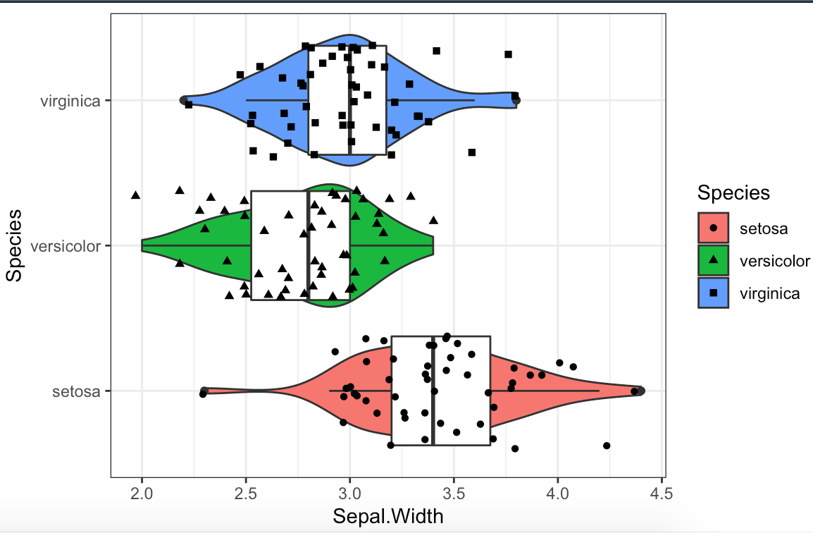
6-3
if(!require(ggplot))install.packages("ggplot")
library(ggplot2)

test <- iris
ggplot(data=test,
       aes(x=Sepal.Width, y=Species)) +
  geom_violin(aes(fill=Species)) +
  geom_boxplot(aes(group=Species)) +
  geom_jitter(aes(shape=Species)) +
  theme_bw()

若有收获,就点个赞吧
0 人点赞
