项目地址:https://github.com/jrnold/ggthemes
这个包用起来非常简单,就像ggplot theme 中自带的主题一样。
简单使用
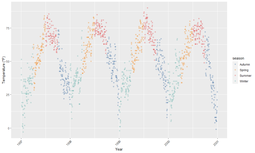
比如首先我们按照默认的主题方案画个:
ggplot(chic, aes(x = date, y = temp)) +geom_point(aes(color = season), alpha = .3) +scale_color_tableau() +theme(axis.text.x = element_text(angle = 45, vjust = 1, hjust = 1)) +labs(x = "Year", y = "Temperature (°F)")
这时候我们可以加载themes 中提供的主题:
p <- ggplot(chic, aes(x = date, y = temp)) +geom_point(aes(color = season), alpha = .3) +scale_color_tableau() +theme(axis.text.x = element_text(angle = 45, vjust = 1, hjust = 1)) +labs(x = "Year", y = "Temperature (°F)")p + theme_economist()
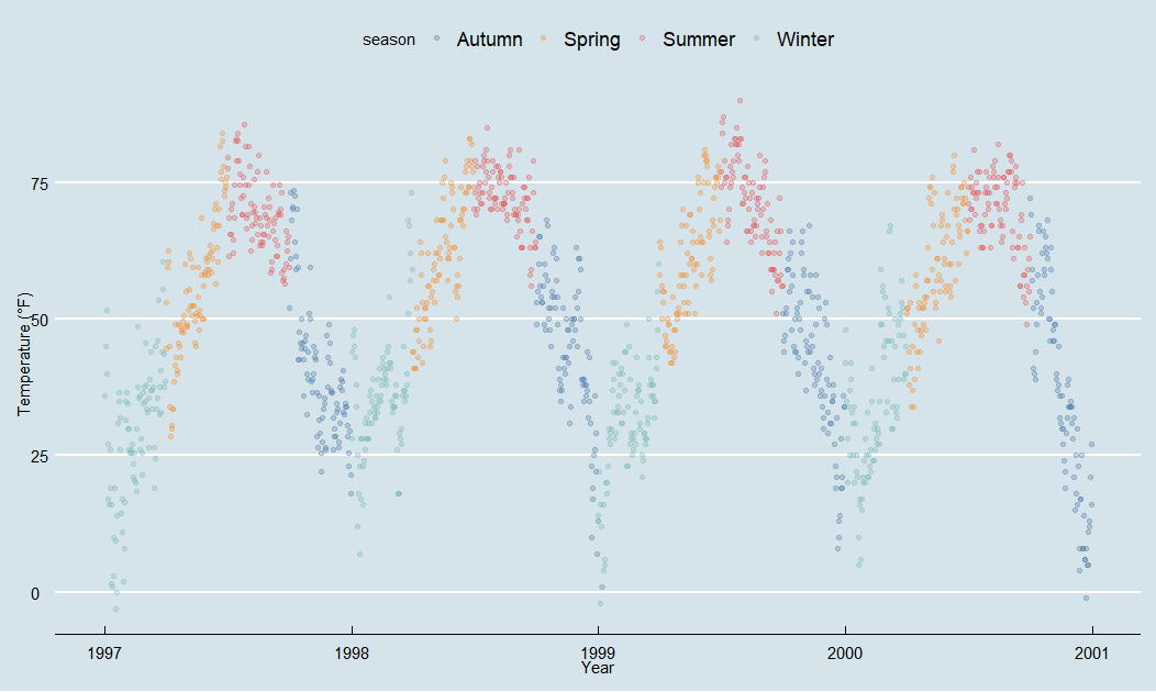
直接就加上经济学人的风格啦~
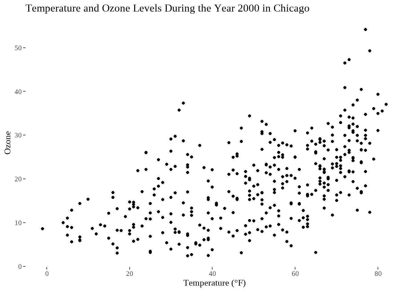
还有一个比较出名的水墨风,Tufte’s plot:
library(dplyr)chic_2000 <- filter(chic, year == 2000)ggplot(chic_2000, aes(x = temp, y = o3)) +geom_point() +labs(x = "Temperature (°F)", y = "Ozone") +ggtitle("Temperature and Ozone Levels During the Year 2000 in Chicago") +theme_tufte()
各种主题如下:
主题名 描述theme_base 类似于 ggplot 默认设置theme_calc 类似 LibreOffice Calc 图表theme_economist 类似经济类图表theme_economist_white 类似经济类图表theme_excel 类似经典excel图表theme_few 简洁型theme_fivethirtyeight 类似于 http://fivethirtyeight.com的图theme_foundation 这个主题的设计是为了基础建立新的主题,而不是直接使用。theme_foundation是一个完整的主题,只有最小的元素定义。它相比于theme_gray或theme_bw更容易通过扩展创建新的主题,因为那些主题和有着较深层次的主题定义。theme_gdocs 类似默认的 Google Docs Charttheme_hc Highcharts JStheme_igary 主题与白色面板和灰色背景。theme_map 一个简洁的地图主题theme_pander pander的默认主题theme_solarized 可以看 http://ethanschoonover.com/solarized 的介绍theme_solarized_2 同上theme_solid 主题删除所有non-geom元素(线条、文本等),这个主题只有所需的几何对象。theme_stata 基于 Stata graph schemes的主题theme_tufte 基于数据墨水最大化和图形设计的Edward Tufte 定量信息的视觉显示。没有边界,没有轴线,没有网格。这个主题与geom_rug或geom_rangeframe结合效果最好。theme_wsj Wall Street Journal theme————————————————版权声明:本文为CSDN博主「炫炫有牛腩」的原创文章,遵循CC 4.0 BY-SA版权协议,转载请附上原文出处链接及本声明。原文链接:https://blog.csdn.net/qq_27755195/article/details/52105087
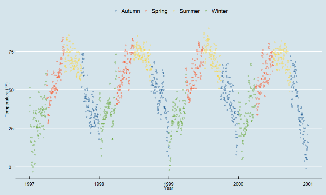
给图例也配上颜色
这个theme 是只能修改主题,可以使用scalefill/color* 形式,修改图例颜色:
p + theme_economist() + scale_color_calc(name = NULL)

若有收获,就点个赞吧
0 人点赞
