第一章:空间转换
1.1 概念
- 空间:是从坐标轴角度定义的。
x、y和z三条坐标轴构成了一个立体空间,z 轴位置和视线方向相同。 - 空间转换也叫
3D 转换。 - 空间转换属性:
transform。

1.2 空间位移
- 语法:
transform: translate3d(x, y, z);
transform: translateX(值);
transform: translateY(值)
transform: translateZ(值);
取值(正负均可):
- 像素单位数值。
- 百分比。
示例:
<!DOCTYPE html>
<html lang="en">
<head>
    <meta charset="UTF-8">
    <meta content="IE=edge" http-equiv="X-UA-Compatible">
    <meta content="width=device-width, initial-scale=1.0" name="viewport">
    <title>Title</title>
    <style>
        .box {
            width: 200px;
            height: 200px;
            background-color: pink;
            margin: 100px auto;
            transition: all 0.5s;
        }

        .box:hover {
            /*transform: translate3d(50px, 100px, 200px);*/

            /*transform: translateX(50px);*/

            /*transform: translateY(100px);*/

            transform: translateZ(200px);
        }
    </style>
</head>
<body>
    <div class="box"></div>
</body>
</html>
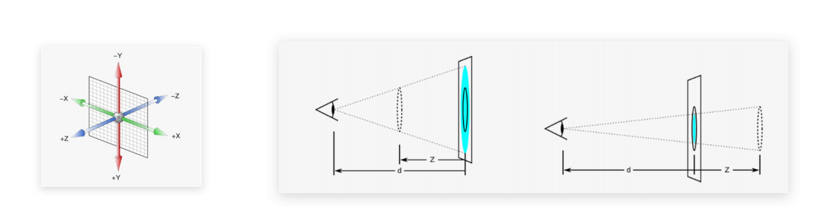
1.3 透视
- 在生活中,同一个物体,观察距离不同,在视觉上会形成
近大远小、近清楚远模糊的效果。 - 默认情况下,是无法观察到 Z 轴位移的效果,因为 Z 轴是视线方向,移动效果应该是距离的远或近,但是电脑屏幕是平面的,默认是无法观察远近效果。
- 可以使用
perspective属性实现透视效果。 - 语法:
perspective: 值;
注意:需要给父级添加此属性。
- 取值:像素单位数值,一般为 800 - 1200 。
- 作用:空间转换时,为元素添加
近大远小、近实远虚的视觉效果。 - 透视距离也称为视距,所谓的视距就是人的眼睛到屏幕的距离。
- 示例:
<!DOCTYPE html>
<html lang="en">
<head>
    <meta charset="UTF-8">
    <meta content="IE=edge" http-equiv="X-UA-Compatible">
    <meta content="width=device-width, initial-scale=1.0" name="viewport">
    <title>Title</title>
    <style>
        body {
            perspective: 800px;
        }

        .box {
            width: 200px;
            height: 200px;
            background-color: pink;
            margin: 100px auto;
            transition: all 0.5s;
        }

        .box:hover {
            /*transform: translate3d(50px, 100px, 200px);*/

            /*transform: translateX(50px);*/

            /*transform: translateY(100px);*/

            transform: translateZ(200px);
        }
    </style>
</head>
<body>
    <div class="box"></div>
</body>
</html>
1.4 空间旋转
- 语法:
transform: rotateZ(值);
transform: rotateX(值)
transform: rotateY(值)
- 示例:
<!DOCTYPE html>
<html lang="en">
<head>
    <meta charset="UTF-8">
    <meta content="IE=edge" http-equiv="X-UA-Compatible">
    <meta content="width=device-width, initial-scale=1.0" name="viewport">
    <title>Title</title>
    <style>
        .box {
            width: 300px;
            margin: 100px auto;
        }

        img {
            width: 300px;
            transition: all 2s;
        }

        .box {
            perspective: 1000px;
        }

        .box img:hover {
            /*transform: rotateZ(360deg);*/
            /*transform: rotateY(360deg);*/
            transform: rotateX(360deg);
        }

    </style>
</head>
<body>
    <div class="box">
        <img alt="" src="./images/hero.jpeg">
    </div>
</body>
</html>
1.5 立体呈现
实现方法:
- 添加
transform-style: preserve-3d ;。 - 使得子元素处于真正的 3d 空间。
- 默认值为 flat ,表明子元素处于 2d 平面内呈现。
- 添加
示例:
<!DOCTYPE html>
<html lang="en">
<head>
    <meta charset="UTF-8">
    <meta content="IE=edge" http-equiv="X-UA-Compatible">
    <meta content="width=device-width, initial-scale=1.0" name="viewport">
    <title>Title</title>
    <style>
        * {
            margin: 0;
            padding: 0;
        }

        .box {
            position: relative;
            width: 200px;
            height: 200px;
            margin: 200px auto;
            transition: all 2s;
            transform-style: preserve-3d;
        }

        .box div {
            position: absolute;
            left: 0;
            top: 0;

            width: 200px;
            height: 200px;
        }

        .front {
            transform: translateZ(200px);
            background-color: orange;
        }

        .back {
            background-color: green;
        }

        .box:hover {
            transform: rotateY(180deg);
        }
    </style>
</head>
<body>
    <div class="box">
        <div class="front">前面</div>
        <div class="back">后面</div>
    </div>
</body>
</html>
1.6 空间缩放
- 语法:
transform: scaleX(倍数);
transform: scaleY(倍数);
transform: scaleZ(倍数);
transform: scale3d(x, y, z);
- 示例:略。
第二章:动画
2.1 概念
- 过渡可以实现 2 个状态间的变化过程。
- 动画的本质是快速切换大量图片时在人脑中形成的具有连续性的画面,换言之,动画可以实现多个状态间的变化过程,并且动画过程可控(重复播放、最终画面、是否暂停)。
2.2 动画的实现步骤
- ① 定义动画:
@keyframes 动画名称 {
     from {}
     to{}
}
@keyframes 动画名称 {
    0% {}
    10% {}
    15% {}
    100% {}
}
- ② 使用动画:
animation: 动画名称 动画时长;
- 示例:
<!DOCTYPE html>
<html lang="en">
<head>
    <meta charset="UTF-8">
    <meta content="IE=edge" http-equiv="X-UA-Compatible">
    <meta content="width=device-width, initial-scale=1.0" name="viewport">
    <title>Title</title>
    <style>
        .box {
            width: 200px;
            height: 100px;
            background-color: pink;

            /* 使用动画 */
            animation: change 1s;
        }

        /* 定义动画:宽度从 200 变大到 600 */
        @keyframes change {
            from {
                width: 200px;
            }
            to {
                width: 600px;
            }
        }

    </style>
</head>
<body>
    <div class="box"></div>
</body>
</html>
- 示例:
<!DOCTYPE html>
<html lang="en">
<head>
    <meta charset="UTF-8">
    <meta content="IE=edge" http-equiv="X-UA-Compatible">
    <meta content="width=device-width, initial-scale=1.0" name="viewport">
    <title>Title</title>
    <style>
        .box {
            width: 200px;
            height: 100px;
            background-color: pink;

            /* 使用动画 */
            animation: change 1s;
        }

        /* 定义动画:宽度为 200 到 500*300 到 800*500 */
        @keyframes change {
            0% {
                width: 200px;
            }
            10% {
                width: 500px;
                height: 300px;
            }
            100% {
                width: 800px;
                height: 500px;
            }
        }
    </style>
</head>
<body>
    <div class="box"></div>
</body>
</html>
2.3 动画属性
- 语法:
animation: 动画名称 动画时长 速度曲线 延迟时间 重复次数 动画方向 执行完毕时状态;
- 示例:
<!DOCTYPE html>
<html lang="en">
<head>
    <meta charset="UTF-8">
    <meta content="IE=edge" http-equiv="X-UA-Compatible">
    <meta content="width=device-width, initial-scale=1.0" name="viewport">
    <title>Title</title>
    <style>
        .box {
            width: 200px;
            height: 100px;
            background-color: pink;

            /* 使用动画 */
            /*animation: change 1s linear;*/
            /* steps 是分步动画 */
            /*animation: change 1s steps(3) 1s;*/
            /* 无限循环 */
            /*animation: change 1s steps(3) infinite;*/
            /* 动画方向 */
            /*animation: change 1s steps(3) 1s infinite alternate;*/
            /* 执行完毕状态 */
            animation: change 1s steps(3) 1s forwards;
        }

        /* 定义动画:宽度从 200 变大到 600 */
        @keyframes change {
            from {
                width: 200px;
            }
            to {
                width: 600px;
            }
        }

    </style>
</head>
<body>
    <div class="box"></div>
</body>
</html>

若有收获,就点个赞吧
0 人点赞
