第一章:平面转换
1.1 平面转换概念
- 平面转换:
- 改变盒子在平面内的形态(位移、旋转、缩放)。
- 实现 2D 转换。
- 平面转换属性:
transform。
1.2 位移
- 语法:
transform: translate(水平移动距离 垂直移动距离);
- 取值(正负均可):
- 像素单位数值。
- 百分比(参照物为盒子自身尺寸)。
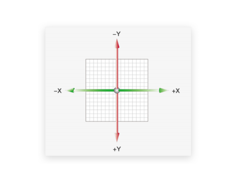
注意:x 轴正向为右,y 轴正向为下。
技巧:
translate()如果只给出一个值,表示x轴方向移动距离。- 可以单独设置某个方向移动距离,如:
translateX()或translateY()。
示例:
<!DOCTYPE html>
<html lang="en">
<head>
    <meta charset="UTF-8">
    <meta content="IE=edge" http-equiv="X-UA-Compatible">
    <meta content="width=device-width, initial-scale=1.0" name="viewport">
    <title>Title</title>
    <style>
        .father {
            width: 500px;
            height: 300px;
            margin: 100px auto;
            border: 1px solid #000;
        }

        .son {
            width: 200px;
            height: 100px;
            background-color: pink;
            transition: all 0.5s;
        }

        /* 当鼠标移入到父盒子,son 改变位置 */
        .father:hover .son {
            /*transform: translate(100px, 50px);*/

            /* 百分比是相对于盒子自身的尺寸 */
            /*transform: translate(100%, 50%);*/

            /*transform: translate(100px);*/

            transform: translateY(100px);
        }
    </style>
</head>
<body>
    <div class="father">
        <div class="son"></div>
    </div>
</body>
</html>
1.3 位移实现绝对定位居中
- 可以使用 translate 快速实现绝对定位的元素盒子居中效果。
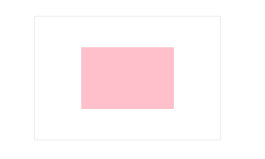
- 示例:
<!DOCTYPE html>
<html lang="en">
<head>
    <meta charset="UTF-8">
    <meta content="IE=edge" http-equiv="X-UA-Compatible">
    <meta content="width=device-width, initial-scale=1.0" name="viewport">
    <title>Title</title>
    <style>
        .father {
            /* 设置父盒子相对定位 */
            position: relative;
            width: 600px;
            height: 400px;
            border: 1px solid #ccc;
            margin: 100px auto;
        }

        .son {
            /* 设置子盒子定位定位 */
            position: absolute;
            left: 50%;
            top: 50%;
            /*margin-left: -150px;*/
            /*margin-top: -100px;*/
            /* 位移取值为百分比数值,参照盒子自身尺寸计算移动距离 */
            transform: translate(-50%, -50%);

            width: 300px;
            height: 200px;
            background-color: pink;
        }
    </style>
</head>
<body>
    <div class="father">
        <div class="son"></div>
    </div>
</body>
</html>
1.4 旋转
- 语法:
transform: rotate(角度);
注意:角度单位是
deg。
取值(正负均可):
- 取值为
正, 则顺时针旋转。 - 取值为
负, 则逆时针旋转。
- 取值为
示例:
<!DOCTYPE html>
<html lang="en">
<head>
    <meta charset="UTF-8">
    <meta content="IE=edge" http-equiv="X-UA-Compatible">
    <meta content="width=device-width, initial-scale=1.0" name="viewport">
    <title>Title</title>
    <style>
        img {
            width: 250px;
            transition: all 1s;
        }

        img:hover {
            /* 取值为正,顺时针旋转 */
            /*transform: rotate(360deg);*/

            /* 取值为负,逆时针旋转 */
            transform: rotate(-360deg);
        }
    </style>
</head>
<body>
    <img alt="" src="./images/rotate.png">
</body>
</html>
1.5 旋转转换原点
- 语法:
transform-origin: 原点水平位置 原点垂直位置;
注意:默认旋转的圆点是盒子中心点。
取值:
方位名词(left、top、right、bottom、center)。- 像素单位数值。
- 百分比(参照盒子自身尺寸计算)。
示例:
<!DOCTYPE html>
<html lang="en">
<head>
    <meta charset="UTF-8">
    <meta content="IE=edge" http-equiv="X-UA-Compatible">
    <meta content="width=device-width, initial-scale=1.0" name="viewport">
    <title>Title</title>
    <style>
        img {
            width: 250px;
            border: 1px solid #000;
            transition: all 1s;
            /*transform-origin: right bottom;*/
            transform-origin: left bottom;
        }

        img:hover {
            transform: rotate(360deg);
        }
    </style>
</head>
<body>
    <img alt="" src="./images/rotate.png">
</body>
</html>
1.6 多重转换
- 语法:
transform: translate() rotate();
注意:
- 旋转会改变网页元素的坐标轴向。
- 先写旋转,则后面的转换效果的轴向以旋转后的轴向为准,会影响转换结果。
- 示例:
<!DOCTYPE html>
<html lang="en">
<head>
    <meta charset="UTF-8">
    <meta content="IE=edge" http-equiv="X-UA-Compatible">
    <meta content="width=device-width, initial-scale=1.0" name="viewport">
    <title>Title</title>
    <style>
        .box {
            width: 800px;
            height: 200px;
            border: 1px solid #000;
        }

        img {
            width: 200px;
            transition: all 4s;
        }

        .box:hover img {
            /* 边走边转 */
            transform: translateX(600px) rotate(360deg);
        }
    </style>
</head>
<body>
    <div class="box">
        <img alt="" src="./images/tyre1.png">
    </div>
</body>
</html>
1.7 缩放
- 语法:
transform: scale(x轴缩放倍数,y轴缩放倍数);
- 一般情况下,只需要为 scale 设置一个值即可,表示 x 轴和 y 轴等比例缩放。
scale 值大于 1 表示放大,scale 值小于 1 表示缩小。
示例:
<!DOCTYPE html>
<html lang="en">
<head>
    <meta charset="UTF-8">
    <meta content="IE=edge" http-equiv="X-UA-Compatible">
    <meta content="width=device-width, initial-scale=1.0" name="viewport">
    <title>Title</title>
    <style>
        .box {
            position: relative;
            width: 300px;
            height: 210px;
            margin: 100px auto;
            background-color: pink;
            overflow: hidden;
        }

        .box img {
            width: 100%;
            transition: all 0.5s;
        }

        /*添加遮罩层*/
        .box:hover::after {
            position: absolute;
            left: 0;
            top: 0;
            display: block;
            content: '';
            width: 100%;
            height: 100%;
            background-color: rgba(0, 0, 0, 0.5);
        }

        .box:hover img {
            transform: scale(1.1);
        }
    </style>
</head>
<body>
    <div class="box">
        <img alt="" src="./images/product.jpeg">
    </div>
</body>
</html>
第二章:渐变
- 渐变是多个颜色逐渐变化的视觉效果。
- 一般用于设置盒子的背景。
- 语法:
background-image: linear-gradient(颜色1, 颜色2);
- 示例:
<!DOCTYPE html>
<html lang="en">
<head>
    <meta charset="UTF-8">
    <meta content="IE=edge" http-equiv="X-UA-Compatible">
    <meta content="width=device-width, initial-scale=1.0" name="viewport">
    <title>Title</title>
    <style>
        .box {
            width: 100px;
            height: 100px;
            background-image: linear-gradient(transparent, rgba(0, 0, 0, .6));
        }
    </style>
</head>
<body>
    <div class="box"></div>
</body>
</html>

若有收获,就点个赞吧
0 人点赞
