Creative Button Styles
antd bnutton
https://code.juejin.cn/pen/7112314290681413662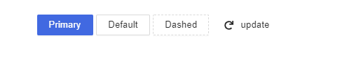
阴影按钮

.btn {color: inherit;cursor: pointer;display: inline-block;text-transform: uppercase;letter-spacing: 1px;font-weight: 700;position: relative;box-shadow: rgb(218, 150, 34) 0px 5px;font-size: 20px;height: 50px;width: 220px;line-height: 50px;-webkit-tap-highlight-color: transparent;border-width: initial;border-style: none;border-color: initial;border-image: initial;margin: 10px 30px;outline: 0px;background: rgb(252, 173, 38);border-radius: 7px;color: #fff;}<button class="btn">按钮</button>
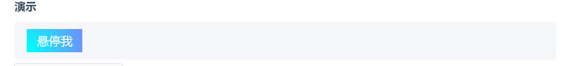
鼠标光标渐变跟踪
<button class="mouse-cursor-gradient-tracking"><span>Hover me</span></button>.mouse-cursor-gradient-tracking {position: relative;background: #7983ff;padding: 0.5rem 1rem;font-size: 1.2rem;border: none;color: white;cursor: pointer;outline: none;overflow: hidden;}.mouse-cursor-gradient-tracking span {position: relative;}.mouse-cursor-gradient-tracking::before {--size: 0;content: '';position: absolute;left: var(--x);top: var(--y);width: var(--size);height: var(--size);background: radial-gradient(circle closest-side, pink, transparent);transform: translate(-50%, -50%);transition: width 0.2s ease, height 0.2s ease;}.mouse-cursor-gradient-tracking:hover::before {--size: 200px;}var btn = document.querySelector('.mouse-cursor-gradient-tracking')btn.onmousemove = function(e) {var x = e.pageX - btn.offsetLeftvar y = e.pageY - btn.offsetTopbtn.style.setProperty('--x', x + 'px')btn.style.setProperty('--y', y + 'px')}
注意!
如果元素的父级具有定位上下文(position: relative ),您还需要减去它的偏移量。
var x = e.pageX - btn.offsetLeft - btn.offsetParent.offsetLeftvar y = e.pageY - btn.offsetTop - btn.offsetParent.offsetTop
气泡动画按钮
<!doctype html><html><head><meta charset="utf-8"><title>按钮点击气泡效果-jq22.com</title><script src="http://libs.baidu.com/jquery/1.11.3/jquery.min.js"></script><style>body {font-size:16px;font-family:'Helvetica','Arial',sans-serif;text-align:center;background-color:#f8faff;}.bubbly-button {font-family:'Helvetica','Arial',sans-serif;display:inline-block;font-size:1em;padding:1em 2em;margin-top:100px;margin-bottom:60px;-webkit-appearance:none;appearance:none;background-color:#ff3de8;color:#fff;border-radius:4px;border:none;cursor:pointer;position:relative;transition:transform ease-in 0.1s,box-shadow ease-in 0.25s;box-shadow:0 2px 15px rgba(255,0,251,0.5);}.bubbly-button:focus {outline:0;}.bubbly-button:before,.bubbly-button:after {position:absolute;content:'';display:block;width:140%;height:100%;left:-20%;z-index:-1000;transition:all ease-in-out 0.5s;background-repeat:no-repeat;}.bubbly-button:before {display:none;top:-75%;background-image:radial-gradient(circle,#ff0081 20%,transparent 20%),radial-gradient(circle,transparent 20%,#ff0081 20%,transparent 30%),radial-gradient(circle,#ff0081 20%,transparent 20%),radial-gradient(circle,#ff0081 20%,transparent 20%),radial-gradient(circle,transparent 10%,#ff0081 15%,transparent 20%),radial-gradient(circle,#ff0081 20%,transparent 20%),radial-gradient(circle,#ff0081 20%,transparent 20%),radial-gradient(circle,#ff0081 20%,transparent 20%),radial-gradient(circle,#ff0081 20%,transparent 20%);background-size:10% 10%,20% 20%,15% 15%,20% 20%,18% 18%,10% 10%,15% 15%,10% 10%,18% 18%;}.bubbly-button:after {display:none;bottom:-75%;background-image:radial-gradient(circle,#ff0081 20%,transparent 20%),radial-gradient(circle,#ff0081 20%,transparent 20%),radial-gradient(circle,transparent 10%,#ff0081 15%,transparent 20%),radial-gradient(circle,#ff0081 20%,transparent 20%),radial-gradient(circle,#ff0081 20%,transparent 20%),radial-gradient(circle,#ff0081 20%,transparent 20%),radial-gradient(circle,#ff0081 20%,transparent 20%);background-size:15% 15%,20% 20%,18% 18%,20% 20%,15% 15%,10% 10%,20% 20%;}.bubbly-button:active {transform:scale(0.9);background-color:#e60074;box-shadow:0 2px 25px rgba(255,0,130,0.2);}.bubbly-button.animate:before {display:block;animation:topBubbles ease-in-out 0.75s forwards;}.bubbly-button.animate:after {display:block;animation:bottomBubbles ease-in-out 0.75s forwards;}@keyframes topBubbles {0% {background-position:5% 90%,10% 90%,10% 90%,15% 90%,25% 90%,25% 90%,40% 90%,55% 90%,70% 90%;}50% {background-position:0% 80%,0% 20%,10% 40%,20% 0%,30% 30%,22% 50%,50% 50%,65% 20%,90% 30%;}100% {background-position:0% 70%,0% 10%,10% 30%,20% -10%,30% 20%,22% 40%,50% 40%,65% 10%,90% 20%;background-size:0% 0%,0% 0%,0% 0%,0% 0%,0% 0%,0% 0%;}}@keyframes bottomBubbles {0% {background-position:10% -10%,30% 10%,55% -10%,70% -10%,85% -10%,70% -10%,70% 0%;}50% {background-position:0% 80%,20% 80%,45% 60%,60% 100%,75% 70%,95% 60%,105% 0%;}100% {background-position:0% 90%,20% 90%,45% 70%,60% 110%,75% 80%,95% 70%,110% 10%;background-size:0% 0%,0% 0%,0% 0%,0% 0%,0% 0%,0% 0%;}}</style></head><body><button class="bubbly-button">点击气泡动画</button><script>var animateButton = function(e) {e.preventDefault;// reset animation 复位动画e.target.classList.remove('animate');e.target.classList.add('animate');setTimeout(function() {e.target.classList.remove('animate');}, 700);};var btn = document.getElementsByClassName("bubbly-button");for (var i = 0; i < btn.length; i++) {btn[i].addEventListener('click', animateButton, false);}</script></body></html>
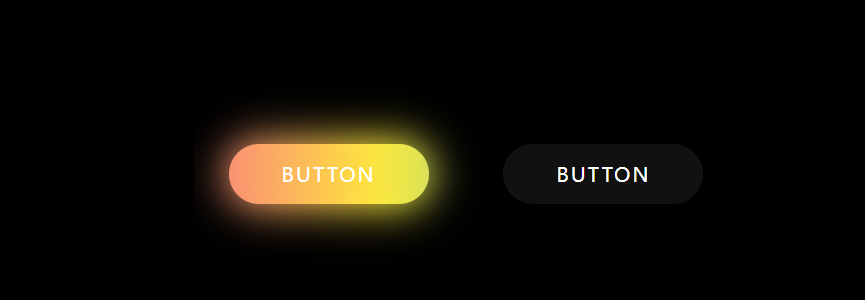
霓虹按钮
<!DOCTYPE html><html lang="en"><head><meta charset="utf-8"><meta http-equiv="X-UA-Compatible" content="IE=edge"><meta name="viewport" content="width=device-width, initial-scale=1"><title></title><style>* {margin: 0;padding: 0;box-sizing: border-box;font-family: "Poppins", sans-serif;}html,body {display: grid;height: 100%;place-items: center;background: #000;overflow: hidden;}button {position: relative;height: 60px;width: 200px;margin: 0 35px;border-radius: 50px;border: none;outline: none;background: #111;color: #fff;font-size: 20px;letter-spacing: 2px;text-transform: uppercase;cursor: pointer}button:first-child:hover {background: linear-gradient(90deg, #03a9f4, #f441a5, #ffeb3b, #03a9f4);background-size: 400%;}button:last-child:hover {background: linear-gradient(90deg, #fa7199, #f5ce62, #e43603, #fa7199);background-size: 400%;}button:first-child:before,button:last-child:before {content: '';position: absolute;background: inherit;top: -5px;right: -5px;bottom: -5px;left: -5px;border-radius: 50px;filter: blur(20px);opacity: 0;transition: opacity 0.5s;}button:first-child:hover:before,button:last-child:hover:before {opacity: 1;z-index: -1;}button:hover {z-index: 1;animation: glow 8s linear infinite;}@keyframes glow {0% {background-position: 0%;}100% {background-position: 400%;}}</style></head><body><div class="buttons"><button>Button</button><button>Button</button></div></body></html>

若有收获,就点个赞吧
0 人点赞
