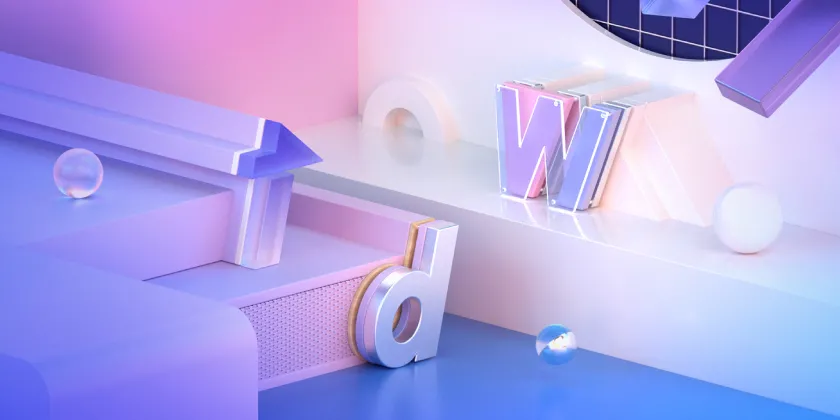

1-1. TDW 2020
TDW(腾讯设计周)是由腾讯举办的年度设计盛会,不仅汇聚腾讯设计师,也有来自其他地方和其他行业的设计师分享不同的观点。因为它代表着腾讯的设计,每一年我们都试着去展示更好的设计。
Tencent Design Week, TDW is an annual design conference hosted by Tencent Design. It is an event that gathers not only the designers of Tencent, but also various designers from all corners of the design and other industries to share ideas of different perspectives. As it represents Tencent’s design, we strive to show better designs every year.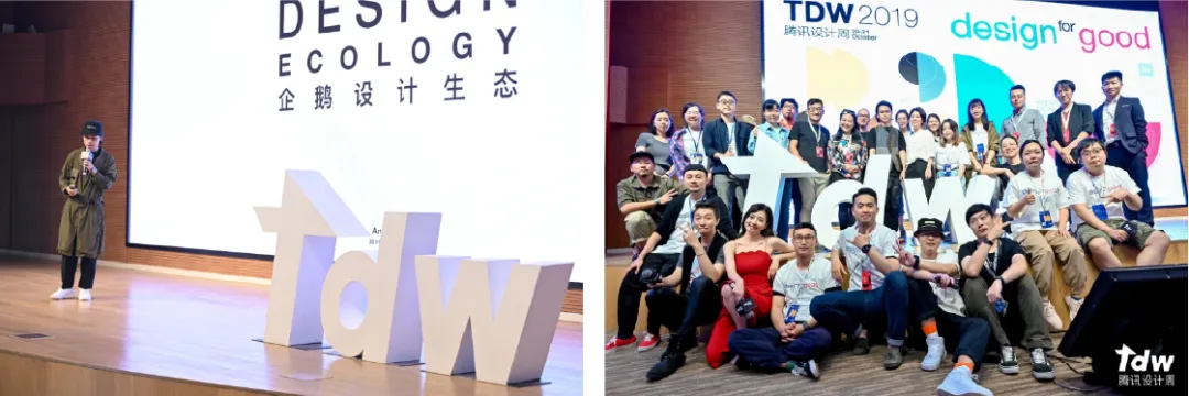
1-2. 原始概念 The Origin Of Concept **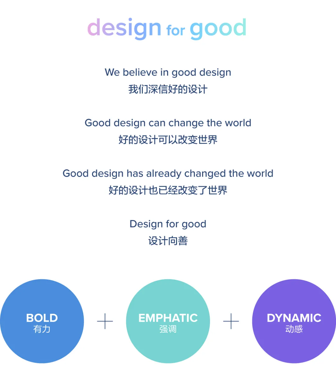 **在“设计向善”的口号之下,TDW每年都可以讨论各种设计主题。我们考虑了多种呈现口号的视觉方式,并决定使用关键词“有力”、“强调”和“动感”。通过这些关键词,得出了以动态描绘形态的设计概念。
Under the slogan ‘Design for Good’ TDW has been an event where many people can discuss on various design topics every year. We mulled over many possible ways to present this slogan visually and we decided to use the three keywords, ‘Bold’, ‘Emphatic’ and ‘Dynamic’. With these keywords, we have derived a design concept that portrays the form in dynamic way.
2-1. 视觉概念 Visual Concept ** **我们想了不同的方法来表现有力且强劲的动作,使用TDW logo 的基本形态,我们创建了一个图案。我们拆解TDW logo中的T,把它制作成三角形和矩形元素,这些元素可以组合在一起形成logo的形状。此外,它们还可以用于创建随机散布在3D空间中的不规则图案。当我们用基本形状创建每个新图案时,图像仍然看起来是简单而具有动感的。我们在整体品牌标识中使用了3D图像,并试图给人与TDW以前的品牌完全不同的印象。
We thought about different ways to show the dynamic and strong movements, and we have created a pattern using some basic forms from the TDW logo. We disassembled the T shape of TDW logo and made triangular and rectangular elements from the T shape. These elements can be assembled together to make the logo shape. Also, they can be used to create irregular patterns that are randomly scattered in a 3D space. The image still looks simple and dynamic while we create every new pattern with basic shapes. We used 3D imageries in overall brand identity and tried to give a completely different impression from the previous branding of TDW.
2-2. Logo
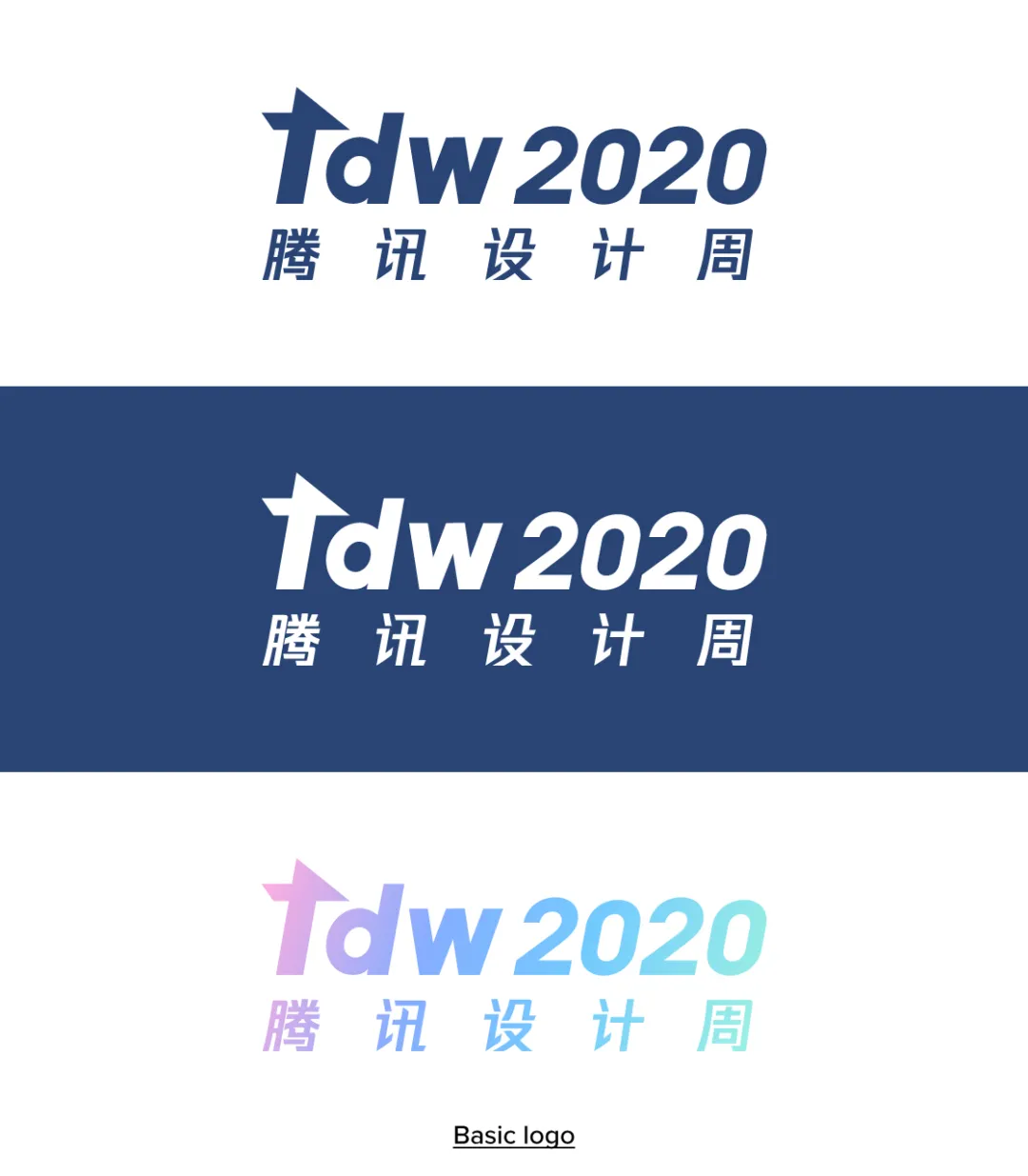
去年,TDW logo 用的是大写字母,今年,为了使它看起来与原始的TDW logo 相似,我们采用小写字母来设计。因为logo包含英文、中文和数字,为了找到与斜体logo相匹配的最佳字母组合,我们尝试了多种可能的方法。此外,logo也需要能轻易地应用于其他不同的设计场景,最后,我们用粗斜体样式统一了所有的英文、中文与数字,使整个logo看起来是平衡的。
Last year, TDW used capital letters for the logo. But for this year, we designed it with lowercase letters to make it feel similar to the original TDW logo, which consists of lowercase letters. Because the logo consists of English, Chinese and numbers, we went through many possible ways to find the best combination of letters to match with the italic style TDW logo well. In addition, the logo also needed to be easily applicable to other various design adaptations. Finally, we unified all the English, Chinese and numeral characters with a thick italic style, so that the whole logo looks balanced.
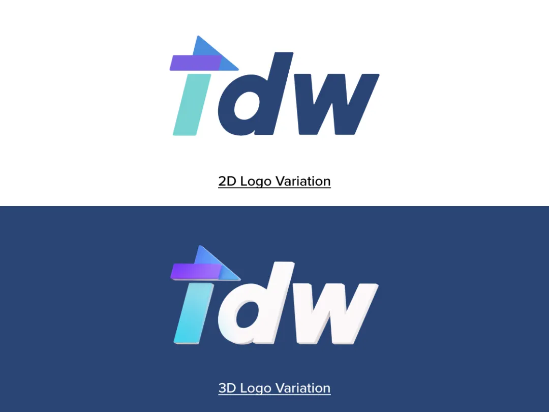 除了上述logo,还制作了一个变动的,反映TDW2020品牌标识维度视角的3D logo。这个logo可以应用于多种不同的场景,比如视频、海报、安装等等,维持基本logo整体外观的同时,创造了更多应用的可能性。
In addition to the aforementioned logo, we also created a logo variation in 3D that reflects the dimensional perspectives of TDW 2020’s brand identity. We designed this logo variation so that we can apply it to many different kinds of applications like videos, posters, installations and others. The logo has maintained the overall look of the basic logo and at the same time, it creates more possibilities of applications creatively.
2-3. 颜色 Color**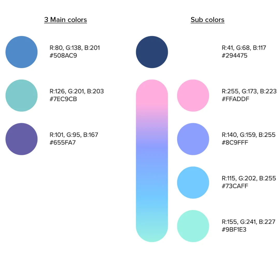 保持之前TDW一贯使用的蓝色的同时,使用柔和色调赋予新鲜感。3D空间则使用渐变色,赋予更深层次且更丰富的感觉。在避免使用深色或鲜艳颜色的同时,我们尽量确保整个调色板使用起来是流畅的。
While maintaining the blue color that has been used consistently in previous TDW, soft pastel-toned colors have also been used to give a fresh impression. Gradational color was used to give a deeper and rich feeling when applied to a 3D space. While avoiding dark or vivid colors, we tried to make sure the overall color palette can be applied smoothly.
2-4. 图形 Pattern 
我们通过结合三种基本形状和不同颜色的球体来设计3D图形。在最终组合成“t”形之前,这些物体以不同角度随机散布在3D空间中。概念刻画方面,随意的形状聚集在一起形成了品牌标识中的logo。通过这些3D图形,我们表达了一种新的感觉,并创造了更为广泛的应用。
We designed the 3D patterns by combining three basic shapes and different colored spheres. Those objects are randomly scattered at various angles within the 3D space before they are made into ‘t’ form. As for the concept portrayal, random shapes gathered to make the logo form in the brand ident. By using these 3D patterns, we were able to express a new feeling and it creates a wider range of applications.
2-5. 字体设计 Typography** 为了找到更为合适的,简洁而又不太坚硬的字体,我们做了多种比较。最终,英文使用Proxima Nova,中文则用方正兰亭黑简体。
We tried to come up with a neat, yet not too rigid font that is more suitable by comparing many various fonts. We used Proxima Nova for English language and 方正兰亭黑简体 for Chinese language.

3-1. 主视觉&海报 Key Visuals & Posters
基于上述概念,我们首先制作各种主视觉图形。我们把TDW的logo以不同的构图和形式放在3D空间中。为了让logo吸引眼球,周围的物体尽可能地保持简单。主视觉图形采用横向和纵向两种形式设计,以便可以以各种方式应用于活动之中。Based on the concept explained above, we made various key visual images first. We placed the TDW logo in various compositions and forms within the 3D space. We kept the surrounding objects as simple as possible in order to have the focus on the logo. The key visual images were designed in both landscape and portrait formats so that these can be applied in various ways for the event.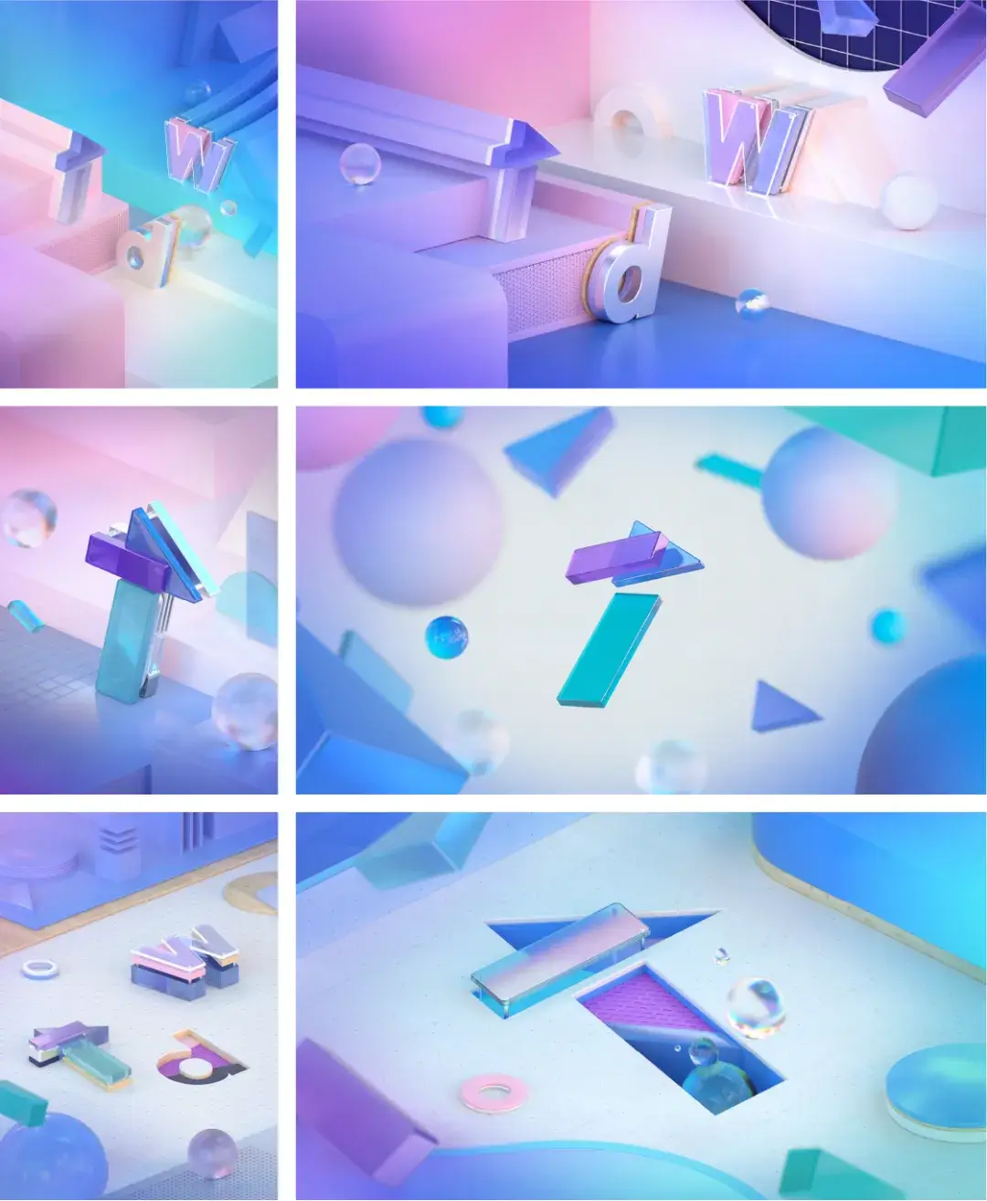
为了设计海报,以主图形为基础,我们测试了各种布局。我们用各种方式测试logo和主版本的布局,并选择最为合适的版本。最后,我们将所选的布局应用于各种主视觉图形,在显示变化的同时,保持统一的色调和方式。
We tested various layouts for poster design using these key visual images. We’ve tried designing few layout versions for the logo and the main copy, and selected the most suitable version. Finally, we applied the selected layout design to various key visual images with a consistent tone and manner while showing the variation.
3-2. 其他应用 **Other Applications
基于品牌标识,我们提出多种应用场景,试图以一致的方式将品牌标识应用于这些场景之中。因为使用了3D图像和渐变色,我们特别注意确保线上线下场景的一致性。在线下场景精确地显示渐变色有点困难,但我们仔细调整了颜色,使其与线上色调相似。
We came up with many kinds of applications based on the brand identity design. We tried to apply brand identity to various applications in a consistent manner. Because 3D images and gradient colors are used, we took extra care to ensure consistent tone of online and offline applications. It was a bit difficult to accurately display gradation colors in offline applications, but we carefully adjusted the colors so that they had similar color tone from online applications.
3-3. 安装设计 Installation Design
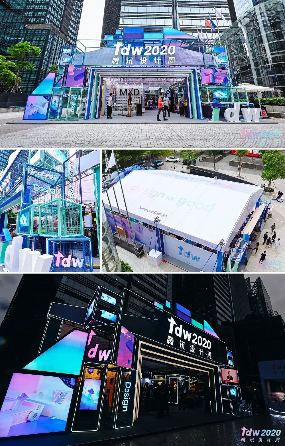
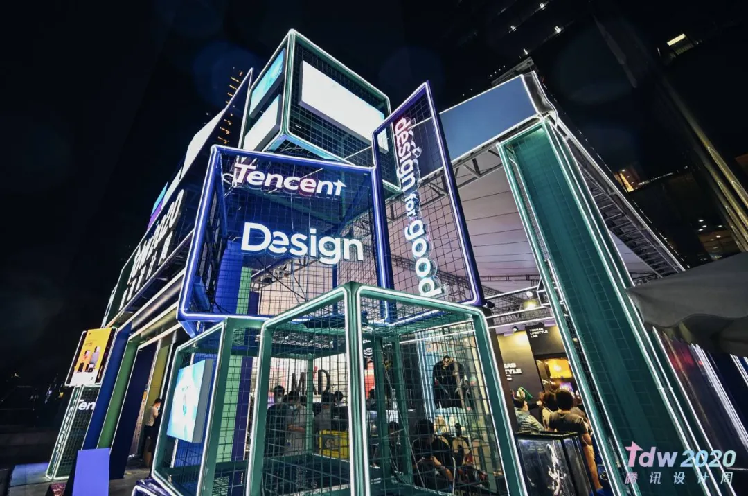
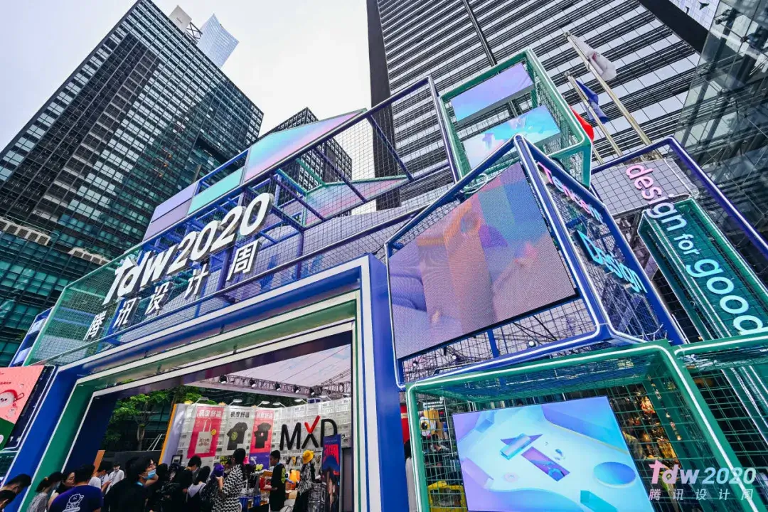
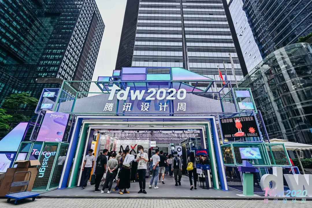
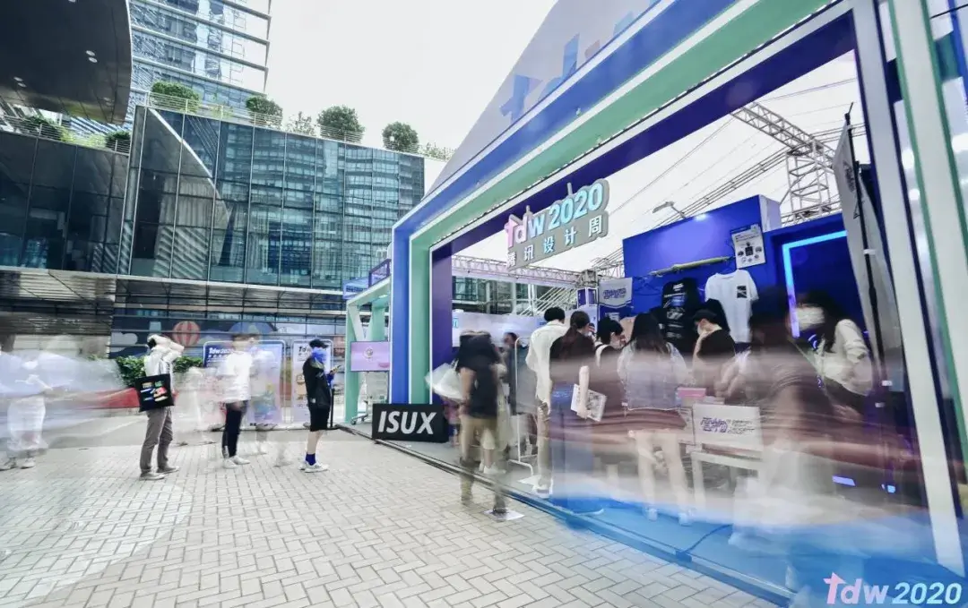
基于设计概念,我们继续进行展位设计。展位是各种人聚集一起体验活动的场所,我们用迄今为止制作的各种图形设计了这个场所,同时保持了足够的简单性。
Based on the design concept, we proceeded to make the booth design. The booth is a space where various people gather to experience the event. We designed the space with various graphics that we’ve made so far, while keeping it simple enough.


3-4. 线上视频 Online Video
通过有效地利用主视觉和logo,也创建了为设计峰会而设立的演播室。适当的颜色校正和相机设置可以使屏幕不偏离整体的视觉色调。我们也试着让观众的注意力可以集中在演讲者身上。
The studio was also created to broadcast the seminar by deploying the key visuals and logos. The screen, which is transmitted through proper color correction and camera setting, will not deviate from the overall visual tone. And also we tried to make screen that viewers be able to focus on the speaker.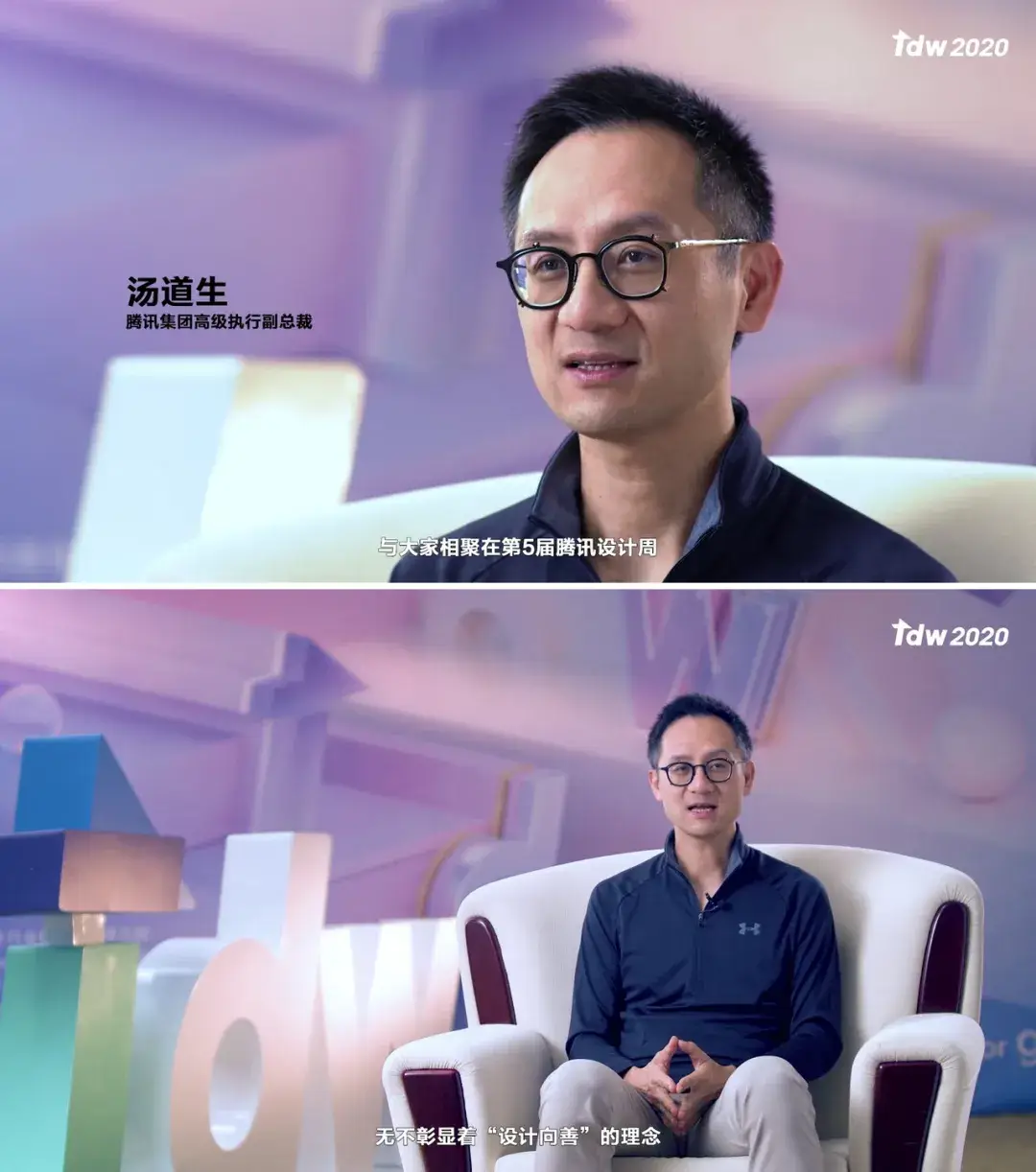

TDW官网的信息结构主要由 首页/设计峰会/创意市集/影像展示/往届回顾 这五部分组成,内容以嘉宾展示、图片及视频信息的呈现为主,因此在界面设计上希望给予更多的空间留白来凸显内容的展示,同时也让整体界面看起来更为的简约轻盈。The information structure of the TDW official website mainly consists of five parts, home, design sharing, design bazaar, gallery wall and past events. Overall the content is made up of multimedia content and speaker guests, still and motion imagery information. So, more white space is applied to emphasize the spatial information display, while also keeping the simplicity and lightness of the overall interface design.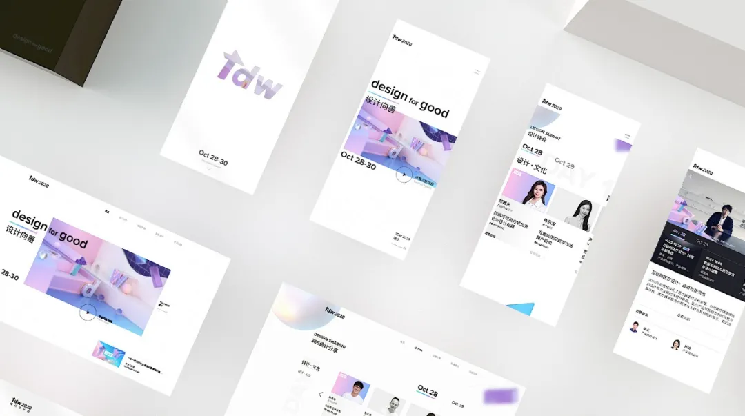 官网整体视觉上通过灵感激发的概念,带来了更全面的影响和改变,延展“设计向善”的理念传达。同时,希望将品牌片中空间感的想法体现在界面的处理上,通过局部破格的设计及元素滑动时的大小缩放、立体几何元素的视差滚动来体现平面视角上的空间概念。
The official website’s visual design is inspired by the visionary idea, bringing a more comprehensive influence and change, and further extends the motif of “Design for Good”. At the same time, the concept of dimension in the brand film is reflected in the interface design, with the overlapping design and dynamic scaling of elements, parallax scrolling of geometrical 3D elements to realize the spatial concept in 2D perspective.

5-1 延展概念可视化 **Extensive concept visualization 
品牌标识的整体概念基于“设计向善”这个slogan。动画视觉用“变化”和“影响”作为关键词,强调设计是改变社会思维的催化剂,无论对消费者还是企业,在各行各业都有积极的影响。The overall concept of the brand ident is based on the slogan, ‘Design for Good’. ‘Change’ and ‘Influence’ were used as the keywords for the animation visual, emphasising that design acts as a catalyst to change societal thinking, that has positive influences on various industries, whether to consumers or businesses.
5-2 故事版,“变化”与“影响”的可视化概念
Storyboard, visualizing the concept of CHANGE and INFLUENCE  视频的整体流程从3D物体开始。首先,它只是一个简单的球体形状,但随着视频的进行,它影响了周围的环境,并逐渐改变了形式。视频的结尾,所有变化的物体聚集在一起形成TDW的logo,使“变化”和“影响”得以形象化。
The overall flow of the video started from a 3D object. At first, it was only a simple geometric shape in a sphere form, but as the video progressed, it affected the surrounding environment, and gradually changed the form. At the end of the video, the TDW logo is formed by gathering all the changed objects, to visualize the ‘Change’ and ‘Influence’.

视频里的球体转换成多面体,这些多面体组合在一起,创建了一个有意义的logo。通过这种几何形态的变化,我们试着暗喻设计对社会变化起着积极而增效的作用。
We expressed in the video that the sphere turned into a polyhedron and these polyhedrons assembled to create a meaningful logo. Through this change in geometrical shapes, we tried to metaphorically express the role of design that leads to positive and synergic changes in society.
5-3 动画 Animatics
在进行全面工作之前,我们制作了一个动画来检查整个图像的组成。为了创造出更具节奏感的动画形象,在动画制作前提前进行了声音处理。Prior to full-scale work, we made an animatic to check the overall image composition. In order to create more rhythmic images of animation, sound work was carried out in advance before the animation progress so that animation and rhythm could be matched well.
5-4 材料渲染,细节 Rendering of materials, detailing 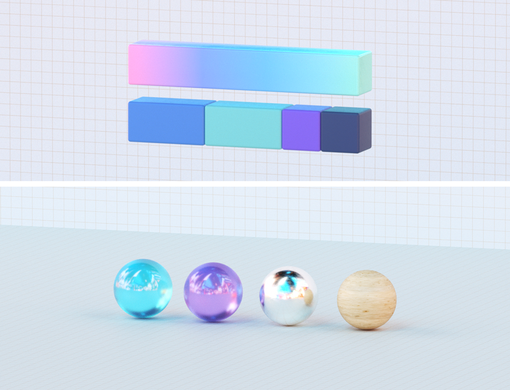

 首先,主要材料是用品牌的主颜色和渐变色构成的,我们还添加了金属、木材和玻璃等材料,以表达世界正因优秀设计而改变的理念。我们将这套材料适当地放于主视觉物体上,同时为动画增加更多的细节。除此之外,为了使动作更加地自然,还对一些动画场景进行了多轮模拟测试,First of all, the main materials were composed using the brand key colors and gradations. And we have added materials such as metal, wood and glass to express the idea that the world is changing by good designs. This set of materials was properly applied on objects used in the key visuals and we also added more detailed animation to the animatic. In addition to this process, some scenes were animated by rounds of simulation tests for more natural movement.
5-5 最终成果 Final artwork **
 腾讯ISUX
设计美好Design for Good,腾讯设计周2020如约而至! 设计峰会:10/28 - 10/29 线上公开直播 创意市集:10/28 - 10/30 腾讯大厦广场 Visual designed by ISUX #腾讯设计周#TDW2020
**
视频号
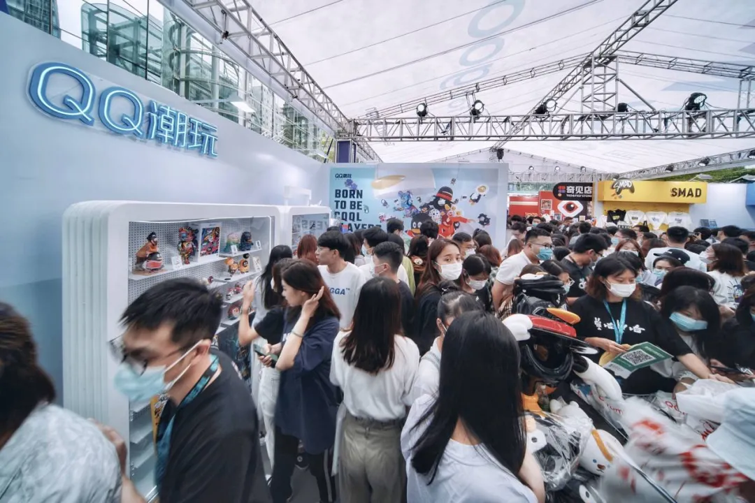
TDW是一年一度的盛事,今年我们在更好的艺术方向上进行了各种各样的尝试。总体而言,我们使用了更多的3D图像和柔和的渐变色,通过最大化空间感,给人更加丰富和新鲜的印象。因此,我们做出了与以往活动不同的外观。TDW 2020于10月28日至30日举行,很多人参加了这次的活动,演讲者们也分享了许多与设计相关的想法和案例。能够参与这么有意义的活动并做出贡献,我们非常感激也十分地荣幸。不仅仅是设计行业,我们希望TDW能够吸引更多行业的人分享他们的经验。
TDW is an annual event, and we’ve made various attempts on a better art direction this year. Overall, we used more 3D graphics and soft gradational colors to give more richer and fresh impression by maximizing the sense of space. As a result, we’ve made a different look from the previous event designs. TDW 2020 was held from Oct 28 to 30 and so many people came to the event and also many idea and case sharing about design by the speakers. We are very grateful and proud to contribute to this meaningful event. We hope that TDW will continue to gather more people from various industries and not only design industry to share their experiences.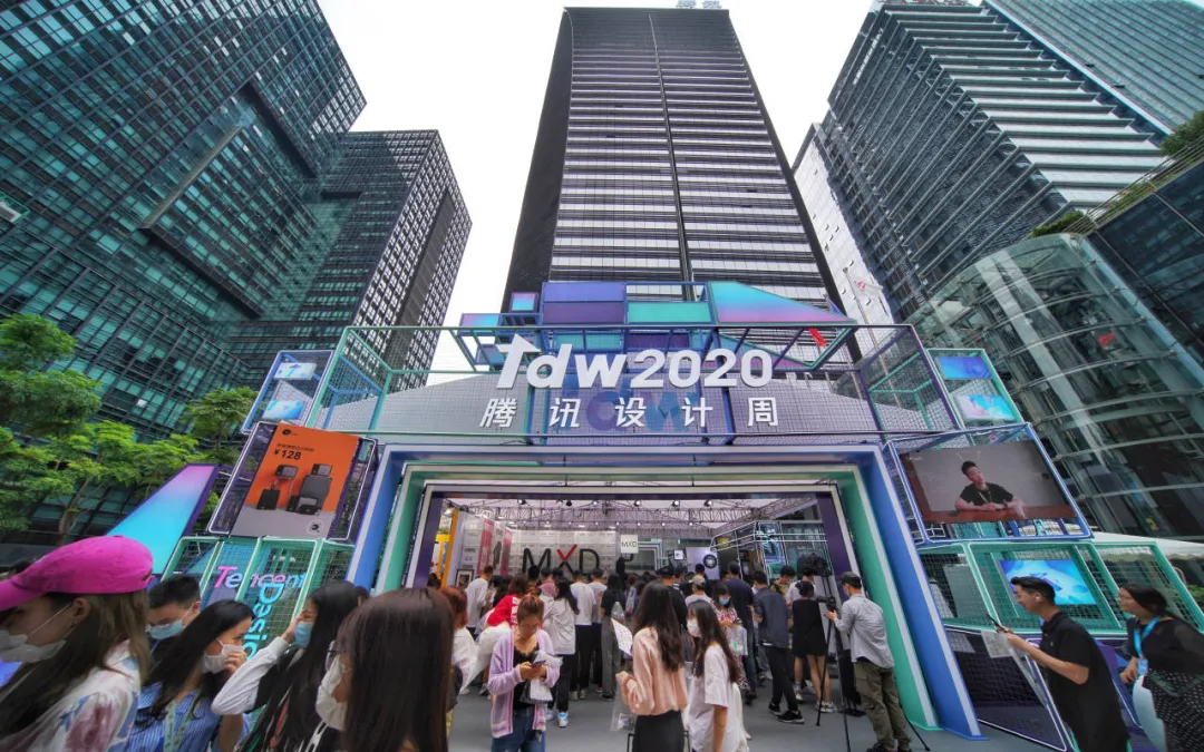
PS:ISUX 开通粉丝QQ群啦!
欢迎各大设计师加入和我们一起聊设计~添加QQ群:764345161或长按以下二维码
以下ISUX文章,你可能也感兴趣
▽
你说的黑是什么黑
腾讯文档 | 全平台系统设计
QQ自习室 | 年轻人学习方式的设计探索腾讯文档品牌升级 (上)设计向善 | QQ群作业策划故事
 感谢阅读,以上文章由腾讯ISUX团队创作,版权归腾讯ISUX所有,转载请注明出处,违者必究,谢谢您的合作。