import matplotlib as mplimport matplotlib.pyplot as pltimport seaborn as sns%matplotlib inlineimport numpy as npimport pandas as pd
# Import Datadf = pd.read_csv('mpg_ggplot2.csv')df.head()
| manufacturer | model | displ | year | cyl | trans | drv | cty | hwy | fl | class | |
|---|---|---|---|---|---|---|---|---|---|---|---|
| 0 | audi | a4 | 1.8 | 1999 | 4 | auto(l5) | f | 18 | 29 | p | compact |
| 1 | audi | a4 | 1.8 | 1999 | 4 | manual(m5) | f | 21 | 29 | p | compact |
| 2 | audi | a4 | 2.0 | 2008 | 4 | manual(m6) | f | 20 | 31 | p | compact |
| 3 | audi | a4 | 2.0 | 2008 | 4 | auto(av) | f | 21 | 30 | p | compact |
| 4 | audi | a4 | 2.8 | 1999 | 6 | auto(l5) | f | 16 | 26 | p | compact |
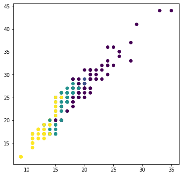
plt.figure(figsize = (6, 6))plt.scatter('cty', 'hwy', data = df, c = df.cyl)
<matplotlib.collections.PathCollection at 0x2795af8d710>
df.shape
(234, 11)
散点图上点数明显少于数据记录数量
df.groupby(['cty', 'hwy']).count().head()
| manufacturer | model | displ | year | cyl | trans | drv | fl | class | ||
|---|---|---|---|---|---|---|---|---|---|---|
| cty | hwy | |||||||||
| 9 | 12 | 5 | 5 | 5 | 5 | 5 | 5 | 5 | 5 | 5 |
| 11 | 14 | 2 | 2 | 2 | 2 | 2 | 2 | 2 | 2 | 2 |
| 15 | 10 | 10 | 10 | 10 | 10 | 10 | 10 | 10 | 10 | |
| 16 | 3 | 3 | 3 | 3 | 3 | 3 | 3 | 3 | 3 | |
| 17 | 5 | 5 | 5 | 5 | 5 | 5 | 5 | 5 | 5 |
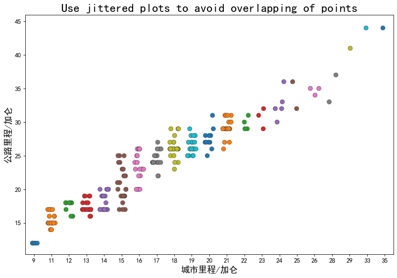
如何在图像上展示横纵坐标一致的那些点?
使用类stripplot绘制
sns.stripplot()
- 抖动图
重要参数:jitter,抖动的幅度(即同一位置的两个点的距离大小),0表示完全不存在抖动
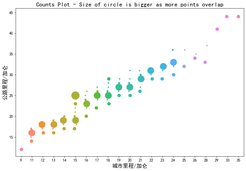
- 计数图
重要参数:size
1. 抖动图
# 建立画布fig, ax = plt.subplots(figsize = (12, 8), dpi = 80)# fig:画布对象# ax:子图对象# 画抖动图的函数sns.stripplot()sns.stripplot(df.cty, df.hwy,jitter = 0.25,size = 8,ax = ax,linewidth = .5,palette = 'tab10')plt.title('Use jittered plots to avoid overlapping of points', fontsize=22)plt.rcParams['font.sans-serif']=['Simhei']plt.xlabel("城市里程/加仑",fontsize=16)plt.ylabel("公路里程/加仑",fontsize=16)plt.xticks(fontsize=12)plt.yticks(fontsize=12)plt.show()
2. 计数图
处理数据
df.groupby(['hwy', 'cty']).size().head()
hwy cty12 9 514 11 215 11 1016 11 312 2dtype: int64
df.groupby(['hwy', 'cty']).count().head()
| manufacturer | model | displ | year | cyl | trans | drv | fl | class | ||
|---|---|---|---|---|---|---|---|---|---|---|
| hwy | cty | |||||||||
| 12 | 9 | 5 | 5 | 5 | 5 | 5 | 5 | 5 | 5 | 5 |
| 14 | 11 | 2 | 2 | 2 | 2 | 2 | 2 | 2 | 2 | 2 |
| 15 | 11 | 10 | 10 | 10 | 10 | 10 | 10 | 10 | 10 | 10 |
| 16 | 11 | 3 | 3 | 3 | 3 | 3 | 3 | 3 | 3 | 3 |
| 12 | 2 | 2 | 2 | 2 | 2 | 2 | 2 | 2 | 2 |
.size() 和 .count() 的区别:
.size()只显示按主键计数的一列
.count()对每一列按主键计数
df.groupby(['hwy', 'cty']).size().reset_index().head() # 将原有的索引转换为特征,然后新增从0开始的索引
| hwy | cty | 0 | |
|---|---|---|---|
| 0 | 12 | 9 | 5 |
| 1 | 14 | 11 | 2 |
| 2 | 15 | 11 | 10 |
| 3 | 16 | 11 | 3 |
| 4 | 16 | 12 | 2 |
df_counts = df.groupby(['hwy', 'cty']).size().reset_index(name = 'counts') # name参数:用于原始Series里面本来是value的那些值的列名
df_counts.head()
| hwy | cty | counts | |
|---|---|---|---|
| 0 | 12 | 9 | 5 |
| 1 | 14 | 11 | 2 |
| 2 | 15 | 11 | 10 |
| 3 | 16 | 11 | 3 |
| 4 | 16 | 12 | 2 |
画计数图
# 建立画布fig, ax = plt.subplots(figsize = (12, 8), dpi = 80)# 画图sns.stripplot(df_counts.cty, df_counts.hwy,size = df_counts.counts * 2, # 尺寸ax = ax)plt.title('Counts Plot - Size of circle is bigger as more points overlap', fontsize=18)plt.rcParams['font.sans-serif']=['Simhei']plt.xlabel("城市里程/加仑",fontsize=16)plt.ylabel("公路里程/加仑",fontsize=16)plt.xticks(fontsize=12)plt.yticks(fontsize=12)plt.show()

若有收获,就点个赞吧
0 人点赞
