分散的文本类似于发散条形图
如果你想以一种漂亮和可呈现的方式显示图表中每个项目的价值,那么它就是一个比较适合的方式。
我们的目标图形与前面讲过的发散型条形图很相似,唯一不同的地方就是每一个条形上多了带颜色的文字
import numpy as npimport pandas as pdimport matplotlib.pyplot as plt%matplotlib inline
绘制文本的函数
plt.text()
参数说明:
- x,y:放置文本的位置。 默认情况下,就是数据坐标。
- s:要显示的文本内容
- fontdict:用于覆盖默认文本属性的字典。 fontdict的默认值是None,默认值由rc参数决定。
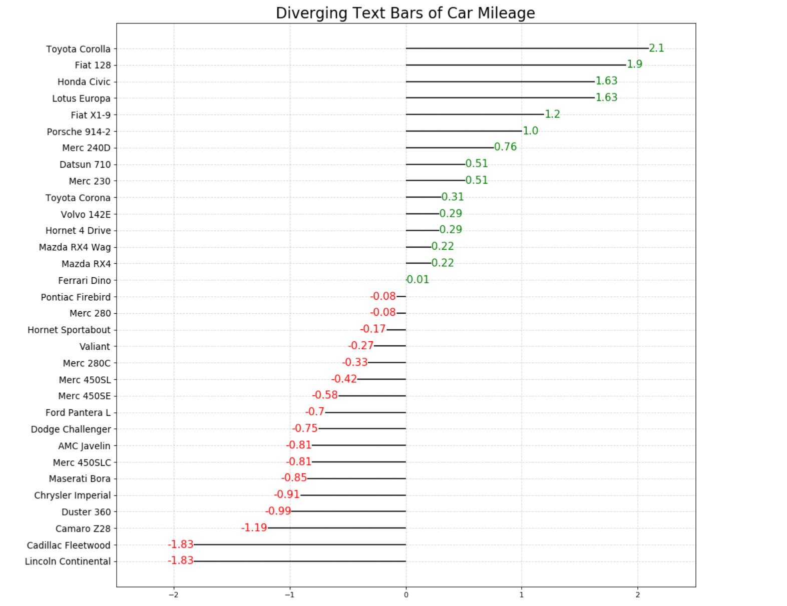
# 绘制简单的文本图# 定义数据x = np.random.rand(1)y = np.random.rand(1)# 创建画布fig = plt.figure(figsize = (8, 4))# 绘制图形plt.text(x, y, 'text',fontdict = {'size':20, 'color':'r'})
Text([0.19290105], [0.47451012], 'text')
【注意】plt.text()函数一次只能标注一个位置的文本
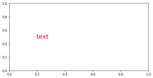
- 如何添加多个文本?
- 写循环
# 创建画布fig = plt.figure(figsize = (8, 4))# 绘制图形for i in range(10):x = np.random.rand(1)y = np.random.rand(1)plt.text(x, y, 'text',fontdict = {'size':16, 'color':'r'})
1. 数据预处理
df = pd.read_csv('mtcars.csv')df.head()
| mpg | cyl | disp | hp | drat | wt | qsec | vs | am | gear | carb | fast | cars | carname | |
|---|---|---|---|---|---|---|---|---|---|---|---|---|---|---|
| 0 | 4.582576 | 6 | 160.0 | 110 | 3.90 | 2.620 | 16.46 | 0 | 1 | 4 | 4 | 1 | Mazda RX4 | Mazda RX4 |
| 1 | 4.582576 | 6 | 160.0 | 110 | 3.90 | 2.875 | 17.02 | 0 | 1 | 4 | 4 | 1 | Mazda RX4 Wag | Mazda RX4 Wag |
| 2 | 4.774935 | 4 | 108.0 | 93 | 3.85 | 2.320 | 18.61 | 1 | 1 | 4 | 1 | 1 | Datsun 710 | Datsun 710 |
| 3 | 4.626013 | 6 | 258.0 | 110 | 3.08 | 3.215 | 19.44 | 1 | 0 | 3 | 1 | 1 | Hornet 4 Drive | Hornet 4 Drive |
| 4 | 4.324350 | 8 | 360.0 | 175 | 3.15 | 3.440 | 17.02 | 0 | 0 | 3 | 2 | 1 | Hornet Sportabout | Hornet Sportabout |
x = df.loc[:, 'mpg']df['mpg_z'] = (x - x.mean()) / x.std()df['colors'] = ['red' if i < 0 else 'green' for i in df.mpg_z]df.sort_values('mpg_z', inplace = True)df.reset_index(inplace = True, drop = True)
df.head()
| mpg | cyl | disp | hp | drat | wt | qsec | vs | am | gear | carb | fast | cars | carname | mpg_z | colors | |
|---|---|---|---|---|---|---|---|---|---|---|---|---|---|---|---|---|
| 0 | 3.224903 | 8 | 460.0 | 215 | 3.00 | 5.424 | 17.82 | 0 | 0 | 3 | 4 | 0 | Lincoln Continental | Lincoln Continental | -1.829979 | red |
| 1 | 3.224903 | 8 | 472.0 | 205 | 2.93 | 5.250 | 17.98 | 0 | 0 | 3 | 4 | 0 | Cadillac Fleetwood | Cadillac Fleetwood | -1.829979 | red |
| 2 | 3.646917 | 8 | 350.0 | 245 | 3.73 | 3.840 | 15.41 | 0 | 0 | 3 | 4 | 0 | Camaro Z28 | Camaro Z28 | -1.191664 | red |
| 3 | 3.781534 | 8 | 360.0 | 245 | 3.21 | 3.570 | 15.84 | 0 | 0 | 3 | 4 | 0 | Duster 360 | Duster 360 | -0.988049 | red |
| 4 | 3.834058 | 8 | 440.0 | 230 | 3.23 | 5.345 | 17.42 | 0 | 0 | 3 | 4 | 0 | Chrysler Imperial | Chrysler Imperial | -0.908604 | red |
2. 绘制图形并添加文本信息
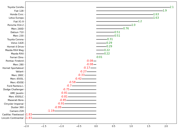
# 创建画布plt.figure(figsize = (12,10), dpi = 65)# 绘制基础图形plt.hlines(y = df.cars, xmin = 0, xmax = df.mpg_z)# 添加文本for i in range(df.shape[0]):plt.text(x = df.mpg_z[i],y = df.index[i],s = str(round(df.mpg_z[i], 2)),color = df.colors[i])
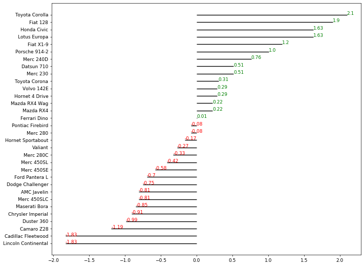
这个基础图形有3个问题:
- 文本信息都显示在线的上方,而我们需要的是显示在线条正对着的位置(中间)
- 红色文本显示在线条的右边,我们需要的是横坐标小于0的显示在左边,大于0的显示在右边
- 文本字体有点小
3. 修正文本信息
# 创建画布plt.figure(figsize = (12,10), dpi = 65)# 绘制基础图形plt.hlines(y = df.cars, xmin = 0, xmax = df.mpg_z)# 添加文本for i in range(df.shape[0]):x = df.mpg_z[i]y = df.index[i]s = str(round(df.mpg_z[i], 2))plt.text(x, y, s,fontdict = {'size':12, 'color':df.colors[i]}, # 设置文本的颜色和尺寸horizontalalignment = 'right' if x < 0 else 'left', # 水平对齐参数,有left/right/centerverticalalignment = 'center' # 垂直对齐参数,有top/bottom/center)
- 水平对齐参数,用了类似于列表推导式的式子,不同的是这里只需要单个值不需要最后形成列表
- 另外,left和right这两个对齐方式很容易混淆
- 以右对齐为例来说明:
首先需要知道的是文本放置的位置点其实就是线条的末端
所谓的右对齐就是要求文本的最右端要与这个位置点对齐
4. 装饰图像
# 创建画布plt.figure(figsize = (12,10), dpi = 65)# 绘制基础图形plt.hlines(y = df.cars, xmin = 0, xmax = df.mpg_z)# 添加文本for i in range(df.shape[0]):x = df.mpg_z[i]y = df.index[i]s = str(round(df.mpg_z[i], 2))plt.text(x, y, s,fontdict = {'size':12, 'color':df.colors[i]}, # 设置文本的颜色和尺寸horizontalalignment = 'right' if x < 0 else 'left', # 水平对齐参数,有left/right/centerverticalalignment = 'center' # 垂直对齐参数,有top/bottom/center)#装饰图像plt.yticks(fontsize=12) # y轴刻度标签,并设置文字大小plt.title('Diverging text Bars of Car Mileage', fontdict={'size':20}) # 设置图形标题plt.xlim(-2.5,2.5) # 设定x轴的最大最小值plt.grid(linestyle='--', alpha=0.5); # 配置网格线
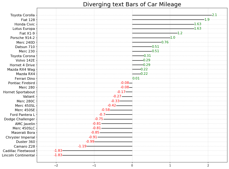
#原始代码# Prepare Datadf = pd.read_csv("mtcars.csv") #导入原始数据集x = df.loc[:, ['mpg']] #提取目标数据df['mpg_z'] = (x - x.mean())/x.std() #对目标数据进行Z-score标准化处理df['colors'] = ['red' if x < 0 else 'green' for x in df['mpg_z']] #生成颜色标签列df.sort_values('mpg_z', inplace=True) #根据标准化之后的目标数据对整个数据集进行排序df.reset_index(inplace=True) #重置排序后的索引# Draw plotplt.figure(figsize=(14,14), dpi= 65) #创建画布并设置画布尺寸plt.hlines(y=df.index, xmin=0, xmax=df.mpg_z) #绘制发散型条形图#绘制文本图for x, y, tex in zip(df.mpg_z, df.index, df.mpg_z):t = plt.text(x, y, round(tex, 2), horizontalalignment='right' if x < 0 else 'left', verticalalignment='center', fontdict={'color':'red' if x < 0 else 'green', 'size':14})# Decorationsplt.yticks(df.index, df.cars, fontsize=12) #添加y轴刻度标签,并设定文本大小plt.title('Diverging Text Bars of Car Mileage', fontdict={'size':20}) #添加图形标题plt.grid(linestyle='--', alpha=0.5) #配置网格线plt.xlim(-2.5, 2.5) #设定x轴最大最小值plt.show() #显示图形

zip()函数解读:
- 这是一个压缩函数,返回一个zip对象
- 其 . next () 方法返回一个元组,其中第i个元素来自第i个可迭代参数
- . next () 方法一直持续到参数序列中最短的那一列元素耗尽,然后它引发StopIteration(也就是停止迭代)
a = zip([1, 2, 3], ['a', 'b', 'c', 'd'], [2 ,3, 4, 5, 6])
a.__next__()
(1, 'a', 2)
a.__next__()
(2, 'b', 3)
a.__next__()
(3, 'c', 4)
a.__next__()
---------------------------------------------------------------------------StopIteration Traceback (most recent call last)<ipython-input-66-d34d2a8c0899> in <module>----> 1 a.__next__()StopIteration:
a = zip([1, 2, 3], ['a', 'b', 'c', 'd'], [2 ,3, 4, 5, 6])
[*a] # 解压缩,也可以用循环来打开
[(1, 'a', 2), (2, 'b', 3), (3, 'c', 4)]
a.__next__()
---------------------------------------------------------------------------StopIteration Traceback (most recent call last)<ipython-input-69-d34d2a8c0899> in <module>----> 1 a.__next__()StopIteration:

若有收获,就点个赞吧
0 人点赞
