边缘箱线图是在散点图的边缘分别画上对横纵坐标的箱线图,以对原始的散点图进行补充的图像。
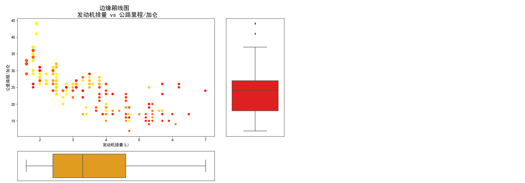
横坐标:发动机排量(L)
纵坐标:公路里程/加仑
虽然没有显示图例不过散点有颜色:制造商
1. 导入需要的绘图库
import matplotlib as mplimport matplotlib.pyplot as pltimport seaborn as sns%matplotlib inlineimport numpy as npimport pandas as pd
2. 认识箱线图及绘制箱线图的函数
箱线图,又叫做箱型图,箱图,是一种用于显示一个变量分布情况的统计图。
其核心作用和直方图类似,我们在统计学和机器学习中也使用它来观察数据是否处于偏态,只不过直方图更著重于看到数据在整个取值区间上的分布,而箱线图更着重于观察变量上的重要分割点。箱线图能够精确地显示有关数据分布的关键数据节点,因此也常被用来作为查找异常值的方式。
认识箱线图的第一步是学会阅读箱线图:
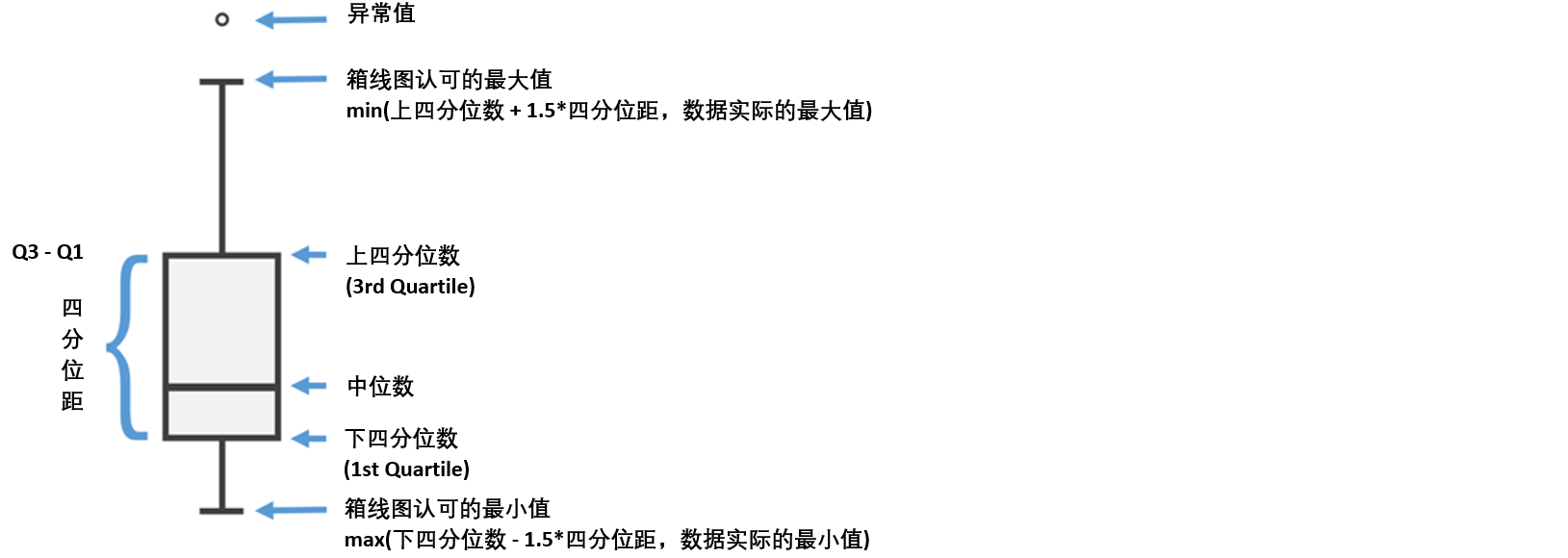
其中上四分位数就是直方图中占75%数据量的位置,下四分位数就是直方图中占25%数据量的位置。
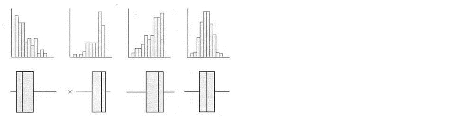
箱线图 vs 直方图
直方图和箱线图都表达数据的分布,从下面的图可以看出来,两者是一一对应的。
当直方图的分布越接近正太分布,箱线图也会越对称
直方图的柱子较高较多的地方,就会是箱线图的箱子所在的地方
箱线图所显示的中位数一般都会非常接近直方图中最高的柱子(毕竟这个取值范围内的样本点最多)
sns.boxplot()
重要参数
x :需要绘制箱线图的变量
ax :需要绘制箱线图的子图
orient :箱线图的方向,可选填”v”或者”h”来决定箱线图的方向
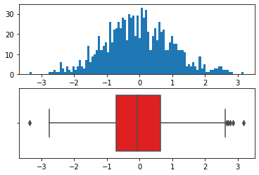
# 正态分布下的随机数X = np.random.randn(1000)
fig, (ax1, ax2) = plt.subplots(2)# fig:画布# (ax1, ax2):两个子图# 直方图ax1.hist(X, bins = 100)# 箱型图sns.boxplot(x = X,ax = ax2,orient = 'h',color = 'r')
<matplotlib.axes._subplots.AxesSubplot at 0x2311fbcb048>
计算箱型图的极值,首先找出四分位距。NumPy中的percentile功能可以找出位于分布a%处的分位数
X = np.random.randn(1000)
Q3, Q1 = np.percentile(X, [75, 25])iqr = Q3 - Q1 # 四分位距iqr
1.3745876391152028
1.5 * iqr + Q3
2.7705180007719674
max(X)
3.8948450430526216
Q1 - 1.5 * iqr
-2.727832555688844
min(X)
-3.1955668568007614
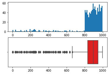
# 严重偏态分布下的随机数X = np.random.randint(0, 300, 50).tolist() + np.random.randint(300, 800, 50).tolist() + np.random.randint(800, 1000, 900).tolist()
X[:10]
[35, 216, 293, 229, 197, 249, 251, 79, 98, 31]
fig, (ax1, ax2) = plt.subplots(2)# fig:画布# (ax1, ax2):两个子图# 直方图ax1.hist(X, bins = 100)# 箱型图sns.boxplot(x = X,ax = ax2,orient = 'h',color = 'r')
<matplotlib.axes._subplots.AxesSubplot at 0x2311fda5da0>
3. 导入数据绘制图像
df = pd.read_csv('mpg_ggplot2.csv')
df.head()
| manufacturer | model | displ | year | cyl | trans | drv | cty | hwy | fl | class | |
|---|---|---|---|---|---|---|---|---|---|---|---|
| 0 | audi | a4 | 1.8 | 1999 | 4 | auto(l5) | f | 18 | 29 | p | compact |
| 1 | audi | a4 | 1.8 | 1999 | 4 | manual(m5) | f | 21 | 29 | p | compact |
| 2 | audi | a4 | 2.0 | 2008 | 4 | manual(m6) | f | 20 | 31 | p | compact |
| 3 | audi | a4 | 2.0 | 2008 | 4 | auto(av) | f | 21 | 30 | p | compact |
| 4 | audi | a4 | 2.8 | 1999 | 6 | auto(l5) | f | 16 | 26 | p | compact |
# 创建画布fig = plt.figure(figsize = (16, 10), dpi = 80, edgecolor = 'white')# 分割画布grid = plt.GridSpec(4, 4, hspace = 0.5, wspace = 0.2)# 创建子图ax_main = fig.add_subplot(grid[:-1, :-1])ax_right = fig.add_subplot(grid[:-1, -1], xticklabels = [], yticklabels = [])ax_bottom = fig.add_subplot(grid[-1, :-1], xticklabels = [], yticklabels = [])# 绘制气泡图ax_main.scatter('displ', 'hwy', s = df['cty'] * 4, data = df, c = df['manufacturer'].astype('category').cat.codes # 一种常用的编码方式, cmap = 'autumn', linewidths = .5, alpha = .9)# 绘制右边的箱型图和底部的箱型图sns.boxplot(ax = ax_right, x = df.hwy, orient = 'v', color = 'red')sns.boxplot(ax = ax_bottom, x = df.displ, orient = 'h', color = 'orange')# 装饰图像plt.rcParams['font.sans-serif'] = ['Simhei']ax_main.set(title = '边缘直方图\n发动机排量 vs 公路里程/加仑',xlabel = '发动机排量(L)',ylabel = '公路里程/加仑')ax_main.title.set_fontsize(22)ax_right.set(ylabel = '')ax_bottom.set(xlabel = '')for item in ([ax_main.xaxis.label, ax_main.yaxis.label] + ax_main.get_xticklabels() + ax_main.get_yticklabels()):item.set_fontsize(14)# 对横坐标、纵坐标上的标题、标尺设置字体for item in [ax_bottom, ax_right]:item.set_xticks([])item.set_yticks([])# 去除标尺xlabels = ax_main.get_xticks().tolist() # 取出现有的标尺,再将其转化为带一位小数的浮点数ax_main.set_xticklabels(xlabels)
[Text(0, 0, '1.0'),Text(0, 0, '2.0'),Text(0, 0, '3.0'),Text(0, 0, '4.0'),Text(0, 0, '5.0'),Text(0, 0, '6.0'),Text(0, 0, '7.0'),Text(0, 0, '8.0')]

- 在右侧的箱线图上发现有两个异常点,可以做为重点研究对象
- 若要建模,需要删除异常值,否则影响模型的性质
df[df.hwy > 40]
| manufacturer | model | displ | year | cyl | trans | drv | cty | hwy | fl | class | |
|---|---|---|---|---|---|---|---|---|---|---|---|
| 212 | volkswagen | jetta | 1.9 | 1999 | 4 | manual(m5) | f | 33 | 44 | d | compact |
| 221 | volkswagen | new beetle | 1.9 | 1999 | 4 | manual(m5) | f | 35 | 44 | d | subcompact |
| 222 | volkswagen | new beetle | 1.9 | 1999 | 4 | auto(l4) | f | 29 | 41 | d | subcompact |

若有收获,就点个赞吧
0 人点赞
