一个基于 JavaScript 的开源可视化图表库
官网:https://echarts.apache.org/zh/index.html
ECharts,一个使用 JavaScript 实现的开源可视化库,可以流畅的运行在 PC 和移动设备上,兼容当前绝大部分浏览器(IE9/10/11,Chrome,Firefox,Safari等),底层依赖矢量图形库 ZRender,提供直观,交互丰富,可高度个性化定制的数据可视化图表;
(zrender:ZRender 强大的二维绘图引擎,一个轻量级的 Canvas 类库,使用 MVC 封装,数据驱动,提供类 Dom 事件模型,让 Canvas 绘图大不同。)
二、版本:
- Echarts2.x是通用的版本。3.0代表未来,2.0比较稳定;
三、代码实现思路
- 准备一个设置宽高的dom元素;创建完会生成cavans标签,审查元素可以看到在vue的生命周期的mounted操作;
- 实例化echarts对象;echarts.init(dom);
- 指定配置项和数据(option);
将配置项设置给echarts实例化对象;myChart.setOption(option);
四、 安装和使用
npm 安装
npm install echarts -D
main.js 全局引入:
vue2引入:
import * as echarts from 'echarts';Vue.prototype.$echarts = echarts
vue3引入:
import * as echarts from 'echarts';Vue.config = echarts
五、echarts组件化:
- 父组件存放主内容区域和echarts外部盒子,子组件实现数据和图表渲染;(还有一种方法是通过props传递和接收参数; ``` 父组件:
调用量占比
```
<template>
  <div
    id="echarts1"
    style="width: 100%; height: 195px"
    v-loading="vLoading"
  ></div>
</template>

<script>
import echarts from "echarts";    // 引入echarts图表
import * as API from "api/home.js"; // 引入api
export default {
  data() {
    return {
      vLoading: false,
      myChartLine: null,
      formData: [],
      nameData: [],
    };
  },
  name: "Chart",
  methods: {
    //获取数据,Promise确保执行和绘画顺序
    getProfessionalCardsCount() {
      return new Promise((resolve, reject) => {
        this.ywlezbLoading = true;
        API.getProfessionalCardsCount()
          .then((res) => {
            this.ywlezbLoading = false;
            if (res.code == 200) {
              this.formData = res.data.professions;
              this.nameData = [];
              this.formData.map((i) => {
                this.nameData.push(i.name);
              });
            }
            resolve(res);
          })
          .catch((err) => {
            this.vLoading = false;
            reject(err);
          });
      });
    },
    myEcharts() {
      // 基于准备好的dom,初始化echarts实例
      this.myChartLine = echarts.init(document.getElementById("echarts1"));
      // 指定图表的配置项和数据
      var option = {
        tooltip: {
          trigger: "item",
          formatter: "{a} <br/>{b} : {c} ({d}%)",
        },
        color: ["#31ceee", "#20adeb", "#6be7e8"],
        legend: {
          orient: "vertical",
          x: "right",
          align: "left",
          padding: [10, 5, 0, 0],
          data: this.nameData,
          formatter: function (name) {
            var oa = option.series[0].data;
            var num = oa[0].value + oa[1].value + oa[2].value;
            for (var i = 0; i < option.series[0].data.length; i++) {
              if (name == oa[i].name) {
                return name;
              }
            }
          },
        },
        series: [
          {
            name: "业务类型占比",
            type: "pie",
            radius: "68%",
            center: ["40%", "50%"],
            data: this.formData,
            itemStyle: {
              normal: {
                label: {
                  show: true,
                  //                                position:'inside',
                  formatter: "{b}: {d}%",
                },
              },
              labelLine: { show: true },
            },
            labelLine: {
              normal: {
                length: 1,
              },
            },
          },
        ],
      };

      // 使用刚指定的配置项和数据显示图表。
      this.myChartLine.setOption(option);
    },
  },
  mounted() {
    //图的大小自适应
    window.addEventListener("resize", () => {
      if (this.myChartLine) {
        this.myChartLine.resize();
      }
    });
    this.getProfessionalCardsCount().then((res) => {
      this.myEcharts();
    });
  },
  beforeDestroy() {
    //实例销毁之前调用
    if (!this.myChartLine) {
      return;
    }
    this.myChartLine.dispose();
    this.myChartLine = null;
  },
};
</script>

<style>
</style>
this.$nextTick(() => {
        this.$echarts.init(document.getElementById(azCode)).setOption({
});
2.调用自适用方法:resize()
let myChart1 = this.$echarts.init(document.getElementById('charts'))
myChart1.setOption({
color: ['#409EFF'],
grid: {
top: '12%',
left: '6%',
right: '5%',
bottom: '17%',
// containLabel: true,
},
tooltip: {
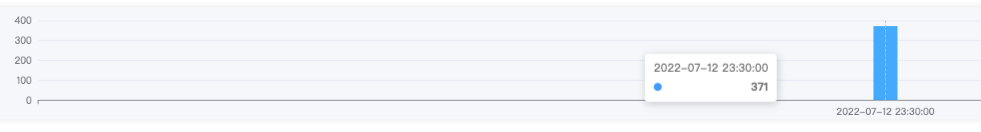
trigger: 'axis', //坐标轴触发,主要在柱状图,折线图等会使用类目轴的图表中使用
},
xAxis: {
type: 'category',
data: colName,
},
yAxis: {
type: 'value',
},
series: [
{
barWidth: 30,
data: value,
type: 'bar',
},
],
})
window.addEventListener("resize", function () {
myChart1.resize();
})
3. 控制台报错:There is a chart instance already initialized on the dom.
1. 定义全局变量;
2. 接收创建的dom节点;
3. 调用dispose方法;
    setRightChart(azCode, data) {
      let myChart;
      this.$nextTick(() => {
        myChart = this.$echarts.init(document.getElementById(azCode)).setOption({
。。。。。。。。。。。。。。。。。。。。。。。。。。。。。。。。。。。。。。。
        });
        if (myChart != null && myChart != "" && myChart != undefined) {
          myChart.dispose(); //销毁
        }
      });
    },
六、基础配置的参数1.图表类型
series: [
  type:'line'         ——-折线图
  type:'bar'             ——-柱状图
  type:'pie'             ——-饼图
  type:'scatter'     --散点图
  type: 'map',         --地理坐标
  type: 'candlestick', --k线图
  type: 'radar',             --雷达图
  type: 'boxplot',         --盒须图
  type: 'heatmap',    --热力图
  type: 'sankey',     --桑基图
  ...
  ]
2.标题的设置
title: {
           text: 'xxxxxxx',         <!--设置标题内容-->
           subtext:'xxxxxx',        <!--设置副标题内容-->
          x:'center',              <!--设置标题位置,center,left,right-->
        textStyle: {
           color:'#000000',      <!--字体颜色,详细参考html颜色库-->
           fontFamily: '宋体',   <!--字体样式,详细参考html字体库-->
           fontSize:24,          <!--字体大小,自定义-->
           fontStyle: 'normal',  <!--字体风格,normal,italic,oblique-->
           fontWeight: 'normal', <!--字体粗细,normal,bold,bolder,lighter-->
        },
        subtextStyle:{},         <!--副标题的字体样式-->
    },
3.图表大小的设置
grid:{
           top:'20%',           <!--距离容器顶部的位置-->
        left: '20%',         <!--距离容器左侧的位置-->
        right: '20%',        <!--距离容器右侧的位置-->
        bottom: '15%',       <!--距离容器底部的位置-->
        containLabel: true   <!--grid 区域是否包含坐标轴的刻度标签-->
      },
4.图例的设置
legend: {
          data:['xxx','xxx'],            <!--图例的内容-->
          padding:[300,100,200,100],     <!--内边距,上,右,下,左边距-->
          textStyle: {
            color: '#000000',          <!--图例文字的颜色-->
            fontSize: 14               <!--图例文字的大小-->
          },

},
5.交互方式的设置
tooltip: {
         trigger: 'item',           <!--触发类型,item,axis-->
         showDelay: 10,             <!--显示延迟,单位ms-->
         borderColor: '#333',       <!--提示边框颜色-->
         axisPointer : {
                        type : 'line',       <!--触发坐标轴,line,shadow-->
                       lineStyle : {        <!--直线指示器样式设置-->
                                   color: '#48b',
                                   width: 2,
                                   type: 'solid'
                                   },
                        shadowStyle : {      <!--阴影指示器样式设置-->
                                    width: 'auto',
                                    color: '#333',
                                     }
                        },
        textStyle: {color: '#333'}         <!--参考标题的字体设置-->
},
6.工具箱的设置
toolbox: {
         feature: {
                   magicType: { show: true, type: ['line', 'bar'] },   <!--转换成柱状图、折线图-->
                      restore: {show: true},       <!--刷新图表-->
                      saveAsImage: {show: true}    <!--保存图表-->
                   },

},
7. 背景虚化:series 中的 emphasis
示例:
series:{
  focus:'series',
  blurScope:'coordinateSystem'
}
其他可选属性:
1. focus         // 在高亮图形时,是否淡出其它数据的图形已达到聚焦的效果。
{
    none      // 不淡出其它图形,默认使用该配置
    self      // 只聚焦(不淡出)当前高亮的数据的图形
    series    // 聚焦当前高亮的数据所在的系列的所有图形
    none 就不过多解释了
}
2.blurScope : 在开启 focus 的时候,可以通过 blurScope 配置淡出的范围。
 {
    coordinateSystem,         // 淡出范围为坐标系,默认使用该配置。
    series,           // 淡出范围为系列。
    global,         // 淡出范围为全局。
 }
7.示例
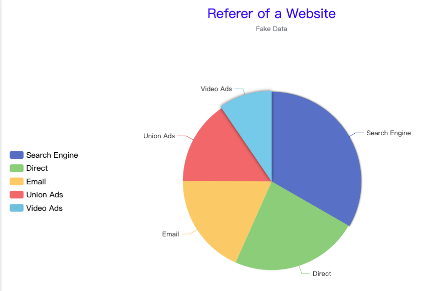
option = {
  title: {
    text: 'Referer of a Website',  // 设置标题内容
    subtext:'Fake Data',  // 设置副标题内容
    left: 'center',  // 设置标题位置,center,left,right
    textStyle: {
           color:'blue',       // 字体颜色,详细参考html颜色库
           fontFamily: '宋体',   // 字体样式,详细参考html字体库
           fontSize:24,          // 字体大小,自定义
           fontStyle: 'normal',  // 字体风格,normal,italic,oblique
           fontWeight: 'normal', // 字体粗细,normal,bold,bolder,lighter
        },
        subtextStyle:{},        // 副标题的字体样式
  },
  // 交互方式的设置
  tooltip: {
         trigger: 'axis',           // 触发类型,item¦axis|none 当trigger为’item’时只会显示该点的数据,为’axis’时显示该列下所有坐标轴所对应的数据
         showDelay: 10,             // 显示延迟,单位ms
         borderColor: '#333',       // 提示边框颜色
         axisPointer : {
         type : 'line',       // 触发坐标轴,line,shadow
        lineStyle : {        // 直线指示器样式设置
                 color: '#48b',
                 width: 2,
                 type: 'solid'
        },
        shadowStyle : {     // 阴影指示器样式设置
                width: 'auto',
                color: '#333',
        }
        },
        textStyle: {color: '#333'}         // 参考标题的字体设置
},
  // 图例
  legend: {
      //     data:['xxx','xxx'],          // 图例的内容
      //     padding:[300,100,200,100], // 内边距,上,右,下,左边距
        orient: 'vertical',  //垂直显示
        y: 'center',   //延Y轴居中
        x: 'right', //居右显示
          left: 'left',
          textStyle: {
            color: '#000000',          // 图例文字的颜色
            fontSize: 14               // 图例文字的大小
          },
},
  series: [
    {
      name: 'Access From',
      type: 'pie', // 类型
      radius: '50%', // 饼图的半径
      data: [
        { value: 1048, name: 'Search Engine' },
        { value: 735, name: 'Direct' },
        { value: 580, name: 'Email' },
        { value: 484, name: 'Union Ads' },
        { value: 300, name: 'Video Ads' }
      ],
      // 背景效果
      emphasis: {
         focus:'series'
         itemStyle: {
          shadowBlur: 10,
          shadowOffsetX: 0,
          shadowColor: 'rgba(0, 0, 0, 0.5)'
        }
      }
    }
  ]
};
## 
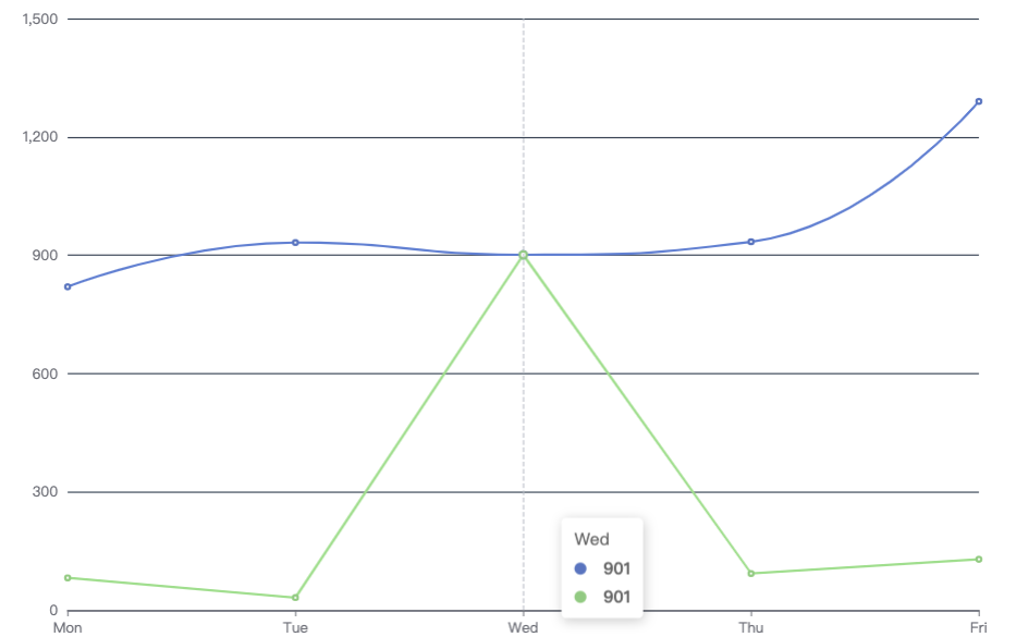
option = {
          grid: { // 折线图距离dom容器的位置
          top: "5%",
          left: "3%",
          right: "10%",
          bottom: "10%",
          containLabel: true  // 防止标签长度动态变化时可能会溢出容器或者覆盖其他组件
        },
  xAxis: {
    type: 'category',
    boundaryGap: false, // 坐标轴两侧留白
    data: ['Mon', 'Tue', 'Wed', 'Thu', 'Fri', 'Sat', 'Sun']
  },
  yAxis: {
    type: 'value',
    splitLine: {  //是否显示分割线
      lineStyle: {
      color: "#2d3a4e" // 分割线颜色
     },
    axisLabel: {
      formatter:function (value, index) {
        return value.toFixed(2);      // 处理显示数据,保留2位小数
        }
    }
  },
  series: [    // 鼠标放上去,悬浮信息
    {
      data: [820, 932, 901, 934, 1290, 133, 1320],
      type: 'line',
      areaStyle: {}
    },
        {
      data: [82, 32, 901, 93, 129, 330, 120],
      type: 'line',
      areaStyle: {}
    }
  ]
};
 ## 七、渲染echarts问题
注意点:1.避免使用全局变量 2.对绑定的事件进行解绑
## 七、渲染echarts问题
注意点:1.避免使用全局变量 2.对绑定的事件进行解绑1.场景:A页面,B页面是从A页面跳转的详情页 A有图表,B无图表;刷新才会显示全部;调用resize方法;
存在的问题:当切换到其他无echarts图表的页面改变宽度时,监听仍然存在,此时监听不到对应dom元素,从而使得再返回去时,echarts图表的宽高变成了默认的最小宽高100px;所以,在离开页面之前需要对绑定的监听事件进行解绑;
window.addEventListener("resize", function () {
 myChart1.resize();
 })
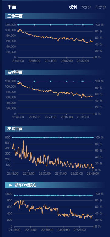
2.场景:动态渲染echarts
<div class="item">
  <div :class="['h3', activeName === 'shiqiao' ? 'active' : '']">石桥</div>
  <div class="charts" ref="shiqiao"></div>
</div>
<div class="item">
  <div :class="['h3', activeName === 'hd' ? 'active' : '']">灰度</div>
  <div class="charts" ref="hd"></div>
</div>
<div class="item">
  <div :class="['h3', activeName === 'RUN_ZD_BCORE_PLANE' ? 'active' : '']">浙东B域核心</div>
  <div class="charts" ref="RUN_ZD_BCORE_PLANE"></div>
</div>
<div class="item">
  <div :class="['h3', activeName === 'RUN_HZW_BCORE_PLANE' ? 'active' : '']">杭州湾B域核心</div>
  <div class="charts" ref="RUN_HZW_BCORE_PLANE"></div>
</div>
<div class="item">
  <div :class="['h3', activeName === 'RUN_ZD_B0DOT1_PLANE' ? 'active' : '']">浙东B域0.1</div>
  <div class="charts" ref="RUN_ZD_B0DOT1_PLANE"></div>
</div>
``
<div class="item" v-for="(el, index) in arrayOfObjects" :key="index">
<div :class="['h3', activeName ===${el.id}? 'active' : '']">{{ el.name }}</div>
<div :id="${el.id}" class="charts" :ref="${el.id}`”>
methods:{
this.$nextTick(() => {
this.$echarts.init(document.getElementById(azCode)).setOption({
……..});
}
```

若有收获,就点个赞吧
0 人点赞
