直方图是我们常常可以作为我们理解数据集的第一步,也是重要一步。
一维直方图绘制
首先还是基操:
%matplotlib inlineimport matplotlib.pyplot as pltplt.style.use('seaborn-white')import numpy as npdata = np.random.randn(1000)
plt.hist(data)

当然 plt.hist() 函数还有很多可选参数:
plt.hist(data, bins=30, density=True, alpha=0.5,histtype='stepfilled', color='steelblue',edgecolor='none')

bins—- 直方图中箱子 ( bins ) 的数量density—- 如果该参数为True,则将直方图正则化,也即直方图下方的面积和为 1.
直接查看 plt.hist() 的官方文档还是更靠谱的,每个参数都解释的很明白。histtype='stepfilled'** 与透明度 alpha 一起使用以在直方图中对比不同数据的分布效果更佳呦!**
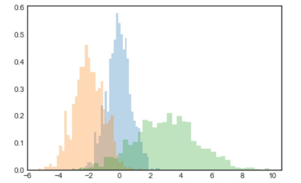
x1 = np.random.normal(0, 0.8, 1000)x2 = np.random.normal(-2, 1, 1000)x3 = np.random.normal(3, 2, 1000)kwargs = dict(histtype='stepfilled', alpha=0.3, density=True, bins=40)plt.hist(x1, **kwargs)plt.hist(x2, **kwargs)plt.hist(x3, **kwargs)
需要说明的是, plt.hist() 是有返回值的。如果我们只想计算直方图参数(计算每一个 bins 中点的数量)而不把直方图画出来,那么可以使用 np.histogram() :
>>> counts, bin_edges = np.histogram(data, bins=5)>>> print(counts, bin_edges)[ 18 200 432 302 48] [-3.35181513 -2.10033581 -0.84885649 0.40262284 1.65410216 2.90558149]
二维直方图绘制
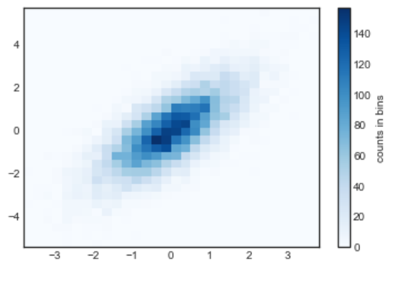
上面我们在绘制一维直方图的时候,通过将一条数轴(x 轴)划分成多个 bins 的方法画出了直方图。那么二维直方图同理,要将一个个二维点分入不同的 bins 里面。比如下面我们定义了一些服从多变量高斯分布的数据点:
mean = [0, 0]cov = [[1, 1], [1, 2]]x, y = np.random.multivariate_normal(mean, cov, 10000).T
plt.hist2d() : 二维直方图
plt.hist2d(x, y, bins=30, cmap='Blues')cb = plt.colorbar()cb.set_label('counts in bins')
与 plt.hist() 一样, plt.hist2d() 也有在 Numpy 中对应的函数 np.histogram2d() :
counts, xedges, yedges = np.histogram2d(x, y, bins=30)
如果想得到高于二维的直方图参数,可以使用 np.histogramdd() 函数
plt.hexbin() : 六边形 bins
上面画出来的直方图使用正方形进行密铺,另外一种常用的密铺形状是正六边形。Matplotlib 也提供了相应的接口:
plt.hexbin(x, y, gridsize=30, cmap='Blues')cb = plt.colorbar(label='count in bin')

plt.hexbin() 提供了一堆有意思的可选参数,比如可以指明每一个点的权重,改变返回值的形式等,详见该函数的 docstring.
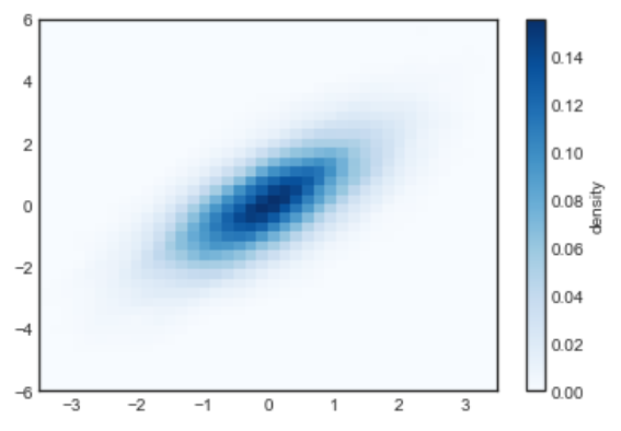
核密度估计 Kernel density estimation
另外一个估计高维数据的密度的方法是核密度估计 (KDE, Kernel Density Estimation). 可以使用 scipy.stats 包直接整!
from scipy.stats import gaussian_kde# fit an array of size [Ndim, Nsamplpes]data = np.vstack([x, y])kde = gaussian_kde(data)# evaluate on a regular gridxgrid = np.linspace(-3.5, 3.5, 40)ygrid = np.linspace(-6, 6, 40)Xgrid, Ygrid = np.meshgrid(xgrid, ygrid)Z = kde.evaluate(np.vstack([Xgrid.ravel(), Ygrid.ravel()]))# Plot the result as an imageplt.imshow(Z.reshape(Xgrid.shape),origin='lower', aspect='auto',extent=[-3.5, 3.5, -6, 6],cmap='Blues')cb = plt.colorbar()cb.set_label('density')

若有收获,就点个赞吧
0 人点赞
