可视化 R
在绘制可视化图表时经常需要对特定区域、位置等使用文本或箭头等标识性字符进行注释显示,这种注释在可视化制作中尤为重要,它可以突出重要信息,引起人们对图形某个特征的关注。接下来就汇总一下在R和Python可视化绘制中是如何进行注释的。具体内容如下:
- R注释操作
- Python注释操作
R注释操作
在使用R进行可视化绘制中,起注释作用的绘图函数有很多,这里还是介绍基于ggplot2绘图体系中的绘图函数,主要介绍R-ggplot2和R-ggforce 包中关于注释的内容,如下:R-ggplot2 注释操作
这一部分使用ggplot2中annotate()函数进行说明,这里直接给出一个具体案例,如下: ```r library(tidyverse) library(ggtext) library(hrbrthemes) library(ggpubr) library(ggsci) library(ggforce)
plot01 <- ggplot(data = iris,aes(Petal.Length, Petal.Width, )) + geom_point(shape=21,aes(fill=Species),colour=”black”,size=3) + scale_fill_jco()+
基础注释方式
annotate( geom = “curve”, x = 2., y = 1, xend = 1.5, yend = .65, curvature = .3,arrow = arrow(length = unit(2, “mm”)))+ annotate(geom = “text”, x = 2.1, y = 1, label = “setosa”, hjust=”left”,vjust = .5)+
labs( title = “Example of ggplot2::annotate()“, subtitle = “processed charts with annotate()“, caption = “Visualization by DataCharm“) + hrbrthemes::theme_ipsum(base_family = “Roboto Condensed”) + theme(plot.title = element_markdown(hjust = 0.5,vjust = .5,color = “black”, size = 20, margin = margin(t = 1, b = 12)), plot.subtitle = element_markdown(hjust = 0,vjust = .5,size=15), plot.caption = element_markdown(face = ‘bold’,size = 12), )
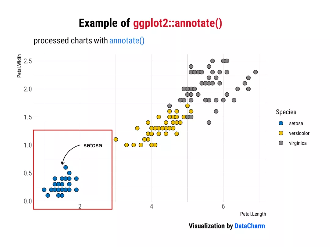<br />Example of ggplot2 annotate()<br />当然如果想要实现这种“箭头”效果,ggplot2的`geom_segment()`和`geom_curve()`都可实现,感兴趣的小伙伴可去ggplot2官网([https://ggplot2.tidyverse.org/reference/index.html](https://ggplot2.tidyverse.org/reference/index.html)) 进行探索。下面介绍一种更为方便直观且简单的方法。<a name="dHKlU"></a>### R-ggforce 注释操作R-ggforce包中有几个绘图函数可以实现较为灵活的注释效果,且语法较为简单。官网为:[https://ggforce.data-imaginist.com/reference/index.html](https://ggforce.data-imaginist.com/reference/index.html)。详细如下:<a name="ICtN4"></a>#### 「geom_mark_rect()」```rggplot(iris, aes(Petal.Length, Petal.Width)) +geom_mark_rect(aes(fill = Species, label = Species),con.cap = 0,label.fill='gray',label.colour="black") +geom_point(shape=21,aes(fill=Species),colour="black",size=3) +scale_fill_nejm() +labs(title = "Example of <span style='color:#D20F26'>ggforce::geom_mark_rect()</span>",subtitle = "processed charts with <span style='color:#1A73E8'>geom_mark_rect()</span>",caption = "Visualization by <span style='color:#0057FF'>DataCharm</span>") +hrbrthemes::theme_ipsum(base_family = "Roboto Condensed") +theme(plot.title = element_markdown(hjust = 0.5,vjust = .5,color = "black",size = 20, margin = margin(t = 1, b = 12)),plot.subtitle = element_markdown(hjust = 0,vjust = .5,size=15),plot.caption = element_markdown(face = 'bold',size = 12),)
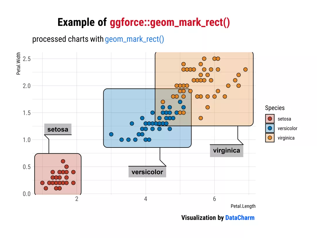
Example of ggforce::geom_mark_rect()
「geom_mark_circle()」
ggplot(iris, aes(Petal.Length, Petal.Width)) +geom_mark_circle(aes(fill = Species, label = Species),con.cap = 0,label.fill='gray',label.colour="black") +geom_point(shape=21,aes(fill=Species),colour="black",size=3) +scale_fill_nejm() +labs(title = "Example of <span style='color:#D20F26'>ggforce::geom_mark_circle()</span>",subtitle = "processed charts with <span style='color:#1A73E8'>geom_mark_circle()</span>",caption = "Visualization by <span style='color:#0057FF'>DataCharm</span>") +hrbrthemes::theme_ipsum(base_family = "Roboto Condensed") +theme(plot.title = element_markdown(hjust = 0.5,vjust = .5,color = "black",size = 20, margin = margin(t = 1, b = 12)),plot.subtitle = element_markdown(hjust = 0,vjust = .5,size=15),plot.caption = element_markdown(face = 'bold',size = 12),)
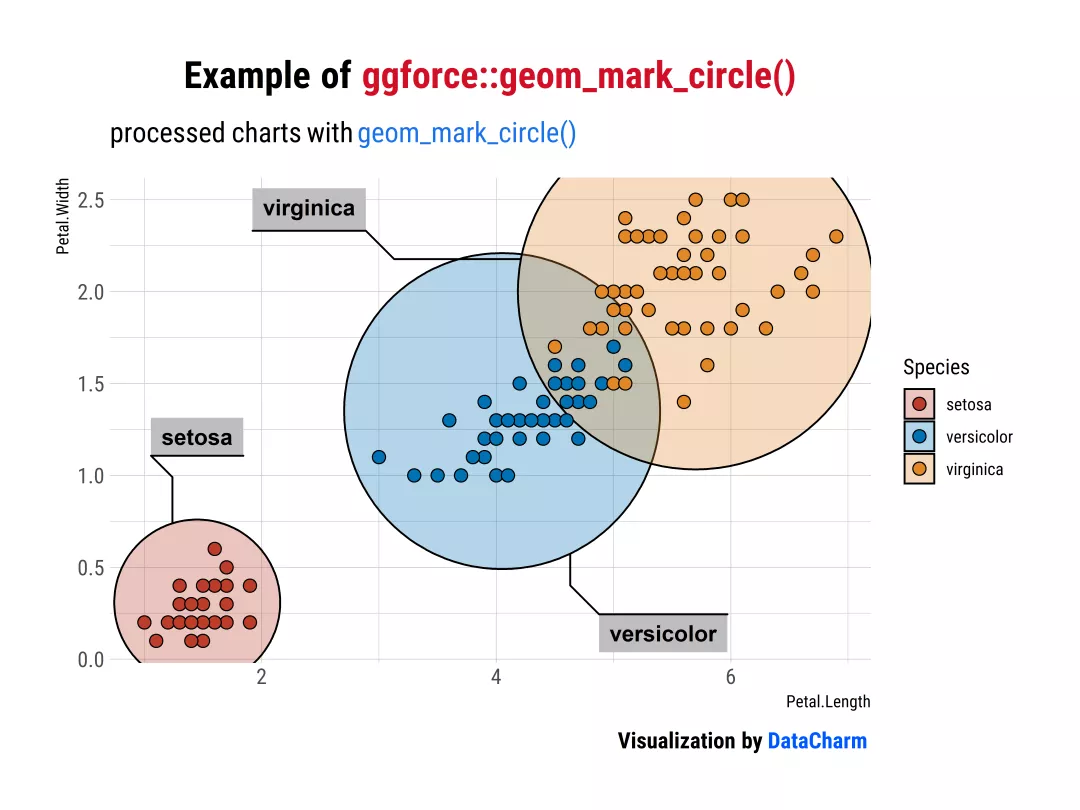
Example of ggforce::geom_mark_circle()
「geom_mark_ellipse()」
ggplot(iris, aes(Petal.Length, Petal.Width)) +geom_mark_ellipse(aes(fill = Species, label = Species),con.cap = 0,label.fill='gray',label.colour="black") +geom_point(shape=21,aes(fill=Species),colour="black",size=3) +scale_fill_nejm() +labs(title = "Example of <span style='color:#D20F26'>ggforce::geom_mark_ellipse()</span>",subtitle = "processed charts with <span style='color:#1A73E8'>geom_mark_ellipse()</span>",caption = "Visualization by <span style='color:#0057FF'>DataCharm</span>") +hrbrthemes::theme_ipsum(base_family = "Roboto Condensed") +theme(plot.title = element_markdown(hjust = 0.5,vjust = .5,color = "black",size = 20, margin = margin(t = 1, b = 12)),plot.subtitle = element_markdown(hjust = 0,vjust = .5,size=15),plot.caption = element_markdown(face = 'bold',size = 12),)

Example of ggforce::geom_mark_ellipse()
「geom_mark_hull()」
ggplot(iris, aes(Petal.Length, Petal.Width)) +geom_mark_hull(aes(fill = Species, label = Species),con.cap = 0,label.fill='gray',label.colour="black") +geom_point(shape=21,aes(fill=Species),colour="black",size=3) +scale_fill_nejm() +labs(title = "Example of <span style='color:#D20F26'>ggforce::geom_mark_hull()</span>",subtitle = "processed charts with <span style='color:#1A73E8'>geom_mark_hull()</span>",caption = "Visualization by <span style='color:#0057FF'>DataCharm</span>") +hrbrthemes::theme_ipsum(base_family = "Roboto Condensed") +theme(plot.title = element_markdown(hjust = 0.5,vjust = .5,color = "black",size = 20, margin = margin(t = 1, b = 12)),plot.subtitle = element_markdown(hjust = 0,vjust = .5,size=15),plot.caption = element_markdown(face = 'bold',size = 12),)
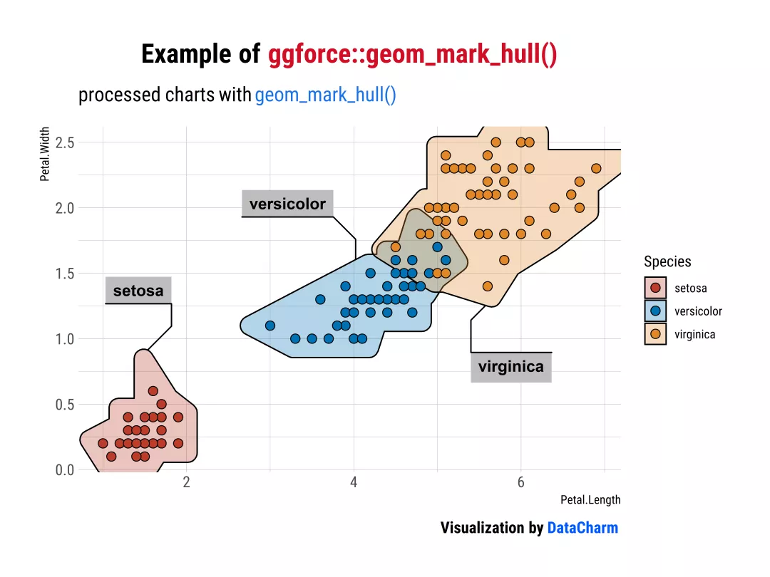
Example of ggforce::geom_mark_hull()()
以上就是对在R中使用注释列举的几个小例子,当然,可能还不只这些。
Python 注释操作
介绍完R绘制注释(annotate)的方法,小编这里再简单介绍下Python的注释(annotate)方法,这里主要介绍Matplotlib的注释方法,如下:
import matplotlib.pyplot as pltimport numpy as npfig, ax = plt.subplots(figsize=(7,5),dpi=100)plt.rcParams['font.family'] = ['Times New Roman']t = np.arange(0.0, 5.0, 0.01)s = np.cos(2*np.pi*t)line, = ax.plot(t, s, lw=3,color="#BC3C28")# 各种annotate样式ax.annotate('straight',xy=(0, 1), xycoords='data',xytext=(-50, 30), textcoords='offset points',arrowprops=dict(arrowstyle="->"))ax.annotate('arc3,\nrad 0.2',xy=(0.5, -1), xycoords='data',xytext=(-80, -60), textcoords='offset points',arrowprops=dict(arrowstyle="->",connectionstyle="arc3,rad=.2"))ax.annotate('arc,\nangle 50',xy=(1., 1), xycoords='data',xytext=(-90, 50), textcoords='offset points',arrowprops=dict(arrowstyle="->",connectionstyle="arc,angleA=0,armA=50,rad=10"))ax.annotate('arc,\narms',xy=(1.5, -1), xycoords='data',xytext=(-80, -60), textcoords='offset points',arrowprops=dict(arrowstyle="->",connectionstyle="arc,angleA=0,armA=40,angleB=-90,armB=30,rad=7"))ax.annotate('angle,\nangle 90',xy=(2., 1), xycoords='data',xytext=(-70, 30), textcoords='offset points',arrowprops=dict(arrowstyle="->",connectionstyle="angle,angleA=0,angleB=90,rad=10"))ax.annotate('angle3,\nangle -90',xy=(2.5, -1), xycoords='data',xytext=(-80, -60), textcoords='offset points',arrowprops=dict(arrowstyle="->",connectionstyle="angle3,angleA=0,angleB=-90"))ax.annotate('angle,\nround',xy=(3., 1), xycoords='data',xytext=(-60, 30), textcoords='offset points',bbox=dict(boxstyle="round", fc="0.8"),arrowprops=dict(arrowstyle="->",connectionstyle="angle,angleA=0,angleB=90,rad=10"))ax.annotate('angle,\nround4',xy=(3.5, -1), xycoords='data',xytext=(-70, -80), textcoords='offset points',size=20,bbox=dict(boxstyle="round4,pad=.5", fc="0.8"),arrowprops=dict(arrowstyle="->",connectionstyle="angle,angleA=0,angleB=-90,rad=10"))ax.annotate('angle,\nshrink',xy=(4., 1), xycoords='data',xytext=(-60, 30), textcoords='offset points',bbox=dict(boxstyle="round", fc="0.8"),arrowprops=dict(arrowstyle="->",shrinkA=0, shrinkB=10,connectionstyle="angle,angleA=0,angleB=90,rad=10"))ax.annotate('', xy=(4., 1.), xycoords='data',xytext=(4.5, -1), textcoords='data',arrowprops=dict(arrowstyle="<->",connectionstyle="bar",ec="k",shrinkA=5, shrinkB=5))# 定制化操作ax.set(xlim=(-1, 5), ylim=(-4, 3))for spine in ['top','bottom','left','right']:ax.spines[spine].set_visible(False)ax.tick_params(left=False,labelleft=False,bottom=False,labelbottom=False)ax.set_title("Example Of Matplotlib.annotate()",size=15,fontweight="bold")
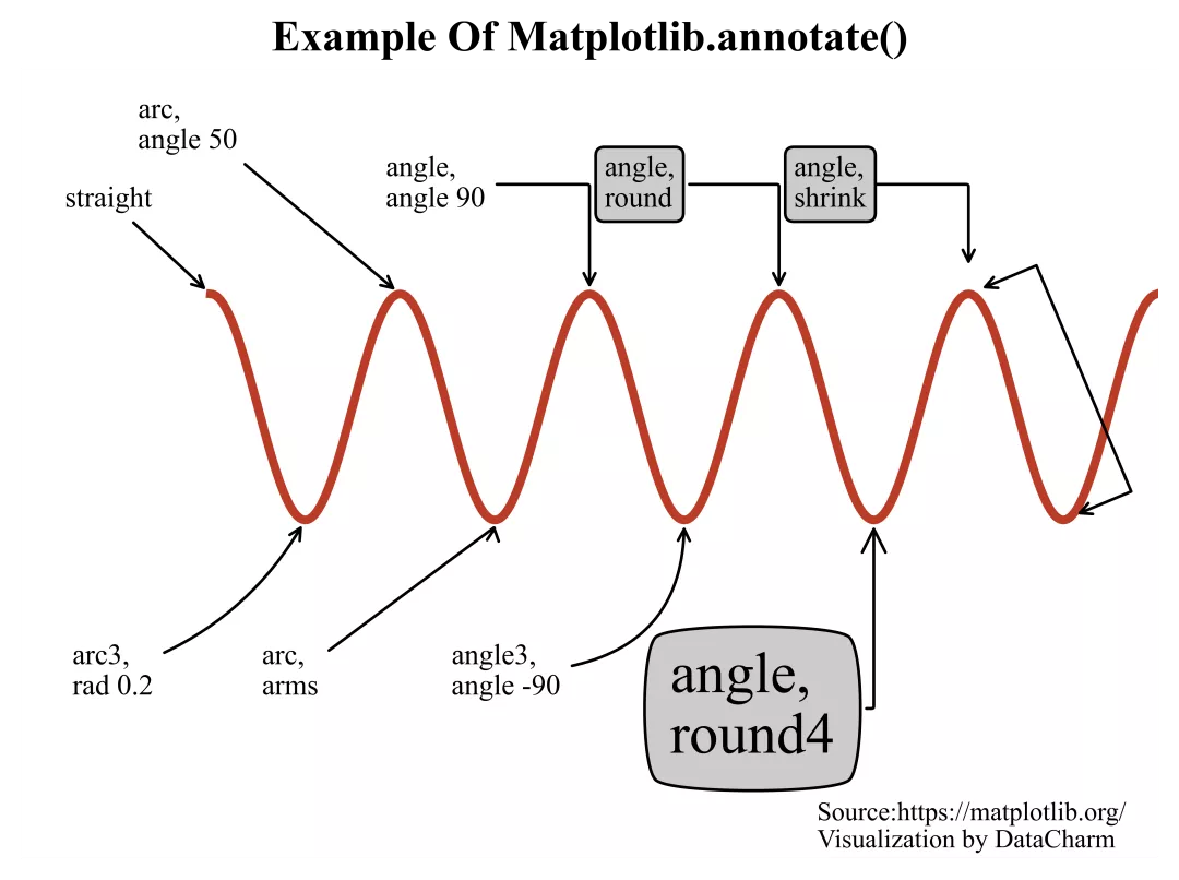
Example Of Matplotlib.annotate()

若有收获,就点个赞吧
0 人点赞
