LEC 001
YAML language
- YAML section is at the start of the file and begins and ends with three dashes: —-
- a prefix to the file
- YAML ain’t markdown language
Sequences
colon operator
```{r}1:10 ## 1 through 1010:1 ## 10 through 1
<a name="DQZF9"></a>
### seq(from, to, by)
```r
```{r}
seq()    ## default sequence from 1 to 1
seq(1, 10, 0.5)    ## sequence from 1 to 10 by 0.5
seq(1, 10, length.out = 19)    ## specifying the length
<a name="TbXoB"></a>
### c(): combines arbitrary values into a vector
```r
```{r}
c(1, 2, 3, 4, 5, 6)
OUTPUT: 1 2 3 4 5 6

c(1:5, 10)
OUTPUT: 1 2 3 4 5 10
<a name="k6Fz5"></a>
## Arithmetic
<a name="eHZPM"></a>
### dot product
```r
```{r}
sum(a * b)
<a name="AxLdp"></a>
### incompatible size
The shorter vector is replicated to be the same length as the longer one.
```r
```{r}
a = 1:3
a
b = 4:5
b
a + b
OUTPUT: 1 2 3 4 5 5 7 7
<a name="gZDMb"></a>
## COMMONS
<a name="zcuhb"></a>
### change types
```r
```{r}
b = seq(1,5)
b
class(b)

b_char = as.character(b)
class(b_char)
OUTPUT: 1 2 3 4 5 “integer” “character”
```
<a name="wGwcV"></a>
### data frames
```r
```{r}
dat = data.frame(x = LETTERS[1:10], y = 1: 10)
class(dat)

## 3 ways to grab the vector that is the first colum
dat$x

dat[[1]]
dat[['x']]
dat[,1]
<a name="CgPgd"></a>
### inquiry dimensions
```r
```{r}
dim(dat)
nrow(dat)
ncol(dat)
---

<a name="o9mZD"></a>
# LEC 002
```r
```{r histogram}
ggplot(mendota) +
    geom_histogram(aes(x = duration))
```r
```{r histogram-fancy}
ggplot(mendota) +
    geom_histogram(aes(x = duration),
                                    fill = "hotpink",
                                    color = "black",
                                    binwidth = 7,
                                    boundary = 0)    +
    xlab("Total days frozen")    +
    ylab("Counts") +
    ggtitle("Lake Mendota Freeze Durations, 1855-2021")
```r
```{r density}
ggplot(mendota)    +
    geom_density(aes(x = duration),
               fill = "hotpink",
               color = "black")    +
    xlab("Total days frozen") +
    ylab("Density")    +
    ggtitle("Lake Mendota Freeze Durations, 1855-2021")
```r
```{r plot}
ggplot(mendota, aes(x = year1, y = duration)) +
    geom_point() +
    geom_line() +
    geom_smooth(se = FALSE) +
    xlab("Year") +
    ylab("Total Days Frozen") +
    ggtitle()
LEC 003
Statistical transformations *
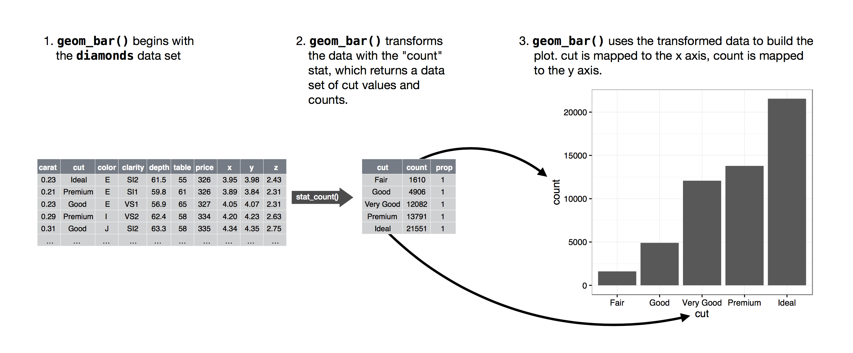
Three reasons need to use a stat explicitly:
- Override the default stat. This allows to map the height of bars to the raw values of a y variable.
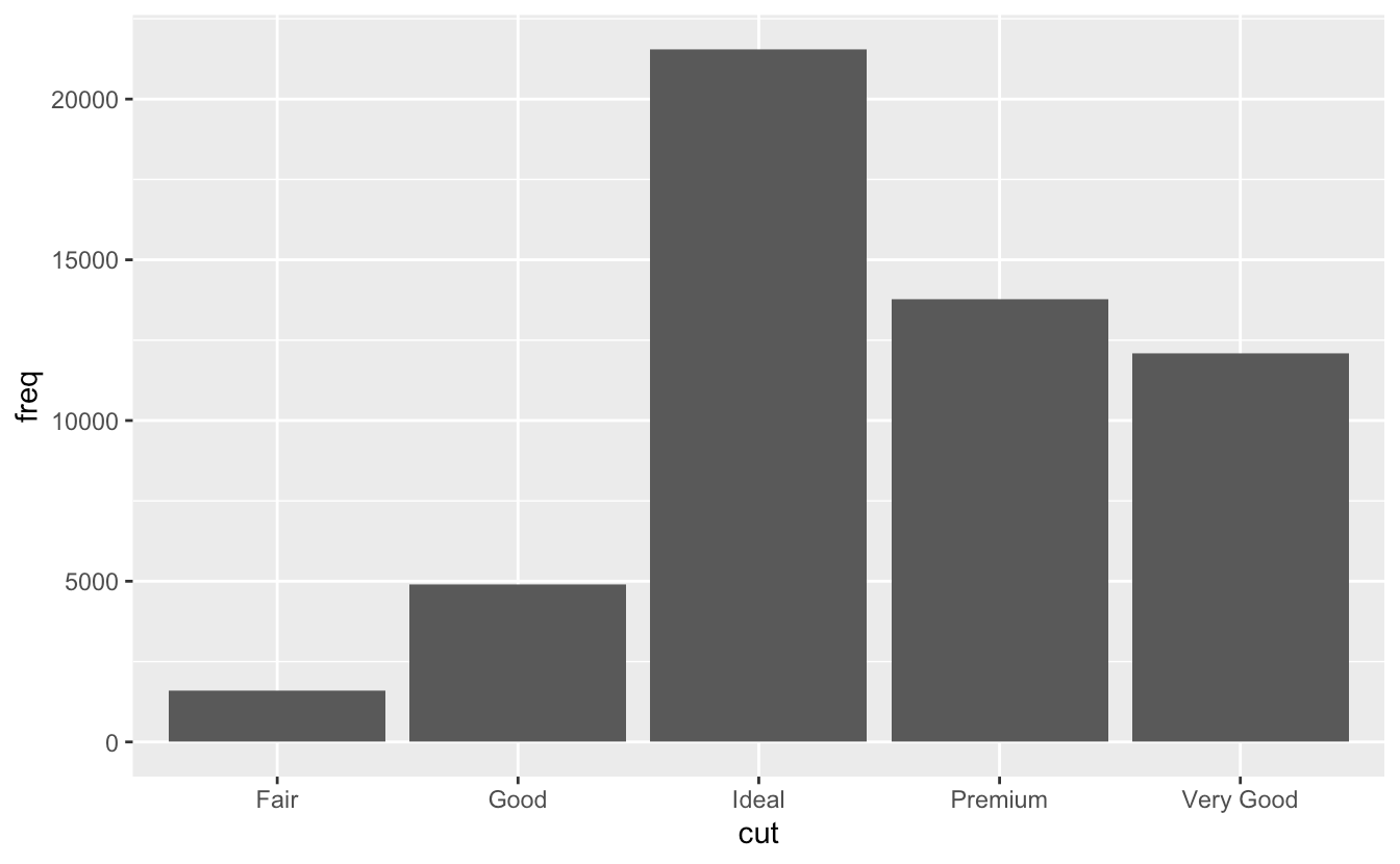
- The default behavior of geom_bar is to count the number of rows of data (using stat=”count”) for each x-value and plot that as the bar height. However, if your data are pre-summarized—that is, you already have a columns of counts (like y=freq in your example)—then use stat=”identity”, which tells geom_bar to use the y aesthetic (freq in this case) for the bar heights rather than count rows of data.
- group=”whatever” is a “dummy” grouping to override the default behavior, which (here) is to group by cut and in general is to group by the x variable. The default for geom_bar is to group by the x variable in order to separately count the number of rows in each level of the x variable. For example, here, the default would be for geom_bar to return the number of rows with cut equal to “Fair”, “Good”, etc.
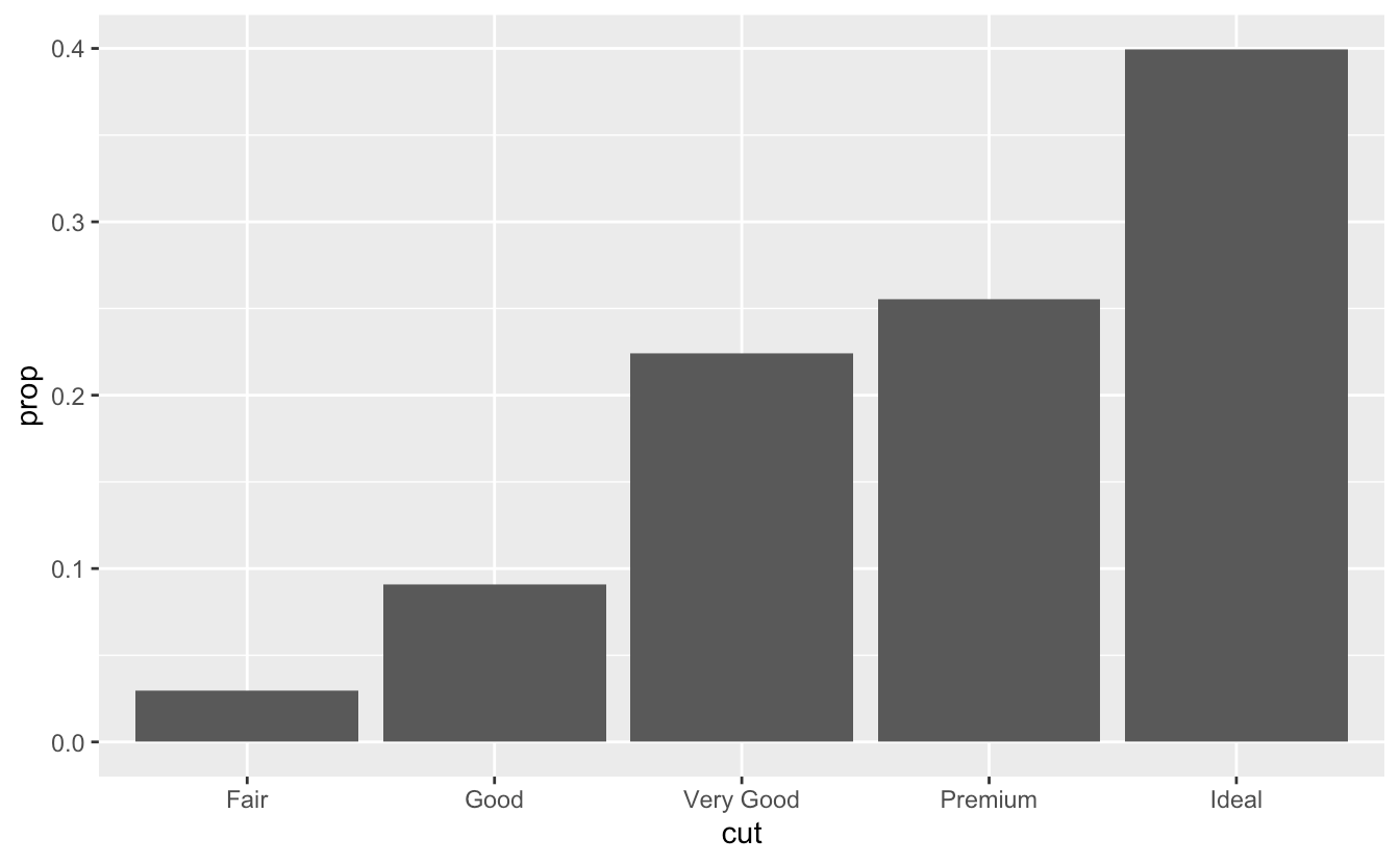
- However, if we want proportions, then we need to consider all levels of cut together. In the second plot, the data are first grouped by cut, so each level of cut is considered separately. The proportion of Fair in Fair is 100%, as is the proportion of Good in Good, etc. group=1 (or group=”x”, etc.) prevents this, so that the proportions of each level of cut will be relative to all levels of cut. ```r demo <- tribble( ~cut, ~freq, “Fair”, 1610, “Good”, 4906, “Very Good”, 12082, “Premium”, 13791, “Ideal”, 21551 )
ggplot(data = demo) + geom_bar(mapping = aes(x = cut, y = freq), stat = “identity”)
2. Override the default mapping from transformed variables to aesthetics. For example, display a bar chart of **proportion**, rather that count.
```r
ggplot(data = diamonds) +
geom_bar(mapping = aes(x = cut, y = stat(prop), group = 1))
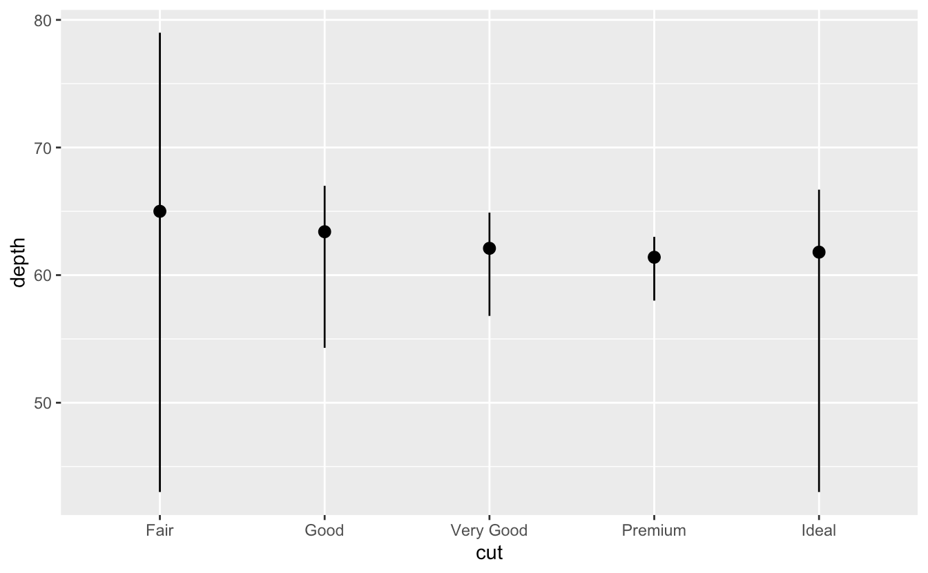
- draw greater attention to the statistical transformation in your code.
ggplot(data = diamonds) +
  stat_summary(
    mapping = aes(x = cut, y = depth),
    fun.min = min,
    fun.max = max,
    fun = median
  )
Position adjustment
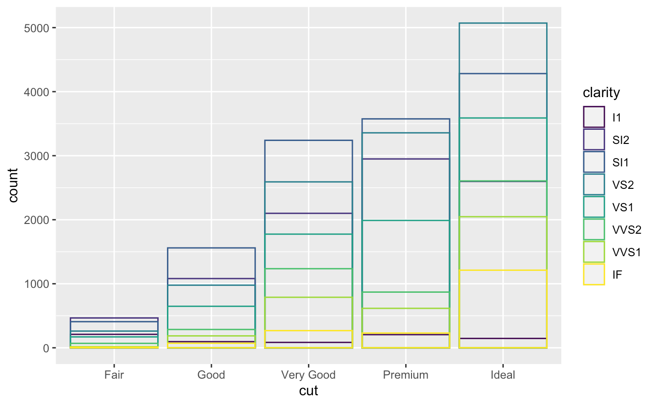
position = "identity"ggplot(data = diamonds, mapping = aes(x = cut, fill = clarity)) + geom_bar(alpha = 1/5, position = "identity") ggplot(data = diamonds, mapping = aes(x = cut, colour = clarity)) + geom_bar(fill = NA, position = "identity")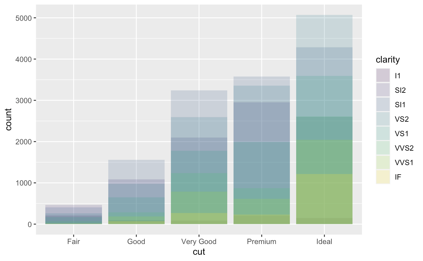
position = "fill"ggplot(data = diamonds) + geom_bar(mapping = aes(x = cut, fill = clarity), position = "fill")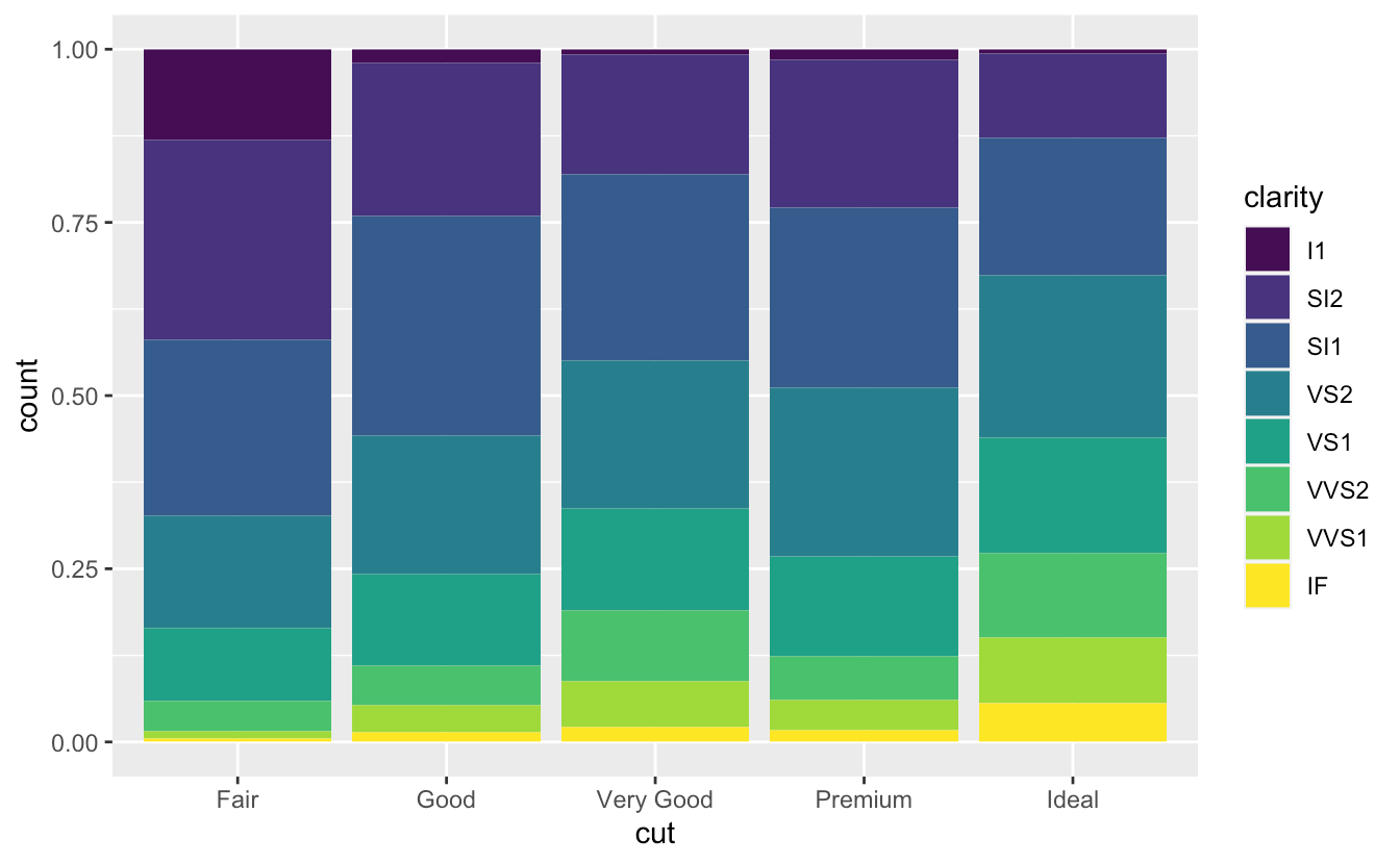
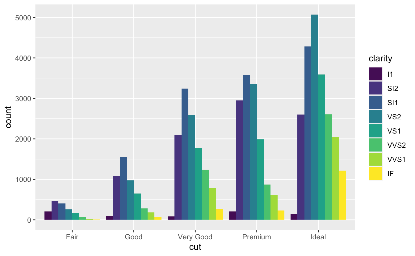
position = "dodge"ggplot(data = diamonds) + geom_bar(mapping = aes(x = cut, fill = clarity), position = "dodge")Layered grammar of graphics template
ggplot(data = <DATA>) +
<GEOM_FUNCTION>(
  mapping = aes(<MAPPINGS>),
  stat = <STAT>,
  position = <POSITION>
) +
<COORDINATE_FUNCTION> +
<FACET_FUNCTION>
Probobility and density
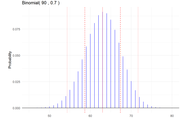
Binomial
The BINS acronym for binomial assumptions
- B = binary outcomes (each trial may be categorized with two outcomes, conventionally labeled success and failure)
- I = independence (results of trials do not affect probabilities of other trial outcomes)
- N = fixed sample size (the sample size is pre-specified and not dependent on outcomes)
- S = same probability (each trial has the same probability of success)
The mean is μ=np
The variance is σ2=np(1−p)
The standard deviation is σ=sqrt(np(1−p))
Functions:
rbinom(n, size, prob)
- desc.: generate random binomial variables
return: random binomial variables
B = 1000000
n = 100
p = 0.5
# simulate binomial random variables
binomial_example = tibble(
x = rbinom(B, n, p)
)
dbinom(x, size, prob)
desc.: binomial density calculations
#prob. when x = 4
dbinom(4, n, p)
-->[1] 0.15625
pbinom(q, size, prob)
desc.: P(X <= x) = F(x), where F is the distribution function. ```r
P(X <= 3):
pbinom(3, n, p) dbinom(0, n, p) + dbinom(1, n, p) + dbinom(2, n, p) + dbinom(3, n, p) 1 - dbinom(4, n, p) - dbinom(5, n, p)
```r
# P(X > 3):
1 - pbinom(3, n, p)     # 1 - P(X <= 3)
pbinom(3, n, p, lower.tail=FALSE)     # P(X > 3)
dbinom(4, n, p) + dbinom(5, n, p)
# P(X < 3):
pbinom(3, n, p) - dbinom(3, n, p)
pbinom(2, n, p)        # P(X <= 2) = P(X < 3)
qbinom(p, size, prob)
- Desc.: Binomial quantile calculations
- Docs: The quantile is defined as the smallest value x such that P(X<=x) = F(x) ≥ p, where F is the distribution function.
qbinom(.2, n, p) # which x such that P(X <= x) = 0.2; there may not be an exact x
-->[1] 2
dbinom(0, n, p) + dbinom(1, n, p) + dbinom(2, n, p)
-->[1] 0.5
dbinom(0, n, p) + dbinom(1, n, p)
-->[1] 0.1875
gbinom(n,p)
```r n = 90 p = 0.7 mu = np sigma = sqrt(np*(1-p))
gbinom(n, p, scale = TRUE) +
geom_vline(xintercept = mu, color = “red”, alpha = 0.5) +
geom_vline(xintercept = mu + c(-1,1)sigma,
color = “red”, linetype = “dashed”) +
geom_vline(xintercept = mu + c(-2,2)sigma,
color = “red”, linetype = “dotted”) +
theme_minimal()
```

若有收获,就点个赞吧
0 人点赞
