More in the iconography series:• Foundations of Iconography• 7 Principles of Icon Design• 5 Ways to Create a Settings Icon• Pixel-Snapping in Icon Design• 3 Classic Icon Families
If you’re a digital designer, you’ve probably encountered an icon grid before. Perhaps you were tasked to create an app icon for iOS or Android, or you contributed to a set of UI icons. Perhaps—like me—you weren’t sure how to use it.
Though the lines can look like cryptic mumbo jumbo, there’s a purpose behind each one. Let’s investigate.
Overview
Icon grids represent an icon set’s rules visually, laying a canvas to draw from. They delineate the icon’s dimensions, the underlying pixel grid, and additional key gridlines — or keylines — to follow.
An icon grid is a tool for speed and consistency. When one designer draws icons, they know the rules intimately because they invented them. But over time these can get lost. Across larger icon sets and larger teams, an icon grid provides the same starting point for multiple contributors.
Anatomy
The necessary parts of an icon grid are determined by context—where the icons will be displayed, how they will be masked, and what shapes will be useful as templates.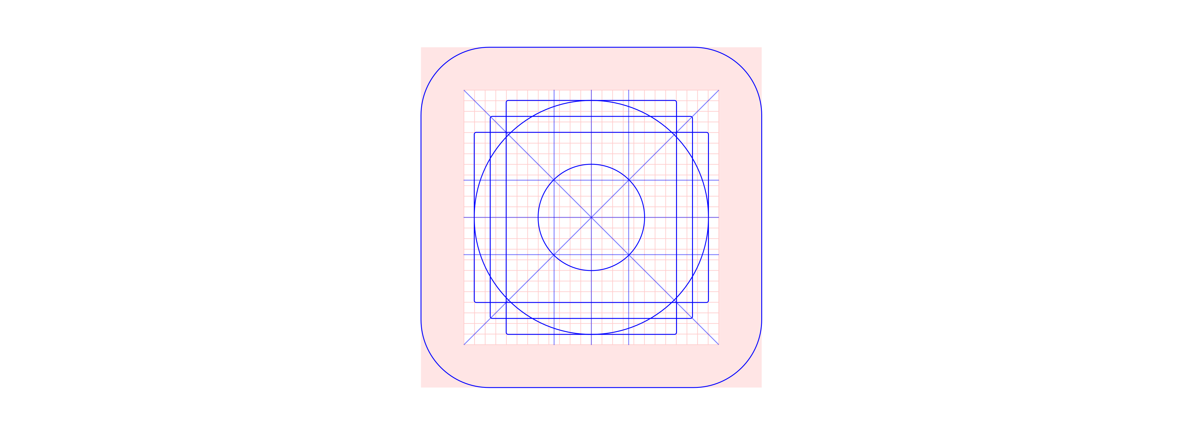
Material Play Store icon grid
Ingredients may include a pixel grid, keyshapes, orthogonals, mask, and safe area / trim area, each providing reference points to draw against. As with any recipe, the creator of the grid chooses what to use and what to omit.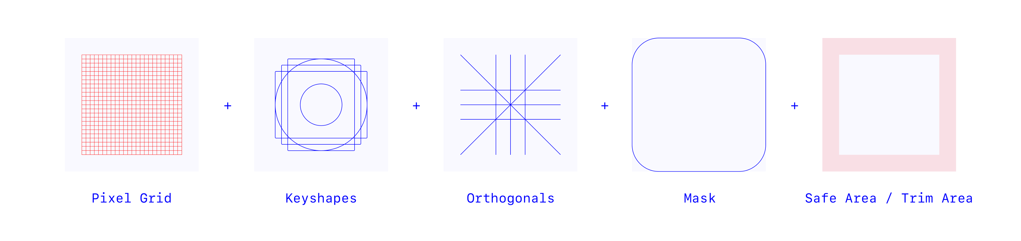
Pixel Grid
A pixel grid helps you draw in specific increments if you are snapping to a grid. A 1px increment has long held the standard in digital and a .5px increment has more recently become adopted.
Material’s Volume Up icon sits snugly on their 24 x 24px system icon grid, using 2px strokes: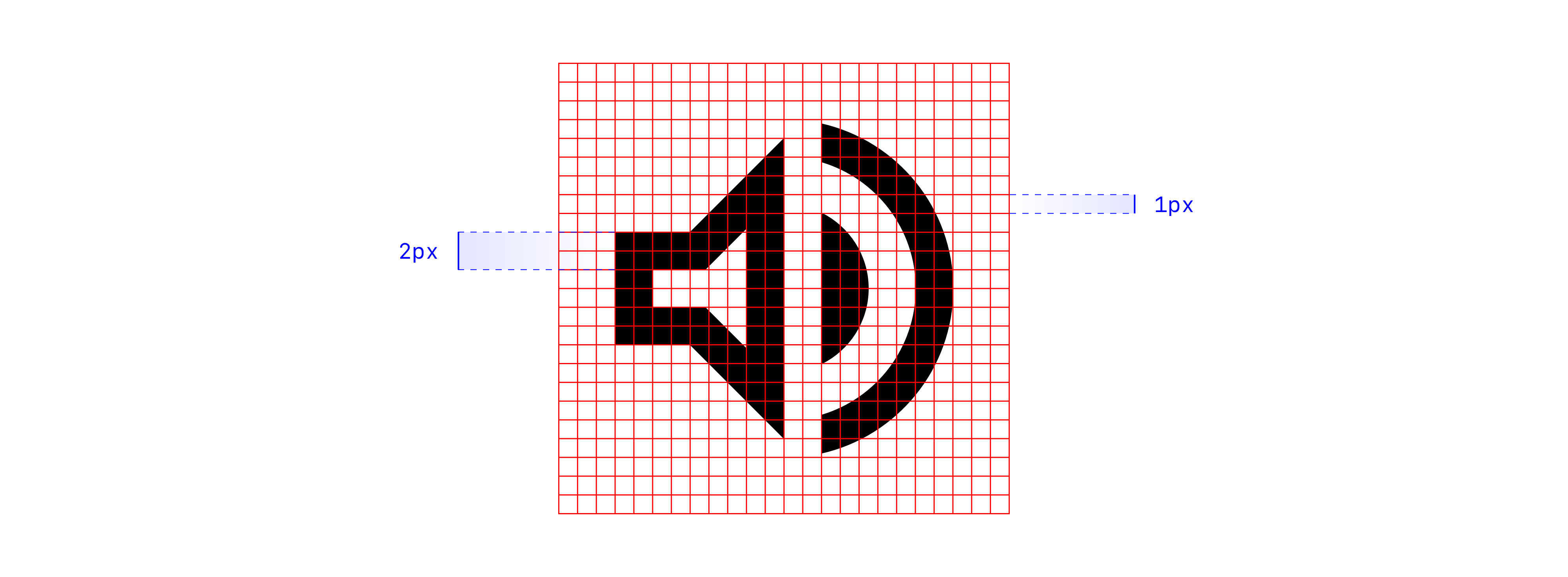
Pixel-snapping helps render icons sharp on lower resolution screens but has become much less of a requirement as hardware rendering has improved. More investigation on pixel-snapping in a future article.
Keyshapes
Keyshapes provide template shapes to start from. Four basics are common: a circle, square, portrait rectangle, and landscape rectangle.
IBM uses these 4 keyshapes to draw icons for Play, Save, Delete, and HD: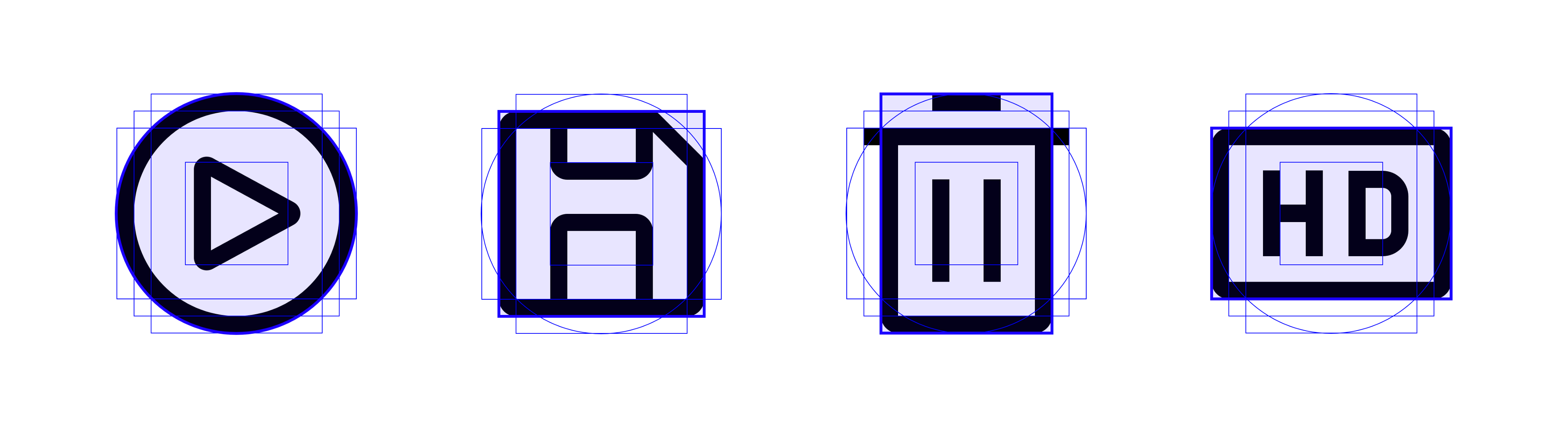
Think of keyshapes as a starter kit, providing just enough to set the standard while leaving room for flexibility and creativity. The intention is not for every icon to map perfectly to a basic shape.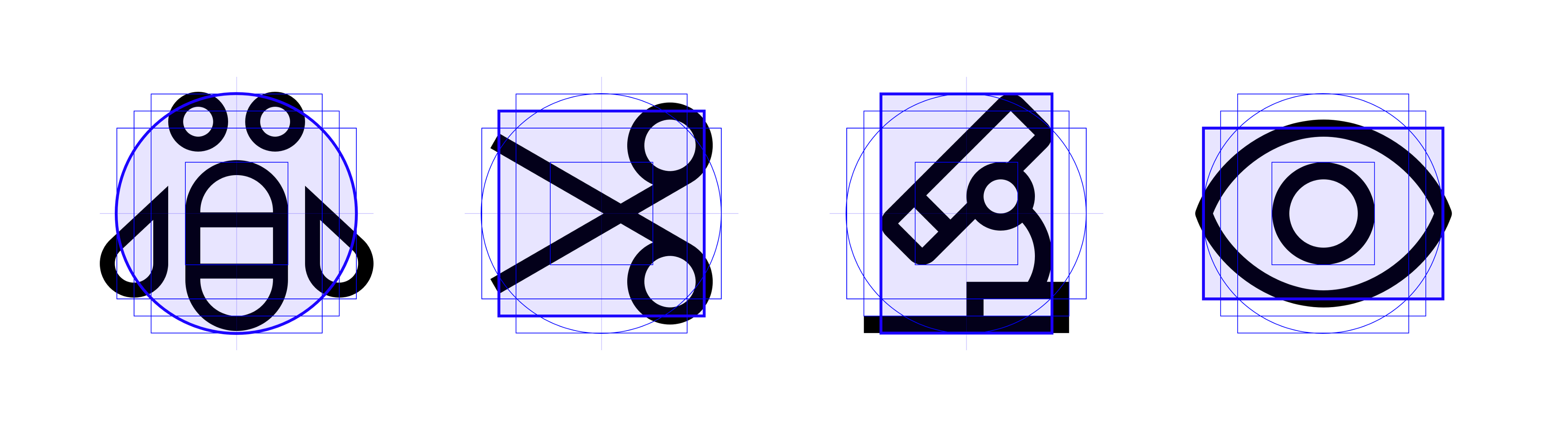
Orthogonals
Orthogonals—_borrowed from perspective drawing—_refer to keylines that intersect the center point of the icon and create additional vertices to use. These lines commonly slice the canvas at 90° and 45°. When further angles are needed increments of 15° and 5° are the next steps.
Material’s Volume Off aligns its slash to a 45° orthogonal: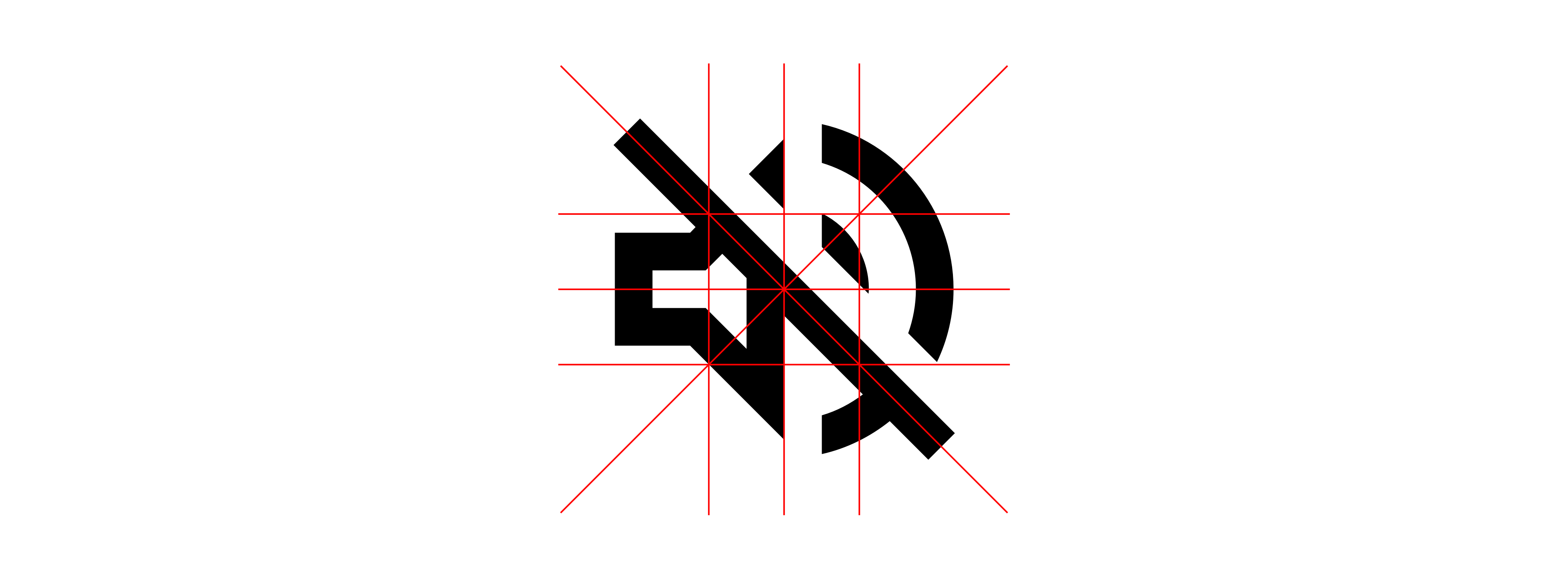
Mask
A mask customizes the container of an icon from the default square canvas. Masks may be embedded in the asset itself or applied afterwards. The Play Store applies a rounded rectangle mask across all its icons: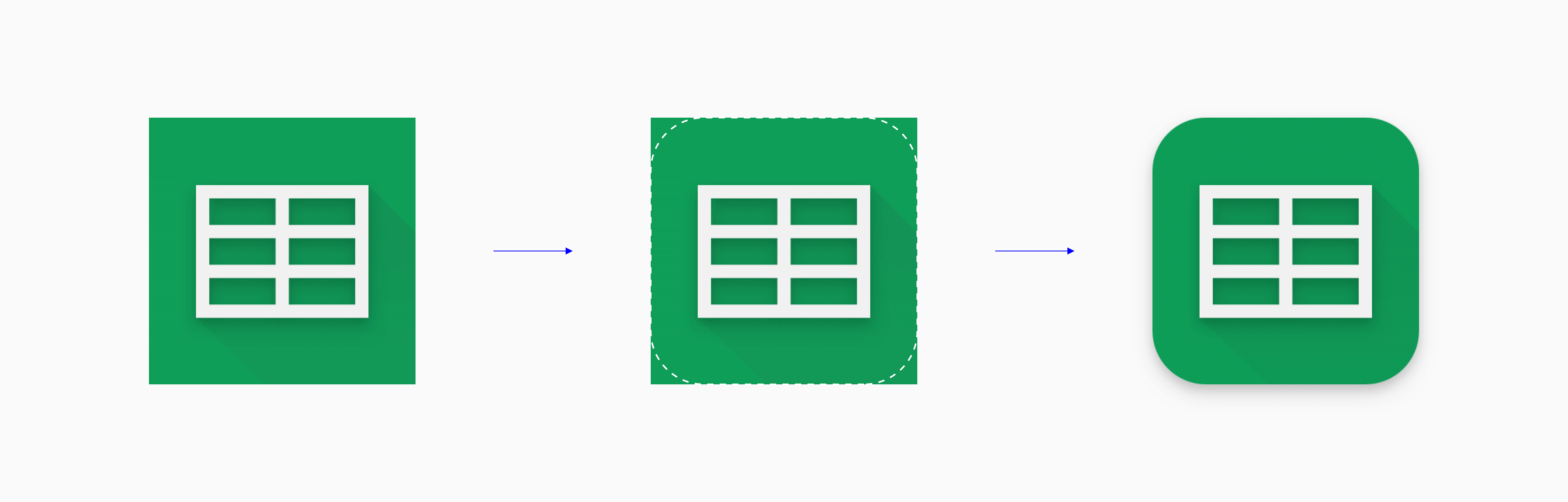
For launcher icons (which live on the home screen and app drawer), different Android OEMs apply different masks on their icons.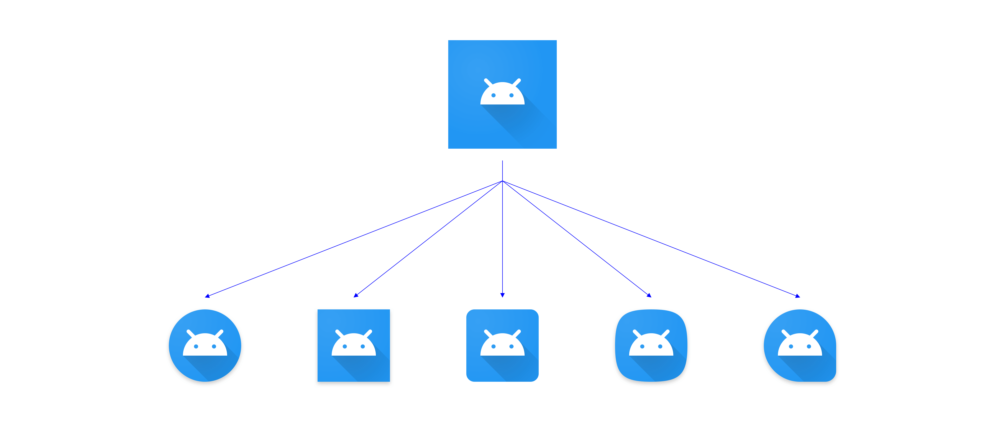
Safe Area & Trim Area
The safe area or _live area _shows where the important content of the icon should live, while the inverse— the _trim area—_shows the area to avoid.
In some cases the safe area is a soft guidance, but when the content gets cropped, the safe area becomes more crucial.
The Google Apps Device Policy icon minds the trim area: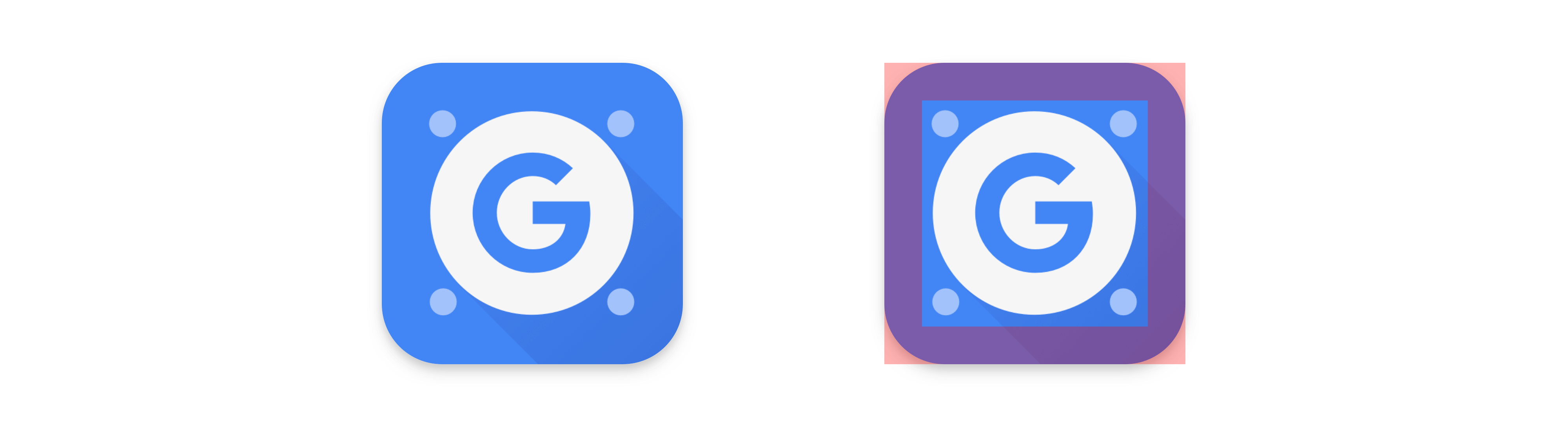
Examples
Now that we are familiar with the components of an icon grid, let’s examine construction and usage in more detail.
iOS App Icon Grid
Apple’s app icon grid aids the creation of app icons displayed in the App Store and iOS system. It’s derived from golden ratio proportions and inscribed shapes, taking the length of one side as a starting point. Its ‘squircle’ mask is an adaptation of a superellipse (or Lamé curve) calculation.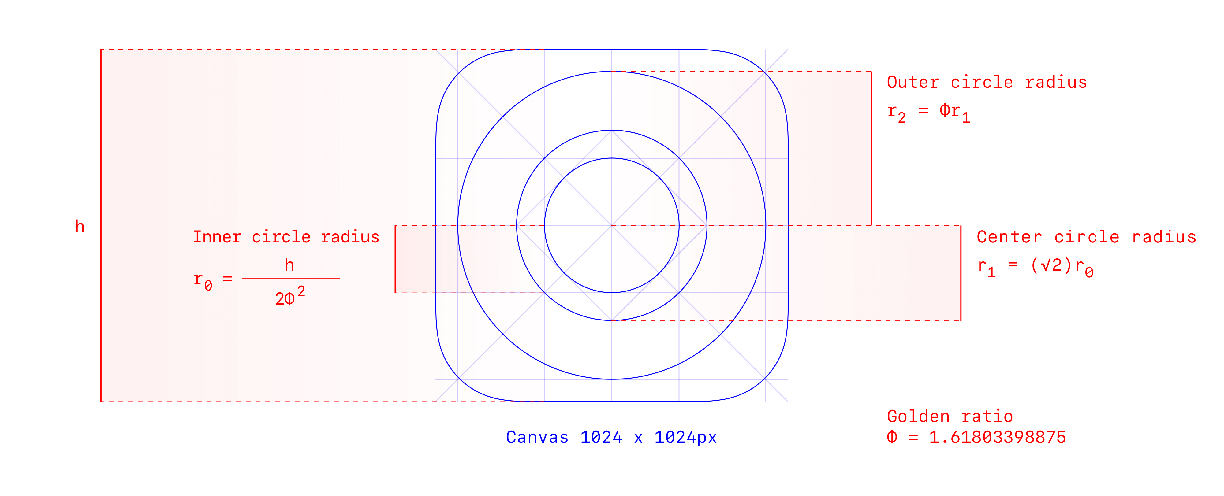
iOS app icon grid construction
Apple’s circular icons—like Safari, Clock, Compass, and Settings—follow their circular keylines directly.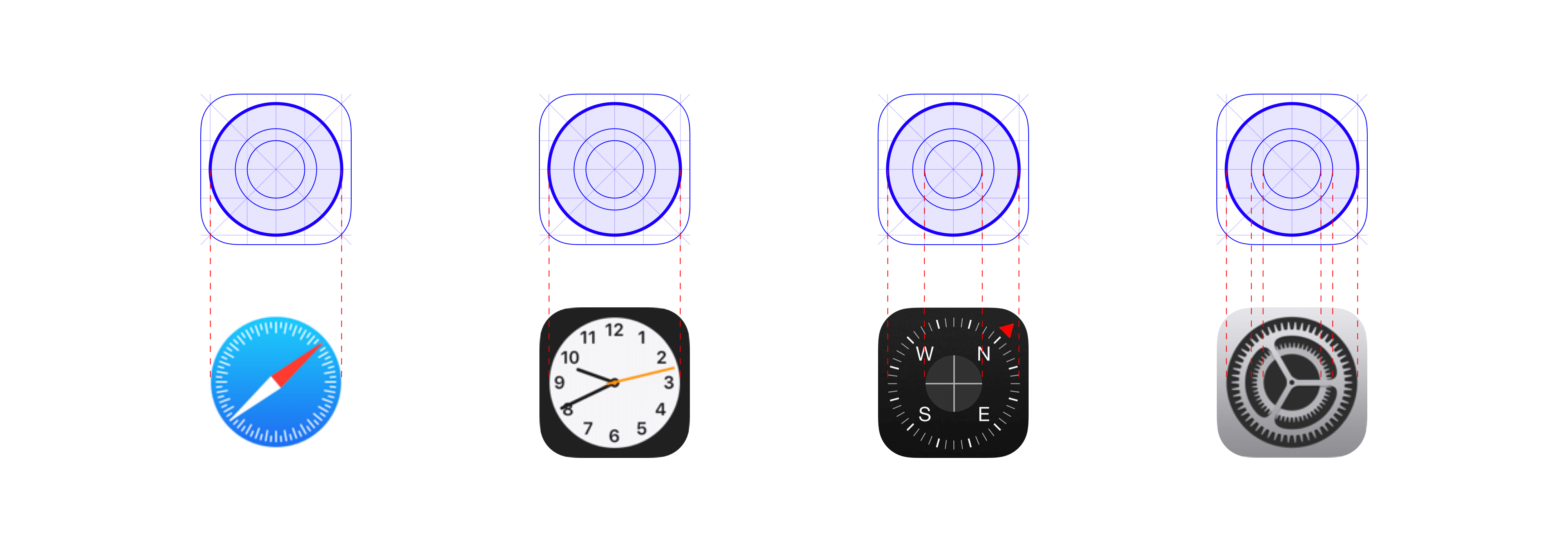
Non-circular icons have a harder construction to trace, but presumably use a combination of further golden ratio calculations and eyeballing: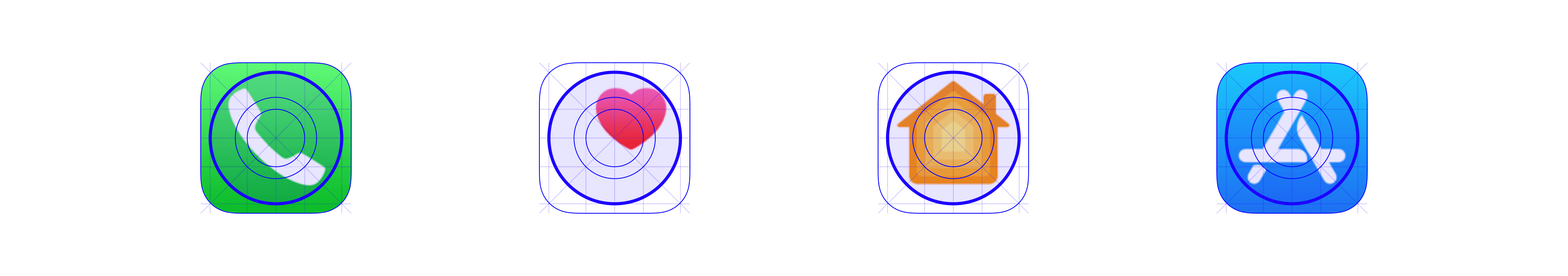
I find this grid very pleasing, but not the most intuitive to use. It’s not apparent what kinds of further calculations to make or rules to follow.
Material’s Icon Grids
The main difference between iOS and Material grids is an addition of keyshapes in Material. Four basic shapes are templated: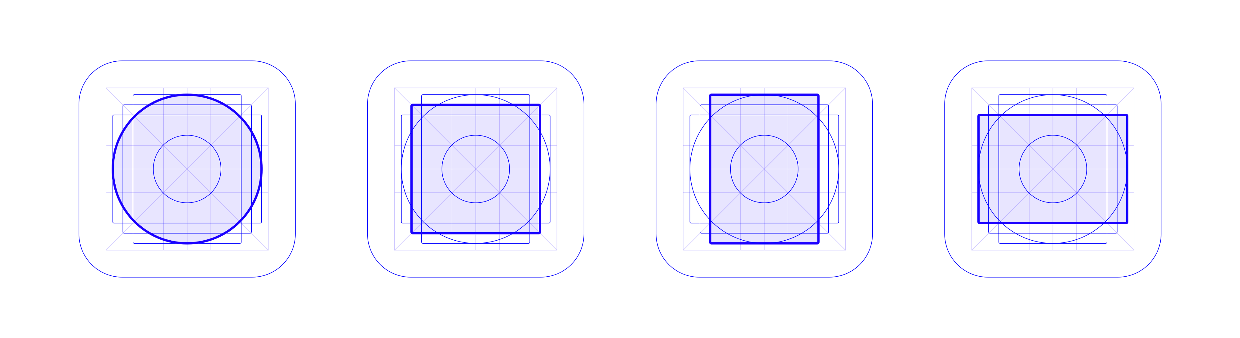
The Play Store grid’s keyshapes: a circle, square, portrait rectangle, and lanscape rectangle
Gmail uses the landscape rectangle keyline: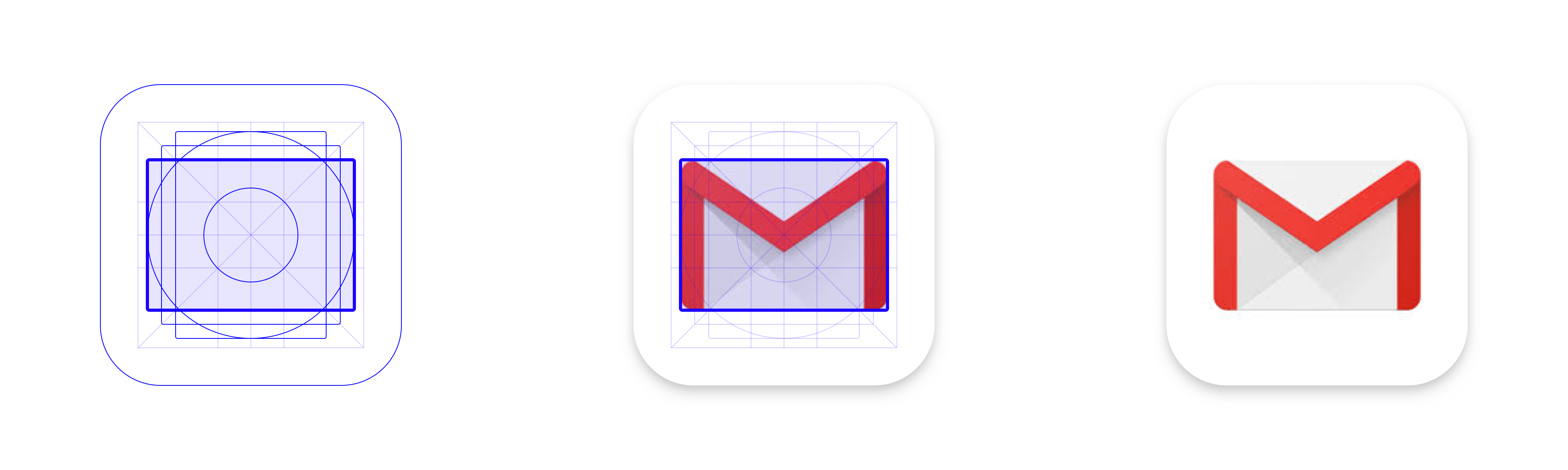
Google Apps Device Policy uses the circular keyline: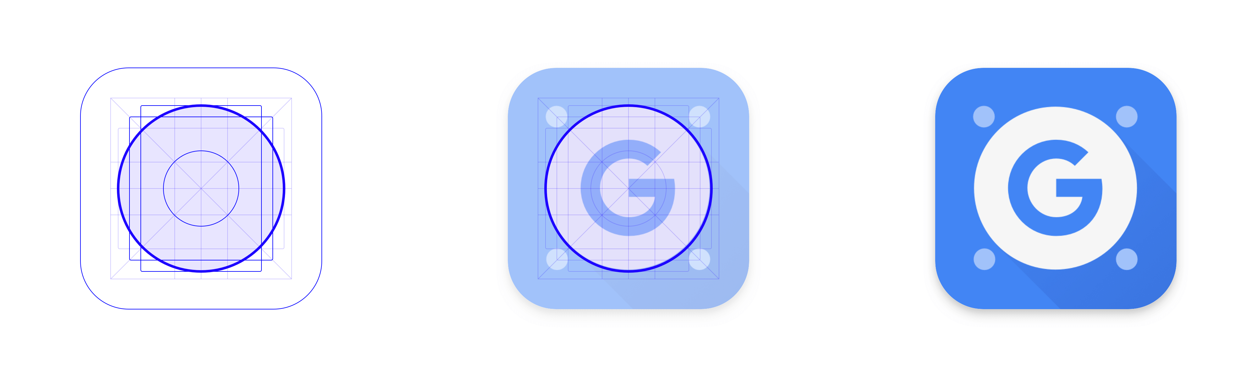
Google specifies a few variants of this grid, adapted to fit different contexts. The launcher icon grid, for example, has a generous trim area to allow different Android OEMs to apply their own shape mask. Though proportions vary, these grids are spiritually the same: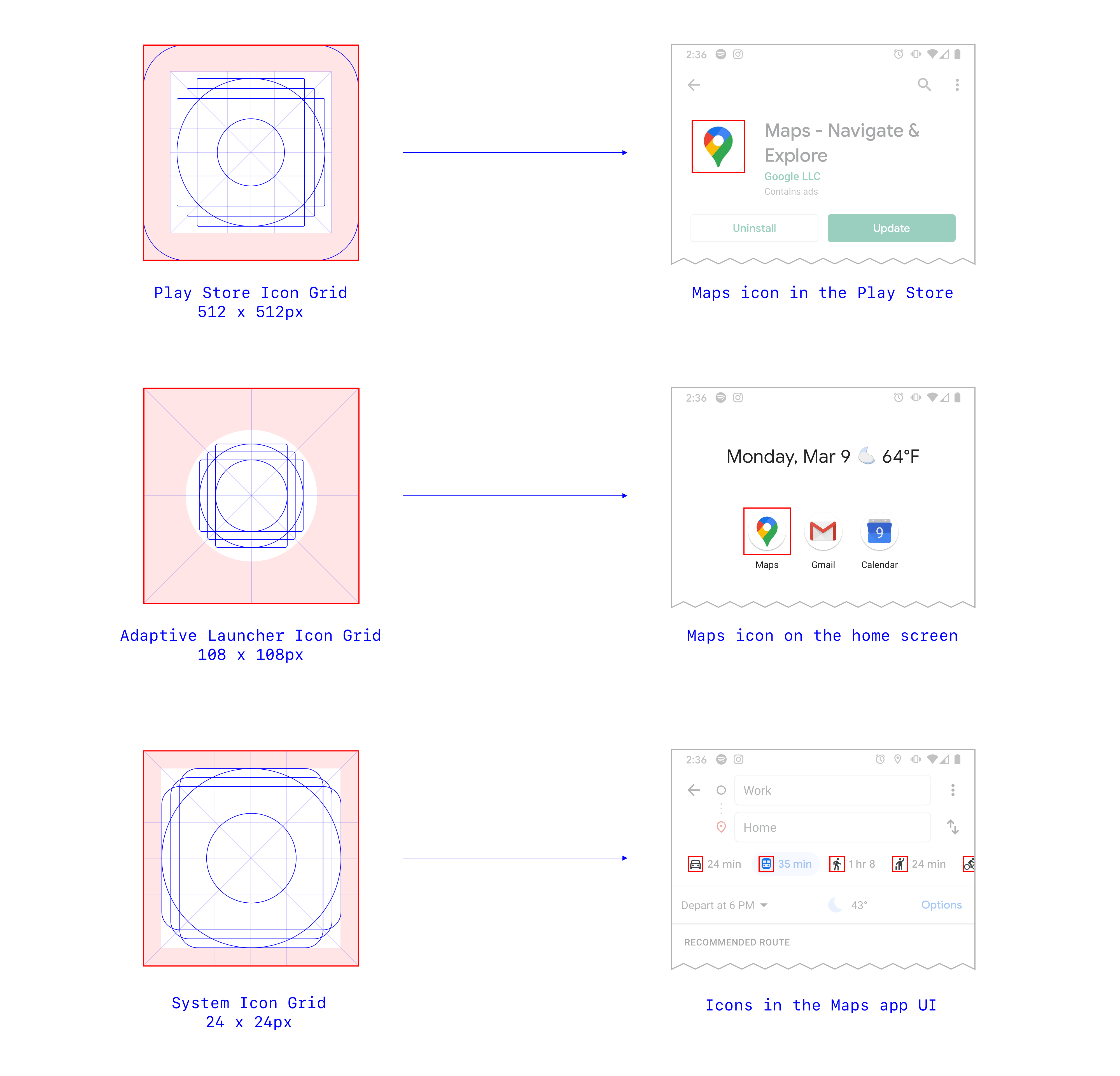
Here’s a breakdown of the system icon grid, used to create icons for product interfaces: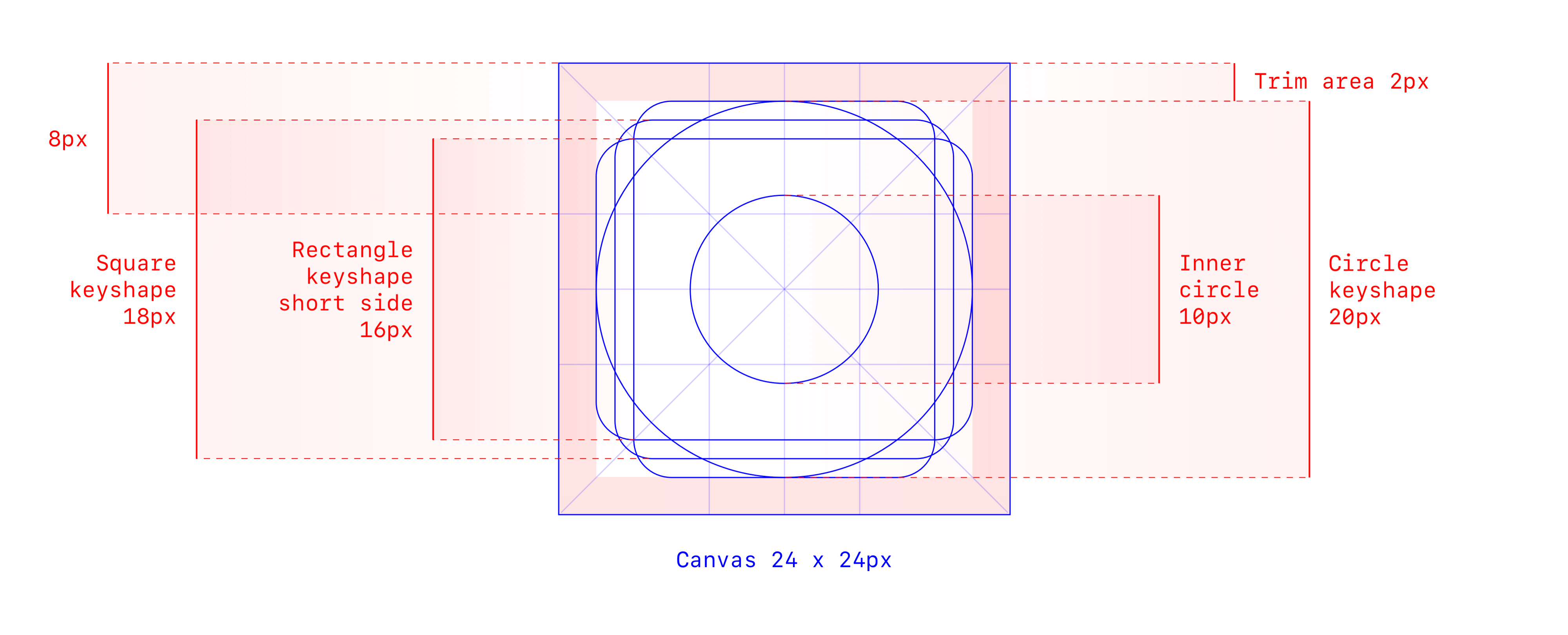
Material system icon grid construction
A Note on Key Dimensions
Note that the key _canvas size for this icon grid is 24 x 24px, which means that icons are _created at this size. In usage, however, Material system icons may be scaled to a range of sizes: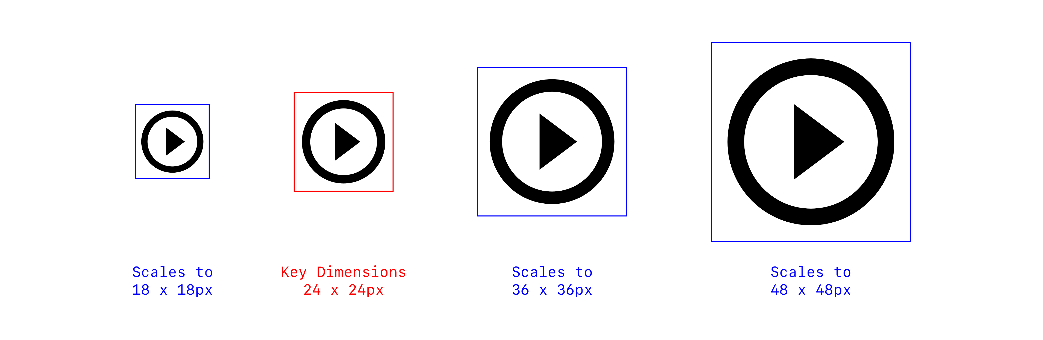
In some icon families, designers draw custom alternate sizes to optimize performance. For example, Nucleo’s compass icon gracefully reduces detail for clarity and readability as the icon gets smaller: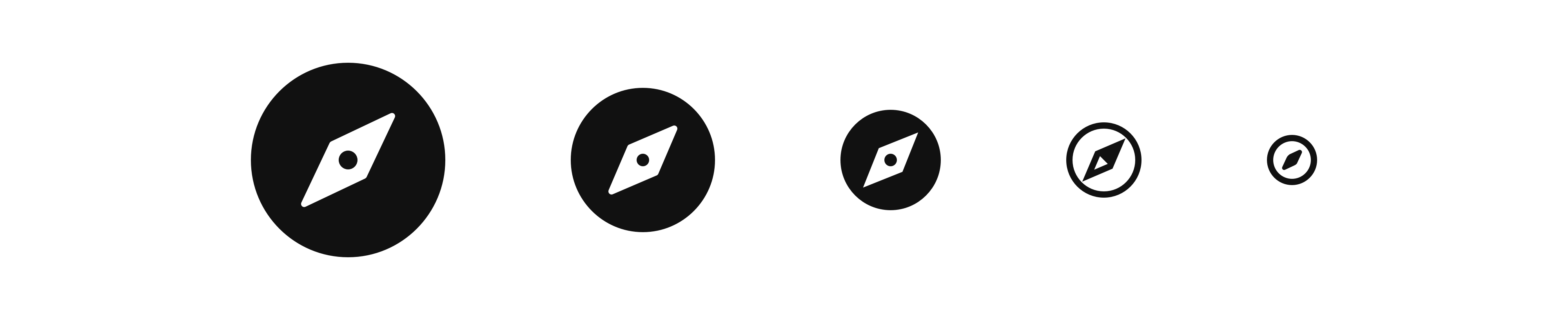
Nucleo’s compass icon employs different levels of detail from 64px to 16px
This is a sophisticated move but time consuming to maintain across many icons. With more nuance comes more complexity.
IBM Icon Grid
IBM’s icon grid is very close to Material’s, offering a similar palette of keyshapes: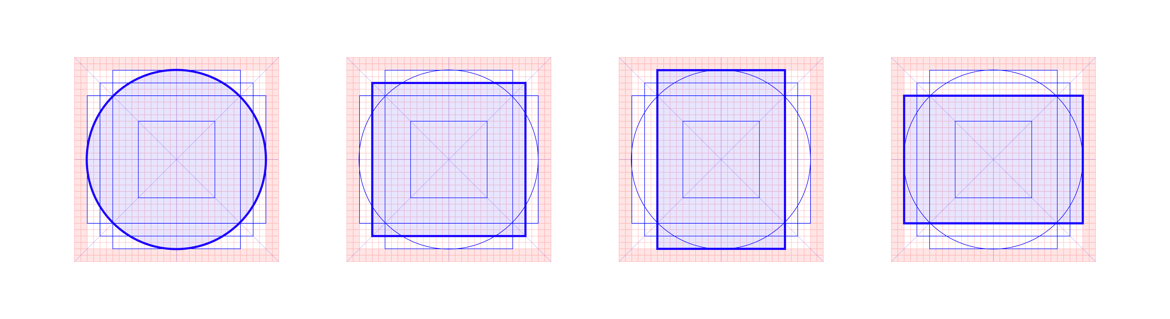
IBM’s keyshapes
It’s elegantly constructed on a 32 x 32px key canvas, with clean, even measurements: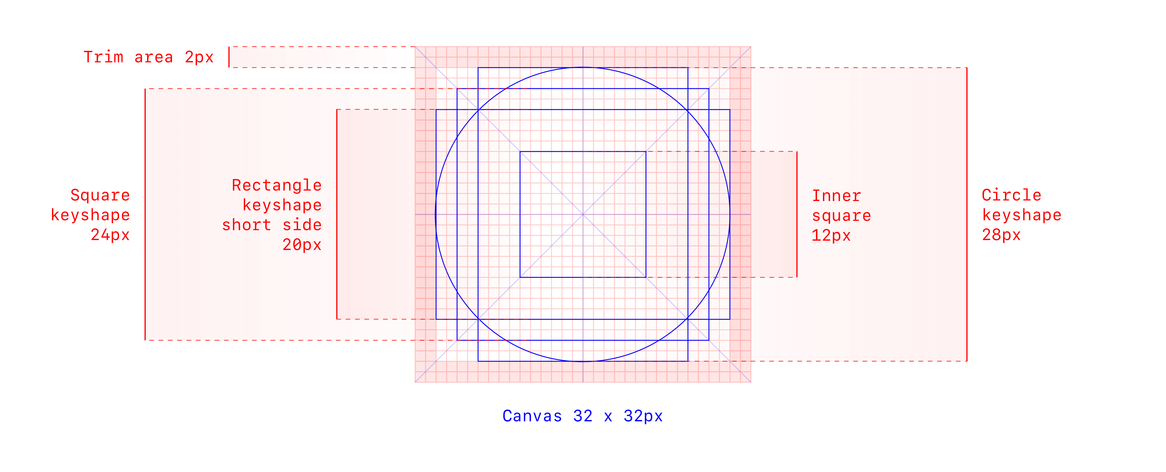
IBM icon grid construction
You’ve seen these above: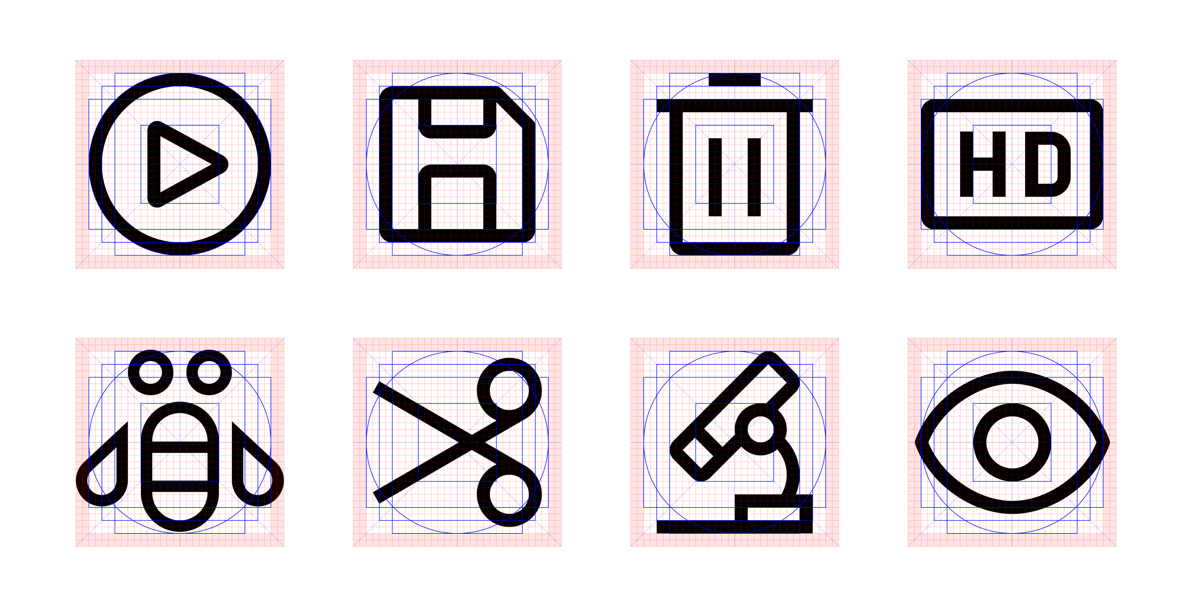
IBM icons against their grid (left to right, top to bottom): Play, Save, Delete, HD, Bee, Cut, Microscope, and Eye
Phosphor Icon Grid
Last year, my partner and I launched Phosphor for Android, an icon family created for Android users to theme their home screens with a minimal aesthetic. Phosphor adapts Material’s grid to support its distinct flavor.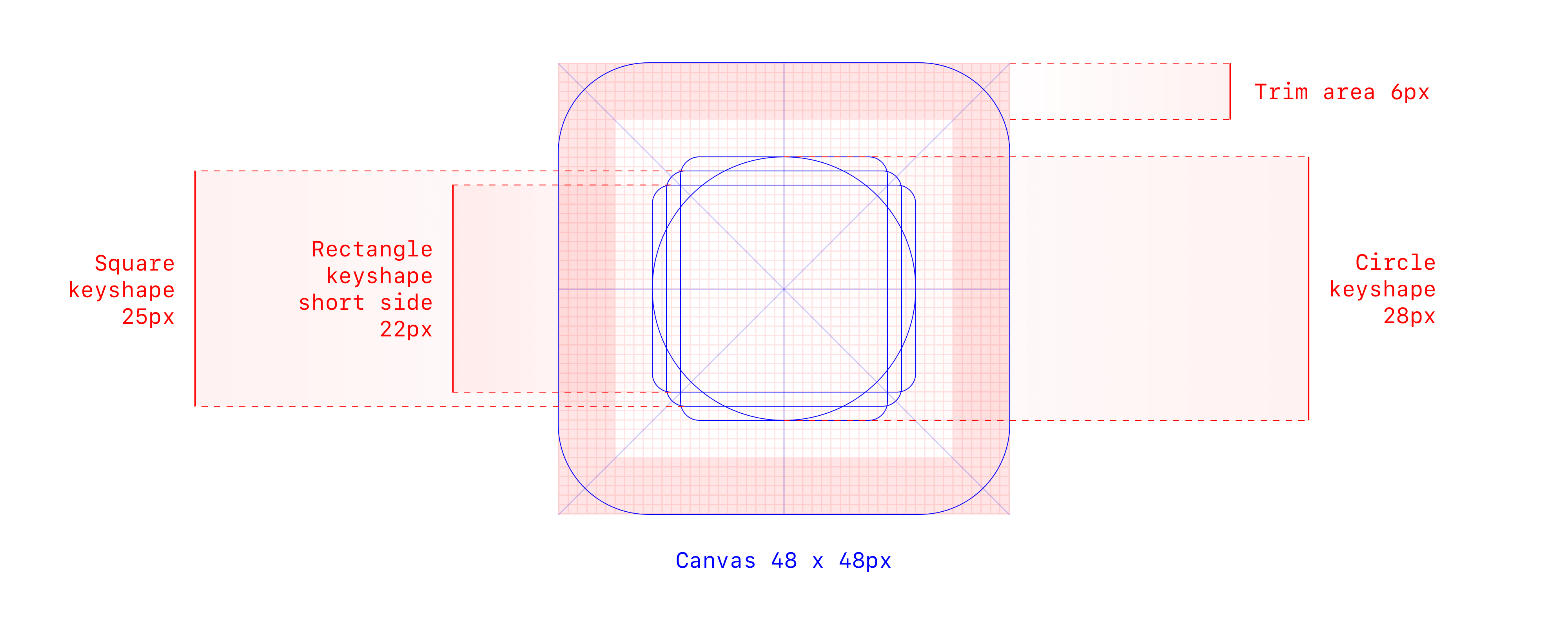
Phosphor icon grid construction
Its keyshapes are roughly based on area calculations to strike visual balance. We reference the circle to draw Daylio and New York Times, a square to draw LinkedIn and a calculator, a portrait rectangle for Google Docs and Microsoft Word, and a landscape rectangle for AliExpress and NBC: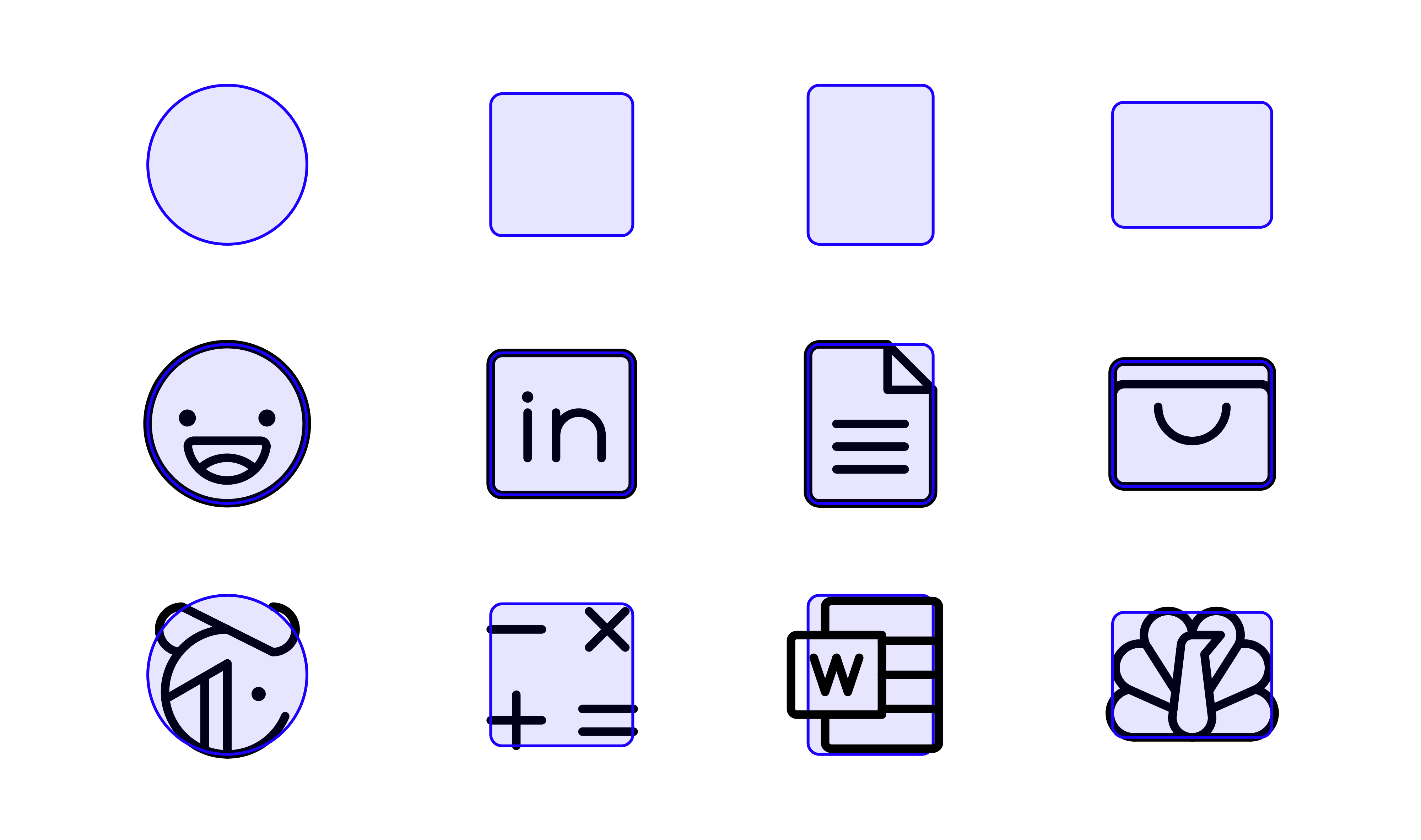
Phosphor keyshapes and example icons
In some cases (second row) we use the mold directly and in others (last row) it’s just a general guide.
It’s important to note that Phosphor’s grid wasn’t set in stone from the beginning. Over time, we stripped away the pieces that didn’t prove helpful, we clarified and emphasized the trim area, and we modified keylines as the rules of our icon family took shape.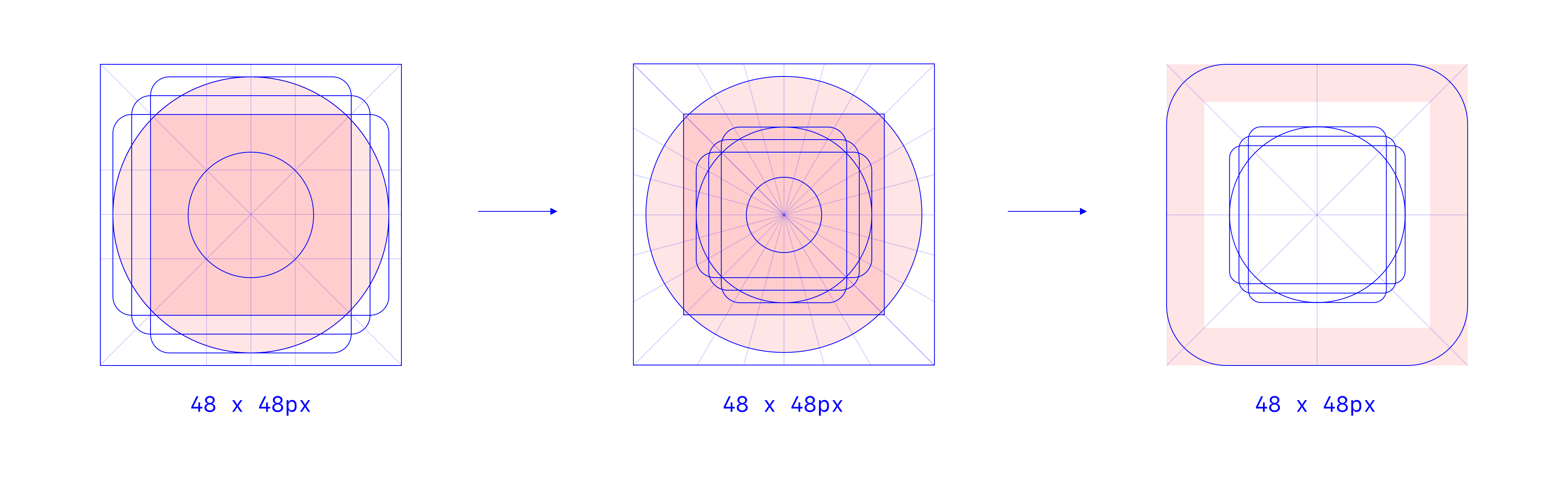
A few iterations of the Phosphor icon grid
A Grid is a Guide
Grids are meant to be used as guides, not hard rules. Drop them when they stop working for you.
Optics > Grids
Always check for optical balance. In the example below, referencing the circle keyshape directly doesn’t feel quite right.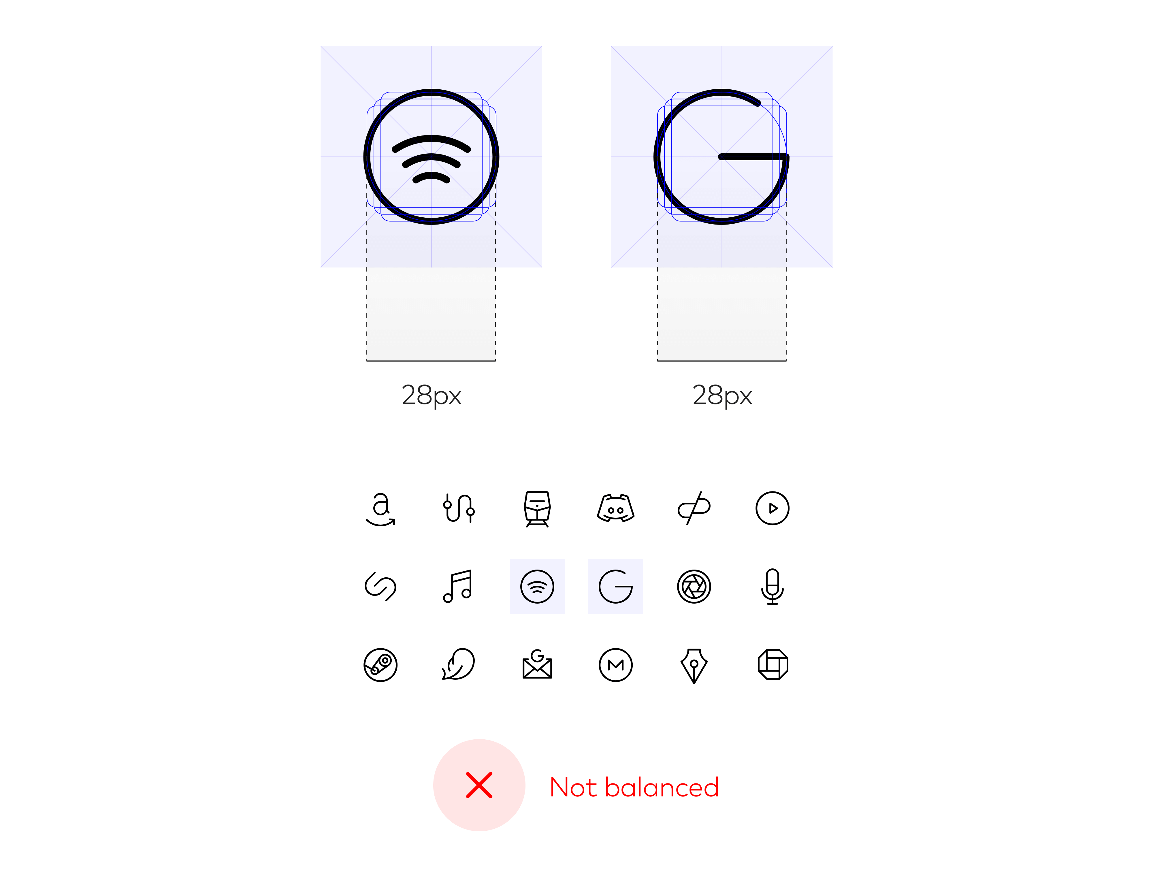
The “G” is a bit big in context. When scaled down a bit, it feels more balanced to the set.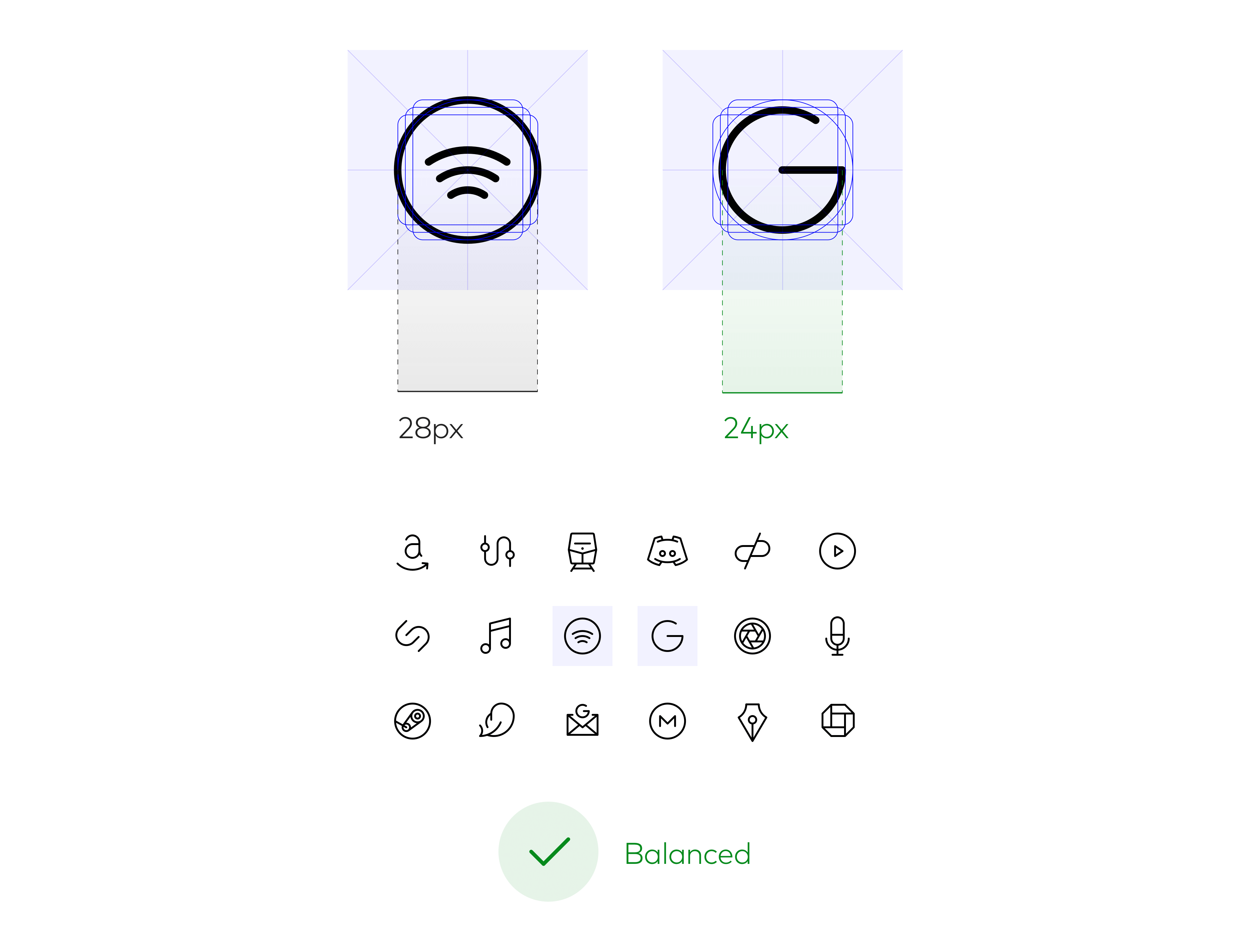
It’s often necessary to deviate from the grid for visual balance. Follow what looks optically right versus strict metric values.
For more about optical effects, read this wonderfully illustrated article by Slava Shestopalov: Optical Effects in User Interfaces: An Illustrated Guide.
Testing > Grids
Test your icons in context to check for consistency and efficacy. If you’re creating an iOS app icon, how does it sit with others on the home screen? Inside a folder, inside a notification, in the Settings view? In the App Store? Test in native contexts (versus design software) for the highest accuracy.
For Phosphor, we developed a rigorous QA procedure, using ‘test sheets’ that place each new icon next to its siblings at different sizes and colors. We preview directly on Android devices to proof for clarity, readability, and stylistic fit.
A test sequence for the Curiosity icon:
Grids + Principles + Rules
Icon grids provide a visual trailhead, but don’t communicate all the technical rules and design principles that each icon should follow. Pair icon grids with clear documentation to paint the full picture.
In my own practice, icon grids are more of a background reference while the principles and rules are top of mind:
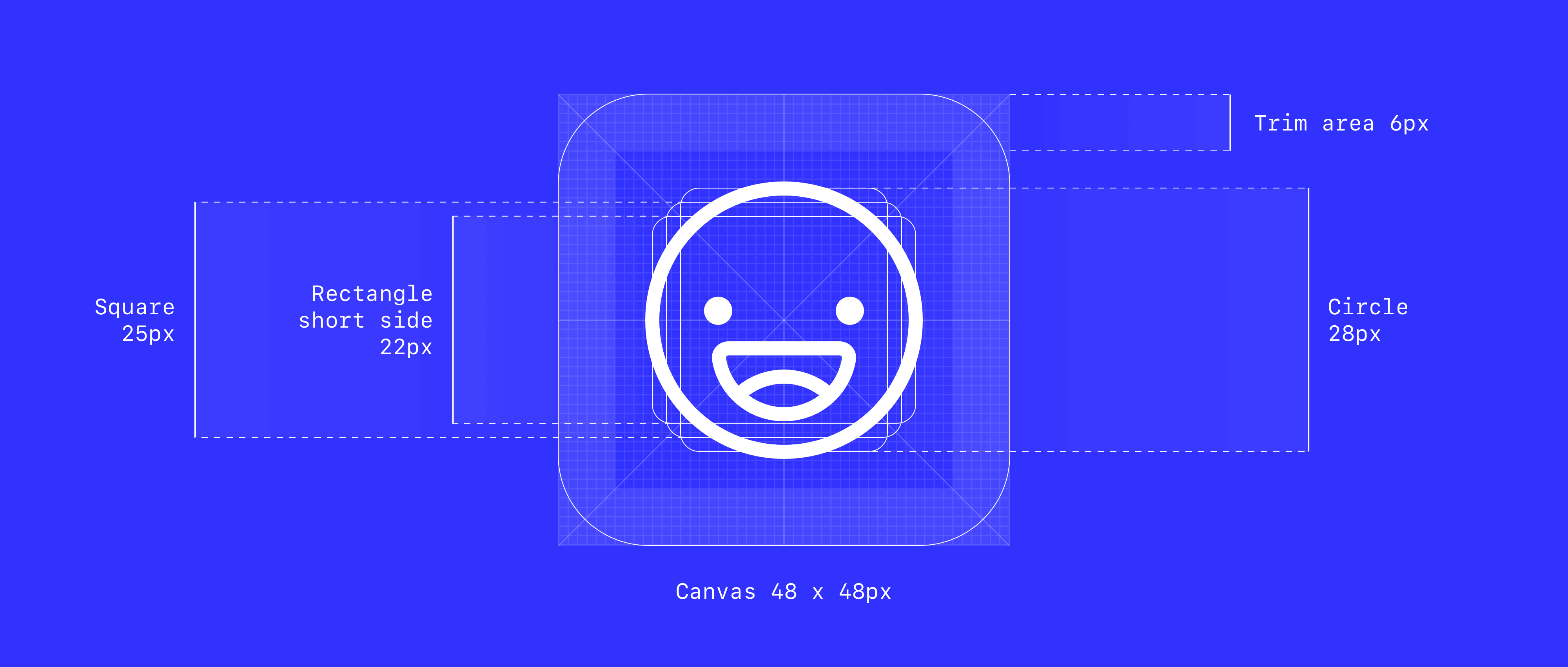
Example principles from the Phosphor icon family:• Clarity. Be clear first and foremost. Make the icon recognizable and readable. Never sacrifice clarity of what the icon represents.• Brevity. Use as few details as possible. Phosphor’s style is reductive. Be concise and intentional with every stroke to communicate the essence of what’s being represented.• Character. Be quirky. Add unique details sparingly to bring a little warmth and play to what may otherwise be a very austere set.—Example technical rules from the Phosphor icon family:• Use a 48 x 48px canvas• Use a 1.5px centered stroke• Use rounded end caps• Use contiguous strokes unless broken segments are helpful for comprehension• Use straight segments, perfect arcs, and 15° angle increments where possible• Adjust curves when necessary to maintain the design principles• Use whole, even number increments for measurements where possible; fold down to 1px and .5px if necessary• Start with the following shape keylines: 28 x 28px circles, 25 x 25px squares, 28 x 22px landscape rectangles, 22 x 28px portrait rectangles• Keep a 6px thick trim area
These are living guidelines that evolve as we learn what works and what breaks. Be okay with iteration, and update your documentation accordingly.
Final Thoughts
When used consistently, icon grids promote harmony within a family of icons and speed up the design process. They are quite a beautiful artifact, but make sure the tools and processes in place are working for you. Over time, they can become outdated or misused. Evaluate if your grid is useful, if you should set it aside, or if it’s time to make a revision.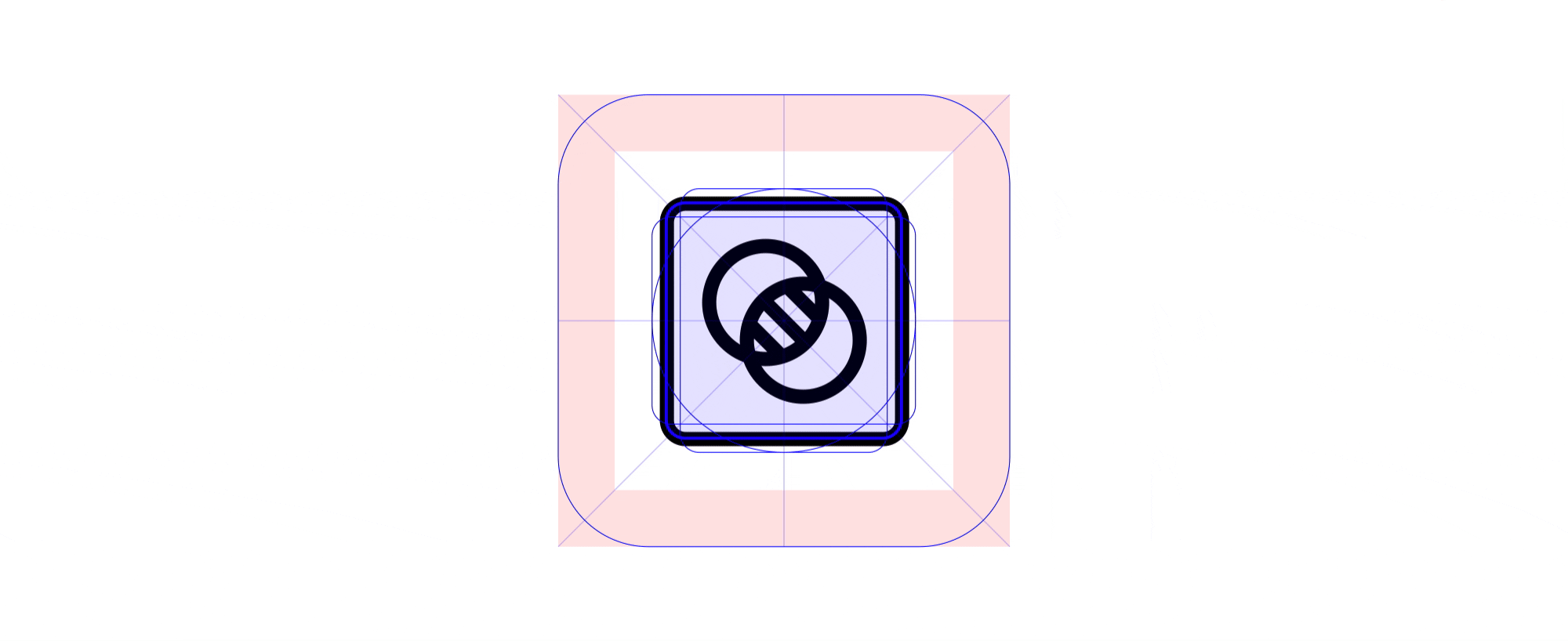
Phosphor icons against the Phosphor grid
Icon Grid Specifications
Apple
Apple Design Resources: Official templates that include canvas dimensions for App Store icons (but unfortunately no vector grids)
Google
Material System Icon Keyline Shapes: Grid guidance on system icons, which are used in product interfaces
- Google Play icon design specifications: Specs and templates for app icons used in the Play Store
- Adaptive icons and Android icons: Specs for app icons used in the launcher (home screen, app drawer)
Material Product Icon Keyline Shapes: Grid guidance on product icons, which map to the Google Play and adaptive launcher icons linked above
IBM
IBM’s UI Icons: Clear icon grid guidance and excellent visual aids
🎶 Written to the sounds of: Plaid
🙏 Thanks to: Toby Fried, Monica Chang, Tate Chow, and Christine Lee
Thanks to Christine Lee and Tate C.

若有收获,就点个赞吧
0 人点赞
