介绍
matplotlib是PYTHON绘图的基础库,是模仿matlab绘图工具开发的一个开源库。 PYTHON其它第三方绘图库都依赖于matplotlib。 这里主要学习三种绘图方式:
- matplotlib绘制基础图形
- pandas plot API
- seaborn绘制统计图形
我们可视化的重点是利用图形去理解数据,而不是注重图形的美观。
常见的步骤如下:
- 创建一块画布
- 往画布里添加不同元素(可以切割画布,指定不同位置显示不同图形)
- 最后显示出来
- %matplotlib inline # 图形直接在下面的cell中显示;
- 相当于调用了plt.show();这是由IPython即notebook这个IDE提供的
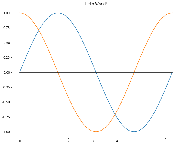
小试牛刀
import pandas as pdimport matplotlib.pyplot as pltimport numpy as np%matplotlib inline# 2π 是弧度制的一种表示,1弧度对应长度为半径长的圆弧,# 而圆的一周刚好是2π个弧度,所以圆的周长为2πr,顺便提一下圆的面积为πr²# 60度 是角度制的一种表示,360度对应圆的一圈X = np.linspace(0, 2 * np.pi, 100)Y = np.sin(X)Y1 = np.cos(X)plt.title('Hello World!')plt.plot(X, Y)plt.plot(X, Y1)plt.plot(X, [0] * 100, c='black')
执行
[<matplotlib.lines.Line2D at 0x138450e10>]
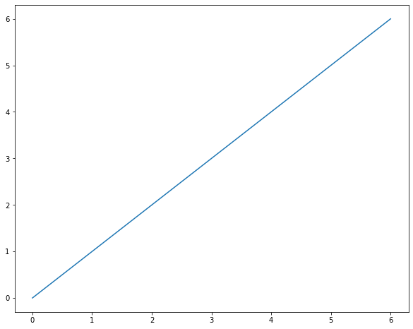
做一条直线 y=x 的练习
plt.plot([0,1,2,3,4,5,6], [i for i in range(7)])
执行
[<matplotlib.lines.Line2D at 0x138ddd9b0>]
使用 subplot 函数来分割画布并指定子图的位置
X = np.linspace(0, 2 * np.pi, 100)
Y = np.sin(X)

# 211表示分割成2行1列,画在第一列第一格
plt.subplot(211)
plt.plot(X, Y)

# 212表示分割成2行1列,画在第一列第二格
plt.subplot(212)
plt.plot(X, np.cos(X), color='r')
执行
[<matplotlib.lines.Line2D at 0x11f4a2048>]
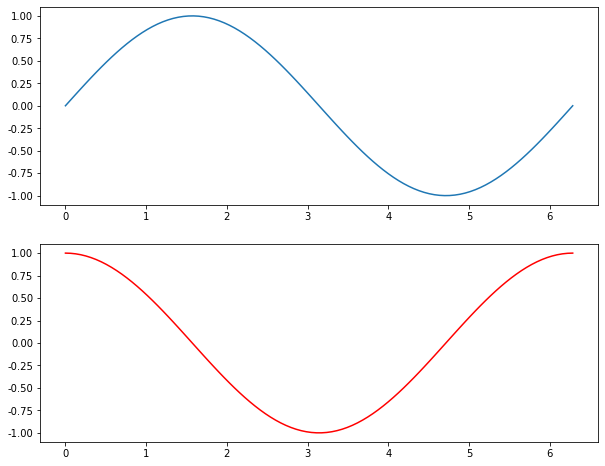
如果是223,则表示分割成2行2列,放置在第二行第一列,此时最后一位的取值1-4
BAR CHART (柱状图)
A bar chart or bar graph is a chart or graph that presents categorical data with rectangular bars with heights or lengths proportional to the values that they represent. The bars can be plotted vertically or horizontally.
主要用来表示一个分类变量的频率
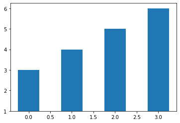
Verticle (垂直纵向)
# plt.bar(range(4), [5, 25, 50, 20])

plt.bar(range(4), height=[2,3,4,5], bottom=1, width=0.5)
执行
<BarContainer object of 4 artists>
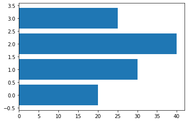
Horizontal (水平横向)
data = [20, 30, 40, 25]
plt.barh(range(len(data)), data)
执行
<BarContainer object of 4 artists>
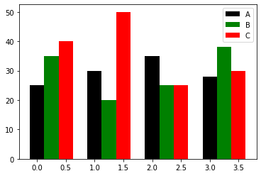
多个bar
注意这个地方使用了np.arange而非range,对水平轴X的坐标进行了整体平移;np.arange可以做广播操作,而range函数则不可以。
data = [[25, 30, 35, 28],
       [35, 20, 25, 38],
       [40, 50, 25, 30]]

X = np.arange(4)
plt.bar(X + 0.00, data[0], width=0.25, color='black', label='A')
plt.bar(X + 0.25, data[1], width=0.25, color='green', label='B')
plt.bar(X + 0.50, data[2], width=0.25, color='red', label='C')
plt.legend() # 添加说明
执行
<matplotlib.legend.Legend at 0x133c2f550>
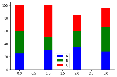
Stacked
注意bottom参数的使用,列表是不能直接参与广播计算的,需要转化为np.array
data = [[25, 30, 35, 28],
       [35, 20, 25, 38],
       [40, 50, 25, 30]]

X = np.arange(4)
plt.bar(X, data[0], width=0.3, color='b', label='A', bottom=0)
plt.bar(X, data[1], width=0.3, color='g', label='B', bottom=data[0])
plt.bar(X, data[2], width=0.3, color='r', label='C', bottom=np.array(data[0]) + np.array(data[1]))
plt.legend()
执行
<matplotlib.legend.Legend at 0x12581da20>
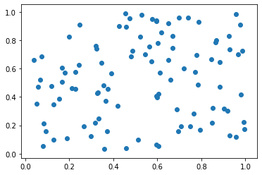
SCATTER POINTS (散点图)
散点图是用来衡量两个连续变量之间的相关性
N = 100
x = np.random.rand(100)
y = np.random.rand(100)

plt.scatter(x, y)
执行
<matplotlib.collections.PathCollection at 0x1259598d0>
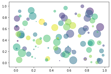
随机绘制点的大小及颜色
N = 100
x = np.random.rand(N)
y = np.random.rand(N)

colors = np.random.random(N)
areas = np.pi * (15 * np.random.rand(N)) ** 2
plt.scatter(x, y, c=colors, s=areas, alpha=0.5)
执行
<matplotlib.collections.PathCollection at 0x12472c9b0>
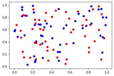
偶数为红色,奇数为蓝色
N = 100
x = np.random.rand(N)
y = np.random.rand(N)

f = lambda i: 'red' if i % 2 == 0 else 'blue'
c = [f(i) for i in range(N)]
# c = np.random.randint(0, 2, N)
# 通过color来分组显示
plt.scatter(x, y, c=c)
执行
<matplotlib.collections.PathCollection at 0x124637668>
HISTOGRAM (直方图)
A histogram is an accurate representation of the distribution of numerical data. It is an estimate of the probability distribution of a continuous variable (quantitative variable) and was first introduced by Karl Pearson.[1] It is a kind of bar graph. To construct a histogram, the first step is to “bin” the range of values—that is, divide the entire range of values into a series of intervals—and then count how many values fall into each interval. The bins are usually specified as consecutive, non-overlapping intervals of a variable. The bins (intervals) must be adjacent, and are often (but are not required to be) of equal size.
解释:直方图是用来衡量连续变量的概率分布的。在构建直方图之前,我们需要先定义好bin(值的范围),也就是说我们需要先把连续值划分成不同等份,然后计算每一份里面数据的数量。
对连续型变量作分箱操作后,对输出两个数组的解释,一个是每一份里面的数量;一个是每个箱子的边界;
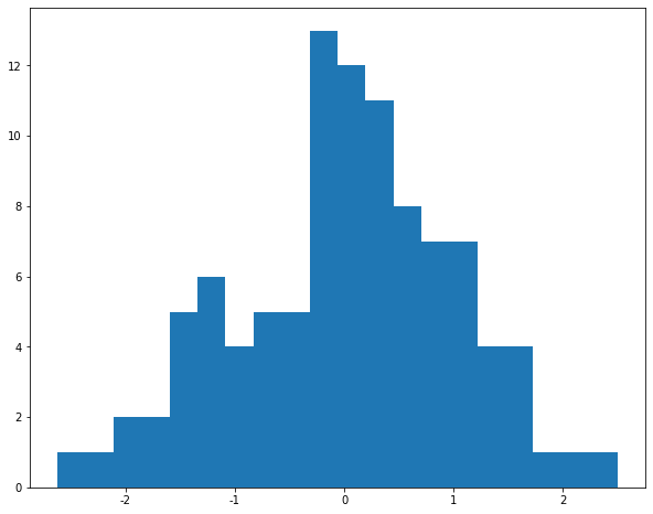
a = np.random.randn(100)
plt.hist(a, bins=20)

# 限定y轴大小
# plt.ylim(0, 15)
执行
(array([ 1.,  1.,  2.,  2.,  5.,  6.,  4.,  5.,  5., 13., 12., 11.,  8.,
         7.,  7.,  4.,  4.,  1.,  1.,  1.]),
 array([-2.61746101, -2.36183551, -2.10621002, -1.85058452, -1.59495903,
        -1.33933353, -1.08370804, -0.82808254, -0.57245705, -0.31683156,
        -0.06120606,  0.19441943,  0.45004493,  0.70567042,  0.96129592,
         1.21692141,  1.47254691,  1.7281724 ,  1.9837979 ,  2.23942339,
         2.49504889]),
 <a list of 20 Patch objects>)
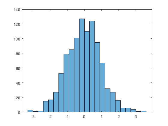
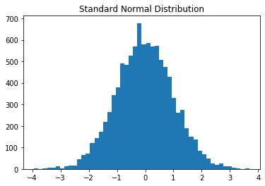
增大我们的数据量,我们来看下标准正态分布的轮廓是怎样的
a = np.random.randn(10000)
plt.hist(a, bins=50)
plt.title("Standard Normal Distribution")
执行
Text(0.5, 1.0, 'Standard Normal Distribution')
对比 bar chart 柱状图,有什么不同之处呢?
- 通常情况下,直方图的条形(也就是每一竖)是聚在一起的;柱状图的条形之间是有分割的。
BOXPLOTS (线箱图)
boxlot用于表达连续特征的百分位数分布。统计学上经常被用于检测单变量的异常值,或者用于检查离散特征和连续特征的关系。比histogram更具有统计意义。
对于检测异常值,容易理解,在线箱图外面的即为异常值;对于检查关系,是这样理解的,每个箱子都对应着一个离散特征,即一个类别,如果连续的箱子之间呈阶梯状,那说明了什么?每个类别对连续特征的影响较大,如果连续的箱子之间是上下浮动,差不多在同一高度的,则该离散特征与连续特征并没太大关系。

# 创建30行3列的数据,20-100之间,每一列是一个box
x = np.random.randint(20, 100, size=(30, 3))
plt.boxplot(x)
plt.ylim(0, 120)

# 在指定位置写入记号
plt.xticks([1,2,3], ['A', 'B', 'C'])
plt.yticks([10,50,100], ['hello', 'box', 'plot'])

# xmin/xmax指定左右边界,检验一下
# 注释的这行代码取了x数据集纵向的三个75百分位数中的最后一个,限定位置从0到3
# plt.hlines(y=np.percentile(x, 75, axis=0)[2], xmin=0, xmax=3)
plt.hlines(y=np.max(x, axis=0)[0], xmin=0, xmax=3)
执行
<matplotlib.collections.LineCollection at 0x138d98b38>
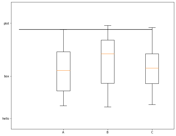
根据图示,我们可以看到,x轴和y轴,都在指定位置写入了tick,同时我们绘制了一条直线,这条直线的位置从0开始到3结束,值为第一列数据即第一个线箱图的最大值。
np.mean(x, axis=0)                    # array([58.06666667, 61.1, 60.2])

np.percentile(x, 75, axis=0)        # array([77.5 , 79.5 , 80.75])

np.median(x, axis=0)                # array([58.5, 67. , 57.5])
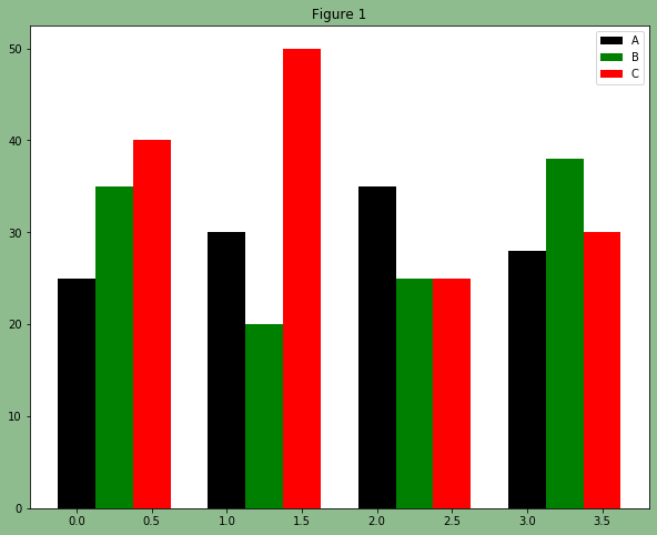
颜色调整与添加文字
颜色调整
# facecolor设置画布本身的颜色
fig, ax = plt.subplots(facecolor='darkseagreen')
data = [[25, 30, 35, 28],
       [35, 20, 25, 38],
       [40, 50, 25, 30]]

X = np.arange(4)
plt.bar(X + 0.00, data[0], width=0.25, color='black', label='A')
plt.bar(X + 0.25, data[1], width=0.25, color='green', label='B')
plt.bar(X + 0.50, data[2], width=0.25, color='red', label='C')

ax.set_title('Figure 1')
plt.legend()
执行
<matplotlib.axes._subplots.AxesSubplot at 0x138d43ef0>
额外补充一个知识点:如果想在一个for循环里,同时循环两个list,该怎么做?
使用zip进行打包
for a,b in zip([1,2,3], [5,6,7]):
    print(a, b)
执行
1 5
2 6
3 7
增加文字
W = [0.0, 0.25, 0.5]
for i in range(3):
    for a, b in zip(X + W[i], data[i]):
        plt.text(a, b, b, ha="center", va="bottom")

plt.xlabel("Group")
plt.ylabel("Num")
plt.text(0, 48, "TEXT")
执行
<function matplotlib.pyplot.text(x, y, s, fontdict=None, withdash=<deprecated parameter>, **kwargs)>
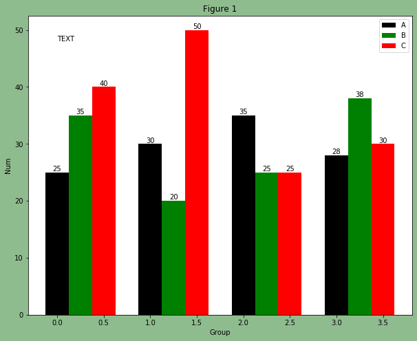
我们对上面增加文字这段代码作一个解释说明,是和颜色调整的那段代码放在一起执行输出的。text函数用来指定放置文本的位置,x,y坐标,值本身,还有其它的一些参数。特别注意一下zip函数的用法。
x = np.linspace(-3, 3, 400)
y = x**2 + 5

fig, ax = plt.subplots()
ax.plot(x, y)
ax.set_title('Simple plot')
上面这段代码可输出一个一元二次方程,可自己输出测试下。
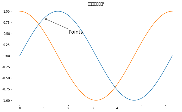
注释与中文显示
在数据可视化的过程中,图片中的文字经常被用来注释图中的一些特征。使用annotate()方法可以很方便地添加此类注释。在使用annotate时,要考虑两个点的坐标:被注释的地方xy(x, y)和插入文本的地方xytext(x, y)
X = np.linspace(0, 2 * np.pi, 100)
Y = np.sin(X)
Y1 = np.cos(X)

plt.plot(X, Y)
plt.plot(X, Y1)

plt.annotate('Points', xy=(1, np.sin(1)),
                       xytext=(2, 0.5),
                       fontsize=16,
                       arrowprops=dict(arrowstyle='->'))

plt.title("这是一幅测试图!")
执行
Text(0.5, 1.0, '这是一幅测试图!')
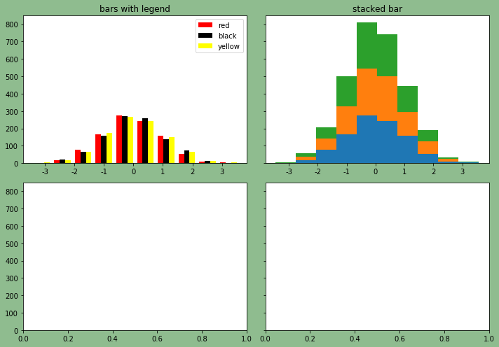
Subplots子图
看一下函数都需要哪些参数?
matplotlib.pyplot.subplots(nrows=1, ncols=1, sharex=False, sharey=False, squeeze=True, subplot_kw=None, gridspec_kw=None, **fig_kw)
使用 subplot 绘制多个图形
subplot(nrows, ncols, index, **kwargs)
# 调整图片的大小,两个参数分别对应宽,高
%pylab inline
pylab.rcParams['figure.figsize'] = (10, 7)
# 定义2*2个子图位置
fig, axes = plt.subplots(nrows=2, ncols=2, facecolor='darkseagreen', sharey=True)
# 将多维数组打平
ax0, ax1, ax2, ax3 = axes.flatten()

n_bins = 10
x = np.random.randn(1000, 3)

# 绘制第一个子图
colors = ['red', 'black', 'yellow']
ax0.hist(x, n_bins, color=colors, label=colors)
ax0.legend()
ax0.set_title("bars with legend")

# 绘制第二个子图
ax1.hist(x, n_bins, stacked=True)
ax1.set_title("stacked bar")

# 使得布局更紧凑,更好看
fig.tight_layout()
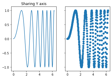
共享x轴与y轴
先来一个共享y轴的小例子
x = np.linspace(0, 2*np.pi, 400)
y = np.sin(x**2)

f, (ax1, ax2) = plt.subplots(1, 2, sharey=True)
ax1.plot(x, y)
ax1.set_title('Sharing Y axis')
ax2.scatter(x, y)
执行
<matplotlib.collections.PathCollection at 0x133718cf8>
探索共享x轴
fig, axes = plt.subplots(nrows=2, ncols=2, facecolor='darkseagreen', sharex=True)
ax0, ax1, ax2, ax3 = axes.flatten() # 将多维数组打平

n_bins = 10
x = np.random.randn(1000, 3)

colors = ['red', 'black', 'yellow']
ax0.hist(x, n_bins, color=colors, label=colors)
ax0.legend()
ax0.set_title("bars with legend")

ax1.bar(np.arange(15), [100,200,300,400,800] * 3)

ax2.hist(x, n_bins, stacked=True)
ax2.set_title("stacked bar")

ax3.scatter([-2, 0, 2] * 5, [200, 400, 700] * 5)
执行
<matplotlib.collections.PathCollection at 0x1238efe48>
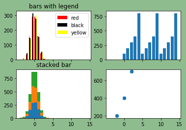
注意:在这个图里面,所有的子图都共享了同一个x轴的刻度。
PANDAS 绘图 API
Pandas API 是在matplotlib上层开发的,可以自动的添加legend等标签,这是它的优势所在;
主要有两种常见的方式:
- 通过df.plot.+图形类别
- 通过df.plot(kind参数设置
df = pd.read_csv('NBAPlayers.txt', sep='\t')
df.head()
| Player | height | weight | collage | born | birth_city | birth_state | |
|---|---|---|---|---|---|---|---|
| 0 | Curly Armstrong | 180.0 | 77.0 | Indiana University | 1918.0 | NaN | NaN |
| 1 | Cliff Barker | 188.0 | 83.0 | University of Kentucky | 1921.0 | Yorktown | Indiana |
| 2 | Leo Barnhorst | 193.0 | 86.0 | University of Notre Dame | 1924.0 | NaN | NaN |
| 3 | Ed Bartels | 196.0 | 88.0 | North Carolina State University | 1925.0 | NaN | NaN |
| 4 | Ralph Beard | 178.0 | 79.0 | University of Kentucky | 1927.0 | Hardinsburg | Kentucky |
第一种方式
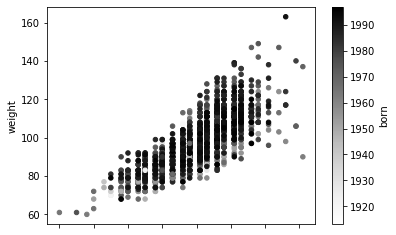
# 指定x轴y轴和点的颜色
df.plot.scatter(x='height', y='weight', c='born')
执行
<matplotlib.axes._subplots.AxesSubplot at 0x124bba7f0>
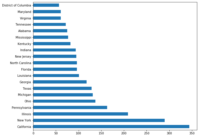
注意:Series的数据结构直接调用plot的用法
# pd.Series([1, 2, 3, 4, 10]).plot.bar()
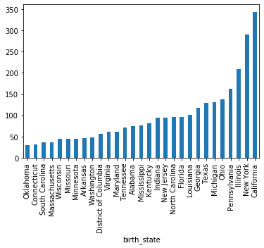
df['birth_state'].value_counts()[:20].plot.barh()
执行
<matplotlib.axes._subplots.AxesSubplot at 0x11f0fc7f0>
第二种方式
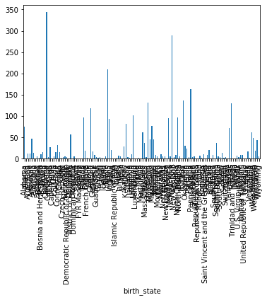
先绘制一个柱状图
df.groupby('birth_state').size().plot(kind='bar')
执行
<matplotlib.axes._subplots.AxesSubplot at 0x12439df28>
grouped = df.groupby('birth_state')
gs = grouped.size()

# 下面这两行等价
# gs[gs >= 30].sort_values().plot.bar()
gs[gs >= 30].sort_values().plot(kind='bar')
执行
<matplotlib.axes._subplots.AxesSubplot at 0x12436f630>
直方图以及线箱图
注意:DataFrame数据结构直接调用plot的用法
df[['height', 'weight']].plot.hist(bins=100)
执行
<matplotlib.axes._subplots.AxesSubplot at 0x139b0c668>
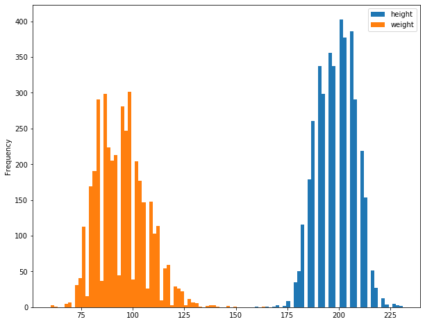
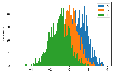
在下面直方图的绘制练习当中,选取了整个数据框的数据,即所有列的数据,全部都聚集到了一起;注意这三列数据的区间范围是存在交集的
df = pd.DataFrame({'a': np.random.randn(1000) + 1,
                  'b': np.random.randn(1000),
                  'c': np.random.randn(1000) - 1})
df.plot.hist(alpha=1, bins=100)
执行
<matplotlib.axes._subplots.AxesSubplot at 0x124df1320>
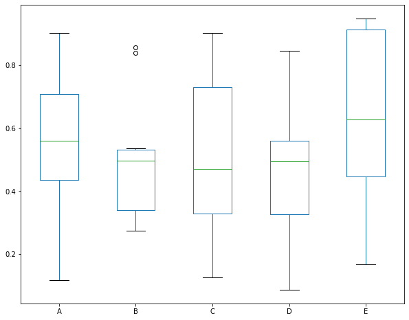
下面是线箱图的练习,很明显,B列数据中有两个异常值
df = pd.DataFrame(np.random.rand(10, 5), columns=['A', 'B', 'C', 'D', 'E'])
df.plot(kind='box')
执行
<matplotlib.axes._subplots.AxesSubplot at 0x13cd94048>
补充一个索引的知识点
# 选中一个元素的几种方式
df.iloc[0, 1]
df.loc[0, 'height']
df['height'][0]                            # height这一列第一行的元素

# 切片可直接作用于Series和DataFrame
pd.Series([1,2,3,4,5])[:2]
df[:10]                                    # 选中前10行
SEABORN
Searborn是基于matplotlib和pandas API的;做了很多优化和封装;相对来说,封装的层级更高一些
import seaborn as sns

# 设置全局的一些配置
# sns.set()
加载我们的数据集
# 需要在联网的情况下load
tips = sns.load_dataset("tips") # 小费数据集
iris = sns.load_dataset('iris') # 花瓣数据集
tips.head()
| total_bill | tip | sex | smoker | day | time | size | |
|---|---|---|---|---|---|---|---|
| 0 | 16.99 | 1.01 | Female | No | Sun | Dinner | 2 |
| 1 | 10.34 | 1.66 | Male | No | Sun | Dinner | 3 |
| 2 | 21.01 | 3.50 | Male | No | Sun | Dinner | 3 |
| 3 | 23.68 | 3.31 | Male | No | Sun | Dinner | 2 |
| 4 | 24.59 | 3.61 | Female | No | Sun | Dinner | 4 |
iris.head()
| sepal_length | sepal_width | petal_length | petal_width | species | |
|---|---|---|---|---|---|
| 0 | 5.1 | 3.5 | 1.4 | 0.2 | setosa |
| 1 | 4.9 | 3.0 | 1.4 | 0.2 | setosa |
| 2 | 4.7 | 3.2 | 1.3 | 0.2 | setosa |
| 3 | 4.6 | 3.1 | 1.5 | 0.2 | setosa |
| 4 | 5.0 | 3.6 | 1.4 | 0.2 | setosa |
displot 单变量
distribution plot 分布图 简称 distplot,常用来描述单个连续变量的分布特征。
常用的参数有两个:
- hist True或False 是否显示直方图
- kde True或False 是否显示密度曲线
# 单个连续变量的分布特征
sns.distplot(iris.sepal_length, bins=20, kde=True)
执行
<matplotlib.axes._subplots.AxesSubplot at 0x13800e668>
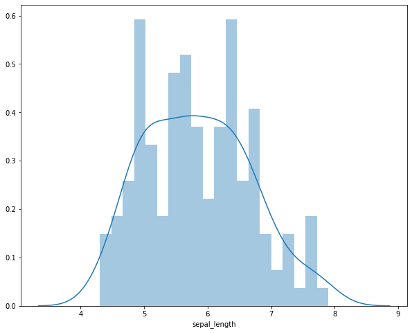
上面的图中,同时绘制了直方图和密度图(density),明明是连续型变量,又是怎么绘制出直方图呢?程序按照我们设定的bins,做了分割处理,如果我们没有设置bins,则函数有一个默认的bins。
# 多个连续变量在一幅图中进行比较 hist表示是否显示直方图 kde表示是否显示密度图
sns.distplot(iris.sepal_length, hist=False, kde=True, label='Length')
sns.distplot(iris.sepal_width, hist=False, kde=True, label='Width')
执行
<matplotlib.axes._subplots.AxesSubplot at 0x1a412ef748>

Plotting bivariate 二变量
两个连续型变量的分布该用什么图?一般多用散点图
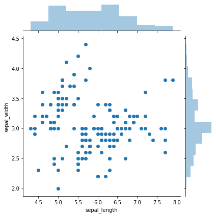
# 返回的是散点图以及两个变量的直方图
sns.jointplot(x='sepal_length', y='sepal_width', data=iris)
执行
<seaborn.axisgrid.JointGrid at 0x1a42922f98>
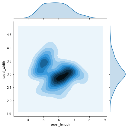
# 返回的类似于热力图以及两个变量的密度曲线
sns.jointplot(x='sepal_length', y='sepal_width', data=iris, kind='kde')
执行
<seaborn.axisgrid.JointGrid at 0x1a403d70b8>
# 画出了拟合的线性回归线
sns.jointplot(x='sepal_length', y='sepal_width', data=iris, kind='reg')
执行
<seaborn.axisgrid.JointGrid at 0x1a401a3b38>
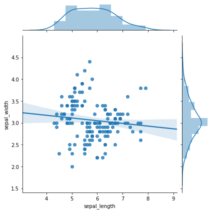
由此可见,花萼的长度和花萼的宽度并没有明显的相关性。
Visualizing pairwise relationships
iris数据集中总共有四列,即4个特征,我们想要看一下特征与特征之间的关系,4个里面选2个,不重复的,共有12个子图,我们使用pairplot函数一次性的输出查看。
sns.pairplot(iris)
执行
<seaborn.axisgrid.PairGrid at 0x11b81c7f0>
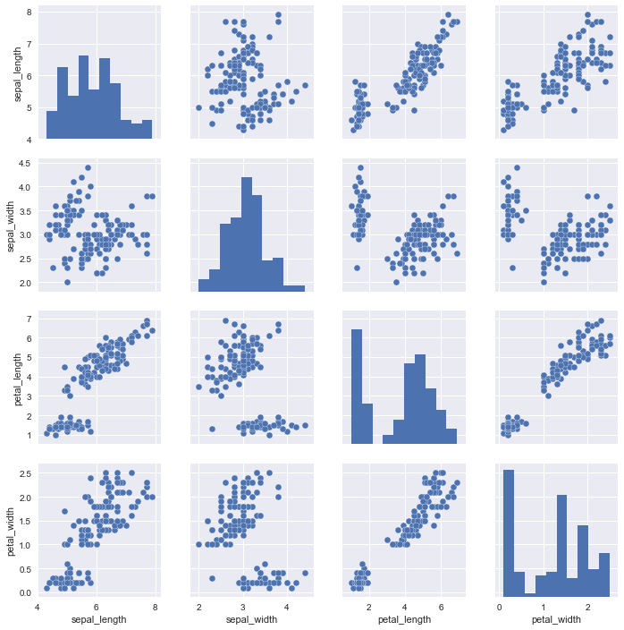
通过这个图示,我们观察第三行第四列和第四行第三列的子图,发现花瓣的长度和花瓣的宽度有一个明显的线性相关性,可以说这两个特征有共线性,要么都大,要么都小。
我们再说一下上图中的直方图,绘制的是变量与变量自身的关系,可理解为单个连续变量的直方图分布。
# 轮廓和上图中最后一个子图相同
iris['petal_width'].plot.hist()
Plotting with categorical data
sns.stripplot(x="day", y="total_bill", data=tips);
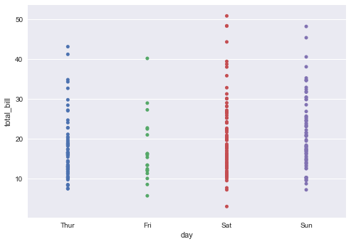
对于上面的图,其中x 轴上是离散型变量,y轴上是连续型变量,打点,不过这些点都打在了一条直线上,存在重叠的点,不过我们还是可以看出,周六给的小费还是要相对高一些。
sns.stripplot(x="day", y="total_bill", data=tips, jitter=True,hue = "smoker");
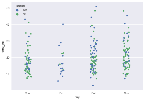
这个图相对上面的图,代码中增加了2个参数,jitter表明是否要把这些点打乱显示,而hue参数则表明是否要分组显示,我们这里hue参数指定为smoker列(离散型变量)很明显,这个图要比上面的图更加清晰明了。
# POINT不会重叠
sns.swarmplot(x="day", y="total_bill", data=tips);
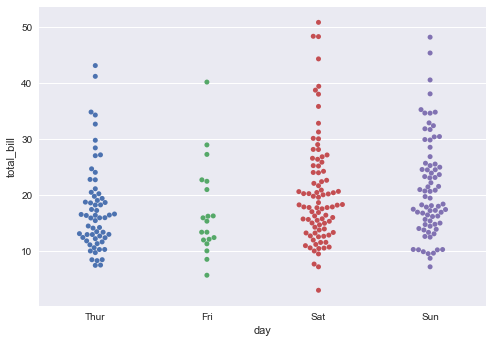
其实,swarmplot和stripplot有异曲同工之妙,只不过swarmplot显示出来的图,点与点之间是不会重叠的,我们可以清晰的观察到,在周六20美元的小费和18美元左右的小费有许多。
当我们想要可视化一个离散变量和一个连续变量间的关系时,我们首先考虑的就是stripplot和swarmplot。
sns.barplot(x="tip", y="day",hue = "smoker", data=tips)
<matplotlib.axes._subplots.AxesSubplot at 0x1e3f2939080>
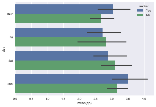
seaborn中的barchart默认是Horizontal的形式,要注意y轴才是离散型变量,x轴取的是小费的平均值(默认情况下),我们也可以通过设置estimator参数的取值来更改x轴上的取值,比如设置estimator=np.median。
Visualizing linear relationships
# linear model
sns.lmplot(x="total_bill", y="tip", data=tips)
<seaborn.axisgrid.FacetGrid at 0x1e3f3a77b38>
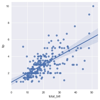
输入的是两个连续型变量,输出的是散点图,以及x和y之间拟合的线性回归方程。
阴影部分可以暂时理解为置信区间。
anscombe = sns.load_dataset("anscombe")
sns.lmplot(x="x", y="y", data=anscombe.query("dataset == 'I'"),
            scatter_kws={"s": 80});
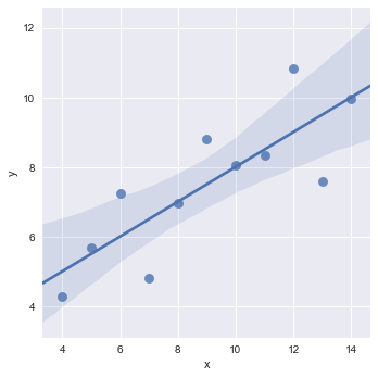
这里加载了新的数据集anscombe,x轴和y轴都是连续型变量,data是对原始数据集进行了筛选,解释一下scatter_kws参数,可以理解为可变参数,是用来定义图片的相关属性的,比如这里设置size为80。
sns.lmplot(x="x", y="y", data=anscombe.query("dataset == 'II'"),
           ci=None, scatter_kws={"s": 80});
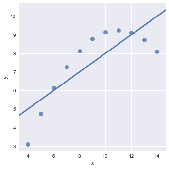
这个地方ci参数为confidence interval的缩写,设置为None则不显示置信区间的范围。
我们可以看到这个地方,拟合的直线并不是很好,我们希望可以有一条曲线来拟合上面的点,由此我们想到了多项式,简单线性回归方程中x是一次幂,为了更好的拟合数据,我们可以添加x的平方,x的立方,x的四次方。。。,这就是多项式,下面的图示中解决了这一点。
sns.lmplot(x="x", y="y", data=anscombe.query("dataset == 'II'"),
           order=2, ci=None, scatter_kws={"s": 80});
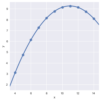
其中的order参数就是用来设置回归方程中的最高次幂的,这里我们设置order为2,当我们设置order为更大的值时,也是可以完美拟合的。低次方可以拟合,那高次方一定也可以拟合。(因为高次方是更加复杂了)
sns.lmplot(x="x", y="y", data=anscombe.query("dataset == 'III'"),
           ci=None, scatter_kws={"s": 80});
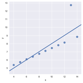
观察这个图示我们可以看到,仅仅是因为一个异常点,导致了我们整个拟合效果的偏离,有没有办法忽略掉异常值,考虑全局,使得模型有更好的适配性,鲁棒性呢?也就是说使得模型的泛化能力更强。
sns.lmplot(x="x", y="y", data=anscombe.query("dataset == 'III'"),
           robust=True, ci=None, scatter_kws={"s": 80});
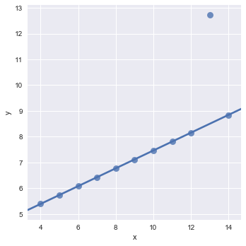
robust参数就是用来解决我们上面提出的问题的。
观察拟合的图形我们可以发现,拟合出来的直线已经忽略了异常值了。
sns.lmplot(x="total_bill", y="tip", hue="smoker", data=tips)
<seaborn.axisgrid.FacetGrid at 0x1e3f3f12668>

这里我们仅仅是增加了hue参数配置,根据吸烟或不吸烟,拟合出了两条直线,不吸烟的斜率更大,也就是说,不吸烟的人相对于吸烟的人,随着消费账单的增加,小费金额增加的更快。

若有收获,就点个赞吧
0 人点赞
