数据列字段的含义如下所示:
- FRESH: annual spending (m.u.) on fresh products (Continuous);
- MILK: annual spending (m.u.) on milk products (Continuous);
- GROCERY: annual spending (m.u.)on grocery products (Continuous);
- FROZEN: annual spending (m.u.)on frozen products (Continuous);
- DETERGENTS_PAPER: annual spending (m.u.) on detergents and paper products (Continuous);
- DELICATESSEN: annual spending (m.u.)on and delicatessen products (Continuous);
- CHANNEL: customers Channel - Horeca (Hotel/Restaurant/Cafe) or Retail channel (Nominal);
- REGION: customers Region - Lisnon, Oporto or Other (Nominal);
我们的数据集就如上面这张表所示,记录了不同渠道,不同区域,顾客针对不同类别商品的消费数据。
需要注意的一点是:Channel(渠道),Region(区域)是离散型变量,而Fresh, Milk, 还有其它的,则是连续型变量
目标是什么?根据已有的数据,对人群进行分类,从而进行不同的推销。
加载模块
import numpy as npimport pandas as pdimport matplotlib.pyplot as pltimport seaborn as snsfrom sklearn.cluster import KMeansfrom sklearn import manifold
数据探索
数据探索,通常指的是我们对数据要有一个初步的印象,对数据的熟悉程度;例如每个特征的分布范围,最大值,最小值等。
有时候,我们也需要针对特征做一些处理,称之为特征工程。
# Wholesales数据加载customers = pd.read_csv("Wholesale_customers_data.csv")customers.head()
执行
| Channel | Region | Fresh | Milk | Grocery | Frozen | Detergents_Paper | Delicassen | |
|---|---|---|---|---|---|---|---|---|
| 0 | 2 | 3 | 12669 | 9656 | 7561 | 214 | 2674 | 1338 |
| 1 | 2 | 3 | 7057 | 9810 | 9568 | 1762 | 3293 | 1776 |
| 2 | 2 | 3 | 6353 | 8808 | 7684 | 2405 | 3516 | 7844 |
| 3 | 1 | 3 | 13265 | 1196 | 4221 | 6404 | 507 | 1788 |
| 4 | 2 | 3 | 22615 | 5410 | 7198 | 3915 | 1777 | 5185 |
查看一下每列数据的分布
customers.describe()
执行
| Channel | Region | Fresh | Milk | Grocery | Frozen | Detergents_Paper | Delicassen | |
|---|---|---|---|---|---|---|---|---|
| count | 440.000000 | 440.000000 | 440.000000 | 440.000000 | 440.000000 | 440.000000 | 440.000000 | 440.000000 |
| mean | 1.322727 | 2.543182 | 12000.297727 | 5796.265909 | 7951.277273 | 3071.931818 | 2881.493182 | 1524.870455 |
| std | 0.468052 | 0.774272 | 12647.328865 | 7380.377175 | 9503.162829 | 4854.673333 | 4767.854448 | 2820.105937 |
| min | 1.000000 | 1.000000 | 3.000000 | 55.000000 | 3.000000 | 25.000000 | 3.000000 | 3.000000 |
| 25% | 1.000000 | 2.000000 | 3127.750000 | 1533.000000 | 2153.000000 | 742.250000 | 256.750000 | 408.250000 |
| 50% | 1.000000 | 3.000000 | 8504.000000 | 3627.000000 | 4755.500000 | 1526.000000 | 816.500000 | 965.500000 |
| 75% | 2.000000 | 3.000000 | 16933.750000 | 7190.250000 | 10655.750000 | 3554.250000 | 3922.000000 | 1820.250000 |
| max | 2.000000 | 3.000000 | 112151.000000 | 73498.000000 | 92780.000000 | 60869.000000 | 40827.000000 | 47943.000000 |
从每个变量的分布上,我们可以看到,有些变量间的尺度还是相差比较大的;比如Fresh的中位数为8504,而Detergents_Paper的中位数仅仅为816.5,有10倍之差。
通常情况下,我们都是不会在整体数据上进行探索的,产品或服务总是针对某个细分领域的用户的,我们进行数据探索也是一样,通常是组与组之间进行比较。这里因为我们的模型不考虑渠道和区域,所以没有进行组间的比较探索。
customers['Channel'].unique() # array([2, 1])customers['Region'].unique() # array([3, 1, 2])
虽然我们这里的模型并不考虑这两个离散变量,但我们还是可以看下,顾客消费主要有2个渠道,3个不同的区域。
模型预测
训练模型
注意:在这个地方,我们只传递了6个连续型变量,即后6列到模型中
# 设置输出图片大小的plt.rcParams['figure.figsize'] = (10, 8)# 训练模型,一般设置为3cluster = KMeans(n_clusters=3)# 丢弃前2列数据cluster.fit(customers.iloc[:,2:])
执行
KMeans(algorithm='auto', copy_x=True, init='k-means++', max_iter=300,n_clusters=3, n_init=10, n_jobs=None, precompute_distances='auto',random_state=None, tol=0.0001, verbose=0)
降维处理
为什么我们需要降低维度呢?
之前我们2个特征可视化时,输出的是二维平面图;3个特征可视化时,输出的是3D图;如今有6个特征,我们可视化时,是不可能输出6维图的;因此需要降维。
TSNE只是多种降维方式中的一种,要注意的是:每次降维都可能会产生不同的结果。(多次执行代码,输出可能不同)
降维前,我们是440行6列数据,降维后,我们就只有440行2列数据了
# 降低维度
tsne = manifold.TSNE()
tsne_data = tsne.fit_transform(customers.iloc[:, 2:])

print(tsne_data.shape)    # (440, 2)
print(type(tsne_data))    # <class 'numpy.ndarray'>
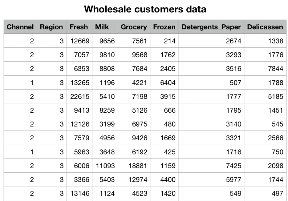
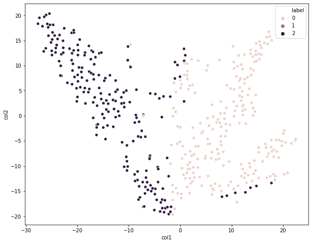
可视化展示
通过散点图的方式可视化聚类结果
tsne_df = pd.DataFrame(tsne_data, columns=['col1', 'col2'])

# 添加一列为预测结果,预测的数据使用的是原始数据
tsne_df['label'] = cluster.predict(customers.iloc[:,2:])
# hue区分不同颜色的
sns.scatterplot(x = 'col1',y = 'col2', hue='label', data = tsne_df)
执行
<matplotlib.axes._subplots.AxesSubplot at 0x12af90c70>
从这个图上看,我们划分为3个类别的效果相对来说还是不错的;虽然存在个别异常值,但先关注大局,后关注细节。我们知道KMeans一个比较严重的缺点就是,对异常值比较敏感,也就是容易受到异常值的影响。
数据预处理
我们知道为了消除数据间尺度的差异,使用马氏距离是一种解决方案;另外我们还可以进行预处理操作来避免不同特征间的尺度(量纲)差异。
Normalizer是我们针对KMeans最为常用的一种数据预处理方法,它可以消除样本间计算距离时存在的量纲问题。比如样本i和样本j直接通过欧式距离进行计算,会受到不同特征尺度不同的影响。
StandardScaler主要就是z-score了,针对每个特征进行标准化,虽然单个特征内部是进行标准化了,但特征与特征之间的量纲差异仍然存在。
MaxAbsScaler设置最大绝对值标量,也是一种预处理数据的方式。
定义函数
from sklearn.preprocessing import Normalizer, StandardScaler, MaxAbsScaler

def showCluster(n, processing_method):

    # 数据预处理
    train_data = customers.iloc[:,2:]
    processing_method.fit(train_data)
    norm_train_data = processing_method.transform(train_data)

    # 聚类模型
    norm_cluster = KMeans(n_clusters=n)
    norm_cluster.fit(norm_train_data)

    # 可视化
    tsne = manifold.TSNE()
    tsne_data = tsne.fit_transform(norm_train_data)
    tsne_df = pd.DataFrame(tsne_data, columns=['col1', 'col2'])
    tsne_df['label'] = norm_cluster.predict(customers.iloc[:, 2:])
    sns.scatterplot(x='col1', y='col2', hue='label', data=tsne_df)

    return norm_train_data, norm_cluster


# 创建三种预处理的对象
norm = Normalizer()
ss = StandardScaler()
ms = MaxAbsScaler()
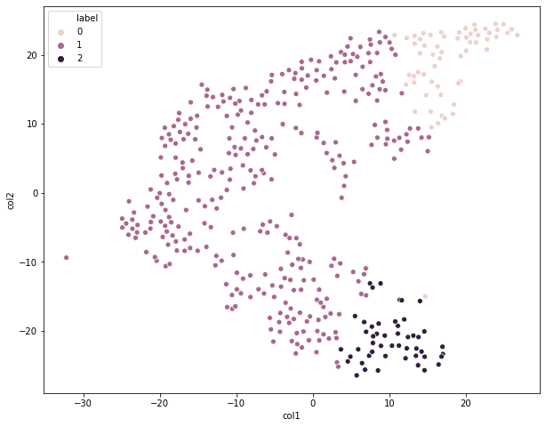
可视化展示
data1, cluster1 = showCluster(3, norm)
执行
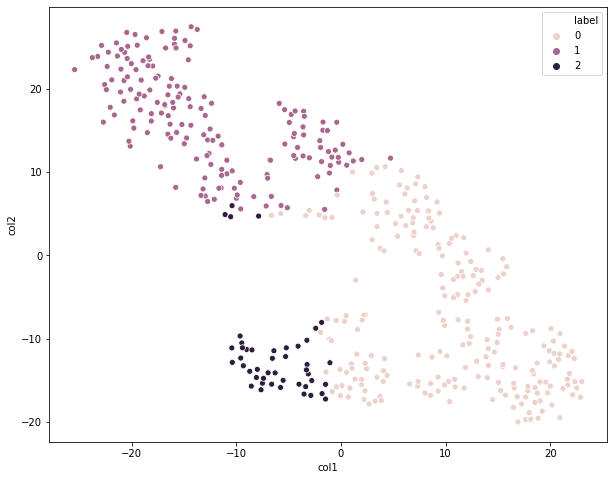
data2, cluster2 = showCluster(3, ss)
执行
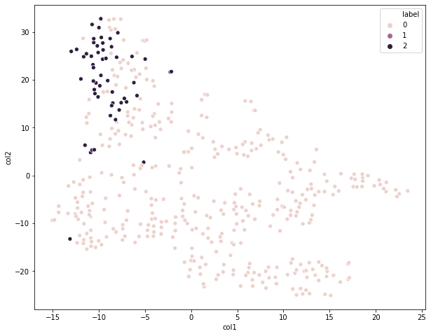
data3, cluster3 = showCluster(3, ms)
执行
对比一下这三个图,我们都是划分为3个类别,只是预处理方法不同,很明显第一个图的聚类效果相对来说是最好的,采用的是Normalizer预处理方法。
你还可以研究下,data1,data2,data3,即预处理后的数据成什么样子了,仍然是440行6列数据,但是值已经发生了变化。
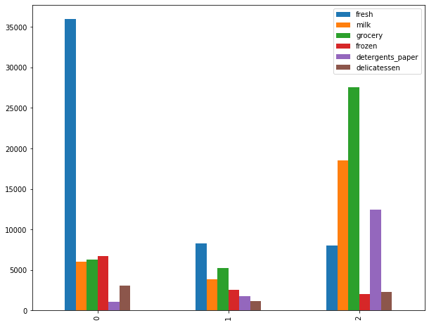
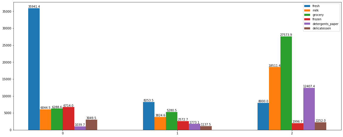
聚类模型分析
查看簇内中心点
我们知道,每个簇都有它对应的质心,即平均数;我们可以通过clustercenters属性来查看。注意,最终的质心并不一定就是样本集中已存在的点。
cluster.cluster_centers_
执行
array([[35941.4       ,  6044.45      ,  6288.61666667,  6713.96666667,
         1039.66666667,  3049.46666667],
       [ 8253.46969697,  3824.6030303 ,  5280.45454545,  2572.66060606,
         1773.05757576,  1137.4969697 ],
       [ 8000.04      , 18511.42      , 27573.9       ,  1996.68      ,
        12407.36      ,  2252.02      ]])
我们可以明显看到,cluster1是经过数据预处理的,它的质心明显有所不同。
cluster1.cluster_centers_
执行
array([[0.90770227, 0.17109877, 0.22618074, 0.15052508, 0.04922206,
        0.07118601],
       [0.26255297, 0.48868876, 0.67784835, 0.0959559 , 0.26615253,
        0.10056063],
       [0.57508847, 0.23324504, 0.27925177, 0.6254248 , 0.05374771,
        0.10905186]])
要注意的一点是:你得到集群中心点的顺序可能是不同的,多次调用下面这段代码,你就会发现不同之处
**
cluster = KMeans(n_clusters=3)
cluster.fit(customers.iloc[:,2:])
cluster.labels_
简单来说,就是这次样本i是被划分到类标号0,下次就可能被划分到类标号1,这里我们并不是很关心对应类标号,我们的目的是把这些数据分为三个类别,至于类标号怎么称呼,那并不是很重要。
可视化展示
将其转化为DataFrame,我们好进行数据的处理和展示
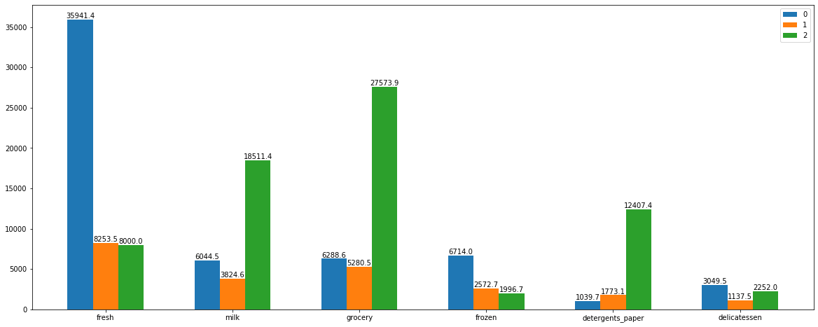
df = pd.DataFrame(cluster.cluster_centers_, columns=['fresh', 'milk', 'grocery', 'frozen', 'detergents_paper', 'delicatessen'])
df.head()
执行
| fresh | milk | grocery | frozen | detergents_paper | delicatessen | |
|---|---|---|---|---|---|---|
| 0 | 35941.400000 | 6044.45000 | 6288.616667 | 6713.966667 | 1039.666667 | 3049.466667 |
| 1 | 8253.469697 | 3824.60303 | 5280.454545 | 2572.660606 | 1773.057576 | 1137.496970 |
| 2 | 8000.040000 | 18511.42000 | 27573.900000 | 1996.680000 | 12407.360000 | 2252.020000 |
每个类内,不同特征间的变化分布**
df.plot(kind='bar')
执行
<matplotlib.axes._subplots.AxesSubplot at 0x12a5ada60>
我们把每个bar对应的数值也给它标注上去
X = np.array([0, 20, 40])
width = 2
for i, col in zip(range(6), df.columns):
    plt.bar(X+width*i, df[col], width=width, label=col)
plt.legend()

for i in range(3):
    for j in range(6):
        plt.text(X[i]+width*j, df.iloc[i, j], round(df.iloc[i, j], 1), ha='center', va='bottom')

plt.xticks([5, 25, 45], [0, 1, 2])
执行
([<matplotlib.axis.XTick at 0x12af06a60>,
  <matplotlib.axis.XTick at 0x12af065b0>,
  <matplotlib.axis.XTick at 0x12af06190>],
 <a list of 3 Text xticklabel objects>)
同一特征,不同类间的比较
df.T
执行
| 0 | 1 | 2 | |
|---|---|---|---|
| fresh | 35941.400000 | 8253.469697 | 8000.04 |
| milk | 6044.450000 | 3824.603030 | 18511.42 |
| grocery | 6288.616667 | 5280.454545 | 27573.90 |
| frozen | 6713.966667 | 2572.660606 | 1996.68 |
| detergents_paper | 1039.666667 | 1773.057576 | 12407.36 |
| delicatessen | 3049.466667 | 1137.496970 | 2252.02 |
直接通过Pandas Api来画图
df.T.plot(kind='bar')
执行
<matplotlib.axes._subplots.AxesSubplot at 0x12a1ed940>
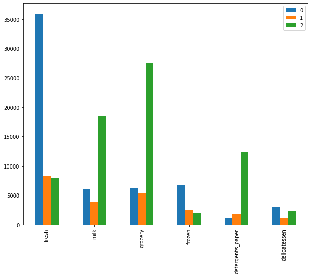
我们把每个bar对应的数值给它标注上去
tdf = df.T
X = np.array([0, 10, 20, 30, 40, 50])
width = 2
for i in range(3):
    plt.bar(X+width*i, tdf[i], width=2, label=i)
plt.legend()

for i in range(3):
    for j in range(6):
        plt.text(X[j]+width*i, tdf.iloc[j, i], round(tdf.iloc[j, i], 1), ha='center', va='bottom')

plt.xticks(X+2, ['fresh', 'milk', 'grocery', 'frozen', 'detergents_paper', 'delicatessen'])
执行
([<matplotlib.axis.XTick at 0x122063100>,
  <matplotlib.axis.XTick at 0x1220630d0>,
  <matplotlib.axis.XTick at 0x122063370>,
  <matplotlib.axis.XTick at 0x127c7a1f0>,
  <matplotlib.axis.XTick at 0x127c7a790>,
  <matplotlib.axis.XTick at 0x127c7ad30>],
 <a list of 6 Text xticklabel objects>)
评估指标
簇内距离和:Sum of squared distances of samples to their closest cluster center.
我们通过inertia_属性来查看
print(cluster.inertia_)    # 80333726672.53995

print(cluster1.inertia_)   # 45.95057704568801

print(cluster2.inertia_)   # 1621.3099868001004

print(cluster3.inertia_)   # 13.871843783240834
我们可以看到,数据预处理之后的簇内距离和明显比原始数据小许多。
留一个小问题:簇间距离如何来查看呢?
我们知道,评估一个聚类模型效果好不好,通常有两点:1,同一个簇内的数据点足够聚集;2,簇间的距离足够大;虽然有一些评估指标的存在,但我们不能完全依赖这些指标,还是要有主观判断的。

若有收获,就点个赞吧
0 人点赞
