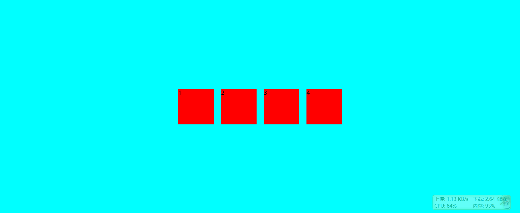
左上—-左到右
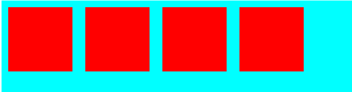
<!DOCTYPE html><html lang="en"><head><meta charset="UTF-8"><title>Title</title><style>#box {height: 600px;width: 100%;background-color: aqua;display: flex;}.item {height: 100px;width: 100px;background-color: red;margin: 10px;}</style></head><body><div id="box"><div class="item"></div><div class="item"></div><div class="item"></div><div class="item"></div></div></body></html>
上中—-左到右
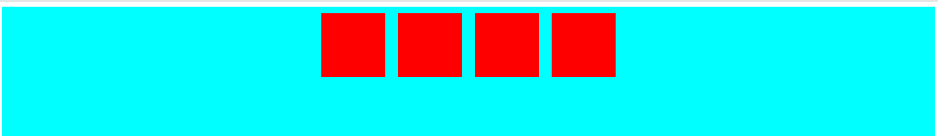
.box {display: flex;justify-content: center;}
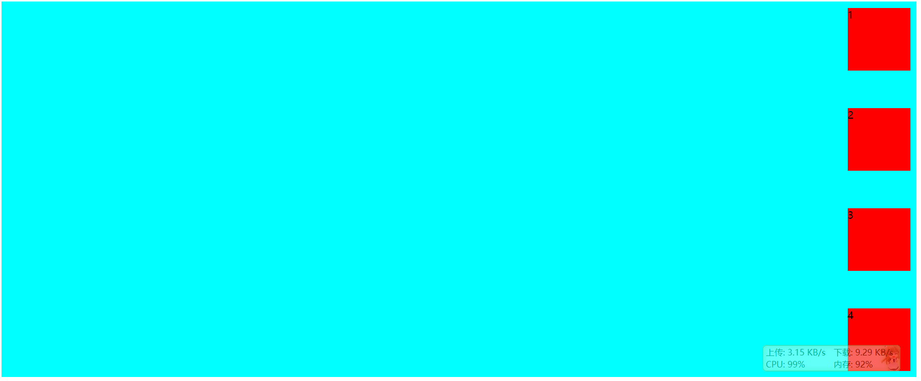
右上—-左到右
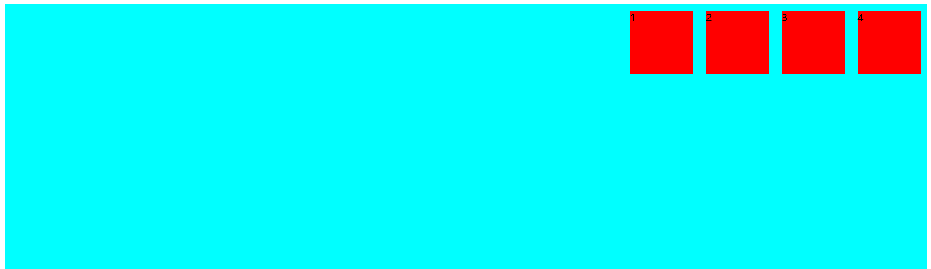
.box {display: flex;justify-content: flex-end;}
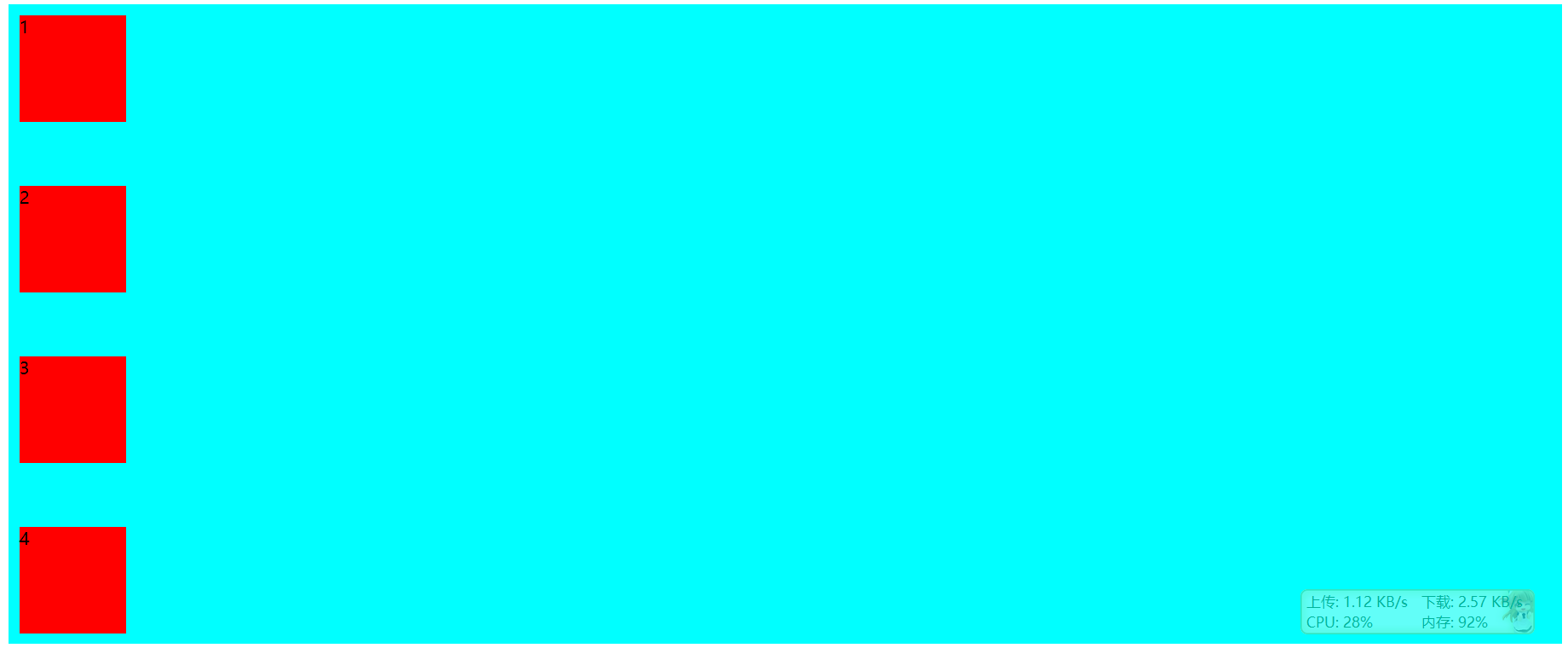
左中—-左到右
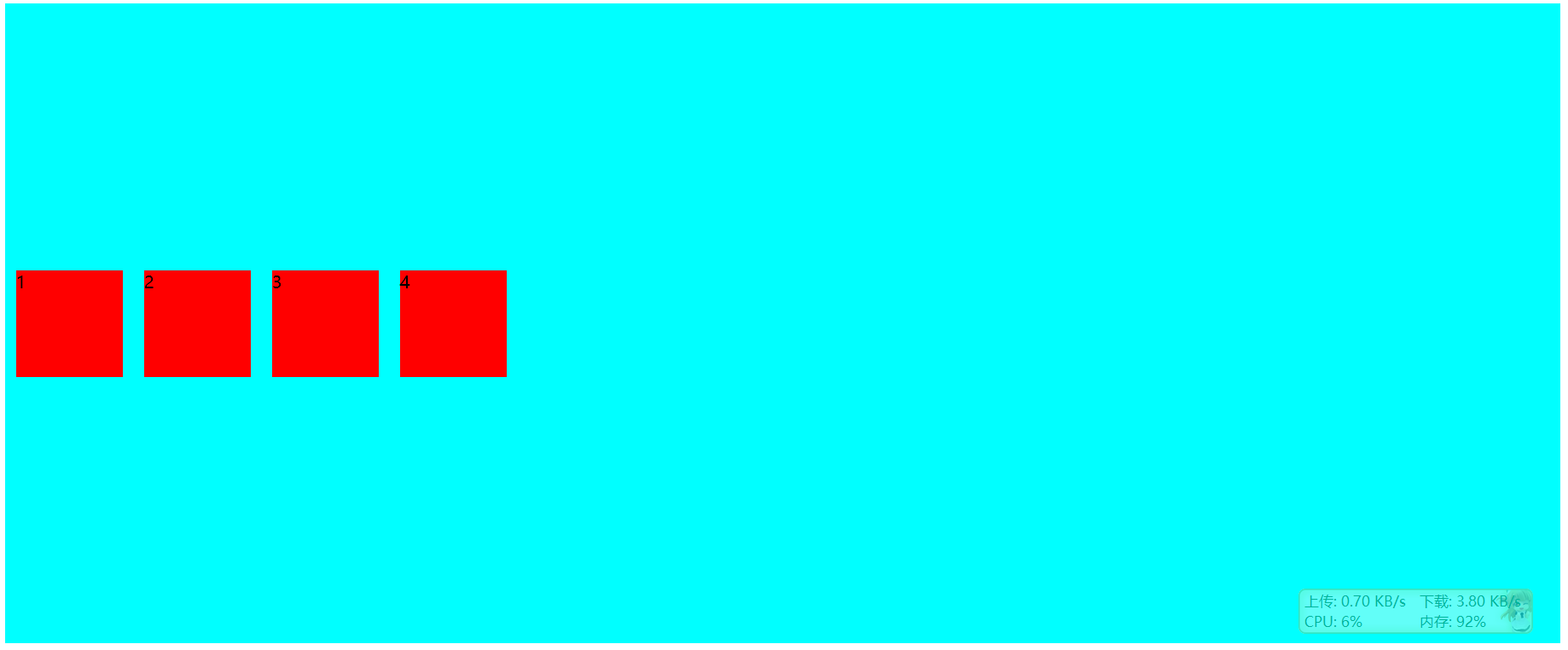
.box {display: flex;align-items: center;}
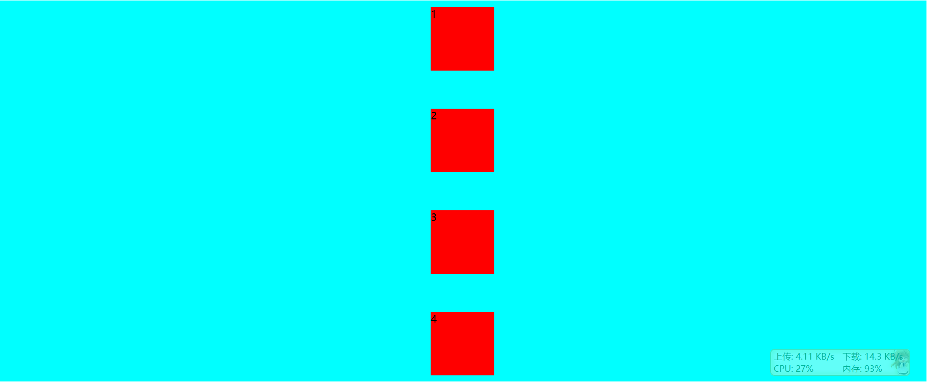
中心—-左到右
.box {display: flex;justify-content: center;align-items: center;}
中下—-左到右
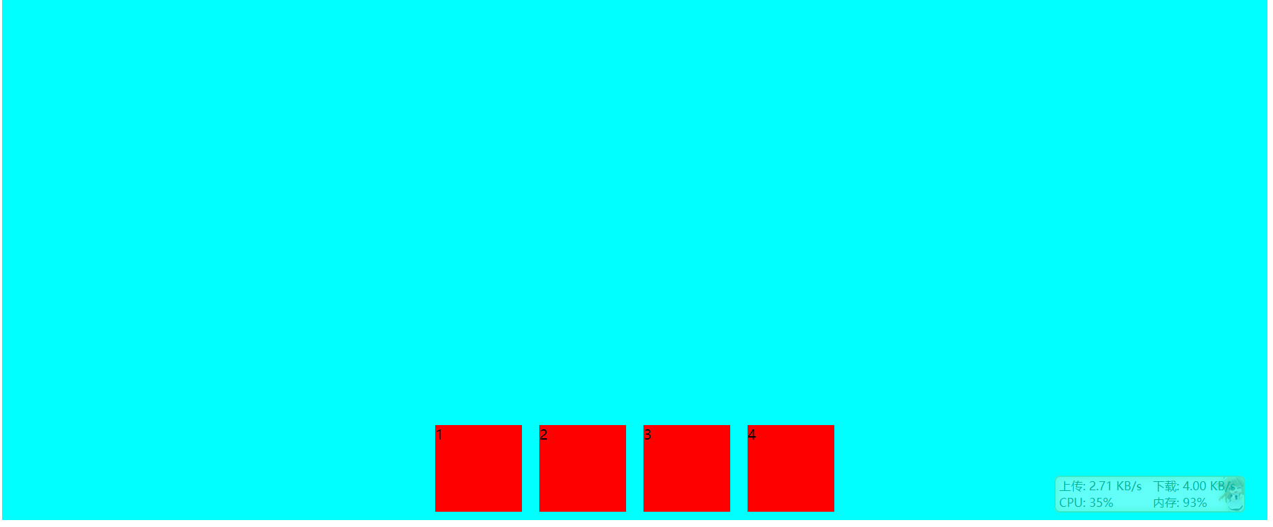
.box {display: flex;justify-content: center;align-items: flex-end;}
右下—-左到右
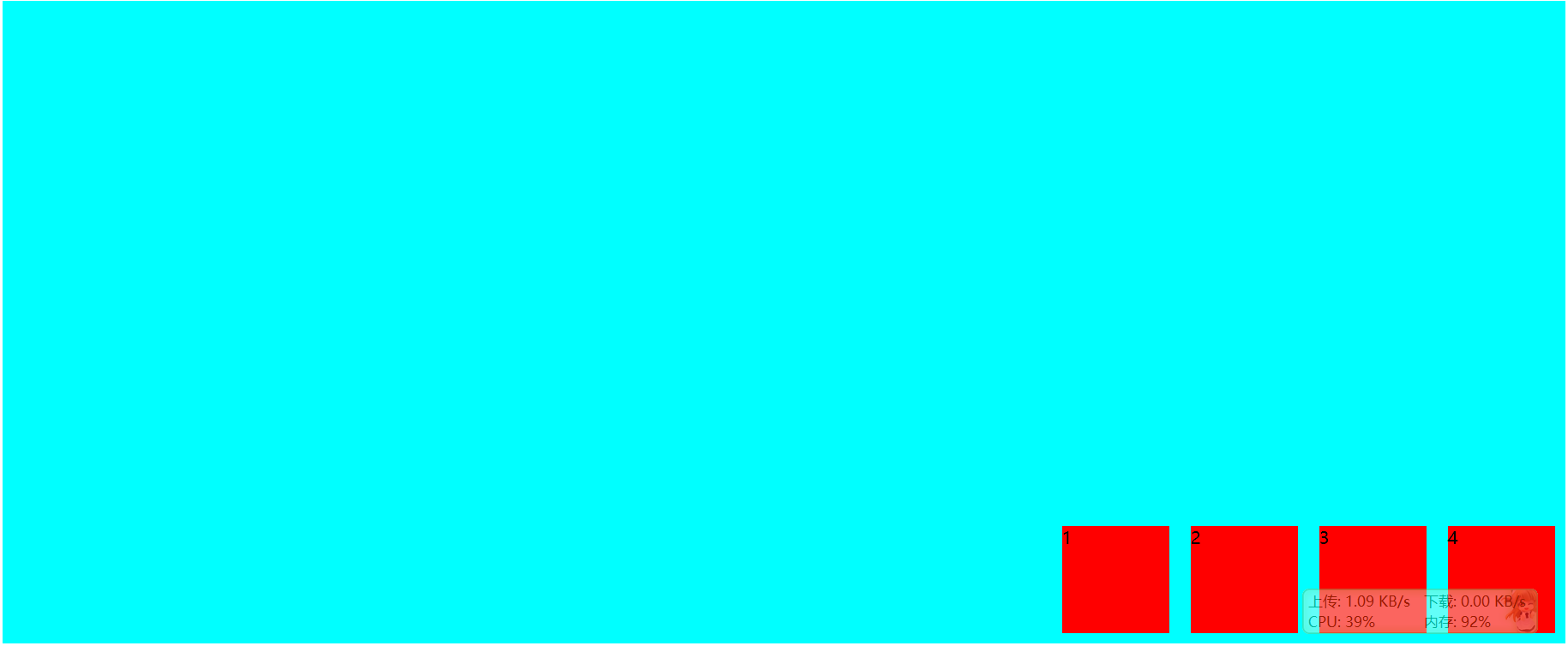
.box {display: flex;justify-content: flex-end;align-items: flex-end;}
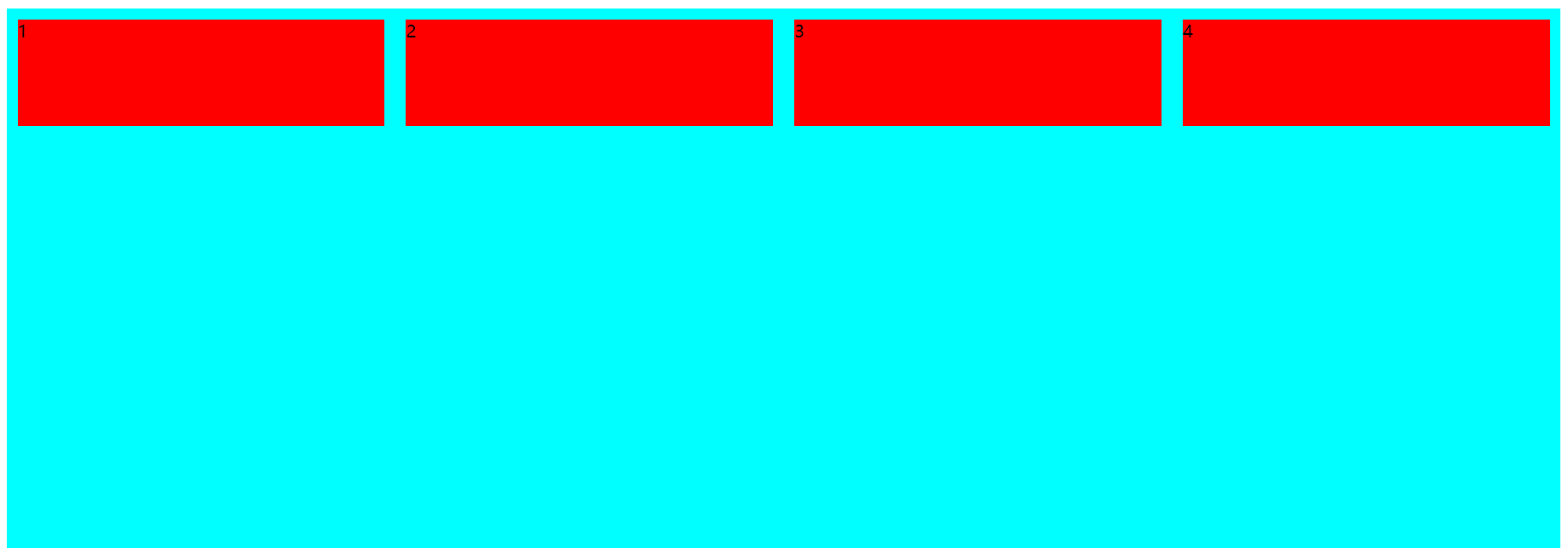
均匀—-左上—-左到右
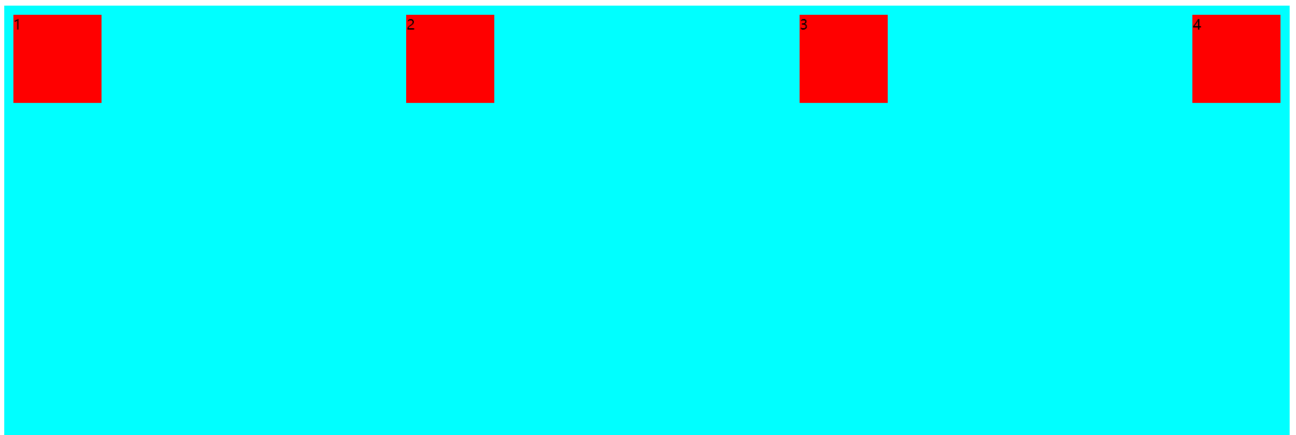
.box {display: flex;justify-content: space-between;}
均匀—-左上—-上到下
.box {display: flex;flex-direction: column;justify-content: space-between;}
均匀—-中上—-上到下
.box {display: flex;flex-direction: column;justify-content: space-between;align-items: center;}
均匀—-右上—-上到下
.box {display: flex;flex-direction: column;justify-content: space-between;align-items: flex-end;}
栅格布局
简单布局
自动分配宽度。
<div class="Grid"><div class="Grid-cell">...</div><div class="Grid-cell">...</div><div class="Grid-cell">...</div></div>
.Grid {display: flex;}.Grid-cell {flex: 1;}
固定百分比
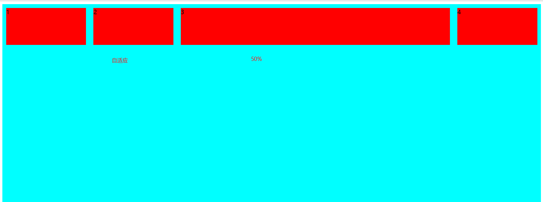
<div id="box"><div class="item">1</div><div class="item">2</div><div class="item u-1of3">3</div><div class="item">4</div></div>
#box {height: 600px;width: 100%;background-color: aqua;display: flex;}.item {height: 100px;background-color: red;margin: 10px;flex: 1;}.item.u-1of3 {flex: 0 0 50%; ## 加上这一句即可}
圣杯布局实例
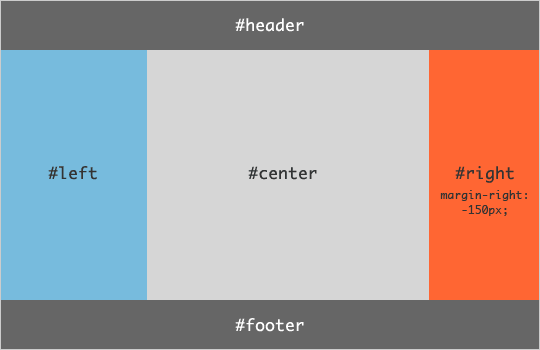
html
<body class="HolyGrail"><header>...</header><div class="HolyGrail-body"><main class="HolyGrail-content">...</main><nav class="HolyGrail-nav">...</nav><aside class="HolyGrail-ads">...</aside></div><footer>...</footer></body>
css
.HolyGrail {display: flex;min-height: 100vh;flex-direction: column;}header,footer {flex: 1;}.HolyGrail-body {display: flex;flex: 1;}.HolyGrail-content {flex: 1;}.HolyGrail-nav, .HolyGrail-ads {/* 两个边栏的宽度设为12em */flex: 0 0 12em;}.HolyGrail-nav {/* 导航放到最左边 */order: -1;}
如果是小屏幕,躯干的三栏自动变为垂直叠加。
@media (max-width: 768px) {.HolyGrail-body {flex-direction: column;flex: 1;}.HolyGrail-nav,.HolyGrail-ads,.HolyGrail-content {flex: auto;}}

若有收获,就点个赞吧
0 人点赞
