参考资料:多项式回归处理非线性问题
多项式回归是一种通过增加自变量上的次数,而将数据映射到高维空间的方法,从而提高模型拟合复杂数据的效果。
线性模型中的升维工具——多项式变化。是一种通过增加自变量上的次数,而将数据映射到高维空间的方法,在sklearn中的PolynomialFeatures 设定一个自变量上的次数(大于1),相应地获得数据投影在高次方的空间中的结果。
语法:
sklearn.preprocessing.PolynomialFeatures (degree=2, interaction_only=False, include_bias=True)
重要参数:
degree : integer多项式中的次数,默认为2interaction_only : boolean, default = False布尔值是否只产生交互项,默认为False。就只能将原有的特征进行组合出新的特征,而不能直接对原特征进行升次。include_bias : boolean布尔值,是否产出与截距项相乘的 ,默认True
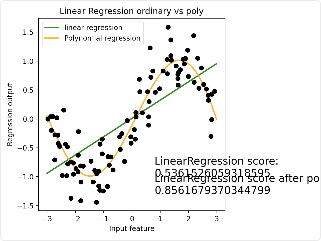
案例一、拟合正弦曲线
线性回归模型无法拟合出这条带噪音的正弦曲线的真实面貌,只能够模拟出大概的趋势,而用复杂的决策树模型又拟合地太过细致,即过拟合。此时利用多项式将数据升维,并拟合数据
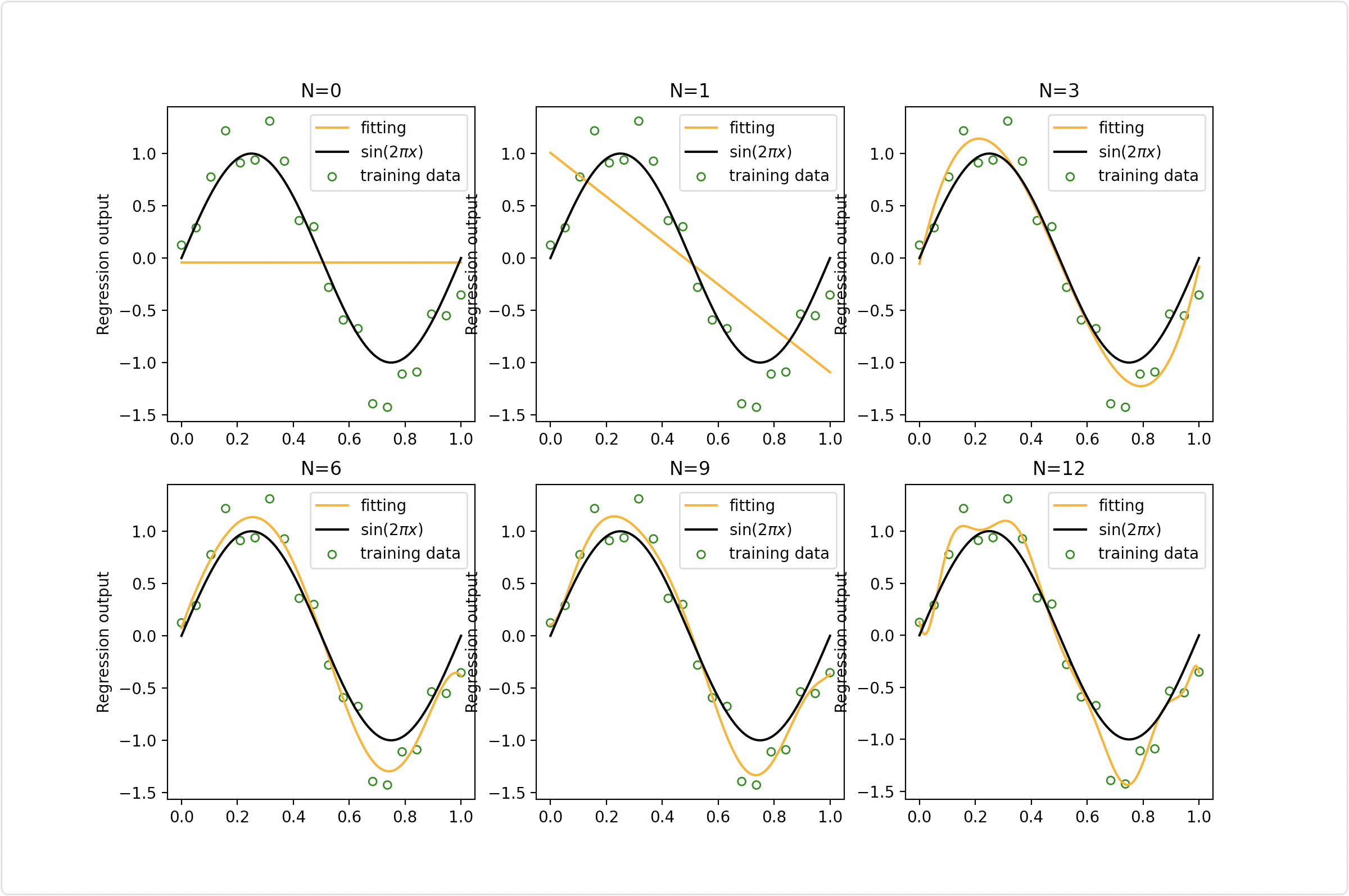
案例二、不同的最高次取值对拟合效果的影响
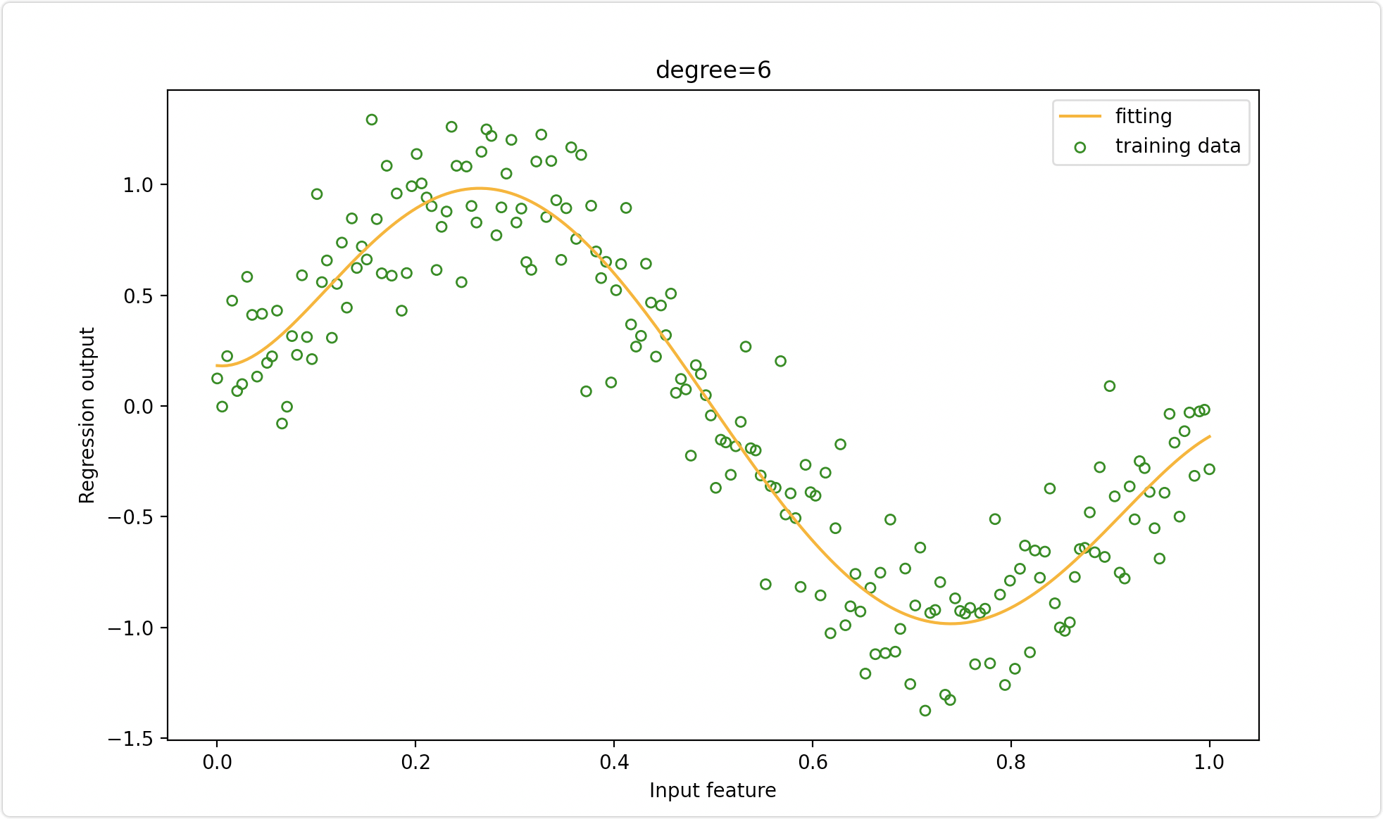
案例三、利用pipeline将三个模型封装起来串联操作
完整代码:
https://github.com/SeafyLiang/machine_learning_study/blob/master/regression/polynomialFeatures.py
from sklearn.pipeline import Pipelinefrom sklearn.preprocessing import PolynomialFeatures as PF, StandardScalerfrom sklearn.linear_model import LinearRegressionimport numpy as npimport matplotlib.pyplot as pltdef demo1():'''利用多项式将数据升维,并拟合数据'''rnd = np.random.RandomState(42) # 设置随机数种子X = rnd.uniform(-3, 3, size=100)y = np.sin(X) + rnd.normal(size=len(X)) / 3# 将X升维,准备好放入sklearn中X = X.reshape(-1, 1)# 多项式拟合,设定高次项d = 5# 原始特征矩阵的拟合结果LinearR = LinearRegression().fit(X, y)# 进行高此项转换X_ = PF(degree=d).fit_transform(X)LinearR_ = LinearRegression().fit(X_, y)line = np.linspace(-3, 3, 1000, endpoint=False).reshape(-1, 1)line_ = PF(degree=d).fit_transform(line)# 放置画布fig, ax1 = plt.subplots(1)# 将测试数据带入predict接口,获得模型的拟合效果并进行绘制ax1.plot(line, LinearR.predict(line), linewidth=2, color='green', label="linear regression")ax1.plot(line, LinearR_.predict(line_), linewidth=2, color='orange', label="Polynomial regression") # 将原数据上的拟合绘制在图像上ax1.plot(X[:, 0], y, 'o', c='k')# 其他图形选项ax1.legend(loc="best")ax1.set_ylabel("Regression output")ax1.set_xlabel("Input feature")ax1.set_title("Linear Regression ordinary vs poly")ax1.text(0.8, -1, f"LinearRegression score:\n{LinearR.score(X, y)}", fontsize=15)ax1.text(0.8, -1.3, f"LinearRegression score after poly :\n{LinearR_.score(X_, y)}", fontsize=15)plt.tight_layout()plt.show()# 生产数据函数def uniform(size):x = np.linspace(0, 1, size)return x.reshape(size, 1)def create_data(size):x = uniform(size)np.random.seed(42) # 设置随机数种子y = sin_fun(x) + np.random.normal(scale=0.25, size=x.shape)return x, ydef sin_fun(x):return np.sin(2 * np.pi * x)def demo2():'''不同的最高次取值,对模型拟合效果有重要的影响。'''X_train, y_train = create_data(20)X_test = uniform(200)y_test = sin_fun(X_test)fig = plt.figure(figsize=(12, 8))for i, degree in enumerate([0, 1, 3, 6, 9, 12]):plt.subplot(2, 3, i + 1)poly = PF(degree)X_train_ploy = poly.fit_transform(X_train)X_test_ploy = poly.fit_transform(X_test)lr = LinearRegression()lr.fit(X_train_ploy, y_train)y_pred = lr.predict(X_test_ploy)plt.scatter(X_train, y_train, facecolor="none", edgecolor="g", s=25, label="training data")plt.plot(X_test, y_pred, c="orange", label="fitting")plt.plot(X_test, y_test, c="k", label="$\sin(2\pi x)$")plt.title("N={}".format(degree))plt.legend(loc="best")plt.ylabel("Regression output")# plt.xlabel("Input feature")plt.legend()plt.show()def demo3():'''利用pipeline将三个模型封装起来串联操作,让模型接口更加简洁,使用起来方便'''X, y = create_data(200) # 利用上面的生产数据函数degree = 6# 利用Pipeline将三个模型封装起来串联操作npoly_reg = Pipeline([("poly", PF(degree=degree)),("std_scaler", StandardScaler()),("lin_reg", LinearRegression())])fig = plt.figure(figsize=(10, 6))poly = PF(degree)poly_reg.fit(X, y)y_pred = poly_reg.predict(X)# 可视化结果plt.scatter(X, y, facecolor="none", edgecolor="g", s=25, label="training data")plt.plot(X, y_pred, c="orange", label="fitting")# plt.plot(X,y,c="k",label="$\sin(2\pi x)$")plt.title("degree={}".format(degree))plt.legend(loc="best")plt.ylabel("Regression output")plt.xlabel("Input feature")plt.legend()plt.show()if __name__ == '__main__':demo1()demo2()demo3()

若有收获,就点个赞吧
0 人点赞
