介绍/Introduction
按钮用来揭示用户可以采取的行动,一般贯穿于整个UI设计中,常常出现在:
Buttons communicate actions that users can take. They are typically placed throughout your UI, in places like:
- 对话框/Dialogs
- 模态窗口/Modal windows
- 表单/Forms
- 卡片/Cards
- 工具栏/Toolbars
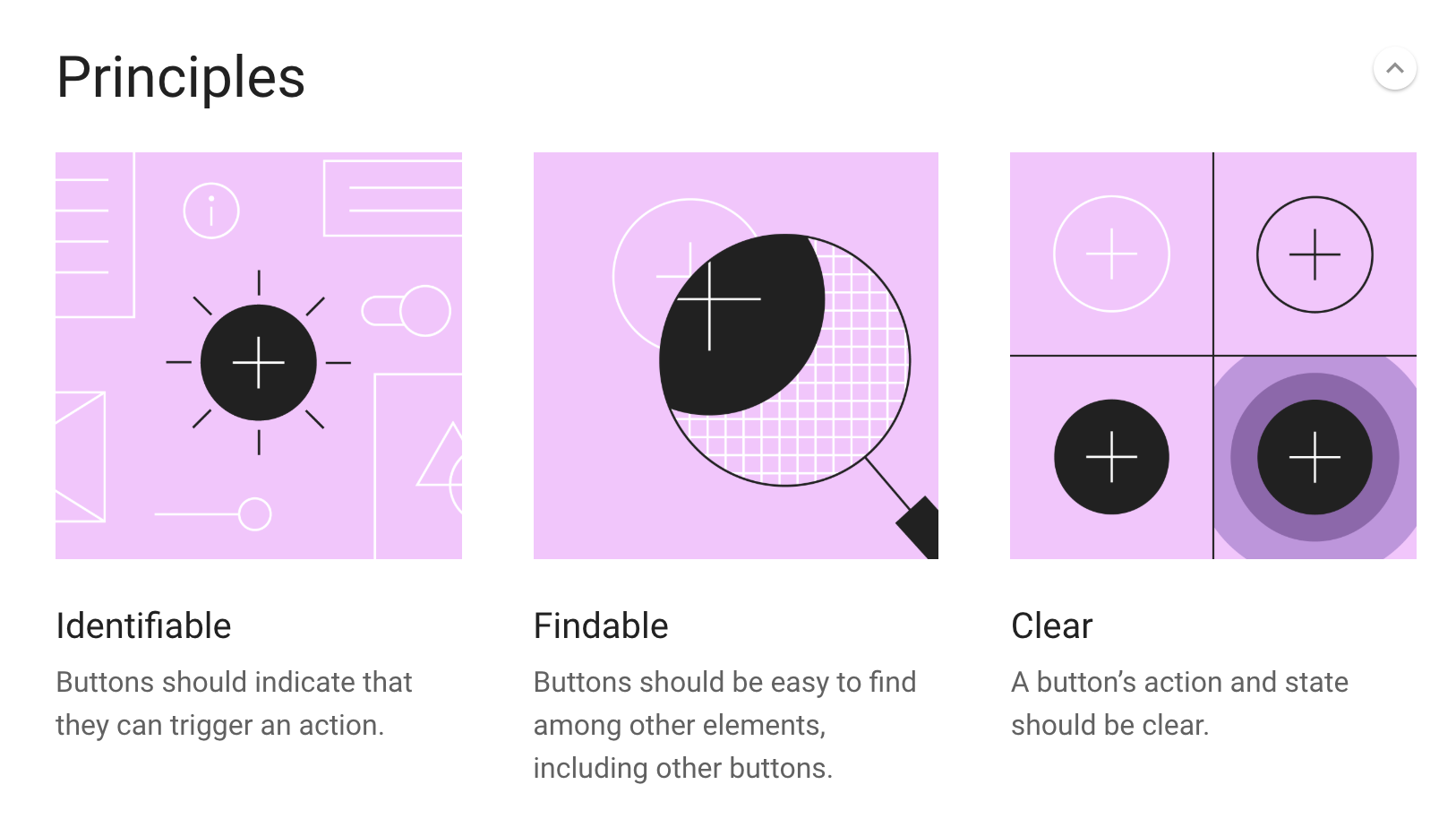
原则/Principles
可识别性:按钮应该可明确表征它们能够触发一个操作行为。
Identifiable: Buttons should indicate that they can triiger an action.
易查找:需要的按钮应该可以轻松从界面元素间找到,包括其他的按钮中。
Findable: Buttons should be easy to find among other elements, including other buttons.
状态清晰:按钮的操作状态应该清晰易懂。
Clear: A button’s action and state should be clear.
按钮的类型/Button types
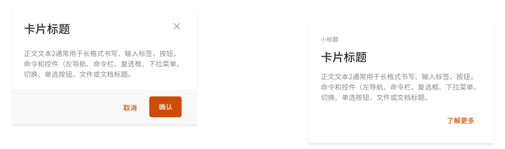
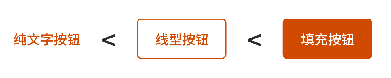
纯文字按钮/Text button
为了与其他文本区分开,纯文字按钮一般是彩色的纯大写字母。
纯文字按钮典型应用场景是不太明显的操作,这些操作常出现在:
Text buttons are typically used for less-pronounced actions, including those located:
- 对话框/In dialogs
对话框中为了保持和文字内容风格的统一常常会使用无边框纯文字的按钮。一般在从左到右的阅读顺序中,按钮会沿右边对齐。Dialogs use text buttons because the absence of a container helps unify the action with the dialog text. Align text buttons to the right edge for left-to-right scripts. - 卡片/ In cards
在卡片中,纯文字按钮可以帮助强调卡片本身的文字内容。要尽量使用短小精悍的文字作为按钮,避免出现太长的内容。In cards, text buttons help maintain an emphasis on card content. Avoid text labels that are too long. They should be concise.
线型边框按钮/Outlined button
线型边框按钮是中等强调的按钮(强调层级比纯文字高,比填充型低)。它们包含了应用中一些重要但是却不主要/被期待的操作行为。Outlined buttons are medium-emphasis buttons(lower emphasis alternative to contained buttons, or a higher emphasis alternative to text buttons). They contain actions that are important, but aren’t the primary action in an app.
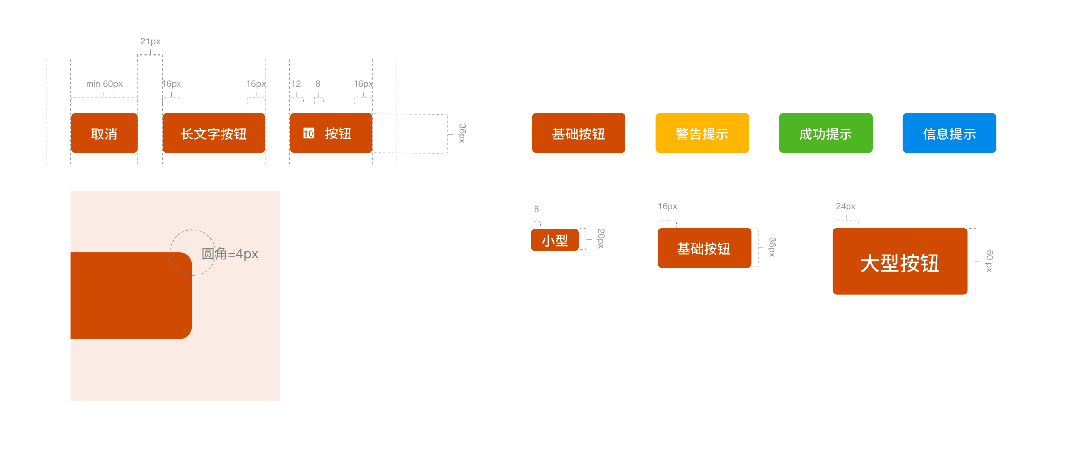
线性边框按钮的尺寸有两种设置方式:
Outlined buttons display a stroke around a text label. Stroke can be represented in different ways:
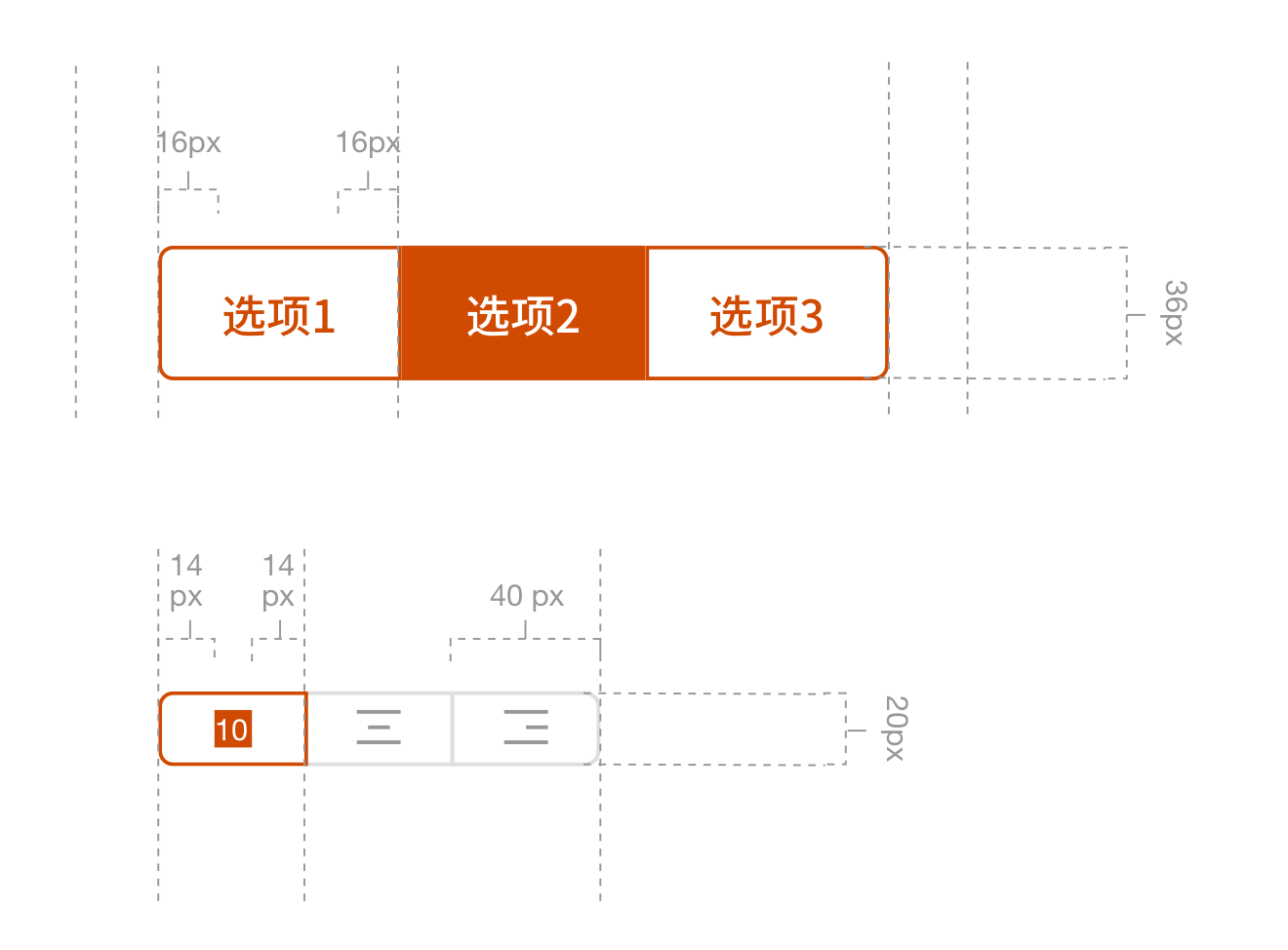
一:将按钮的宽度设置为文字标签的宽度,左右两边各留出16dp的间距,按钮的宽度随着文字长度改变。Set a button’s width to be the size of the text label, with 16dp padding on the left and right,and its width will dynamically fit the text label.。
二:将按钮的相对位置设定与响应式布局一致。Set the button’s relative position to the responsive layout grid.
一般而言,线型边框按钮常用于以下两种场景:
- 背景图上层
线型边框按钮可用于不同背景之上,从而不会对背景造成太大的影响。Outlined buttons can be placed on top of a variety of backgrounds. Its container is transparent and until the button is interacted with, a color isn’t visible.
- 和填充型按钮同时出现,用于弱化操作
和填充型按钮同时出现,用与弱化不安全或者危险的用户操作。Appear together with Contained button in order to weaken unsafe operations.


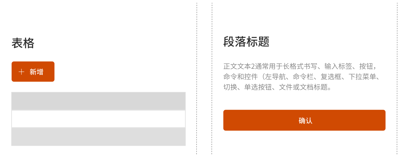
填充型按钮/Contained button
填充型按钮强调操作本身,根据它们的填充颜色表达不同的操作状态。填充型按钮的操作是应用中最主要的操作,会达到引导用户进行点击操作的功能。
Contained buttons are high-emphasis, distinguished by their use of elevation and fill. They contain actions that are primary to your app, they can be used where the platform wants to strongly suggest something that the user should do.
同样的,可以设定按钮的宽度随文字或者布局改变。需要注意的是,不要在同一个按钮里面使用一个以上icon。Similarly, the width of the button can be set to change with the text or layout. Don’t use more than 1 icon in the same button.
一般而言界面设计中,硬朗的边线使得界面看上去严肃和专业,圆角的方式正好相反,它使界面看起来更加灵动有趣,给人无忧无虑的感觉。可以通过增加一些色彩的渐变(色相提高十个点左右)使得按钮的颜色显得更自然温和。
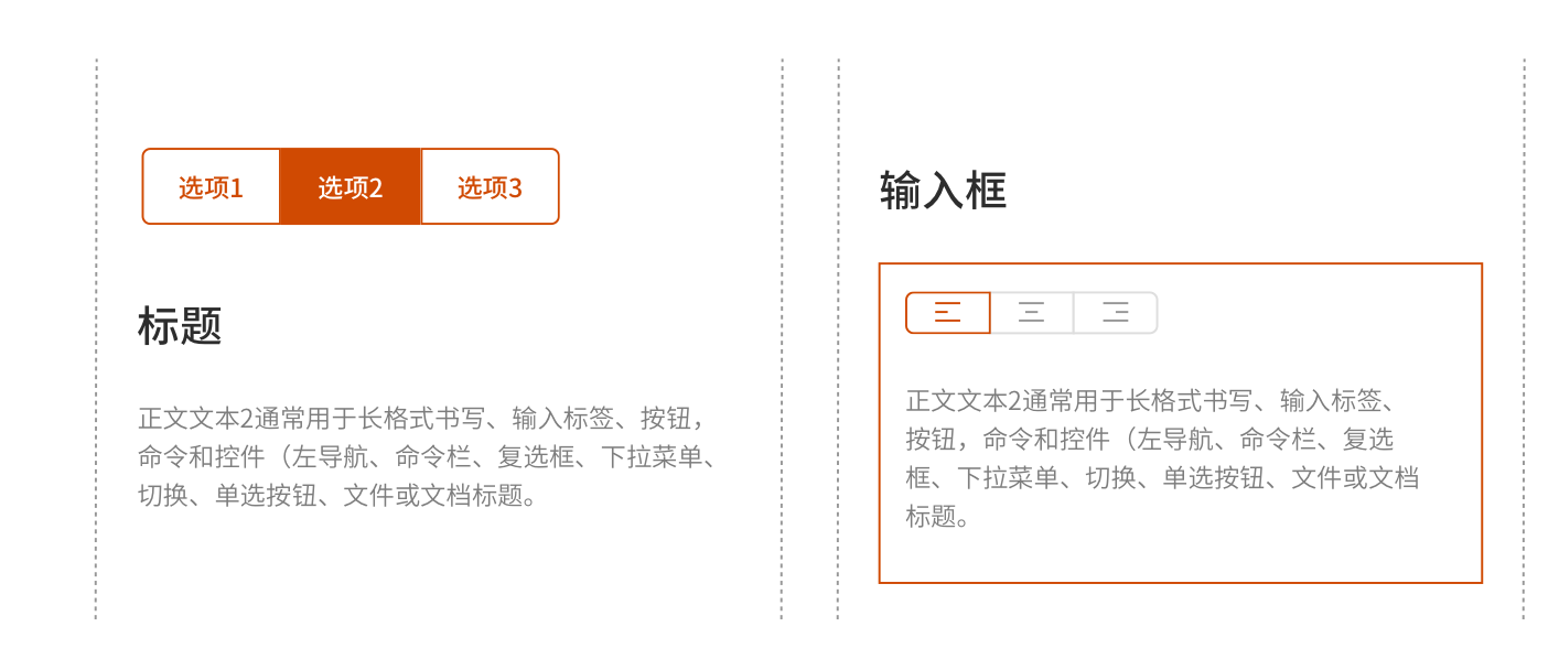
切换型按钮/Toggle button
切换按钮可用于对相关选项进行分组。为了强调相关的切换按钮组,组应该共享一个公共容器。一次只能选择并激活一组切换按钮中的一个选项。选择一个选项将取消选择任何其他选项。Toggle buttons can be used to group related options. To emphasize groups of related toggle buttons, a group should share a common container. Only one option in a group of toggle buttons can be selected and active at a time. Selecting one option deselects any other.
按钮的重要层级/Importance hierachy
布局应该只包含一个突出的按钮,使其他按钮在层次结构中的重要性降低。这个高度强调的按钮最引人注目。
A layout should contain a single prominent button that makes it clear that other buttons have less importance in the hierarchy. This high-emphasis button commands the most attention.
一个应用程序一次可以在一个布局中显示多个按钮,因此一个高强调按钮可以与执行不太重要操作的中低强调按钮一起使用。使用多个按钮时,请确保一个按钮的可用状态与另一个按钮的禁用状态不同。
An app can show more than one button in a layout at a time, so a high-emphasis button can be accompanied by medium- and low-emphasis buttons that perform less important actions. When using multiple buttons, ensure the available state of one button doesn’t look like the disabled state of another.
Refernce link: https://material.io/components/buttons/#usage

若有收获,就点个赞吧
0 人点赞
