页面路径:src/pages/index/index.vue
搜索框
首页搜索框点击以后会跳转到课程列表页,所以没有过多的交互,
直接使用uni-ui组件即可
<!-- 搜索框 --><v-search-bar @focus="focus" class="header"></v-search-bar>
focus() {// 点击首页搜索框,跳转到课程页面uni.switchTab({url: "/pages/course/index?focus=true",});},
url后面带focus参数的目的是跳转到了课程页以后search-bar直接聚焦让用户进行输入操作
轮播图
定义接口
接口文档:https://www.yuque.com/xiumubai/fe/yf8tf3#sHXSf
import Service from '@/utils/http';class Course extends Service {/*** @description: 获取首页banner图* @param {*} options* @return {*}*/banner(options = {}) {options.url = '/api/cms/banner';return this.get(options);}}const courseService = new Course();export default courseService;
调用接口
import courseService from "@/services/course";export default {data() {return {bannerList: [],}},methods: {async getBannerList() {try {const res = await courseService.banner();this.bannerList = res.data.bannerList;} catch (e) {console.log("e", e);}},}}
Tips: 对于api请求部分的代码,一定要
try {} catch(e) {},这样即使接口挂掉了,也不会导致整个程序崩溃掉。
渲染视图
<template><view class="swiper_box"><swiperclass="swiper"circularindicator-dotsautoplay:interval="2000"indicator-color="#fff"indicator-active-color="#26B7FF":duration="500"><swiper-item v-for="item in bannerList" :key="item.src"><view class="swiper_item uni_bg_red"><image mode="heightFix" :src="item.imageUrl" /></view></swiper-item></swiper></view></template>
上面是一个基础的从定义接口,到调用接口,渲染数据的三步骤,后面所有的涉及接口操作都是这个步骤,可直接参考源码部分。
课程&大咖
接口地址:https://www.yuque.com/xiumubai/fe/yf8tf3#td9Jy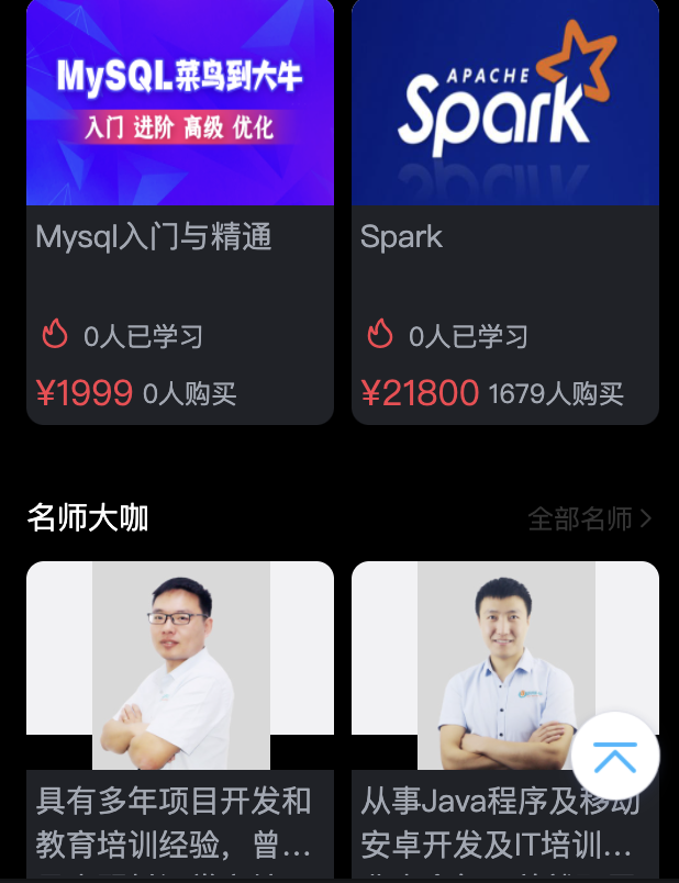
组件封装
从布局上来,课程和名师卡片样式基本一致,我们可以单独封装成组件做复用,针对个别不一致的地方使用参数进行控制,下面是一个v-vard组件,后面我们封装的所有组件都会以v-[name]的形式进行统一的命名。
<template><view class="preferences"><h2 class="preferences_title">{{ title }}<navigatorclass="link":url="link":open-type="type === 'course' ? 'switchTab' : 'navigate'">{{ linkTitle }}<uni-icons type="right" size="12"></uni-icons></navigator></h2><slot></slot></view></template><script>export default {name: 'v-card',props: {title: {type: String,default: '热门',},linkTitle: {type: String,default: '全部',},type: {type: String,default: 'course',},link: {type: String,default: '',},},};</script><style lang="scss" scoped>.preferences {padding: 0 16px 24px 16px;&_title {color: $uni-text-color-white;font-size: 14px;margin-bottom: 10px;justify-content: space-between;align-items: center;display: flex;.link {font-size: $uni-font-size-12;color: $uni-text-color;}}}</style>
v-vard-list组件
<template><view class="preferences_list"><viewclass="preferences_list_item"v-for="(item, index) in list":key="index"><navigatorclass="list_item_card":url="type == 'course'? '/pages/course/detail?id=' + item.id: '/pages/teacher/detail?id=' + item.id"><view class="list_item_card_img"><imagealt="封面":mode="type === 'course' ? 'fill' : 'aspectFit'":src="type === 'course' ? item.cover : item.avatar"/></view><view class="list_item_card_content"><h3 class="item_content_name">{{ type === "course" ? item.title : item.intro }}</h3><view class="item_content__labal"><uni-iconsv-if="type === 'course'"type="fire"size="18"color="#fa3f4e"></uni-icons><view:class="['study_num', type === 'teacher' ? 'teacher_name' : '']"><text v-if="type === 'course'">{{ item.lessonNum }}人已学习</text><text v-else>{{ item.name }}</text></view></view><view class="item-content_footer" v-if="type === 'course'"><view class="footer_price">¥{{ item.price }}</view><view class="footer_buy_num">{{ item.buyCount }}人购买</view></view></view></navigator></view></view></template><script>export default {name: "v-card-list",props: {list: {type: Array,default: [],},type: {type: String,default: "course",},},};</script><style lang="scss" scoped>.preferences_list {&_item {padding-bottom: 8px;display: inline-block;width: 50%;box-sizing: border-box;&:nth-child(2n-1) {padding-right: 4px;}&:nth-child(2n) {padding-left: 4px;}.list_item_card {display: block;width: 100%;&_img {width: 100%;height: 95px;background-image: url("https://8.idqqimg.com/edu/mobilev2/m-core/3d1dd248376a6da4a15e0000184f44c6.png");background-repeat: no-repeat;background-size: contain;border-radius: 8px 8px 0 0;image {height: 100%;width: 100%;border-radius: 8px 8px 0 0;}}&_content {background: $uni-bg-wrapper-color;border-radius: 0 0 8px 8px;.item_content_name {height: 40px;padding: 4px 4px;color: $uni-text-color-name;font-size: $uni-font-size-14;white-space: normal;overflow: hidden;text-overflow: ellipsis;display: -webkit-box;-webkit-line-clamp: 2;-webkit-box-orient: vertical;}.item_content__labal {display: flex;align-items: center;padding: 0 4px;.study_num {font-size: $uni-font-size-12;color: $uni-text-color-name;margin-left: 4px;}.teacher_name {color: #68cb9b;margin-left: 0;font-size: 14px;margin-bottom: 4px;}}.item-content_footer {display: flex;align-items: center;padding: 4px;.footer_price {font-size: $uni-font-size-16;color: $price-font-color;margin-right: $uni-spacing-4;}.footer_buy_num {font-size: $uni-font-size-12;color: $uni-text-color-name;}}}}}}</style>
使用组件
<view class="preferences_wrapper"><v-cardtitle="热门课程"linkTitle="全部课程"type="course"link="/pages/course/index"><v-card-list type="course" :list="courseList"></v-card-list></v-card><v-cardtitle="名师大咖"linkTitle="全部名师"type="teacher"link="/pages/teacher/index"><v-card-list type="teacher" :list="teacherList"></v-card-list></v-card></view>
接口定义和调用参考轮播图部分,或可直接看源码src/services/course.js,形式一模一样,这里不再过多甩文。
对于跳转链接的区分:
navigateTo(link, type) {if (type === "course") {uni.switchTab({ url: link });} else if (type === "teacher") {uni.navigateTo({ url: link });}},
返回顶部
返回顶部这个组件需要单独讲一讲具体的封装过程,图示如下: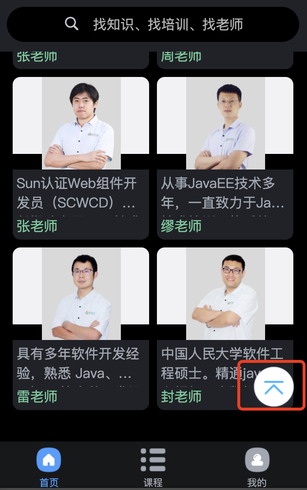
封装这个组件我们需要考虑下面几个点:
- 什么条件显示
返回顶部按钮 - 点击
返回顶部如何平滑返回顶部 - 按钮位置需要可配置
下面我们来封装这个组件
<template><viewclass="back_top"v-show="show"@click="backTop":style="{ bottom: bottom, right: right }"><imagesrc="https://cdn-cos-ke.myoed.com/ke_proj/mobilev2/m-core/03de0936a7aafee76646b8b2d5fa5b4f.png"/></view></template><script>export default {name: 'v-back-top',props: {bottom: {type: [String, Number],default: 20,},right: {type: [String, Number],default: 10,},},data() {return {show: false,scrollHeight: 0,};},mounted() {// 必须在page层级页面触发onPageScroll方法,才能接受到事件uni.$on('onPageScroll', (e) => {uni.getSystemInfo({success: (res) => {this.scrollHeight = e.scrollTop - res.windowHeight;this.show = this.scrollHeight > 0 ? true : false;},});});},methods: {backTop() {if (this.scrollHeight > 0) {uni.pageScrollTo({duration: 500,scrollTop: 0,success: () => {this.show = false;},});}},},};</script><style lang="scss" scoped>.back_top {position: fixed;right: 10px;bottom: 30px;z-index: 10000;width: 52px;height: 52px;image {width: 100%;height: 100%;}}</style>
:::info
- 判断
返回顶部显示条件,当滚动高度-窗口高度>0即可显示; - 点击
返回顶部,使用uni.pageScrollTo()方法使滚动条滚动到顶部,并给添加duration参数,平滑滚动; - 定义props为right和bottom来控制按钮位置。
:::
在上面的代码中我们使用了
uni.$on('onPageScroll')做了事件监听,因为在子组件中无法监听到页面滚动的事件,只能在在父组件来触发,具体代码如下:
具体使用:// 监听滚动事件,控制返回顶部按钮onPageScroll(res) {uni.$emit("onPageScroll", res);},
<template><view><v-back-top></v-back-top></view></template>

若有收获,就点个赞吧
0 人点赞
