文档地址: https://v-charts.js.org/#/
在使用 echarts 生成图表时,经常需要做繁琐的数据类型转化、修改复杂的配置项,v-charts 的出现正是为了解决这个痛点。基于 Vue2.0 和 echarts 封装的 v-charts 图表组件,只需要统一提供一种对前后端都友好的数据格式设置简单的配置项,便可轻松生成常见的图表。
安按照文档引入之后,运行项目,如果报错
This dependency was not found:
* echarts/lib/visual/dataColor in ./node_modules/echarts-liquidfill/src/liquidFill.js
To install it, you can run: npm install —save echarts/lib/visual/dataColor
降级echarts到v4.9.0即可
npm i v-charts echarts@4.9.0 -S
图表 公有属性
所有图表都具有的属性,例如 width, events 等。
:data 设置图表的数据
:setting 图表自身属性
用于设置图表自身属性,例如用于设置数据类型的 yAxisType, 是否展示为面积图的 area等,因为每种图表的自有属性不完全相同,将在具体图表中详细介绍setting的使用。
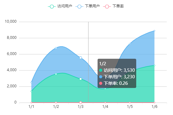
<ve-line :data="lineChartData" :settings="lineChartSettings"></ve-line>data() {this.lineChartSettings = {stack: { 用户: ["访问用户", "下单用户"] },area: true, // 折线图 -- 填充整个面积的色块};return {lineChartData: {columns: ["日期", "访问用户", "下单用户", "下单率"],rows: [{ 日期: "1/1", 访问用户: 1393, 下单用户: 1093, 下单率: 0.32 },{ 日期: "1/2", 访问用户: 3530, 下单用户: 3230, 下单率: 0.26 },{ 日期: "1/3", 访问用户: 2923, 下单用户: 2623, 下单率: 0.76 },{ 日期: "1/4", 访问用户: 1723, 下单用户: 1423, 下单率: 0.49 },{ 日期: "1/5", 访问用户: 3792, 下单用户: 3492, 下单率: 0.323 },{ 日期: "1/6", 访问用户: 4593, 下单用户: 4293, 下单率: 0.78 },],}};}
:extend
为了能够更方便的设置属性配置项等,可以通过extend属性实现对已配置好的内部属性进行单独的设置
:loading 图表加载状态
<ve-line:data="chartData":loading="loading"></ve-line>import 'v-charts/lib/style.css'loading: true
:data-zoom 设置区域缩放
在使用 dataZoom 组件时,数据发生改变会引起 dataZoom 的重置,在组件上设置
:not-set-unchange="['dataZoom']"即可解决这个问题。
:colors 修改颜色列表
<template><ve-line:data="chartData":colors="colors"></ve-line></template><script>export default {data () {this.colors = ['#c23531','#2f4554', '#61a0a8','#d48265', '#91c7ae','#749f83','#ca8622', '#bda29a','#6e7074','#546570', '#c4ccd3']return {chartData: {columns: ['日期', '成本', '利润'],rows: [{ '日期': '1月1日', '成本': 15, '利润': 12 },{ '日期': '1月2日', '成本': 12, '利润': 25 },{ '日期': '1月3日', '成本': 21, '利润': 10 },{ '日期': '1月4日', '成本': 41, '利润': 32 },{ '日期': '1月5日', '成本': 31, '利润': 30 },{ '日期': '1月6日', '成本': 71, '利润': 55 }]}}}}</script>
Demo
柱形图
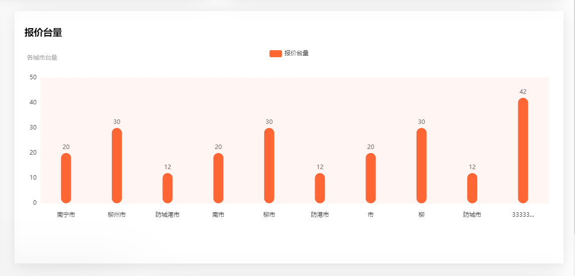
template><div><div class="card-panel"><h3>报价台量</h3><ve-histogramclass="myve":data="chartData":settings="vchartsConfig.setting":extend="vchartsConfig.extend"></ve-histogram></div></div></template><script>export default {name: "AreaChart",data() {return {// v-charts配置参数vchartsConfig: {setting: {// 别称labelMap: {area: "地区",count: "报价台量",},},extend: {// 左上角图表标题title: {show: true,text: "",subtext: "各城市台量",// textAlign:'center',},// 图表上方的维度标题及按钮legend: {show: true,},// backgroundColor:'red',//整个组件的背景颜色//X轴线xAxis: {// name: "地区",type: "category",show: true,// 坐标轴轴线axisLine: {show: false,},// 坐标轴刻度axisTick: {show: false,},// 坐标轴每项的文字axisLabel: {showMaxLabel: true,showMinLabel: true,color: "#3a3a3a",rotate: 0, //刻度文字旋转,防止文字过多不显示margin: 18, //文字离x轴的距离boundaryGap: true,// backgroundColor:'#0f0',formatter: (v) => {// console.log('x--v',v)if (v.length > 5) {return v.substring(0, 5) + "...";}return v;},},// X轴下面的刻度小竖线axisTick: {show: false,alignWithLabel: true, //axisLabel.boundaryGap=true时有效interval: 0,length: 4, //长度},// x轴对应的竖线splitLine: {show: false,interval: 0,lineStyle: {color: "red",backgroundColor: "red",},},},yAxis: {show: true,offset: 0,// 坐标轴轴线axisLine: {show: false,},// x轴对应的竖线splitLine: {show: false,},// 坐标轴刻度axisTick: {show: false,},boundaryGap: false,axisLabel: {color: "#3a3a3a",},},// 滚动缩放组件参数// dataZoom: [// {// type: "inside",// show: true,// xAxisIndex: [0],// startValue: 0,// endValue: 4,// zoomLock: true, //阻止区域缩放// },// ],// dataZoom: [// {// type: "slider",// startValue: 0,// endValue: 5, //只显示5个数据// },// ],// 柱形区域grid: {show: true,backgroundColor: "#FFF6F3",borderColor: "#FFF6F3",// containLabel:false,},// 每个柱子series(v) {// console.log("v", v);// 设置柱子的样式v.forEach((i) => {console.log("series", i);i.barWidth = 20;i.itemStyle = {barBorderRadius: [10, 10, 10, 10],color: "#FF6633",borderWidth: 0,};i.label = {color: "#666",show: true,position: "top", //top inner insideBottom insideRight// backgroundColor:'yellow',};});return v;},},},// v-chats列表数据chartData: {columns: ["area", "count"],rows: [{ area: "南宁市", count: 20 },{ area: "柳州市", count: 30 },{ area: "防城港市", count: 12 },{ area: "南市", count: 20 },{ area: "柳市", count: 30 },{ area: "防港市", count: 12 },{ area: "市", count: 20 },{ area: "柳", count: 30 },{ area: "防城市", count: 12 },{ area: "3333333", count: 42 },],},};},created() {},methods: {},};</script>
柱形折线混合图
主要是 label 的设置。设置双 y 轴后 ,折线的 label 也需要设置为百分比
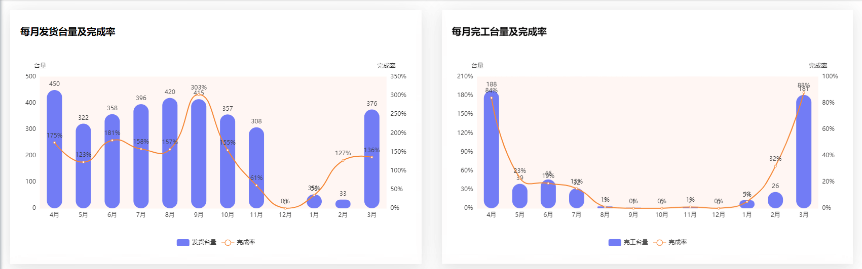
<template><div class="card-panel"><h3>每月发货台量及完成率</h3><ve-histogram:data="chartData":settings="chartSettings":extend="chartExtend"></ve-histogram></div></template><script>import { sendChart } from "@/api/install/chart";export default {data() {this.chartSettings = {showLine: ["percent"], //展示为折线图的指标axisSite: { right: ["percent"] }, //指标所在的轴 默认不在right轴的指标都在left轴yAxisType: ["KMB", "percent"], //左右坐标轴数据类型; KMB, normal, percentyAxisName: ["台量", "完成率"], //左右坐标轴标题labelMap: { count: "发货台量", percent: "完成率" }, //设置指标的别名,同时作用于提示框和图例};this.chartExtend = {// 图表上方的维度标题及按钮legend: {show: true,left: "center",bottom: "bottom",},// 柱形区域grid: {show: true,backgroundColor: "#FFF6F3",borderColor: "#FFF6F3",},// 每个柱子series(v) {// 设置发货台量 柱形图样式v[0].barWidth = 30;v[0].itemStyle = {barBorderRadius: [15, 15, 15, 15],color: "#727CF5",};v[0].label = {color: "#3a3a3a",show: true,position: "top", //top inner inside insideBottom insideRight};// 设置完成率 折线的样式v[1].itemStyle = {color: "#f58634",};// 设置折线的 labelv[1].label = {color: "#3a3a3a",show: true,position: "top",// formatter: "{c}%", 这样设置只是在数据后加上了百分符,但没有小数部分没有没有转化为百分数formatter: function(param){console.log(param)return param.value * 100 + '%'},};return v;},yAxis: {show: true,offset: 0,// y轴对应的横线splitLine: {show: false,},//这样设置的话 双 y 轴都是百分比了// axisLabel: {// show: true,// interval: "auto",// formatter: "{value}%",// },},// 自定义鼠标悬浮框toolTip// tooltip: {// // formatter: '{b0}<br />{a0}: {c0}<br />{a1}: {c1}%', //直接这样没有前面的颜色图例// trigger: "axis",// formatter: function (params) {// let html = params[0].name + "<br>";// for (let i = 0; i < params.length; i++) {// html +=// '<span style="display:inline-block;margin-right:5px;border-radius:10px;width:10px;height:10px;background-color:' +// params[i].color +// ';"></span>';// if (params[i].seriesName == "完成率") {// html += params[i].seriesName + ": " + params[i].value + "%<br>";// } else {// html += params[i].seriesName + ": " + params[i].value + "<br>";// }// }// return html;// },// },};return {chartData: {columns: ["month", "count", "percent"],rows: [{ month: "1月", count: 393, percent: 0.32 },{ month: "2月", count: 530, percent: 1.32 },{ month: "3月", count: 923, percent: 2.32 },{ month: "4月", count: 723, percent: 3.2 },{ month: "5月", count: 792, percent: 1.2 },{ month: "6月", count: 593, percent: 2.2 },{ month: "7月", count: 393, percent: 1.32 },{ month: "8月", count: 530, percent: 2.32 },{ month: "9月", count: 923, percent: 0.32 },{ month: "10月", count: 723, percent: 3.32 },{ month: "11月", count: 792, percent: 1.32 },{ month: "12月", count: 593, percent: 2.32 },],},};},mounted() {sendChart().then((res) => {console.log("🚀 ~ file: SendChart.vue ~ line 99 ~ sendChart ~ res", res);});},};</script>

若有收获,就点个赞吧
0 人点赞
