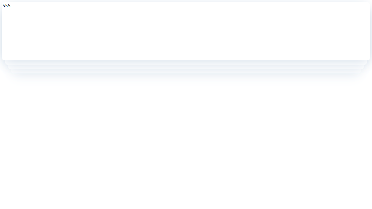
层叠阴影卡片
<!--* @Author: hhn* @Date: 2020-09-01 15:14:35* @lastEditTime: Do not edit* @Description: In User Settings Edit* @FilePath: \codehub\study\studied\html\cascade.html--><!DOCTYPE html><html lang="en"><head><meta charset="utf-8"><meta http-equiv="X-UA-Compatible" content="IE=edge"><meta name="divport" content="width=device-width, initial-scale=1"><title>层叠阴影卡片</title><style>.cascade {position: relative;z-index: 10;min-height: 200px;box-shadow: 0 10px 40px -10px rgba(0, 64, 128, .2);z-index: 10;background: #fff;}.cascade div {border-radius: 8px;box-shadow: inherit;background: inherit;position: absolute;}.cascade div:nth-child(1) {width: 100%;height: 100%;z-index: 11;bottom: 0;left: 0;background: inherit;}.cascade div:nth-child(2) {width: calc(100% - 20px);height: 30px;bottom: -15px;left: 10px;z-index: 9;}.cascade div:nth-child(3) {width: calc(100% - 40px);height: 30px;bottom: -30px;left: 20px;z-index: 8;}.cascade div:nth-child(4) {width: calc(100% - 60px);height: 30px;bottom: -45px;left: 30px;z-index: 7;}</style></head><body><div class="cascade"><div>555</div><div></div><div></div><div></div></div></body></html>
卡片翻转
主要利用的CSS3的perspective结合transform:ratateY()属性完成。当为元素定义 perspective 属性时,其子元素会获得透视效果,而不是元素本身。需要注意的是:perspective 属性只影响 3D 转换元素。
实现思路就是将两个要展示的div利用定位重叠在一起,其中一个首先围绕Y轴旋转一定角度,还要加上一个关键属性backface-visibility:hidden (该属性定义当元素不面向屏幕时是否可见)。如果不加上这个属性的话,那么就会始终只能看到一张卡片了。
点击查看【juejin】

若有收获,就点个赞吧
0 人点赞
