大多数web开发人员在设计中都使用了内置的ease、ease-in、ease-out或ease-in-out函数来处理转换时间函数的大多数用例。虽然这些在日常使用中都很好,但还有一个更强大但令人生畏的选项,即bezier-curve()函数。
使用bezier-curve(),我们可以轻松地定义自定义缓动变量,帮助我们的设计弹出。事实上,上面提到的内置函数也可以使用bezier-curve()函数来编写。为了方便使用,这里有一些有用的缓动函数存储在CSS变量中:
:root {/* ease-in corresponds to cubic-bezier(0.42, 0, 1.0, 1.0) */--ease-in-quad: cubic-bezier(0.55, 0.085, 0.68, 0.53);--ease-in-cubic: cubic-bezier(0.55, 0.055, 0.675, 0.19);--ease-in-quart: cubic-bezier(0.895, 0.03, 0.685, 0.22);--ease-in-quint: cubic-bezier(0.755, 0.05, 0.855, 0.06);--ease-in-expo: cubic-bezier(0.95, 0.05, 0.795, 0.035);--ease-in-circ: cubic-bezier(0.6, 0.04, 0.98, 0.335);/* ease-out corresponds to cubic-bezier(0, 0, 0.58, 1.0) */--ease-out-quad: cubic-bezier(0.25, 0.46, 0.45, 0.94);--ease-out-cubic: cubic-bezier(0.215, 0.61, 0.355, 1);--ease-out-quart: cubic-bezier(0.165, 0.84, 0.44, 1);--ease-out-quint: cubic-bezier(0.23, 1, 0.32, 1);--ease-out-expo: cubic-bezier(0.19, 1, 0.22, 1);--ease-out-circ: cubic-bezier(0.075, 0.82, 0.165, 1);/* ease-in-out corresponds to cubic-bezier(0.42, 0, 0.58, 1.0) */--ease-in-out-quad: cubic-bezier(0.455, 0.03, 0.515, 0.955);--ease-in-out-cubic: cubic-bezier(0.645, 0.045, 0.355, 1);--ease-in-out-quart: cubic-bezier(0.77, 0, 0.175, 1);--ease-in-out-quint: cubic-bezier(0.86, 0, 0.07, 1);--ease-in-out-expo: cubic-bezier(1, 0, 0, 1);--ease-in-out-circ: cubic-bezier(0.785, 0.135, 0.15, 0.86);}
cubic-bezier() 函数
cubic-bezier() 函数定义了一个贝塞尔曲线(Cubic Bezier)。
贝塞尔曲线曲线由四个点 P0,P1,P2 和 P3 定义。P0 和 P3 是曲线的起点和终点。P0是(0,0)并且表示初始时间和初始状态,P3是(1,1)并且表示最终时间和最终状态。
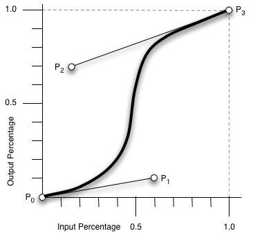
从上图我们需要知道的是 cubic-bezier 的取值范围:
P0:默认值 (0, 0)
P1:动态取值 (x1, y1)
P2:动态取值 (x2, y2)
P3:默认值 (1, 1)
我们需要关注的是 P1 和 P2 两点的取值,而其中 X 轴的取值范围是 0 到 1,当取值超出范围时 cubic-bezier 将失效;Y 轴的取值没有规定,当然也毋须过大。
最直接的理解是,将以一条直线放在范围只有 1 的坐标轴中,并从中间拿出两个点来拉扯(X 轴的取值区间是 [0, 1],Y 轴任意),最后形成的曲线就是动画的速度曲线。
cubic-bezier() 可用于 animation-timing-function 和 transition-timing-function 属性。
css3中常用的几个动画效果:
ease: cubic-bezier(0.25, 0.1, 0.25, 1.0) // 开始和结束慢,中间快linear: cubic-bezier(0.0, 0.0, 1.0, 1.0) // 匀速ease-in: cubic-bezier(0.42, 0, 1.0, 1.0) // 开始慢ease-out: cubic-bezier(0, 0, 0.58, 1.0) // 结速慢ease-in-out: cubic-bezier(0.42, 0, 0.58, 1.0) // 与ease类似,但比ease幅度大
实例演示
<div class="normal"></div><div class="custom"></div>
.normal {width: 50px;height: 50px;margin-bottom: 10px;background-color: #1890ff;border-radius: 50%;transition: all 2s;}.normal:hover {transform: translateX(150px);}.custom {width: 50px;height: 50px;background-color: @primary-color;border-radius: 50%;transition: all 2s cubic-bezier(0.94, -0.25, 0.32, 1.31);}.custom:hover {transform: translateX(300px);}
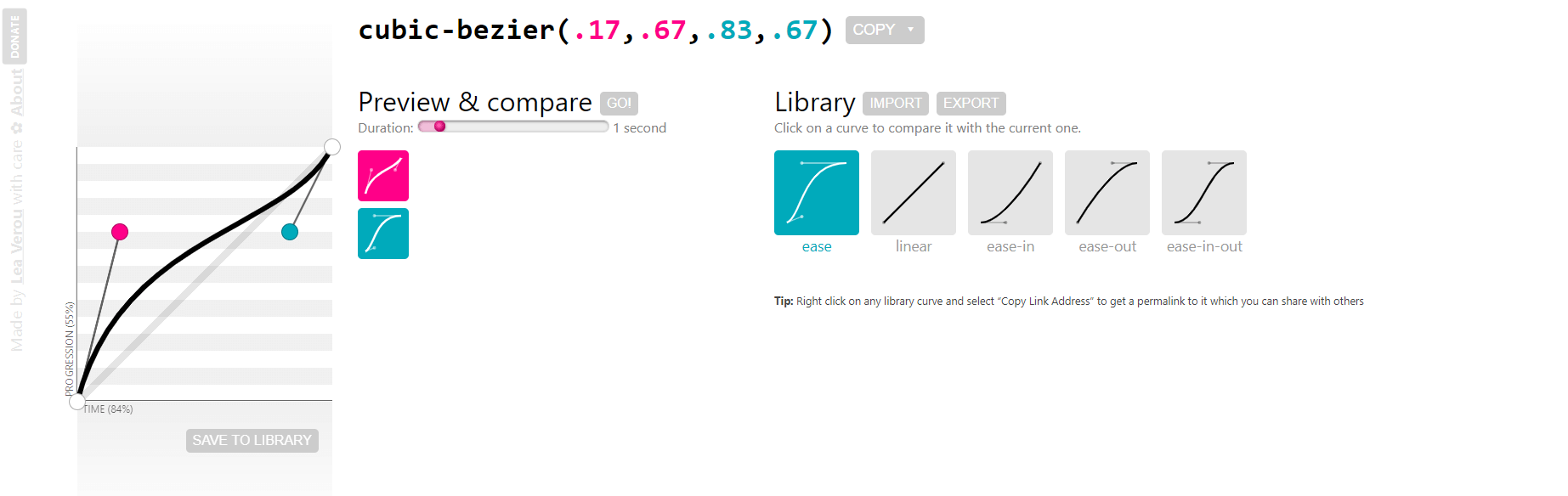
在线工具
https://cubic-bezier.com/

若有收获,就点个赞吧
0 人点赞
