Material组件库中提供了输入框组件 TextField 和表单组件 Form。下面我们分别介绍一下。
TextField
TextField 用于文本输入,它提供了很多属性,我们先简单介绍一下主要属性的作用,然后通过几个示例来演示一下关键属性的用法。
(new) TextField TextField({Key key,TextEditingController controller,FocusNode focusNode,InputDecoration decoration = const InputDecoration(),TextInputType keyboardType,TextInputAction textInputAction,TextCapitalization textCapitalization = TextCapitalization.none,TextStyle style,StrutStyle strutStyle,TextAlign textAlign = TextAlign.start,TextAlignVertical textAlignVertical,TextDirection textDirection,bool readOnly = false,ToolbarOptions toolbarOptions,bool showCursor,bool autofocus = false,bool obscureText = false,bool autocorrect = true,bool enableSuggestions = true,int maxLines = 1,int minLines,bool expands = false,int maxLength,bool maxLengthEnforced = true,void Function(String) onChanged,void Function() onEditingComplete,void Function(String) onSubmitted,List<TextInputFormatter> inputFormatters,bool enabled,double cursorWidth = 2.0,Radius cursorRadius,Color cursorColor,Brightness keyboardAppearance,EdgeInsets scrollPadding = const EdgeInsets.all(20.0),DragStartBehavior dragStartBehavior = DragStartBehavior.start,bool enableInteractiveSelection = true,void Function() onTap,Widget Function(BuildContext,{currentLength: int,isFocused: bool,maxLength: int}) buildCounter,ScrollController scrollController,ScrollPhysics scrollPhysics})
- controller 编辑框的控制器,通过它可以设置/获取编辑框的内容、选择编辑内容、监听编辑文本改变事件。大多数情况下我们都需要显式提供一个controller来与文本框交互。如果没有提供controller,则TextField内部会自动创建一个。
- focusNode 用于控制TextField是否占有当前键盘的输入焦点。它是我们和键盘交互的一个句柄(handle)。
- decoration 用于控制TextField的外观显示,如提示文本、背景颜色、边框等。
| InputDecoration类参数 | 含义 | | —- | —- | | labelText | 描述输入字段的文本,相当于html的 label | | hintText | 表示字段接受的输入类型的文本,相当于html的 placeholder | | prefixIcon | 出现在装饰容器中的[prefix]或[prefixText]前面和文本字段可编辑部分前面的图标 |(new) InputDecoration InputDecoration({Widget icon,String labelText,TextStyle labelStyle,String helperText,TextStyle helperStyle,int helperMaxLines,String hintText,TextStyle hintStyle,int hintMaxLines,String errorText,TextStyle errorStyle,int errorMaxLines,bool hasFloatingPlaceholder = true,bool isDense,EdgeInsetsGeometry contentPadding,Widget prefixIcon,Widget prefix,String prefixText,TextStyle prefixStyle,Widget suffixIcon,Widget suffix,String suffixText,TextStyle suffixStyle,Widget counter,String counterText,TextStyle counterStyle,bool filled,Color fillColor,Color focusColor,Color hoverColor,InputBorder errorBorder,InputBorder focusedBorder,InputBorder focusedErrorBorder,InputBorder disabledBorder,InputBorder enabledBorder,InputBorder border,bool enabled = true, // 为false时候禁止交互String semanticCounterText,bool alignLabelWithHint})
keyboardType 用于设置该输入框默认的键盘输入类型,取值如下: | TextInputType枚举值 | 含义 | | —- | —- | | text | 文本输入键盘 | | multiline | 多行文本,需和maxLines配合使用(设为null或大于1) | | number | 数字;会弹出数字键盘 | | phone | 优化后的电话号码输入键盘;会弹出数字键盘并显示“* #” | | datetime | 优化后的日期输入键盘;Android上会显示“: -” | | emailAddress | 优化后的电子邮件地址;会显示“@ .” | | url | 优化后的url输入键盘; 会显示“/ .” |
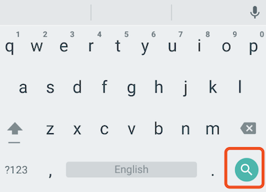
textInputAction 键盘动作按钮图标(即回车键位图标),它是一个枚举值,有多个可选值,全部的取值列表读者可以查看API文档,下面是当值为TextInputAction.search时,原生Android系统下键盘样式如图3-24所示:
- style:正在编辑的文本样式。
- textAlign: 输入框内编辑文本在水平方向的对齐方式。
- autofocus: 是否自动获取焦点。
- obscureText:是否隐藏正在编辑的文本,如用于输入密码的场景等,文本内容会用“•”替换。
- maxLines:输入框的最大行数,默认为1;如果为null,则无行数限制。
- maxLength和maxLengthEnforced :maxLength代表输入框文本的最大长度,设置后输入框右下角会显示输入的文本计数。maxLengthEnforced决定当输入文本长度超过maxLength时是否阻止输入,为true时会阻止输入,为false时不会阻止输入但输入框会变红。
- onChange:输入框内容改变时的回调函数;注:内容改变事件也可以通过controller来监听。
- onEditingComplete和onSubmitted:这两个回调都是在输入框输入完成时触发,比如按了键盘的完成键(对号图标)或搜索键(🔍图标)。不同的是两个回调签名不同,onSubmitted回调是ValueChanged
类型,它接收当前输入内容做为参数,而onEditingComplete不接收参数。 - inputFormatters:用于指定输入格式;当用户输入内容改变时,会根据指定的格式来校验。
- enable:如果为false,则输入框会被禁用,禁用状态不接收输入和事件,同时显示禁用态样式(在其decoration中定义)。
- cursorWidth cursorRadius cursorColor :这三个属性是用于自定义输入框光标宽度、圆角和颜色的。
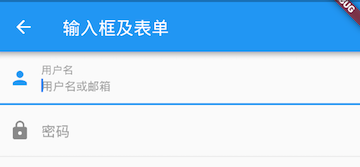
示例:登录输入框
布局
import 'package:flutter/material.dart';void main() => runApp(new MyApp());class MyApp extends StatelessWidget {@overrideWidget build(BuildContext context) {return MaterialApp(debugShowCheckedModeBanner: false,title: 'TextField 文本输入框',theme: ThemeData(primarySwatch: Colors.blue),home: Scaffold(appBar: AppBar(title: Text("TextField 文本输入框")),body: InputWidget()));}}class InputWidget extends StatelessWidget {@overrideWidget build(BuildContext context) {return Column(children: <Widget>[Padding(padding: EdgeInsets.only(left: 50, right: 50, top: 10),child: ConstrainedBox(constraints: BoxConstraints(maxHeight: 250,minWidth: 200,),child: TextField(autofocus: true,maxLength: 11,keyboardType: TextInputType.datetime,textInputAction: TextInputAction.search,decoration: InputDecoration(contentPadding: const EdgeInsets.symmetric(vertical: 4.0),// labelText: "用户名",hintText: "用户名或邮箱",border: OutlineInputBorder(borderRadius: BorderRadius.circular(10.0),borderSide: BorderSide.none,// borderSide: BorderSide(color: Colors.red, width: 3.0, style: BorderStyle.solid)//没什么卵效果),filled: true,fillColor: Color(0xffDCDCDC),prefixIcon: Icon(Icons.person)),onChanged: (val) {},),)),Padding(padding: EdgeInsets.only(left: 50,right: 50,top: 10,),child: ConstrainedBox(constraints: BoxConstraints(maxHeight: 250,minWidth: 200,),child: TextField(style: TextStyle(),decoration: InputDecoration(contentPadding: EdgeInsets.fromLTRB(10, 0, 10, 15),labelText: "密码",hintText: "您的登录密码",border: OutlineInputBorder(borderRadius: BorderRadius.circular(10.0),//borderSide: BorderSide(color: Colors.red, width: 3.0, style: BorderStyle.solid)//没什么卵效果),prefixIcon: Icon(Icons.lock)),obscureText: true,),),),Padding(padding: EdgeInsets.only(left: 50,right: 50,top: 30,),child: ConstrainedBox(constraints: BoxConstraints(maxHeight: 40,),child: TextField(decoration: InputDecoration(contentPadding: EdgeInsets.fromLTRB(10, 0, 10, 15),labelText: "搜索",labelStyle: TextStyle(color:Colors.red),fillColor: Color(0XFFFFF8F4),filled: true,enabledBorder: OutlineInputBorder(/*边角*/borderRadius: BorderRadius.all(Radius.circular(5), //边角为5),borderSide: BorderSide(color: Colors.green, //边线颜色为白色width: 1, //边线宽度为2),),focusedBorder: OutlineInputBorder(borderSide: BorderSide(color: Colors.red, //边框颜色为白色width: 1, //宽度为5),borderRadius: BorderRadius.all(Radius.circular(5), //边角为30),),),),),),],);}}
运行后,效果如图所示: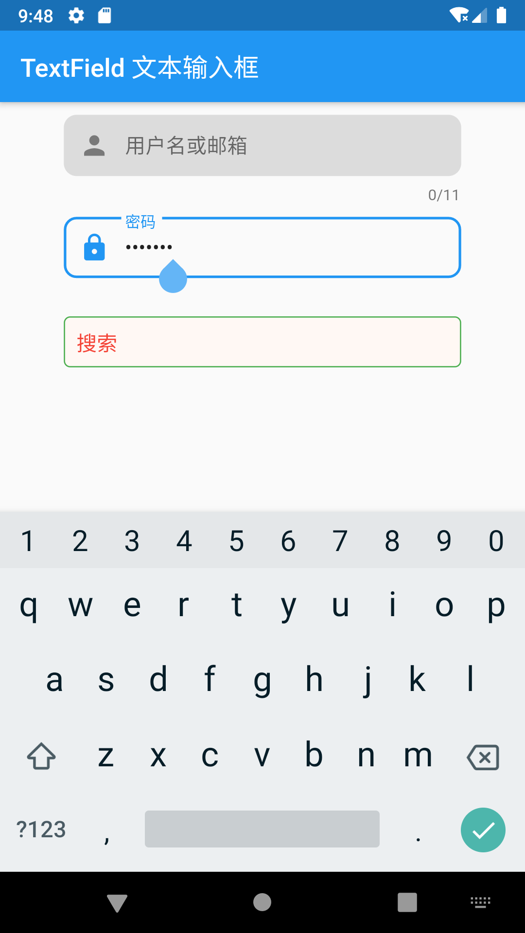
获取输入内容
获取输入内容有两种方式:
- 定义两个变量,用于保存用户名和密码,然后在onChange触发时,各自保存一下输入内容。
- 通过controller直接获取。
第一种方式比较简单,不在举例,我们来重点看一下第二种方式,我们以用户名输入框举例:
定义一个controller:
//定义一个controllerTextEditingController _unameController = TextEditingController();
然后设置输入框controller:
TextField(autofocus: true,controller: _unameController, //设置controller...)
通过controller获取输入框内容
print(_unameController.text)
监听文本变化
监听文本变化也有两种方式:
设置onChange回调,如:
TextField(autofocus: true,onChanged: (v) {print("onChange: $v");})
通过controller监听,如:
@overridevoid initState() {//监听输入改变_unameController.addListener((){print(_unameController.text);});}
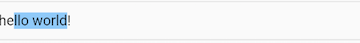
两种方式相比,onChanged是专门用于监听文本变化,而controller的功能却多一些,除了能监听文本变化外,它还可以设置默认值、选择文本,下面我们看一个例子:
创建一个controller:
TextEditingController _selectionController = TextEditingController();
设置默认值,并从第三个字符开始选中后面的字符
_selectionController.text="hello world!";_selectionController.selection=TextSelection(baseOffset: 2,extentOffset: _selectionController.text.length);
设置controller:
TextField(controller: _selectionController,)
运行效果如图3-26所示:
控制焦点
焦点可以通过FocusNode和FocusScopeNode来控制
默认情况下,焦点由FocusScope来管理,它代表焦点控制范围,可以在这个范围内可以通过FocusScopeNode在输入框之间移动焦点、设置默认焦点等。
我们可以通过FocusScope.of(context)来获取Widget树中默认的FocusScopeNode,然后通过FocusScope.of(context).requestFocus(“在TextField中focusNode绑定过的对象”)下面看一个示例,在此示例中创建两个TextField,第一个自动获取焦点,然后创建两个按钮:
- 点击第一个按钮可以将焦点从第一个TextField挪到第二个TextField。
- 点击第二个按钮可以关闭键盘。
我们要实现的效果如图3-27所示: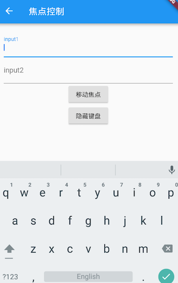
import 'package:flutter/material.dart';void main() => runApp(new MyApp());class MyApp extends StatelessWidget {@overrideWidget build(BuildContext context) {return MaterialApp(debugShowCheckedModeBanner: false,title: 'TextField 控制焦点',theme: ThemeData(primarySwatch: Colors.blue),home: Scaffold(appBar: AppBar(title: Text("TextField 控制焦点")),body: FocusTestRoute()));}}class FocusTestRoute extends StatefulWidget {@override_FocusTestRouteState createState() => new _FocusTestRouteState();}class _FocusTestRouteState extends State<FocusTestRoute> {FocusNode focusNode1 = new FocusNode();FocusNode focusNode2 = new FocusNode();FocusScopeNode focusScopeNode;@overrideWidget build(BuildContext context) {return Padding(padding: EdgeInsets.all(16.0),child: Column(children: <Widget>[TextField(autofocus: true,focusNode: focusNode1, //关联focusNode1decoration: InputDecoration(labelText: "input1"),),TextField(focusNode: focusNode2, //关联focusNode2decoration: InputDecoration(labelText: "input2"),),Builder(builder: (ctx) {return Column(children: <Widget>[RaisedButton(child: Text("移动焦点"),onPressed: () {//将焦点从第一个TextField移到第二个TextField// 这是一种写法 FocusScope.of(context).requestFocus(focusNode2);// 这是第二种写法if (null == focusScopeNode) {focusScopeNode = FocusScope.of(context);}focusScopeNode.requestFocus(focusNode2);},),RaisedButton(child: Text("隐藏键盘"),onPressed: () {// 当所有编辑框都失去焦点时键盘就会收起focusNode1.unfocus();focusNode2.unfocus();},),],);},),],),);}}
FocusNode和FocusScopeNode还有一些其它的方法,详情可以查看API文档。
监听焦点状态改变事件
FocusNode继承自ChangeNotifier,通过FocusNode可以监听焦点的改变事件,如:
...// 创建 focusNodeFocusNode focusNode = new FocusNode();...// focusNode绑定输入框TextField(focusNode: focusNode);...// 监听焦点变化focusNode.addListener((){print(focusNode.hasFocus);});
获得焦点时focusNode.hasFocus值为true,失去焦点时为false。
自定义样式
虽然我们可以通过decoration属性来定义输入框样式,下面以自定义输入框下划线颜色为例来介绍一下:
import 'package:flutter/material.dart';void main() => runApp(new MyApp());class MyApp extends StatelessWidget {@overrideWidget build(BuildContext context) {return MaterialApp(debugShowCheckedModeBanner: false,title: 'TextField 自定义样式',theme: ThemeData(primarySwatch: Colors.blue),home: Scaffold(appBar: AppBar(title: Text("TextField 自定义样式")),body: CustomInput()));}}class CustomInput extends StatelessWidget {const CustomInput({Key key}) : super(key: key);@overrideWidget build(BuildContext context) {return TextField(decoration: InputDecoration(labelText: "请输入用户名",prefixIcon: Icon(Icons.person),// 未获得焦点下划线设为灰色enabledBorder: UnderlineInputBorder(borderSide: BorderSide(color: Colors.grey),),//获得焦点下划线设为蓝色focusedBorder: UnderlineInputBorder(borderSide: BorderSide(color: Colors.blue),),),);}}
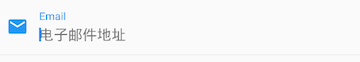
上面代码我们直接通过InputDecoration的enabledBorder和focusedBorder来分别设置了输入框在未获取焦点和获得焦点后的下划线颜色。另外,我们也可以通过主题来自定义输入框的样式,下面我们探索一下如何在不使用enabledBorder和focusedBorder的情况下来自定义下滑线颜色。
由于TextField在绘制下划线时使用的颜色是主题色里面的hintColor,但提示文本颜色也是用的hintColor, 如果我们直接修改hintColor,那么下划线和提示文本的颜色都会变。值得高兴的是decoration中可以设置hintStyle,它可以覆盖hintColor,并且主题中可以通过inputDecorationTheme来设置输入框默认的decoration。所以我们可以通过主题来自定义,代码如下:
import 'package:flutter/material.dart';void main() => runApp(new MyApp());class MyApp extends StatelessWidget {@overrideWidget build(BuildContext context) {return MaterialApp(debugShowCheckedModeBanner: false,title: 'TextField 自定义样式',theme: ThemeData(primarySwatch: Colors.blue,),home: Scaffold(appBar: AppBar(title: Text("TextField 自定义样式")),body: CustomInput()));}}class CustomInput extends StatelessWidget {const CustomInput({Key key}) : super(key: key);@overrideWidget build(BuildContext context) {return Theme(data: Theme.of(context).copyWith(hintColor: Colors.grey[200], //定义下划线颜色inputDecorationTheme: InputDecorationTheme(labelStyle: TextStyle(color: Colors.grey), //定义label字体样式hintStyle:TextStyle(color: Colors.grey, fontSize: 14.0) //定义提示文本样式)),child: Column(children: <Widget>[TextField(decoration: InputDecoration(labelText: "用户名",hintText: "用户名或邮箱",prefixIcon: Icon(Icons.person)),),TextField(decoration: InputDecoration(prefixIcon: Icon(Icons.lock),labelText: "密码",hintText: "您的登录密码",hintStyle: TextStyle(color: Colors.grey, fontSize: 13.0)),obscureText: true,),Container(child: TextField(keyboardType: TextInputType.emailAddress,decoration: InputDecoration(labelText: "Email",hintText: "电子邮件地址",prefixIcon: Icon(Icons.email),border: InputBorder.none //隐藏下划线)),decoration: BoxDecoration(// 下滑线浅灰色,宽度1像素border: Border(bottom: BorderSide(color: Colors.grey[200], width: 1.0))),)],));}}
我们成功的自定义了下划线颜色和提问文字样式,细心的读者可能已经发现,通过这种方式自定义后,输入框在获取焦点时,labelText不会高亮显示了,正如上图中的”用户名”本应该显示蓝色,但现在却显示为灰色,并且我们还是无法定义下划线宽度。另一种灵活的方式是直接隐藏掉TextField本身的下划线,然后通过Container去嵌套定义样式,如:
Container(child: TextField(keyboardType: TextInputType.emailAddress,decoration: InputDecoration(labelText: "Email",hintText: "电子邮件地址",prefixIcon: Icon(Icons.email),border: InputBorder.none //隐藏下划线)),decoration: BoxDecoration(// 下滑线浅灰色,宽度1像素border: Border(bottom: BorderSide(color: Colors.grey[200], width: 1.0))),)
通过这种组件组合的方式,也可以定义背景圆角等。一般来说,优先通过decoration来自定义样式,如果decoration实现不了,再用widget组合的方式。
思考题:在这个示例中,下划线颜色是固定的,所以获得焦点后颜色仍然为灰色,如何实现点击后下滑线也变色呢?
表单Form
实际业务中,在正式向服务器提交数据前,都会对各个输入框数据进行合法性校验,但是对每一个TextField都分别进行校验将会是一件很麻烦的事。还有,如果用户想清除一组TextField的内容,除了一个一个清除有没有什么更好的办法呢?为此,Flutter提供了一个Form 组件,它可以对输入框进行分组,然后进行一些统一操作,如输入内容校验、输入框重置以及输入内容保存
Form
Form继承自StatefulWidget对象,它对应的状态类为FormState。我们先看看Form类的定义:
Form({@required Widget child,bool autovalidate = false,WillPopCallback onWillPop,VoidCallback onChanged,})
- autovalidate:是否自动校验输入内容;当为true时,每一个子FormField内容发生变化时都会自动校验合法性,并直接显示错误信息。否则,需要通过调用FormState.validate()来手动校验。
- onWillPop:决定Form所在的路由是否可以直接返回(如点击返回按钮),该回调返回一个Future对象,如果Future的最终结果是false,则当前路由不会返回;如果为true,则会返回到上一个路由。此属性通常用于拦截返回按钮。
- onChanged :Form的任意一个子FormField内容发生变化时会触发此回调。
FormField
Form的子孙元素必须是FormField类型,FormField是一个抽象类,定义几个属性,FormState内部通过它们来完成操作,FormField部分定义如下:
const FormField({...FormFieldSetter<T> onSaved, //保存回调FormFieldValidator<T> validator, //验证回调T initialValue, //初始值bool autovalidate = false, //是否自动校验。})
为了方便使用,Flutter提供了一个TextFormField组件,它继承自FormField类,也是TextField的一个包装类,所以除了FormField定义的属性之外,它还包括TextField的属性。
FormState
FormState为Form的State类,可以通过Form.of()或GlobalKey获得。我们可以通过它来对Form的子孙FormField进行统一操作。我们看看其常用的三个方法:
- FormState.validate():调用此方法后,会调用Form子孙FormField的validate回调,如果有一个校验失败,则返回false,所有校验失败项都会返回用户返回的错误提示。
- FormState.save():调用此方法后,会调用Form子孙FormField的save回调,用于保存表单内容
- FormState.reset():调用此方法后,会将子孙FormField的内容清空。
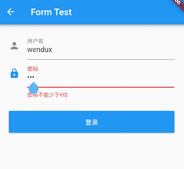
示例
我们修改一下上面用户登录的示例,在提交之前校验:
- 用户名不能为空,如果为空则提示“用户名不能为空”。
- 密码不能小于6位,如果小于6为则提示“密码不能少于6位”。
完整代码:
import 'package:flutter/material.dart';void main() => runApp(new MyApp());class MyApp extends StatelessWidget {@overrideWidget build(BuildContext context) {return MaterialApp(debugShowCheckedModeBanner: false,title: 'TextField 自定义样式',theme: ThemeData(primarySwatch: Colors.blue,),home: Scaffold(appBar: AppBar(title: Text("TextField 自定义样式")),body: FormTestRoute()));}}class FormTestRoute extends StatefulWidget {@override_FormTestRouteState createState() => new _FormTestRouteState();}class _FormTestRouteState extends State<FormTestRoute> {GlobalKey _formKey = new GlobalKey<FormState>();final Map<String, TextEditingController> nobleGases = {'_unameController': new TextEditingController(),'_pwdController': new TextEditingController(),};@overrideWidget build(BuildContext context) {return Padding(padding: const EdgeInsets.symmetric(vertical: 16.0, horizontal: 24.0),child: Form(key: _formKey, //设置globalKey,用于后面获取FormStateautovalidate: true, //开启自动校验child: Column(children: <Widget>[TextFormField(autofocus: true,// controller: this.nobleGases['_unameController'],decoration: InputDecoration(labelText: "用户名",hintText: "用户名或邮箱",icon: Icon(Icons.person)),// 校验用户名validator: (v) {return v.trim().length > 0 ? null : "用户名不能为空";}),TextFormField(// controller: this.nobleGases['_pwdController'],decoration: InputDecoration(labelText: "密码",hintText: "您的登录密码",icon: Icon(Icons.lock)),obscureText: true,//校验密码validator: (v) {return v.trim().length > 5 ? null : "密码不能少于6位";}),// 登录按钮Padding(padding: const EdgeInsets.only(top: 28.0),child: Row(children: <Widget>[Expanded(child: RaisedButton(padding: EdgeInsets.all(15.0),child: Text("登录"),color: Theme.of(context).primaryColor,textColor: Colors.white,onPressed: () {//在这里不能通过此方式获取FormState,context不对//print(Form.of(context));// 通过_formKey.currentState 获取FormState后,// 调用validate()方法校验用户名密码是否合法,校验// 通过后再提交数据。if ((_formKey.currentState as FormState).validate()) {//验证通过提交数据// print(this.nobleGases['_unameController'].text);(_formKey.currentState as FormState).save();(_formKey.currentState as FormState).reset();}},),),],),)],),));}}
注意,登录按钮的onPressed方法中不能通过Form.of(context)来获取,原因是,
- 此处的context为FormTestRoute的context,而Form.of(context)是根据所指定context向根去查找
- 而FormState是在FormTestRoute的子树中,所以不行
- 正确的做法是通过Builder来构建登录按钮,Builder会将widget节点的context作为回调参数:
Expanded(// 通过Builder来获取RaisedButton所在widget树的真正context(Element)child:Builder(builder: (context){return RaisedButton(...onPressed: () {//由于本widget也是Form的子代widget,所以可以通过下面方式获取FormStateif(Form.of(context).validate()){//验证通过提交数据}},);}))
其实context正是操作Widget所对应的Element的一个接口,由于Widget树对应的Element都是不同的,所以context也都是不同的,有关context的更多内容会在后面高级部分详细讨论。Flutter中有很多“of(context)”这种方法,读者在使用时一定要注意context是否正确。
案例
常规的圆角矩形输入框
import 'package:flutter/cupertino.dart';
import 'package:flutter/material.dart';
import 'package:flutter/rendering.dart';
import 'package:jmc_zx_ownerapp_flutter/router/router_tool.dart';
import 'package:provider/provider.dart';
import 'package:flutter_screenutil/flutter_screenutil.dart';
import 'package:jmc_zx_ownerapp_flutter/widgets/app_new_bar.dart';
import 'package:jmc_zx_ownerapp_flutter/utils/common_method.dart';
import 'package:jmc_zx_ownerapp_flutter/router/router_config.dart';
import 'vm.dart' show VM;

class IndexPage extends StatefulWidget {
  final isResidentReturnBtn;
  String scanText;

  IndexPage({
    required this.scanText,
    this.isResidentReturnBtn = true,
    Key? key,
  }) : super(key: key);

  @override
  State<StatefulWidget> createState() => ServicePackageState();
}

class ServicePackageState extends State<IndexPage>
    with TickerProviderStateMixin {
  bool _isCanClick = false;
  TextEditingController _textEditingController = TextEditingController();

  handleScanInput(VM vm, String text) {
    var inputText = _textEditingController.text;
    if (inputText.length > 0) {
      this.setState(() {
        _isCanClick = true;
      });
    } else {
      this.setState(() {
        _isCanClick = false;
      });
    }
  }

  // 事件:查询配件真伪
  void handleCheckAuthenticity(VM vm, BuildContext context) {
    // 002-C41-029B
    vm.onCheckAuthenticity(context, _textEditingController.text);
  }

  // 事件:查询价配件格
  void handlecheckPartsPrice(VM vm, BuildContext context) {
    // 002-C41-029B
    vm.onCheckPartsPrice(context, _textEditingController.text);
  }

  /// 扫描的窗口
  Widget _getScanView(VM vm) {
    var widget = Container(
      margin: EdgeInsets.symmetric(horizontal: 20.w),
      constraints: BoxConstraints(minWidth: 335.w, minHeight: 284.w),
      decoration: BoxDecoration(
          color: Colors.white,
          // border: Border(
          //   bottom: BorderSide(
          //     color: const Color(0x1a000000),
          //     width: 0.5.w,
          //     style: BorderStyle.solid,
          //   ),
          // ),
          // borderRadius: BorderRadius.only(bottomLeft: Radius.circular(4.0.w)),
          borderRadius: BorderRadius.circular(4.0.w),
          boxShadow: [
            BoxShadow(
              color: Color(0x1A386DF8),
              offset: Offset(0, 2),
              blurRadius: 5.0.w,
              spreadRadius: 3.0.w,
            )
          ]),
      // clipBehavior: Clip.antiAliasWithSaveLayer,
      child: Column(
        children: [
          Image.asset(
            getImagePath("img_default_scan"),
            width: 200.w,
            height: 200.w,
          ),
          _getInputView(vm, context),
        ],
      ),
    );
    return widget;
  }

  void _routerToScan(BuildContext context) {
    router.push(context, RouterConfig.scanRouter).then((res) {
      if (res is String && res.length > 0) {
        this.setState(() {
          _isCanClick = true;
        });
        _textEditingController.text = res;
      } else {
        this.setState(() {
          _isCanClick = false;
        });
      }
    });
  }

  Widget _getInputView(vm, BuildContext context) {
    return Container(
      padding: EdgeInsets.symmetric(horizontal: 20.w),
      height: 48.w,
      child: TextField(
          controller: _textEditingController,
          keyboardType: TextInputType.multiline,
          maxLines: 1,
          minLines: 1,
          maxLength: 30,
          decoration: InputDecoration(
            counterText: "", //此处控制最大字符是否显示
            label: Text("输入字符或点击右方扫码"),
            // labelText: "输入字符或点击右方扫码",
            // alignLabelWithHint: false,
            // 打开浮动 lable
            floatingLabelBehavior: FloatingLabelBehavior.never,
             // 能否交互选择
            enableInteractiveSelection:false,
            suffixIcon: GestureDetector(
              onTapDown: (details) {
                this._routerToScan(context);
              },
              child: Container(
                width: 40.w,
                height: 40.w,
                margin: EdgeInsets.all(4.w),
                alignment: Alignment.center,
                decoration: BoxDecoration(
                  color: Color(0x99386df8),
                  borderRadius: BorderRadius.all(
                    Radius.circular(38.w), //边角为5
                  ),
                  // borderRadius: BorderRadius.circular(22.w),
                ),
                child: Image.asset(
                  getImagePath("icon_line_scan"),
                  color: Colors.white,
                  width: 24.w,
                ),
              ),
            ),
            // contentPadding: EdgeInsets.fromLTRB(10, 0, 10, 15),
            labelStyle: TextStyle(
              color: Color(0x40000000),
              fontSize: 18.sp,
            ),
            fillColor: Color(0xFFF7F8FA),
            filled: true,
            isDense: true,
            // 去掉冗余边距, 只显示指定的
            contentPadding: EdgeInsets.only(left: 16.w),
            enabledBorder: OutlineInputBorder(
              /*边角*/
              borderRadius: BorderRadius.all(
                Radius.circular(40.w), //边角为5
              ),
              borderSide: BorderSide.none,
            ),
            /*       border: OutlineInputBorder(
              gapPadding: 0,
              borderRadius: BorderRadius.all(Radius.circular(40.w)),
              borderSide: BorderSide(
                width: 1,
                style: BorderStyle.none,
              ),
            ),*/
            focusedBorder: OutlineInputBorder(
              borderSide: BorderSide.none,
              borderRadius: BorderRadius.all(
                Radius.circular(40.w),
              ),
            ),
          ),
          onChanged: (e) {
            handleScanInput(vm, e);
          }),
    );
  }

  Widget _getButtonFunctionView(vm) {
    return Container(
        // color: Colors.red,
        margin: EdgeInsets.only(top: 40.w),
        child: Row(
          // mainAxisSize: MainAxisSize.min,
          mainAxisAlignment: MainAxisAlignment.spaceAround,
          children: [
            TextButton(
              onPressed: () {
                if (!_isCanClick) return;
                this.handlecheckPartsPrice(vm, context);
              },
              style: ButtonStyle(
                  // alignment: Alignment.centerRight,
                  // padding: MaterialStateProperty.all(EdgeInsets.zero), // 消除按钮带来的内边距
                  ),
              child: Container(
                width: 160.w,
                height: 44.w,
                alignment: Alignment.center,
                // 垂直水平居中可以在 设置【padding】 和 【alignment、width、height】 二选一
                // padding: EdgeInsets.symmetric(horizontal: 23.w, vertical: 10.w),
                decoration: BoxDecoration(
                  border: Border.all(
                    color: Color(_isCanClick ? 0xFF576B95 : 0x26000000),
                    width: 1.w,
                    style: BorderStyle.solid,
                  ),
                  borderRadius: BorderRadius.circular(22.w),
                ),
                child: Text(
                  "查询零售价",
                  style: TextStyle(
                    color: Color(_isCanClick ? 0xFF576B95 : 0x26000000),
                    fontWeight: FontWeight.w600,
                    fontSize: 16.sp,
                  ),
                ),
              ),
            ),
            TextButton(
              onPressed: () {
                if (!_isCanClick) return;
                this.handleCheckAuthenticity(vm, context);
              },
              style: ButtonStyle(
                  // alignment: Alignment.centerRight,
                  // padding: MaterialStateProperty.all(
                  //     EdgeInsets.symmetric(horizontal: 20.w, vertical: 21.w)),
                  ),
              child: Container(
                width: 160.w,
                height: 44.w,
                alignment: Alignment.center,
                decoration: BoxDecoration(
                    color: Color(_isCanClick ? 0xFF386DF8 : 0x33386DF8),
                    borderRadius: BorderRadius.circular(22.w)),
                child: Text(
                  "验证真伪",
                  style: TextStyle(
                      color: Colors.white,
                      fontWeight: FontWeight.w600,
                      fontSize: 16.sp),
                ),
              ),
            ),
          ],
        ));
  }

  @override
  Widget build(BuildContext context) {
    // Map<String, dynamic> routeParams = ModalRoute.of(context).settings?.arguments;

    return ChangeNotifierProvider(
        create: (_) => VM(this),
        child: Consumer<VM>(
            builder: (cx, vm, child) => new Container(
                  color: Colors.white,
                  child: new Stack(
                    children: [
                      Positioned(
                        top: 0,
                        left: 0,
                        child: Container(
                          height: 375.w,
                          child: new Image.asset(
                            'assets/images/img_1_1_bg_default_white.png',
                            fit: BoxFit.fitHeight,
                          ),
                        ),
                      ),
                      Scaffold(
                          backgroundColor: Colors.transparent,
                          appBar: AppNewBar(
                            backgroundColor: Colors.transparent,
                            showReturnBtn: widget.isResidentReturnBtn,
                            title: "扫码验真伪",
                          ),
                          body: SingleChildScrollView(
                            child: new Column(
                              children: [
                                _getScanView(vm),
                                _getButtonFunctionView(vm),
                              ],
                            ),
                          )),
                    ],
                  ),
                )));
  }
}

若有收获,就点个赞吧
0 人点赞
