本节我们实现一个圆形背景渐变进度条,它支持:
- 支持多种背景渐变色。
- 任意弧度;进度条可以不是整圆。
- 可以自定义粗细、两端是否圆角等样式。
可以发现要实现这样的一个进度条是无法通过现有组件组合而成的,所以我们通过自绘方式实现,代码如下:
import 'dart:math';import 'package:flutter/material.dart';class GradientCircularProgressIndicator extends StatelessWidget {GradientCircularProgressIndicator({this.strokeWidth = 2.0,@required this.radius,@required this.colors,this.stops,this.strokeCapRound = false,this.backgroundColor = const Color(0xFFEEEEEE),this.totalAngle = 2 * pi,this.value});///粗细final double strokeWidth;/// 圆的半径final double radius;///两端是否为圆角final bool strokeCapRound;/// 当前进度,取值范围 [0.0-1.0]final double value;/// 进度条背景色final Color backgroundColor;/// 进度条的总弧度,2*PI为整圆,小于2*PI则不是整圆final double totalAngle;/// 渐变色数组final List<Color> colors;/// 渐变色的终止点,对应colors属性final List<double> stops;@overrideWidget build(BuildContext context) {double _offset = .0;// 如果两端为圆角,则需要对起始位置进行调整,否则圆角部分会偏离起始位置// 下面调整的角度的计算公式是通过数学几何知识得出,读者有兴趣可以研究一下为什么是这样if (strokeCapRound) {_offset = asin(strokeWidth / (radius * 2 - strokeWidth));}var _colors = colors;if (_colors == null) {Color color = Theme.of(context).accentColor;_colors = [color, color];}return Transform.rotate(angle: -pi / 2.0, //开始弧度 [- _offset]child: CustomPaint(size: Size.fromRadius(radius),painter: _GradientCircularProgressPainter(strokeWidth: strokeWidth,strokeCapRound: strokeCapRound,backgroundColor: backgroundColor,value: value,total: totalAngle,radius: radius,colors: _colors,)),);}}//实现画笔class _GradientCircularProgressPainter extends CustomPainter {_GradientCircularProgressPainter({this.strokeWidth: 10.0,this.strokeCapRound: false,this.backgroundColor = const Color(0xFFEEEEEE),this.radius,this.total = 2 * pi,@required this.colors,this.stops,this.value});final double strokeWidth;final bool strokeCapRound;final double value;final Color backgroundColor;final List<Color> colors;final double total;final double radius;final List<double> stops;@overridevoid paint(Canvas canvas, Size size) {if (radius != null) {size = Size.fromRadius(radius);}double _offset = strokeWidth / 2.0;double _value = (value ?? .0);_value = _value.clamp(.0, 1.0) * total;double _start = .0;if (strokeCapRound) {_start = asin(strokeWidth / (size.width - strokeWidth));}Rect rect = Offset(_offset, _offset) &Size(size.width - strokeWidth, size.height - strokeWidth);var paint = Paint()..strokeCap = strokeCapRound ? StrokeCap.round : StrokeCap.butt..style = PaintingStyle.stroke..isAntiAlias = true..strokeWidth = strokeWidth;// 先画背景if (backgroundColor != Colors.transparent) {paint.color = backgroundColor;canvas.drawArc(rect, _start, total, false, paint);}// 再画前景,应用渐变if (_value > 0) {paint.shader = SweepGradient(startAngle: 0.0,endAngle: _value,colors: colors,stops: stops,).createShader(rect);canvas.drawArc(rect, _start, _value, false, paint);}}@overridebool shouldRepaint(CustomPainter oldDelegate) => true;}
下面我们来测试一下,为了尽可能多的展示GradientCircularProgressIndicator的不同外观和用途,这个示例代码会比较长,并且添加了动画,建议读者将此示例运行起来观看实际效果,我们先看看其中的一帧动画的截图: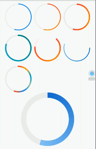
示例代码:
import 'package:flutter/material.dart';import 'dart:math';void main() => runApp(new MyApp());class MyApp extends StatelessWidget {@overrideWidget build(BuildContext context) {return MaterialApp(debugShowCheckedModeBanner: true,title: 'GradientCircularProgressRoute',theme: ThemeData(primarySwatch: Colors.blue,),home: Scaffold(appBar: AppBar(title: Text("GradientCircularProgressRoute")),body: GradientCircularProgressRoute(),));}}class GradientCircularProgressRoute extends StatefulWidget {@overrideGradientCircularProgressRouteState createState() {return new GradientCircularProgressRouteState();}}class GradientCircularProgressRouteStateextends State<GradientCircularProgressRoute> with TickerProviderStateMixin {AnimationController _animationController;@overridevoid initState() {super.initState();_animationController =new AnimationController(vsync: this, duration: Duration(seconds: 3));bool isForward = true;_animationController.addStatusListener((status) {if (status == AnimationStatus.forward) {isForward = true;} else if (status == AnimationStatus.completed ||status == AnimationStatus.dismissed) {if (isForward) {_animationController.reverse();} else {_animationController.forward();}} else if (status == AnimationStatus.reverse) {isForward = false;}});_animationController.forward();}@overridevoid dispose() {_animationController.dispose();super.dispose();}@overrideWidget build(BuildContext context) {return SingleChildScrollView(child: Center(child: Column(crossAxisAlignment: CrossAxisAlignment.center,children: <Widget>[AnimatedBuilder(animation: _animationController,builder: (BuildContext context, Widget child) {return Padding(padding: const EdgeInsets.symmetric(vertical: 16.0),child: Column(children: <Widget>[Wrap(spacing: 10.0,runSpacing: 16.0,children: <Widget>[GradientCircularProgressIndicator(// No gradientcolors: [Colors.blue, Colors.blue],radius: 50.0,strokeWidth: 3.0,value: _animationController.value,),GradientCircularProgressIndicator(colors: [Colors.red, Colors.orange],radius: 50.0,strokeWidth: 3.0,value: _animationController.value,),GradientCircularProgressIndicator(colors: [Colors.red, Colors.orange, Colors.red],radius: 50.0,strokeWidth: 5.0,value: _animationController.value,),GradientCircularProgressIndicator(colors: [Colors.teal, Colors.cyan],radius: 50.0,strokeWidth: 5.0,strokeCapRound: true,value: CurvedAnimation(parent: _animationController,curve: Curves.decelerate).value,),TurnBox(turns: 1 / 8,child: GradientCircularProgressIndicator(colors: [Colors.red, Colors.orange, Colors.red],radius: 50.0,strokeWidth: 5.0,strokeCapRound: true,backgroundColor: Colors.red[50],totalAngle: 1.5 * pi,value: CurvedAnimation(parent: _animationController,curve: Curves.ease).value),),RotatedBox(quarterTurns: 1,child: GradientCircularProgressIndicator(colors: [Colors.blue[700], Colors.blue[200]],radius: 50.0,strokeWidth: 3.0,strokeCapRound: true,backgroundColor: Colors.transparent,value: _animationController.value),),GradientCircularProgressIndicator(colors: [Colors.red,Colors.amber,Colors.cyan,Colors.green[200],Colors.blue,Colors.red],radius: 50.0,strokeWidth: 5.0,strokeCapRound: true,value: _animationController.value,),],),GradientCircularProgressIndicator(colors: [Colors.blue[700], Colors.blue[200]],radius: 100.0,strokeWidth: 20.0,value: _animationController.value,),Padding(padding: const EdgeInsets.symmetric(vertical: 16.0),child: GradientCircularProgressIndicator(colors: [Colors.blue[700], Colors.blue[300]],radius: 100.0,strokeWidth: 20.0,value: _animationController.value,strokeCapRound: true,),),//剪裁半圆ClipRect(child: Align(alignment: Alignment.topCenter,heightFactor: .5,child: Padding(padding: const EdgeInsets.only(bottom: 8.0),child: SizedBox(//width: 100.0,child: TurnBox(turns: .75,child: GradientCircularProgressIndicator(colors: [Colors.teal, Colors.cyan[500]],radius: 100.0,strokeWidth: 8.0,value: _animationController.value,totalAngle: pi,strokeCapRound: true,),),),),),),SizedBox(height: 104.0,width: 200.0,child: Stack(alignment: Alignment.center,children: <Widget>[Positioned(height: 200.0,top: .0,child: TurnBox(turns: .75,child: GradientCircularProgressIndicator(colors: [Colors.teal, Colors.cyan[500]],radius: 100.0,strokeWidth: 8.0,value: _animationController.value,totalAngle: pi,strokeCapRound: true,),),),Padding(padding: const EdgeInsets.only(top: 10.0),child: Text("${(_animationController.value * 100).toInt()}%",style: TextStyle(fontSize: 25.0,color: Colors.blueGrey,),),)],),),],),);},),],),),);}}class GradientCircularProgressIndicator extends StatelessWidget {GradientCircularProgressIndicator({this.strokeWidth = 2.0,@required this.radius,@required this.colors,this.stops,this.strokeCapRound = false,this.backgroundColor = const Color(0xFFEEEEEE),this.totalAngle = 2 * pi,this.value});///粗细final double strokeWidth;/// 圆的半径final double radius;///两端是否为圆角final bool strokeCapRound;/// 当前进度,取值范围 [0.0-1.0]final double value;/// 进度条背景色final Color backgroundColor;/// 进度条的总弧度,2*PI为整圆,小于2*PI则不是整圆final double totalAngle;/// 渐变色数组final List<Color> colors;/// 渐变色的终止点,对应colors属性final List<double> stops;@overrideWidget build(BuildContext context) {double _offset = .0;// 如果两端为圆角,则需要对起始位置进行调整,否则圆角部分会偏离起始位置// 下面调整的角度的计算公式是通过数学几何知识得出,读者有兴趣可以研究一下为什么是这样if (strokeCapRound) {_offset = asin(strokeWidth / (radius * 2 - strokeWidth));}var _colors = colors;if (_colors == null) {Color color = Theme.of(context).accentColor;_colors = [color, color];}return Transform.rotate(angle: -pi / 2.0 - _offset,child: CustomPaint(size: Size.fromRadius(radius),painter: _GradientCircularProgressPainter(strokeWidth: strokeWidth,strokeCapRound: strokeCapRound,backgroundColor: backgroundColor,value: value,total: totalAngle,radius: radius,colors: _colors,)),);}}//实现画笔class _GradientCircularProgressPainter extends CustomPainter {_GradientCircularProgressPainter({this.strokeWidth: 10.0,this.strokeCapRound: false,this.backgroundColor = const Color(0xFFEEEEEE),this.radius,this.total = 2 * pi,@required this.colors,this.stops,this.value});final double strokeWidth;final bool strokeCapRound;final double value;final Color backgroundColor;final List<Color> colors;final double total;final double radius;final List<double> stops;@overridevoid paint(Canvas canvas, Size size) {if (radius != null) {size = Size.fromRadius(radius);}double _offset = strokeWidth / 2.0;double _value = (value ?? .0);_value = _value.clamp(.0, 1.0) * total;double _start = .0;if (strokeCapRound) {_start = asin(strokeWidth/ (size.width - strokeWidth));}Rect rect = Offset(_offset, _offset) & Size(size.width - strokeWidth,size.height - strokeWidth);var paint = Paint()..strokeCap = strokeCapRound ? StrokeCap.round : StrokeCap.butt..style = PaintingStyle.stroke..isAntiAlias = true..strokeWidth = strokeWidth;// 先画背景if (backgroundColor != Colors.transparent) {paint.color = backgroundColor;canvas.drawArc(rect,_start,total,false,paint);}// 再画前景,应用渐变if (_value > 0) {paint.shader = SweepGradient(startAngle: 0.0,endAngle: _value,colors: colors,stops: stops,).createShader(rect);canvas.drawArc(rect,_start,_value,false,paint);}}@overridebool shouldRepaint(CustomPainter oldDelegate) => true;}class TurnBox extends StatefulWidget {const TurnBox({Key key,this.turns = .0, //旋转的“圈”数,一圈为360度,如0.25圈即90度this.speed = 200, //过渡动画执行的总时长this.child}): super(key: key);final double turns;final int speed;final Widget child;@override_TurnBoxState createState() => new _TurnBoxState();}class _TurnBoxState extends State<TurnBox> with SingleTickerProviderStateMixin {AnimationController _controller;@overridevoid initState() {super.initState();_controller = new AnimationController(vsync: this, lowerBound: -double.infinity, upperBound: double.infinity);_controller.value = widget.turns;}@overridevoid dispose() {_controller.dispose();super.dispose();}@overrideWidget build(BuildContext context) {return RotationTransition(turns: _controller,child: widget.child,);}@overridevoid didUpdateWidget(TurnBox oldWidget) {super.didUpdateWidget(oldWidget);//旋转角度发生变化时执行过渡动画if (oldWidget.turns != widget.turns) {_controller.animateTo(widget.turns,duration: Duration(milliseconds: widget.speed ?? 200),curve: Curves.easeOut,);}}}
怎么样,很炫酷吧!GradientCircularProgressIndicator已经被添加进了笔者维护的flukit组件库中了,读者如果有需要,可以直接依赖flukit包。

若有收获,就点个赞吧
0 人点赞
