Material组件库中的按钮
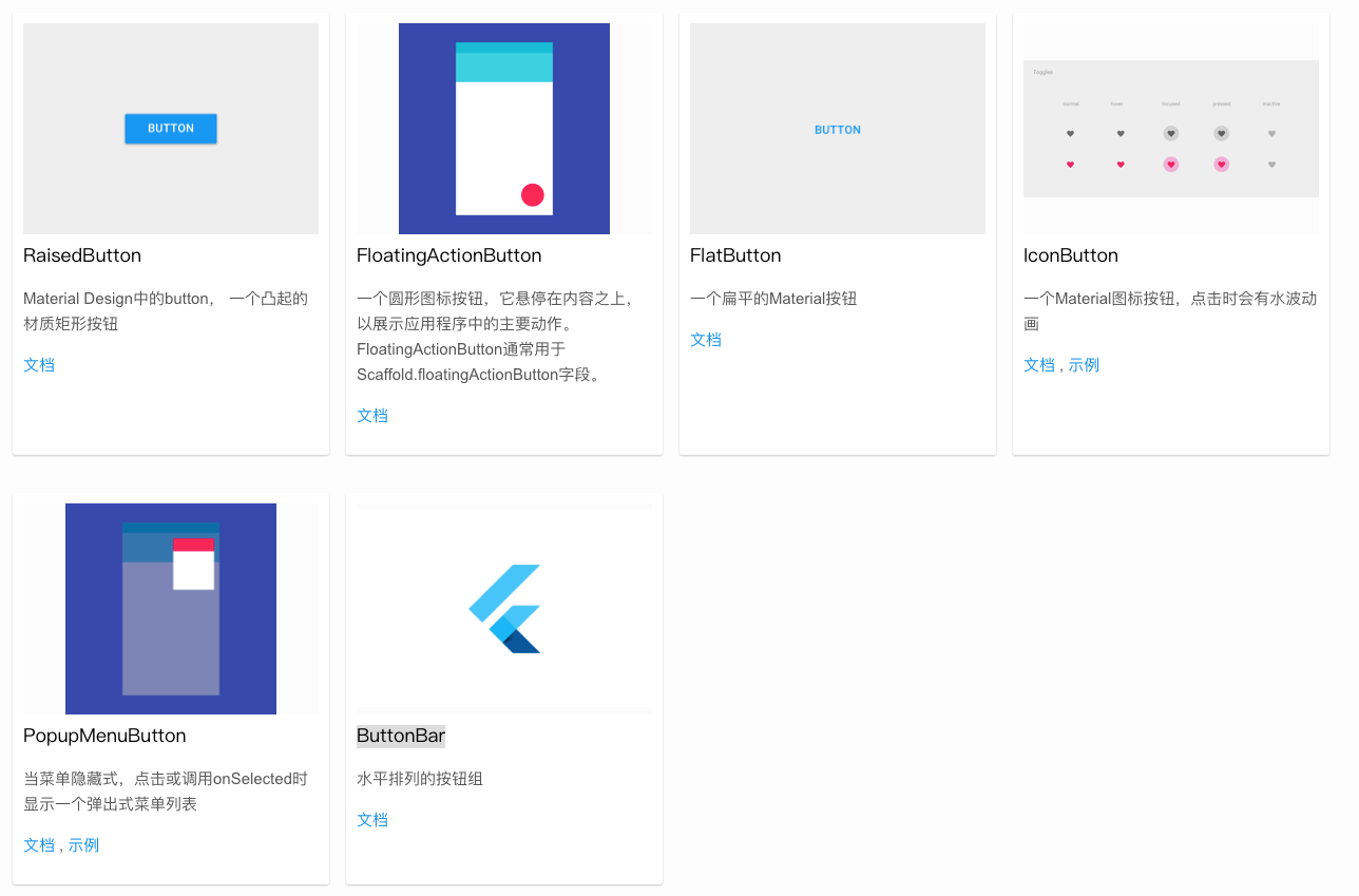
Material 组件库 中提供了多种按钮组件,如:
- RaisedButton
- FloatingActionButton
- IconButton
- FlatButton
- OutlineButton
- PopupMenuButton
- ButtonBar
- 等等
它们都是直接或间接对 RawMaterialButton 组件的包装定制,所以他们大多数属性都和 RawMaterialButton 一样。在介绍各个按钮时我们先介绍其默认外观,而按钮的外观大都可以通过属性来自定义,我们在后面统一介绍这些属性。另外,所有Material 库中的按钮都有如下相同点:
- 按下时都会有“水波动画”(又称“涟漪动画”,就是点击时按钮上会出现水波荡漾的动画)。
- 有一个 onPressed 属性来设置点击回调,当按钮按下时会执行该回调,如果不提供该回调则按钮会处于禁用状态,禁用状态不响应用户点击。
RawMaterialButton
RawMaterialButton(onPressed: () {},elevation: 0.5,fillColor: Colors.white,shape: CircleBorder(side: BorderSide(width: 1.sp,color: Color(0xff576b95),)),padding: EdgeInsets.all(4.sp),child: Icon(MyIcons.icon_line_phone,size: 24.sp,color: Color.fromRGBO(87, 107, 149, 1),),)RawMaterialButton(onPressed: () {show_dialog(context,title: "拨打电话",onOk: () {callPhone(item.phone ?? "");},onCancle: () {},text: item.phone ?? "",);},constraints: BoxConstraints(minWidth: 20.w, minHeight: 20.w),elevation: 0.5,fillColor: Colors.white,shape: CircleBorder(side: BorderSide(width: 1.sp,color: Color(0xff576b95),)),padding: EdgeInsets.all(4.sp),child: Icon(MyIcons.icon_line_phone,size: 24.sp,color:Color.fromRGBO(87, 107, 149, 1),),)
参数属性
const RawMaterialButton({Key? key,required this.onPressed,this.onLongPress,this.onHighlightChanged,this.mouseCursor,this.textStyle,this.fillColor,this.focusColor,this.hoverColor,this.highlightColor,this.splashColor,this.elevation = 2.0,this.focusElevation = 4.0,this.hoverElevation = 4.0,this.highlightElevation = 8.0,this.disabledElevation = 0.0,this.padding = EdgeInsets.zero,this.visualDensity = VisualDensity.standard,this.constraints = const BoxConstraints(minWidth: 88.0, minHeight: 36.0),this.shape = const RoundedRectangleBorder(),this.animationDuration = kThemeChangeDuration,this.clipBehavior = Clip.none,this.focusNode,this.autofocus = false,MaterialTapTargetSize? materialTapTargetSize,this.child,this.enableFeedback = true,
MaterialButton

MaterialButton中实际上是对 RawMaterialButton 的调用
@overrideWidget build(BuildContext context) {final ThemeData theme = Theme.of(context);final ButtonThemeData buttonTheme = ButtonTheme.of(context);return RawMaterialButton(onPressed: onPressed,onLongPress: onLongPress,enableFeedback: enableFeedback,onHighlightChanged: onHighlightChanged,mouseCursor: mouseCursor,fillColor: buttonTheme.getFillColor(this),textStyle: theme.textTheme.button!.copyWith(color: buttonTheme.getTextColor(this)),focusColor: focusColor ?? buttonTheme.getFocusColor(this),hoverColor: hoverColor ?? buttonTheme.getHoverColor(this),highlightColor: highlightColor ?? theme.highlightColor,splashColor: splashColor ?? theme.splashColor,elevation: buttonTheme.getElevation(this),focusElevation: buttonTheme.getFocusElevation(this),hoverElevation: buttonTheme.getHoverElevation(this),highlightElevation: buttonTheme.getHighlightElevation(this),padding: buttonTheme.getPadding(this),visualDensity: visualDensity ?? theme.visualDensity,constraints: buttonTheme.getConstraints(this).copyWith(minWidth: minWidth,minHeight: height,),shape: buttonTheme.getShape(this),clipBehavior: clipBehavior,focusNode: focusNode,autofocus: autofocus,animationDuration: buttonTheme.getAnimationDuration(this),materialTapTargetSize: materialTapTargetSize ?? theme.materialTapTargetSize,disabledElevation: disabledElevation ?? 0.0,child: child,);}
MaterialButton的案例
MaterialButton(minWidth: 48.w,height: 48.w,child: Image.asset(getImagePath("icon_line_flashlight"),width: 24.w,height: 24.w,color: Colors.white,),onPressed: () {_controller.toggleTorchMode();if (lightIcon == Icons.flash_on) {lightIcon = Icons.flash_off;} else {lightIcon = Icons.flash_on;}setState(() {});});
RaisedButton
RaisedButton 即”漂浮”按钮,它默认带有阴影和灰色背景。按下后,阴影会变大,如图3-10所示:
RaisedButton(child: Text("normal"),onPressed: () {},);
参数属性
(new) RaisedButton RaisedButton({Key key,void Function() onPressed,void Function() onLongPress,void Function(bool) onHighlightChanged,ButtonTextTheme textTheme,Color textColor,Color disabledTextColor,Color color,Color disabledColor,Color focusColor,Color hoverColor,Color highlightColor,Color splashColor,Brightness colorBrightness,double elevation,double focusElevation,double hoverElevation,double highlightElevation,double disabledElevation,EdgeInsetsGeometry padding,ShapeBorder shape,Clip clipBehavior = Clip.none,FocusNode focusNode,bool autofocus = false,MaterialTapTargetSize materialTapTargetSize,Duration animationDuration,Widget child})
FlatButton
FlatButton 即扁平按钮,默认背景透明并不带阴影。按下后,会有背景色,如图3-11所示: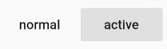
FlatButton(child: Text("normal"),onPressed: () {},)
参数属性
(new) FlatButton FlatButton({Key key,void Function() onPressed,void Function() onLongPress,void Function(bool) onHighlightChanged,ButtonTextTheme textTheme,Color textColor,Color disabledTextColor,Color color,Color disabledColor,Color focusColor,Color hoverColor,Color highlightColor,Color splashColor,Brightness colorBrightness,EdgeInsetsGeometry padding,ShapeBorder shape,Clip clipBehavior = Clip.none,FocusNode focusNode,bool autofocus = false,MaterialTapTargetSize materialTapTargetSize,Widget child})
OutlineButton
OutlineButton 默认有一个边框,不带阴影且背景透明。按下后,边框颜色会变亮、同时出现背景和阴影(较弱),如图3-12所示: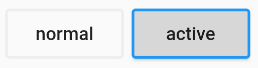
OutlineButton(child: Text("normal"),onPressed: () {},)
参数属性
(new) OutlineButton OutlineButton({Key key,void Function() onPressed,void Function() onLongPress,ButtonTextTheme textTheme,Color textColor,Color disabledTextColor,Color color,Color focusColor,Color hoverColor,Color highlightColor,Color splashColor,double highlightElevation,BorderSide borderSide,Color disabledBorderColor,Color highlightedBorderColor,EdgeInsetsGeometry padding,ShapeBorder shape,Clip clipBehavior = Clip.none,FocusNode focusNode,bool autofocus = false,Widget child})
IconButton
IconButton是一个可点击的Icon,不包括文字,默认没有背景,点击后会出现背景,如图3-13所示: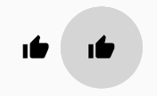
代码如下:
IconButton(icon: Icon(Icons.thumb_up),onPressed: () {},)
参数属性
(new) IconButton IconButton({Key key,double iconSize = 24.0,EdgeInsetsGeometry padding = const EdgeInsets.all(8.0),AlignmentGeometry alignment = Alignment.center,Widget icon,Color color,Color focusColor,Color hoverColor,Color highlightColor,Color splashColor,Color disabledColor,void Function() onPressed,FocusNode focusNode,bool autofocus = false,String tooltip,bool enableFeedback = true})
TextButton
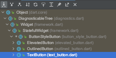
abstract class ButtonStyleButton extends StatefulWidget {/// Abstract const constructor. This constructor enables subclasses to provide/// const constructors so that they can be used in const expressions.const ButtonStyleButton({Key? key,required this.onPressed,required this.onLongPress,required this.style,required this.focusNode,required this.autofocus,required this.clipBehavior,required this.child,}) : assert(autofocus != null),assert(clipBehavior != null),super(key: key);
参数属性
const TextButton({Key? key,required VoidCallback? onPressed,VoidCallback? onLongPress,ButtonStyle? style,FocusNode? focusNode,bool autofocus = false,Clip clipBehavior = Clip.none,required Widget child,})
TextButton使用案例
TextButton(onPressed: () {if (!_isCanClick) return;this.handlecheckPartsPrice(vm, context);},style: ButtonStyle(// alignment: Alignment.centerRight,// padding: MaterialStateProperty.all(EdgeInsets.zero), // 消除按钮带来的内边距),child: Container(width: 160.w,height: 44.w,alignment: Alignment.center,// 垂直水平居中可以在 设置【padding】 和 【alignment、width、height】 二选一// padding: EdgeInsets.symmetric(horizontal: 23.w, vertical: 10.w),decoration: BoxDecoration(border: Border.all(color: Color(_isCanClick ? 0xFF576B95 : 0x26000000),width: 1.w,style: BorderStyle.solid,),borderRadius: BorderRadius.circular(22.w),),child: Text("查询零售价",style: TextStyle(color: Color(_isCanClick ? 0xFF576B95 : 0x26000000),fontWeight: FontWeight.w600,fontSize: 16.sp,),),),)
TextButton(style: ButtonStyle(padding: MaterialStateProperty.all(EdgeInsets.zero)),onPressed: () {},child: item.statusName == 0? Text(item.statusName ?? "",style: TextStyle(color: Color(0xff576b95),fontWeight: FontWeight.w600,fontSize: 14.sp),): Container(width: 80.w,height: 32.w,margin: EdgeInsets.all(0),alignment: Alignment.center,// color: Colors.white,decoration: BoxDecoration(color: Color.fromRGBO(56, 109, 248, 1),borderRadius:BorderRadius.circular(16.w)),child: Text(item.statusName ?? "",style: TextStyle(color: Colors.white,fontWeight:FontWeight.w600,fontSize: 14.sp),),)
TextButton(// style: ButtonStyle(// padding: MaterialStateProperty.all(// EdgeInsets.zero)),onPressed: () {switch (item.orderStatus) {case "12881001":show_dialog(context,title: "提示",text: "确认借车?", onOk: () {vm2.handleReturnCar(item.orderNo, 1);}, onCancle: () {});break;}},child: item.orderStatus == "12881001" ||item.orderStatus == "12881003"? Container(// width: 80.w,// height: 32.w,constraints: BoxConstraints(maxWidth:double.infinity, //宽度尽可能大// minWidth: 80.w,),margin: EdgeInsets.all(0),padding: EdgeInsets.symmetric(vertical: 8.sp,horizontal: 12.sp),// alignment: Alignment.center,// color: Colors.white,decoration: BoxDecoration(color: Color.fromRGBO(56, 109, 248, 1),borderRadius:BorderRadius.circular(16.w)),child: Text(item.statusName ?? "",style: TextStyle(color: Colors.white,fontWeight: FontWeight.w600,fontSize: 14.sp),),): Text(item.statusName ?? "",style: TextStyle(color: Color(0xff576b95),fontWeight: FontWeight.w600,fontSize: 14.sp),),)
 //这是一个文本按钮 未设置点击事件下的样式
  Widget buildTextButton() {
    return TextButton(
      child: Text("TextButton按钮"),
      //添加一个点击事件
      onPressed: () {},
      //设置按钮是否自动获取焦点
      autofocus: true,
      //定义一下文本样式
      style: ButtonStyle(
        //定义文本的样式 这里设置的颜色是不起作用的
        textStyle: MaterialStateProperty.all(
            TextStyle(fontSize: 18, color: Colors.red)),
        //设置按钮上字体与图标的颜色
        //foregroundColor: MaterialStateProperty.all(Colors.deepPurple),
        //更优美的方式来设置
        foregroundColor: MaterialStateProperty.resolveWith(
          (states) {
            if (states.contains(MaterialState.focused) &&
                !states.contains(MaterialState.pressed)) {
              //获取焦点时的颜色
              return Colors.blue;
            } else if (states.contains(MaterialState.pressed)) {
              //按下时的颜色
              return Colors.deepPurple;
            }
            //默认状态使用灰色
            return Colors.grey;
          },
        ),
        //背景颜色
        backgroundColor: MaterialStateProperty.resolveWith((states) {
          //设置按下时的背景颜色
          if (states.contains(MaterialState.pressed)) {
            return Colors.blue[200];
          }
          //默认不使用背景颜色
          return null;
        }),
        //设置水波纹颜色
        overlayColor: MaterialStateProperty.all(Colors.yellow),
        //设置阴影  不适用于这里的TextButton
        elevation: MaterialStateProperty.all(0),
        //设置按钮内边距
        padding: MaterialStateProperty.all(EdgeInsets.all(10)),
        //设置按钮的大小
        minimumSize: MaterialStateProperty.all(Size(200, 100)),

        //设置边框
        side:
            MaterialStateProperty.all(BorderSide(color: Colors.grey, width: 1)),
        //外边框装饰 会覆盖 side 配置的样式
        shape: MaterialStateProperty.all(StadiumBorder()),
      ),
    );
  }
带图标的按钮
RaisedButton、FlatButton、OutlineButton都有一个icon 构造函数,通过它可以轻松创建带图标的按钮,如图3-14所示: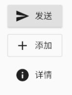
RaisedButton.icon(
  icon: Icon(Icons.send),
  label: Text("发送"),
  onPressed: _onPressed,
),
OutlineButton.icon(
  icon: Icon(Icons.add),
  label: Text("添加"),
  onPressed: _onPressed,
),
FlatButton.icon(
  icon: Icon(Icons.info),
  label: Text("详情"),
  onPressed: _onPressed,
),
参数属性
(new) RaisedButton RaisedButton.icon({Key key,
 void Function() onPressed,
 void Function() onLongPress,
 void Function(bool) onHighlightChanged,
 ButtonTextTheme textTheme,
 Color textColor,
 Color disabledTextColor,
 Color color,
 Color disabledColor,
 Color focusColor,
 Color hoverColor,
 Color highlightColor,
 Color splashColor,
 Brightness colorBrightness,
 double elevation,
 double highlightElevation,
 double disabledElevation,
 ShapeBorder shape,
 Clip clipBehavior,
 FocusNode focusNode,
 bool autofocus,
 MaterialTapTargetSize materialTapTargetSize,
 Duration animationDuration,
 Widget icon,
 Widget label})
自定义按钮外观
按钮外观可以通过其属性来定义,不同按钮属性大同小异,我们以FlatButton为例,介绍一下常见的按钮属性,详细的信息可以查看API文档。
const FlatButton({
  ...
  @required this.onPressed, //按钮点击回调
  this.textColor, //按钮文字颜色
  this.disabledTextColor, //按钮禁用时的文字颜色
  this.color, //按钮背景颜色
  this.disabledColor,//按钮禁用时的背景颜色
  this.highlightColor, //按钮按下时的背景颜色
  this.splashColor, //点击时,水波动画中水波的颜色
  this.colorBrightness,//按钮主题,默认是浅色主题
  this.padding, //按钮的填充
  this.shape, //外形
  @required this.child, //按钮的内容
})
其中大多数属性名都是自解释的,我们不赘述。下面我们通过一个示例来看看如何自定义按钮。
蓝色背景的圆角矩形边框按钮
FlatButton(
  color: Colors.blue,
  highlightColor: Colors.blue[700],
  colorBrightness: Brightness.dark,
  splashColor: Colors.grey,
  child: Text("Submit"),
  shape:RoundedRectangleBorder(borderRadius: BorderRadius.circular(20.0)),
  onPressed: () {},
)
很简单吧,在上面的代码中,我们主要通过 shape 来指定其外形为一个圆角矩形。
- 因为按钮背景是蓝色(深色),我们需要指定按钮主题colorBrightness为Brightness.dark,这是为了保证按钮文字颜色为浅色。
- Flutter 中没有提供去除背景的设置,假若我们需要去除背景,则可以通过将背景颜色设置为全透明来实现。对应上面的代码,便是将 color: Colors.blue 替换为 color: Color(0x000000)。
细心的读者可能会发现这个按钮没有阴影(点击之后也没有),这样会显得没有质感。其实这也很容易,将上面的FlatButton换成RaisedButton就行,其它代码不用改(这里 color 也不做更改),换了之后的效果如图3-16所示: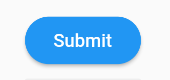
是不是有质感了!之所以会这样,是因为RaisedButton默认有配置阴影:
const RaisedButton({
  ...
  this.elevation = 2.0, //正常状态下的阴影
  this.highlightElevation = 8.0,//按下时的阴影
  this.disabledElevation = 0.0,// 禁用时的阴影
  ...
}
值得注意的是,在Material 组件库中,我们会在很多组件中见到elevation相关的属性,它们都是用来控制阴影的,这是因为阴影在Material设计风格中是一种很重要的表现形式,以后在介绍其它组件时,便不再赘述。
如果我们想实现一个背景渐变的圆角按钮,按钮有没有相应的属性呢?
答案是没有,但是,我们可以通过其它方式来实现,我们将在后面”自定义组件”一章中实现。
flutter 中 TextButton、OutlinedButton、ElevatedButton去除内置padding
Text(
    '*****Flutter 1.22版本新增的按钮*****',
    style: TextStyle(color: Colors.redAccent),
),
SizedBox(height: 20),
Container(
    color: Colors.orange,
    child: TextButton(
        onPressed: () {},
        child: Text('TextButton'),
        style: ButtonStyle(
            tapTargetSize: MaterialTapTargetSize.shrinkWrap, // 设置点击区域尺寸跟随内容大小
            minimumSize: MaterialStateProperty.all(Size(0, 0)),
            padding: MaterialStateProperty.all(EdgeInsets.zero),
        ),
    ),
),
SizedBox(height: 20),
Container(
    color: Colors.blue,
    child: OutlinedButton(
        child: Text('OutlinedButton'),
        onPressed: () {},
        style: ButtonStyle(
            backgroundColor: MaterialStateProperty.all(Colors.redAccent),
            minimumSize: MaterialStateProperty.all(Size(0, 0)),
            padding: MaterialStateProperty.all(EdgeInsets.zero),
        ),
    ),
),
SizedBox(height: 20),
Container(
    color: Colors.pinkAccent,
    child: ElevatedButton(
        child: Text('ElevatedButton'),
        onPressed: () {},
        style: ButtonStyle(
            minimumSize: MaterialStateProperty.all(Size(0, 0)),
            padding: MaterialStateProperty.all(EdgeInsets.zero),
        ),
    ),
),

若有收获,就点个赞吧
0 人点赞
