Text参数属性
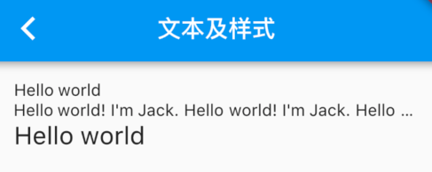
Text用于显示简单样式文本,它包含一些控制文本显示样式的一些属性,一个简单的例子如下:
Text("Hello world",textAlign: TextAlign.left,);Text("Hello world! I'm Jack. " * 4,maxLines: 1,overflow: TextOverflow.ellipsis,);Text("Hello world",textScaleFactor: 1.5,);
(new) Text Text(String data,{Key key,TextStyle style,StrutStyle strutStyle,TextAlign textAlign,TextDirection textDirection,Locale locale,bool softWrap,TextOverflow overflow,double textScaleFactor,int maxLines,String semanticsLabel,TextWidthBasis textWidthBasis})
textAlign 文本的对齐方式,注意,对齐的参考系是Text widget本身。
- TextAlign.center 居中对齐
- TextAlign.end 结尾对齐
- TextAlign.justify 拉伸以软换行符结尾的文本行,以填充容器的宽度
- TextAlign.left 左对齐
- TextAlign.right 右对齐
- TextAlign.start 开头对齐
本例中虽然是指定了居中对齐,但因为Text文本内容宽度不足一行,Text的宽度和文本内容长度相等,那么这时指定对齐方式是没有意义的,只有Text宽度大于文本内容长度时指定此属性才有意义。下面我们指定一个较长的字符串:
//字符串内容超过一行,Text宽度等于屏幕宽度,第二行文本便会居中显示Text("Hello world " * 6, //字符串重复六次textAlign: TextAlign.center,);//运行效果 Hello world Hello world Hello world Hello world Hello world Hello world
- maxLines 指定文本显示的最大行数,默认情况下,文本是自动折行的,如果指定此参数,则文本最多不会超过指定的行。
- overflow 如果有多余的文本,可以通过overflow来指定截断方式,默认是直接截断,本例中指定的截断方式TextOverflow.ellipsis,它会将多余文本截断后以省略符“…”表示;TextOverflow的其它截断方式请参考SDK文档。
- textScaleFactor 代表文本相对于当前字体大小的缩放因子,相对于去设置文本的样式style属性的fontSize,它是调整字体大小的一个快捷方式。该属性的默认值可以通过 MediaQueryData.textScaleFactor 获得,如果没有MediaQuery,那么会默认值将为1.0。
- textDirection 文字的方向
- 这决定了如何解释[textAlign.start]和[textAlign.end]等[textAlign]值。
- 这也用于消除如何呈现双向文本的歧义。例如,如果[data]是英文短语,后跟希伯来语短语,则在[TextDirection.ltr]上下文中,英文短语位于左侧,希伯来语短语位于右侧;而在[TextDirection.rtl]上下文中,英文短语位于右侧,希伯来语短语位于左侧。
- strutStyle 要使用的支柱样式。支柱样式定义支柱,设置最小垂直布局度量
- 省略或提供空值将禁用支柱StrutStyle.disabled
- 省略或为[StrutStyle]的任何属性提供空值将导致使用默认值。强烈建议至少指定一个[fontSize]。
- textWidthBasis 定义如何测量呈现文本的宽度
- TextWidthBasis.longestLine
- TextWidthBasis.parent
TextStyle参数属性
用于指定文本显示的样式如颜色、字体、粗细、背景等。我们看一个示例:
Text("Hello world",style: TextStyle(color: Colors.blue,fontSize: 18.0,height: 1.2,fontFamily: "Courier",background: new Paint()..color=Colors.yellow,decoration:TextDecoration.underline,decorationStyle: TextDecorationStyle.dashed),);
效果如图所示: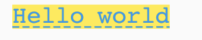
此示例只展示了TextStyle的部分属性,它还有一些其它属性,属性名基本都是自解释的,在此不再赘述,读者可以查阅SDK文档了解Flutter的文本参数。值得注意的是:
(new) TextStyle TextStyle({bool inherit = true,Color color,Color backgroundColor,double fontSize,FontWeight fontWeight,FontStyle fontStyle,double letterSpacing,double wordSpacing,TextBaseline textBaseline,double height,Locale locale,Paint foreground,Paint background,List<Shadow> shadows,List<FontFeature> fontFeatures,TextDecoration decoration,Color decorationColor,TextDecorationStyle decorationStyle,double decorationThickness,String debugLabel,String fontFamily,List<String> fontFamilyFallback,String package})
- height 该属性用于指定行高,但它并不是一个绝对值,而是一个因子,具体的行高等于fontSize*height。
- fontFamily 由于不同平台默认支持的字体集不同,所以在手动指定字体时一定要先在不同平台测试一下。
- fontSize 该属性和Text的textScaleFactor都用于控制字体大小。但是有两个主要区别:
- fontSize可以精确指定字体大小,而textScaleFactor只能通过缩放比例来控制。
- textScaleFactor主要是用于系统字体大小设置改变时对Flutter应用字体进行全局调整,而fontSize通常用于单个文本,字体大小不会跟随系统字体大小变化。
- color 绘制文本时要使用的颜色,以下是使用方法:
- 可使用的类Color
- Color.alphaBlend(foreground, background)
- Color.fromARGB(a, r, g, b)
- Color.fromRGBO(r, g, b, opacity)
- Color.getAlphaFromOpacity(opacity)
- Color.lerp(a, b, t)
- Colors.xxxxxxxx
- 可使用的类Color
- backgroundColor 用作文本背景的颜色,继承的是Color类
- wordSpacing 文字间距
- decorationStyle 绘制文本装饰的样式
- TextDecorationStyle.dashed 虚线
- TextDecorationStyle.dotted 细虚线
- TextDecorationStyle.double 双实线
- TextDecorationStyle.solid 实线
- TextDecorationStyle.wavy 波浪形
- fontWeight 绘制文本时使用的字体厚度(e.g., bold).
- FontWeight.bold
- FontWeight.w500
DefaultTextStyle
在Widget树中,文本的样式默认是可以被继承的(子类文本类组件未指定具体样式时可以使用Widget树中父级设置的默认样式)
因此,如果在Widget树的某一个节点处设置一个默认的文本样式,那么该节点的子树中所有文本都会默认使用这个样式,而 DefaultTextStyle 正是用于设置默认文本样式的。下面我们看一个例子:
DefaultTextStyle(//1.设置文本默认样式style: TextStyle(color:Colors.red,fontSize: 20.0,),textAlign: TextAlign.start,child: Column(crossAxisAlignment: CrossAxisAlignment.start,children: <Widget>[Text("hello world"),Text("I am Jack"),Text("I am Jack",style: TextStyle(inherit: false, //2.不继承默认样式color: Colors.grey),),],),);
上面代码中,我们首先设置了一个默认的文本样式,即字体为20像素(逻辑像素)、颜色为红色。然后通过DefaultTextStyle 设置给了子树Column节点处,这样一来Column的所有子孙Text默认都会继承该样式,除非Text显示指定不继承样式,如代码中注释2。示例运行效果如图3-9: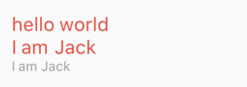
Text.rich
TextSpan
在上面的例子中,Text的所有文本内容只能按同一种样式,如果我们需要对一个Text内容的不同部分按照不同的样式显示,这时就可以使用 TextSpan,它代表文本的一个“片段”。我们看看 TextSpan 的定义:
(new) TextSpan TextSpan({String text,List<InlineSpan> children,TextStyle style,GestureRecognizer recognizer,String semanticsLabel})
- style 该文本片段的样式
- text 属性代表和内容
- children 是一个TextSpan的数组,也就是说TextSpan可以包括其他TextSpan。
- recognizer 用于对该文本片段上用于手势进行识别处理
下面我们看一个效果,然后用TextSpan实现它。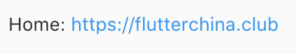
Text.rich(TextSpan(children: [TextSpan(text: "Home: "),TextSpan(text: "https://flutterchina.club",style: TextStyle(color: Colors.blue),recognizer: _tapRecognizer),]))
- 上面代码中,我们通过TextSpan实现了一个基础文本片段和一个链接片段,然后通过Text.rich 方法将TextSpan 添加到Text中,之所以可以这样做,是因为Text其实就是RichText的一个包装,而RichText是可以显示多种样式(富文本)的widget。
- _tapRecognizer 它是点击链接后的一个处理器(代码已省略),关于手势识别的更多内容我们将在后面单独介绍。
- Text.rich
(new) Text Text.rich(InlineSpan textSpan, {Key key,TextStyle style,StrutStyle strutStyle,TextAlign textAlign,TextDirection textDirection, Locale locale, bool softWrap, TextOverflow overflow,double textScaleFactor,int maxLines,String semanticsLabel,TextWidthBasis textWidthBasis})
WidgetSpan
使用 WidgetSpan 能够存放不是TextSpan格式的Widget,从而形成文字环绕的效果
Text.rich(TextSpan(children: [WidgetSpan(child: Visibility(visible: item.isBuySrore == true,child: Padding(padding: EdgeInsets.only(right: 4.w),child: Image.asset(getImagePath("icon_color_buy"),height: 24.w,),),),),TextSpan(text: '${item.dealerName ?? ""}',style: TextStyle(fontSize: 16.sp,color: const Color(0xd9000000),fontWeight: FontWeight.w600),)])),
�
自定义字体
可以在Flutter应用程序中使用不同的字体。例如:
- 我们可能会使用设计人员创建的自定义字体
- 或者其它第三方的字体,如 Google Fonts 中的字体。
本节将介绍如何为Flutter应用配置字体,并在渲染文本时使用它们。 在Flutter中使用字体分两步完成。首先在pubspec.yaml中声明它们,以确保它们会打包到应用程序中。然后通过TextStyle属性使用字体
在asset中声明
要将字体文件打包到应用中,和使用其它资源一样,要先在 pubspec.yaml 中声明它。然后将字体文件复制到在pubspec.yaml 中指定的位置。如:
flutter:fonts:- family: Ralewayfonts:- asset: assets/fonts/Raleway-Regular.ttf- asset: assets/fonts/Raleway-Medium.ttfweight: 500- asset: assets/fonts/Raleway-SemiBold.ttfweight: 600- family: AbrilFatfacefonts:- asset: assets/fonts/abrilfatface/AbrilFatface-Regular.ttf
使用字体
// 声明文本样式const textStyle = const TextStyle(fontFamily: 'Raleway',);// 使用文本样式var buttonText = const Text("Use the font for this text",style: textStyle,);
package中的字体
要使用Package中定义的字体,必须提供 package 参数。例如,假设上面的字体声明位于my_package包中。然后创建TextStyle的过程如下:
const textStyle = const TextStyle(fontFamily: 'Raleway',package: 'my_package', //指定包名);
如果在package包内部使用它自己定义的字体,也应该在创建文本样式时指定 package 参数,如上例所示。
一个包也可以只提供字体文件而不需要在 pubspec.yaml 中声明。 这些文件应该存放在包的lib/文件夹中。字体文件不会自动绑定到应用程序中,应用程序可以在声明字体时有选择地使用这些字体。假设一个名为 my_package 的包中有一个字体文件:
lib/fonts/Raleway-Medium.ttf
然后,应用程序可以声明一个字体,如下面的示例所示:
flutter:fonts:- family: Ralewayfonts:- asset: assets/fonts/Raleway-Regular.ttf- asset: packages/my_package/fonts/Raleway-Medium.ttfweight: 500
lib/是隐含的,所以它不应该包含在asset路径中
在这种情况下,由于应用程序本地定义了字体,所以在创建TextStyle时可以不指定package参数:
const textStyle = const TextStyle(fontFamily: 'Raleway',);
扩展
flutter实现文字超出最大宽度显示省略号
Padding(padding: EdgeInsets.only(left: 4.w),child: Container(constraints:BoxConstraints(maxWidth: 60.sp),child: Text("华南深圳地区",style: TextStyle(fontSize: 14.sp,fontWeight: FontWeight.w500,wordSpacing: 4,overflow: TextOverflow.ellipsis,),),),),
文本换行
一些场景下直接设置 maxLines,比如说
父的宽度没有设置过
Text("广州市黄埔区开发大道将军山路段黄埔工程机械园东区六号广州市黄埔区开发大道将军山路段黄埔工程机械园东区六号广州市黄埔区开发大道将军山路段黄埔工程机械园东区六号广州市黄埔区开发大道将军山路段黄埔工程机械园东区六号广州市黄埔区开发大道将军山路段黄埔工程机械园东区六号",maxLines: 4,style: TextStyle(color: Color.fromRGBO(77, 99, 104, 1),),),
但是直接设置maxLines 发现有些场景会无效,这时候可以考虑使用 Flexible 或者 Expanded 组件。用方如下:
这两个组件都需要作为row或者column的子组件使用,如主轴空间不够用,则会自动扩充至次轴,实现自动换行。Expanded 组件 会尽可能的充满分布在Row, Column, 或 Flex的主轴方向上;
- Flexible 组件 也是为小部件提供空间的,但是不会要求子空间填满可用空间。
new Row(mainAxisAlignment: MainAxisAlignment.spaceBetween,children: [Text('地址:',style: TextStyle(fontSize: 18),),Flexible(child: Text("广州市黄埔区开发大道将军山路段黄埔工程机械园东区六号",style: TextStyle(fontSize: 18),),)],)

若有收获,就点个赞吧
0 人点赞
