Material 组件库中提供了两种进度指示器:LinearProgressIndicator和CircularProgressIndicator,它们都可以同时用于精确的进度指示和模糊的进度指示。精确进度通常用于任务进度可以计算和预估的情况,比如文件下载;而模糊进度则用户任务进度无法准确获得的情况,如下拉刷新,数据提交等。
LinearProgressIndicator
LinearProgressIndicator是一个线性、条状的进度条,定义如下:
(new) LinearProgressIndicator LinearProgressIndicator({Key key,double value,Color backgroundColor,Animation<Color> valueColor,String semanticsLabel,String semanticsValue})
- value:表示当前的进度,取值范围为[0,1];如果value为null时则指示器会执行一个循环动画(模糊进度);当value不为null时,指示器为一个具体进度的进度条。
- backgroundColor:指示器的背景色。
- valueColor:指示器的进度条颜色;值得注意的是,该值类型是Animation
,这允许我们对进度条的颜色也可以指定动画。如果我们不需要对进度条颜色执行动画,换言之,我们想对进度条应用一种固定的颜色,此时我们可以通过AlwaysStoppedAnimation来指定。 示例
```dart import ‘package:flutter/material.dart’;
void main() => runApp(new MyApp());
class MyApp extends StatelessWidget { @override Widget build(BuildContext context) { return MaterialApp( debugShowCheckedModeBanner: false, title: ‘TextField 自定义样式’, theme: ThemeData( primarySwatch: Colors.blue, ), home: Scaffold( appBar: AppBar(title: Text(“TextField 自定义样式”)), body: ProgressWidget())); } }
class ProgressWidget extends StatefulWidget { ProgressWidget({Key key}) : super(key: key);
@override _ProgressWidgetState createState() => _ProgressWidgetState(); }
class _ProgressWidgetState extends State
运行效果如图3-30所示:<br />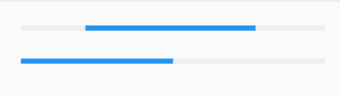<br />第一个进度条在执行循环动画:蓝色条一直在移动,而第二个进度条是静止的,停在50%的位置。<a name="circularprogressindicator"></a>### CircularProgressIndicatorCircularProgressIndicator是一个圆形进度条,定义如下:```dart(new) CircularProgressIndicator CircularProgressIndicator({Key key,double value,Color backgroundColor,Animation<Color> valueColor,double strokeWidth = 4.0,String semanticsLabel,String semanticsValue})
前三个参数和LinearProgressIndicator相同,不再赘述。strokeWidth 表示圆形进度条的粗细。示例如下:
import 'package:flutter/material.dart';void main() => runApp(new MyApp());class MyApp extends StatelessWidget {@overrideWidget build(BuildContext context) {return MaterialApp(debugShowCheckedModeBanner: false,title: 'TextField 自定义样式',theme: ThemeData(primarySwatch: Colors.blue,),home: Scaffold(appBar: AppBar(title: Text("TextField 自定义样式")),body: ProgressWidget()));}}class ProgressWidget extends StatefulWidget {ProgressWidget({Key key}) : super(key: key);@override_ProgressWidgetState createState() => _ProgressWidgetState();}class _ProgressWidgetState extends State<ProgressWidget> {@overrideWidget build(BuildContext context) {return Column(children: <Widget>[// 模糊进度条(会执行一个旋转动画)CircularProgressIndicator(backgroundColor: Colors.grey[200],valueColor: AlwaysStoppedAnimation(Colors.blue),),//进度条显示50%,会显示一个半圆CircularProgressIndicator(backgroundColor: Colors.grey[200],valueColor: AlwaysStoppedAnimation(Colors.blue),value: .5,),],);}}
运行效果如图所示: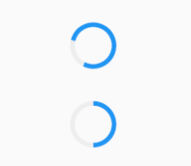
第一个进度条会执行旋转动画,而第二个进度条是静止的,它停在50%的位置。
自定义尺寸
我们可以发现LinearProgressIndicator和CircularProgressIndicator,并没有提供设置圆形进度条尺寸的参数;如果我们希望LinearProgressIndicator的线细一些,或者希望CircularProgressIndicator的圆大一些该怎么做?
其实LinearProgressIndicator和CircularProgressIndicator都是取父容器的尺寸作为绘制的边界的。知道了这点,我们便可以通过尺寸限制类Widget,如ConstrainedBoxSizedBox (我们将在后面容器类组件一章中介绍)来指定尺寸,如:
// 线性进度条高度指定为3
SizedBox(
  height: 3,
  child: LinearProgressIndicator(
    backgroundColor: Colors.grey[200],
    valueColor: AlwaysStoppedAnimation(Colors.blue),
    value: .5,
  ),
),
// 圆形进度条直径指定为100
SizedBox(
  height: 100,
  width: 100,
  child: CircularProgressIndicator(
    backgroundColor: Colors.grey[200],
    valueColor: AlwaysStoppedAnimation(Colors.blue),
    value: .7,
  ),
),
运行效果如图3-32所示: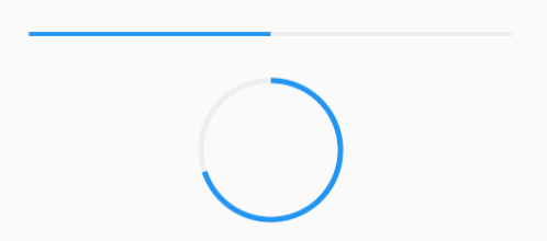
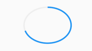
注意,如果CircularProgressIndicator显示空间的宽高不同,则会显示为椭圆。如:
// 宽高不等
SizedBox(
  height: 100,
  width: 130,
  child: CircularProgressIndicator(
    backgroundColor: Colors.grey[200],
    valueColor: AlwaysStoppedAnimation(Colors.blue),
    value: .7,
  ),
),
进度色动画
前面说过可以通过valueColor对进度条颜色做动画,关于动画我们将在后面专门的章节详细介绍,这里先给出一个例子,读者在了解了Flutter动画一章后再回过头来看。
我们实现一个进度条在3秒内从灰色变成蓝色的动画:
import 'package:flutter/material.dart';

void main() => runApp(new MyApp());

class MyApp extends StatelessWidget {
  @override
  Widget build(BuildContext context) {
    return MaterialApp(
        debugShowCheckedModeBanner: false,
        title: '进度色动画',
        theme: ThemeData(
          primarySwatch: Colors.blue,
        ),
        home: Scaffold(
            appBar: AppBar(title: Text("进度色动画")), body: ProgressRoute()));
  }
}

class ProgressRoute extends StatefulWidget {
  @override
  _ProgressRouteState createState() => _ProgressRouteState();
}

class _ProgressRouteState extends State<ProgressRoute> with SingleTickerProviderStateMixin {
  AnimationController _animationController;
  @override
  void initState() {
    //动画执行时间3秒
    _animationController = new AnimationController(vsync: this, duration: Duration(seconds: 3));
    _animationController.forward();
    _animationController.addListener(() => setState(() => {}));
    super.initState();
  }

  @override
  void dispose() {
    _animationController.dispose();
    super.dispose();
  }

  @override
  Widget build(BuildContext context) {
    return SingleChildScrollView(
      child: Column(
        children: <Widget>[
          Padding(
            padding: EdgeInsets.all(16),
            child: LinearProgressIndicator(
              backgroundColor: Colors.grey[200],
              valueColor: ColorTween(begin: Colors.grey, end: Colors.blue)
                  .animate(_animationController), // 从灰色变成蓝色
              value: _animationController.value,
            ),
          )
        ],
      ),
    );
  }
}
自定义进度指示器样式
定制进度指示器风格样式,可以通过CustomPainter Widget 来自定义绘制逻辑,实际上LinearProgressIndicator和CircularProgressIndicator也正是通过CustomPainter来实现外观绘制的。关于CustomPainter,我们将在后面“自定义Widget”一章中详细介绍。
flutter_spinkit
安装包pubspec.yarm
dependencies:
  flutter_spinkit: "^4.1.2"
导入包⚡️
import 'package:flutter_spinkit/flutter_spinkit.dart';
使用包
使用相对用的组件就行,SpinKit+以下名字就是为一个组件
const spinkit = SpinKitRotatingCircle(
  color: Colors.white,
  size: 50.0,
);
final spinkit = SpinKitFadingCircle(
  itemBuilder: (BuildContext context, int index) {
    return DecoratedBox(
      decoration: BoxDecoration(
        color: index.isEven ? Colors.red : Colors.green,
      ),
    );
  },
);
final spinkit = SpinKitSquareCircle(
  color: Colors.white,
  size: 50.0,
  controller: AnimationController(vsync: this, duration: const Duration(milliseconds: 1200)),
);
例子
import 'package:flutter/material.dart';
import 'package:flutter_spinkit/flutter_spinkit.dart';

void main() => runApp(new MyApp());

class MyApp extends StatelessWidget {
  @override
  Widget build(BuildContext context) {
    return MaterialApp(
        debugShowCheckedModeBanner: false,
        title: 'flutter_spinkit模糊加载动画',
        theme: ThemeData(
          primarySwatch: Colors.blue,
        ),
        home: Scaffold(
            appBar: AppBar(title: Text("flutter_spinkit模糊加载动画")), body: ProgressRoute()));
  }
}

class ProgressRoute extends StatefulWidget {
  @override
  _ProgressRouteState createState() => _ProgressRouteState();
}

class _ProgressRouteState extends State<ProgressRoute> with SingleTickerProviderStateMixin {
  // AnimationController _animationController;
  // @override
  // void initState() {
  //   //动画执行时间3秒
  //   _animationController =
  //       new AnimationController(vsync: this, duration: Duration(seconds: 3));
  //   _animationController.forward();
  //   _animationController.addListener(() => setState(() => {}));
  //   super.initState();
  // }

  // @override
  // void dispose() {
  //   _animationController.dispose();
  //   super.dispose();
  // }

  @override
  Widget build(BuildContext context) {
    return SpinKitCircle(
      color: Colors.black,
      size: 50.0,
    );
  }
}
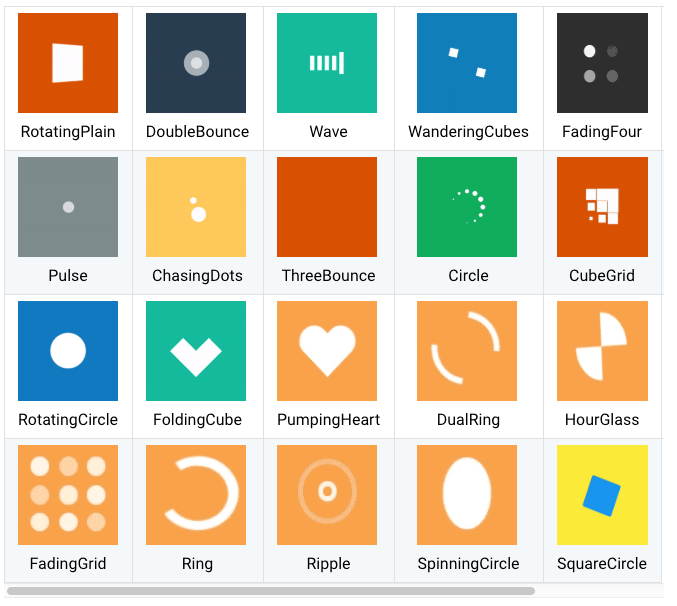
flutter_spinkit 包提供了多种风格的模糊进度指示器,读者若是感兴趣,可以参考。

若有收获,就点个赞吧
0 人点赞
