图表如何支持自适应宽度
(1) 方式一
const chart = new G2.Chart({container: 'c1',forceFit: true,height : 400});
(2) 方式二
chart.forceFit();
如何格式化坐标轴文本
chart.axis('field', {label: {formatter: val => {return val + 'k';}}});
怎么控制坐标轴刻度线个数以及刻度线的间距
列定义中为对应的数据字段设置 tickCount 用于控制刻度线的个数;
chart.source(data, {y: {tickCount: 8}});
// 或者使用 chart.scale()chart.scale('y', {tickCount: 8});
列定义中为对应的数据字段设置 tickInterval 用于控制刻度线的间距;
chart.source(data, {y: {tickInterval: 1000, // 当为时间类型时,请传入单位为微秒的数据}});
// 或者使用 chart.scale()chart.scale('y', {tickInterval: 1000});
!注意: tickCount 和 tickInterval 不可以同时设置。
示例:
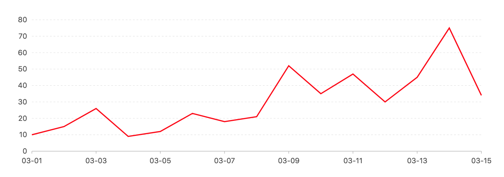
const data = [{ value: 10, time: '2015-03-01T00:00:00.000Z' },{ value: 15, time: '2015-03-02T00:00:00.000Z' },{ value: 26, time: '2015-03-03T00:00:00.000Z' },{ value: 9, time: '2015-03-04T00:00:00.000Z' },{ value: 12, time: '2015-03-05T00:00:00.000Z' },{ value: 23, time: '2015-03-06T00:00:00.000Z' },{ value: 18, time: '2015-03-07T00:00:00.000Z' },{ value: 21, time: '2015-03-08T00:00:00.000Z' },{ value: 52, time: '2015-03-09T00:00:00.000Z' },{ value: 35, time: '2015-03-10T00:00:00.000Z' },{ value: 47, time: '2015-03-11T00:00:00.000Z' },{ value: 30, time: '2015-03-12T00:00:00.000Z' },{ value: 45, time: '2015-03-13T00:00:00.000Z' },{ value: 75, time: '2015-03-14T00:00:00.000Z' },{ value: 34, time: '2015-03-15T00:00:00.000Z' }];const chart = new G2.Chart({container: 'chart1',forceFit: true,height: 334});const defs = {'time': {type: 'time',nice: false,mask: 'MM-DD',tickInterval: 2 * 24 * 60 * 60 * 1000 // 对于 linear 类型的数据,可以设置 tickInterval 参数来设定每个刻度之间的间距,time 类型的单位为微秒},value: {tickInterval: 10}};chart.source(data,defs);chart.line().position('time*value').color('red');chart.render();
如何控制坐标轴的显示的数值范围
列定义中,为对应的数据字段设置 min 和 max 字段。
chart.source(data, {y: {min: 0,max: 100}});
// 或者使用 chart.scale()chart.scale('y', {min: 0,max: 100});
如何格式化图例的显示文本
在列定义中,为对应字段设置 formatter 函数。
chart.source(data, {y: {formatter: val => {if (val === 'male') {return '男';}return '女';}}});
// 或者使用 chart.scale()chart.scale('y', {formatter: val => {if (val === 'male') {return '男';}return '女';}});
示例: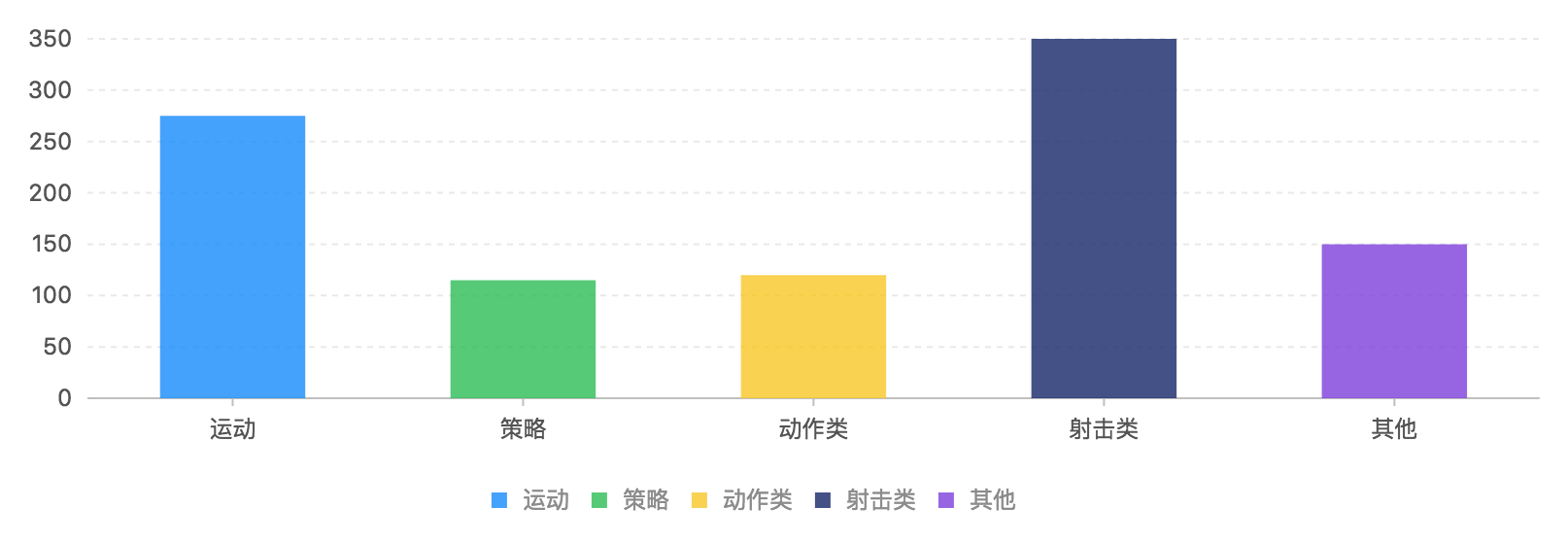
const data = [{ genre: 'Sports', sold: 275 },{ genre: 'Strategy', sold: 115 },{ genre: 'Action', sold: 120 },{ genre: 'Shooter', sold: 350 },{ genre: 'Other', sold: 150 }];const map = {Sports: '运动',Strategy: '策略',Action: '动作类',Shooter: '射击类',Other: '其他'};const chart = new G2.Chart({container: 'chart2', // 指定图表容器 IDheight : 300, // 指定图表高度forceFit: true,});chart.source(data, {genre: {formatter: val => {return map[val];}, // **关键代码**:在列定义中调用 formatter 回调函数,alias: '游戏种类' // 列定义,定义该属性显示的别名},sold: {alias: '销售量'}});chart.interval().position('genre*sold').color('genre');chart.render();
如何设置图例项的初始状态
chart.filter('field', callback)
可以过滤指定字段的数据,其中 callback 是一个回调函数,回调函数的参数 field 字段对应的数值,参考下面 demo: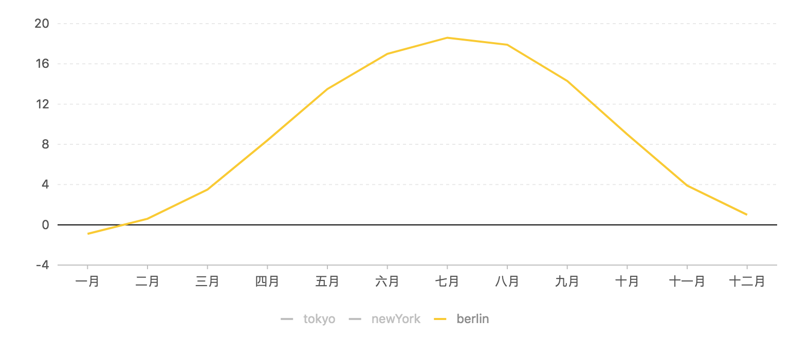
const data = [{ month: 0, tem: 7, city: 'tokyo' },{ month: 1, tem: 6.9, city: 'tokyo' },{ month: 2, tem: 9.5, city: 'tokyo' },{ month: 3, tem: 14.5, city: 'tokyo' },{ month: 4, tem: 18.2, city: 'tokyo' },{ month: 5, tem: 21.5, city: 'tokyo' },{ month: 6, tem: 25.2, city: 'tokyo' },{ month: 7, tem: 26.5, city: 'tokyo' },{ month: 8, tem: 23.3, city: 'tokyo' },{ month: 9, tem: 18.3, city: 'tokyo' },{ month: 10, tem: 13.9, city: 'tokyo' },{ month: 11, tem: 9.6, city: 'tokyo' },{ month: 0, tem: -0.2, city: 'newYork' },{ month: 1, tem: 0.8, city: 'newYork' },{ month: 2, tem: 5.7, city: 'newYork' },{ month: 3, tem: 11.3, city: 'newYork' },{ month: 4, tem: 17, city: 'newYork' },{ month: 5, tem: 22, city: 'newYork' },{ month: 6, tem: 24.8, city: 'newYork' },{ month: 7, tem: 24.1, city: 'newYork' },{ month: 8, tem: 20.1, city: 'newYork' },{ month: 9, tem: 14.1, city: 'newYork' },{ month: 10, tem: 8.6, city: 'newYork' },{ month: 11, tem: 2.5, city: 'newYork' },{ month: 0, tem: -0.9, city: 'berlin' },{ month: 1, tem: 0.6, city: 'berlin' },{ month: 2, tem: 3.5, city: 'berlin' },{ month: 3, tem: 8.4, city: 'berlin' },{ month: 4, tem: 13.5, city: 'berlin' },{ month: 5, tem: 17, city: 'berlin' },{ month: 6, tem: 18.6, city: 'berlin' },{ month: 7, tem: 17.9, city: 'berlin' },{ month: 8, tem: 14.3, city: 'berlin' },{ month: 9, tem: 9, city: 'berlin' },{ month: 10, tem: 3.9, city: 'berlin' },{ month: 11, tem: 1, city: 'berlin' }];const chart = new G2.Chart({container: 'c1',width: 800,height: 350});const defs = {month: {type: 'cat',values: [ '一月', '二月', '三月', '四月', '五月', '六月', '七月', '八月', '九月', '十月', '十一月', '十二月' ]}};chart.source(data,defs);chart.filter('city', val => {return val === 'berlin';}); // 只展示 berlin 的数据chart.line().position('month*tem').color('city');chart.render();
如何绘制多 y 轴图表
在 G2 中,实现多 Y 轴的绘制非常简单,用户完全不需要做任何配置。只要做到各个 geom 的 X 轴属性相同, Y 轴属性不同,G2 就会为您自动生成。
chart.interval().position('month*rainfall').color('#95ceff');chart.line().position('month*temperature').color('#90ed7d').size(2).shape('smooth');
这个时候就会自动生成两条 y 轴,分别对应 rainfall 和 temperature。
示例: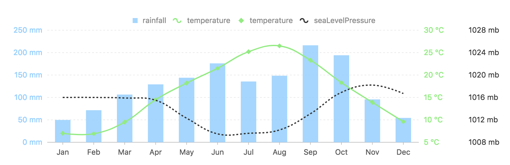
const data = [{ month: 'Jan', rainfall: 49.9, seaLevelPressure: 1016, temperature: 7 },{ month: 'Feb', rainfall: 71.5, seaLevelPressure: 1016, temperature: 6.9 },{ month: 'Mar', rainfall: 106.4, seaLevelPressure: 1015.9, temperature: 9.5 },{ month: 'Apr', rainfall: 129.2, seaLevelPressure: 1015.5, temperature: 14.5 },{ month: 'May', rainfall: 144, seaLevelPressure: 1012.3, temperature: 18.2 },{ month: 'Jun', rainfall: 176, seaLevelPressure: 1009.5, temperature: 21.5 },{ month: 'Jul', rainfall: 135.6, seaLevelPressure: 1009.6, temperature: 25.2 },{ month: 'Aug', rainfall: 148.5, seaLevelPressure: 1010.2, temperature: 26.5 },{ month: 'Sep', rainfall: 216.4, seaLevelPressure: 1013.1, temperature: 23.3 },{ month: 'Oct', rainfall: 194.1, seaLevelPressure: 1016.9, temperature: 18.3 },{ month: 'Nov', rainfall: 95.6, seaLevelPressure: 1018.2, temperature: 13.9 },{ month: 'Dec', rainfall: 54.4, seaLevelPressure: 1016.7, temperature: 9.6 }];const chart = new G2.Chart({container: 'chart3',forceFit: true, // 宽度自适应height: 300,padding: [ 60, 160, 60, 90 ]});chart.source(data, {rainfall: {min: 0,tickInterval: 50,alias: '降雨量'},temperature: {min: 5,tickInterval: 5,alias: '温度'},seaLevelPressure: {min: 1008,max: 1028,tickInterval: 4,alias: '海平面气压'}});// 左侧 Y 轴,即降雨量轴chart.axis('rainfall', {label: {formatter: val => {return val + ' mm'; // 格式化坐标轴显示},textStyle: {fill: '#95ceff'}},line: null,tickLine: null});// 右侧第一个 Y 轴,即温度轴chart.axis('temperature', {line: null,tickLine: null,label: {formatter: val => {return val + ' °C'; // 格式化坐标轴显示},textStyle: {fill: '#90ed7d'}}});// 右侧第二个 Y 轴,即海平面气压轴chart.axis('seaLevelPressure', {line: null,tickLine: null,label: {offset: 80,formatter: val => {return val + ' mb'; // 格式化坐标轴显示},textStyle: {fill: '#333'}}});chart.legend({position: 'top'});chart.tooltip({crosshairs: {type: 'line'}});chart.interval().position('month*rainfall').color('#95ceff'); // 降雨量chart.line().position('month*temperature').color('#90ed7d').size(2).shape('smooth'); // 温度chart.point().position('month*temperature').color('#90ed7d').shape('diamond');chart.line().position('month*seaLevelPressure').shape('smooth').size(2).color('#333').style({lineDash: [ 3, 3 ]}); // 海平面气压chart.render();
如何绘制混合图表
G2 采用图层的设计,每一个几何标记 geom 对应一个图形,当需要绘制混合图表时,直接在 chart 对象上创建不同的 geom 几何对象即可。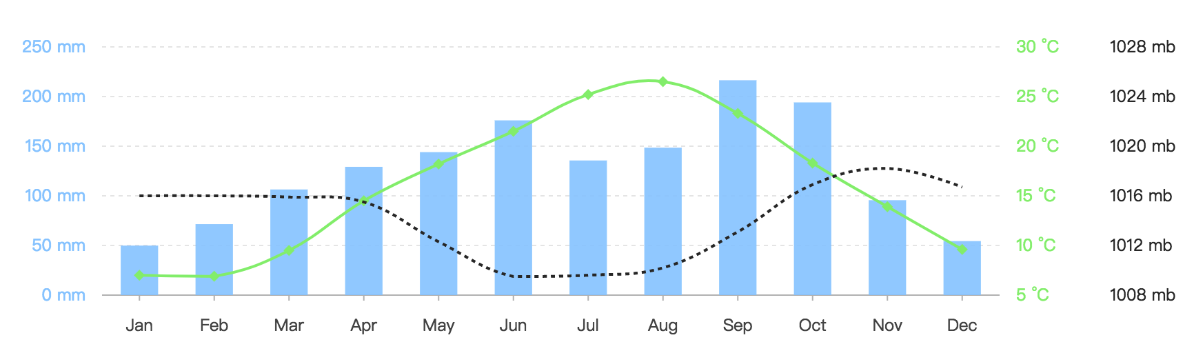
在这个例子中除了生成多 Y 轴之外还绘制了混合图表(柱状图、线图以及点图)。
参考如何绘制多 y 轴图表。
如何修改 tooltip 的显示内容
G2 提供了多种修改 tooltip 显示内容的方法,详见 tooltip 提示信息 教程。
如何导出图片
直接调用 chart.downloadImage(); 即可导出图片。
但是注意最好在 chart 生成后延时几秒调用,因为 chart 默认是有执行动画的,如:
setTimeout(function() {chart.downloadImage();}, 1500);

若有收获,就点个赞吧
0 人点赞
