开始
微信内禁止保存图片
// 给图片添加这个属性pointer-events: none;user-select: none;
图片下白边
// div里嵌套了img底部会有白块// 因为img默认是按基线(baseline)对齐的vertical-align: bottom; 推荐// 因为img在浏览器里的默认样式是inline,除非有特别的需要否则还是不改变盒模型为好,// 在这个问题中本质还是行内元素的纵向对齐问题,// 可以给img调整vertical-align来解决,本题中用bottom就行了display:block; 不推荐
图片上白边
// html img 图片上方产生1像素px间隙解决// 通过css对图片加一个浮动元素,比如.divcss5 img{ float:left}// 将图片高度处理为单数(1、3、5、7单数),比如图片本身为200px高度,// 为了解决我们将图片PS处理成201px或199px高度。
小于12px
font-size: 12px;transform-origin: 0% 0%; /*修正缩放引起的偏移*/transform: scale(0.92); /*缩放到视觉效果11px*/
使用div显示图片时
background-color: rgba(239, 242, 247, 1); // 建议写上默认色background-position: center;background-size: cover;background-repeat: no-repeat;image-rendering: -webkit-optimize-contrast;
图片不清晰
image-rendering: -webkit-optimize-contrast;
设置默认图片
div背景图方式时
background-image: url(${props => props.image}), url(${iconDefaultImage});
img标签时
<img src="abc.jpg" οnerrοr="nofind()" /><script type="text/javascript">function nofind(){var img=event.srcElement;img.src="http://mat1.gtimg.com/cd/2017/home/nlogo0518.png"; //替换的图片img.οnerrοr=null; //控制不要一直触发错误}</script>
文本省略号显示
文本省略号是非常常见的需求,而省略号展示又通常分为俩种情况折行和不折行。
不折行:
div {overflow: hidden;/* 规定超出内容宽度的元素隐藏 */white-space:nowrap;/* 规定文本是否折行 */text-overflow: ellipsis;/* 规定超出的内容文本省略号显示,通常跟上面的属性连用,因为没有上面的属性不会触发超出规定的内容 */}
折行:
div {display: -webkit-box; /* 将对象作为弹性伸缩盒子模型显示 */overflow: hidden;text-overflow: ellipsis;-webkit-line-clamp: 4; /* 控制最多显示几行 *//* autoprefixer: ignore next */ /* 编译后丢失问题 */-webkit-box-orient: vertical; /* 设置或检索伸缩盒对象的子元素的排列方式 */}
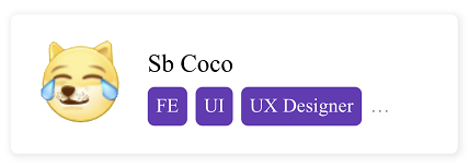
超长文本整块省略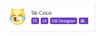
将 display: inline 改为 display: inline-block 实现整块省略
.person-card__desc {width: 200px;white-space: nowrap;overflow: hidden;text-overflow: ellipsis;}.person-card__desc span {display: inline-block;}
iOS 不支持整块超长溢出打点省略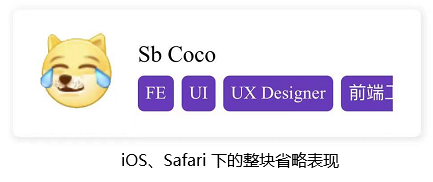
解决方案,使用多行省略替代单行省略
.person-card__desc {width: 200px;white-space: normal;overflow : hidden;text-overflow: ellipsis;display: -webkit-box;-webkit-line-clamp: 1;-webkit-box-orient: vertical;}.person-card__desc span {display: inline-block;}
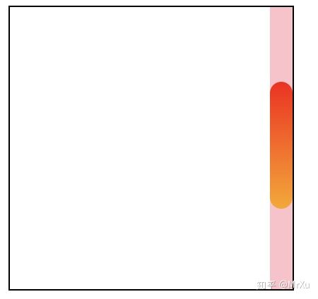
改变滚动条样式
首先要明确滚动条的组成分为三个部分,滚动条容器 scrollbar, 滚筒条轨道 scrollbar-track,滚动条滑块 scrollbar-thumb。然而我写这篇文字的时候尝试了一下轨道的内容可以直接在容器设置,也就是没有清晰的区分容器和轨道之间的区别。
div::-webkit-scrollbar {/* 这里的宽是指竖向滚动条的宽,高是指横向滚动条的高*/width: 16px;height: 16px;background: pink;}div::-webkit-scrollbar-thumb {border-radius: 10px;background:linear-gradient(red,orange);}<img src="https://pic2.zhimg.com/v2-08cb45500644b92f7037cd36f2702e22_b.jpg" data-caption="" data-size="normal" data-rawwidth="450" data-rawheight="424" class="origin_image zh-lightbox-thumb" width="450" data-original="https://pic2.zhimg.com/v2-08cb45500644b92f7037cd36f2702e22_r.jpg">
最后一个 div 不显示下边框
div:not(:last-child) /* 匹配非最后一个 div 元素的 div 元素 */
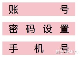
设置文本俩端对齐—段落建议设置
div {width: 100px;padding: 0 10px;background: pink;margin-bottom: 10px;text-align: justify; /* 这是关键属性 */text-align-last: left; /* 这是关键属性 */}<div>账号</div><div>密码设置</div><div>手机号</div>
图片文字水平对齐
图片使用before或者after的方式比较好。
使用img标签,可能会阻塞页面,而background-image却不会。
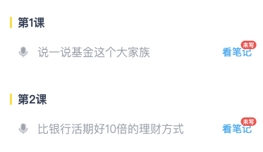
// 第一课 的样式div {position: relative;padding: 0 0 0 11px; /* 这是关键属性,给左侧留出位置 */width: 100%;height: 18px;&:before {position: absolute;left: 0;top: 50%; /* 这是关键属性,使左侧的样式居中显示 */transform: translateY(-50%); /* 这是关键属性,使左侧的样式居中显示 */content: '';width: 3px;height: 16px;background: yellow;border-radius: 2px;}}
// 说一说基金这个大家族 的样式div{position: relative;flex: 1;margin: 0 0 0 11px;padding: 0 0 0 28px; /* 这是关键属性,给左侧留出位置 */height: 44px;font-size: 16px;line-height: 44px;color: ${props => props.theme.font100};overflow: hidden;text-overflow: ellipsis;white-space: nowrap;&:before {position: absolute;left: 0;top: 50%;transform: translateY(-50%);display: inline-block;content: '';width: 16px;height: 16px;background: url(${props => props.image});/* 左边图片的尺寸是16*16 */background-repeat: no-repeat;background-size: cover;}}
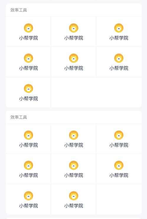
格子布局
[
  {
    title: '办公系统',
    list: [
      {
        subTitle: '小帮学院',
        icon: iconUser,
        link: 'http://www.baidu.com',
      },
    ],
  },
  {
    title: '效率工具',
    list: [
      {
        subTitle: '小帮学院',
        icon: iconUser,
        link: 'http://www.baidu.com',
      },
      {
        subTitle: '小帮学院',
        icon: iconUser,
        link: 'http://www.baidu.com',
      },
    ],
  }
 ]
.cardBox {
  margin: 0 0 8px;
  width: 100%;
  border-radius: 8px;
  background-color: #ffffff;
}

.cardTitle {
  position: relative;
  padding: 12px;
  // prettier-ignore
  font-size: 14PX;
  font-weight: 400;
  color: #999999;
  &:after {
    position: absolute;
    left: 0;
    right: 0;
    bottom: 0;
    display: block;
    content: '';
    height: 1px;
    border-bottom: 1px solid #cccccc;
    transform: scaleY(0.33);
    overflow: hidden;
  }
}

.cardContent {
  display: flex;
  flex-direction: row;
  flex-wrap: wrap;
  overflow: hidden;
}

.card {
  position: relative;
  display: flex;
  flex-direction: column;
  align-items: center;
  justify-content: center;
  width: 33.3%;
  height: 80px;
  &:before {
    position: absolute;
    right: 0;
    top: -100px;
    bottom: 0;
    display: block;
    content: '';
    height: 240px;
    border-right: 1px solid #eeeeee;
    transform: scaleY(0.5);
    overflow: hidden;
  }
  &:after {
    position: absolute;
    left: 0;
    right: 0;
    bottom: 0;
    display: block;
    content: '';
    border-bottom: 1px solid #cccccc;
    transform: scaleY(0.33);
    overflow: hidden;
  }
  img {
    width: 24px;
    height: 24px;
  }
  span {
    margin-top: 8px;
    // prettier-ignore
    font-size: 16PX;
    font-weight: 400;
    color: #324057;
  }
}

.card:nth-child(3n) {
  &:before {
    border-right: 0;
  }
}

// 最下面一行的item
// 最下面一行的item
// 最下面一行的item
.card:nth-child(3n + 1):nth-last-child(-n + 3),
.card:nth-child(3n + 1):nth-last-child(-n + 3) ~ .card {
  &:after {
    border-bottom: 0;
  }
}
<div className={styles.cardBox} key={key}>
  <div className={styles.cardTitle}>{item.title}</div>
  <div className={styles.cardContent}>
    {list.map(subItem => {
    const { subTitle, icon, key: subKey } = subItem;
    return (
    <div className={styles.card} key={subKey}>
      <img src={icon} alt="" />
      <span>{subTitle}</span>
    </div>
    );
    })}
  </div>
</div>
建议
- 所有的段落都用p便签包含,并且加上text-align: justify; text-align-last: left;
- 多使用before和after解决小图标,但是如果有点击效果,最好还是使用img标签
- 头像的动画
- 如果图片质量足够了,但是图片不清晰,给图片添加 image-rendering: -webkit-optimize-contrast;
参考
- 开发效率创新高,只因收下了这波 CSS 操作 - MrXu的文章 - 知乎 https://zhuanlan.zhihu.com/p/80713907
- image-rendering 像素化图像像素(实验中)
- 前端DEMO以及基础的效果,CSS3简单的动画特效

若有收获,就点个赞吧
0 人点赞
