其实 ggplot2 并没有类似于 geom_pie() 这样的函数实现饼图的绘制,它是由 geom_bar() 柱状图经过 coord_polar() 极坐标弯曲从而得到的。
对于为什么 ggplot2 中没有专门用于饼图绘制的函,有人说:“柱状图的高度,对应于饼图的弧度,饼图并不推荐,因为人类的眼睛比较弧度的能力比不上比较高度(柱状图)”。关于饼状图被批评为可视化效果差,不推荐在 R 社区中使用的文章在网络也有不少,感兴趣的可以去搜一下。
不管怎么说,学习一下总不是坏事,趁着一些客户刚好对饼图有需求,学习重温一下。
极坐标系
极坐标应该是高中数学的知识,对我而言,基本都已经忘光了,结合网上的一些资料重温一下。
极坐标是指在平面内取一个定点 O,叫极点,引一条射线 Ox,叫做极轴,再选定一个长度单位和角度的正方向(通常取逆时针方向)。对于平面内任何一点 M,用 ρ 表示线段 OM 的长度(有时也用 r 表示),θ 表示从 Ox 到 OM 的角度,ρ 叫做点 M 的极径,θ 叫做点 M 的极角,有序数对 (ρ, θ) 就叫点 M 的极坐标,这样建立的坐标系叫做极坐标系。通常情况下,M 的极径坐标单位为 1(长度单位),极角坐标单位为 rad(或 °)。
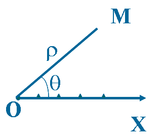
极坐标系中一个重要的特性是,平面直角坐标中的任意一点,可以在极坐标系中有无限种表达形式。通常来说,点(r, θ)可以任意表示为(r, θ ± n×360°)或 (−r, θ ± (2n + 1)180°),这里 n 是任意整数。如果某一点的 r 坐标为 0,那么无论 θ 取何值,该点的位置都落在了极点上。
笛卡尔坐标和极坐标之间的转换,请参考数学乐网站的《极坐标与笛卡尔坐标》一文,非常详细直观。
coord_polar
coord_polar() 是 ggplot2 中的极坐标函数,它可以弯曲横纵坐标,使用这个函数做出蜘蛛图或饼图的效果。我在网络上查了一下,比较少看到关于 coord_polar() 原理的介绍,只是在 ggplot2 的 Tidyverse 上发现了几个例子。
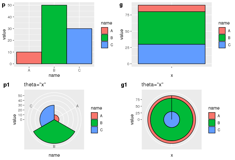
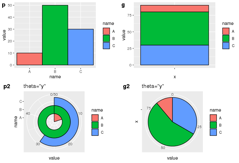
library(ggpubr)library(ggplot2)df <- data.frame(name = c("A", "B", "C"), value = c(10, 50, 30))p <- ggplot(df, aes(x=name, y=value, fill=name)) + geom_bar(stat="identity", width=1, colour="black")g <- ggplot(df, aes(x="", y=value, fill=name)) + geom_bar(stat="identity", width=1, colour="black")
用法
coord_polar() 主要有四个参数: theta, start, direction 和 clip 。
coord_polar(theta = "x", start = 0, direction = 1, clip = "on")
- theta:variable to map angle to (
xory). - start:offset of starting point from 12 o’clock in radians.
- direction:1, clockwise; -1, anticlockwise.
- clip:Should drawing be clipped to the extent of the plot panel? A setting of
"on"(the default) means yes, and a setting of"off"means no.
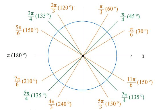
小知识:角度制 vs 弧度制 ** 1度=π/180≈0.01745弧度,1弧度=180/π≈57.3度。
角的度量单位通常有两种,一种是角度制,另一种就是弧度制。 角度制,就是用角的大小来度量角的大小的方法。在角度制中,我们把周角的 1/360 看作 1 度,那么,半周就是 180 度,一周就是 360 度。由于 1 度的大小不因为圆的大小而改变,所以角度大小是一个与圆的半径无关的量。
弧度制,顾名思义,就是用弧的长度来度量角的大小的方法。单位弧度定义为圆周上长度等于半径的圆弧与圆心构成的角。由于圆弧长短与圆半径之比,不因为圆的大小而改变,所以弧度数也是一个与圆的半径无关的量。角度以弧度给出时,通常不写弧度单位,有时记为 rad 或 R。
参数示例
结合一些示例,理解一下 coord_polar() 的几个参数。
- theta=”x”
**
x 轴极化,x 轴刻度值对应扇形弧度,y 轴刻度值对应圆环半径。p 中由于 x 是等长的,所以 p1 每一个弧度为 60 度;p2 的每一个弧度为 360 度。
p1 <- p + coord_polar(theta="x") + labs(title="theta=\"x\"")g1 <- g + coord_polar(theta="x") + labs(title="theta=\"x\"")ggarrange(p, g, p1, g1, ncol=2, nrow=2, labels=c("p", "g", "p1", "g1"))
- theta=”y”
y 轴极化,y 轴刻度值对应扇形弧度,x 轴长度对应扇形半径。对于并列柱状图 p,以最大的 y 值作为 360 度的弧度,剩下的按比例类推,由于 p 中 A、B、C 是等长的,所以在 p1 中它们的半径是 1:2:3。对于堆叠柱状图 g,把 y 值按照比例划分弧度,因此它们的弧度比等于各自的 y 值比例。
p2 <- p + coord_polar(theta="y") + labs(title="theta=\"y\"")g2 <- g + coord_polar(theta="y") + labs(title="theta=\"y\"")ggarrange(p, g, p2, g2, ncol=2, nrow=2, labels=c("p", "g", "p2", "g2"))
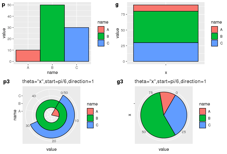
- start=pi/6, direction=1
起始位置为距离 12 点针方向 30 度,顺时针排列。
p3 <- p + coord_polar(theta="y", start=pi/6, direction=1) + labs(title="theta=\"x\",start=pi/6,direction=1")g3 <- g + coord_polar(theta="y", start=pi/6, direction=1) + labs(title="theta=\"x\",start=pi/6,direction=1")ggarrange(p, g, p3, g3, ncol=2, nrow=2, labels=c("p", "g", "p3", "g3"))
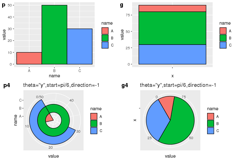
- start=pi/6, direction=-1
起始位置为距离 12 点针方向 30 度,逆时针排序。
p4 <- p + coord_polar(theta="y", start=pi/6, direction=-1) + labs(title="theta=\"y\",start=pi/6,direction=-1")g4 <- g + coord_polar(theta="y", start=pi/6, direction=-1) + labs(title="theta=\"y\",start=pi/6,direction=-1")ggarrange(p, g, p4, g4, ncol=2, nrow=2, labels=c("p", "g", "p4", "g4"))
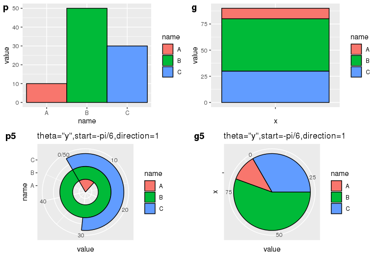
- start=-pi/6, direction=1
起始位置为距离 12 点针方向负 30 度,顺时针排序。
p5 <- p + coord_polar(theta="y", start=-pi/6, direction=1) + labs(title="theta=\"y\",start=-pi/6,direction=1")g5 <- g + coord_polar(theta="y", start=-pi/6, direction=1) + labs(title="theta=\"y\",start=-pi/6,direction=1")ggarrange(p, g, p5, g5, ncol=2, nrow=2, labels=c("p", "g", "p5", "g5"))
Github 上有关于 coord-pola.r 的源码,整个代码只有 300 多行,有兴趣的同学可以去研究一下,上面的理解如有不对的地方还请看官们帮忙指正。
饼图中添加文字的位置控制 - 借助公式
绘制饼图的过程中,利用 ggplot2 的 geom_bar 结合 coord_polar 实现。
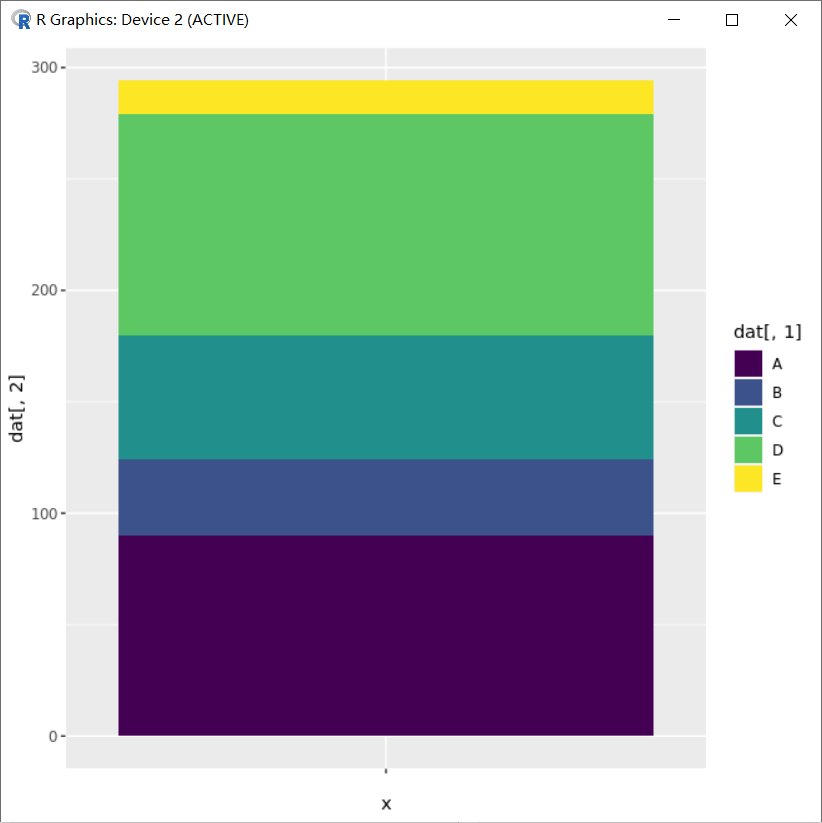
# Load ggplot2library(ggplot2)# Create Datadata <- data.frame(group=LETTERS[1:5], value=c(13,7,9,21,2))# Basic piechartggplot(data, aes(x="", y=value, fill=group)) +geom_bar(stat="identity", width=1) +coord_polar("y", start=0)
需要理解的点是饼图的排布是按照 aes(fill) 的因子顺序确定的。譬如数据如下:
> dat <- data.frame(type=LETTERS[1:5], Num=c(90, 34, 56, 99, 15))> dattype Num1 A 902 B 343 C 564 D 995 E 15
必须根据数据先确定 mapping 中 aes(fill) 的因子顺序,譬如这里会按照 dat$type 填充,这种非有序因子会基于字母顺序来默认其填充顺序。
为了确定数据填充的先后,同时方便在不同区域上填写上对应数据的大小,所以会先去创建有序因子,从而使数据列 dat$Num 的自然顺序和因子的顺序在一定程度上一致(一致的同向对应或反向对应)。譬如如下使方向一致:
dat$type <- factor(dat$type,levels = dat$type,order=T)dat$type
有序因子的结果则如下,和 dat$Num 的顺序能够一致上,不会出现对应错乱问题。
[1] A B C D ELevels: A < B < C < D < E
画图:
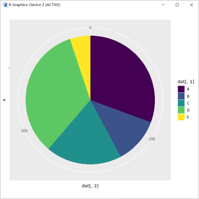
p_pie <- ggplot(dat, aes(x="", y=dat[,2], fill=dat[,1]))+geom_bar(stat="identity", width=1)+coord_polar(theta="y", direction=1)+scale_fill_brewer(palette ="Set3", direction = 1)+labs(x="", y="", fill="Type")+ggtitle(label ="test", subtitle=NULL)p_pie
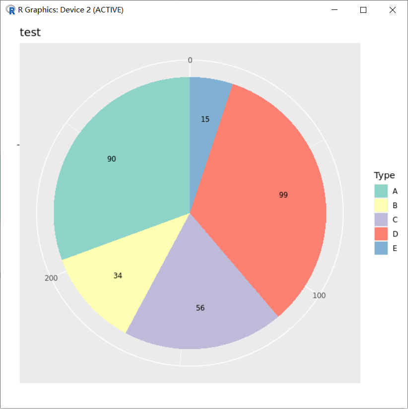
结合下图结果可以看出坐标轴方向使顺时针,而颜色设置 scale_fill_brewer(palette ="Set3",direction = 1) 设定了第一个颜色填充到第一个因子对应的 “A” 上,这样就反映出在图片实际分布中数据和因子是反向对应的。虽然在 dat 数据框中设置是顺序一致方向相同的对应,但图片分布中会改变。
小知识:scale_fill_brewer
scale_fill_brewer 是一个 ggplot2 和 RColorBrewer 关联的一个扩展调色板,其他可用于 scale_fill_brewer 调色板的颜色包括:
Diverging BrBG, PiYG, PRGn, PuOr, RdBu, RdGy, RdYlBu, RdYlGn, Spectral Qualitative Accent, Dark2, Paired, Pastel1, Pastel2, Set1, Set2, Set3 Sequential Blues, BuGn, BuPu, GnBu, Greens, Greys, Oranges, OrRd, PuBu, PuBuGn, PuRd, Purples, RdPu, Reds, YlGn, YlGnBu, YlOrBr, YlOrRd
参考:https://ggplot2.tidyverse.org/reference/scale_brewer.html

结合图片中反向对应的关系,在 A 区块上中间位置填充上对应的文字 “Num:90”,它的坐标因该是 sum(dat$Num)-90 +90/2 ;如果是 B 区块对应的应该坐标为 sum(dat$Num)-90-34 +34/2 ,归纳为:sum(dat$Num)-cumsum(dat$Num)+dat$Num/2,即:
> sum(dat$Num)-cumsum(dat$Num)+dat$Num/2[1] 249.0 187.0 142.0 64.5 7.5
小知识:R 语言 cumsum 函数 **
cumsum是 R 语言base包 cum 系列的一个函数,它的功能是计算向量的累积和并返回。cum 系列还有另外三个函数:cumprod,cummin,cummax,它们的作用分别是计算向量的累积的乘积、极小值、极大值,并返回。
# 对数值型向量求和> cumsum(1:10)[1] 1 3 6 10 15 21 28 36 45 55# 对数值型矩阵求和,结果返回仍是向量> cumsum(matrix(1:12, nrow = 3))[1] 1 3 6 10 15 21 28 36 45 55 66 78# 对数据框求和,返回结果仍然是数据框,cumsum 会对对每个变量进行求和处理> cumsum(data.frame(a = 1:10, b = 21:30))a b1 1 212 3 433 6 664 10 905 15 1156 21 1417 28 1688 36 1969 45 22510 55 255
结合 geom_text(aes(x,y)) 的位置设置,保证中间文字填写不会出错:
p_pie=p_pie+geom_text(aes(x=1.2,y=sum(dat$Num)-cumsum(dat$Num)+dat$Num/2 ,label=as.character(dat[,2])),size=3)p_pie
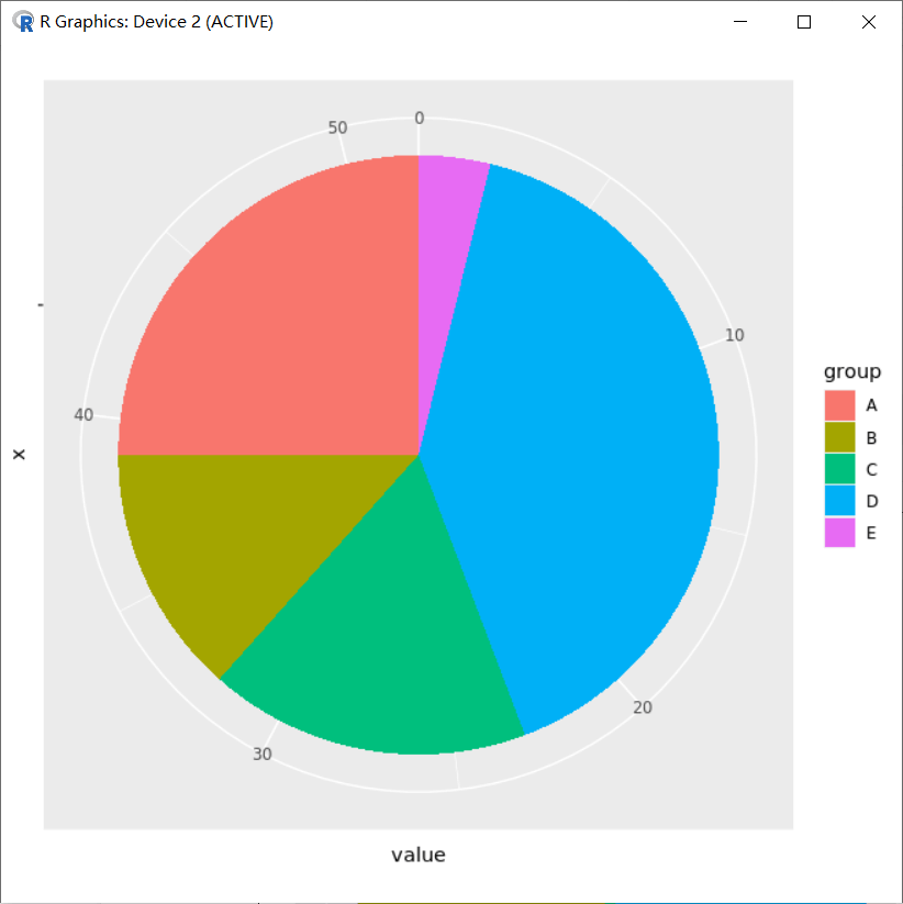
如果最初构建有序因子的方向和实际数据的方向反向对应呢?
dat$type=factor(dat$type,levels = rev(dat$type),order=T)dat$typep_pie=ggplot(dat,aes(x="",y=dat[,2],fill=dat[,1]))+geom_bar(stat="identity",width=1)+coord_polar(theta="y",direction=1)+scale_fill_brewer(palette ="Set3",direction = 1)+labs(x="",y="",fill="Type")+ggtitle(label ="test",subtitle=NULL)p_pie
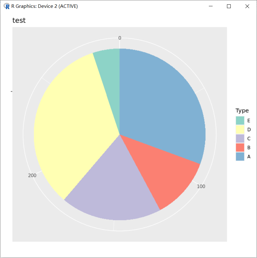
结合图片可以知道,第一个因子 “E” 对应了第一个颜色,不过从图片显示坐标中可以看到,”A” 在前,而 “A” 在原始数据 dat$Num 中对应的数据也在前 90,这样计算位置就会发生改变了,这时候 “A” 文字应该对应 90-90/2,文字 “B” 将对应 90+34-34/2,…,归纳为 cumsum(dat$Num)-dat$Num/2 。
> cumsum(dat$Num)-dat$Num/2[1] 45.0 107.0 152.0 229.5 286.5
而且图例也是反向的,需要结合 guides(fill=guide_legend(reverse=T)) ,并且希望第一个颜色对应最后一个因子 “A”, scale_fill_brewer(palette ="Set3",direction = -1) :
dat$type=factor(dat$type,levels = rev(dat$type),order=T)dat$typep_pie=ggplot(dat,aes(x="",y=dat[,2],fill=dat[,1]))+geom_bar(stat="identity",width=1)+coord_polar(theta="y",direction=1)+scale_fill_brewer(palette ="Set3",direction = -1)+labs(x="",y="",fill="Type")+ggtitle(label ="test",subtitle=NULL)+guides(fill=guide_legend(reverse = T))+geom_text(aes(x=1.2,y=cumsum(dat$Num)-dat$Num/2 ,label=as.character(dat[,2])),size=3)p_pie
总结可知:ggplot2 在画饼图的过程中设定填充的因子方向总和图片坐标中的方向相反,不过因子的顺序和数据 dat$Num 的对应关系是正向对应或者反向对应,会影响相关区块的中心位置值计算的方式,从而影响 geom_text 中文字定位。
饼图中添加文字的位置控制 - 非公式
介绍一下,不利用公式,而利用 geom_bar(position) 和 geom_text(postion) 控制饼图文字的添加过程。
- 数据
> type <- c("A","B","C","D","E")> Num <- c(90,34,56,99,15)> dat <- data.frame(type,Num)> dattype Num1 A 902 B 343 C 564 D 995 E 15
- 创建有序因子,方便颜色填充
> dat$type <- factor(dat$type,levels = dat$type,order=T)> dat$type[1] A B C D ELevels: A < B < C < D < E
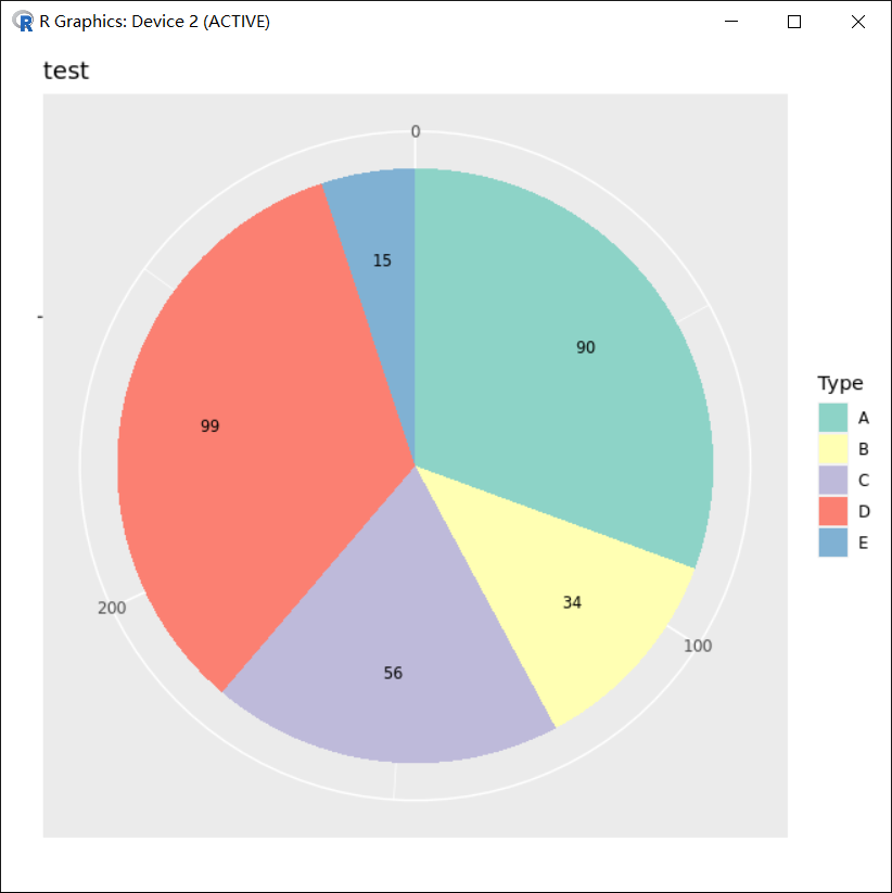
- 画图,柱状图 position_stack(reverse =T) 控制填充顺序反向,第一个起始于坐标 0 的位置
p_pie=ggplot(dat,aes(x="",y=dat[,2],fill=dat[,1]))+geom_bar(stat="identity",width=1,position = position_stack(reverse =T))p_pie
- 极坐标变换与颜色等设置
###添加极坐标进行图片变换p_pie=p_pie+coord_polar(theta="y",direction=1)p_pie
###修改颜色、标签p_pie=p_pie+scale_fill_brewer(palette ="Set3",direction = 1)+labs(x="",y="",fill="Type")+ggtitle(label ="test",subtitle=NULL)p_pie

- 控制 geom_text(position)
### 添加文字,文字位置控制position = position_stack(reverse =T,vjust=0.5)### reverse =T与柱子填充顺序同时反向,vjust=0.5在堆叠柱子的中间位置添加文字p_pie=p_pie+geom_text(aes(x=1.2,label=as.character(dat[,2])),position = position_stack(reverse =T,vjust=0.5),size=3)p_pie

sessionInfo
本次学习 R 和相关包版本信息。
> sessionInfo()R version 3.6.2 (2019-12-12)Platform: x86_64-conda_cos6-linux-gnu (64-bit)Running under: CentOS Linux 7 (Core)Matrix products: defaultBLAS/LAPACK: /usr/local/software/miniconda3/lib/libopenblasp-r0.3.8.solocale:[1] LC_CTYPE=en_US.UTF-8 LC_NUMERIC=C[3] LC_TIME=en_US.UTF-8 LC_COLLATE=en_US.UTF-8[5] LC_MONETARY=en_US.UTF-8 LC_MESSAGES=en_US.UTF-8[7] LC_PAPER=en_US.UTF-8 LC_NAME=C[9] LC_ADDRESS=C LC_TELEPHONE=C[11] LC_MEASUREMENT=en_US.UTF-8 LC_IDENTIFICATION=Cattached base packages:[1] stats graphics grDevices utils datasets methods baseother attached packages:[1] ggplot2_3.2.1loaded via a namespace (and not attached):[1] Rcpp_1.0.3 viridisLite_0.3.0 digest_0.6.25 withr_2.1.2[5] crayon_1.3.4 dplyr_0.8.3 assertthat_0.2.1 grid_3.6.2[9] R6_2.4.0 gtable_0.3.0 magrittr_1.5 scales_1.0.0[13] pillar_1.4.3 rlang_0.4.5 lazyeval_0.2.2 labeling_0.3[17] RColorBrewer_1.1-2 glue_1.3.1 purrr_0.3.2 munsell_0.5.0[21] compiler_3.6.2 pkgconfig_2.0.3 colorspace_1.4-1 tidyselect_0.2.5[25] tibble_2.1.3>
FAQ:如何实现 R 语言饼图标签的 overlap 问题?
有没有通用的 R 包或者函数,可以得到下面效果的饼图?

**
参考资料
- Daitoue,《饼图 pie - ggplot2》,OmicsClass
- Daitoue,《饼图中添加文字的位置控制-ggplot2(非公式)》,OmicsClass
:::info 特别声明:文章中关于”饼图中添加文字的位置控制(借助公式与非公式)” 部分内容,主要参考了 Daitoue 在 OmicsClass 的两篇文章(详见参考资料),在这里特别感谢一下。参考的文章主要用于学习交流目的,如有任何侵权,请第一时间与我联系。 :::

若有收获,就点个赞吧
0 人点赞
