什么是 Dashboard
关于什么是Dashboard,可看我的这篇文章《什么是管理驾驶舱》。本篇内容汇集了好几篇网文、在线课程,出处已难考,只能感谢前辈们的分享。
这里也摘抄几个还不错的概念:
- 狭义的定义:a predominantly visual information display that people use to rapidly monitor current conditions that require a timely response to fulfill a specific role.
- 宽泛的定义:a visual display of data used to monitor conditions and/or facilitate understanding。用于监控现状或者实现业务理解的数据的视觉化展示。
the dashboard concept has evolved from single-view reporting screens to include interactive interfaces with multiple views and purposes, including communication, learning, and motivation, in addition to the classic notions of monitoring and decision support.
可能划分得还不够合理,但是可以突出仪表板设计时的两个要点:
- (1)the visual genre of dashboards :由简单的统计图 and/or 巨大的数字拼接形成的数据视觉呈现
- a visual data representation structured as a tiled layout of simple charts and/or large numbers
- the functional genre :能够实时监控的可交互的展示
- an interactive display that enables real-time monitoring of dynamically updating data
- (1)the visual genre of dashboards :由简单的统计图 and/or 巨大的数字拼接形成的数据视觉呈现
- 类型一:统计数值 + 统计图表
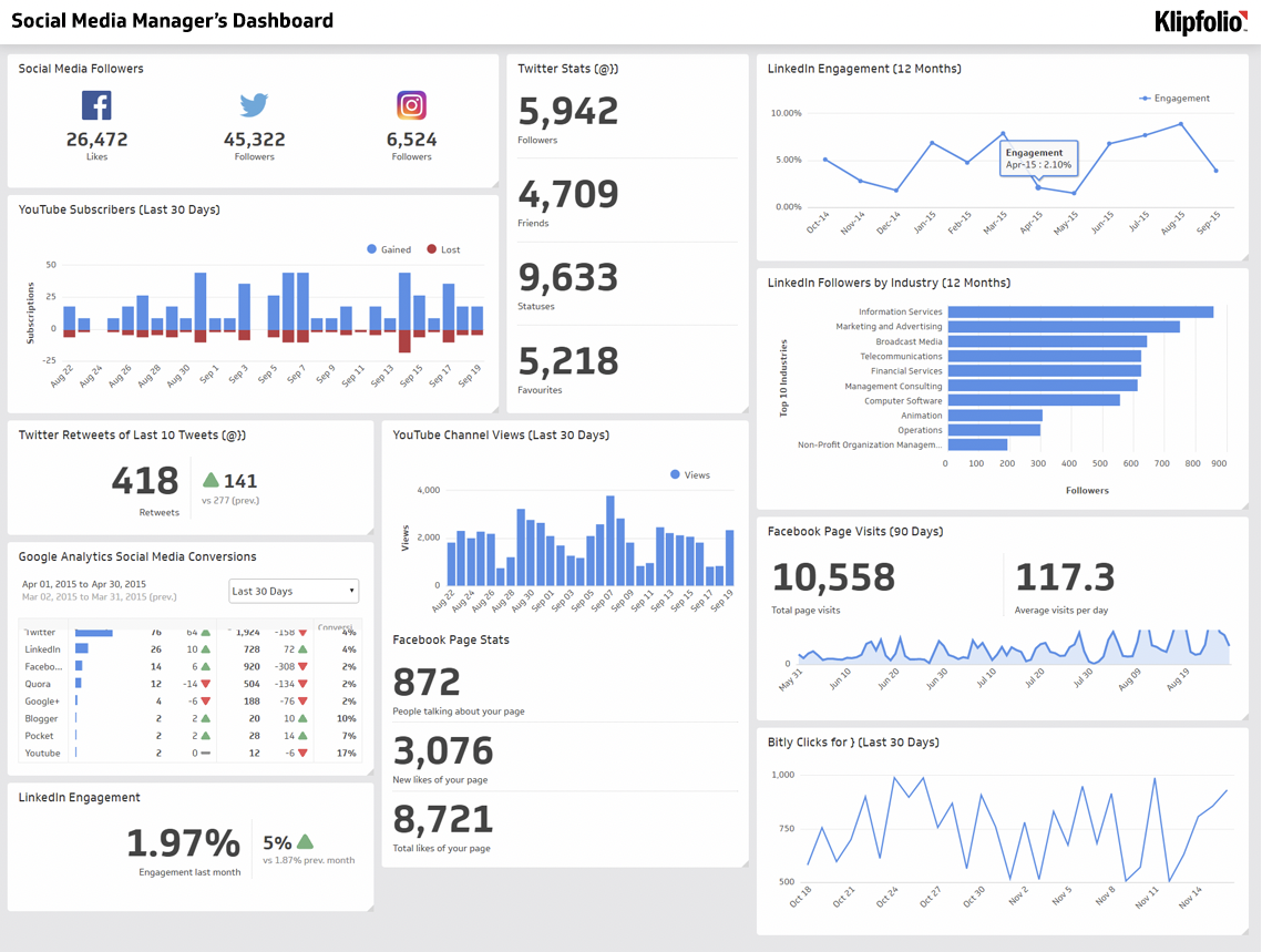
- 类型二:统计数值 + 图表 + 文字说明 + 指示图案
Dashboard 按使用目的分类
- Dashboards for Decision-Making 支持决策
- strategic decision-making 战略决策
- operational decision-making 运营决策
- Static Dashboards for Awareness(传统仪表板的设计模式范例)
- Static Operational
- 运营场景下使用,所需可视化解读能力低,需要特定领域知识,交互性低。
- Static Organizational
- 面向组织内受众的,可以“一目了然”的,比如发送给主管或者展示在工作环境的显示器上的。
- Static Operational
- Dashboards for Motivation and Learning
- Qualified Self:个人
- primarily tactical and operation decision-making, with interactive interfaces and alerting.
- Communication:一般大众
- 模糊的决策能力,大约一半的体现了决策的目标;基本都是为了沟通和教育受众的;没有 alerting 或者 benchmark;倾向于简单直白地展示数据。
- Qualified Self:个人
- Dashboards Evolved 其他类型
- Many of these examples visually appeared as dashboards, but may not fit the strictest definition of dashboard functionality. 很多可能严格上不符合仪表板的概念。
仪表板的 15 个要素
- a design space consisting of 15 visual and functional aspects of dashboards.
- 这 15 个要素分成四组:purpose, audience, visual & interactive features, and data semantics.
-
Purpose 目标
Decision Support
- 运营层面的关注数据时间段较短,战术层面的关注数据时间段较长且指标更多。决策支持型的都往往会兼顾全局视角和详情视角。
- Strategic
- Tactical
- Operational
Communication and Learning
Circulation 流通区域
- Public:社会相关的数据
- Social:某一个人有选择地控制可以看到数据的人群。如某一个兴趣团体。
- Organizational:同一个组织架构下的多个个体间
- Individual:个人查看,或分享给有限的受信任个别个体的。
- Required Visualization Literacy 所需的可视化解读能力
- Low:basic visualization types such as bar and line charts with typical faceting and aggregation
- Medium:combined dual axes, scatterplots, cumulative measures, and heatmaps
- High:techniques known by a typical visualization student or practitioner: radar, treemap, and network vi- sualizations, error bars or intervals, connected scatterplots, or other custom visualizations.
- Requires Advanced Domain Expertise
- 用户可以设计或者定制仪表板。
- 通过 filters 或者 slicers 来获取数据的切片。
- 基于仪表板上展示的数据修改数据、世界的状态(可能说的是底层数据)。
Construction and Composition
- 允许用户修改视图的构成
Multipage
- 分页(tab 页),提供相关的决策工具或提供必要的信息
Interactive Interface 交互式的界面
- 允许用户专注于与他们相关的数据:
- faceting the data with slicers and filters 使用切片器或筛选器选取数据
- cross-highlighting by selecting data items within the views 通过选择数据项来高亮数据
- drilling up and down the levels of data hierarchy 在不同的数据层级间上卷或下钻
- 允许用户专注于与他们相关的数据:
Highlighting & Annotating
- 高亮或者标记特定的视图,便于持续地继续分析
Modify Data or the World
Alerting + Notification 异常值报警 / 通知
- Benchmarks 达标符号
- Updatable 数据自动更新
- Metrics
- 数据的选择和呈现方式影响了决策的范围和本质。
- 选择正确的指标对于那些不太通晓分析的组织是一个挑战,很多组织缺少搭建指标和数据呈现的组织能力和数据解读力。
- Impoverished Data Vocabulary
- 需要更加复杂的指标和呈现方式来表现复杂的问题分析过程中的微妙之处。
优质仪表板的特点(仪表板设计自查手册)
数据源
- 使用了正确的数据源。
- 正确地命名了数据源名称。
-
指标
含义
- 正确且简明的命名,符合命名规范。
- 复杂指标、不常用指标给出了必要的解释。
- 同一个指标使用同一个指标名,同一份指标解释。至少在本仪表板上统一,最好能做到全业务线统一。
- 计算
- 正确地计算了该指标,且确保各处计算方式唯一且正确。
解答
选用了恰当的图表
- 标题、坐标轴名、图例等不缺失,且恰当地使用了它们。
- 指标名前后统一。
-
交互性能 / 引导式分析
使用了必要的交互功能
- 交互功能有助于提升报表的分析性、降低用户的理解门槛。
- 不采用多余的交互。
-
业务
确保报表针对的问题与业务紧密结合,或是能够提出、分析、解决问题。
- 不是为了分析而分析,为了展示而展示的报表。
仪表板设计中的常见挑战
第一类:终端用户灵活性 End-User Flexibility
- drill down options 下钻选项
- level of detail adjustments 详细级别调整
- search 搜索
- comparison support 对比支持
- adaptability to different users 适应不同的用户(研究难点)
- adaptability to different situations 适应不同的环境(研究难点)
- adaptability to different display devices or multi-display environments 适应不同的显示设备或多显示屏的环境(研究难点)
- 终端用户自定义视图的功能需求很大
- more analytical support in their tools
- 自动分析(模式识别、预测、what-if 模拟)
- 目标设定、游戏化 gamification
storytelling ability
支持可视化解读能力、分析能力、数据解读能力较弱的用户一直是一个主题
- finding and extracting data (Level 1)
- integrating data and finding relations (Level 2)
- analyzing implicit relationships, generating, and predicting (Level 3)
- A frequent example of analytic illiteracy was the confusion between correlation and causation. 常见的分析错误:混淆相关性和因果性
- 可视化解读能力的缺失也包括:指标理解能力 和 常规图表解读能力
- 简化仪表板的使用一直是一个问题。训练终端用户是作者的负担。
- 显式的指导,如教程;编入仪表板内部的指导。
- 问题的严重性可能会超过我们的想象:对于有些用户filter 这样的功能也会显得过于复杂。
- 通过减少交互功能和降低报表的自定义能力来降低复杂度。
- The golden rule is to simplify, simplify, simplify!
- meet the needs of both casual and power users 的关键是 support the information needs of power users and then turn off functionality as needed to avoid overwhelming casual users with too many bells and whistles or pathways to explore.
- 建立跨组织的设计原则。
- 仪表板作者们自己也面临着学习曲线,随着数据的“爆炸”,很多仪表板作者并不是数据分析专家或视觉设计专家。
- the need for accessible templates, guidelines, and learning resources to help non-experts become proficient.

若有收获,就点个赞吧
0 人点赞
