背景
图可视化有时需要借助动画达到展示、分析的目的。合理的动画不仅可以为视觉带来更多炫酷的体验,也能够辅助图的分析。
图 1. 时序图的动画展示。
问题
有如下数据集,节点北京地铁线路的起点和终点;边代表一条地铁线路,其 controlPoints 字段是边的控制点集合:
{"nodes": [{"id": "0","x": 12955418.07889617,"y": 4858516.455509626,"class": "地铁二号线","name": "地铁二号线 0"}, {"id": "1","x": 12955418.07889617,"y": 4858516.455509626,"class": "地铁二号线","name": "地铁二号线 1"},...],"edges": [{"id": "0","source": "0","target": "1","class": "地铁二号线","name": "地铁二号线 0","controlPoints": [{"x": 12956158.028659772,"y": 4858523.099945488}, {"x": 12956181.882943347,"y": 4858523.313643505}, {"x": 12956333.569265882,"y": 4858524.675979247}, {"x": 12956722.101097316,"y": 4858528.426228019}, {"x": 12956892.09019568,"y": 4858529.577087689},...]},...]}
如果使用 G6 简单地绘制默认样式,将会得到如下结果: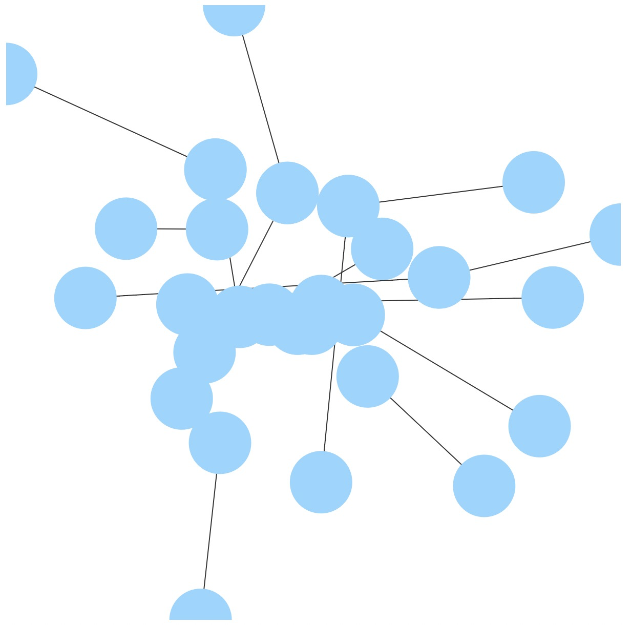
图 2. G6 渲染原始数据结果。
上图中的边被绘制成了直线,难以看出任何有用信息。
期待效果
我们希望可以利用 G6 绘制一个能够反映一定地理信息,且有交通动感的图。要实现下图效果,涉及到的 G6 主要功能是自定义节点、自定义边,在自定义中实现动画效果。
图 3. 期待效果图。
实现步骤
画布背景设置
为了实现荧光效果,并反映地理信息,我们给画布贴了一个暗色系的北京地图。
在 HTML 或 CSS 中设置 canvas 的 style :
<style>canvas{background: rgb(0, 0, 0);background-image: url("./assets/data/background-small.png");background-size: 600px 600px;}</style>
自定义呼吸节点
节点的呼吸效果是通过为节点增加循环播放的渐大、渐淡的 Halo 实现的。
// 自定义呼吸节点名为 breath-nodeG6.registerNode('breath-node', {afterDraw(cfg, group) {const r = cfg.size / 2;const haloColor = cfg.color || (cfg.style && cfg.style.fill);const back1 = group.addShape('circle', {zIndex: -2,attrs: {x: 0,y: 0,r,fill: haloColor,opacity: 0.6}});const back2 = group.addShape('circle', {zIndex: -1,attrs: {x: 0,y: 0,r,fill: haloColor,opacity: 0.6}});group.sort(); // 排序,根据zIndex 排序const delayBase = Math.random() * 2000;back1.animate({ // 逐渐放大,并消失r: r + 10,opacity: 0.0,repeat: true // 循环}, 3000, 'easeCubic', null, delayBase) // 无延迟back2.animate({ // 逐渐放大,并消失r: r + 10,opacity: 0.0,repeat: true // 循环}, 3000, 'easeCubic', null, delayBase + 1000) // 1 秒延迟}}, 'circle');
自定义边
边的动画效果是通过在边上增加沿着边的路径移动的小圆点实现的。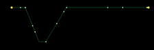
G6.registerEdge('running-polyline', {afterDraw(cfg, group) {const shape = group.get('children')[0];const length = shape.getTotalLength(); // 获取边的总长度const startPoint = shape.getPoint(0);let circleCount = Math.ceil(length / 20); // 根据边总长度计算该边上的小圆点数量circleCount = circleCount === 0 ? 1 : circleCount;// 生成小圆点for (let i = 0; i < circleCount; i++) {// 小圆点动画的随机延迟const delay = Math.random() * 1000;const start = shape.getPoint(i / circleCount);// 加入小圆点const circle = group.addShape('circle', {attrs: {x: start.x,y: start.y,r: 0.8,fill: '#A0F3AF',shadowColor: '#fff',shadowBlur: 30,}});// 小圆点的动画circle.animate({// 动画的每一帧,返回小圆点在该帧的位置,入参 ratio 是 [0, 1] 的比例值onFrame(ratio) {ratio += i / circleCount;if (ratio > 1) {ratio %= 1;}// 根据比例值获取在边上的位置const tmpPoint = shape.getPoint(ratio);return {x: tmpPoint.x,y: tmpPoint.y};},repeat: true // 循环动画}, 10 * length, 'easeCubic', null, delay);}}}, 'polyline'); // 继承 polyline 折线
实例化图
在这一步中,我们在实例化图时,为之指定节点和边的类型(刚才自定义的 breath-node 和 running-polyline)、节点样式、边样式。
const graphSize = [ 600, 600 ];const graph = new G6.Graph({container: 'mountNode',width: graphSize[0],height: graphSize[1],defaultNode: {shape: 'breath-node',size: 3,style: {lineWidth: 0,fill: 'rgb(240, 223, 83)'}},defaultEdge: {shape: 'running-polyline',size: 1,color: 'rgb(14,142,63)',style: {opacity: 0.4,lineAppendWidth: 3}}});
整理数据并渲染
这里使用了JQuery 读取文件中的数据。由于地理数据中的 y 坐标代表的是经度,其方向与画布的 y 轴方向相反,因此需要将其反向。下面代码还使用了 scaleNodesPoints 函数将节点和边归一化到之前定义的图大小 graphSize。另外,我们根据边的聚类信息设置边的颜色。
// 边的颜色数组const colors = [ 'rgb(64, 174, 247)', 'rgb(108, 207, 169)', 'rgb(157, 223, 125)','rgb(240, 198, 74)', 'rgb(221, 158, 97)', 'rgb(141, 163, 112)','rgb(115, 136, 220)', 'rgb(133, 88, 219)', 'rgb(203, 135, 226)','rgb(227, 137, 163)' ];// 使用 JQuery 读取数据文件$.getJSON('./assets/data/beijing-metro-lines.json', data => {const nodes = data.nodes;const edges = data.edges;const classMap = new Map();let classId = 0;// 反向节点的 y 坐标nodes.forEach(node => {node.y = -node.y;});edges.forEach(edge => {// 根据边的聚类信息设置边的颜色。同一条地铁线路使用同一种颜色if (edge.class && classMap.get(edge.class) === undefined) {classMap.set(edge.class, classId);classId ++;}const cid = classMap.get(edge.class);edge.color = colors[cid % colors.length];const controlPoints = edge.controlPoints;// 反向边控制点的 y 坐标controlPoints.forEach(cp => {cp.y = -cp.y;});})scaleNodesPoints(nodes, edges, graphSize);graph.data(data); // 为图实例配置数据源graph.render(); // 渲染图});
scaleNodesPoints 函数如下:
function scaleNodesPoints(nodes, edges, graphSize) {const size = graphSize[0] < graphSize[1] ? graphSize[0] : graphSize[1];let minX = 99999999999999999;let maxX = -99999999999999999;let minY = 99999999999999999;let maxY = -99999999999999999;nodes.forEach(node => {if (node.x > maxX) maxX = node.x;if (node.x < minX) minX = node.x;if (node.y > maxY) maxY = node.y;if (node.y < minY) minY = node.y;});edges.forEach(edge => {const controlPoints = edge.controlPoints;controlPoints.forEach(cp => {if (cp.x > maxX) maxX = cp.x;if (cp.x < minX) minX = cp.x;if (cp.y > maxY) maxY = cp.y;if (cp.y < minY) minY = cp.y;});});const xScale = maxX - minX;const yScale = maxY - minY;nodes.forEach(node => {node.orix = node.x;node.oriy = node.y;node.x = (node.x - minX) / xScale * size;node.y = (node.y - minY) / yScale * size;});edges.forEach(edge => {const controlPoints = edge.controlPoints;controlPoints.forEach(cp => {cp.x = (cp.x - minX) / xScale * size;cp.y = (cp.y - minY) / yScale * size;});});}
设置 edge-tooltip
使用 edge-tooltip,可以在鼠标 hover 到边上时展示该边的某些信息。首先在 HTML 中设定 tooltip 的样式:
<style>.g6-tooltip {border: 1px solid #e2e2e2;border-radius: 4px;font-size: 12px;color: #545454;background-color: rgba(255, 255, 255, 0.9);padding: 10px 8px;box-shadow: rgb(174, 174, 174) 0px 0px 10px;}</style>
然后,在上一步实例化 graph 时,增加一个名为 modes 的配置项到参数中,如下写法启动了 edge-tooltip,在 formatText 函数中指定了 edge-tooltip 显示的文本内容:
modes: {default: [{type: 'edge-tooltip',formatText(model) {const text = model.class;return text;},shouldUpdate: e => {return true;}}]}
这样,当鼠标移动到节点上时,带有该边所属地铁线路信息的 tooltip 将会出现:
edge-tooltip
最终效果

最终效果图。节点代表地铁线路的起点和终点。边的颜色代表不同的地铁线路。鼠标放置在边上出现有该边所属的地铁线路名的 edge-tooltip。
完整代码
自此,该案例完成。完整代码参见:Metro Animation Case。

若有收获,就点个赞吧
0 人点赞
