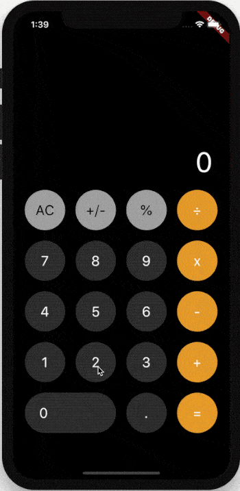
整个项目的 UI 分为两大部分,一部分是顶部显示数字和计算结果,另一部分是底部的输入按钮。
calculator.dart 整体布局
整体布局使用 Column,在不同分辨率的手机上,规定底部固定大小,剩余空间都由顶部组件填充,所以顶部组件使用 Expanded 扩充。
import 'package:flutter/material.dart';import 'calculator_keyboard.dart';class CalCulatorDemo extends StatefulWidget {@override_CalCulatorDemoState createState() => _CalCulatorDemoState();}class _CalCulatorDemoState extends State<CalCulatorDemo> {String _text = '';_onValueChange(String value) {print('_onValueChange => $value');}@overrideWidget build(BuildContext context) {return Material(color: Colors.black,child: Container(padding: EdgeInsets.symmetric(horizontal: 20),width: double.infinity,child: Column(children: [Expanded(child: Container(color: Colors.green,alignment: Alignment.bottomRight,padding: EdgeInsets.only(right: 10),child: Text('$_text',maxLines: 1,style: TextStyle(color: Colors.white, fontSize: 48, fontWeight: FontWeight.w700),),),),SizedBox(height: 20),//底部的输入按钮组件CalculatorKeyboard(onValueChange: _onValueChange,),SizedBox(height: 80),],),),);}}
calculator_item.dart 按钮封装
CalculatorKeyboard 是底部的输入按钮组件,也是此项目的重点,除了 0 这个按钮外,其余都是圆形按钮,不同之处是 高亮颜色(按住时颜色)、背景颜色、按钮文本、文本颜色不同,因此需要封装。
import 'package:flutter/material.dart';typedef CalculatorValueChanged<T> = Function(T value);class CalculatorItem extends StatelessWidget {CalculatorItem({key,this.text,this.textColor = Colors.white,this.color,this.highlightColor,this.width,this.onValueChange,}) : super(key: key);final String text; //文字final Color textColor; //前景色final Color color; //背景色final Color highlightColor; //高亮背景色final double width; //宽度final CalculatorValueChanged<String> onValueChange; //点击按钮的回调,参数是当前按钮的文本@overrideWidget build(BuildContext context) {return Ink(decoration: BoxDecoration(color: color,borderRadius: BorderRadius.circular(200),),child: InkWell(borderRadius: BorderRadius.circular(200),radius: 200,highlightColor: highlightColor ?? color,onTap: () {onValueChange('$text');},child: Container(width: width ?? 70,height: 70,padding: EdgeInsets.only(left: width == null ? 0 : 25),alignment: width == null ? Alignment.center : Alignment.centerLeft,child: Text('$text',style: TextStyle(color: textColor ?? Colors.white, fontSize: 24),),),),);}}
calculator_keyboard.dart 输入按钮布局
输入按钮的布局使用 Wrap 布局组件,如果没有 0 这个组件也可以使用 GridView组件。
import 'package:flutter/material.dart';import 'calculator_item.dart';class CalculatorKeyboard extends StatelessWidget {CalculatorKeyboard({key, this.onValueChange}) : super(key: key);final CalculatorValueChanged<String> onValueChange;static const colorNum = Color(0xFF363636);static const colorTopSymbol = Color(0xFFA5A5A5);static const colorRightSymbol = Color(0xFFE89E28);static const colorRightHighlight = Color(0xFFE89E28);static const colorRightSymbolHighlight = Color(0xFFEDC68F);final List<Map> _keyboardList = [{'text': 'AC', 'color': colorTopSymbol, 'highlightColor': colorRightHighlight, 'textColor': Colors.black},{'text': '+/-', 'color': colorTopSymbol, 'highlightColor': colorRightHighlight, 'textColor': Colors.black},{'text': '%', 'color': colorTopSymbol, 'highlightColor': colorRightHighlight, 'textColor': Colors.black},{'text': '÷', 'color': colorRightSymbol, 'highlightColor': colorRightSymbolHighlight},{'text': '7', 'color': colorNum},{'text': '8', 'color': colorNum},{'text': '9', 'color': colorNum},{'text': 'x', 'color': colorRightSymbol, 'highlightColor': colorRightSymbolHighlight},{'text': '4', 'color': colorNum},{'text': '5', 'color': colorNum},{'text': '6', 'color': colorNum},{'text': '-', 'color': colorRightSymbol, 'highlightColor': colorRightSymbolHighlight},{'text': '1', 'color': colorNum},{'text': '2', 'color': colorNum},{'text': '3', 'color': colorNum},{'text': '+', 'color': colorRightSymbol, 'highlightColor': colorRightSymbolHighlight},// 0 这个按钮的宽度是两个按钮的宽度 + 两个按钮的间隙{'text': '0', 'color': colorNum, 'width': 170.0},{'text': '.', 'color': colorNum},{'text': '=', 'color': colorRightSymbol, 'highlightColor': colorRightSymbolHighlight},];@overrideWidget build(BuildContext context) {return Wrap(runSpacing: 18, //垂直间距spacing: 30, //水平间距children: _keyboardList.map((item) {return CalculatorItem(text: item['text'],textColor: item['textColor'],color: item['color'],highlightColor: item['highlightColor'],width: item['width'],onValueChange: onValueChange,);}).toList(),);}}
计算
这里有4个变量:
- _text:显示当前输入的数字和计算结果。
- _beforeText:用于保存被加数,比如输入 5+1,保存 5 ,用于后面的计算。
- _isResult:表示当前值是否为计算的结果,true:新输入数字直接显示,false:新输入数字和当前字符串相加,比如当前显示 5,如果是计算的结果,点击 1 时,直接显示1,否则显示 51。
- _operateText:保存加减乘除。
import 'package:flutter/material.dart';import 'calculator_keyboard.dart';class CalCulatorDemo extends StatefulWidget {@override_CalCulatorDemoState createState() => _CalCulatorDemoState();}class _CalCulatorDemoState extends State<CalCulatorDemo> {String _text = '0'; //显示当前输入的数字和计算结果。String _beforeText = '0'; //用于保存被加数,比如输入 5+1,保存 5 ,用于后面的计算。bool _isResult = false; //表示当前值是否为计算的结果,true:新输入数字直接显示,false:新输入数字和当前字符串相加,// 比如当前显示 5,如果是计算的结果,点击 1 时,直接显示1,否则显示 51。String _operateText = ''; //保存加减乘除。double _valueToDouble(String value) {if (_text.startsWith('-')) {String s = value.substring(1);return double.parse(s) * -1;} else {return double.parse(value);}}_onValueChange(String value) {print('_onValueChange => $value');setState(() {switch (value) {// AC 按钮表示清空当前输入,显示 0,同时初始化其他变量:case 'AC':_text = '0';_beforeText = '0';_isResult = false;break;// +/- 按钮表示对当前数字取反,比如 5->-5:case '+/-':if (_text.startsWith('-')) {_text = _text.substring(1);} else {_text = '-$_text';}break;// % 按钮表示当前数除以100:case '%':double d = _valueToDouble(_text);_isResult = true;_text = '${d / 100.0}';break;// +、-、x、÷ 按钮,保存当前 操作符号:case '+':case '-':case 'x':case '÷':_isResult = false;_operateText = value;break;// 0-9 和 . 按钮根据是否是计算结果和是否有操作符号进行显示:case '0':case '1':case '2':case '3':case '4':case '5':case '6':case '7':case '8':case '9':case '.':// 重新开始计算if (_isResult) {_text = value;}//if (_operateText.isNotEmpty && _beforeText.isEmpty) {_beforeText = _text;_text = '';}_text += value;if (_text.startsWith('0')) {_text = _text.substring(1);}break;// = 按钮计算结果:case '=':double d = _valueToDouble(_beforeText);double d1 = _valueToDouble(_text);switch (_operateText) {case '+':_text = '${d + d1}';break;case '-':_text = '${d - d1}';break;case 'x':_text = '${d * d1}';break;case '÷':_text = '${d / d1}';break;}_beforeText = '';_isResult = true;_operateText = '';break;default:}});}@overrideWidget build(BuildContext context) {return Material(color: Colors.black,child: Container(padding: EdgeInsets.symmetric(horizontal: 20),width: double.infinity,child: Column(children: [Expanded(child: Container(color: Colors.green,alignment: Alignment.bottomRight,padding: EdgeInsets.only(right: 10),child: Text('$_text',maxLines: 1,style: TextStyle(color: Colors.white, fontSize: 48, fontWeight: FontWeight.w700),),),),SizedBox(height: 20),CalculatorKeyboard(onValueChange: _onValueChange,),SizedBox(height: 80),],),),);}}
- 不足之一:计算结果逻辑,上面计算结果的逻辑是不完美的,当增加一个操作符(比如 取余),计算逻辑复杂度将会以指数级方式增加,那为什么还要用此方式?最重要的原因是计算结果逻辑不是此项目的重点,作为一个Flutter的入门项目重点是熟悉组件的使用,计算器的计算逻辑有一个比较著名的方式:后缀表达式的计算过程,然而此方式偏向于算法,对初学者非常不友好,因此,我采用了一种不完美但适合初学者的逻辑。
- 不足之二:此App没有考虑横屏的情况,为什么?因为横屏很可能导致整体布局发生变化,横屏时按钮是变大还是拉伸,或者拉伸间隙?不同的方式使用的布局会发生变化,因此,目前只考虑了竖屏的布局,实际项目中要考虑横屏情况吗?其实这是一个用户体验的问题,首先问问自己,为什么要横屏?横屏可以显著的提升用户体验吗?如果不能,为什么要花费大力气适配横屏呢?

若有收获,就点个赞吧
0 人点赞
