Flutter中很多组件都有一个叫做shape的属性,类型是ShapeBorder,比如Button类、Card等组件,shape表示控件的形状,系统已经为我们提供了很多形状,对于没有此属性的组件,可以使用 Clip 类组件进行裁减。
shape
BeveledRectangleBorder 斜角矩形边框
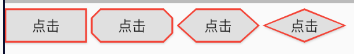
RaisedButton(child: Text('点击'),onPressed: () {},shape: BeveledRectangleBorder(side: BorderSide(width: 1, color: Colors.red),borderRadius: BorderRadius.circular(0), //如果半径设置为0,就是矩形。// borderRadius: BorderRadius.circular(10),// borderRadius: BorderRadius.circular(20),// borderRadius: BorderRadius.circular(1000), //如果设置的半径比控件还大,就会变成菱形:),),
CircleBorder 圆形边框

RaisedButton(child: Text('点击'),onPressed: () {},shape: CircleBorder(side: BorderSide(color: Colors.red),),),
RoundedRectangleBorder、ContinuousRectangleBorder
RoundedRectangleBorder圆角矩形ContinuousRectangleBorder连续的圆角矩形,直线和圆角平滑连续的过渡,和RoundedRectangleBorder相比,圆角效果会小一些。
RaisedButton(child: Text('点击'),onPressed: () {},shape: RoundedRectangleBorder(side: BorderSide(width: 1, color: Colors.red), //设置边框borderRadius: BorderRadius.circular(10), //设置圆角),),RaisedButton(child: Text('点击'),onPressed: () {},shape: ContinuousRectangleBorder(side: BorderSide(width: 1, color: Colors.red),borderRadius: BorderRadius.circular(20),),),
StadiumBorder 两边圆形,中间矩形
类似足球场的形状,两边圆形,中间矩形。
shape: StadiumBorder(side: BorderSide(color: Colors.red),),
OutlineInputBorder
带外边框。
shape: OutlineInputBorder(borderSide: BorderSide(color: Colors.red),borderRadius: BorderRadius.circular(10),),
UnderlineInputBorder
下划线边框。
shape: UnderlineInputBorder(borderSide: BorderSide(color: Colors.red),),
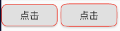
Border
RaisedButton(child: Text('点击'),onPressed: () {},// shape: Border.all(color: Colors.red),// shape: Border.symmetric(// vertical: BorderSide(),// horizontal: BorderSide(color: Colors.red, width: 4),// ),shape: Border(top: BorderSide(color: Colors.red, width: 10),right: BorderSide(color: Colors.blue, width: 10),bottom: BorderSide(color: Colors.yellow, width: 10),left: BorderSide(color: Colors.green, width: 10),),),
BorderDirectional
BorderDirectional和Border基本一样,区别就是BorderDirectional带有阅读方向,大部分国家阅读是从左到右,但有的国家是从右到左的,比如阿拉伯等。
RaisedButton(child: Text('点击'),onPressed: () {},// shape: Border.all(color: Colors.red),// shape: Border.symmetric(// vertical: BorderSide(),// horizontal: BorderSide(color: Colors.red, width: 4),// ),shape: BorderDirectional(top: BorderSide(color: Colors.red, width: 10),end: BorderSide(color: Colors.blue, width: 10),bottom: BorderSide(color: Colors.yellow, width: 10),start: BorderSide(color: Colors.green, width: 10),),),
Clip 裁剪
Flutter中提供了一些剪裁函数,用于对组件进行剪裁。
Rect.fromLTRB()
比如 截取一张图片,原图的宽高分别为w和h,Rect.fromLTRB(0, 0, w/2, h/2) :从原图片中截取一个矩形,矩形的坐标从(0.0)到(w/2, h/2)。
ClipOval 裁剪为圆
子组件为正方形时剪裁为内贴圆形,为矩形时,剪裁为内贴椭圆。
ClipOval(child: Image.network('https://www.bugclose.com/oss/27/42/b9/001e190a04c6.jpg', width: 100),),ClipOval(child: Image.network('https://images.h128.com/upload/202012/20/202012201302083641.jpg',width: 200,),),
ClipRRect 裁剪为圆角矩形
将子组件剪裁为圆角矩形。
ClipRRect(borderRadius: BorderRadius.circular(15),child: Image.network('https://www.bugclose.com/oss/27/42/b9/001e190a04c6.jpg', width: 100),),
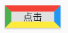
ClipRect 裁剪溢出部分
剪裁子组件到实际占用的矩形大小(溢出部分剪裁)。
ClipRect组件使用矩形裁剪子组件,通常情况下,ClipRect作用于CustomPaint 、 CustomSingleChildLayout 、 CustomMultiChildLayout 、 Align 、 Center 、 OverflowBox 、 SizedOverflowBox组件。定义如下:
ClipRect({Key key,this.clipper,this.clipBehavior = Clip.hardEdge,Widget child,})
clipBehavior参数定义了裁剪的方式,只有子控件超出父控件的范围才有裁剪的说法,各个方式说明如下:
- none:不裁剪,系统默认值,如果子组件不超出边界,此值没有任何性能消耗。
- hardEdge:裁剪但不应用抗锯齿,速度比
none慢一点,但比其他方式快。 - antiAlias:裁剪而且抗锯齿,此方式看起来更平滑,比
antiAliasWithSaveLayer快,比hardEdge慢,通常用于处理圆形和弧形裁剪。 - antiAliasWithSaveLayer:裁剪、抗锯齿而且有一个缓冲区,此方式很慢,用到的情况比较少。
示例
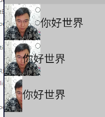
Widget avatar = Image.network('https://www.bugclose.com/oss/27/42/b9/001e190a04c6.jpg',width: 100,);Widget text = Text("你好世界", textScaleFactor: 2);...Column(crossAxisAlignment: CrossAxisAlignment.start,children: [// 原图效果Row(children: [Align(alignment: Alignment.topLeft, child: avatar),text,]),//宽度设为原来宽度一半,另一半会溢出Row(children: [Align(alignment: Alignment.topLeft, widthFactor: 0.5, child: avatar),text,]),//宽度设为原来宽度一半,将溢出部分剪裁Row(children: [ClipRect(child: Align(alignment: Alignment.topLeft, widthFactor: 0.5, child: avatar),),text,]),],),
ClipPath 按路径裁剪
根据路径进行裁剪,我们自定义裁剪路径也可以使用系统提供的。shape参数是ShapeBorder类型,系统已经定义了很多形状,介绍如下:
- RoundedRectangleBorder:圆角矩形
- ContinuousRectangleBorder:直线和圆角平滑连续的过渡,和RoundedRectangleBorder相比,圆角效果会小一些。
- StadiumBorder:类似于足球场的形状,两端半圆。
- BeveledRectangleBorder:斜角矩形。
- CircleBorder:圆形。
ClipPath.shape(shape: StadiumBorder(),child: Container(height: 150,width: 250,child: Image.network('https://www.bugclose.com/oss/27/42/b9/001e190a04c6.jpg',fit: BoxFit.cover,),),),
CustomClipper
CustomClipper并不是一个组件,而是一个abstract(抽象)类,使用CustomClipper可以绘制出任何我们想要的形状。
示例1
如果我们想剪裁子组件的特定区域,比如,在上面示例的图片中,如果我们只想截取图片中部40×30像素的范围应该怎么做?这时我们可以使用CustomClipper来自定义剪裁区域,实现代码如下:
首先,自定义一个CustomClipper:
class MyClipper extends CustomClipper<Rect> {@overrideRect getClip(Size size) => Rect.fromLTWH(5, 15, 40, 30);// 以 距左5像素,距顶15像素位置为原点,裁剪出40*30的矩形。@overridebool shouldReclip(CustomClipper<Rect> oldClipper) => false;}
getClip()是用于获取剪裁区域的接口,由于图片大小是60×60,我们返回剪裁区域为Rect.fromLTWH(5.0, 15.0, 40.0, 30.0),即图片中部40×30像素的范围。shouldReclip()接口决定是否重新剪裁。如果在应用中,剪裁区域始终不会发生变化时应该返回false,这样就不会触发重新剪裁,避免不必要的性能开销。如果剪裁区域会发生变化(比如在对剪裁区域执行一个动画),那么变化后应该返回true来重新执行剪裁。
然后,我们通过ClipRect来执行剪裁,为了看清图片实际所占用的位置,我们设置一个红色背景: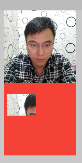
Widget avatar = Image.network('https://www.bugclose.com/oss/27/42/b9/001e190a04c6.jpg',width: 100,);...avatar,Container(color: Colors.red,child: ClipRect(clipper: MyClipper(),child: avatar,),),
示例2:三角形

Container(color: Colors.red,child: ClipPath(clipper: TrianglePath(),child: avatar,),),class TrianglePath extends CustomClipper<Path>{@overridePath getClip(Size size) {var path = Path();path.moveTo(size.width/2, 0);path.lineTo(0, size.height);path.lineTo(size.width, size.height);return path;}@overridebool shouldReclip(CustomClipper<Path> oldClipper) {return true;}}
示例3:五角星

Container(color: Colors.red,child: ClipPath(clipper: StarPath(),child: avatar,),),class StarPath extends CustomClipper<Path> {StarPath({this.scale = 2.5});final double scale; //scale参数表示间隔的点到圆心的缩放比例double perDegree = 36;/// 角度转弧度公式double degree2Radian(double degree) {return (pi * degree / 180);}@overridePath getClip(Size size) {var R = min(size.width / 2, size.height / 2);var r = R / scale;var x = size.width / 2;var y = size.height / 2;var path = Path();path.moveTo(x, y - R);path.lineTo(x - sin(degree2Radian(perDegree)) * r, y - cos(degree2Radian(perDegree)) * r);path.lineTo(x - sin(degree2Radian(perDegree * 2)) * R, y - cos(degree2Radian(perDegree * 2)) * R);path.lineTo(x - sin(degree2Radian(perDegree * 3)) * r, y - cos(degree2Radian(perDegree * 3)) * r);path.lineTo(x - sin(degree2Radian(perDegree * 4)) * R, y - cos(degree2Radian(perDegree * 4)) * R);path.lineTo(x - sin(degree2Radian(perDegree * 5)) * r, y - cos(degree2Radian(perDegree * 5)) * r);path.lineTo(x - sin(degree2Radian(perDegree * 6)) * R, y - cos(degree2Radian(perDegree * 6)) * R);path.lineTo(x - sin(degree2Radian(perDegree * 7)) * r, y - cos(degree2Radian(perDegree * 7)) * r);path.lineTo(x - sin(degree2Radian(perDegree * 8)) * R, y - cos(degree2Radian(perDegree * 8)) * R);path.lineTo(x - sin(degree2Radian(perDegree * 9)) * r, y - cos(degree2Radian(perDegree * 9)) * r);path.lineTo(x - sin(degree2Radian(perDegree * 10)) * R, y - cos(degree2Radian(perDegree * 10)) * R);return path;}@overridebool shouldReclip(StarPath oldClipper) {return oldClipper.scale != this.scale;}}
动画动态设置scale

class StartClip extends StatefulWidget {@overrideState<StatefulWidget> createState() => _StartClipState();}class _StartClipState extends State<StartClip>with SingleTickerProviderStateMixin {AnimationController _controller;Animation _animation;@overridevoid initState() {_controller =AnimationController(duration: Duration(seconds: 2), vsync: this)..addStatusListener((status) {if (status == AnimationStatus.completed) {_controller.reverse();} else if (status == AnimationStatus.dismissed) {_controller.forward();}});_animation = Tween(begin: 1.0, end: 4.0).animate(_controller);_controller.forward();super.initState();}@overrideWidget build(BuildContext context) {return Center(child: AnimatedBuilder(animation: _animation,builder: (context, child) {return ClipPath(clipper: StarPath(scale: _animation.value),child: Container(height: 150,width: 150,color: Colors.red,),);}),);}}

若有收获,就点个赞吧
0 人点赞
