PageView
PageView 控件可以实现一个“图片轮播”的效果,PageView 不仅可以水平滑动也可以垂直滑动。
PageView({Key key,this.scrollDirection = Axis.horizontal,this.reverse = false,PageController controller,this.physics,this.pageSnapping = true, //是否自动切合(是否非自由模式)this.onPageChanged, //slider 切换时回调,回调参数为改变后的索引List<Widget> children = const <Widget>[],this.dragStartBehavior = DragStartBehavior.start,this.allowImplicitScrolling = false,this.restorationId,this.clipBehavior = Clip.hardEdge,})
简单示例
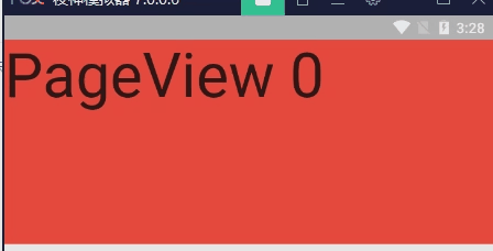
Container(height: 200,child: PageView(onPageChanged: (int index) {print('index => $index');},// pageSnapping: false,children: List.generate(4,(index) => Container(color: Colors.primaries[index % Colors.primaries.length],child: Text('PageView $index', textScaleFactor: 4),),),),),
PageController 控制器

PageView(controller: PageController(initialPage: 1, //表示当前加载第几页,默认第一页。keepPage: true,viewportFraction: 0.9, //slider 左右缩小倍数),...)
PageView.builder
PageView.builder({...@required IndexedWidgetBuilder itemBuilder,int itemCount,...})
无限滚动
import "package:flutter/material.dart";import 'package:app1/coms/base/empty_null/empty_null.dart';class TestPage extends StatefulWidget {@override_TestPageState createState() => _TestPageState();}class _TestPageState extends State<TestPage> {List sliders = [PageViewSlider(1), PageViewSlider(2), PageViewSlider(3)];@overrideWidget build(BuildContext context) {return Scaffold(appBar: EmptyNull.appBar(),body: Container(height: 200,child: PageView.builder(itemCount: 10000,itemBuilder: (context, index) {return sliders[index % sliders.length];},),),);}}class PageViewSlider extends StatelessWidget {PageViewSlider(this.index);final int index;@overrideWidget build(BuildContext context) {return Container(color: Colors.primaries[index % Colors.primaries.length],child: Text('PageView $index', textScaleFactor: 4),);}}
库 flutter_swiper
https://pub.dev/packages/flutter_swiper
中文说明:https://github.com/best-flutter/flutter_swiper/blob/master/README-ZH.md
flutter最强大的siwiper, 多种布局方式,无限轮播,Android和IOS双端适配。
配置依赖
dependencies:flutter_swiper: ^1.1.6
导入
import 'package:flutter_swiper/flutter_swiper.dart';
基本示例

import 'package:flutter/material.dart';import 'package:flutter_swiper/flutter_swiper.dart';class FlutterSwiper extends StatefulWidget {@override_FlutterSwiperState createState() => _FlutterSwiperState();}class _FlutterSwiperState extends State<FlutterSwiper> {static List<String> list = ['https://lstatic.zuimeia.com/common/image/2020/12/1/f6f251bb-132d-46e7-8740-0b0425bddae3_4835_1450.jpeg','https://lstatic.zuimeia.com/common/image/2020/11/3/cb418da0-d7a3-4b8c-829f-8cdf23ff1b08_4834_1450.jpeg','https://lstatic.zuimeia.com/common/image/2020/12/1/b4d482f1-d7cf-4af0-a70a-b35c7cb60fff_4835_1450.jpeg','https://lstatic.zuimeia.com/common/image/2020/5/28/7a62d3f3-f1f0-4963-98be-27f44c9628cc_2320_696.jpeg',];@overrideWidget build(BuildContext context) {return Container(child: Column(children: [Container(width: double.infinity,color: Colors.grey,child: AspectRatio(aspectRatio: 16 / 6,child: Swiper(itemCount: 4,itemBuilder: (context, index) {return Container(child: Image.network(list[index], fit: BoxFit.fill),);},pagination: SwiperPagination(),control: SwiperControl(),),),),Row(children: [Text('我是一个文本'),],),],),);}}
参数
基本参数
- itemWidth、itemHeight
- containerWidth、containerHeight
- scrollDirection 滚动方向(默认 Axis.horizontal)
- itemCount 数量
- itemBuilder 构造器 (Widget Function(BuildContext context, int index);)
- autoplay 是否自动轮播(默认 false)
- autoplayDisableOnInteraction 互动时是否禁止轮播(默认 true)
- autoplayDelay 轮播间隔时间(默认 3000毫秒)
- duration 轮播切换动画时间(默认 300毫秒)
- loop 无限轮播模式开关(默认 true)
- curve 动画运动方式(默认 curve: Curves.ease,)
- viewportFraction slider 左右缩小倍数。如:viewportFraction: 0.8,
- scale 上下缩小倍数(当前slider高度不缩放)。如:scale: 0.9,
- fade
- pagination 设置
pagination: SwiperPagination()展示默认分页指示器 - control 设置
control: SwiperControl()展示默认分页按钮 - index 初始下标位置(默认 0)
- onIndexChanged 当用户手动拖拽或者自动播放引起下标改变的时候调用(void onIndexChanged(int index))
- onTap 当用户点击某个轮播的时候调用(void onTap(int index))
- layout
- customLayoutOption
- indicatorLayout
分页指示器
分页指示器继承自 SwiperPlugin,SwiperPlugin 为 Swiper 提供额外的界面.设置为new SwiperPagination() 展示默认分页.
| 参数 | 默认值 | 描述 |
|---|---|---|
| alignment | Alignment.bottomCenter | 如果要将分页指示器放到其他位置,那么可以修改这个参数 |
| margin | const EdgeInsets.all(10.0) | 分页指示器与容器边框的距离 |
| builder | SwiperPagination.dots | 目前已经定义了两个默认的分页指示器样式: SwiperPagination.dots 、 SwiperPagination.fraction,都可以做进一步的自定义. |
如果需要定制自己的分页指示器,那么可以这样写:
new Swiper(...,pagination: SwiperCustomPagination(builder:(BuildContext context, SwiperPluginConfig config){return new YourOwnPaginatipon();}));pagination: SwiperPagination(margin: EdgeInsets.all(2),builder: DotSwiperPaginationBuilder(activeColor: Color.fromRGBO(255, 255, 255, 0.4),color: Color.fromRGBO(255, 255, 255, 1),size: 7,),),
控制按钮
控制按钮组件也是继承自 SwiperPlugin,设置 new SwiperControl() 展示默认控制按钮.
| 参数 | 默认值 | 描述 |
|---|---|---|
| iconPrevious | Icons.arrow_back_ios | 上一页的IconData |
| iconNext | Icons.arrow_forward_ios | 下一页的IconData |
| color | Theme.of(context).primaryColor | 控制按钮颜色 |
| size | 30.0 | 控制按钮的大小 |
| padding | const EdgeInsets.all(5.0) | 控制按钮与容器的距离 |
控制器(SwiperController)
SwiperController 用于控制 Swiper的index属性, 停止和开始自动播放. 通过 new SwiperController() 创建一个SwiperController实例,并保存,以便将来能使用。
| 方法 | 描述 |
|---|---|
| void move(int index, {bool animation: true}) | 移动到指定下标,设置是否播放动画 |
| void next({bool animation: true}) | 下一页 |
| void previous({bool animation: true}) | 上一页 |
| void startAutoplay() | 开始自动播放 |
| void stopAutoplay() | 停止自动播放 |
内建的布局
示例1

new Swiper(itemBuilder: (BuildContext context, int index) {return new Image.network("http://via.placeholder.com/288x188",fit: BoxFit.fill,);},itemCount: 10,viewportFraction: 0.8,scale: 0.9,)
示例2
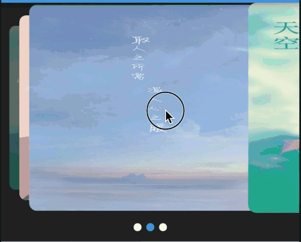
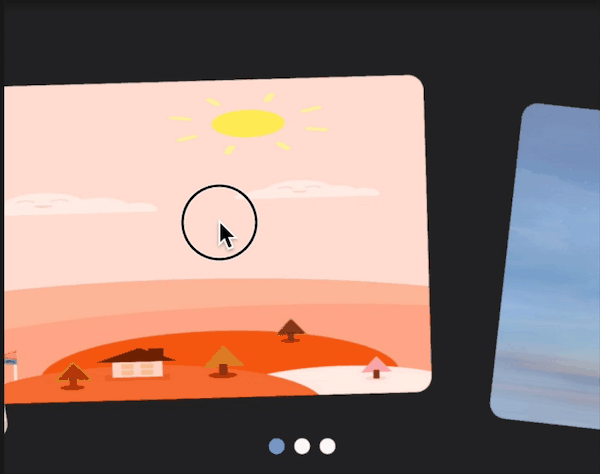
new Swiper(itemBuilder: (BuildContext context, int index) {return new Image.network("http://via.placeholder.com/288x188",fit: BoxFit.fill,);},itemCount: 10,itemWidth: 300.0,layout: SwiperLayout.STACK,)
示例3

new Swiper(itemBuilder: (BuildContext context, int index) {return new Image.network("http://via.placeholder.com/288x188",fit: BoxFit.fill,);},itemCount: 10,itemWidth: 300.0,itemHeight: 400.0,layout: SwiperLayout.TINDER,)
示例4:
构建你自己的动画十分简单:
new Swiper(layout: SwiperLayout.CUSTOM,customLayoutOption: new CustomLayoutOption(startIndex: -1,stateCount: 3).addRotate([-45.0/180,0.0,45.0/180]).addTranslate([new Offset(-370.0, -40.0),new Offset(0.0, 0.0),new Offset(370.0, -40.0)]),itemWidth: 300.0,itemHeight: 200.0,itemBuilder: (context, index) {return new Container(color: Colors.grey,child: new Center(child: new Text("$index"),),);},itemCount: 10)
CustomLayoutOption 被设计用来描述布局和动画,很简单的可以指定每一个元素的状态.
new CustomLayoutOption(startIndex: -1, /// 开始下标stateCount: 3 /// 下面的数组长度).addRotate([ // 每个元素的角度-45.0/180,0.0,45.0/180]).addTranslate([ /// 每个元素的偏移new Offset(-370.0, -40.0),new Offset(0.0, 0.0),new Offset(370.0, -40.0)])
代码
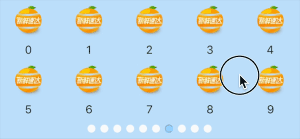
new ConstrainedBox(child: new Swiper(outer:false,itemBuilder: (c, i) {return new Wrap(runSpacing: 6.0,children: [0,1,2,3,4,5,6,7,8,9].map((i){return new SizedBox(width: MediaQuery.of(context).size.width/5,child: new Column(mainAxisSize: MainAxisSize.min,children: <Widget>[new SizedBox(child: new Container(child: new Image.network("https://fuss10.elemecdn.com/c/db/d20d49e5029281b9b73db1c5ec6f9jpeg.jpeg%3FimageMogr/format/webp/thumbnail/!90x90r/gravity/Center/crop/90x90"),),height: MediaQuery.of(context).size.width * 0.12,width: MediaQuery.of(context).size.width * 0.12,),new Padding(padding: new EdgeInsets.only(top:6.0),child: new Text("$i"),)],),);}).toList(),);},pagination: new SwiperPagination(margin: new EdgeInsets.all(5.0)),itemCount: 10,),constraints:new BoxConstraints.loose(new Size(screenWidth, 170.0))),
这里可以找到所有的定制选项
https://github.com/jzoom/flutter_swiper/blob/master/example/lib/src/ExampleCustom.dart

若有收获,就点个赞吧
0 人点赞
