层叠布局和Web中的绝对定位、Android中的Frame布局是相似的,子组件可以根据距父容器四个角的位置来确定自身的位置。绝对定位允许子组件堆叠起来(按照代码中声明的顺序)。Flutter中使用Stack和Positioned这两个组件来配合实现绝对定位。Stack允许子组件堆叠,而Positioned用于根据Stack的四个角来确定子组件的位置。
Stack
https://api.flutter.dev/flutter/widgets/Stack-class.html
叠加布局组件包含 Stack 和 IndexedStack,Stack 组件将子组件叠加显示,根据子组件的顺利依次向上叠加。
定义如下:
Stack({Key key,this.alignment = AlignmentDirectional.topStart,this.textDirection,this.fit = StackFit.loose,this.overflow = Overflow.clip,this.clipBehavior = Clip.hardEdge,List<Widget> children = const <Widget>[],})
alignment:此参数决定如何去对齐没有定位(没有使用Positioned)或部分定位的子组件。所谓部分定位,在这里特指没有在某一个轴上定位:left、right为横轴,top、bottom为纵轴,只要包含某个轴上的一个定位属性就算在该轴上有定位。textDirection:和Row、Wrap的textDirection功能一样,都用于确定alignment对齐的参考系,即:textDirection的值为TextDirection.ltr,则alignment的start代表左,end代表右,即从左往右的顺序;textDirection的值为TextDirection.rtl,则alignment的start代表右,end代表左,即从右往左的顺序。fit:此参数用于确定没有定位的子组件如何去适应Stack的大小。StackFit.loose表示使用子组件的大小,StackFit.expand表示扩伸到Stack的大小。overflow:此属性决定如何显示超出Stack显示空间的子组件;值为Overflow.clip时,超出部分会被剪裁(隐藏),值为Overflow.visible时则不会。
Positioned
Positioned({Key key,this.left,this.top,this.right,this.bottom,this.width,this.height,@required Widget child,})
left、top 、right、 bottom分别代表离Stack左、上、右、底四边的距离。width和height用于指定需要定位元素的宽度和高度。注意,Positioned的width、height 和其它地方的意义稍微有点区别,此处用于配合left、top 、right、 bottom来定位组件,举个例子,在水平方向时,你只能指定left、right、width三个属性中的两个,如指定left和width后,right会自动算出(left+width),如果同时指定三个属性则会报错,垂直方向同理。
示例
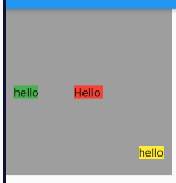
Container(color: Colors.grey,width: 200,height: 200,child: Stack(alignment: AlignmentDirectional.center,fit: StackFit.loose, //expand 充满; loose 自身大小;passthroughchildren: [// 没有定位,并且alignment值为Alignment.center,所以 垂直水平居中Container(color: Colors.red, child: Text("Hello")),// 只定位了水平方向,垂直方向上没有定位,属于部分定位。那么垂直方向上居中,水平方向距左边界 10 像素Positioned(left: 10.0,child: Container(color: Colors.green, child: Text('hello')),),// 水平方向上距右边界 10 像素,垂直方向上距下边界 20 像素Positioned(right: 10.0,bottom: 20.0,child: Container(color: Colors.yellow, child: Text('hello')),),],),);
fit属性 示例
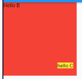
Container(color: Colors.grey,width: 200,height: 200,child: Stack(alignment: AlignmentDirectional.center,fit: StackFit.expand, //expand 充满; loose 自身大小;passthroughchildren: [//由于Stack子元素是堆叠的,所以第一个子组件被第二个遮住了。Positioned(left: 10.0,child: Container(color: Colors.green, child: Text('hello A')),),//由于第二个子组件没有定位,所以fit属性会对它起作用,就会占满StackContainer(color: Colors.red, child: Text("Hello B")),//第三个在最上层,所以可以正常显示。Positioned(right: 10.0,bottom: 20.0,child: Container(color: Colors.yellow, child: Text('hello C')),),],),);
IndexedStack
这个 Widget 的作用和 Stack 非常类似,唯一的区别是如果你有三个 child Widget,那么它的布局行为是显示你指定的第index个 child Widget ,其他 child Widget 不可见。

import 'package:flutter/material.dart';class AVStack extends StatelessWidget {@overrideWidget build(BuildContext context) {return new MaterialApp(home: new Scaffold(appBar: new AppBar(title: new Text('AVStack'),),body: new Container(width: 200.0,height: 200.0,color: Colors.blue,child: new IndexedStack(index: 1,children: <Widget>[new Container(width: 20.0,height: 20.0,color: Colors.grey,),new Positioned(top: 10.0,right: 10.0,child: new Container(width: 50.0,height: 50.0,color: Colors.red,),)],),)),);}}

若有收获,就点个赞吧
0 人点赞
