https://api.flutter.dev/flutter/material/AppBar-class.htmlAppBar是一个Material风格的导航栏,通过它可以设置导航栏标题、导航栏菜单、导航栏底部的Tab标题等。
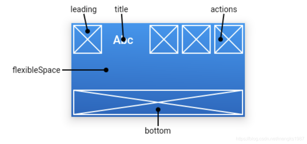
结构图
定义
AppBar({Key key,this.leading, //导航栏最左侧Widget,常见为抽屉菜单按钮或返回按钮。this.automaticallyImplyLeading = true, //如果leading为null,是否自动实现默认的leading按钮this.title, // 页面标题this.actions, // 导航栏右侧菜单this.flexibleSpace,this.bottom, //导航栏底部菜单,通常为Tab按钮组, bottom: PreferredSize(child: Text('ss'))this.elevation, //导航栏阴影this.shadowColor,this.shape,this.backgroundColor, //导航背景色this.brightness,this.iconTheme, //图标样式this.actionsIconTheme,this.textTheme, //文字样式this.primary = true,this.centerTitle, //标题是否居中this.excludeHeaderSemantics = false,this.titleSpacing = NavigationToolbar.kMiddleSpacing,this.toolbarOpacity = 1.0,this.bottomOpacity = 1.0,this.toolbarHeight,this.leadingWidth,})
AppBar高度的全局变量
/// The height of the toolbar component of the [AppBar].const double kToolbarHeight = 56.0;
常用参数
leading 左侧图标
通常设置返回图标。
如果leading属性未设置,Scaffold也未设置Drawer,此时如果有前一个路由,则默认显示BackButton。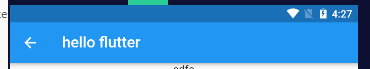
appBar: AppBar(leading: BackButton(),title: Text('hello flutter'),),
如果leading属性未设置,且Scaffold设置了Drawer则显示打开Drawer的菜单图标。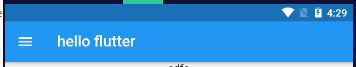
appBar: AppBar(title: Text('hello flutter'),),drawer: Text('左抽屉'),
如果我们想自定义菜单图标打开抽屉,也可以手动来设置 leading 。
appBar: AppBar(leading: Builder(builder: (context) {return IconButton(icon: Icon(Icons.dashboard, color: Colors.white), //自定义图标onPressed: () {Scaffold.of(context).openDrawer(); // 打开抽屉菜单},);}),)
代码中打开抽屉菜单的方法在ScaffoldState中,通过Scaffold.of(context)可以获取父级最近的Scaffold 组件的State对象。
// 查找父级最近的Scaffold对应的ScaffoldState对象// ScaffoldState _state = context.findAncestorStateOfType<ScaffoldState>();// 或var _state = Scaffold.of(context);
通过automaticallyImplyLeading属性改变其行为,设置为false将不会自动设置控件。
AppBar(automaticallyImplyLeading: false,)
actions 右侧图标组
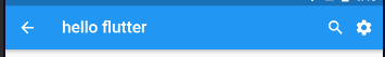
appBar: AppBar(actions: [Icon(Icons.search),IconButton(icon: Icon(Icons.settings),onPressed: () {print('1');},),],),
title 标题
appBar: AppBar(title: Text('hello flutter'),centerTitle: true, //标题是否居中),
flexibleSpace
flexibleSpace属性在AppBar中一般用不到,此控件和AppBar的height保持一致,只有在改变AppBar的尺寸的时候才会出现效果,因此一般用在SliverAppBar中。
SliverAppBar: https://www.yuque.com/zhuchaoyang/tnyvrp/sg1pql#O6u8K
bottom
通常请求下设置TabBar。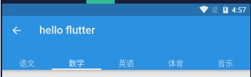
class _TestPageState extends State<TestPage> with SingleTickerProviderStateMixin {@overrideWidget build(BuildContext context) {return Scaffold(// appBar: EmptyNull.appBar(),appBar: AppBar(title: Text('hello flutter'),bottom: TabBar(tabs: [Text('语文'),Text('数学'),Text('英语'),Text('体育'),Text('音乐'),],controller: TabController(length: 5, vsync: this),),),);}}
设置阴影、形状、背景颜色。
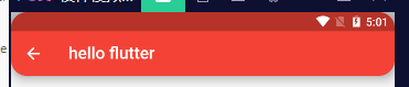
appBar: AppBar(title: Text('hello flutter'),elevation: 10,shape: RoundedRectangleBorder(borderRadius: BorderRadius.circular(20)),backgroundColor: Colors.red,),
设置icon样式及文字样式
AppBar(iconTheme:IconThemeData(size: 24),actionsIconTheme: IconThemeData(size: 24),textTheme: TextTheme(title: TextStyle(color: Colors.red)),title: Text('hello flutter'),)
appBar 常用子类
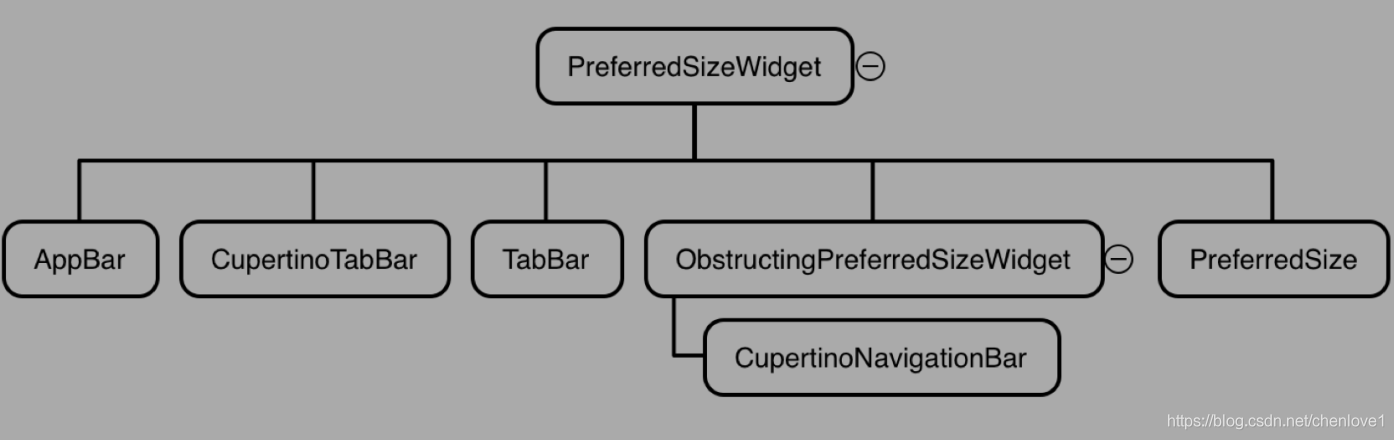
| AppBar | 一个设计应用程序栏。 |
|---|---|
| TabBar | 显示水平行标签的选项 通常创建为AppBar的AppBar.bottom部分并与TabBarView结合使用。 |
| CupertinoTabBar | iOS风格的底部导航标签栏 |
| CupertinoNavigationBar | iOS风格的导航栏。 导航栏是一个工具栏,最小程度上由工具栏中间的小部件组成,通常是页面标题。 它还支持中间窗口小部件之前和之后的前导和尾随窗口 小部件,同时保持中间窗口小部件居中。 |
| PreferredSize | 自定义导航栏使用 |
PreferredSize
设置appBar的高度
使用脚手架Scaffold可以设置AppBar,想要设置高度,在AppBar外包一层PreferredSize,设置preferredSize的属性为想要的高度即可。
Scaffold(appBar: PreferredSize(child: AppBar(),preferredSize: Size.fromHeight(MediaQuery.of(context).size.height * 0.07)));
应用:Flutter去掉AppBar避免body溢出到状态栏
没有AppBar的Flutter,如果不在Scaffold中使用AppBar,会发现默认是沉浸式。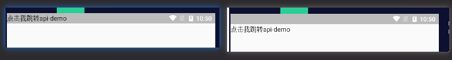
return Scaffold(appBar: PreferredSize(//preferredSize: Size.fromHeight(MediaQuery.of(context).size.height * 0.07),preferredSize: Size.fromHeight(MediaQuery.of(context).size.padding.top),child: SafeArea(top: true,child: Offstage(),),),body: Text('点击我跳转api-demo'),);

若有收获,就点个赞吧
0 人点赞
