 ">
">
Material 组件库中提供了Material风格的单选开关Switch和复选框Checkbox,虽然它们都是继承自StatefulWidget,但它们本身不会保存当前选中状态,选中状态都是由父组件来管理的。当Switch或Checkbox被点击时,会触发它们的onChanged回调,我们可以在此回调中处理选中状态改变逻辑。
Switch 开关组件
https://api.flutter.dev/flutter/material/Switch-class.html

var _switchValue = false;Switch(onChanged: (value){setState(() {_switchValue = value;});},value: _switchValue,activeColor: Colors.green, //选中状态下 小球颜色activeTrackColor: Colors.red, //选中状态下 滑轨颜色inactiveThumbColor: Colors.yellow, //未选中状态下 小球颜色inactiveTrackColor: Colors.orange, //未选中状态下 滑轨颜色//小球设置背景图片inactiveThumbImage: NetworkImage('https://cdn.nlark.com/yuque/0/2019/png/139415/1553520035105-avatar/4bf65c0d-4927-4106-a892-0275245560c6.png'),),
CupertinoSwitch
CupertinoSwitch是ios风格控件。
import 'package:flutter/cupertino.dart';var _switchValue = false;CupertinoSwitch(value: _switchValue,onChanged: (value) {setState(() {_switchValue = value;});},),
Slider.adaptive
根据平台显示不同风格的Switch,ios平台显示CupertinoSwitch效果,其他平台显示Material风格。
SwitchListTile
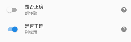
SwitchListTile(value: _switchValue,title: Text('是否正确'),subtitle: Text('副标题'),// 勾选框的位置//leading 勾选框在开头位置;trailing 结尾位置;platform 根据平台确定controlAffinity: ListTileControlAffinity.leading,secondary: Icon(Icons.help), //一般放置一个图标,位于勾选框的另一边。selected: _switchValue, //选中时,是否文字也高亮onChanged: (value) {setState(() {_switchValue = value;});},),
Checkbox 复选组件
https://api.flutter.dev/flutter/material/Checkbox-class.html
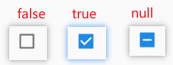
var _checkValue = false;Checkbox(value: _checkValue, //值为bool类型,true表示选择状态onChanged: (value){setState(() {_checkValue = value;});},activeColor: Colors.green, //选中状态下 背景颜色checkColor: Colors.red, //选中状态下 对勾颜色// Checkbox有一个属性tristate ,表示是否为三态,其默认值为false ,这时Checkbox有两种状态即“选中”和“不选中”,// 如果tristate值为true时,value的值会增加一个状态null,该状态是一个破折号tristate: true,materialTapTargetSize: MaterialTapTargetSize.shrinkWrap, //shrinkWrap padded);
checkbox 组
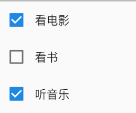
import "package:flutter/material.dart";class TestPage extends StatefulWidget {@override_TestPageState createState() => _TestPageState();}class _TestPageState extends State<TestPage> {List<Map> list = [{"checked": true, "title": '看电影'},{"checked": false, "title": '看书'},{"checked": true, "title": '听音乐'},];renderCheckbox() {return list.map<Widget>((item) {return Row(children: [Checkbox(value: item["checked"],onChanged: (value) {setState(() {item["checked"] = value;});},),Text('${item["title"]}'),],);}).toList();}@overrideWidget build(BuildContext context) {return Scaffold(appBar: EmptyNull.appBar(),body: Container(child: Column(children: this.renderCheckbox(),),),);}}
CheckboxListTile

renderCheckbox() {return list.map<Widget>((item) {return CheckboxListTile(value: item["checked"],title: Text('标题-${item["title"]}'),subtitle: Text('副标题'),// 勾选框的位置//leading 勾选框在开头位置;trailing 结尾位置;platform 根据平台确定controlAffinity: ListTileControlAffinity.leading,secondary: Icon(Icons.help), //一般放置一个图标,位于勾选框的另一边。selected: item["checked"], //选中时,是否文字也高亮onChanged: (value) {setState(() {item["checked"] = value;});},);}).toList();}
Radio 单选组件
https://api.flutter.dev/flutter/material/Radio-class.html
Radio控件本身没有State状态,当value的值和groupValue值相等时,Radio显示选中状态。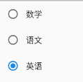
import "package:flutter/material.dart";class TestPage extends StatefulWidget {@override_TestPageState createState() => _TestPageState();}class _TestPageState extends State<TestPage> {List<Map> list = [{'value': '1', 'label': '数学'},{'value': '2', 'label': '语文'},{'value': '3', 'label': '英语'},];var _radioGroupValue = '1';renderRadio() {return list.map<Widget>((info) {return Row(children: [Radio(value: info['value'], //本项value值groupValue: _radioGroupValue, //当前radio组选中项的value值onChanged: (value) {setState(() {_radioGroupValue = value;});},),Text('${info["label"]}'),],);}).toList();}@overrideWidget build(BuildContext context) {return Scaffold(body: Container(child: Column(children: this.renderRadio(),),),);}}
RadioListTile
通常情况下,需要在Radio控件的后面添加说明,用户需要知道自己选择的是什么,当然我们可以直接在Radio后面添加Text控件,不过,Flutter已经为我们提供了相应的控件,就是RadioListTile,这是一个Radio和ListTile 组合的控件。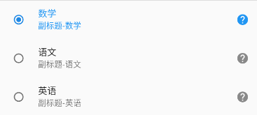
renderRadio() {return list.map<Widget>((info) {return RadioListTile(title: Text('${info["label"]}'),subtitle: Text('副标题-${info["label"]}'),secondary: Icon(Icons.help), //一般放置一个图标,位于右侧selected: _radioGroupValue == info['value'], //选中时,是否文字也高亮value: info['value'],groupValue: _radioGroupValue,onChanged: (value) {setState(() {_radioGroupValue = value;});},);}).toList();}
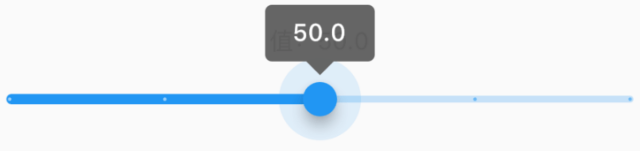
Slider 滑块组件
https://api.flutter.dev/flutter/material/Slider-class.html
Flutter 1.20 版本将 Slider 和 RangeSlider 小部件更新为最新的 Material 准则。新的滑块在设计时考虑到了更好的可访问性:轨道更高,拇指带有阴影,并且值指示器具有新的形状和改进的文本缩放支持。
基本使用
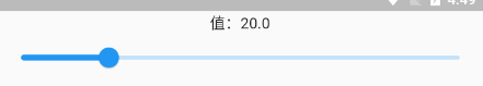
import "package:flutter/material.dart";class TestPage extends StatefulWidget {@override_TestPageState createState() => _TestPageState();}class _TestPageState extends State<TestPage> {double _sliderValue = 20;@overrideWidget build(BuildContext context) {return Scaffold(body: Container(child: Column(children: [Text('值:$_sliderValue'),Slider(value: _sliderValue, //当前值min: 0, //最小值max: 100, //最大值// divisions: 5, //分隔成5段(只能选择 0、20、40、60、80、100 这个几个值)// label: '值:$_sliderValue', //设置标签,滑动过程中在其上方显示// activeColor: Colors.red, //激活 滑轨颜色// inactiveColor: Colors.green, //未激活 滑轨颜色onChanged: (v) { //滑块值改变时回调setState(() {_sliderValue = v;});},),],),),);}}
CupertinoSlider
ios风格的滑块。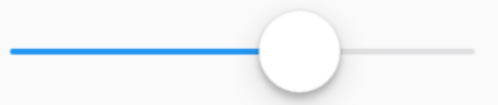
double _sliderValue = 0;CupertinoSlider(value: _sliderValue,onChanged: (v) {setState(() {_sliderValue = v;});},)
Slider.adaptive
根据平台显示不同风格的Slider,ios平台显示CupertinoSlider效果,其他平台显示Material风格。
Slider.adaptive(value: _sliderValue,onChanged: (v) {setState(() {_sliderValue = v;});},)
自定义样式
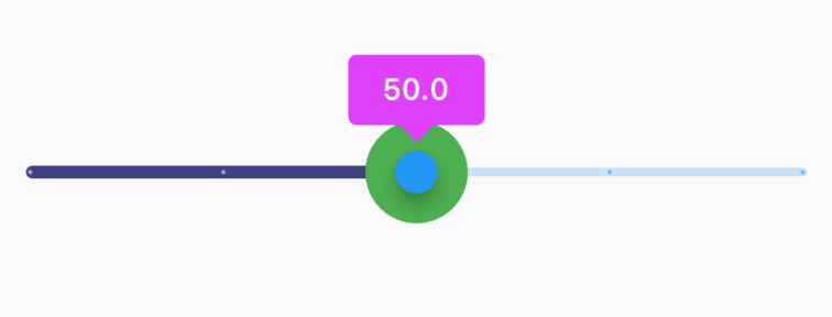
SliderTheme(data: SliderTheme.of(context).copyWith(activeTrackColor: Color(0xff404080),thumbColor: Colors.blue,overlayColor: Colors.green,valueIndicatorColor: Colors.purpleAccent,),child: Slider(value: _sliderValue,label: '$_sliderValue',min: 0,max: 100,onChanged: (v) {setState(() {_sliderValue = v;});},),)
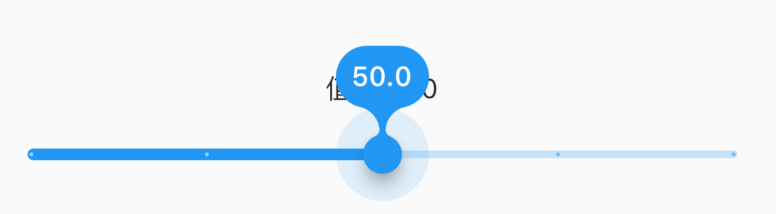
在 Flutter 1.20 版本使用以前的标签样式
SliderTheme(data: SliderTheme.of(context).copyWith(valueIndicatorShape: PaddleSliderValueIndicatorShape(), //以前的水滴样式//RectangularSliderValueIndicatorShape 表示矩形样式),child: ...)
RangeSlider 范围滑块组件
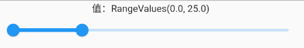
RangeValues _rangeValues = RangeValues(0, 25);RangeSlider(values: _rangeValues,min: 0,max: 100,// divisions: 5,labels: RangeLabels('${_rangeValues.start}', '${_rangeValues.end}'),// activeColor: Colors.red,// inactiveColor: Colors.green,onChanged: (v) {setState(() {_rangeValues = v;});},),
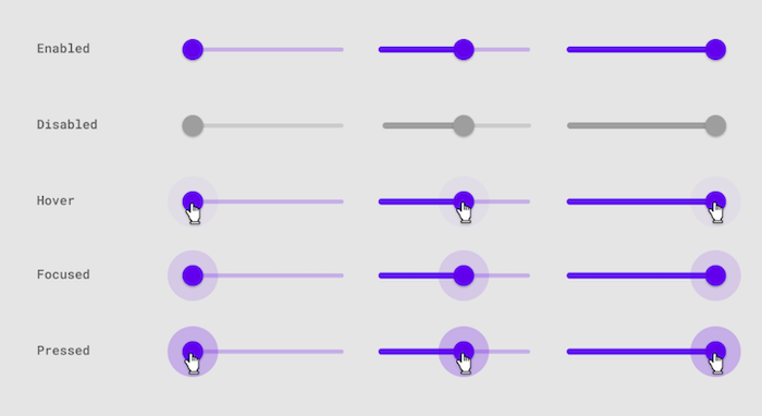
滑块状态
TextFiled 文本输入组件
https://api.flutter.dev/flutter/material/TextField-class.html
常用属性
controller编辑框的控制器,通过它可以设置/获取编辑框的内容、选择编辑内容、监听编辑文本改变事件。大多数情况下我们都需要显式提供一个controller来与文本框交互。如果没有提供controller,则TextField内部会自动创建一个。focusNode:用于控制TextField是否占有当前键盘的输入焦点。它是我们和键盘交互的一个句柄(handle)。keyboardType:用于设置该输入框默认的键盘输入类型,取值如下:
| TextInputType枚举值 | 含义 | | —- | —- | | text | 文本输入键盘 | | multiline | 多行文本,需和maxLines配合使用(设为null或大于1) | | number | 数字;会弹出数字键盘 | | phone | 优化后的电话号码输入键盘;会弹出数字键盘并显示“* #” | | datetime | 优化后的日期输入键盘;Android上会显示“: -” | | emailAddress | 优化后的电子邮件地址;会显示“@ .” | | url | 优化后的url输入键盘; 会显示“/ .” |textInputAction:键盘动作按钮图标(即回车键位图标),它是一个枚举值,有多个可选值,- none:android上显示返回键,ios不支持。
- unspecified:让操作系统自己决定哪个合适,一般情况下,android显示“完成”或者“返回”。
- done:android显示代表“完成”的按钮,ios显示“Done”(中文:完成)。
- go:android显示表达用户去向目的地的图标,比如向右的箭头,ios显示“Go”(中文:前往)。
- search:android显示表达搜索的按钮,ios显示”Search”(中文:搜索)。
- send:android显示表达发送意思的按钮,比如“纸飞机”按钮,ios显示”Send”(中文:发送)。
- next:android显示表达“前进”的按钮,比如“向右的箭头”,ios显示”Next”(中文:下一项)。
- previous:android显示表达“后退”的按钮,比如“向左的箭头”,ios不支持。
- continueAction:android 不支持,ios仅在ios9.0+显示”Continue”(中文:继续)。
- join:Android和ios显示”Join”(中文:加入)。
- route:android 不支持,ios显示”Route”(中文:路线)。
- emergencyCall:android 不支持,ios显示”Emergency Call”(中文:紧急电话)。
- newline:android显示表达“换行”的按钮,ios显示”换行“。
Android上显示的按钮大部分是不确定的,比如next有的显示向右的箭头,有的显示前进,这是因为各大厂商对Android ROM定制引发的。
全部的取值列表读者可以查看API文档,下面是当值为TextInputAction.search时,原生Android系统下键盘样式如图所示: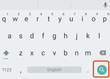
textCapitalization配置键盘是大写还是小写,仅支持键盘模式为text,其他模式下忽略此配置。- words:每一个单词的首字母大写。
- sentences:每一句话的首字母大写。
- characters:每个字母都大写
- none:都小写
这里仅仅是控制软键盘是大写模式还是小写模式,你也可以切换大小写,系统并不会改变输入框内的内容。
style:文本样式。textAlign: 水平方向的对齐方式。textAlignVertical垂直方向的对齐方式。textDirection文本方向。readOnly是否只读。toolbarOptions长按时弹出的菜单,有copy、cut、paste、selectAll。autofocus: 是否自动获取焦点。obscureText:是否密码框形式。maxLines:输入框的最大行数,默认为1;如果为null,则无行数限制。maxLength和maxLengthEnforced:maxLength代表输入框文本的最大长度,设置后输入框右下角会显示输入的文本计数。maxLengthEnforced决定当输入文本长度超过maxLength时是否阻止输入,为true时会阻止输入,为false时不会阻止输入但输入框会变红。inputFormatters:用于指定输入格式;当用户输入内容改变时,会根据指定的格式来校验。//只想让用户输入字符TextField(inputFormatters: [WhitelistingTextInputFormatter(RegExp("[a-zA-Z]")),],)
enable:如果为false,则输入框会被禁用,禁用状态不接收输入和事件,同时显示禁用态样式(在其decoration中定义)。cursorWidth、cursorRadius和cursorColor:这三个属性是用于自定义输入框光标宽度、圆角和颜色的。TextField(showCursor: true,cursorWidth: 3,cursorRadius: Radius.circular(10),cursorColor: Colors.red,)
onChanged:输入框内容改变时的回调函数;注:内容改变事件也可以通过controller来监听。onTap点击输入框时回调。onEditingComplete和onSubmitted:这两个回调都是在输入框输入完成时触发,比如按了键盘的完成键(对号图标)或搜索键(🔍图标)。不同的是两个回调签名不同,onSubmitted回调是ValueChanged<String>类型,它接收当前输入内容做为参数,而onEditingComplete不接收参数。``buildCounter输入框右下角字数统计。
TextField(maxLength: 100,buildCounter: (BuildContext context, {int currentLength,int maxLength,bool isFocused,}) {return Text('$currentLength/$maxLength',);},)
失焦、获焦
import 'dart:async';import "package:flutter/material.dart";class TestPage extends StatefulWidget {@override_TestPageState createState() => _TestPageState();}class _TestPageState extends State<TestPage> {var _focusNode = FocusNode();@overridevoid initState() {super.initState();Timer(Duration( seconds: 2), (){aa();} );Timer(Duration( seconds: 4), bb );}aa() {print('聚焦');//FocusScope.of(context).requestFocus(_focusNode);_focusNode.requestFocus();}bb() {print('失焦');_focusNode.unfocus();}@overrideWidget build(BuildContext context) {return Scaffold(body: TextField(focusNode: _focusNode,),);}}
decoration 装饰
用于控制TextField的外观显示,如提示文本、背景颜色、边框等。
decoration: InputDecoration(hintText: '请输入placeholder内容',// hintStyle: TextStyle(color: Colors.red),// hintMaxLines: 1, //限制行数,溢出出现...// helperText: '底部普通信息提示',// helperStyle,// helperMaxLines,// errorText: '底部错误信息提示', //优先于helperText// errorStyle// errorMaxLines// prefixIcon(suffixIcon): Icon(Icons.home), //内置前缀、后缀图标// prefix: Text('前缀Widget'),// prefixText: '前缀文字',// prefixStyle// icon: Icon(Icons.home), //左侧图标// labelText: "用户名", //卡进左上角边框线的label//当输入框是空而且没有焦点时,labelText显示在输入框上边,当获取焦点或者不为空时labelText往上移动一点// labelStyle: TextStyle(color: Colors.red), //label样式// isCollapsed: true, //紧凑// isDense: true, //紧凑// contentPadding: EdgeInsets.all(0)), //内边距// counter: Text('已输入 2/12 字'),// counterText// counterStyle// filled: true, //是否开启背景色// fillColor: Colors.grey,// focusColor: Colors.red,// hoverColor: Colors.red,// border: InputBorder.none, //无边框// border: UnderlineInputBorder(), //底边框// border: OutlineInputBorder(), //全边框border: OutlineInputBorder(borderSide: BorderSide(color: Colors.red),borderRadius: BorderRadius.circular(10.0),),// 边框:聚焦时focusedBorder: OutlineInputBorder(borderSide: BorderSide(color: Colors.green),borderRadius: BorderRadius.circular(10.0),),// errorBorder, //错误时边框// focusedErrorBorder// disabledBorder //禁止时边框// enabledBorder //未禁止时边框// enabled: false, //是否不禁用),
示例:登录输入框
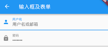
布局
Column(children: <Widget>[TextField(autofocus: true,decoration: InputDecoration(labelText: "用户名",hintText: "用户名或邮箱",prefixIcon: Icon(Icons.person)),),TextField(decoration: InputDecoration(labelText: "密码",hintText: "您的登录密码",prefixIcon: Icon(Icons.lock)),obscureText: true,),],);
获取输入内容
获取输入内容有两种方式:
(1)定义两个变量,用于保存用户名和密码,然后在onChanged触发时,各自保存一下输入内容。
import "package:flutter/material.dart";class FromPage extends StatefulWidget {@override_FromPageState createState() => _FromPageState();}class _FromPageState extends State<FromPage> {String _username; //不需要初始赋值,直接写@overrideWidget build(BuildContext context) {return Scaffold(appBar: AppBar(title: Text('form 表单页面')),body: TextField(decoration: InputDecoration(hintText: '请输入用户名'),onChanged: (value) {setState(() {_username = value;});},),);}}
(2)通过controller直接获取。
import "package:flutter/material.dart";class FromPage extends StatefulWidget {@override_FromPageState createState() => _FromPageState();}class _FromPageState extends State<FromPage> {// 定义一个controllerTextEditingController _username = TextEditingController();@overridevoid initState() {super.initState();_username.text = '初始值'; // 初始化的时候给表单赋值}@overrideWidget build(BuildContext context) {print(_username.text); //通过controller获取输入框内容return Scaffold(appBar: AppBar(title: Text('form 表单页面')),body: TextField(controller: _username, //设置输入框controllerdecoration: InputDecoration(hintText: '请输入用户名'),onChanged: (value) {setState(() {_username.text = value;});},),);}}
监听文本变化
监听文本变化也有两种方式:
(1)设置onChange回调
TextField(onChanged: (v) {print("onChange: $v");})
(2)通过controller监听
@overridevoid initState() {//监听输入改变_username.addListener((){print(_username.text);});}
两种方式相比,onChanged是专门用于监听文本变化,而controller的功能却多一些,除了能监听文本变化外,它还可以设置默认值、选择文本,下面我们看一个例子:
创建一个controller:
TextEditingController _selectionController = TextEditingController();
设置默认值,并从第三个字符开始选中后面的字符
_selectionController.text="hello world!";_selectionController.selection=TextSelection(baseOffset: 2,extentOffset: _selectionController.text.length);
设置controller:
TextField(controller: _selectionController,)
运行效果如图所示:
控制焦点
焦点可以通过FocusNode和FocusScopeNode来控制,默认情况下,焦点由FocusScope来管理,它代表焦点控制范围,可以在这个范围内可以通过FocusScopeNode在输入框之间移动焦点、设置默认焦点等。我们可以通过FocusScope.of(context) 来获取Widget树中默认的FocusScopeNode。
下面看一个示例,在此示例中创建两个TextField,第一个自动获取焦点,然后创建两个按钮:
- 点击第一个按钮可以将焦点从第一个
TextField挪到第二个TextField。 - 点击第二个按钮可以关闭键盘。
我们要实现的效果如图所示:
class FocusTestRoute extends StatefulWidget {@override_FocusTestRouteState createState() => new _FocusTestRouteState();}class _FocusTestRouteState extends State<FocusTestRoute> {FocusNode focusNode1 = new FocusNode();FocusNode focusNode2 = new FocusNode();FocusScopeNode focusScopeNode;@overrideWidget build(BuildContext context) {return Padding(padding: EdgeInsets.all(16.0),child: Column(children: <Widget>[TextField(autofocus: true,focusNode: focusNode1,//关联focusNode1decoration: InputDecoration(labelText: "input1"),),TextField(focusNode: focusNode2,//关联focusNode2decoration: InputDecoration(labelText: "input2"),),Builder(builder: (ctx) {return Column(children: <Widget>[RaisedButton(child: Text("移动焦点"),onPressed: () {//将焦点从第一个TextField移到第二个TextField// 这是一种写法 FocusScope.of(context).requestFocus(focusNode2);// 这是第二种写法if(null == focusScopeNode){focusScopeNode = FocusScope.of(context);}focusScopeNode.requestFocus(focusNode2);},),RaisedButton(child: Text("隐藏键盘"),onPressed: () {// 当所有编辑框都失去焦点时键盘就会收起focusNode1.unfocus();focusNode2.unfocus();},),],);},),],),);}}
FocusNode和FocusScopeNode还有一些其它的方法,详情可以查看API文档。
监听焦点状态改变事件
FocusNode继承自ChangeNotifier,通过FocusNode可以监听焦点的改变事件,如:
...// 创建 focusNodeFocusNode focusNode = new FocusNode();...// focusNode绑定输入框TextField(focusNode: focusNode);...// 监听焦点变化focusNode.addListener((){print(focusNode.hasFocus);});
获得焦点时focusNode.hasFocus值为true,失去焦点时为false。
自定义样式
虽然我们可以通过decoration属性来定义输入框样式,下面以自定义输入框下划线颜色为例来介绍一下:
直接通过InputDecoration的enabledBorder和focusedBorder来分别设置了输入框在未获取焦点和获得焦点后的下划线颜色。
TextField(decoration: InputDecoration(labelText: "请输入用户名",prefixIcon: Icon(Icons.person),// 未获得焦点下划线设为灰色enabledBorder: UnderlineInputBorder(borderSide: BorderSide(color: Colors.grey),),//获得焦点下划线设为蓝色focusedBorder: UnderlineInputBorder(borderSide: BorderSide(color: Colors.blue),),),),
我们也可以通过主题来自定义输入框的样式,下面我们探索一下如何在不使用enabledBorder和focusedBorder的情况下来自定义下滑线颜色。
由于TextField在绘制下划线时使用的颜色是主题色里面的hintColor,但提示文本颜色也是用的hintColor, 如果我们直接修改hintColor,那么下划线和提示文本的颜色都会变。值得高兴的是decoration中可以设置hintStyle,它可以覆盖hintColor,并且主题中可以通过inputDecorationTheme来设置输入框默认的decoration。所以我们可以通过主题来自定义,代码如下:
Theme(data: Theme.of(context).copyWith(hintColor: Colors.grey[200], //定义下划线颜色inputDecorationTheme: InputDecorationTheme(labelStyle: TextStyle(color: Colors.grey),//定义label字体样式hintStyle: TextStyle(color: Colors.grey, fontSize: 14.0)//定义提示文本样式)),child: Column(children: <Widget>[TextField(decoration: InputDecoration(labelText: "用户名",hintText: "用户名或邮箱",prefixIcon: Icon(Icons.person)),),TextField(decoration: InputDecoration(prefixIcon: Icon(Icons.lock),labelText: "密码",hintText: "您的登录密码",hintStyle: TextStyle(color: Colors.grey, fontSize: 13.0)),obscureText: true,)],))
运行效果如图所示:
我们成功的自定义了下划线颜色和提问文字样式,细心的读者可能已经发现,通过这种方式自定义后,输入框在获取焦点时,labelText不会高亮显示了,正如上图中的”用户名”本应该显示蓝色,但现在却显示为灰色,并且我们还是无法定义下划线宽度。另一种灵活的方式是直接隐藏掉TextField本身的下划线,然后通过Container去嵌套定义样式,如:
Container(child: TextField(keyboardType: TextInputType.emailAddress,decoration: InputDecoration(labelText: "Email",hintText: "电子邮件地址",prefixIcon: Icon(Icons.email),border: InputBorder.none //隐藏下划线)),decoration: BoxDecoration(// 下滑线浅灰色,宽度1像素border: Border(bottom: BorderSide(color: Colors.grey[200], width: 1.0))),)
运行效果:
通过这种组件组合的方式,也可以定义背景圆角等。一般来说,优先通过decoration来自定义样式,如果decoration实现不了,再用widget组合的方式。
思考题:在这个示例中,下划线颜色是固定的,所以获得焦点后颜色仍然为灰色,如何实现点击后下滑线也变色呢?
Form
实际业务中,在正式向服务器提交数据前,都会对各个输入框数据进行合法性校验,但是对每一个TextField都分别进行校验将会是一件很麻烦的事。还有,如果用户想清除一组TextField的内容,除了一个一个清除有没有什么更好的办法呢?为此,Flutter提供了一个Form 组件,它可以对输入框进行分组,然后进行一些统一操作,如输入内容校验、输入框重置以及输入内容保存。
Form
Form 继承自 StateFulWidget 对象,它对应的状态为 FromState 。部分定义如下:
Form({@required Widget child,@Deprecated('Use autoValidateMode parameter which provide more specific ''behaviour related to auto validation. ''This feature was deprecated after v1.19.0.')bool autovalidate = false,WillPopCallback onWillPop,VoidCallback onChanged,AutovalidateMode autovalidateMode,})
autovalidate: 是否自动校验输入内容;当为 true 时,每一个 FromField 内容发生变化时都会自动校验合法性,并直接显示错误信息。否则,需要通过调用FromState.validate()来手动校验。onWillPop: 决定Form所在的路由是否可以直接返回(如点击返回按钮),该回调返回一个Future对象,如果 Future 的最终结果是 false,则当前路由不会返回;如果为 true,则会返回到上一个路由。此属性通常用于拦截返回按钮。onChanged:From的任意一个子FromField内容发生变化时会触发此回调。
FormField
Form 的子孙元素必须是 FormField 类型,FromField 是一个抽象类,定义了几个属性,FormState 内部通过它们来完成操作,FormField 部分定义如下:
const FormField({...FormFieldSetter<T> onSaved, //保存回调FormFieldValidator<T> validator, //验证回调T initialValue, //初始值bool autovalidate = false, //是否自动校验。})
为了方便使用,Flutter提供了一个 TextFormField 组件,它继承自 FormField 类,也是 TextField 的一个包装类,所以除了 FormField 定义的属性之外,它还包括 TextField 的属性。
FormState
FormState 为 Form 的 State 类,可以通过 Form.of() 或 GlobalKey 获得。我们可以通过它来对 Form 的子孙 FormField 进行统一操作。我们看看其常用的三个方法:
FormState.validate():调用此方法后,会调用Form子孙FormField的validate回调,如果有一个校验失败,则返回false,所有校验失败项都会返回用户返回的错误提示。FormState.save():调用此方法后,会调用Form子孙FormField的save回调,用于保存表单内容FormState.reset():调用此方法后,会将子孙FormField的内容清空。
示例:
我们修改一下上面用户登录的示例,在提交之前校验:
- 用户名不能为空,如果为空则提示“用户名不能为空”。
- 密码不能小于6位,如果小于6为则提示“密码不能少于6位”。
import "package:flutter/material.dart";class FromPage extends StatefulWidget {@override_FromPageState createState() => _FromPageState();}class _FromPageState extends State<FromPage> {TextEditingController _uname = TextEditingController();TextEditingController _pwd = TextEditingController();GlobalKey _formKey = GlobalKey();@overrideWidget build(BuildContext context) {return Scaffold(appBar: AppBar(title: Text('form 表单页面')),body: Container(padding: EdgeInsets.symmetric(vertical: 16, horizontal: 24),child: Form(key: _formKey, //设置globalKey,用于后面获取FromStateautovalidateMode: AutovalidateMode.always,child: Column(children: [TextFormField(autofocus: true,controller: _uname,decoration: InputDecoration(labelText: '用户名',hintText: '请输入用户名',icon: Icon(Icons.person),),// 校验用户名validator: (v) {return v.trim().length > 0 ? null : '用户名不能为空';},),TextFormField(controller: _pwd,obscureText: true,decoration: InputDecoration(labelText: '密码',hintText: '请输入密码',icon: Icon(Icons.lock),),// 校验密码validator: (v) {return v.trim().length > 5 ? null : '密码不能小于5位';},),// 登录按钮Container(margin: EdgeInsets.only(top: 30),width: double.infinity,child: RaisedButton(padding: EdgeInsets.all(15),child: Text('登录'),color: Theme.of(context).primaryColor,textColor: Colors.white,onPressed: () {//在这里不能通过此方式获取FormState,context不对print(Form.of(context)); //null// 通过_formKey.currentState 获取FormState后,// 调用validate()方法校验用户名密码是否合法,校验通过后再提交数据。if ((_formKey.currentState as FormState).validate()) {//验证通过提交数据}},),),],),),),);}}
效果如图: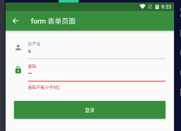
注意,登录按钮的onPressed方法中不能通过Form.of(context)来获取,原因是,此处的context为FormTestRoute的context,而Form.of(context)是根据所指定context向根去查找,而FormState是在FormTestRoute的子树中,所以不行。正确的做法是通过Builder来构建登录按钮,Builder会将widget节点的context作为回调参数:
Expanded(// 通过Builder来获取RaisedButton所在widget树的真正context(Element)child:Builder(builder: (context){return RaisedButton(...onPressed: () {//由于本widget也是Form的子代widget,所以可以通过下面方式获取FormStateif(Form.of(context).validate()){//验证通过提交数据}},);}))
其实context正是操作Widget所对应的Element的一个接口,由于Widget树对应的Element都是不同的,所以context也都是不同的,有关context的更多内容会在后面高级部分详细讨论。Flutter中有很多“of(context)”这种方法,读者在使用时一定要注意context是否正确。
表单示例1
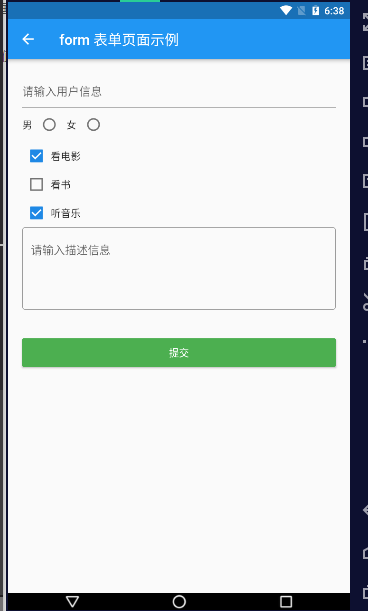
import "package:flutter/material.dart";class FromPage extends StatefulWidget {@override_FromPageState createState() => _FromPageState();}class _FromPageState extends State<FromPage> {String _username;int _sex;List hobby = [{"checked": true, "title": '看电影'},{"checked": false, "title": '看书'},{"checked": true, "title": '听音乐'},];String _description;void onChangeUsername(value) {setState(() {_username = value;});}void onChangeSex(value) {setState(() {_sex = value;});}void onChangeDescription(value) {setState(() {_description = value;});}void onSubmit() {print('用户名: $_username');print('性别: $_sex');print('爱好: $hobby');print('爱好: $_description');}List<Widget> _getHobby() {return hobby.map((item) {return Row(children: [Checkbox(value: item["checked"],onChanged: (value) {setState(() {item["checked"] = value;});},materialTapTargetSize: MaterialTapTargetSize.shrinkWrap,),Text('${item["title"]}'),],);}).toList();}@overrideWidget build(BuildContext context) {return Scaffold(appBar: AppBar(title: Text('form 表单页面示例')),body: Container(padding: EdgeInsets.all(20),child: Column(crossAxisAlignment: CrossAxisAlignment.start,children: [// 用户名TextField(decoration: InputDecoration(hintText: '请输入用户信息'),onChanged: onChangeUsername,),// 性别Row(children: [Text('男'),Radio(value: 1, groupValue: _sex, onChanged: onChangeSex),Text('女'),Radio(value: 2, groupValue: _sex, onChanged: onChangeSex),],),// 爱好Column(children: this._getHobby(),),// 描述TextField(maxLines: 4,decoration: InputDecoration(hintText: '请输入描述信息',border: OutlineInputBorder(),),onChanged: onChangeDescription,),// 提交按钮Container(margin: EdgeInsets.only(top: 40),height: 40,width: double.infinity,child: RaisedButton(child: Text('提交'),color: Colors.green,textColor: Colors.white,onPressed: onSubmit,),),],),),);}}

若有收获,就点个赞吧
0 人点赞
