在Flutter中提供了两种方式来完成弹出菜单功能。
PopupMenuButton
https://api.flutter.dev/flutter/material/PopupMenuButton-class.html
菜单隐藏式,点击或调用onSelected时显示一个弹出式菜单列表。
PopupMenuButton定义
PopupMenuButton({Key key,@required this.itemBuilder,this.initialValue, //初始值,设置初始值后,打开菜单后,设置的值将会高亮,this.onSelected, //选取后回调this.onCanceled, //popup菜单 取消选取回调this.tooltip, //入口按钮上长按提示this.enabled = true, //是否开启 popupthis.icon, //icon 与 child 只能用一个this.child,// 默认情况下,PopupMenuButton显示3个小圆点,我们也可以对其进行自定义设置。// 设置后,child组件将会被InkWell包裹,点击弹出菜单。this.color, //popup背景色this.elevation, //popup 阴影this.shape, //popup边框形状this.padding = const EdgeInsets.all(8.0),this.offset = Offset.zero, //弹出菜单偏移量//offset: Offset(10.0, 20.0), popup距左10,距右20,值超出entry右下角位置时,按右下角算。this.captureInheritedThemes = true,})
PopupMenuItem 定义
PopupMenuItem({Key key,this.value, //当此项选中后,此值将会通过onSelected返回this.enabled = true, //此项是否可用this.height = kMinInteractiveDimension, //此项的高度this.textStyle,this.mouseCursor,@required this.child,})
示例1:
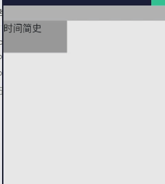
import "package:flutter/material.dart";import 'package:app1/coms/base/empty_null/empty_null.dart';class TestPage extends StatefulWidget {@override_TestPageState createState() => _TestPageState();}class _TestPageState extends State<TestPage> {List<Book> books = [Book('1', '时间简史'),Book('2', '漂'),Book('3', '茶花女'),Book('4', '存在与虚无'),];Book _selected;@overridevoid initState() {super.initState();_selected = books[0];}@overrideWidget build(BuildContext context) {return Scaffold(appBar: EmptyNull.appBar(),body: PopupMenuButton(// 入口entrychild: Container(width: 100,height: 50,color: Colors.grey,child: Text(_selected.label),),// 弹出菜单选中项 高亮initialValue: _selected,// 构建弹出菜单// PopupMenuButton的每一项都需要是PopupMenuEntry类型,PopupMenuEntry为抽象类,// 其子类有PopupMenuItem、PopupMenuDivider、CheckedPopupMenuItem。itemBuilder: (BuildContext context) => <PopupMenuEntry<Book>>[for (var i = 0; i < books.length; i++)PopupMenuItem<Book>(value: books[i],child: Text(books[i].label),),],// 弹出菜单子项点击回调onSelected: (value) {setState(() {_selected = value;});},// 弹出菜单偏移量offset: Offset(20.0, 20.0),shape: RoundedRectangleBorder(side: BorderSide(color: Colors.red),borderRadius: BorderRadius.all(Radius.circular(10.0)),),),);}}class Book {Book(this.value, this.label);final String value;final String label;}
PopupMenuDivider
PopupMenuDivider是菜单分割线,定义如下:
PopupMenuDivider({Key key,this.height = _kMenuDividerHeight,// PopupMenuDivider默认高度为16,注意这个高度并不是分割线的高度,而是分割线控件的高度,// 设置为50代码:PopupMenuDivider(height: 50,),})
示例:
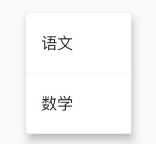
PopupMenuButton<String>(itemBuilder: (context) {return <PopupMenuEntry<String>>[PopupMenuItem<String>(value: '语文', child: Text('语文')),PopupMenuDivider(),PopupMenuItem<String>(value: '数学', child: Text('数学')),];},)
CheckedPopupMenuItem
前面带选中的控件。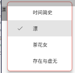
CheckedPopupMenuItem<Book>(value: books[i],checked: _selected == books[i], //是否选中。为true时,前边带上对勾图标child: Text(books[i].label),),
showMenu
PopupMenuButton也是使用showMenu实现的。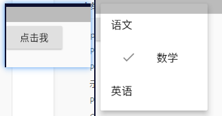
class _TestPageState extends State<TestPage> {openMenu() {showMenu(context: context,position: RelativeRect.fill, //表示弹出的位置items: <PopupMenuEntry>[PopupMenuItem(child: Text('语文')),CheckedPopupMenuItem(child: Text('数学'),checked: true,),PopupMenuItem(child: Text('英语')),],);}@overrideWidget build(BuildContext context) {return Scaffold(appBar: EmptyNull.appBar(),body: RaisedButton(child: Text('点击我'),onPressed: openMenu,),);}}
属性和PopupMenuButton基本一样,但使用showMenu需要我们指定位置,所以一般情况下,我们不会直接使用showMenu,而是使用PopupMenuButton,免去了计算位置的过程。
PopupMenuButton是如何计算的?
final PopupMenuThemeData popupMenuTheme = PopupMenuTheme.of(context);final RenderBox button = context.findRenderObject();final RenderBox overlay = Overlay.of(context).context.findRenderObject();final RelativeRect position = RelativeRect.fromRect(Rect.fromPoints(button.localToGlobal(widget.offset, ancestor: overlay),button.localToGlobal(button.size.bottomRight(Offset.zero), ancestor: overlay),),Offset.zero & overlay.size,);final List<PopupMenuEntry<T>> items = widget.itemBuilder(context);

若有收获,就点个赞吧
0 人点赞
