Tooltip 提示
https://api.flutter.dev/flutter/material/Tooltip-class.html
一个文本提示工具,帮助解释一个按钮或其他用户界面,当widget长时间按下时(当用户采取其他适当操作时)显示一个提示标签。
Tooltip({Key key,@required this.message,this.height, //高度this.padding,this.margin,this.verticalOffset, //垂直偏移this.preferBelow,this.excludeFromSemantics,this.decoration,this.textStyle,this.waitDuration,this.showDuration,this.child,})
示例

Tooltip(message: '我是提示',child: RaisedButton(child: Text('按钮'),onPressed: () {},),),
某些Material组件(如IconButton)已包含工具提示,直接使用即可。
IconButton(icon: Icon(Icons.access_alarm),onPressed: () {},tooltip: '提示文案',),
showDialog
系统内置的dialog,默认会占满屏幕。返回一个Future对象。
Future<T> showDialog<T>({@required BuildContext context,WidgetBuilder builder,bool barrierDismissible = true, //点击遮罩,是否退出对话框Color barrierColor,bool useSafeArea = true,bool useRootNavigator = true,RouteSettings routeSettings,})
import "package:flutter/material.dart";class DialogDemo extends StatelessWidget {_alertDialog(context) {// print(context); //DialogDemo(state: _DialogDemoState#2b533)showDialog(context: context,builder: (context) => Container(height: 100,color: Colors.red,),);}@overrideWidget build(BuildContext context) {return Container(child: Column(children: [RaisedButton(child: Text('alert弹出框-AlertDialog'),onPressed: _alertDialog,),],),);}}

AlertDialog 确认框
https://docs.flutter.io/flutter/material/AlertDialog-class.html
一个会中断用户操作的对话款,需要用户确认。
AlertDialog({Key key,this.title, //标题this.titlePadding,this.titleTextStyle,this.content, //内容this.contentPadding = const EdgeInsets.fromLTRB(24.0, 20.0, 24.0, 24.0),this.contentTextStyle,this.actions, //底部按钮数组this.actionsPadding = EdgeInsets.zero,this.actionsOverflowDirection,this.actionsOverflowButtonSpacing,this.buttonPadding,this.backgroundColor, //背景色this.elevation,this.semanticLabel,this.insetPadding = _defaultInsetPadding,this.clipBehavior = Clip.none,this.shape, //可参考RaisedButton控件的shape参数this.scrollable = false,})
示例

写法1:
_alertDialog(){showDialog(context: context,builder: (context) {return AlertDialog(title: Text('提示信息'),content: Text('你确定要删除吗?'),actions: [FlatButton(child: Text('取消'),onPressed: () {print('取消');Navigator.pop(context); //关闭确认框},),FlatButton(child: Text('确定'),onPressed: () {print('确定');Navigator.pop(context);},),],);},);}
写法2:
_alertDialog() async {var result = await showDialog(context: context,builder: (context) {return AlertDialog(title: Text('提示信息'),content: Text('你确定要删除吗?'),actions: [FlatButton(child: Text('取消'),onPressed: () {Navigator.pop(context, 'cancel');},),FlatButton(child: Text('确定'),onPressed: () {Navigator.pop(context, 'ok');},),],);},);if (result == 'ok') {print('确定');} else {print('取消');}}
CupertinoAlertDialog ios风格确认框
showDialog和AlertDialog配合使用展示Material风格对话框。showCupertinoDialog和CupertinoAlertDialog配合使用展示iOS风格对话框。
showCupertinoDialog点击空白处是无法退出对话框的,而showDialog点击空白处默认退出对话框。
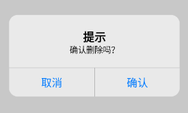
showCupertinoDialog(context: context,builder: (context) {return CupertinoAlertDialog(title: Text('提示'),content: Text('确认删除吗?'),actions: [CupertinoDialogAction(child: Text('取消'),onPressed: () {},),CupertinoDialogAction(child: Text('确认'),onPressed: () {},),],);},);
bug: The getter ‘modalBarrierDismissLabel’ was called on null.
问题描述:如果在MaterialApp里调用showCupertinoDialog显示弹出框,可能会遇到这个错误。
原因分析:就是Material主题下Context没有这个Cupertine主题的属性
方法1:
localizationsDelegates: [...GlobalCupertinoLocalizations.delegate, //添加这行即可解决问题],注意:需要在pubspec.yaml添加localizations依赖,如下:dependencies:flutter_localizations:sdk: flutter
方法2:
在 main.dart 文件中加入 localizationsDelegates 这个属性,并在其中加入FallbackCupertinoLocalisationsDelegate(),不需要的不要加。并且在该文件下生成对应的类:
localizationsDelegates: [...FallbackCupertinoLocalisationsDelegate(),],class FallbackCupertinoLocalisationsDelegate extends LocalizationsDelegate<CupertinoLocalizations> {const FallbackCupertinoLocalisationsDelegate();@overridebool isSupported(Locale locale) => true;@overrideFuture<CupertinoLocalizations> load(Locale locale) => DefaultCupertinoLocalizations.load(locale);@overridebool shouldReload(FallbackCupertinoLocalisationsDelegate old) => false;}
SimpleDialog 选择框
https://api.flutter.dev/flutter/material/SimpleDialog-class.html
简单对话框可以显示附加的提示或操作。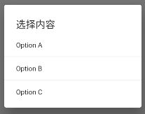
void _simpleDialog() async {showDialog(context: context,builder: (context) {return SimpleDialog(title: Text('选择内容'),children: [SimpleDialogOption(child: Text('Option A'), onPressed: () {}),Divider(),SimpleDialogOption(child: Text('Option B'), onPressed: () {}),Divider(),SimpleDialogOption(child: Text('Option C'), onPressed: () {}),],);},);}//...RaisedButton(child: Text('select弹出框-SimpleDialog'),onPressed: _simpleDialog,),
BottomSheet 底部滑框
https://api.flutter.dev/flutter/material/BottomSheet-class.html
BottomSheet是一个从屏幕底部滑起的列表(以显示更多的内容)。你可以调用showBottomSheet()或showModalBottomSheet弹出。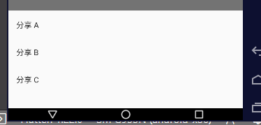
void _modalBottomSheet() async {// showBottomSheet() 占全屏// showModalBottomSheet() 默认占底部半屏左右,可以设置高度var result = await showModalBottomSheet(context: context,builder: (context) {return Container(height: 200,child: Column(children: [ListTile(title: Text('分享 A'),onTap: () {Navigator.pop(context, 'a');},),ListTile(title: Text('分享 B'),onTap: () {Navigator.pop(context, 'b');},),ListTile(title: Text('分享 C'),onTap: () {Navigator.pop(context, 'c');},),],),);},);print(result);}//...aisedButton(child: Text('ActionSheet底部弹出框-showModalBottomSheet'),onPressed: _modalBottomSheet,),
SnackBar 底部轻提示
https://api.flutter.dev/flutter/material/SnackBar-class.html
带有可选操作的轻量级消息,在屏幕底部短暂显示,SnackBar一般不单独使用,而是配合Scaffold.of(context).showSnackBar进行弹出展示。
定义
SnackBar({Key key,@required this.content,this.backgroundColor, //背景色this.elevation, //阴影this.margin,this.padding,this.width, //需搭配 behavior: SnackBarBehavior.floating, 模式this.shape, //形状this.behavior, //弹出形式。fixed floatingthis.action, //搭配 SnackBarAction 使用this.duration = _snackBarDisplayDuration, //设置显示时间,默认是4秒。duration: Duration(seconds: 1),this.animation,this.onVisible, //在显示的时候调用})
简单使用
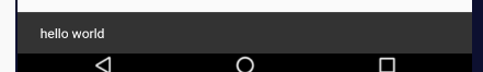
Builder(builder: (context) {return RaisedButton(child: Text('click me'),onPressed: () {// 查找父级最近的Scaffold对应的ScaffoldState对象// ScaffoldState _state = context.findAncestorStateOfType<ScaffoldState>();ScaffoldState _state = Scaffold.of(context);//调用ScaffoldState的showSnackBar来弹出SnackBar_state.showSnackBar(SnackBar(content: Text('hello world'),),);},);},),
设置样式
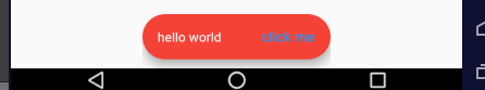
SnackBar(backgroundColor: Colors.red,elevation: 8,width: 200,behavior: SnackBarBehavior.floating,action: SnackBarAction(label: 'click me',onPressed: () {},),shape: RoundedRectangleBorder(borderRadius: BorderRadius.circular(100)),content: Text('hello world'),),
瞬间多个弹出延迟问题
当短时间内多次调用SnackBar方法时,SnackBar消息将会以队列的形式一个一个的弹出,比如下面的代码:
RaisedButton(child: Text('点我,弹出SnackBar',),onPressed: () {List.generate(10, (index){Scaffold.of(context).showSnackBar(SnackBar(content: Text('我是消息:$index'),));});},)
默认情况下每个显示4秒,如果有10个,那么40秒内会一直弹消息,体验明显不友好,我们希望的效果是如果有新的消息时,旧的都消息立刻消失,显示新的消息,只需在弹出新的SnackBar时移除现在的SnackBar,
Scaffold.of(context).removeCurrentSnackBar();Scaffold.of(context).showSnackBar(...);
ExpansionPanel 扩展框
https://api.flutter.dev/flutter/material/ExpansionPanel-class.html
ExpansionPanel
一个material 扩展面板。它有一个 header 和一个 body ,可以展开或折叠。面板的 body 仅在展开时可见。 扩展面板仅用作于 ExpansionPanelList。
ExpansionPanel({@required this.headerBuilder,@required this.body,this.isExpanded = false, //是否展开this.canTapOnHeader = false, //header是否可以点击})
ExpansionPanelList
material 展开面板列表,用于设置其子项并为展开设置动画。
const ExpansionPanelList({Key key,this.children = const <ExpansionPanel>[], //就是 ExpansionPanelthis.expansionCallback, //展开回调,expansionCallback: (int index, bool isExpanded){}this.animationDuration = kThemeAnimationDuration, //动画的时间this.expandedHeaderPadding = _kPanelHeaderExpandedDefaultPadding,this.dividerColor,this.elevation = 2,})
示例
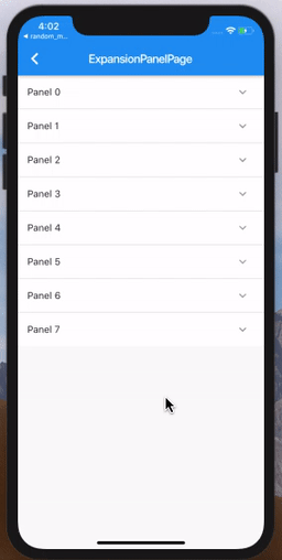
import 'package:flutter/material.dart';class Item {Item({this.expandedValue,this.headerValue,this.isExpanded = false,});String expandedValue; //展开的title值String headerValue; //header的值bool isExpanded; //是否已经展开}// 生成指定数量的ListList<Item> generateItems(int counter) {return List.generate(counter, (int index) {return Item(headerValue: 'Panel $index',expandedValue: 'This is item number $index',);});}class ExpansionPanelPage extends StatefulWidget {ExpansionPanelPage({Key key}) : super(key: key);@override_ExpansionPanelPageState createState() => _ExpansionPanelPageState();}class _ExpansionPanelPageState extends State<ExpansionPanelPage> {List<Item> _data = generateItems(8);@overrideWidget build(BuildContext context) {return Scaffold(appBar: AppBar(title: Text('ExpansionPanelPage demo')),body: SingleChildScrollView(child: Container(child: _buildPanel(),),),);}Widget _buildPanel() {return ExpansionPanelList(expansionCallback: (int index, bool isExpanded) {setState(() {_data[index].isExpanded = !isExpanded;});},children: _data.map<ExpansionPanel>((Item item) {return ExpansionPanel(headerBuilder: (BuildContext context, bool isExpanded) {return ListTile(title: Text(item.headerValue));},body: ListTile(title: Text(item.expandedValue),subtitle: Text('To delete this panel, tap the trash can icon'),trailing: Icon(Icons.delete),onTap: () {setState(() {_data.removeWhere((currentItem) => item == currentItem);});}),isExpanded: item.isExpanded,);}).toList(),);}}
什么要用 SingleChildScrollView 包起来?
我们先把 SingleChildScrollView 去掉来看一下效果:
发现什么都没有了,看一下log:
flutter: The following assertion was thrown during performLayout(): flutter: RenderListBody must have unlimited space along its main axis. flutter: RenderListBody does not clip or resize its children, so it must be placed in a parent that does not flutter: constrain the main axis. You probably want to put the RenderListBody inside a RenderViewport with a matching main axis.
大致意思就是说:
RenderListBody所在的主轴必须要有无线的空间,因为RenderListBody 要不断的调整children 的大小,所以必须把它放在不约束主轴的 parent 中。
body is ListView
在我们实际业务中,可能最多的业务为展开是一个列表,那需要 body 是ListView。
其实和官方Demo差不多,需要注意的一点就是 shrinkWrap & physics 这两个字段:
return ListView.builder(shrinkWrap: true,physics: NeverScrollableScrollPhysics(),);
只能展开一个
有时我们也会遇到只能展开一个,点击其他的时候要关闭已经展开的。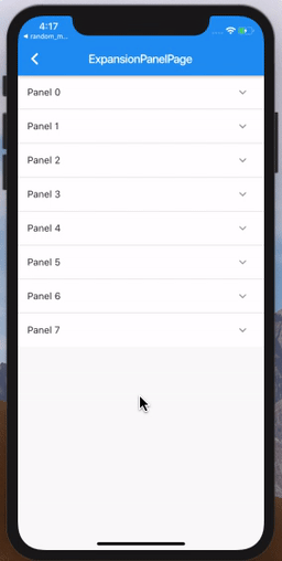
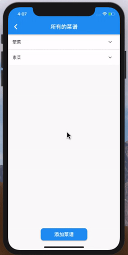
代码如下,需使用 ExpansionPanelList.radioExpansionPanelList.radio 的 children 也需要改变为: ExpansionPanelRadio。ExpansionPanelRadio 和 ExpansionPanel 的区别就是一个 value。ExpansionPanelRadio 是用 value 来区分的,所以每一个要是唯一的。
Widget _buildPanel() {return ExpansionPanelList.radio(expansionCallback: (int index, bool isExpanded) {setState(() {_data[index].isExpanded = !isExpanded;});},children: _data.map<ExpansionPanel>((Item item) {return ExpansionPanelRadio(canTapOnHeader: true,headerBuilder: (BuildContext context, bool isExpanded) {return ListTile(title: Text(item.headerValue),);},body: ListTile(title: Text(item.expandedValue),subtitle: Text('To delete this panel, tap the trash can icon'),trailing: Icon(Icons.delete),onTap: () {setState(() {_data.removeWhere((currentItem) => item == currentItem);});}),value: item.headerValue,);}).toList(),);}
自定义Dialog
自定义 Dialog 对象,需要继承 Dialog 类,尽管 Dialog 提供了child 参数可以用来写视图界面,但是往往达不到想要的效果,因为默认的 Dialog 背景框是满屏的。如果我们想完全定义界面,就需要重写 build 函数。
示例:简单对话框
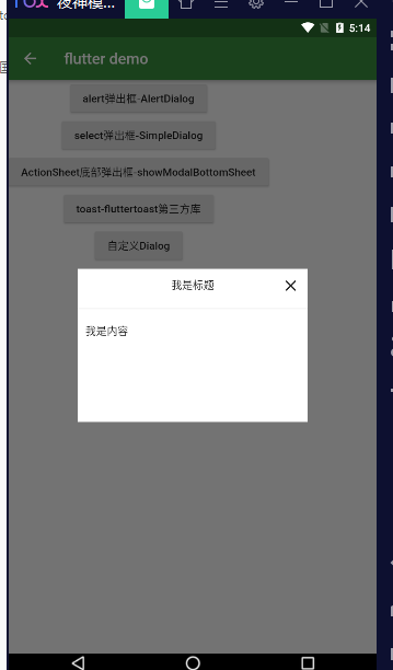
import 'package:app1/coms/dialogs/MyDialog.dart';//...RaisedButton(child: Text('自定义Dialog'),onPressed: () {showDialog(context: context,builder: (context) {return MyDialog(title: '我是标题',content: '我是内容',);},);},),
import 'package:flutter/material.dart';class MyDialog extends StatelessWidget {String title;String content;MyDialog({key,this.title = null,this.content = null,}) : super(key: key);@overrideWidget build(BuildContext context) {return Material(type: MaterialType.transparency, //背景透明child: Center(child: Container(width: 300,constraints: BoxConstraints(minHeight: 200),color: Colors.white,child: Column(mainAxisSize: MainAxisSize.min,children: [Padding(padding: EdgeInsets.all(10),child: Stack(children: [Align(alignment: Alignment.bottomCenter,child: Text(this.title),),Align(alignment: Alignment.centerRight,child: InkWell(child: Icon(Icons.close),onTap: () {Navigator.pop(context);},),),],),),Divider(),Container(width: double.infinity,padding: EdgeInsets.all(10),child: Text(this.content),),],),),),);}}
示例:loading对话框
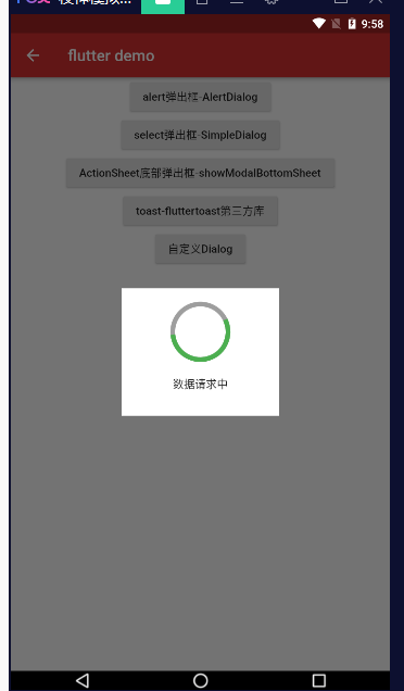
showDialog(context: context,builder: (context) {return MyDialog(title: '数据请求中',);},);
import 'dart:async';import 'package:flutter/material.dart';class MyDialog extends StatelessWidget {String title;MyDialog({key,this.title = null,}) : super(key: key);_showTimer(context) {var timer = null;timer = Timer.periodic(Duration(milliseconds: 3000), (t) {Navigator.pop(context);t.cancel(); //取消定时器});}@overrideWidget build(BuildContext context) {_showTimer(context);return Material(type: MaterialType.transparency,child: Center(child: Container(width: 200,padding: EdgeInsets.all(20),color: Colors.white,child: Column(mainAxisSize: MainAxisSize.min,children: [Container(width: 70,height: 70,child: CircularProgressIndicator(backgroundColor: Colors.grey,valueColor: AlwaysStoppedAnimation(Colors.green),strokeWidth: 6.0,),),Container(padding: EdgeInsets.only(top: 20, bottom: 10),child: Text(this.title),),],),),),);}}
库 fluttertoast
https://pub.dev/packages/fluttertoast
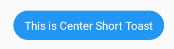
import "package:flutter/material.dart";import 'package:fluttertoast/fluttertoast.dart';class DialogDemo extends StatelessWidget {void _toast() {Fluttertoast.showToast(msg: "This is Center Short Toast",toastLength: Toast.LENGTH_SHORT, //LENGTH_SHORT LENGTH_LONGgravity: ToastGravity.CENTER, //位置 TOP BOTTOM CENTERtimeInSecForIosWeb: 1, //只在ios上有效果backgroundColor: Colors.blue,textColor: Colors.white,fontSize: 16.0,);}@overrideWidget build(BuildContext context) {return Container(child: Column(children: [RaisedButton(child: Text('toast-fluttertoast第三方库'),onPressed: _toast,),],),);}}
属性
| property | description | default |
|---|---|---|
| msg | String (Not Null)(required) | required |
| toastLength | Toast.LENGTH_SHORT or Toast.LENGTH_LONG (optional) | Toast.LENGTH_SHORT |
| gravity | ToastGravity.TOP (or) ToastGravity.CENTER (or) ToastGravity.BOTTOM (Web Only supports top, bottom) | ToastGravity.BOTTOM |
| timeInSecForIosWeb | int (for ios & web) | 1 (sec) |
| backgroundColor | Colors.red | null |
| textcolor | Colors.white | null |
| fontSize | 16.0 (float) | null |
| webShowClose | false (bool) | false |
| webBgColor | String (hex Color) | linear-gradient(to right, #00b09b, #96c93d) |
| webPosition | String (left, center or right) |
right |
To cancel all the toasts call
Fluttertoast.cancel()
库 flutter_easyloading
https://pub.dev/packages/flutter_easyloading
中文说明:https://github.com/kokohuang/flutter_easyloading/blob/master/README-zh_CN.md
安装依赖
dependencies:flutter_easyloading: ^2.2.1
导入
import 'package:flutter_easyloading/flutter_easyloading.dart';
使用
首先, 在MaterialApp/CupertinoApp中初始化FlutterEasyLoading:
class MyApp extends StatelessWidget {@overrideWidget build(BuildContext context) {return MaterialApp(title: 'Flutter EasyLoading',theme: ThemeData(primarySwatch: Colors.blue,),home: MyHomePage(title: 'Flutter EasyLoading'),builder: EasyLoading.init(),);}}
调用


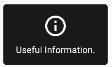

EasyLoading.show(status: 'loading...');EasyLoading.showProgress(0.3, status: 'downloading...');EasyLoading.showSuccess('Great Success!');EasyLoading.showError('Failed with Error');EasyLoading.showInfo('Useful Information.');EasyLoading.showToast('Toast');//关闭EasyLoading.dismiss();
添加 Loading 状态回调
EasyLoading.show(status: 'loading...');Timer(Duration(milliseconds: 1000), () {EasyLoading.dismiss();});EasyLoading.addStatusCallback((status) {print('EasyLoading Status: $status');//EasyLoading Status: EasyLoadingStatus.show// 1秒后输出:EasyLoading Status: EasyLoadingStatus.dismiss});
移除 Loading 状态回调
EasyLoading.removeCallback(statusCallback);EasyLoading.removeAllCallbacks();
自定义
textColor、indicatorColor、progressColor、backgroundColor仅对EasyLoadingStyle.custom有效。maskColor仅对EasyLoadingMaskType.custom有效。
//使用示例EasyLoading.instance.loadingStyle = EasyLoadingStyle.light;EasyLoading.instance.indicatorType = EasyLoadingIndicatorType.threeBounce;EasyLoading.show(status: 'loading...');loadingStyle //loading的样式,默认[EasyLoadingStyle.dark] lightindicatorType //loading的指示器类型, 默认[EasyLoadingIndicatorType.fadingCircle]maskType //loading的遮罩类型,默认[EasyLoadingMaskType.none]toastPosition //toast的位置,默认[EasyLoadingToastPosition.center]animationStyle //动画类型, 默认[EasyLoadingAnimationStyle.opacity]EasyLoadingAnimation customAnimation; // 自定义动画, 默认 null.TextAlign textAlign // 文本的对齐方式, 默认[TextAlign.center]TextStyle textStyle // 文本的样式, 默认 nullEdgeInsets contentPadding // loading内容区域的内边距.EdgeInsets textPadding // 文本的内边距.double indicatorSize; // 指示器的大小, 默认40.0.double radius; // loading的圆角大小, 默认5.0.double fontSize; // 文本大小, 默认15.0.double progressWidth; // 进度条指示器的宽度, 默认2.0.double lineWidth; // 指示器的宽度, 默认4.0,//仅对[EasyLoadingIndicatorType.ring, EasyLoadingIndicatorType.dualRing]有效.Duration displayDuration; // [showSuccess] [showError] [showInfo]的展示时间, 默认2000ms.Duration animationDuration; // 动画时间, 默认200ms.Color textColor; // 文本的颜色, 仅对[EasyLoadingStyle.custom]有效.Color indicatorColor; // 指示器的颜色, 仅对[EasyLoadingStyle.custom]有效.Color progressColor; // 进度条指示器的颜色, 仅对[EasyLoadingStyle.custom]有效.Color backgroundColor; // loading的背景色, 仅对[EasyLoadingStyle.custom]有效.Color maskColor; // 遮罩的背景色, 仅对[EasyLoadingMaskType.custom]有效.bool userInteractions; // 当loading展示的时候,是否允许用户操作.bool dismissOnTap; // 点击背景是否关闭.Widget indicatorWidget; // 指示器自定义组件Widget successWidget; // 展示成功状态的自定义组件Widget errorWidget; // 展示失败状态的自定义组件Widget infoWidget; // 展示信息状态的自定义组件
因为 EasyLoading 是一个全局单例, 所以你可以在任意一个地方自定义它的样式:
EasyLoading.instance..displayDuration = const Duration(milliseconds: 2000)..indicatorType = EasyLoadingIndicatorType.fadingCircle..loadingStyle = EasyLoadingStyle.dark..indicatorSize = 45.0..radius = 10.0..progressColor = Colors.yellow..backgroundColor = Colors.green..indicatorColor = Colors.yellow..textColor = Colors.yellow..maskColor = Colors.blue.withOpacity(0.5)..userInteractions = true..dismissOnTap = false..customAnimation = CustomAnimation();
更多的指示器类型可查看 👉 flutter_spinkit showcase
自定义动画
例子: 👉 Custom Animation
loading 封装
ELoading.dart
import 'package:flutter/material.dart';import 'package:flutter_easyloading/flutter_easyloading.dart';class ELoading {// 卸载static destroy() {EasyLoading.dismiss();}// 加载框static show({String status = 'Loading...'}) {EasyLoading.instance..indicatorType = EasyLoadingIndicatorType.threeBounce..indicatorSize = 30.0;EasyLoading.show(status: status);}// 进度加载框static showProgress({@required double progress,String status,}) {EasyLoading.instance.indicatorSize = 45.0;EasyLoading.showProgress(progress, status: status);}// 成功信息框static showSuccess({String status}) {EasyLoading.instance.indicatorSize = 45.0;EasyLoading.showSuccess(status);}// 失败信息框static showError({String status}) {EasyLoading.instance.indicatorSize = 45.0;EasyLoading.showError(status);}// 普通信息框static showInfo({String status}) {EasyLoading.showInfo(status);}// toast轻提示static showToast({String status}) {EasyLoading.showToast(status);}}

若有收获,就点个赞吧
0 人点赞
