https://api.flutter.dev/flutter/material/LinearProgressIndicator-class.html
Material 组件库中提供了两种进度指示器:LinearProgressIndicator和CircularProgressIndicator,它们都可以同时用于精确的进度指示和模糊的进度指示。精确进度通常用于任务进度可以计算和预估的情况,比如文件下载;而模糊进度则用户任务进度无法准确获得的情况,如下拉刷新,数据提交等。
LinearProgressIndicator 水平进度条
LinearProgressIndicator是一个线性、条状的进度条。定义如下:
LinearProgressIndicator({double value,Color backgroundColor,Animation<Color> valueColor,this.minHeight,String semanticsLabel,String semanticsValue,})
value:value表示当前的进度,取值范围为[0,1];如果value为null时则指示器会执行一个循环动画(模糊进度);当value不为null时,指示器为一个具体进度的进度条。backgroundColor:指示器的背景色。valueColor: 指示器的进度条颜色;值得注意的是,该值类型是Animation<Color>,这允许我们对进度条的颜色也可以指定动画。如果我们不需要对进度条颜色执行动画,换言之,我们想对进度条应用一种固定的颜色,此时我们可以通过AlwaysStoppedAnimation来指定。
示例1:不设置进度值,会执行一个循环动画
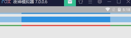
LinearProgressIndicator(),SizedBox(height: 10),LinearProgressIndicator(minHeight: 20,),SizedBox(height: 10),LinearProgressIndicator(backgroundColor: Colors.green,valueColor: AlwaysStoppedAnimation(Colors.red),),
示例2:指定进度值

LinearProgressIndicator(value: 0.2,backgroundColor: Colors.green,valueColor: AlwaysStoppedAnimation<Color>(Colors.red),),
CircularProgressIndicator 圆形进度条
CircularProgressIndicator是一个圆形进度条,定义如下:
CircularProgressIndicator({double value,Color backgroundColor,Animation<Color> valueColor,this.strokeWidth = 4.0,...})
前三个参数和LinearProgressIndicator相同,不再赘述。strokeWidth 表示圆形进度条的粗细。
示例1:不设置进度值,会执行一个循环动画
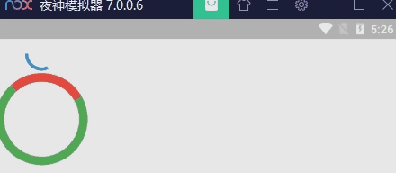
CircularProgressIndicator(),SizedBox(height: 10),Container(width: 100,height: 100,child: CircularProgressIndicator(backgroundColor: Colors.green,valueColor: AlwaysStoppedAnimation<Color>(Colors.red),strokeWidth: 10,),),
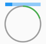
示例2:制定进度值

CircularProgressIndicator(value: 0.2,backgroundColor: Colors.grey,valueColor: AlwaysStoppedAnimation(Colors.green),),
CupertinoActivityIndicator
ios风格的指示器,CupertinoActivityIndicator不能设置进度,只能一直转“菊花”。
CupertinoActivityIndicator(radius: 10, //radius参数是半径,值越大,控件越大。),
自定义尺寸
我们可以发现LinearProgressIndicator和CircularProgressIndicator,并没有提供设置圆形进度条尺寸的参数;如果我们希望LinearProgressIndicator的线细一些,或者希望CircularProgressIndicator的圆大一些该怎么做?
其实LinearProgressIndicator和CircularProgressIndicator都是取父容器的尺寸作为绘制的边界的。知道了这点,我们便可以通过尺寸限制类Widget,如ConstrainedBox、SizedBox (我们将在后面容器类组件一章中介绍)来指定尺寸,如:
// 线性进度条高度指定为3SizedBox(width: 100, //宽100height: 10, //高10child: LinearProgressIndicator(value: 0.2,),),// 圆形进度条直径指定为100SizedBox(width: 100,height: 100, //注意,如果显示空间的宽高不同,则会显示为椭圆。child: CircularProgressIndicator(value: 0.2,backgroundColor: Colors.grey,valueColor: AlwaysStoppedAnimation(Colors.green),),),
进度色动画
前面说过可以通过valueColor对进度条颜色做动画,关于动画我们将在后面专门的章节详细介绍,这里先给出一个例子,读者在了解了Flutter动画一章后再回过头来看。
我们实现一个进度条在3秒内从灰色变成蓝色的动画:
import 'package:flutter/material.dart';class ProgressRoute extends StatefulWidget {@override_ProgressRouteState createState() => _ProgressRouteState();}class _ProgressRouteState extends State<ProgressRoute>with SingleTickerProviderStateMixin {AnimationController _animationController;@overridevoid initState() {//动画执行时间3秒_animationController =new AnimationController(vsync: this, duration: Duration(seconds: 3));_animationController.forward();_animationController.addListener(() => setState(() => {}));super.initState();}@overridevoid dispose() {_animationController.dispose();super.dispose();}@overrideWidget build(BuildContext context) {return SingleChildScrollView(child: Column(children: <Widget>[Padding(padding: EdgeInsets.all(16),child: LinearProgressIndicator(backgroundColor: Colors.grey[200],valueColor: ColorTween(begin: Colors.grey, end: Colors.blue).animate(_animationController), // 从灰色变成蓝色value: _animationController.value,),);],),);}}
自定义进度指示器样式
定制进度指示器风格样式,可以通过CustomPainter Widget 来自定义绘制逻辑,实际上LinearProgressIndicator和CircularProgressIndicator也正是通过CustomPainter来实现外观绘制的。关于CustomPainter,我们将在后面“自定义Widget”一章中详细介绍。
flutter_spinkit 包提供了多种风格的模糊进度指示器,读者若是感兴趣,可以参考。

若有收获,就点个赞吧
0 人点赞
