Material 组件库中提供了多种按钮组件,比如 RaisedButton、FlatButton、OutlineButton、DropdownButton、RawMaterialButton、PopupMenuButton、IconButton、BackButton、CloseButton、ButtonBar、ToggleButtons等。它们都是直接或间接对RawMaterialButton组件的包装定制,所以他们大多数属性都和RawMaterialButton一样。在介绍各个按钮时我们先介绍其默认外观,而按钮的外观大都可以通过属性来自定义,我们在后面统一介绍这些属性。
另外,所有Material 库中的按钮都有如下相同点:
- 按下时都会有“水波动画”(又称“涟漪动画”,就是点击时按钮上会出现水波荡漾的动画)。
- 有一个
onPressed属性来设置点击回调,当按钮按下时会执行该回调,如果不提供该回调则按钮会处于禁用状态,禁用状态不响应用户点击。
按钮常用API
按钮外观可以通过其属性来定义,不同按钮属性大同小异,我们以 RaisedButton 为例,介绍一下常见的按钮属性,详细的信息可以查看API文档。
RaisedButton({Key key,//点击回调,传null 表示按钮禁用,会显示禁用相关样式@required VoidCallback onPressed,//长按回调VoidCallback onLongPress,//按钮高亮变化回调,当点击或者按住按钮时,按钮出现水波纹效果,水波纹变化时就是高亮状态。ValueChanged<bool> onHighlightChanged,MouseCursor mouseCursor,ButtonTextTheme textTheme, //ButtonTextTheme.primary, //前景色 normal accent primaryColor textColor, //文本颜色Color disabledTextColor, //禁用时文字颜色Color color, //背景色Color disabledColor, //禁用时背景色Color focusColor, //聚焦时背景色Color hoverColor, //hover时背景色Color highlightColor, //高亮时背景色,即按钮按下时的背景颜色Color splashColor, //水波纹颜色,按下时会有水波纹效果Brightness colorBrightness, //按钮主题,默认是浅色主题 dark lightdouble elevation, //阴影的范围,值越大阴影范围越大double focusElevation,double hoverElevation,double highlightElevation, //高亮阴影double disabledElevation, //禁用状态阴影EdgeInsetsGeometry padding, //内边距VisualDensity visualDensity, //视觉偏移 范围[-4.0, 4.0]ShapeBorder shape, //设置按钮的形状Clip clipBehavior = Clip.none,FocusNode focusNode,bool autofocus = false,MaterialTapTargetSize materialTapTargetSize, //默认边距padded 去掉默认边距shrinkWrapDuration animationDuration,Widget child,})
示例:定义一个背景蓝色,圆角按钮,点击时蓝色加重
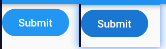
FlatButton(color: Colors.blue,highlightColor: Colors.blue[700],colorBrightness: Brightness.dark,splashColor: Colors.grey,child: Text("Submit"),shape: RoundedRectangleBorder(borderRadius: BorderRadius.circular(20.0)),onPressed: () {},)
主要通过shape来指定其外形为一个圆角矩形。因为按钮背景是蓝色(深色),我们需要指定按钮主题colorBrightness为Brightness.dark,这是为了保证按钮文字颜色为浅色。
Flutter 中没有提供去除背景的设置,假若我们需要去除背景,则可以通过将背景颜色设置为全透明来实现。对应上面的代码,便是将 color: Colors.blue 替换为 color: Color(0x000000)。
我们也可以为这个按钮加上阴影,让它显得有质感。只需要将上面的FlatButton换成RaisedButton就行,其它代码不用改,换了之后的效果: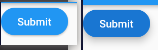
常规按钮
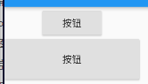
RaisedButton 凸起按钮
https://api.flutter.dev/flutter/material/RaisedButton-class.html
即”漂浮”按钮,它默认带有阴影和灰色背景。按下后,阴影会变大。
Column(children: [RaisedButton(child: Text('按钮'),onPressed: (){},),// 有宽高的按钮Container(width: 200.0,height: 60.0,child: RaisedButton(child: Text('按钮'),onPressed: (){},),),],);
FlatButton 扁平按钮
https://api.flutter.dev/flutter/material/FlatButton-class.html
扁平按钮,默认背景透明并不带阴影。按下后,会有背景色。
FlatButton(child: Text('按钮'),onPressed: () {},),
OutlineButton 幽灵按钮
默认有一个边框,不带阴影且背景透明。按下后,边框颜色会变亮、同时出现背景和阴影(较弱)。
OutlineButton(child: Text('按钮'),onPressed: () {},),
IconButton 图标按钮
https://api.flutter.dev/flutter/material/IconButton-class.html
是一个可点击的Icon,不包括文字,默认没有背景,点击后会出现背景。
IconButton(icon: Icon(Icons.access_alarm),onPressed: () {},iconSize: 24.0, //图标大小tooltip: '提示文案',),
带图标的文字按钮
RaisedButton、FlatButton、OutlineButton都有一个icon 构造函数,通过它可以轻松创建带图标的按钮。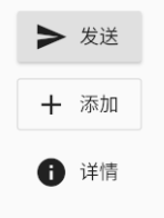
RaisedButton.icon(icon: Icon(Icons.send),label: Text("发送"),onPressed: () {},),OutlineButton.icon(icon: Icon(Icons.add),label: Text("添加"),onPressed: () {},),FlatButton.icon(icon: Icon(Icons.info),label: Text("详情"),onPressed: () {},),
FloatingActionButton
https://api.flutter.dev/flutter/material/FloatingActionButton-class.html
一个圆形图标按钮,它悬停在内容之上,以展示应用程序中的主要动作。FloatingActionButton通常用于Scaffold.floatingActionButton字段。
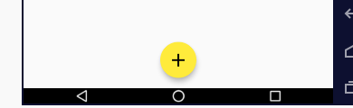
Scaffold(appBar: AppBar(title: Text('我是导航标题')),floatingActionButton: FloatingActionButton(child: Icon(Icons.add, size: 34),onPressed: () {},backgroundColor: Colors.yellow,foregroundColor: Colors.black,),floatingActionButtonLocation: FloatingActionButtonLocation.centerFloat, //悬浮位置);
按钮内通过Builder组件 获取按钮位置的context
GlobalKey _formKey = GlobalKey();Form(key: _formKey, //设置globalKey,用于后面获取FromStatechild: RaisedButton(child: Text('登录'),onPressed: () {//这里获取的context是根context,不能通过这个context获取FormStateprint(Form.of(context)); //null// 通过_formKey.currentState 获取FormState后,// 调用validate()方法校验用户名密码是否合法,校验通过后再提交数据。if ((_formKey.currentState as FormState).validate()) {//验证通过提交数据}},),)
Form(key: _formKey,// 通过Builder来获取按钮位置所在widget树的真正context(Element)child: Builder(builder: (context){return RaisedButton(child: Text('登录'),onPressed: () {//由于本widget也是Form的子代widget,所以可以通过下面方式获取FormStateif(Form.of(context).validate()){//验证通过提交数据}},);},),)
ButtonBar 按钮组
https://api.flutter.dev/flutter/material/ButtonBar-class.html
ButtonBar({Key key,this.alignment, //对齐方式 alignment: MainAxisAlignment.start,this.mainAxisSize, //min maxthis.buttonTextTheme, //主题色this.buttonMinWidth, //按钮最小宽度this.buttonHeight, //按钮高度this.buttonPadding, //constrained paddedthis.buttonAlignedDropdown,this.layoutBehavior, //constrained paddedthis.overflowDirection, //down upthis.overflowButtonSpacing,this.children = const <Widget>[],})
示例
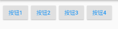
ButtonBar(alignment: MainAxisAlignment.start,// mainAxisSize: MainAxisSize.min, //min maxbuttonTextTheme: ButtonTextTheme.accent,// buttonMinWidth: 200.0,// buttonHeight: 200.0,// buttonPadding: EdgeInsets.all(20.0),// buttonAlignedDropdown: true,// layoutBehavior: ButtonBarLayoutBehavior.padded, //constrained padded// overflowDirection: VerticalDirection.up, //down up// overflowButtonSpacing: 1.0,children: [RaisedButton(child: Text('按钮1'), onPressed: () {}),RaisedButton(child: Text('按钮2'), onPressed: () {}),RaisedButton(child: Text('按钮3'), onPressed: () {}),RaisedButton(child: Text('按钮4'), onPressed: () {}),],),
自定义按钮
lib/coms/base/buttons/MyButton.dart
import "package:flutter/material.dart";class MyButton extends StatelessWidget {final text;final onPressed;final width;final height;const MyButton({key,this.text = '',this.onPressed = null,this.width = 80.0,this.height = 30.0,}) : super(key: key);@overrideWidget build(BuildContext context) {return Container(width: this.width,height: this.height,child: RaisedButton(child: Text(this.text),onPressed: this.onPressed,),);}}
使用
import "package:app1/coms/base/buttons/MyButton.dart";//...MyButton(text: '按钮1',onPressed: () {},),

若有收获,就点个赞吧
0 人点赞
