https://api.flutter.dev/flutter/widgets/Container-class.html
Container是一个组合类容器,它本身不对应具体的RenderObject,它是DecoratedBox、ConstrainedBox、Transform、Padding、Align等组件组合的一个多功能容器,所以我们只需通过一个Container组件可以实现同时需要装饰、变换、限制的场景。
Container的定义:
Container({this.alignment,this.padding, //容器内补白,属于decoration的装饰范围Color color, // 背景色Decoration decoration, // 背景装饰Decoration foregroundDecoration, //前景装饰double width,//容器的宽度double height, //容器的高度BoxConstraints constraints, //容器大小的限制条件this.margin,//容器外补白,不属于decoration的装饰范围this.transform, //变换this.child,})
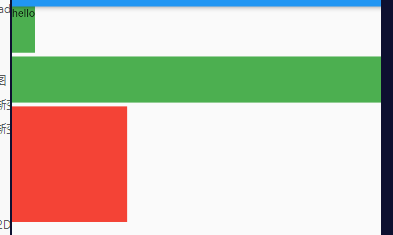
Container 没设置child时,默认填满父组件;
Container 设置了child,默认是适配子控件大小的,即其宽高由子元素决定。
Container 设置了child,又设置了对齐方式,默认填满父组件。
示例:
Column(crossAxisAlignment: CrossAxisAlignment.start,children: [Container(height: 60.0,color: Colors.green,child: Text('hello'),),SizedBox(height: 5),Container(height: 60.0,color: Colors.green, //没设置child,宽度等于全屏宽度),SizedBox(height: 5),Container(width: 150,height: 150,color: Colors.green,child: Container(color: Colors.red), //宽高、child都不设置,默认完全填充父组件),],);
常用属性
alignment 对齐方式
注意:设置对齐方式后,Container将会充满其父控件,相当于Android中 match_parent 。
Alignment封装常用位置对照图:
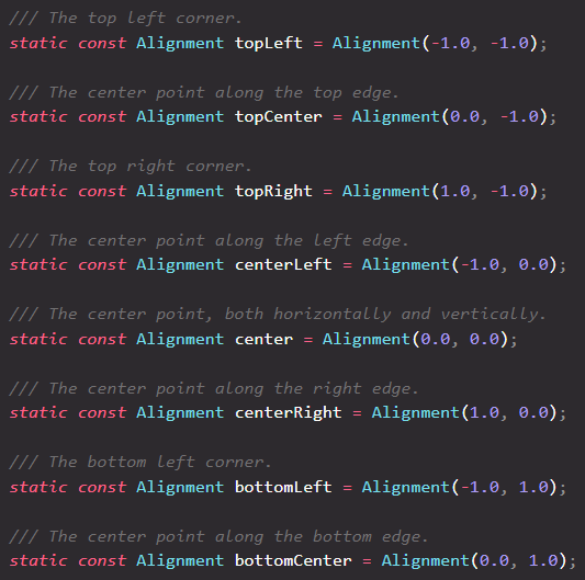
Alignment 坐标系,原点在组件中心。
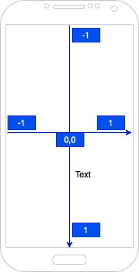
示例
Container(alignment: Alignment.centerRight,width: 100.0,height: 100.0,decoration: BoxDecoration(color: Colors.grey,border: Border.all(color: Colors.green, width: 2.0),borderRadius: BorderRadius.all(Radius.circular(10.0)),),child: Text('我是'),),
width、height、constraints
width、height宽高constrains容器大小的限制条件,设置最大/小宽、高来确定大小,如果不设置,默认最小宽高是0,最大宽高是无限大(double.infinity)
容器的大小可以通过width、height属性来指定,也可以通过constraints来指定;如果它们同时存在时,width、height优先。实际上Container内部会根据width、height来生成一个constraints。
Container(width: 100.0,height: 100.0,),
Container(// 限定宽高范围constraints: BoxConstraints(maxWidth: 300.00,minWidth: 100.0,minHeight: 100.0,maxHeight: 300.0,),// 指定宽高constraints: BoxConstraints.tightFor(width: 100.0, height: 100.0),),
margin、padding 外边距、内边距
Container(margin: EdgeInsets.all(20.0),color: Colors.orange,child: Text('hello flutter'),),Container(// 全内边距padding: EdgeInsets.all(20.0),// 四边距// padding: EdgeInsets.fromLTRB(left, top, right, bottom)padding: EdgeInsets.fromLTRB(20, 10, 20, 10),// 垂直、水平内边距padding: EdgeInsets.symmetric(vertical: 10.0, horizontal: 20.0),// 单边距padding: EdgeInsets.only(top: 20.0, right: 10.0),color: Colors.orange,child: Text('hello flutter'),),

直观的感觉就是margin的留白是在容器外部,而padding的留白是在容器内部,读者需要记住这个差异。事实上,Container内margin和padding都是通过Padding 组件来实现的,上面的示例代码实际上等价于:
Padding(padding: EdgeInsets.all(20.0),child: DecoratedBox(decoration: BoxDecoration(color: Colors.orange),child: Text('hello flutter'),),),DecoratedBox(decoration: BoxDecoration(color: Colors.red),child: Padding(padding: EdgeInsets.all(20.0),child: Text('hello flutter'),),),
decoration
装饰器,可以传递背景图、背景色、边框等。
decoration: BoxDecoration()
BoxDecoration
我们通常会直接使用BoxDecoration类,它是一个Decoration的子类,实现了常用的装饰元素的绘制。
BoxDecoration({Color color, //颜色DecorationImage image,//图片BoxBorder border, //边框BorderRadiusGeometry borderRadius, //圆角List<BoxShadow> boxShadow, //阴影,可以指定多个Gradient gradient, //渐变BlendMode backgroundBlendMode, //背景混合模式BoxShape shape = BoxShape.rectangle, //形状})
color 背景色
Container(margin: EdgeInsets.all(10.0),width: 100.0,height: 100.0,color: Colors.grey,);// 等同于Container(margin: EdgeInsets.all(10.0),width: 100.0,height: 100.0,decoration: BoxDecoration(color: Colors.grey,),);
image 背景图
decoration: BoxDecoration(color: Colors.grey,image: DecorationImage(image: NetworkImage('https://lstatic.zuimeia.com/common/image/2020/11/3/cb418da0-d7a3-4b8c-829f-8cdf23ff1b08_4834_1450.jpeg'),fit: BoxFit.contain,),),

gradient 背景渐变
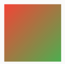
横向渐变
Container(margin: EdgeInsets.all(10.0),width: 100.0,height: 100.0,decoration: BoxDecoration(gradient: LinearGradient(colors: [Colors.red, Colors.green], //颜色组begin: Alignment.topLeft, //起始点坐标 等同于 begin: Alignment(-1, -1)end: Alignment.bottomRight, //终止点坐标 等同于 begin: Alignment(1, 1)tileMode: TileMode.clamp, //clamp、repeated、mirror// end: Alignment(1, 1),),),);
径向渐变
Container(margin: EdgeInsets.all(10.0),width: 100.0,height: 100.0,decoration: BoxDecoration(gradient: RadialGradient(colors: [Colors.red, Colors.green], //颜色组center: Alignment.topLeft, //圆心坐标位置radius: 0.5, //圆半径// focalRadius: 0.0, //焦半径tileMode: TileMode.clamp, //clamp、repeated、mirror),),);
tileMode 不同情况图示: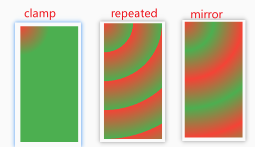
border 边框
decoration: BoxDecoration(// 全边框border: Border.all(color: Colors.green, width: 2.0, style: BorderStyle.solid),border: Border.fromBorderSide(BorderSide(color: Colors.green, width: 2.0, style: BorderStyle.solid)),// 单边框border: Border(left: BorderSide(color: Colors.green, width: 2.0)),// 双边框border: Border.symmetric(vertical: BorderSide(),horizontal: BorderSide(color: Colors.red, width: 4),),),
borderRadius 圆角
decoration: BoxDecoration(// 全圆角(BorderRadius.all)borderRadius: BorderRadius.all(Radius.circular(10.0)),borderRadius: BorderRadius.circular(10),// 单圆角(BorderRadius.only) topLeft、topRight、bottomLeft、bottomRightborderRadius: BorderRadius.only(topLeft: Radius.circular(10.0)),//上下圆角(BorderRadius.vertical) top bottomborderRadius:BorderRadius.vertical(top: Radius.circular(10.0), bottom: Radius.circular(20.0)),//左右圆角(BorderRadius.horizontal) left rightborderRadius:BorderRadius.horizontal(left: Radius.circular(10.0), right: Radius.circular(20.0)),),
boxShadow 阴影
decoration: BoxDecoration(color: Colors.grey,boxShadow: [BoxShadow(color: Color.fromRGBO(0, 0, 0, 0.2),offset: Offset(2.0, 10.0),blurRadius: 10.0,// spreadRadius: 50.0, //扩散),],),
shape 形状
https://www.yuque.com/zhuchaoyang/tnyvrp/hl64eg
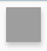
decoration: BoxDecoration(color: Colors.grey,shape: BoxShape.circle, //circle 圆形;rectangle 矩形),
transform 2D变换
transform: Matrix4.rotationZ((45 / 180) * pi) 以左上角为轴,顺时针旋转45度。
详情请参考 transform 一节。

若有收获,就点个赞吧
0 人点赞
